So, you’ve picked Sherwin Williams Ripe Olive but are unsure of how it will perform because of its deep shade. It’s ok to waver with indecision when you pick a dark paint color, especially if it’s for interior decor. However, I know something drew you to it in the first place.
Therefore, this guide will help you decide whether Ripe Olive is ideal for your decor. You’ll learn about the paint color’s characteristics and what makes it unique. The color palettes will also help you know how to make it work. Ready for the journey? Let’s get going!
Table of Contents
When to Choose Sherwin Williams Ripe Olive
One of the first things you have to decide when you pick a paint color is why it is your go-to choice for that room or decor. This is especially true of colors like Ripe Olive because they usually have specific uses. If you are unsure of when to pick this color over others, check out the following.
Does black feel too heavy?
Ripe Olive is pretty dark and saturated. Because of this, you can substitute black with it if your decor can work with green, and black just feels too heavy.
Thinking of a new exterior paint color?
This paint color looks amazing on the exterior walls because the light is abundant. Plus, it is such an unconventional color that draws attention for all the right reasons.
Need a new accent color?
Using Ripe Olive as an entire room paint color may be out of the question. However, you can try it on an accent wall or ceiling for a striking effect.
Want to change the window frame color?
Black is trendy as a window frame color, but have you considered deep greens like Ripe Olive? No one can tell it’s green from just looking at it, and it’s a shift from the norm. After all, normal is boring.
These are only a few ideas of how and when you can use Ripe Olive and love the color. Let me show you more about the paint color that will help you make an informed decision.
What Color Is Ripe Olive?
You may be wondering if there’s a reason behind the name of the paint color. Is it just to draw attention or is there more to it? We all know how useful olives are, and not just as fruits. Olive oil can serve many purposes, and the world will still discover more about it.
Olives can be black or green, and this paint color is a beautiful combination of both colors. The truth is that ripe olives are usually dark brown or black, so this specific paint color shade is unique only to it. Want a look at what inspired the name? Take a look below.
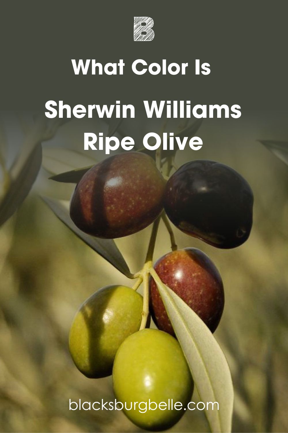
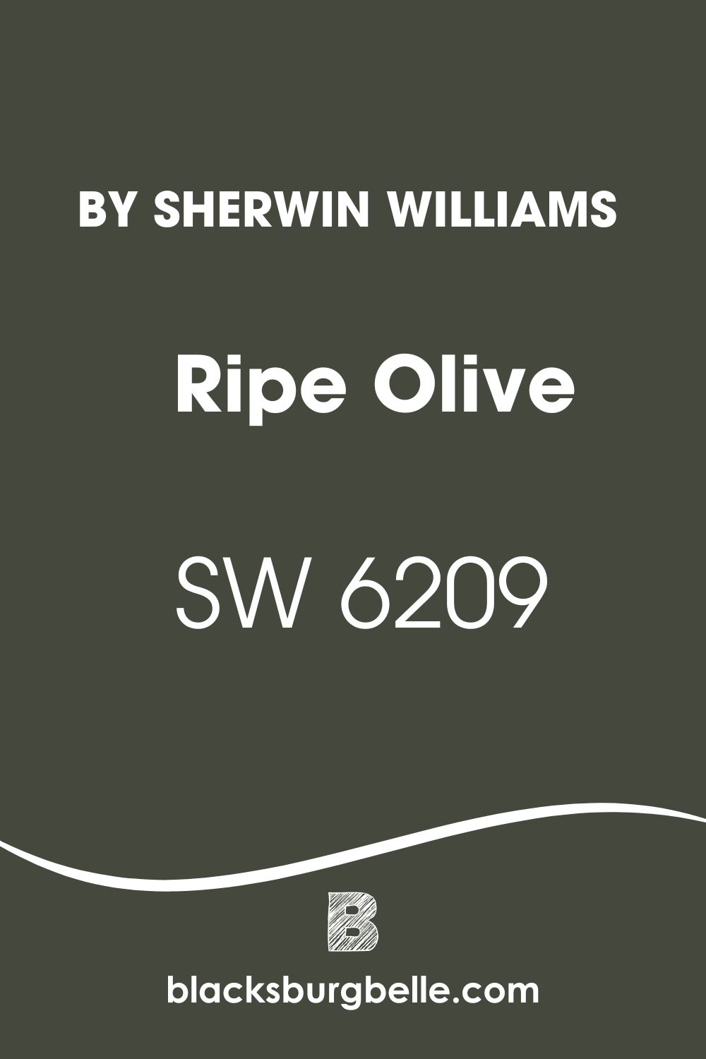
Sherwin Williams Ripe Olive SW 6209 is a deep green paint color with cool undertones that don’t read crisply. If you want an alternative to black that doesn’t entirely throw away color, RIpe Olive is one of your best options.
A Snapshot of the Specifications of Sherwin Williams Ripe Olive
Here, I use a chart to reveal the details of Ripe Olive, such as undertones and LRV. It’s usually easier to make a reference or understand paint colors when you have a summarised version of their attributes.
| Sherwin Williams Ripe Olive | |
| RGB | 68, 72, 61 |
| LRV | 6 |
| Undertone | Blue-gray |
| HEX Code | #44483D |
The LRV of Sherwin Williams Ripe Olive
LRV means the light reflectance value of color and refers to the amount of light it reflects on a scale of 0 to 100. Pure black has an LRV of 0, while pure white has an LRV of 100. The lower the value is, the darker the color is. And the higher the value is, the lighter the color is.
Paint colors are slightly different, in that they don’t have pure black or pure white. So, the scale is not entirely the same. Paint colors use an LRV scale of 2.5 to 94 to check how much light they reflect. By this, you have an idea of how a color of choice works in different lighting conditions.
Sherwin Williams Ripe Olive has an LRV of 6, which is pretty low. As green colors go, this is probably the darkest one in the market from Sherwin Williams. That also means it doesn’t reflect a lot of light.
The Undertones of Sherwin Williams Ripe Olive
Now, the undertones of Ripe Olive make it a truly unique color. For such a dark shade, you would think its undertones would be different. But the color’s undertones of blue-gray add depth and keep it from appearing too dark in a low-lit room.
At first glance, you may not immediately notice the undertones. But when used in certain lighting, you can pick up the slightly deep blue hue in it.
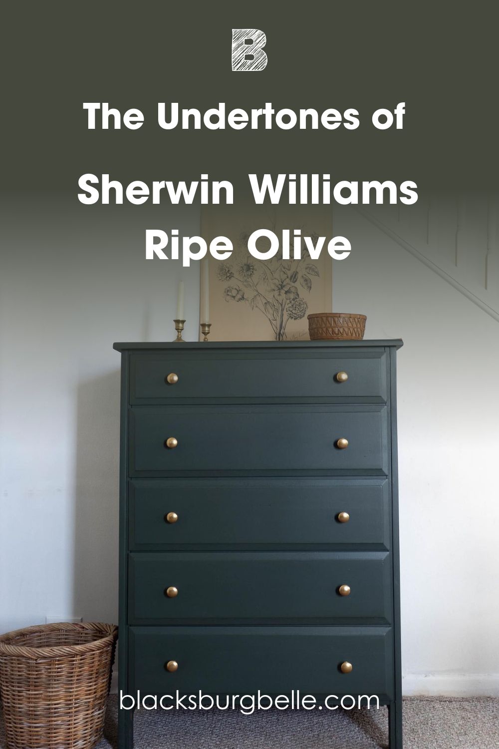
And here, you can see a hint of gray in it:
How Does Lighting Affect SW Ripe Olive?
It’s easy to see why it’s such a special color. While it appears dark and somber, which may make you skeptical about using it, Ripe Olive holds back from turning truly dark. You will always see a hint of color, regardless of the lighting.
Colors tend to look different in different types of lighting. Bright natural lighting, which means direct or abundance of daylight, is the best for Ripe Olive.
It brings out the best aspects of the color. But the light can be cold or low, and this can deepen the color to almost black. Thankfully, it never completely loses all its color.
However, in places like bathrooms, this paint color may not have a good amount of natural light. Consequently, artificial light comes into play, and this has a way of changing the color.
Here is Ripe Olive in a bathroom with yellow artificial light:
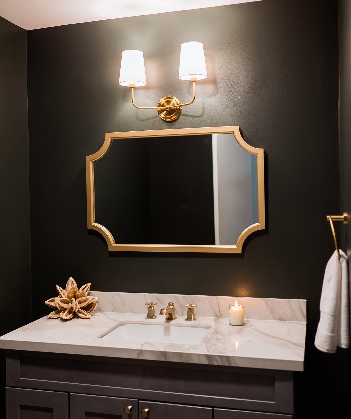
And here is the same paint color in brighter light:
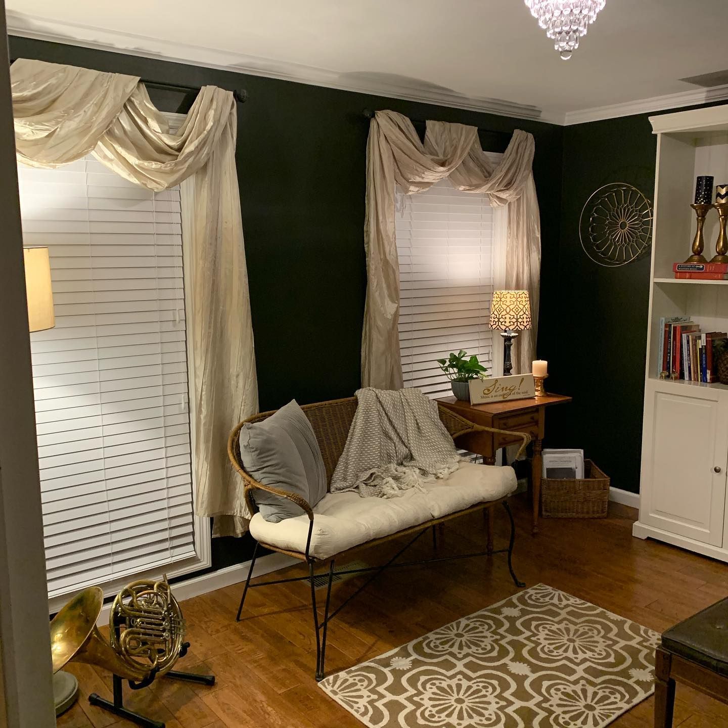
How Does Ripe Olive Feel in a Room?
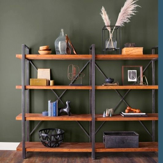
It depends on your perception, style, and what you have in that room. Dark colors may not pick up hues from other colors, but they are still affected by other elements. White or light gray will work well with Ripe Olive to create a stunningly sophisticated space.
Also, light wood tones look great with it. Use RIpe Olive minimally if you want to enjoy it unless you’re not afraid of making a bold statement. Dark and saturated colors typically make a room feel smaller, so keep that in mind.
Sherwin Williams Ripe Olive: Warm or Cool?
Although your first thought about this color is warmth and coziness, Ripe Olive is a cool-toned color. This is because of its blue-gray undertones.
However, it doesn’t read crispy or icy since olive typically shows a bit of yellow. That means in some settings, you may notice a bit of yellow, which turns the color slightly warm. Loosely speaking, Ripe Olive can show some neutrality and versatility, pairing well with warm, cool, and neutral colors.
Sherwin Williams Ripe Olive Color Strip: Lighter to Darker Exploration
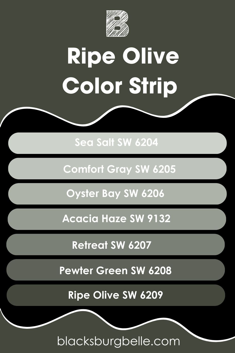
If you find that Ripe Olive is too dark for your style, you don’t have to panic. The paint color comes from a color strip, and I’ve carefully picked other similar colors to give you options. Check them out below, from light to dark.
- Sherwin Williams Sea Salt SW 6204
- Sherwin Williams Comfort Gray SW 6205
- Sherwin Williams Oyster Bay SW 6206
- Sherwin Williams Acacia Haze SW 9132
- Sherwin Williams Retreat SW 6207
- Sherwin Williams Pewter Green SW 6208
- Sherwin Williams Ripe Olive SW 6209
Sherwin Williams Ripe Olive Complementary Color
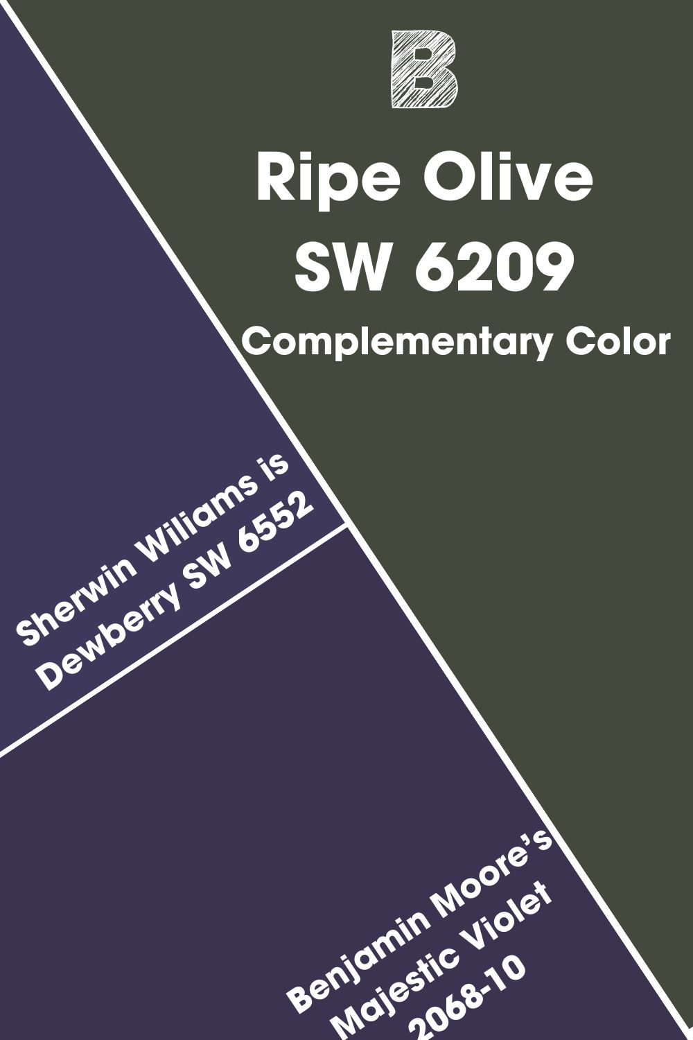
If you’ve ever looked at a color wheel, you will notice some colors face each other. These are complementary colors, although they don’t usually look like they match, and may both be vibrant colors. Simply put, complementary colors are opposite each other on the color wheel.
Ripe Olive is not your typical green color, so it may be a little difficult to find it on the color wheel. But I’ve picked it out for easy reference, and it is a dark shade of purple. And the closest to it from Sherwin Wiliams is Dewberry SW 6552. You can also try Benjamin Moore’s Majestic Violet 2068-10.
Sherwin Williams Ripe Olive Coordinating Colors
Any color can be a coordinating color, but it must have some similarities to the main color. Coordinating colors typically have a level of association that makes them blend well in a color scheme. They are harmonious and look pleasing to the eye when used together.
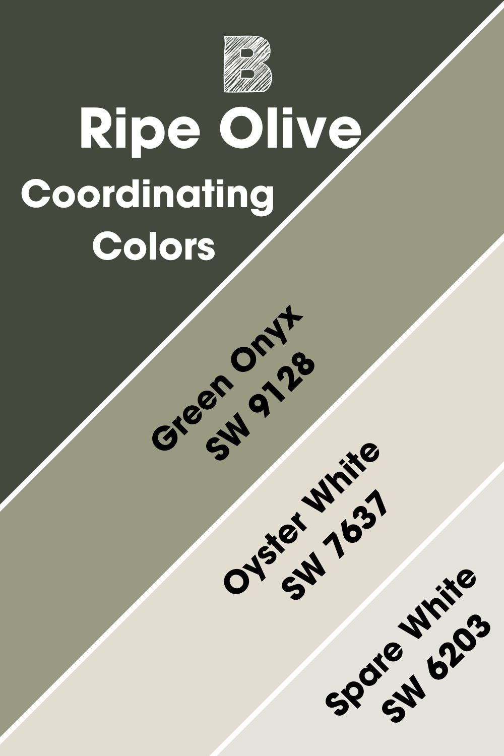
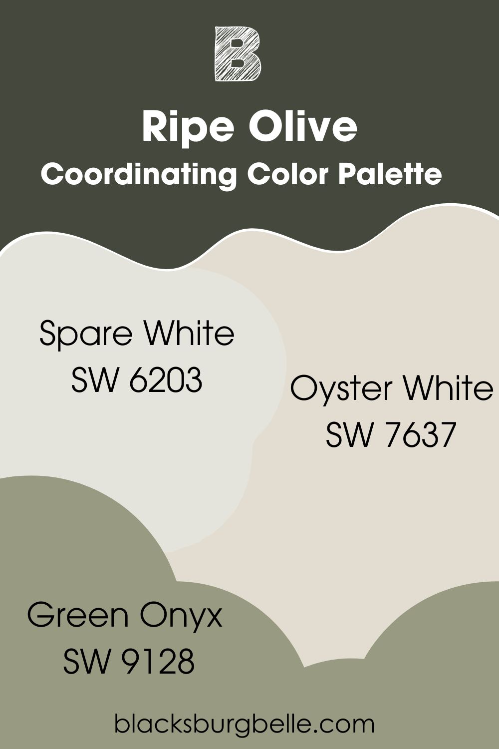
Some of the coordinating colors for Ripe Olive include Green Onyx, Oyster White, and Spare White.
- Sherwin Williams Green Onyx SW 9128: A medium shade of green with a muted hue that pairs well with the much darker Ripe Olive.
- Sherwin Williams Oyster White SW 7637: A relatively bright white with a green-beige undertone that perfectly complements Ripe Olive.
- Sherwin Williams Spare White SW 6203: A bright white paint color with cool green undertones that bring out the best in Ripe Olive when used as a trim color.
Sherwin Williams Ripe Olive Color Palettes
These palettes allow you to use Ripe Olive without feeling as if you live in a cave. While light colors will be your go-to choice for pairing with Ripe Olive, you can also consider a few other saturated colors.
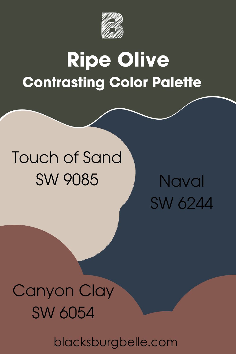
Contrasting Color Palette
- Touch of Sand SW 9085: A light beige paint color that brings calmness and a laid-back feeling, brightening the space when paired with Ripe Olive.
- Naval SW 6244: A navy blue shade that surprisingly pairs well with the dark Ripe Olive because of the blue-gray depths of the green paint color.
- Canyon Clay SW 6054: A deep red paint color reminiscent of clay that grounds the colors in the decor and brings something different with its earthy tones.
Coordinating Color Palette
- Spare White SW 6203: With its green undertone, this bright white blends well with the much darker Ripe Olive.
- Oyster White SW 7637: Its undertone of green-beige is what Ripe Olive needs to brighten any space.
- Green Onyx SW 9128: As its name suggests, this paint color is a medium shade of green that enhances the depths of the rich Ripe Olive.
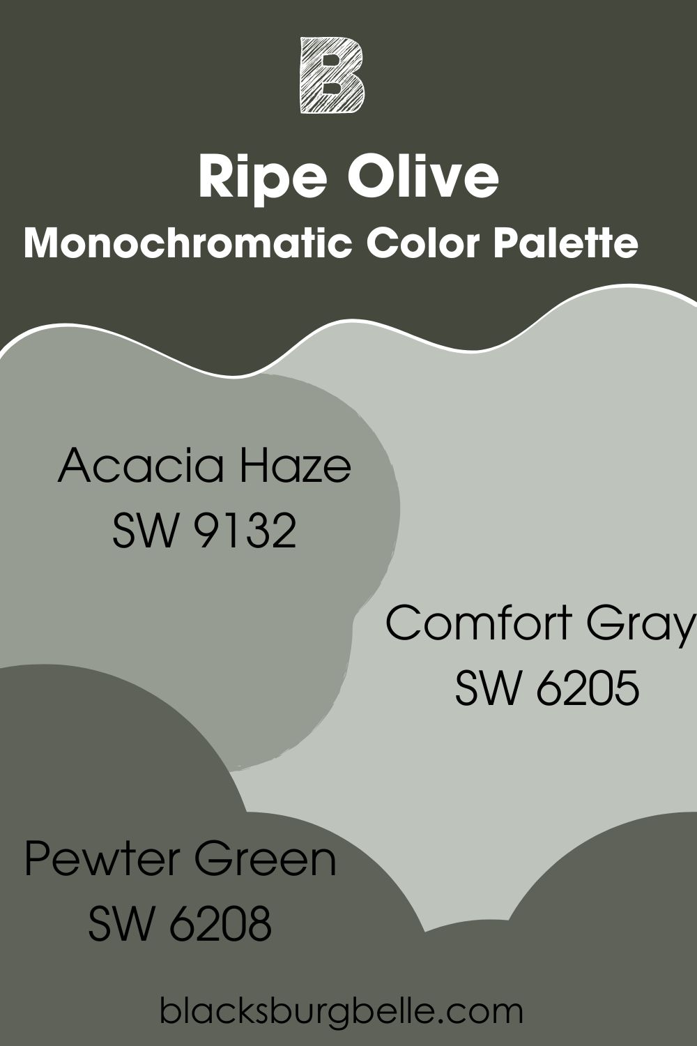
Monochromatic Color Palette
- Acacia Haze SW 9132: Picked from the same color strip and collection as Ripe Olive, this paint color will work well in monochromatic decor as the darker green color.
- Comfort Gray SW 6205: A light shade of green-gray that brings something light and soft to the decor when used together with Ripe Olive.
- Pewter Green SW 6208: This color is only a shade lighter than Ripe Olive but has similar attributes as the main color.
Sherwin Williams Ripe Olive vs Similar Colors
It’s ok if you want to have options within the same color family. I would even recommend it to avoid restricting yourself. So here, I’ve picked colors similar to Ripe Olive for this purpose.
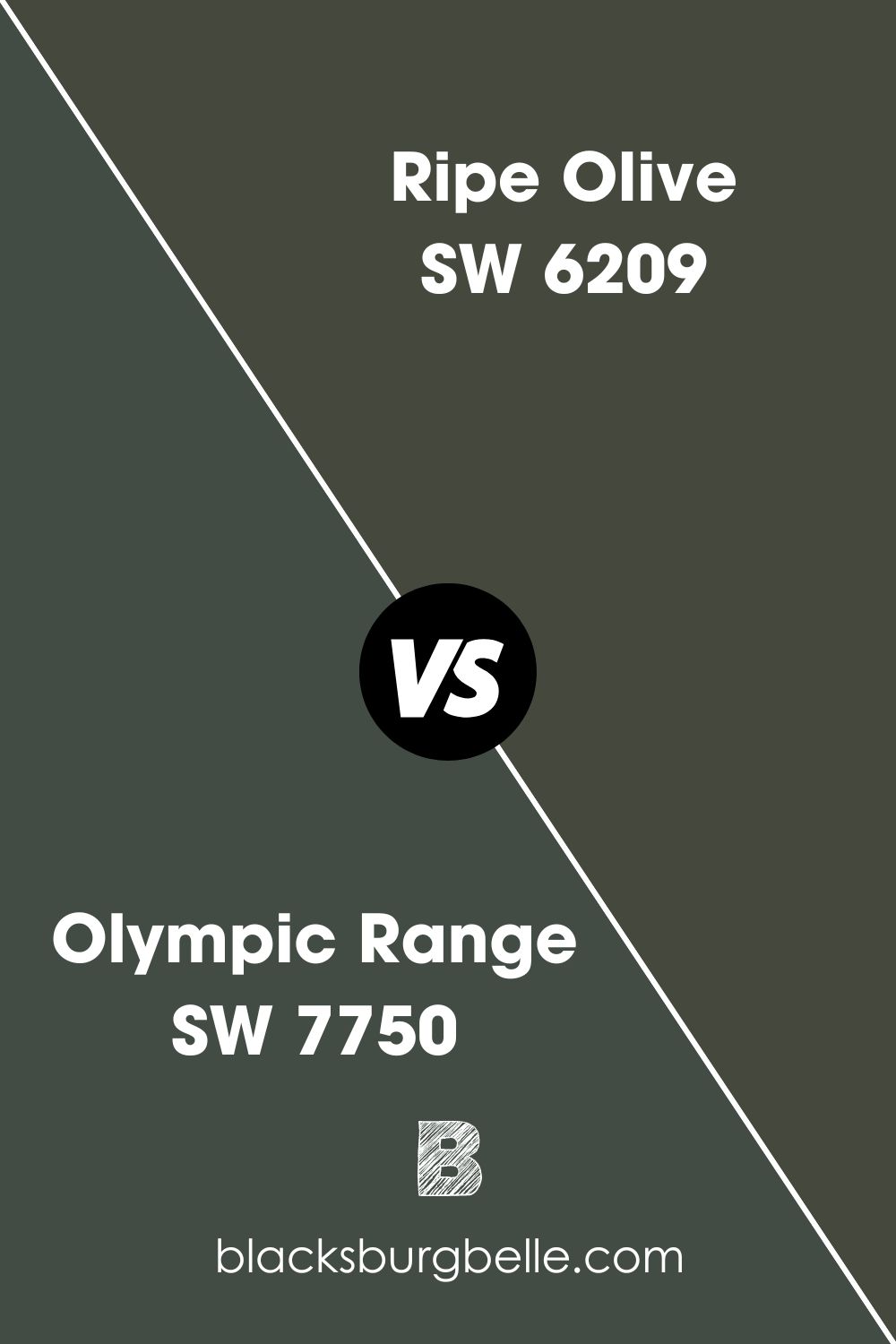
SW Olympic Range vs SW Ripe Olive
Olympic Range has the same blue-gray undertones as Ripe Olive but is more cool-toned than its counterpart.
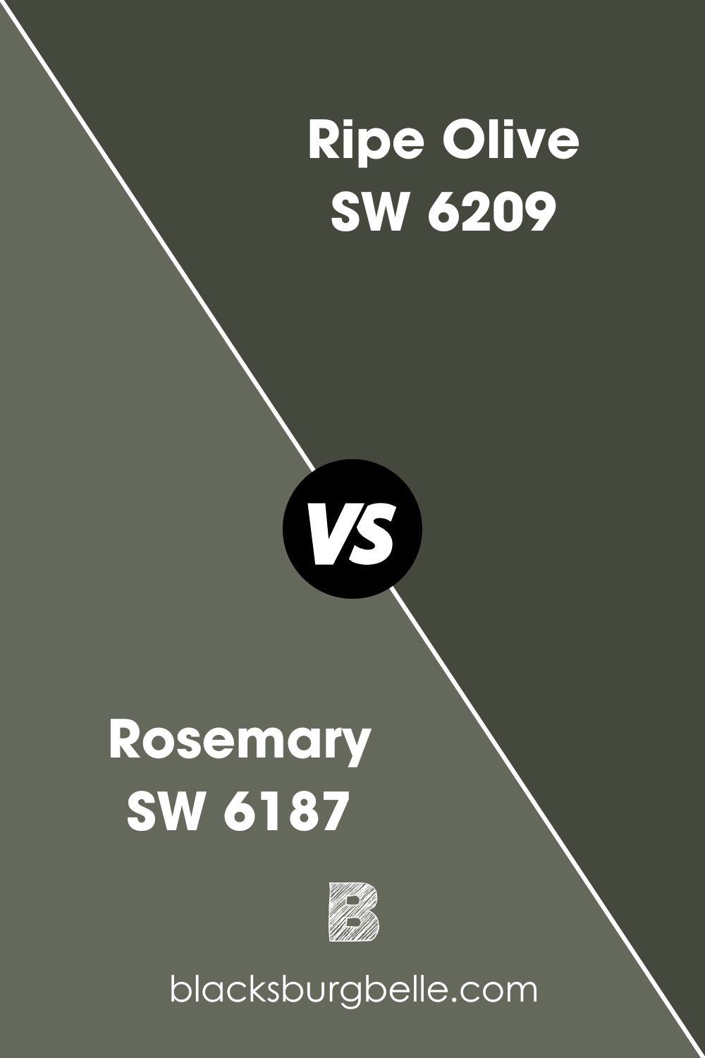
SW Rosemary vs SW Ripe Olive
Rosemary is considerably brighter than Ripe Olive because of its LRV of 21. The similarity between them is their undertones of gray.
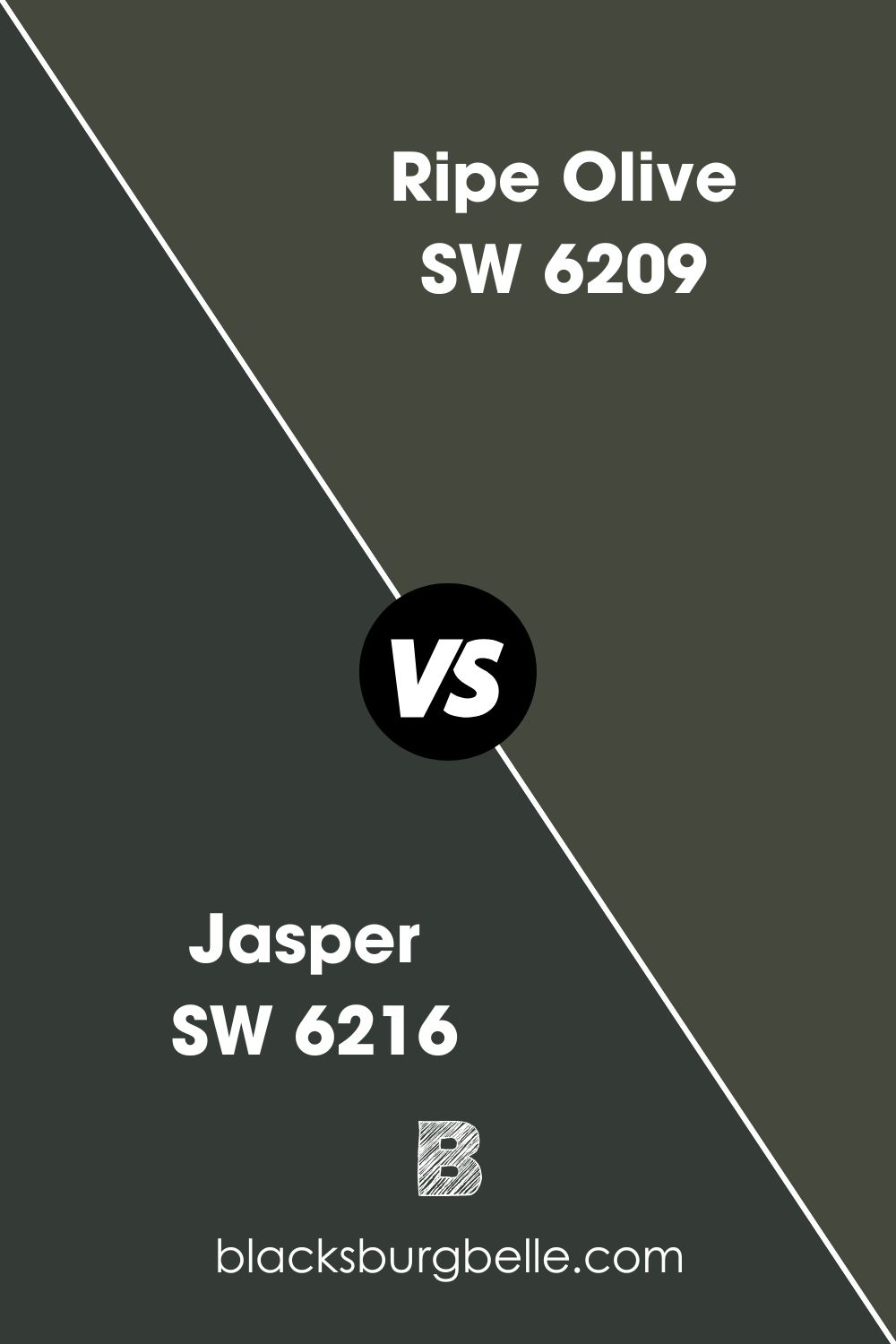
SW Jasper vs SW Ripe Olive
Believe it or not, there are greens darker than Ripe Olive. Jasper has an LRV of 4 and looks greener than the olive hue of Ripe Olive.
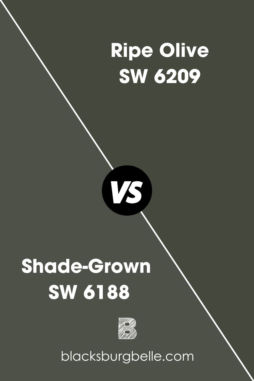
SW Shade-Grown vs SW Ripe Olive
Shade-Grown is a lighter green than Ripe Olive and has brownish-gray undertones. Therefore, it’s warm, while Ripe Olive is cool.
Benjamin Moore Paint Color Equivalent to SW Ripe Olive
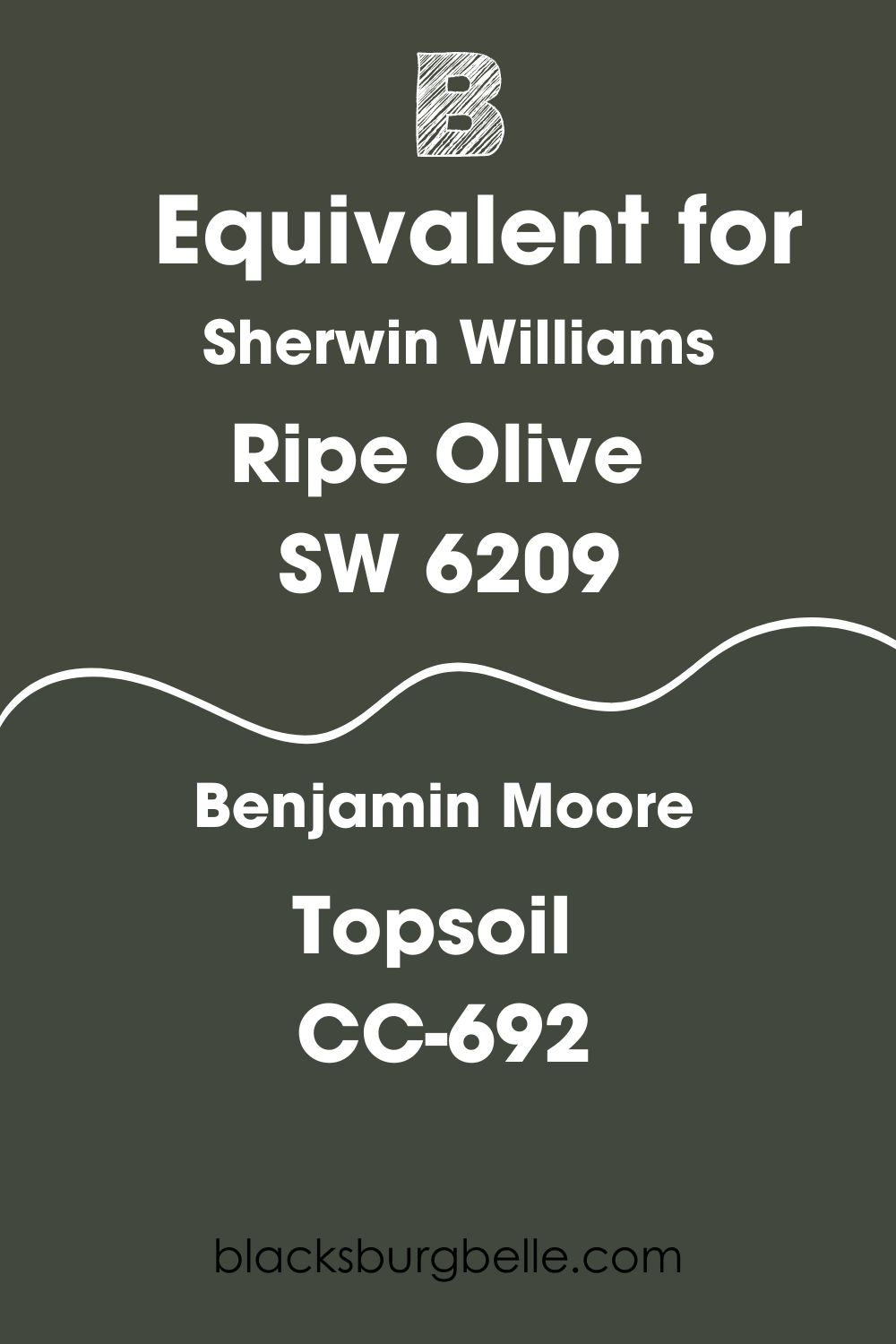
There’s no exact equivalent paint color from Benjamin Moore that matches Sherwin Williams Ripe Olive. Although you will find colors that are unbelievably close to it, none is an exact equivalent.
That said, Benjamin Moore’s Topsoil CC-692 is uncannily similar to Ripe Olive, with almost the same red, green, and blue (RGB) code. It only has a little more blue in it.
Where Can You Use Sherwin Williams Ripe Olive?
It may not look like it, but Ripe Olive is pretty versatile. It can pair with many other colors and holds up well inside the house. So, where can you use it? I can tell you that it works just about anywhere. Without further, let’s see some examples.
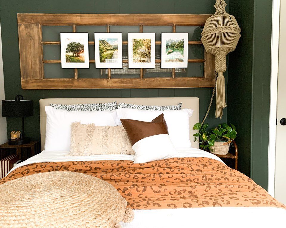
Sherwin Williams Ripe Olive in a Bedroom
If you are going to use this paint color in your bedroom or anywhere else inside the house, ensure there’s a good amount of light. Check out this bedroom with its light wood tones and Ripe Olive accent.
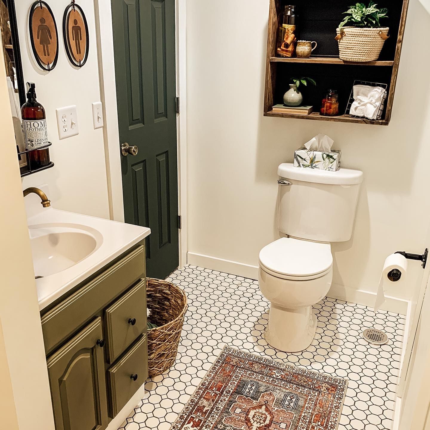
Sherwin Williams Ripe on a Door
Front doors may look amazing when painted in Ripe Olive, but doors inside the house can also look the same. This door in a white bathroom is the focus of the room.
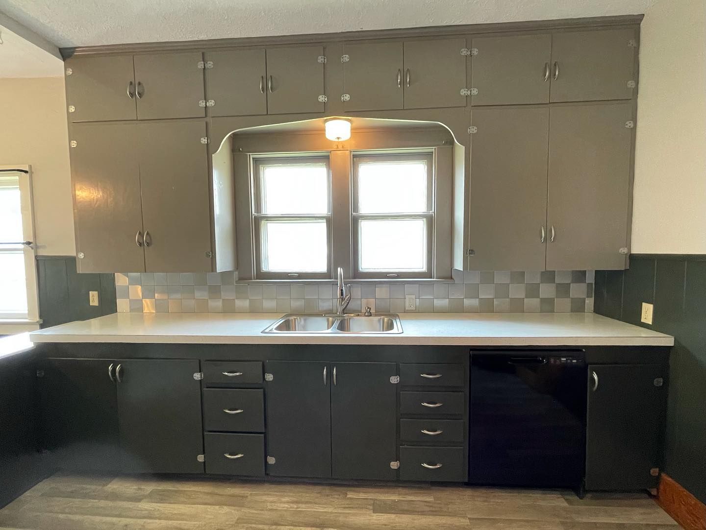
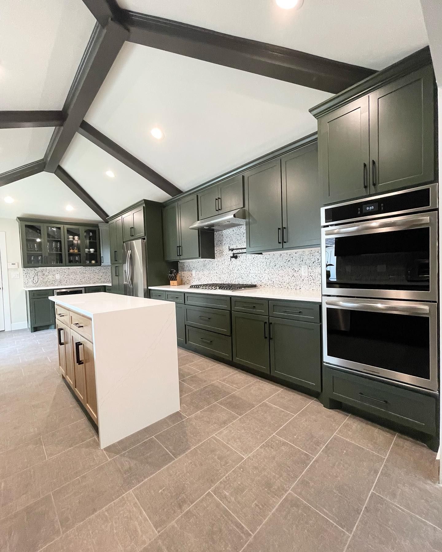
Sherwin Williams Ripe Olive on Kitchen Cabinets
This kitchen looks spectacular with the color blend. The cabinets are Ripe Olive, the beams are SW Urbane Bronze, and the ceiling is SW Oyster White.
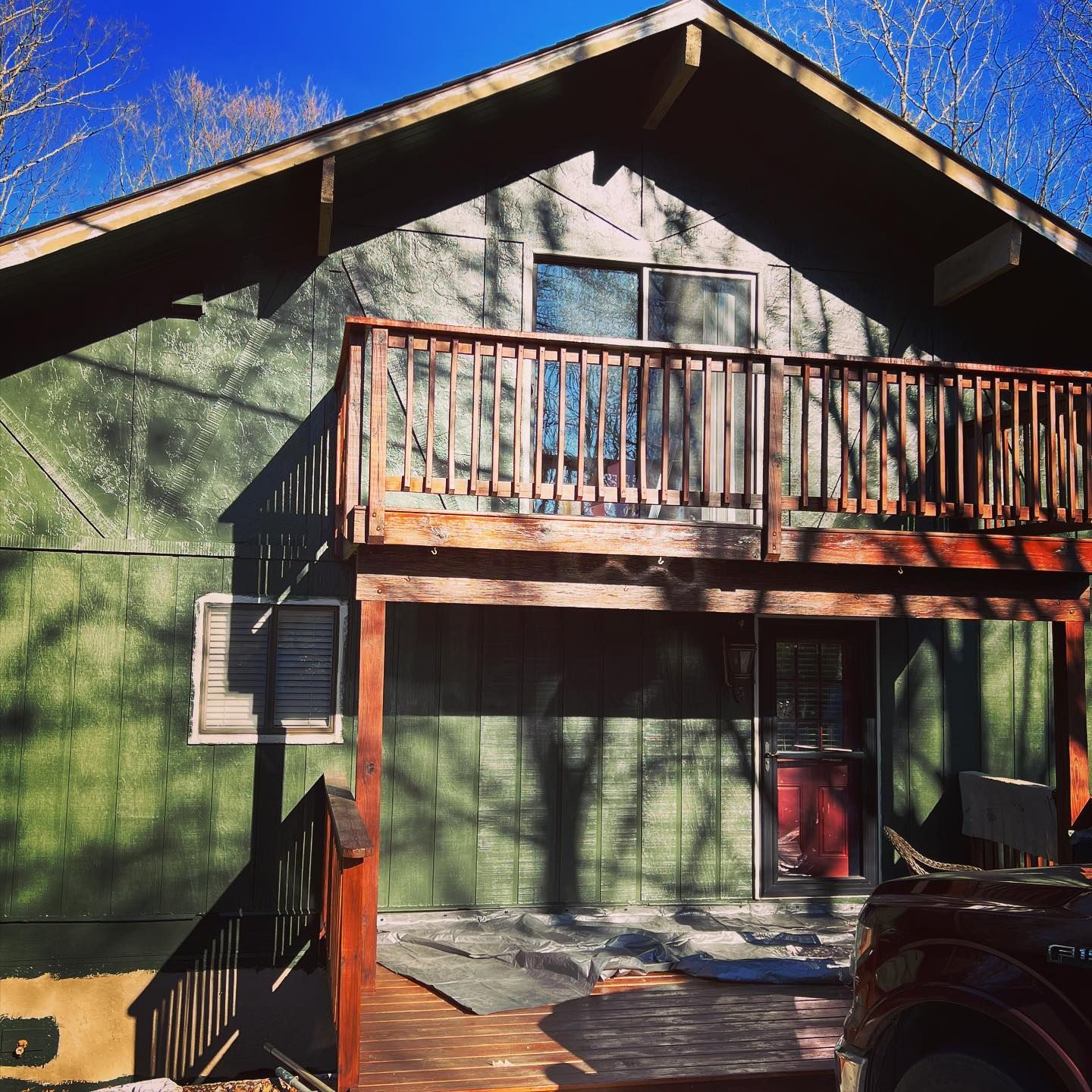
Sherwin Williams Ripe Olive on Exterior Walls
I love this next picture because it shows different aspects of Ripe Olive. You can see the true olive shade on one side and its dark aspect on another side. It’s a truly beautiful color.
Sherwin Williams Ripe Olive in a Bathroom
As mentioned, Ripe Olive works best in a well-lit room and with light colors. This bathroom is proof of that.
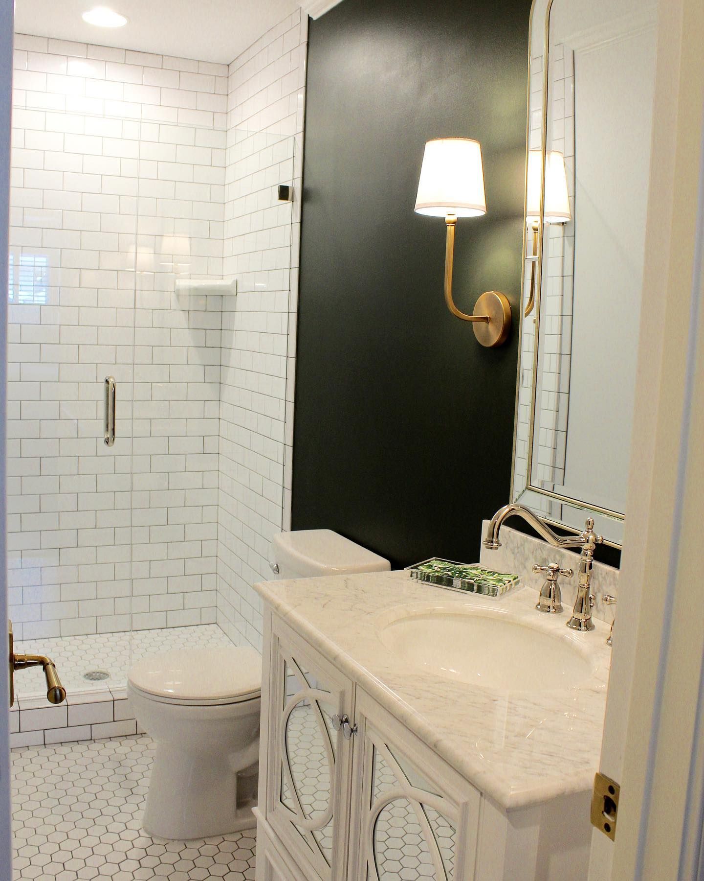
Sherwin Williams Ripe Olive in a Powder Room
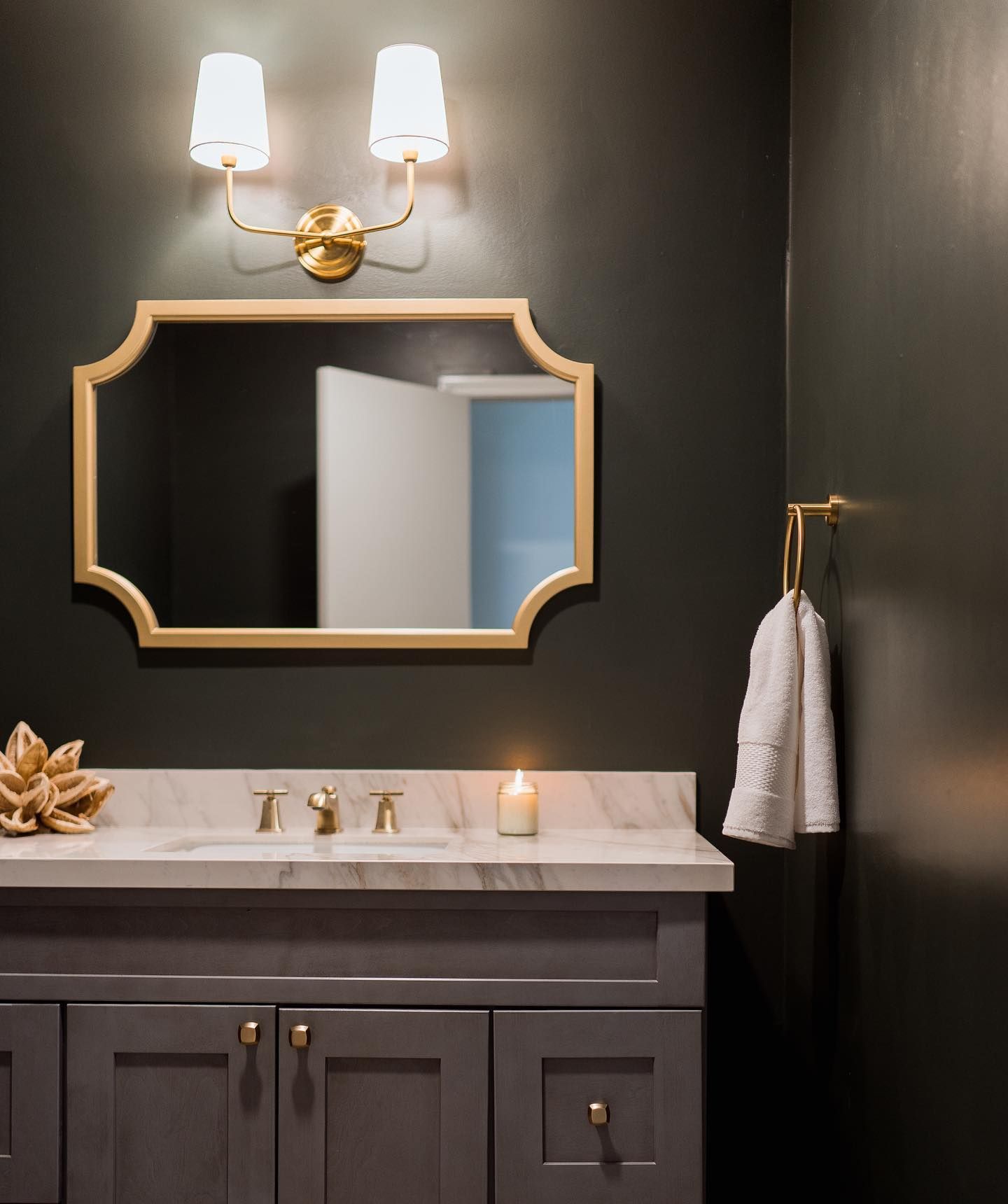
If it works in a bathroom, it should work in a powder room. See how well Ripe Olive works with the dark gray paint color on the vanity.
Sherwin Williams Ripe Olive in a Laundry Room
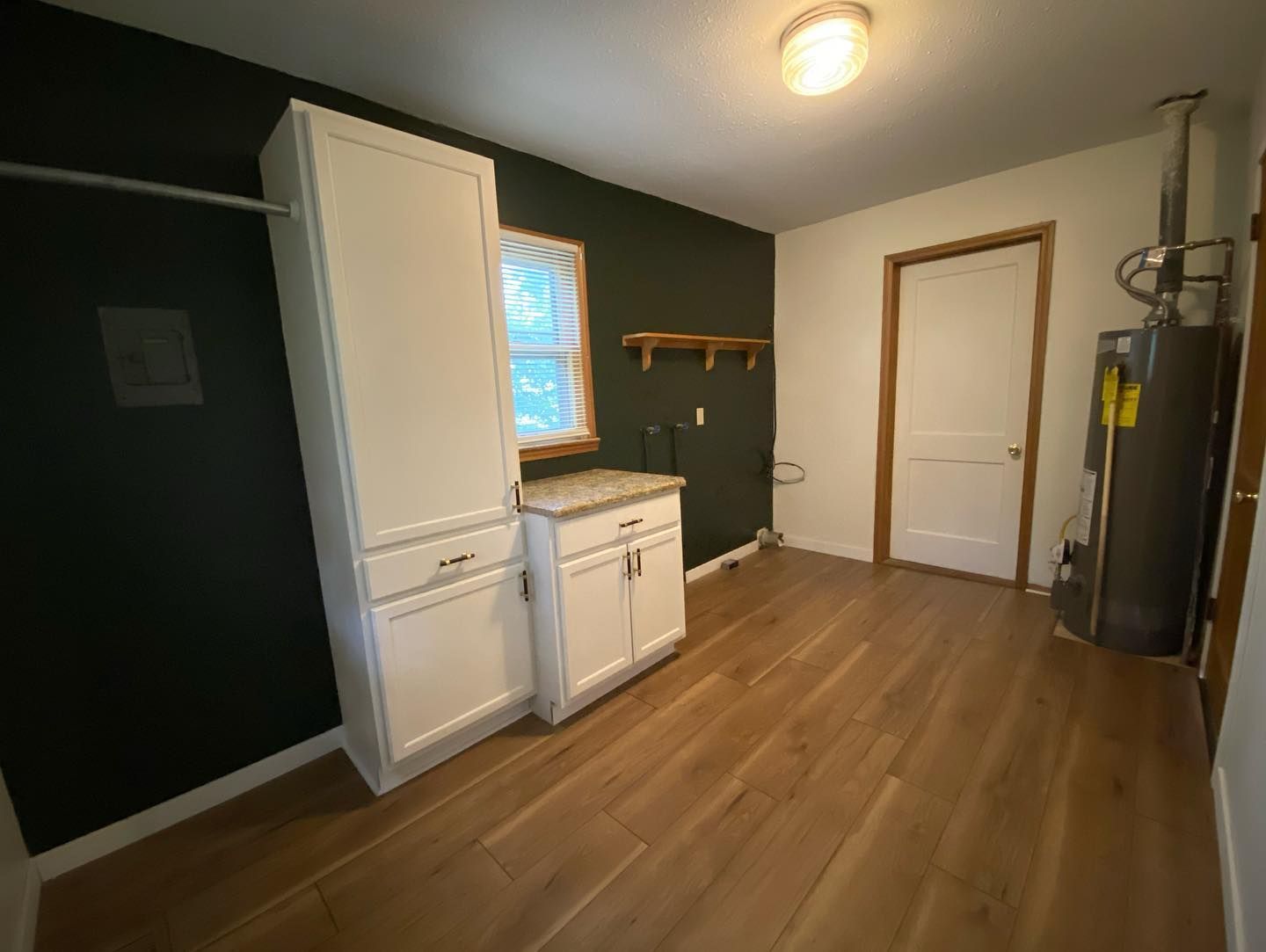
Laundry rooms are another place that usually doesn’t have bright natural lighting. You have to rely on artificial light for most of the illumination. But this next picture combines natural and artificial light to make Ripe Olive work.
Sherwin Williams Ripe Olive in a Personal Library
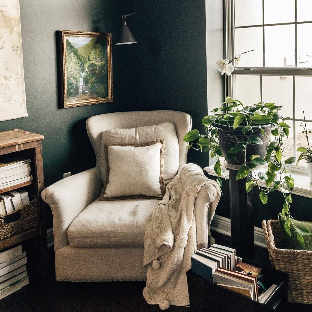
If you have a personal library, Ripe Olive can be your paint color of choice if paired with light colors. Check out the next picture to see what I mean.
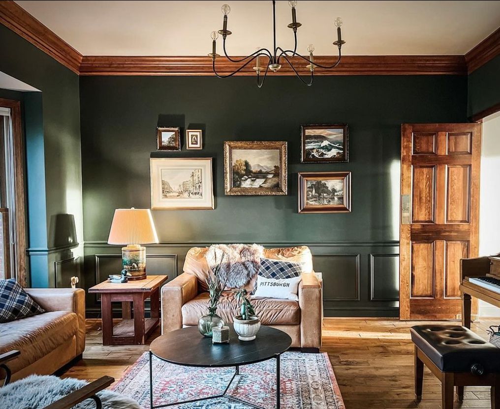
Sherwin Williams Ripe Olive in a Living Room
If Ripe Olive doesn’t work in a living room, where else can it work? The living is where we want to try the best paint colors, so consider this beautiful green for yours.
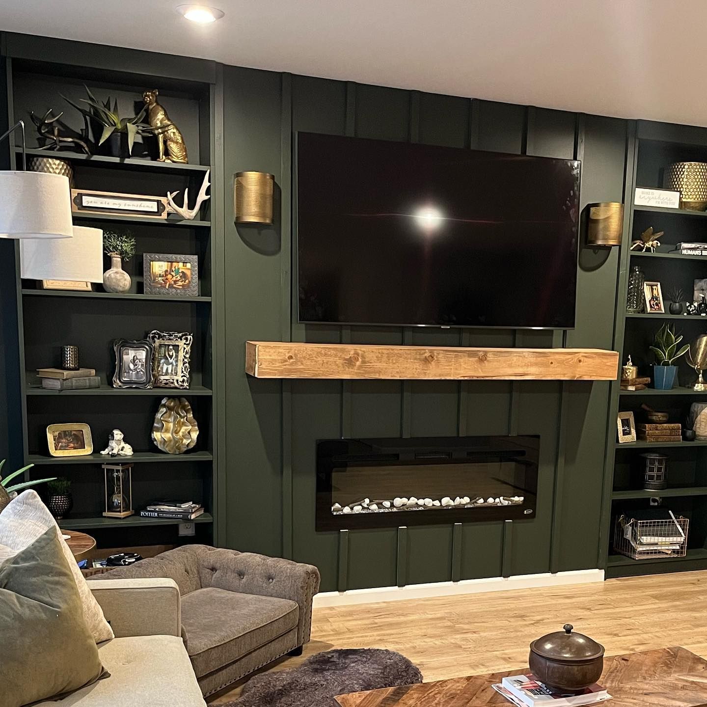
Best Ceiling Color for SW Ripe Olive Walls
I would say white. Ceiling Bright White from Sherwin Williams works, but you can also try SW Spare White or SW Oyster White. Just keep the color scheme the same.
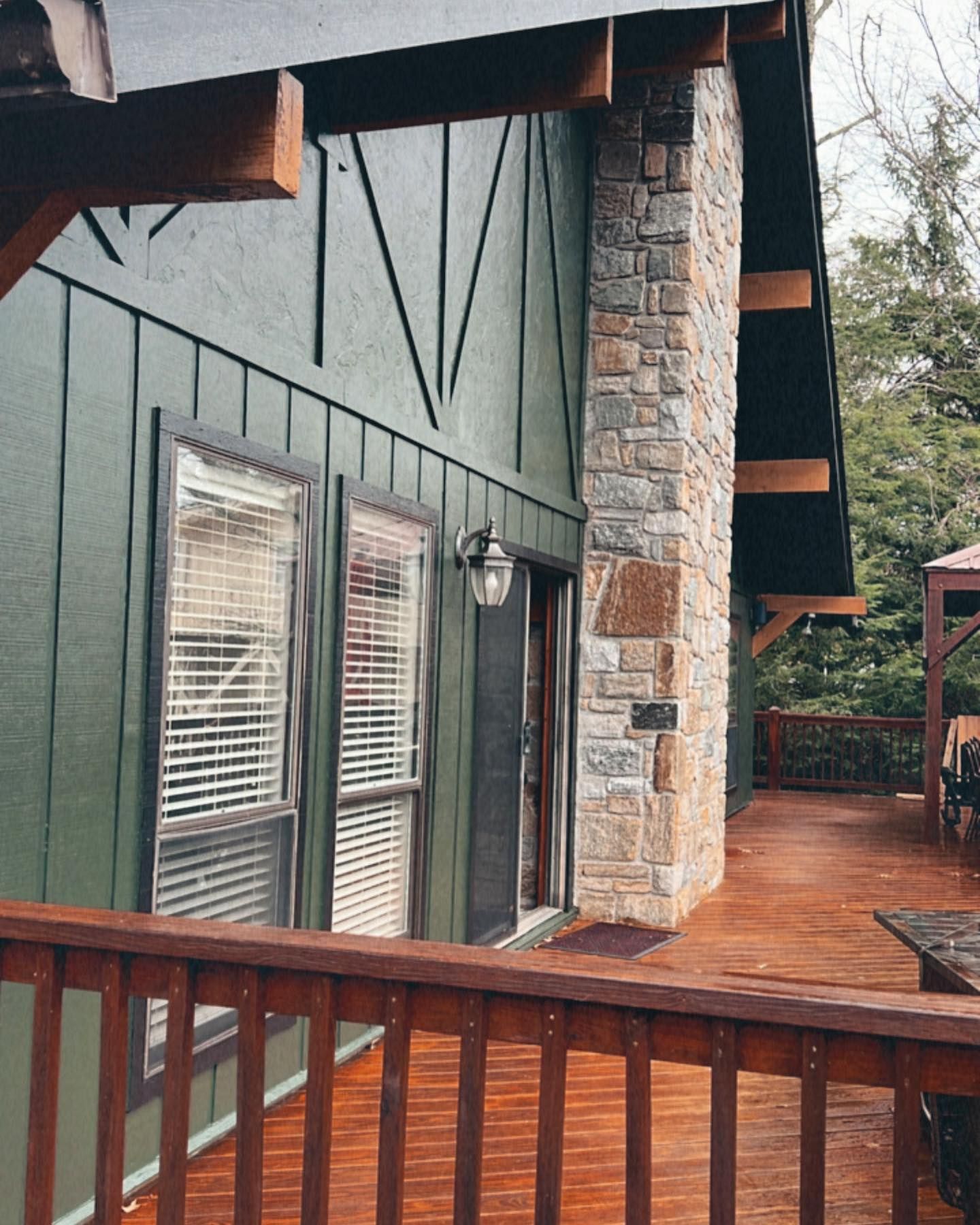
Best Trim Color for SW Ripe Olive Exterior Walls
Wood tones work well with the exterior of a house painted in Ripe Olive. It’s already a dark color, so you need a color that will stand out without clashing. Gray may also work if you are inclined to try something different.
Conclusion
There you have it: all there is to know about Sherwin Williams Ripe Olive. It is a deep green paint color with blue-gray undertones and an LRV of 6. Although it is dark, Ripe Olive never loses all its color, even in a room with low light.
This guide explains complementary and coordinating colors for Ripe Olive with examples. You will also find color palettes ready to use or to guide you in creating yours. Don’t hold back from your creativity or shy away from this color. It looks better in real life than you can imagine.
Get rolling and pick the best colors for your decor, but don’t forget to use samples before making a final choice. Let me know your thoughts and questions in the comments section.

