
Picking a gray paint color is not always as easy as it looks. This is because there are many options. So, you’re not alone if you are torn between Benjamin Moore Pale Oak vs Classic Gray.
Both paint colors are neutral and look very much alike. But is there a difference? The main differences lie in their brightness and undertones. While Pale Oak OC-20 has warm gray undertones that can show other colors, Classic Gray OC-23 has pale pink/purple undertones. Also, Classic Gray is brighter than Pale Oak.
If these differences are enough to help you decide between the two colors, there you go. However, I have more to reveal about these colors, especially how lighting conditions affect the undertones. Stick around on this ride, and you’ll be glad you did.
Table of Contents
When to Use Pale Oak vs Classic Gray
Because of their similarity in color, you may get confused as to when to use Pale Oak instead of Classic Gray and vice versa. Well, I can help you narrow your choices to decide when and where to use either paint color.
Use Pale Oak if:
- You want a warm gray in your decor
- A neutral paint color that blends well with everything
- You don’t mind that the gray is slightly muted
Use Classic Gray if:
- A bright gray is your ideal choice
- You want a balance between light gray and off-white
- The room does not have enough lights
Classic Gray is the brighter of the two paint colors. And because of this, and its shade, it is ideal for a room without enough lighting. Its warmth also comes in handy for a room with slightly cold lighting. It can bring a bit of warmth without looking washed out.
Pale Oak is slightly warmer than Classic Gray, so it may hold up better in a room with cold light. It is relatively bright but not as bright as Classic Gray. Keep this in mind when picking either color. You can also place them side by side in the room to see which performs better for the decor and lighting.
The Visual Distinctions: Benjamin Moore Pale Oak vs Classic Gray
Before we go any further, I would like to show you how similar, or dissimilar if you want, Pale Oak and Classic Gray can be using pictures. Images go a long way in revealing key differences and similarities between colors, so let’s use them now, shall we?
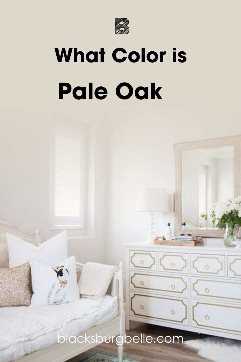
First, this is Pale Oak, looking bright and soft on these walls:
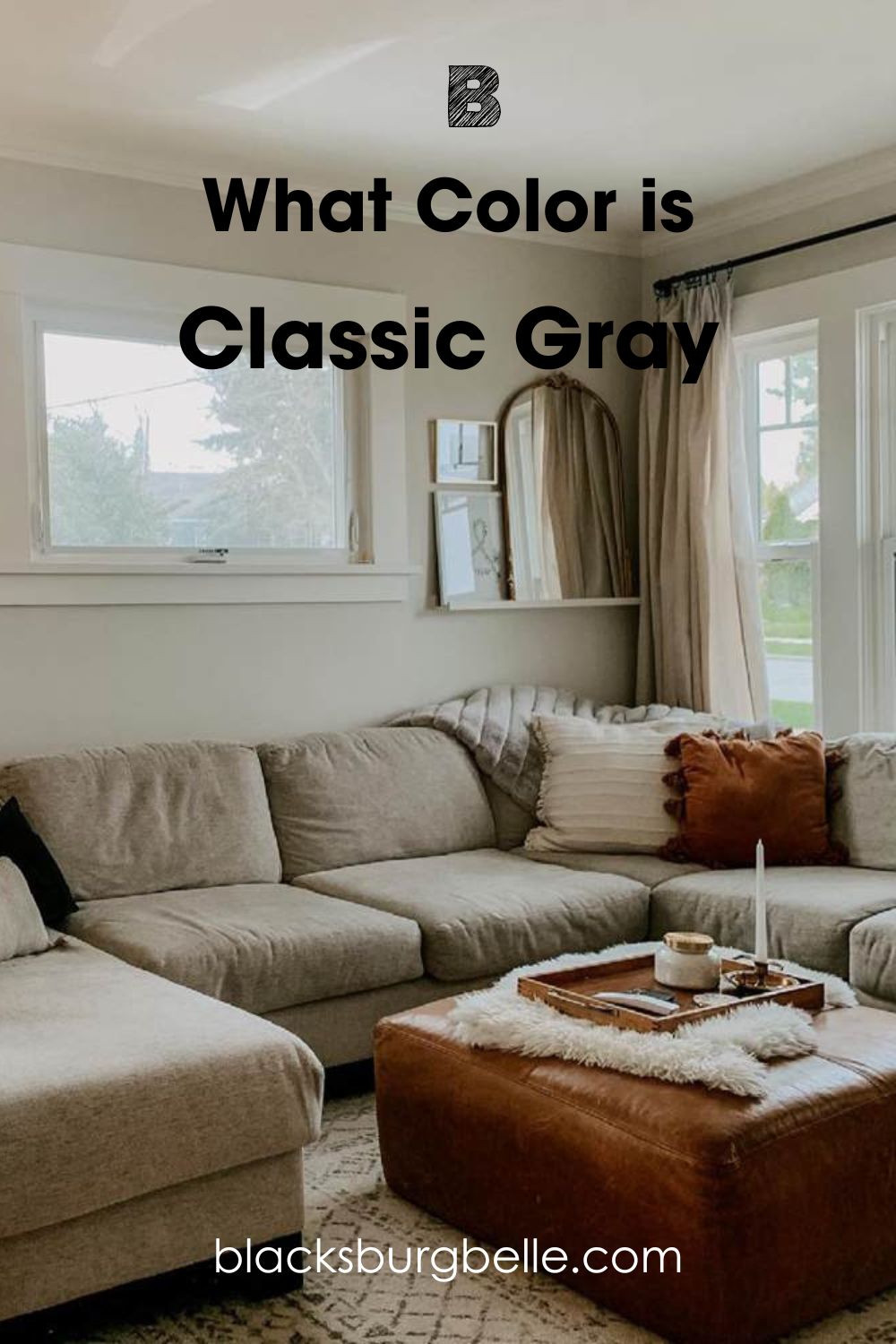
This next picture is Classic Gray, and it looks warm and darker than usual:
The shades of the two paint colors in the pictures above are a result of the lighting. The Pale Oak picture has a lot of natural lighting, making the paint color appear brother and lighter than usual. Although it is typically a light greige or gray, it looks more like an off-white than gray in the picture.
Classic Gray looks like a darker and more muted paint color because of the low natural light. However, you can still see some warmth exuding from it, especially with such neutral elements around it. Therefore, it is important to remember how these colors can change in different settings.
Moving on, let’s briefly outline the basic differences between Pale Oak and Classic Gray.
Benjamin Moore Pale Oak vs Classic Gray: A Quick Comparison
I’ll use a table to outline the basics of these two paint colors. That way, you can easily see the attributes that make them different.
| Pale Oak | Classic Gray | |
| RGB | 222, 216, 205 | 227, 224, 215 |
| LRV | 68.64 | 73.67 |
| Undertones | Warm gray | Pink/purple |
| HEX Value | #DED8CD | #E3E0D7 |
Emotional Effects: Benjamin Moore Pale Oak vs Classic Gray
Warm colors tend to make a room more welcoming and cozy. Pale Oak and Classic Gray can read war, but Pale Oak is the warmer color. So, the feeling you get with each color may differ.
Pale Oak gives a warm feeling of home and safety, especially when the lighting is warm. It is not a dull color, so you don’t have to worry whether or not the space will be bright. In other words, it combines warmth and relative brightness to create a welcoming feeling.
Classic Gray is lighter and slightly cooler. Therefore, it can read a little neutral instead of warm or cool, although this depends on your perspective. For the most part, it may give you the same feeling as a warm off-white instead of a cool gray, bringing a quiet and relaxed mood with it.
LRV of Pale Oak vs Classic Gray: Which Reflects More Light?
By now, you already know the importance of lighting to paint colors and how you see them. LRV is the light reflectance value and refers to how much light any color can reflect or absorb. The darker a color is, the lower its LRV, and the lighter it is, the higher its LRV.
While colors typically use an LRV scale of 0 to 100, pure blacks being 0 and pure whites being 100, paint colors remain between 2.5 and 94. This is because there are no true black or pure white paint colors.
Pale Oak has an LRV of 68.64. This value is above the middle point of 50 but not high enough to count as very bright. But it is a good value for a gray or greige paint color.
Classic Gray has an LRV of 73.67. While it is not as high as 80, it still has enough to reflect a good amount of light. In simple terms, Classic Gray reflects more light than Pale Oak.
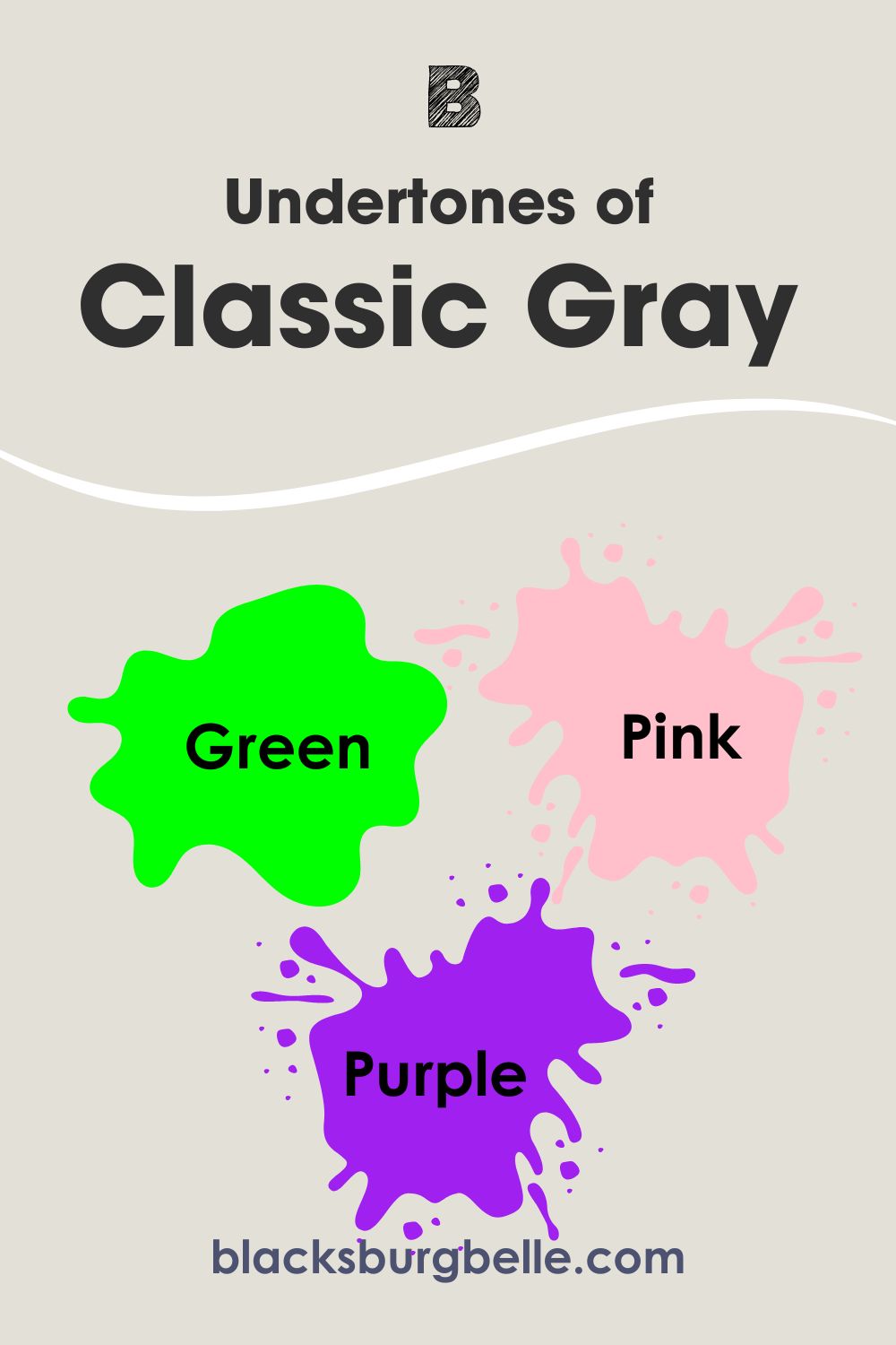
Undertones of Pale Oak vs Classic Gray: Are They Similar?
This is where the Pale Oak and Classic Gray part ways a little. Their undertones are not very similar, although the colors can look the same at face value to the untrained eye. But there is a difference when you see them in certain lighting.
Pale Oak has warm gray undertones that can read a little yellow or green in certain lighting. At other times, it can show a hint of pink or purple. This color may appear like a simple neutral, but it is complex with a promise of more.
Classic Gray can also show a hint of green or pink and purple. But its undertones are not as warm as those of Pale Oak. Classic Gray is also as mercurial as Pale Oak when it comes to its undertones, but it all depends on who is looking at it, the lighting, and other elements.
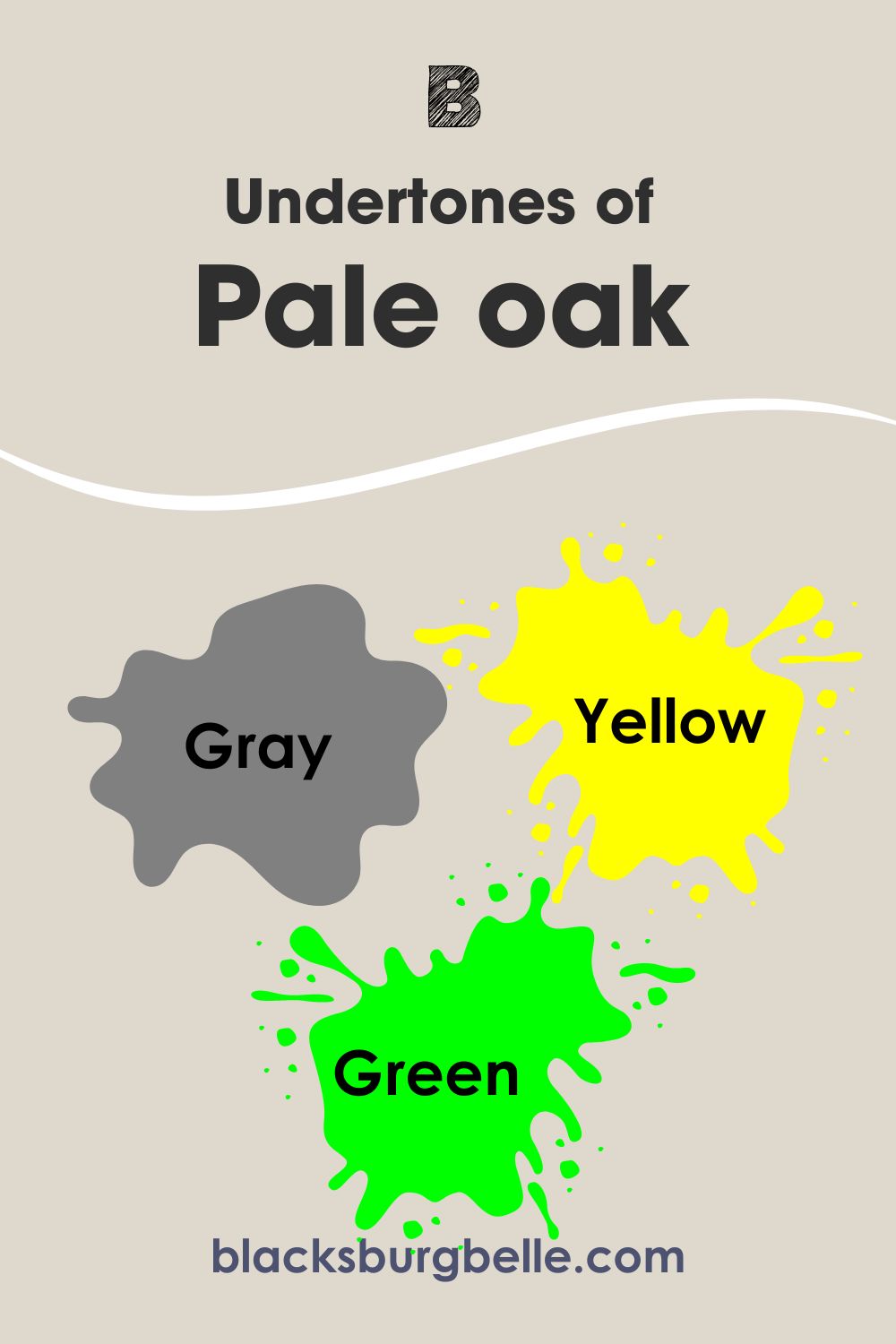
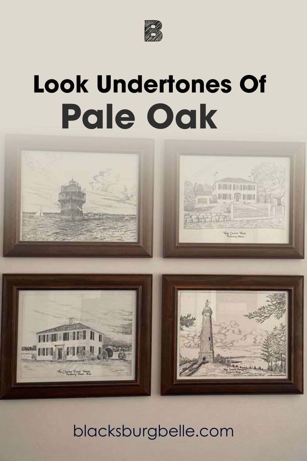
Picking Up on the Undertones of Pale Oak
Now, I want to give you a closer look at the undertones of Pale Oak that you are likely to see most of the time. It looks like warm gray with just a touch of creamy yellow.
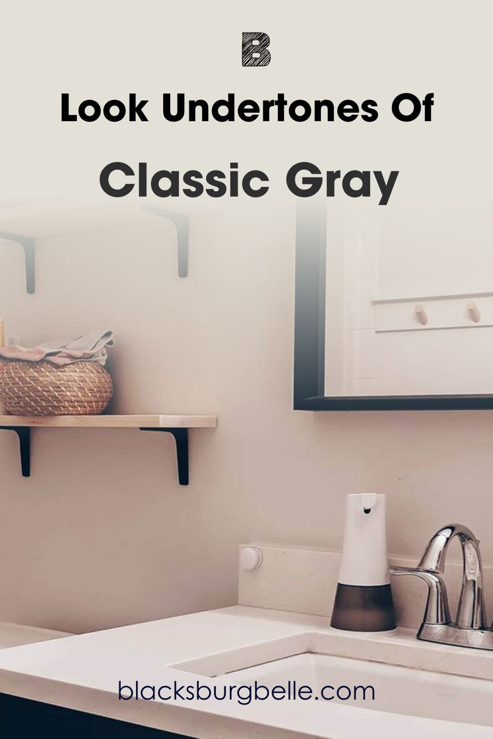
Picking Up on the Undertones of Classic Gray
This next picture is the perfect representation of the undertones of Classic Gray. It shows a hint of pink/purple, and while it looks cool, it is not crispy or icy.
How much these colors change will surprise you. The pictures above show their true undertones, but as we go on, you may see other pictures where they look entirely different. Don’t be alarmed; all you need to do is use samples of these paint colors.
Put them in the room where you plan to paint and see how they perform with natural and artificial lighting, and around other colors. Then, you can decide which works better.
Benjamin Moore Pale Oak vs Classic Gray: Are They Warm or Cool?
Pale Oak is a warm neutral paint color. You can attribute this to the warm gray undertones that can show a bit of yellow.
Classic Gray is not as warm as Pale Oak. And while it can read warm sometimes, it can also show some cool tones. You can call it a bridge between warm and cool, although Pale Oak exhibits more neutrality in most cases.
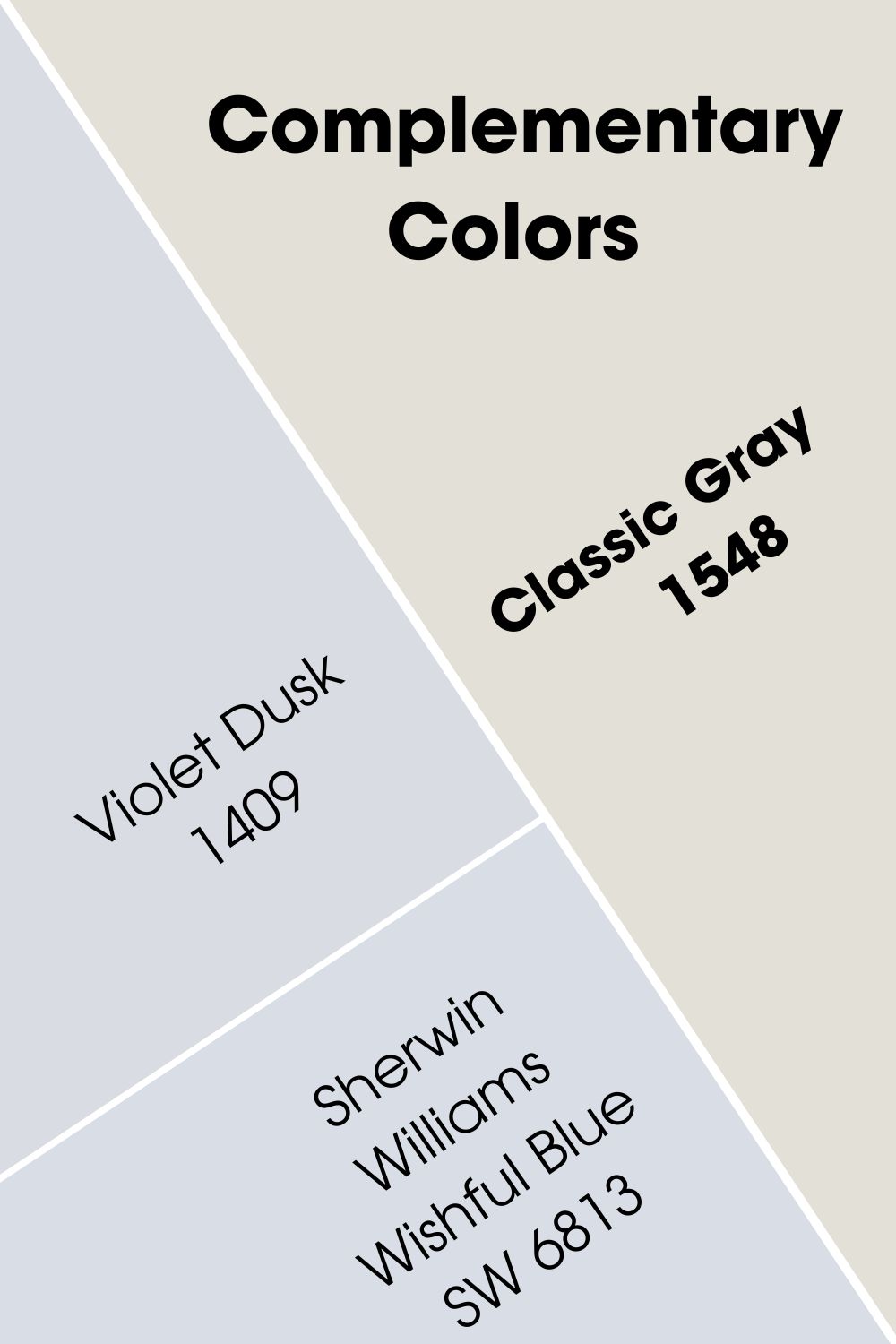
Benjamin Moore Pale Oak vs Classic Gray Complementary Colors
Every color has a complementary color. They sit opposite each other on the color wheel and can cancel each other out. Sometimes, they don’t match and usually appear like vibrant opposites. Perfect examples are blue and orange, green and red, and purple and yellow.
The best color that complements Pale Oak is a light blue that borders on purple. Benjamin Moore’s Lake Placid 827 best fits this color. You can also try Sherwin Williams Icelandic SW 6526.
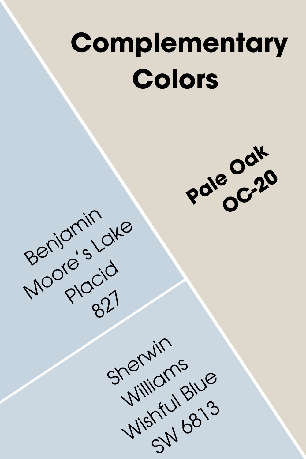
For Classic Gray, the best color that complements it is similar to that of Pale Oak, only slightly lighter. And the best Benjamin Moore color to fit it is Violet Dusk 1409. Sherwin Williams Wishful Blue SW 6813 also fits the bill.
Benjamin Moore Pale Oak vs Classic Gray Color Palettes
Color palettes are necessary to create if you want to get the best out of any color. They may look like a challenge, but that is only because you haven’t tried them with other colors that may not be in the same class.
Instead of keeping it monochromatic, try incorporating different colors with the same tone. Let me help you with some colors for these palettes.
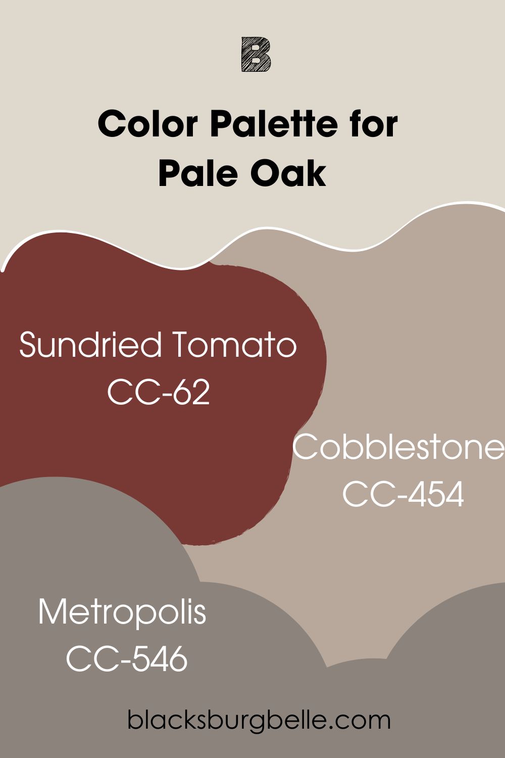
Color Palette for Pale Oak
Sundried Tomato, Cobblestone, and Metropolis are the colors I’ve picked for this palette. Now, this is to guide you in the right direction, so you don’t have to stick to this palette.
- Sundried Tomato CC-62: It is an earthy red with such a rich depth that makes Pale Oak pop
- Cobblestone CC-454: This is a warm gray with a hint of violet that brings out the undertones of Pale Oak and matches them well
- Metropolis CC-546: A warm taupe paint color with plum undertones and a hint of gray to suit the lightness of Pale Oak
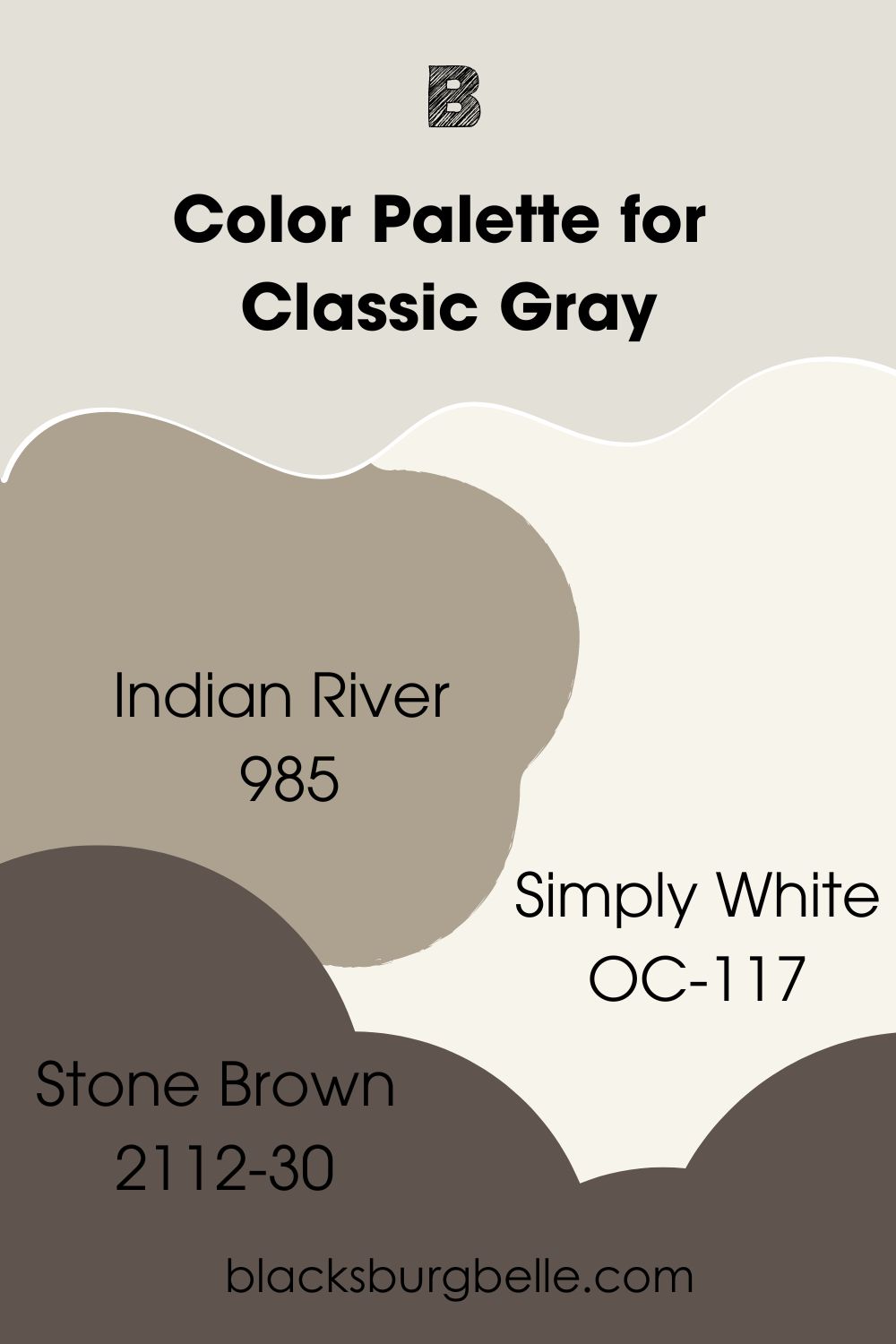
Color Palette for Classic Gray
Indian River, Simply White, and Stone Brown are some colors I recommend for this color palette. Although Classic Gray is similar to Pale Oak, you want some versatility in your color choices. Remember that this is only a guide.
- Indian River 985: A taupe paint color with neutral tones that fits well in any decor, making it pair well with the light Classic Gray
- Simply White OC-117: A warm white with slightly yellow undertones that work well as a trim color for Classic Gray
- Stone Brown 2112-30: A deep warm brown for some versatility in your space when paired with Classic Gray
Benjamin Moore Pale Oak vs Classic Gray on Cabinets
Because of how light they are, Pale Oak and Classic Gray are excellent alternatives for white paint colors on cabinets. If you don’t want that classic white look but can’t sacrifice brightness, try either of these colors.
Pale Oak on Cabinets
Here, Pale Oak looks like a warm off-white instead of a light gray paint color. You can see how it appears next to the white kitchen wall.
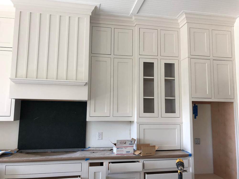
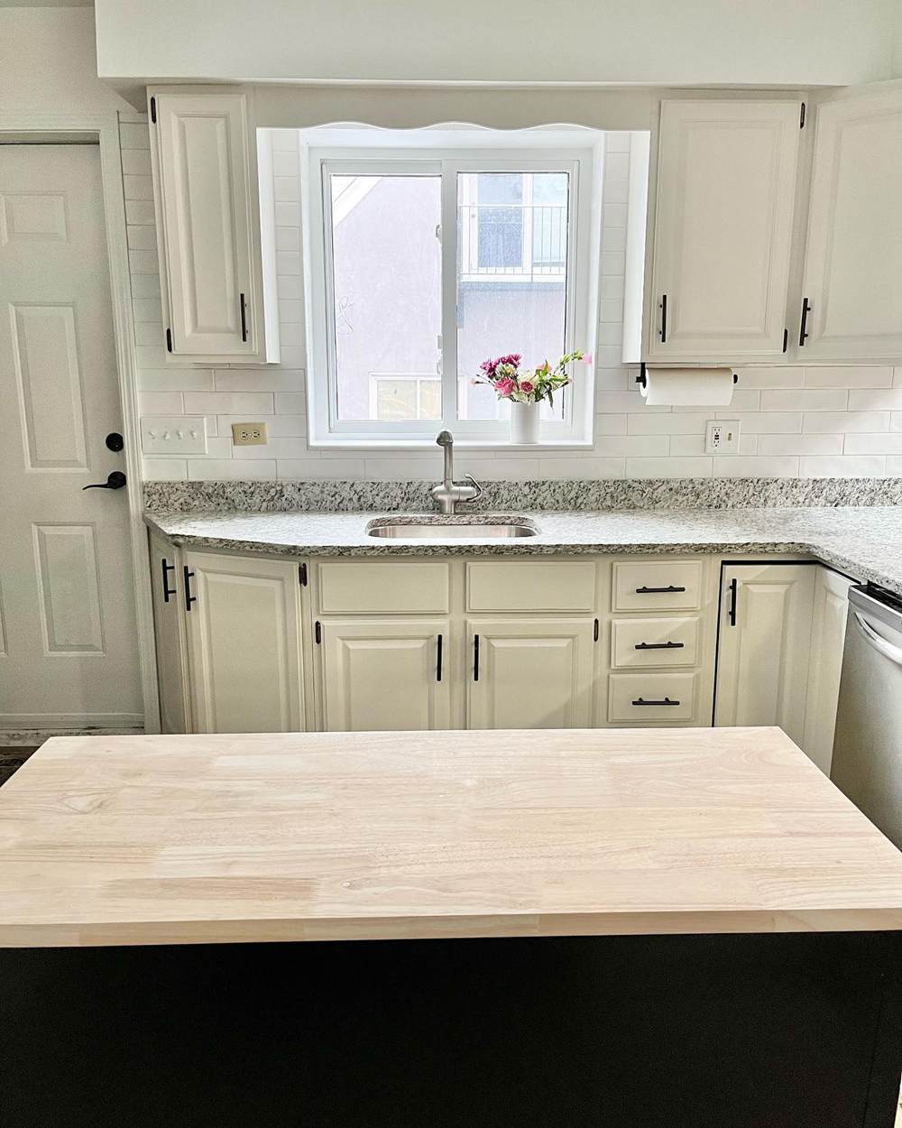
Classic Gray on Cabinets
Although it should be the lighter-looking paint color of the two, Classic Gray looks warmer and creamier than Pale Oak. This may have something to do with the picture angle and lighting.
Benjamin Moore Pale Oak vs Classic Gray on Bedroom Walls
You may be on the hunt for the best light gray paint color for your bedroom walls. If you have settled on Pale Oak and Classic Gray but can’t seem to decide on one, check out real pictures of how they look in bedrooms.
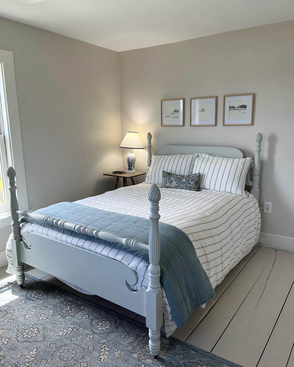
Pale Oak on Bedroom Walls
This simple but beautiful bedroom uses Pale Oak on the walls and Benjamin Moore’s Revere Pewter on the floor. With the blue bed, the result is striking.
Classic Gray on Bedroom Walls
In contrast, Classic Gray looks like a warm off-white on these bedroom walls. This is where it shows its true form and shade. Do you see why it is an excellent alternative for white?
Benjamin Moore Pale Oak vs Classic Gray in Living Rooms
Like white paint colors, Pale Oak and Classic Gray paint colors are classics in living rooms. You can use them as a backdrop for accessories and other colors, whether neutral or vibrant.
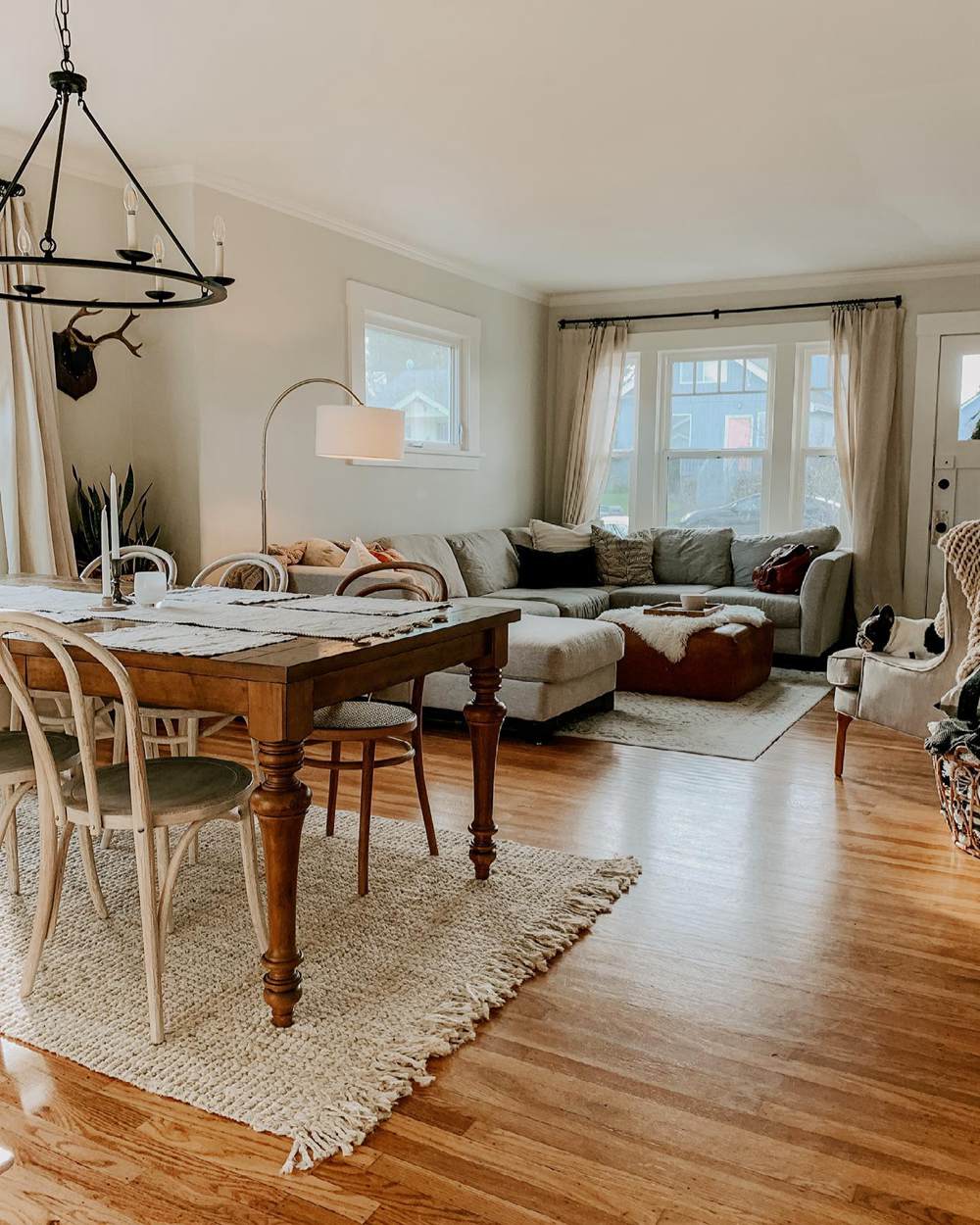
Pale Oak in Living Rooms
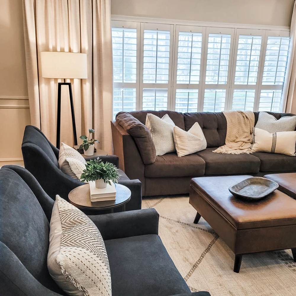
There are a few neutral colors in this living room, but Pale Oak on the walls still blends well. And the warm artificial lighting does not remove from it.
Classic Gray in Living Rooms
This paint color shows a hint of green in the muted lighting. Again, there are neutral colors in this living room, but Classic Gray holds up well.
Benjamin Moore Pale Oak vs Classic Gray on Kitchen Walls
Your cabinets are not the only part of your kitchen that needs love. Have you considered using Pale Oak or Classic Gray on the walls with dark-colored cabinets or something light and neutral? Let’s take a look.
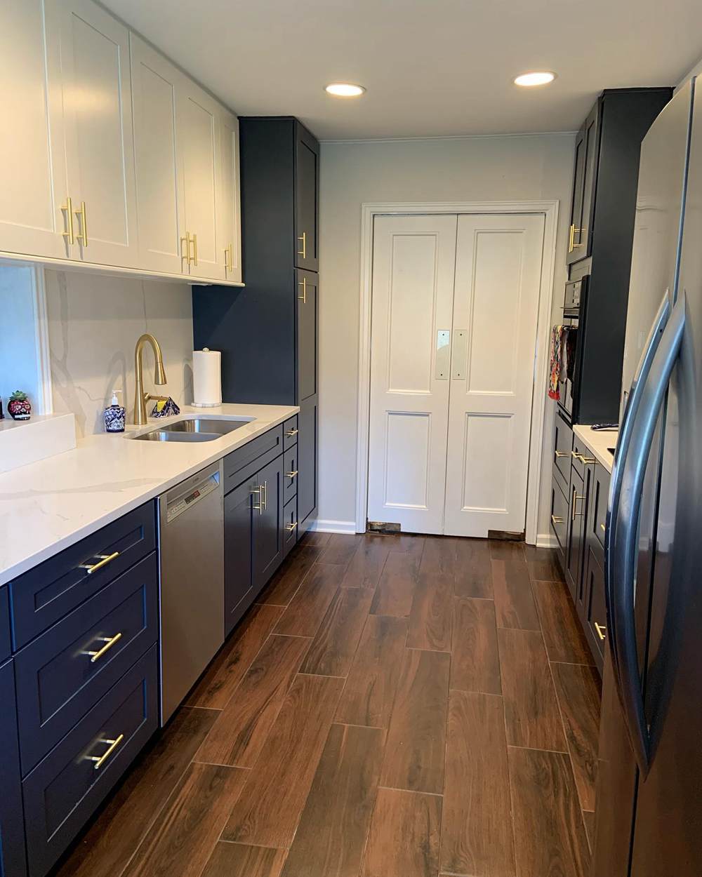
Pale Oak on Kitchen Walls
This kitchen uses navy cabinets and Pale Oak on the walls. You already know the result will be spectacular, right?
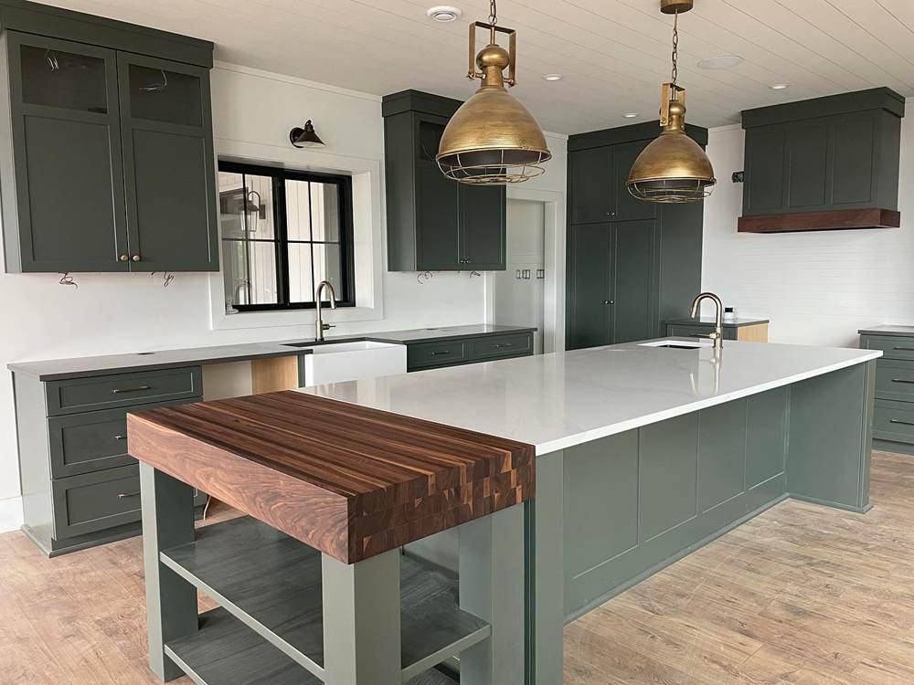
Classic Gray on Kitchen Walls
As with Pale Oak, this kitchen uses dark-colored cabinets, green this time, and Classic Gray on the walls. You will want to spend time making great meals in this kitchen.
Benjamin Moore Pale Oak vs Classic Gray in Bathrooms
Many of us unwind and release the stress of the day in our bathrooms. That is why I always recommend paying attention to the ambiance of the room as it is vital to how much time we spend there. And one of the contributing factors is the paint color.
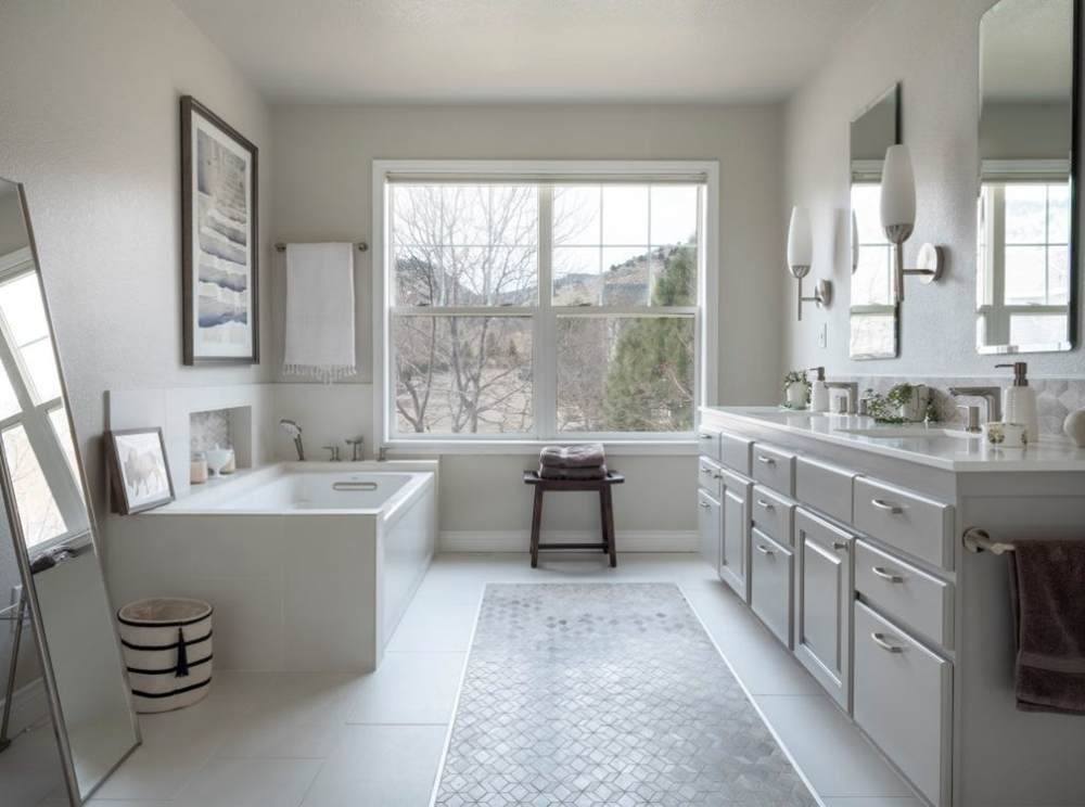
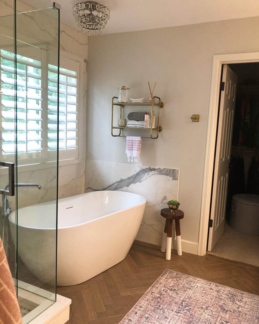
Pale Oak in Bathrooms
The cold light streaming into this bathroom gives Pale Oak a solid stone-like appearance. It is a beautiful room, but it could use some warm light.
Classic Gray in Bathrooms
In contrast, Classic Gray looks inviting and cozy because of the warm glow on it. It can also use a bit of color, but the light reduces its coolness a bit.
Benjamin Moore Pale Oak vs Classic Gray on Exterior Walls
Not all light colors perform well on the exterior walls, especially when you use them as whole-house exterior paint color. But you don’t have to worry about Pale Oak or Classic Gray because they are ideal for exteriors.
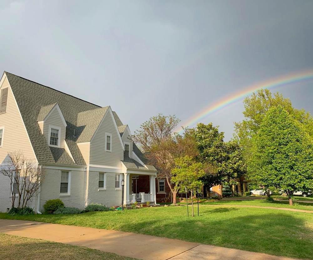
Pale Oak on Exterior Walls
Have you seen a rainbow lately? This next picture features a beautiful rainbow in the sky and Pale Oak on the exterior of the house.
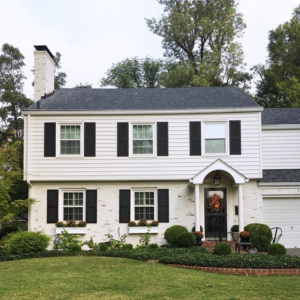
Classic Gray on Exterior Walls
This house is the classic white and black that never gets old. But instead of a typical white, it is Classic Gray that perfectly mimics warm white.
Benjamin Moore Pale Oak vs Classic Gray with Various Colors
Do Pale Oak and Classic Gray pick up hues from vibrant colors around them? You can decide for yourself with the next couple of pictures.
Pale Oak Paired with Various Colors
The picture is a beautiful flower arrangement next to a wall painted with Pale Oak. Do the bright colors reflect on the wall? They don’t, but this is a subjective matter.
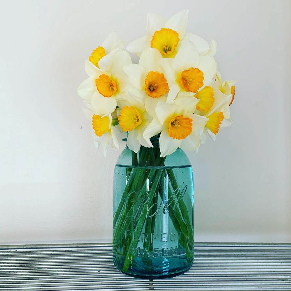
Classic Gray Paired with Various Colors
There are more colors in the next picture than in the previous one, and they seem to reflect slightly on the Classic Gray wall. But as I said before, it is a matter of perception.

Lighting Conditions
Pale Oak and Classic Gray change color or hue in different lighting conditions. You can see the pink undertones of Classic Gray because of the type of lighting in the room. And Pale Oak can appear paler than usual because of cold light.
Rooms with cold light have no direct sunlight. That means they need warm color schemes. And rooms with excessively warm light need some cool colors to tone down the warmth. Light can also play on other colors in a room, especially the vibrant ones, causing them to reflect their hue on lighter colors like Pale Oak and Classic Gray.
I always recommend testing paint colors by applying large swatches on clean walls. The walls must have no other paint if you must see the colors well. Then, you can see how they perform with elements around them and different lighting conditions.
Conclusion
Benjamin Moore’s Pale Oak vs Classic Gray is not a new battle. But I understand how daunting it can get trying to find the better one for your specific needs. And that is why I have unpacked various aspects of the colors and reviewed each for a more informed decision.
When in doubt, ask questions, and my comments section is open to you. I would like to share your experience and hear your thoughts about these paint colors, especially if you have used them. Have fun painting and decorating, and share your pictures with me!
 Sherwin Williams Worldly Gray Vs Agreeable Gray
 Sherwin Williams Alabaster Vs Pure White: How to Choose!
 Benjamin Moore Alabaster vs Sherwin Williams Alabaster: What’s the Difference?
 Revere Pewter vs Agreeable Gray: What’s The Difference?
 Light French Gray vs Repose Gray: How to Choose?
 Benjamin Moore Edgecomb Gray vs Revere Pewter: How to Choose?
