
The fact that gray is one of the most preferred hues by homeowners around the world cannot be overstated. This paint shade accrues a plethora of interesting properties and qualities, one of which is its versatility. There are varieties of grays, from light gray to dark grays, to warm grays and cool gray; no wonder they’re incredibly popular too.
Today, I’ll be reviewing Benjamin Moore Revere Pewter, a widely accepted and timeless mid toned gray color that leaves your space ravishing and sensational.
At the end of this piece you’ll understand how to pair this color to attain your desired results.
Table of Contents
When to Choose Benjamin Moore Revere Pewter HC-172
Picking a cute paint color isn’t enough; you must also be intentional about the outcome, pairing, and the color’s overall interpretation in your home. All these culminate into an aesthetically appealing space.
This section helps you make sense of your constant yearning for Revere Pewter in your space.
You Love Warm Grays
Benjamin Moore Revere Pewter is a beautiful gray encompassing your home in a rich embrace of warmth and tranquility. If you like this, then Revere Pewter is your best pick.
Greige Colors are Your Favorite
Greige colors combine gray and beige, so if you like this package deal, Revere Pewter is right up your alley.
Neutral Tones Do It For You
Due to the presence of more than one color in Revere Pewter, it can also come off as neutral under some lighting conditions. This feature also lets you layer more colors on it and still get beautiful results.
You Love Relaxing Colors
Revere Pewter has a medium to light LRV, which means it’s not too bright or dark if you use it in a space. The implication is that you get the most relaxing space all day long, regardless of whichever side it decides to show off.
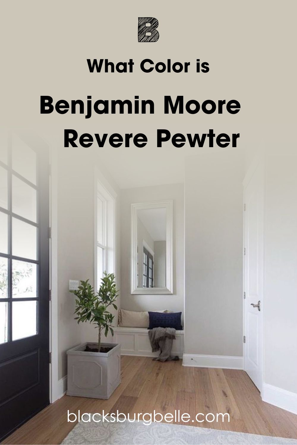
What Color is Benjamin Moore Revere Pewter HC-172
Benjamin Moore’s Official Website states, “Revere Pewter is an iconic neutral that acts as a versatile bridge between warm and cool tones”. This statement is true, and how this color adapts to its immediate environment is noteworthy.
Benjamin Moore Revere Pewter is a classic warm greige that leaves an earthy, rustic trail in your home.
With this in mind, you should however realize that Revere Pewter won’t give you that crispy or spa-like feedback most grays give thanks to its warm undertones; this doesn’t alter the experience in any way, though.
Instead, RP creates an organic, calming, accommodating, and flexible home ambiance, allowing you to build an interesting palette.
Snapshot of Benjamin Moore Revere Pewter Specifications
Need info on the numerical statistics and makeup of Revere Pewter? This table covers all of that, including a sneak peek into its undertones and, most importantly, the Light Reflective Value.
Quick facts like these can even help you make an early decision on whether to proceed with this color or opt for something different.
| Color Name | Benjamin Moore Revere Pewter HC-172 |
| LRV | 55.05 |
| RGB | 204,196,184 |
| Hex Code | #CCC4B8 |
| Undertones | Green, Beige, Gray |
The LRV of Benjamin Moore Revere Pewter
LRV, also known as Light Reflective Value, is the universally acceptable mode of measurement adopted by design professionals to measure how much light a given color can reflect from a surface.
This unique scale typically runs from 0-100 but has since been adjusted to run from 3-97, with 3 being the lowest light reflectance value and 97 being the highest (this adjustment was necessary as there’s no true black or white).
Benjamin Moore Revere Pewter isn’t left out of this discussion as it has an LRV of 55.05, which leaves it somewhere around the middle of the scale. It reflects a significant amount of light, but when used in a small space, it can also show a bit of depth.
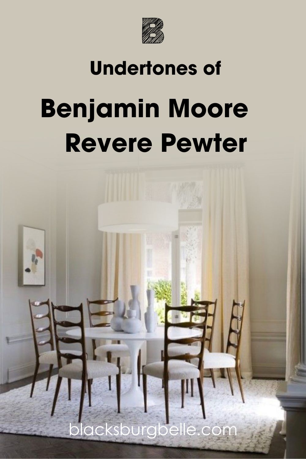
Undertones of Benjamin Moore Revere Pewter OC-117
Undertones add spice and life to your desired color, and Benjamin Moore Revere Pewter is quite the chameleon in this situation. You’d find not one but three alien tones in the gorgeous color.
Applying Revere Pewter on your walls means you’ll find hints of Gray, Green, and Beige (Hello neutral!).
Discovering your color undertones helps you find ways to balance your colors, pair them with the right accessories, and apply them in spaces where they’ll show their best side.
Does Lighting Condition Affect the Appearance of Revere Pewter
The lighting situation in your environment is one factor that determines the outcome of your paint color after application.
I encourage my readers to always sample their preferred paint color before deciding. This move will reveal lots of hidden details about your paint and how it performs at different times of the day.
Now, how does Revere Pewter fare under these conditions? Let me walk you through it,
Revere Pewter will appear very warm in a SOUTHERN FACING room. Thanks to the warm light in the early afternoon, you’ll see more of its BEIGE side.
NORTHERN FACING LIGHT will have Revere Pewter looking all cool, and you can get the GREEN and GRAY in the situation, courtesy of the blue tint this light casts on all tones.
Revere Pewter will appear warmer in the mornings for EASTERN FACING rooms, showing off a strong beige influenced by the yellow light and slowly shifting towards gray as the day passes.
Finally, WESTERN FACING light will cast a cool light on Revere Pewter in the morning, and as the sun sets in the evenings (from 5 pm), you’ll see the most beautiful golden glow on your wall (it can lean greige, beige or even taupe as the day closes).
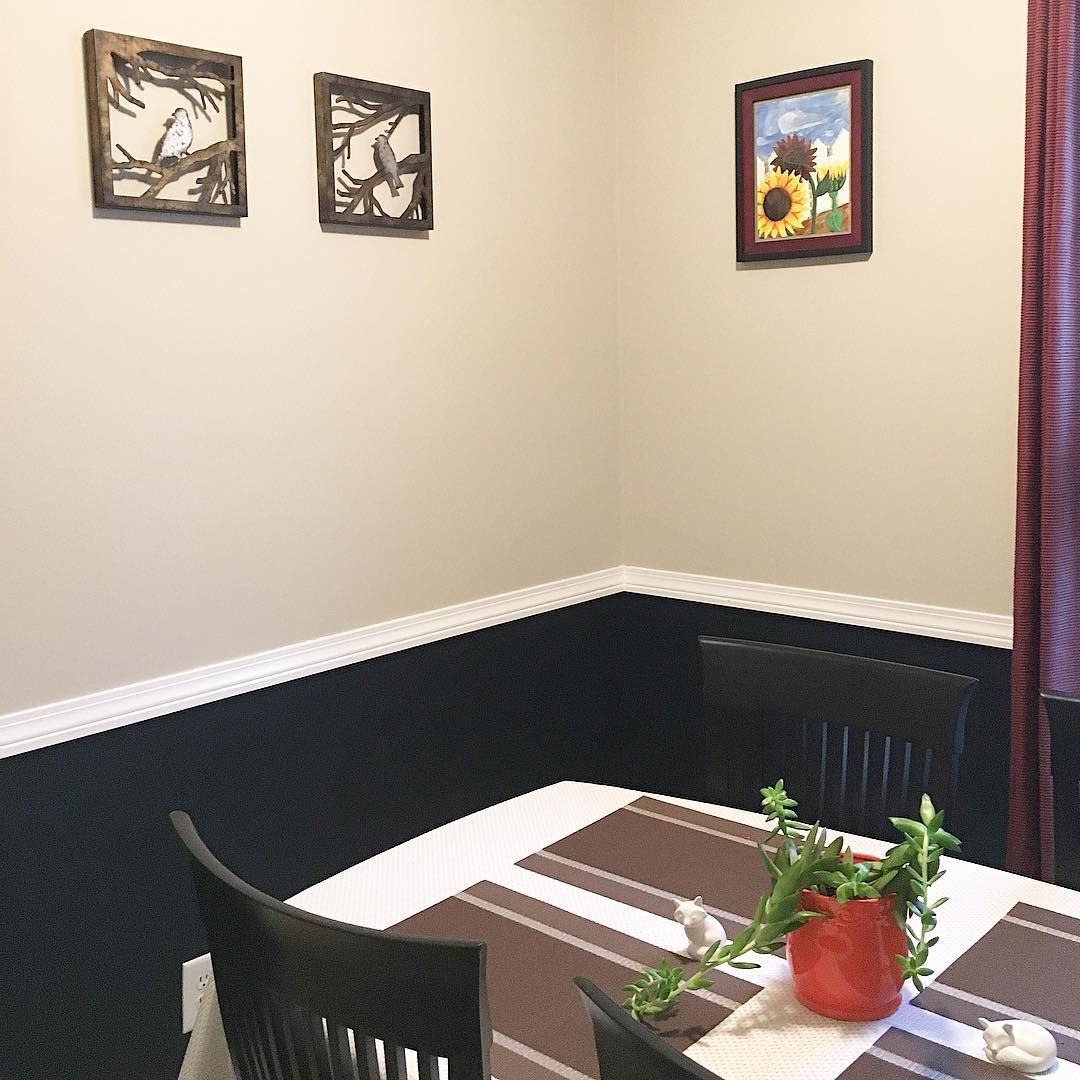
Does Benjamin Moore Revere Pewter Read Beige?
You can see that Revere Pewter looks very warm in the image below and connects to its dark side, thanks to the small space and low light condition in this dining space. The dark accent wall also adds to the dark situation.
This shows that accessories can help improve the appearance of your preferred shade.
Does Benjamin Moore Revere Pewter Read Green?
Absolutely. There are hints of green in this greige paint. While it’s not all in your face, you’ll discover this mind blowing hue when you apply it outdoors or pair it with solid whites and blacks as they draw it out.
Does Benjamin Moore Revere Pewter Read Gray?
Under cool and low lighting, Benjamin Moore Revere Pewter reads gray. The image below perfectly represents my claim, and you can tell that this space is somewhat facing the north.
Benjamin Moore Revere Pewter: Is It a Warm or Cool Color
Revere Pewter is definitely a WARM color, but it won’t look too creamy and warm on your walls. I’ve even gotten feedback on how muddy the color can look, especially if you want a clean, fresh palette.
Remember that Revere Pewter also has gray undertones, which means that cool or low lighting can plant doubts in your head regarding its “warm” status.
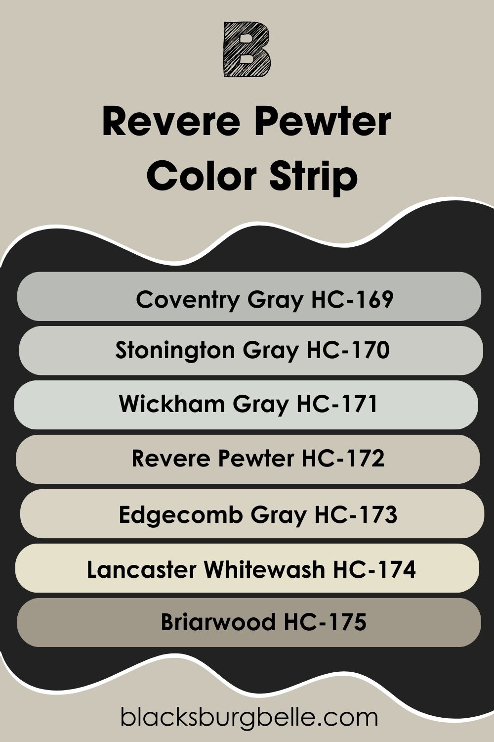
Benjamin Moore Revere Pewter Color Strip: Lighter or Darker Exploration
This has to be my favorite part of curating these reviews. Color strips are a fascinating arrangement that brings you closer to the world of these shades and the thought process of their formulators.
If anything, you’d also discover color strips don’t happen by accident or chance. Every shade you find below can stand alone and work seamlessly with Revere Pewter in ANY capacity.
They range from darkest to lightest, or vice versa, and each carries unique undertones that are identical, similar, or complementary to Benjamin Moore Revere Pewter.
- Benjamin Moore Coventry Gray HC-169
- Benjamin Moore Stonington Gray HC-170
- Benjamin Moore Wickham Gray HC-171
- Benjamin Moore Revere Pewter HC-172
- Benjamin Moore Edgecomb Gray HC-173
- Benjamin Moore Lancaster Whitewash HC-174
- Benjamin Moore Briarwood HC-175
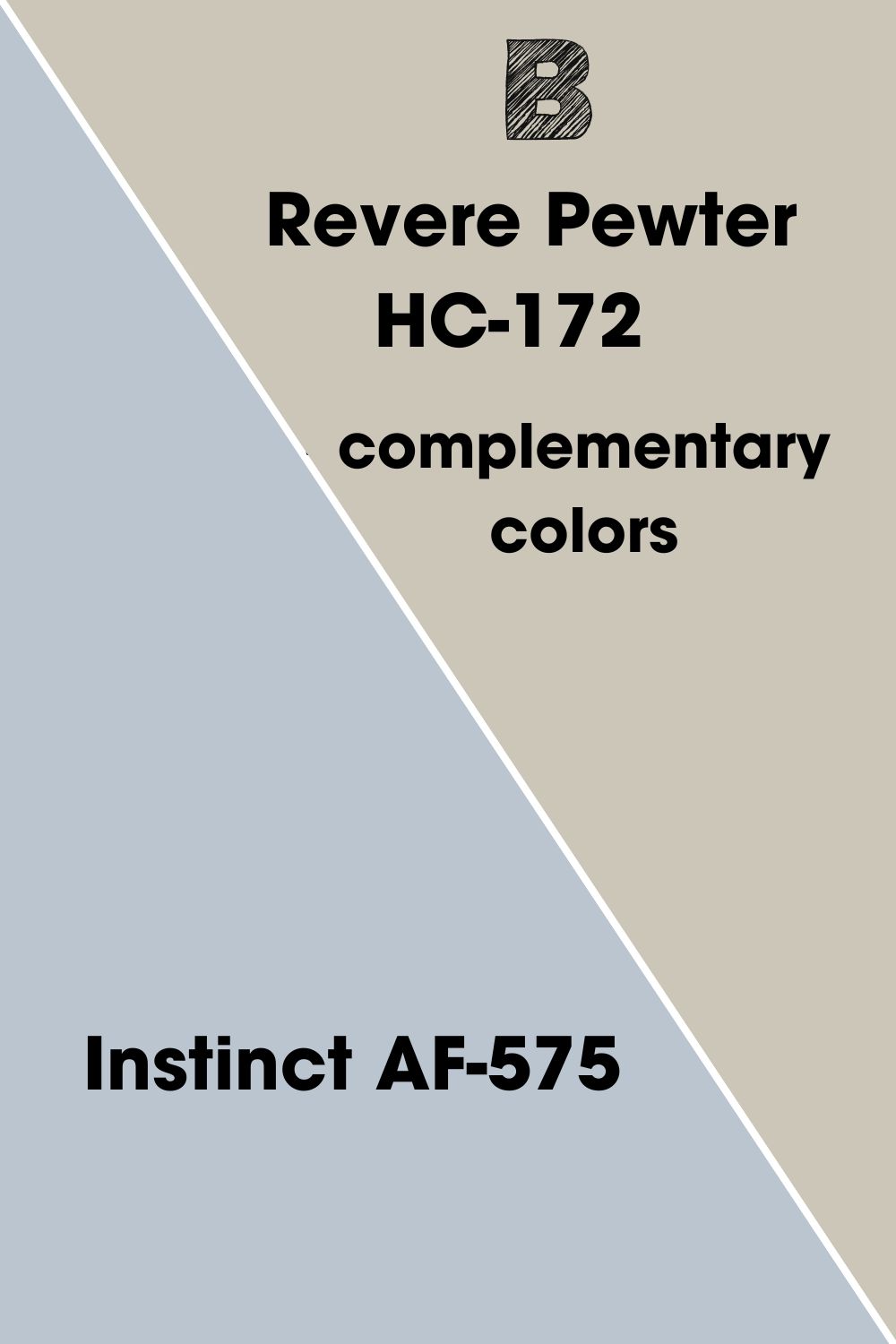
Benjamin Moore Revere Pewter Complementary Colors
Complementary colors stay directly opposite your anchor color’s shade on the color wheel. The interpretation of this in real-time is that when you mix the two colors, you get a grayscale shade (black or white).
Complementary colors also work in opposites, I.E., if your anchor color is warm, the complementary color is a cool tone.
The perfect pair for Revere Pewter is Benjamin Moore Instinct AF-575. This gorgeous cool powder blue has subtle hints of lilac and gray, perfectly working with RP’s busy undertones.
Benjamin Moore Revere Pewter Coordinating Colors
I’ll list out the schemes most color formation picks below with the sole aim of helping you curate a balanced space with Revere Pewter and other hues in the mix.
The beauty of themes is how you can finally learn how to interpret combos and make-up of the color wheel in real-life spaces.
- Split Complementary Color Theme: You get one main color and two colors directly adjacent to the main color’s complementary shade on this theme.
- Monochromatic Color Theme:You can get a monochromatic color theme by picking a specific base color and changing the saturation and lightness by adding black and white, otherwise known as tints and shades.
- Complementary Color Theme: As earlier explained, complementary colors stay opposite each other on the color wheel. For example, Blue is opposite orange, purple-yellow, and green-red.
- Triadic Color Theme: This theme contains three colors equally placed in a line around the color wheel. This combination gives a sharp contrast and sticks to the same tone.
- Analogous Color Theme: The colors on this theme are adjacent to each other on the color wheel
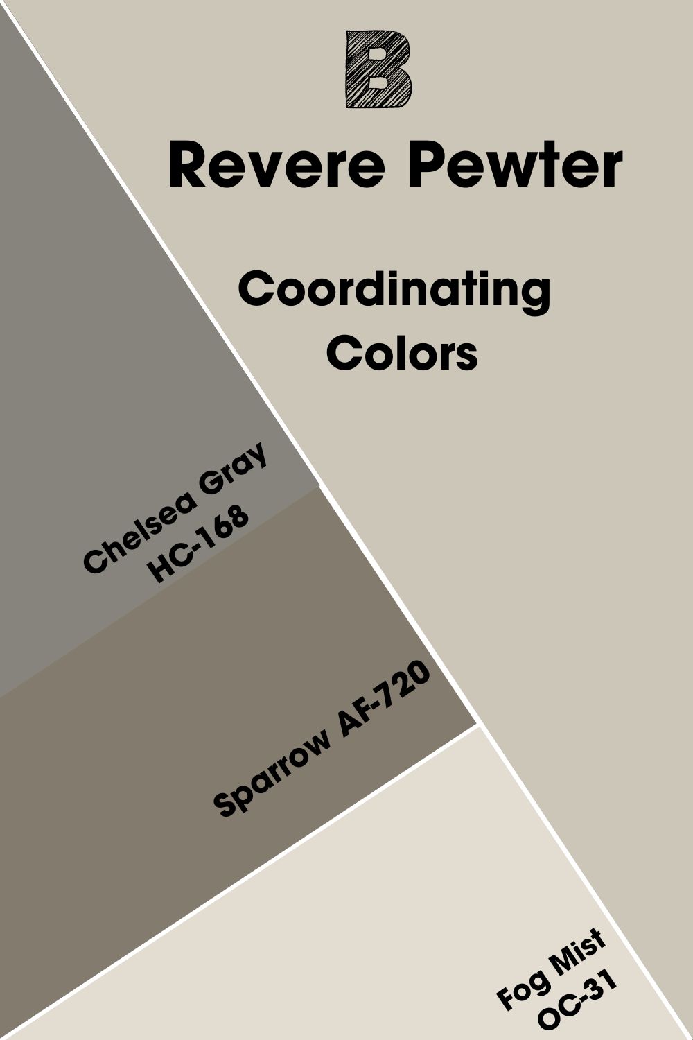
Coordinating Colors of Benjamin Moore Revere Pewter
These colors give a stellar performance when used alongside Benjamin Moore Revere Pewter in any space, whether trims, accents, walls, or even ceiling colors. Take this as the ultimate sign to get your artistic cap on.
- Benjamin Moore Chelsea Gray HC-168: This warm gray has undertones of green and hints of violet that complement its low LRV of 23.33. It looks fierce as an accent or trim wall alongside Revere Pewter indoors and outdoors.
- Benjamin Moore Sparrow AF-720: A deep, warm gray with green and earthy brown undertones. It’s even darker than Chelsea Gray, with an LRV of 21.14. The
- Benjamin Moore Fog Mist OC-31: This bright off-white has an LRV of 70.15 with warm, greige undertones that complement the depth Revere Pewter brings.
Use this as a cabinetry color for your RP kitchen or a bathroom hue if you like the coastal vibe.
Benjamin Moore Revere Pewter Color Palette
Your color palette reflects your taste and preference, and in this section, I’ve curated something for the minimalists and lovers of traditional decor.
Each palette has a specific number of tones you must add together (triadic and Analogous) to get that perfect arrangement. However, I’ve added white paint as the third color for the Triadic and Analogous Palette to create balance.
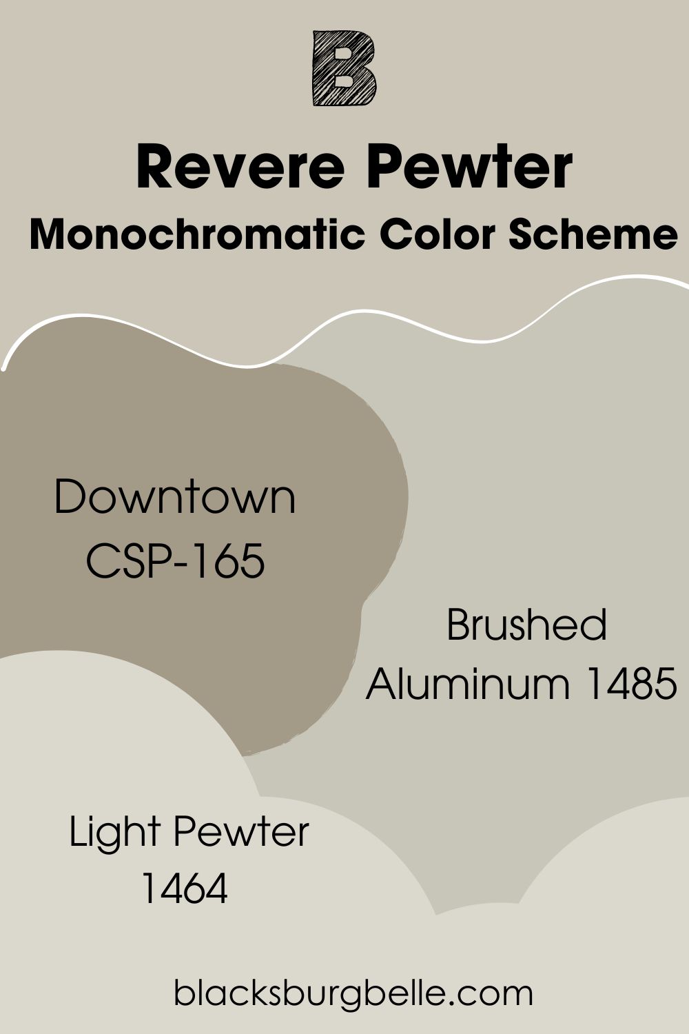
Monochromatic Color Scheme
- Benjamin Moore Downtown CSP-165: This dark neutral has rich green undertones with a touch of gray and beige. It has an LRV of 33.02, an impressive 22 points behind Revere Pewter, making it an excellent choice for outdoor application.
- Benjamin Moore Brushed Aluminum 1485: This cozy mid-toned hue comes with a truckload of green undertones and hints of gray. It has similar undertones to Revere Pewter and is perfect for a minimalist living room or kitchen.
- Benjamin Moore Light Pewter 1464: The lightest on the palette, Light Pewter has an LRV of 67.52 and combines cool green and warm undertones to deliver a neutral and versatile greige that can work with Revere Pewter in any capacity.
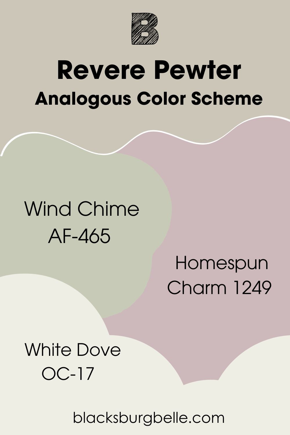
Analogous Color Scheme
- Benjamin Moore Wind Chime AF-465: Wind Chime is quite the diva, with soft yellow and gray undertones that warm the crispy green hue. It’s one shade lighter than Revere Pewter with an LRV of 56.58 and can work in your bathroom or nursery as a color of choice.
- Benjamin Moore Homespun Charm 1249: This one is a medium pink color with an LRV of 50.27, offering a sharp contrast against Revere Pewter. The gray in this color further expands its versatility and retains its popular vintage charm.
- Benjamin Moore White Dove OC-17: This one is a creamy white warm white with gray, beige, and green undertones. It has an LRV of 83.16 and would work as a cabinetry or trim color.
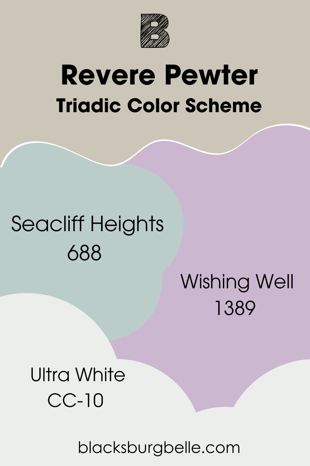
Triadic Color Scheme
- Benjamin Moore Seacliff Heights 688: A cloud gray with blue-green undertones and an LRV of 57.63. Perfect for woodwork, outdoor trim, and accent walls with Revere Pewter.
- Benjamin Moore Wishing Well 1389: A smooth mid toned lilac color with an LRV of 51.35. Like Revere Pewter, it also has whispers of gray in it. I see it working alongside Revere Pewter in the bathroom or laundry room with lots of natural light.
- Benjamin Moore Ultra White CC-10: This sparkly white has cool gray and green undertones with an LRV of 83.46. Use it as a kitchen cabinetry color or trim alongside a Benjamin Moore Revere Pewter wall.
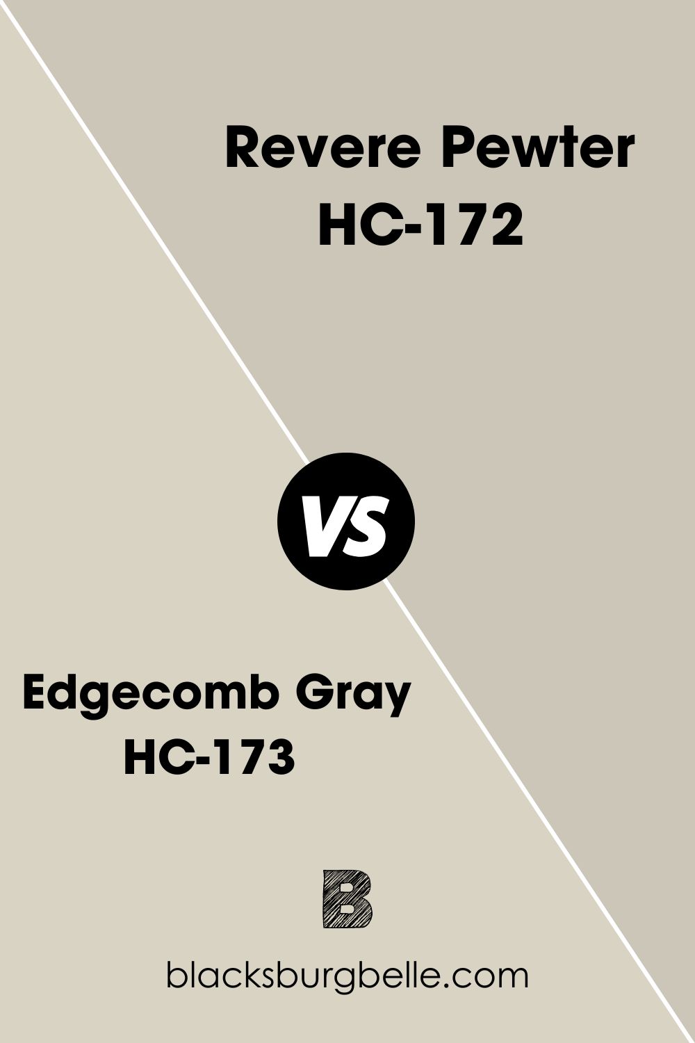
Benjamin Moore Edgecomb Gray HC-173 vs. Revere Pewter
Edgecomb Gray has an LRV of 63.88, which means it’s 8 points ahead of Revere Pewter and leans warmer as it carries more beige than RP’s brown and green properties. Edgecomb Gray appears lighter and more saturated than Revere Pewter when used side by side in a space.
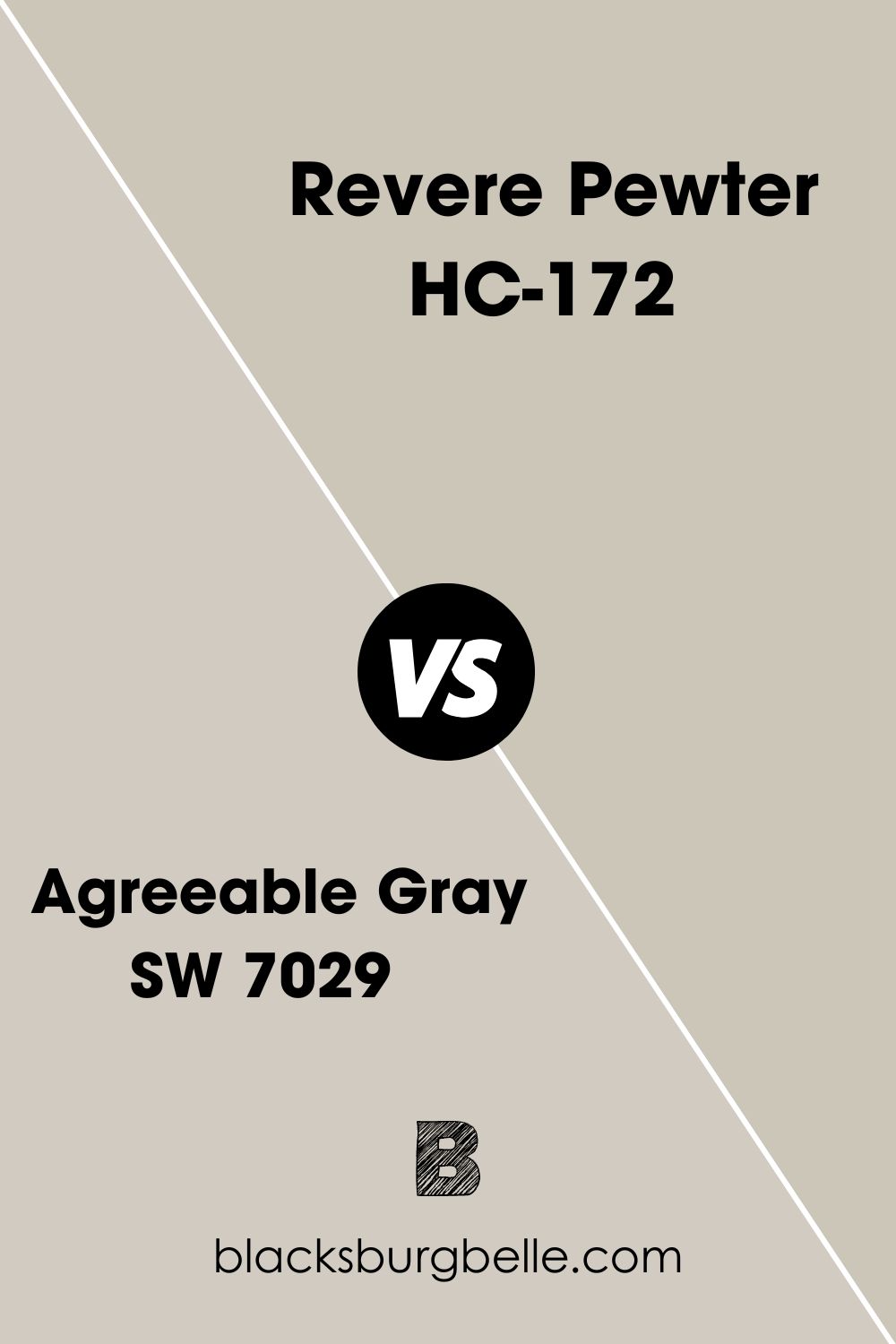
Sherwin Williams Agreeable Gray SW 7029 vs Revere Pewter
When placed side by side, Sherwin Williams Agreeable Gray is much lighter than Revere Pewter due to its LRV of 60, which is 5 solid points ahead of Revere Pewter’s 55. AG also has green and gray undertones like RP, but you may not even get to see this green as often as RP shows its own.
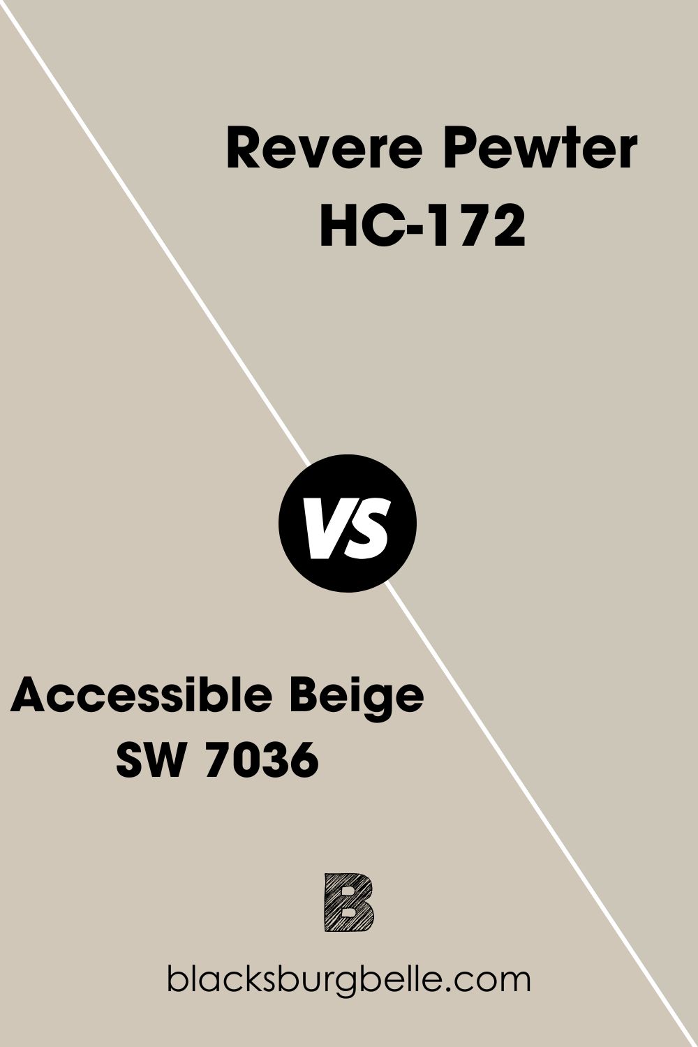
Benjamin Moore Revere Pewter vs. Sherwin Williams Accessible Beige SW 7036
Accessible Beige is similar to Revere Pewter with an LRV of 58, and also because it’s a beige color with hints of gray and green. AB is also a light color that doesn’t necessarily look washed out and is also more warm-toned than Revere Pewter.
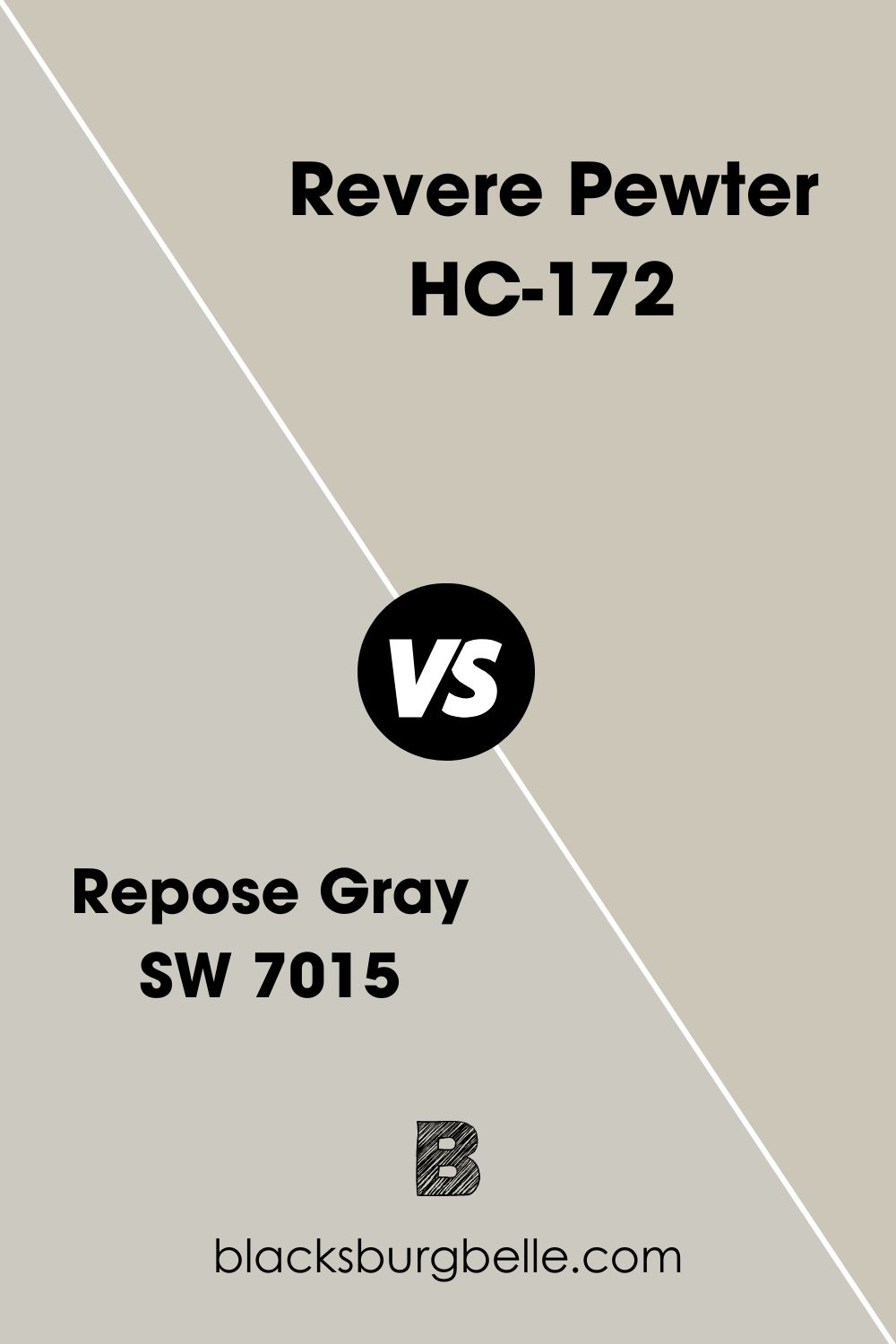
Benjamin Moore Revere Pewter vs. Sherwin Williams Repose Gray SW 7015
Repose Gray by Sherwin Williams is a soft, warm gray-greige paint with an LRV of 58 and the same undertones as Revere Pewter; the only difference is that you get a slight touch of purple in this one, making it a tad bit lighter and cooler than Revere Pewter.
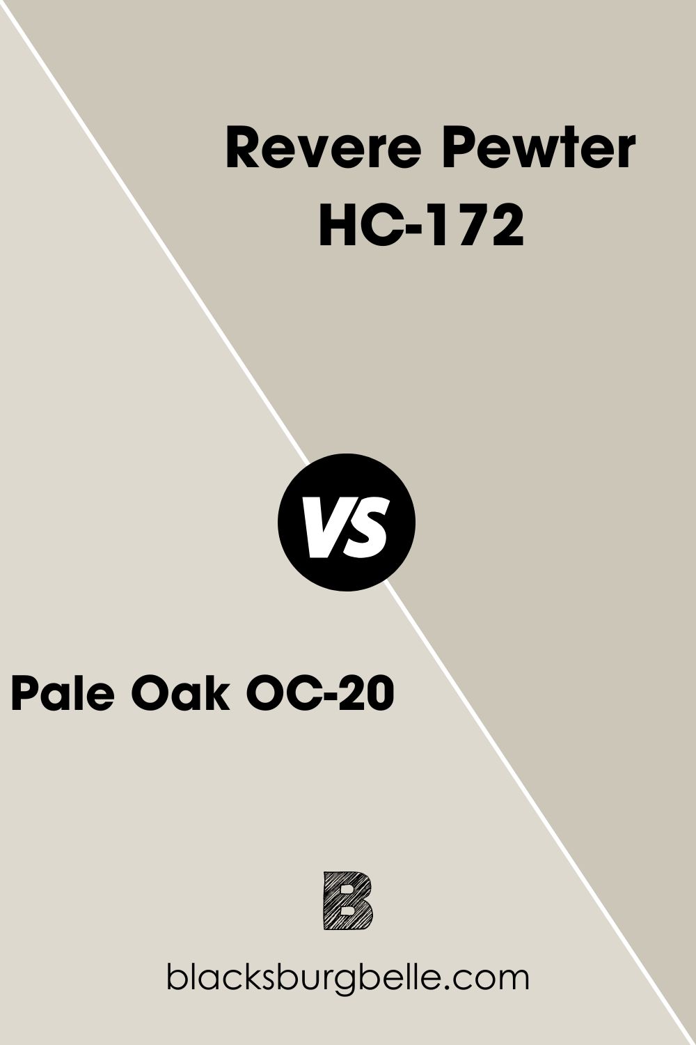
Benjamin Moore Pale Oak OC-20 vs Revere Pewter
Pale Oak is 14 solid points ahead of Revere Pewter with an LRV of 69.89. It also has interesting purple, pink, and green undertones, making it appear more saturated and lighter than Revere Pewter.
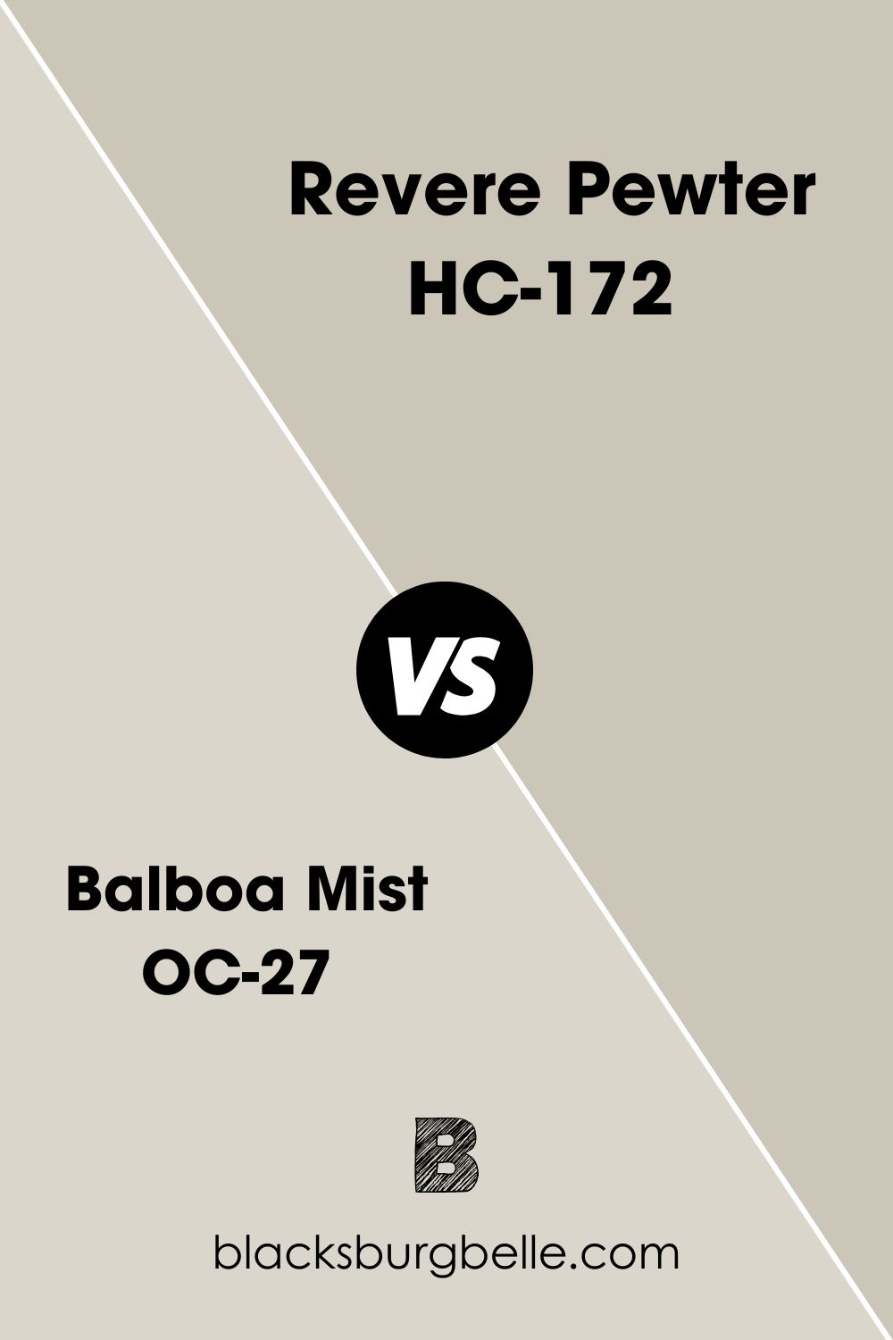
Benjamin Moore Balboa Mist OC-27 vs. Revere Pewter
Revere Pewter is darker than Balboa Mist with an LRV of 65, but they have their warm properties as a ground for similarity. These colors also have different undertones, with Balboa leaning violet and Revere Pewter leaning green.
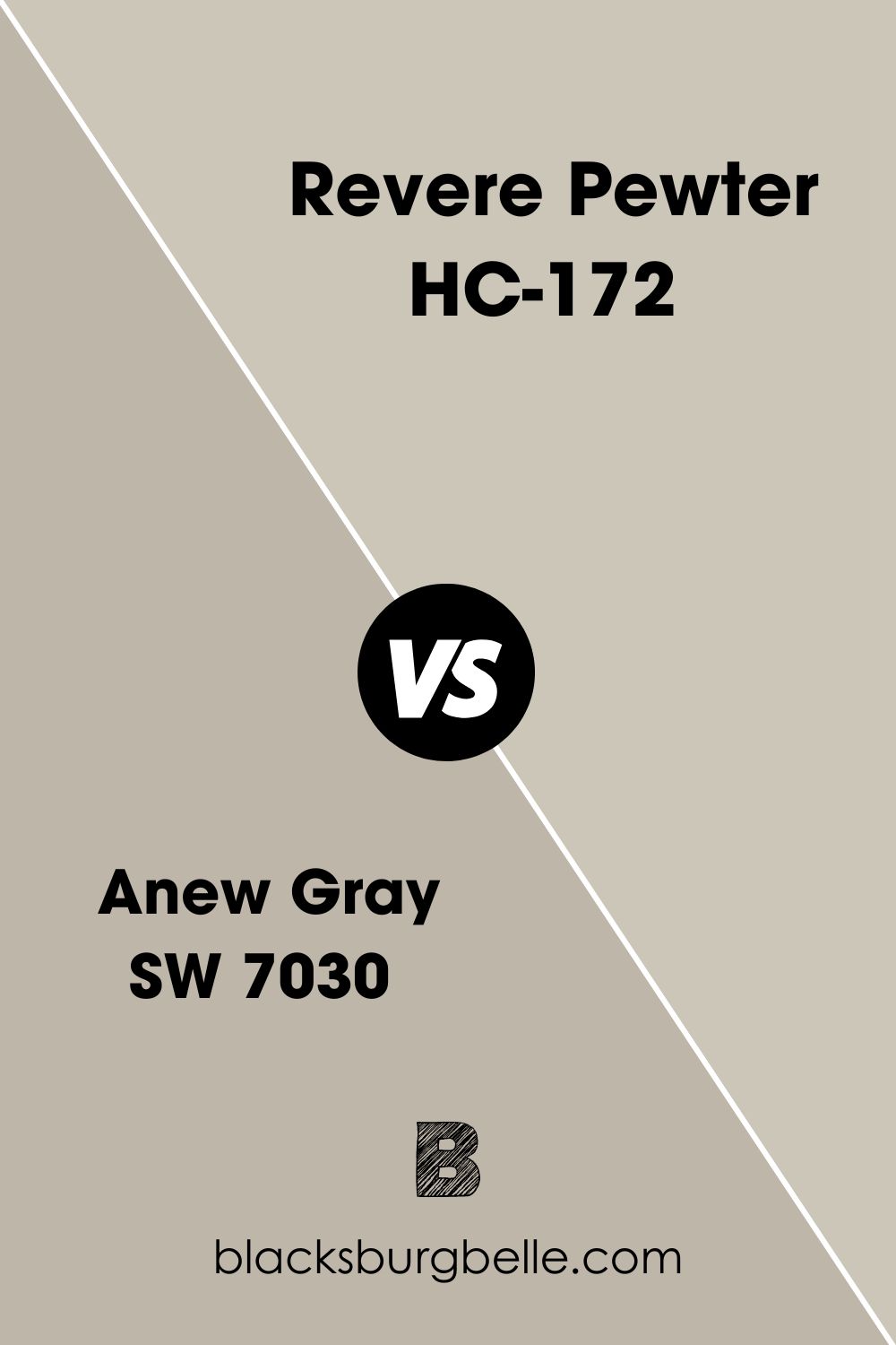
Sherwin Williams Anew Gray SW 7030 vs Revere Pewter
Anew Gray is a warm, greige paint with an LRV of 47, which means Revere Pewter will appear lighter when used alongside AG. Anew Gray adds hints of purple alongside its beige and gray undertones, while Revere Pewter has green.
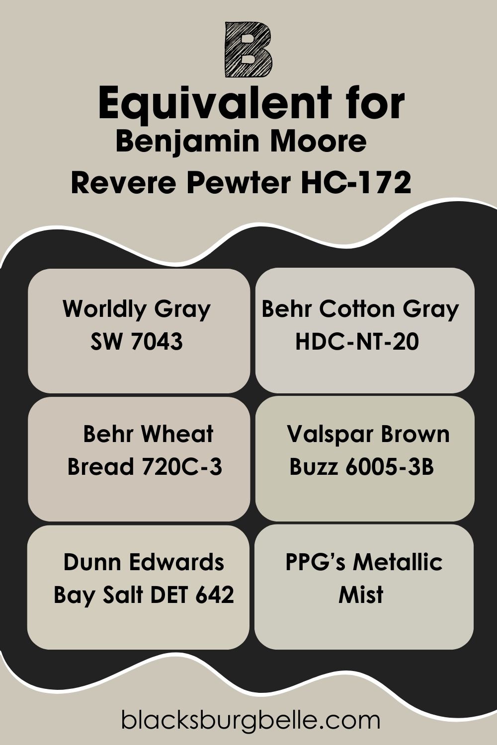
Benjamin Moore Revere Pewter Equivalent in Sherwin Williams and Other Brands
Before I proceed, I’d like to reiterate that no two colors are equal or have the same formulation. Of course, you can find similar tones, especially from other brands besides Benjamin Moore.
Sherwin Williams Worldly Gray SW 7043, Behr Cotton Gray HDC-NT-20, Behr Wheat Bread 720C-3, Valspar Brown Buzz 6005-3B, Dunn Edwards Bay Salt DET 642, and PPG’s Metallic Mist are all excellent alternatives to Benjamin Moore’s Revere Pewter.
Where can you use Revere Pewter OC-117?
Revere Pewter is a versatile paint color, which means you can use it everywhere in the house, including exteriors. However, this color may perform better in bigger rooms or open floor plans that get loads of natural light.
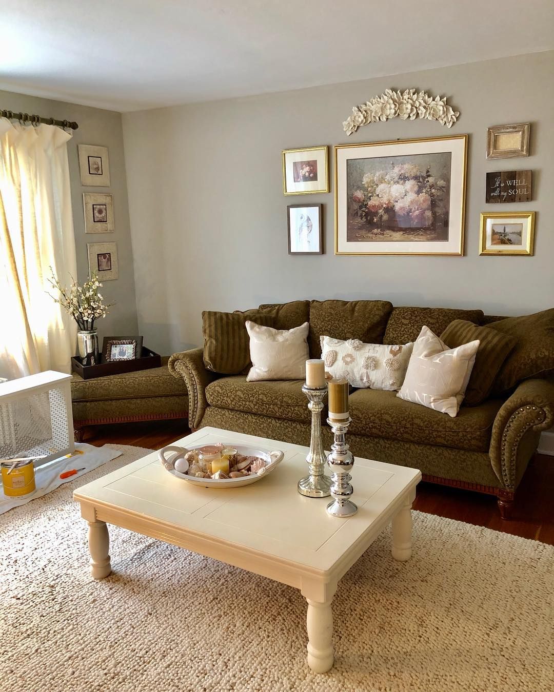
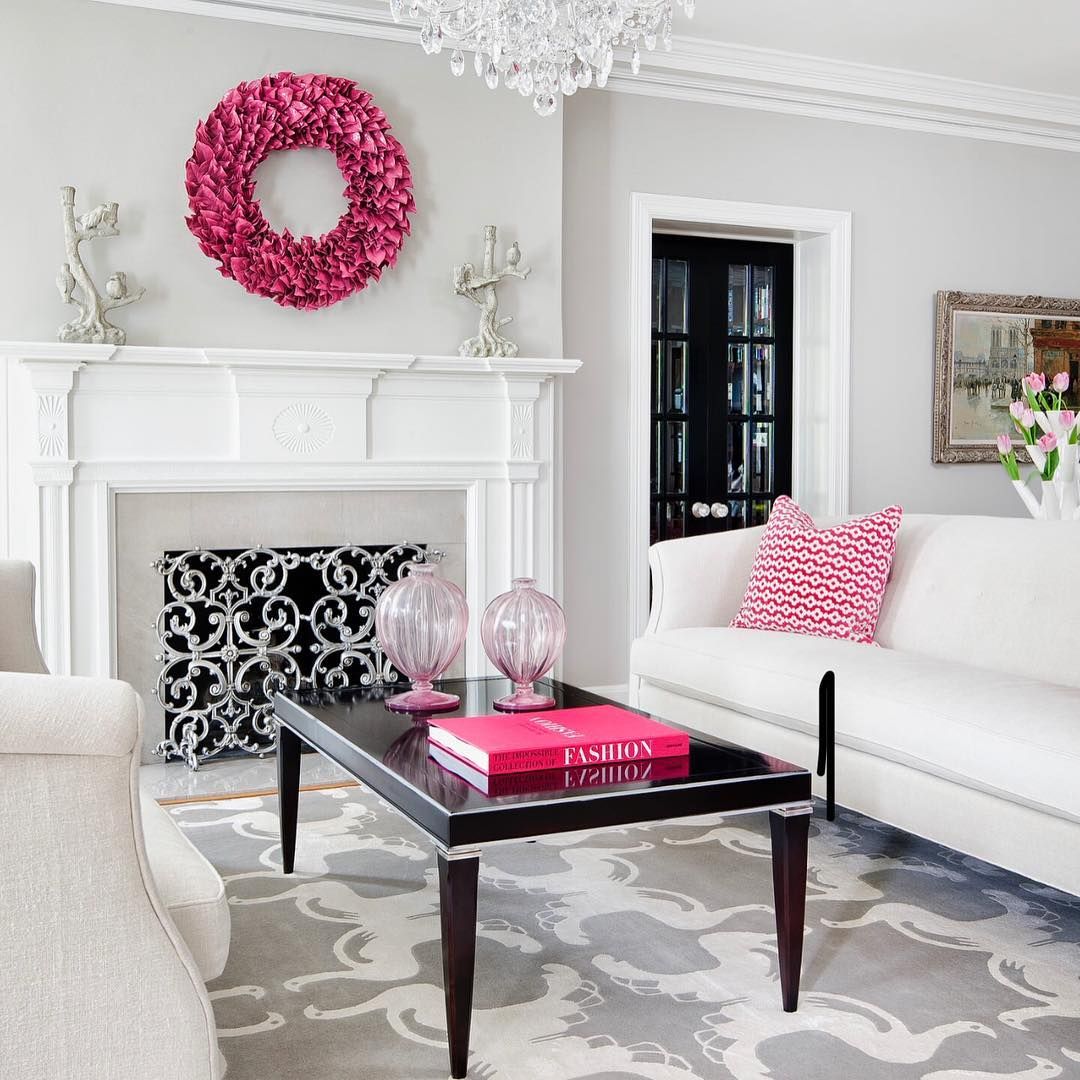
Revere Pewter in the Living Room
Revere Pewter is an excellent choice for your living room, especially if it has impressive natural lighting like this image. It completely leans gray in the space, making it easy to pair with the bright pink, white, and black accessories you see around.
Add white trims for more contrast and a balanced appearance, most especially to prevent your space from looking too icy.
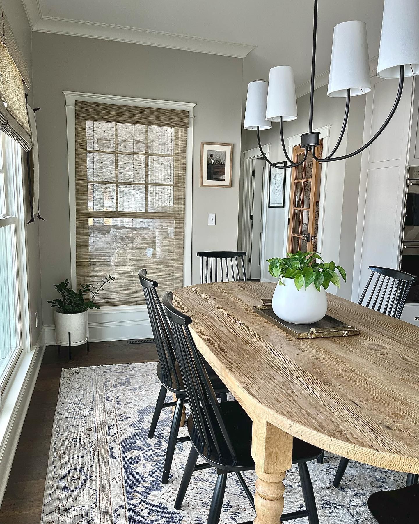
Revere Pewter In the Dining Room
Before the analysis, I need you to stare at the plant on the table for about a minute and then gaze at the wall without breaking contact. After this experiment, it’s almost impossible to ignore the green hints on the wall.
From RP showing off a bit of beige to match the wooden accessories to leaning gray towards the left corner of the room, it really doesn’t get better than this. Throw in black chairs and lamps for more edginess.
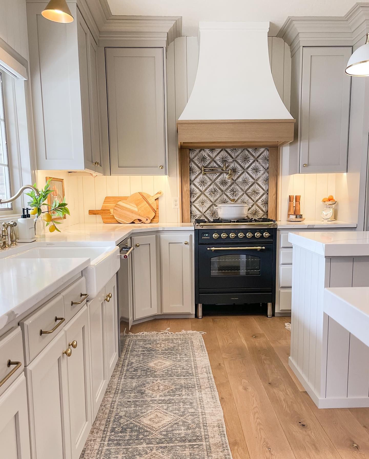
Revere Pewter in the Kitchen
Revere Pewter works hard in kitchens, too, especially on cabinets. You can get a good mix of gray, green, and beige here, depending on the lighting in your kitchen, like the image below, where RP maintains a gray appearance.
Switch things up with wooden floors and white backsplash tiles to lessen the tension and trap more natural light.
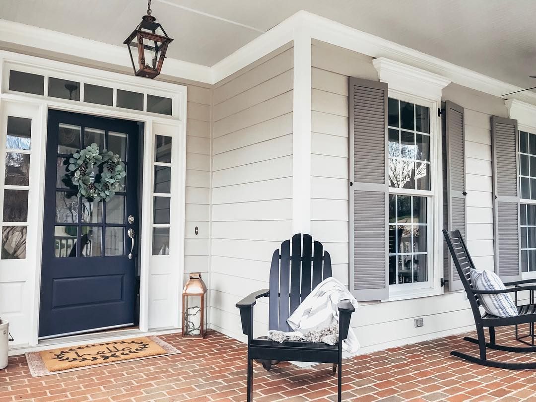
Revere Pewter on an Exterior
All colors appear washed out when applied outdoors, and RP isn’t exempted. Revere Pewter reads green in this image due to intense lighting and also the greenery reflecting on it.
Throw in the white trims, solid-colored doors (think navy blue or any shade of blue), and black accessories. I like the twist that the Terracotta floor adds to the whole set-up and doesn’t make it look so monotonous.
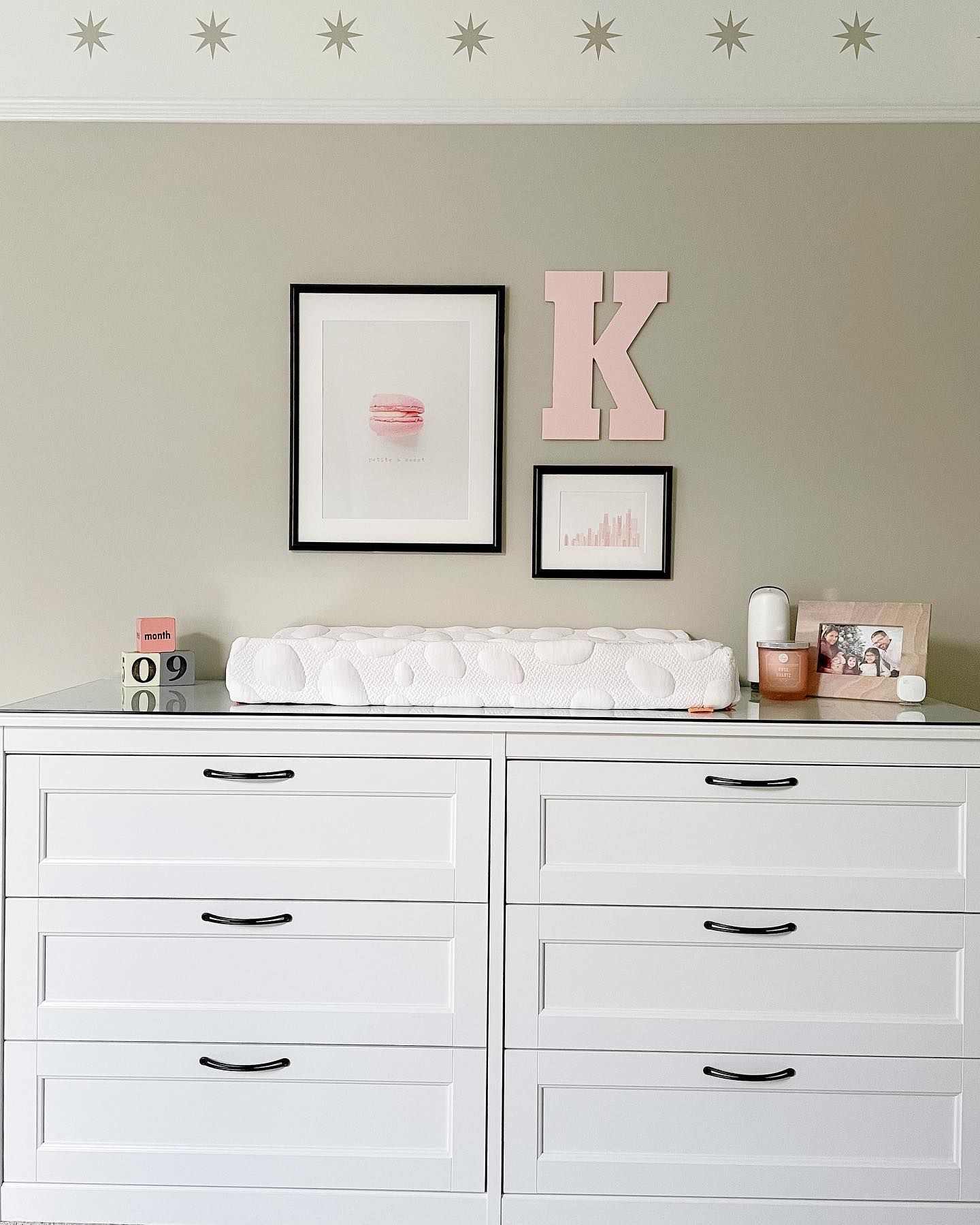
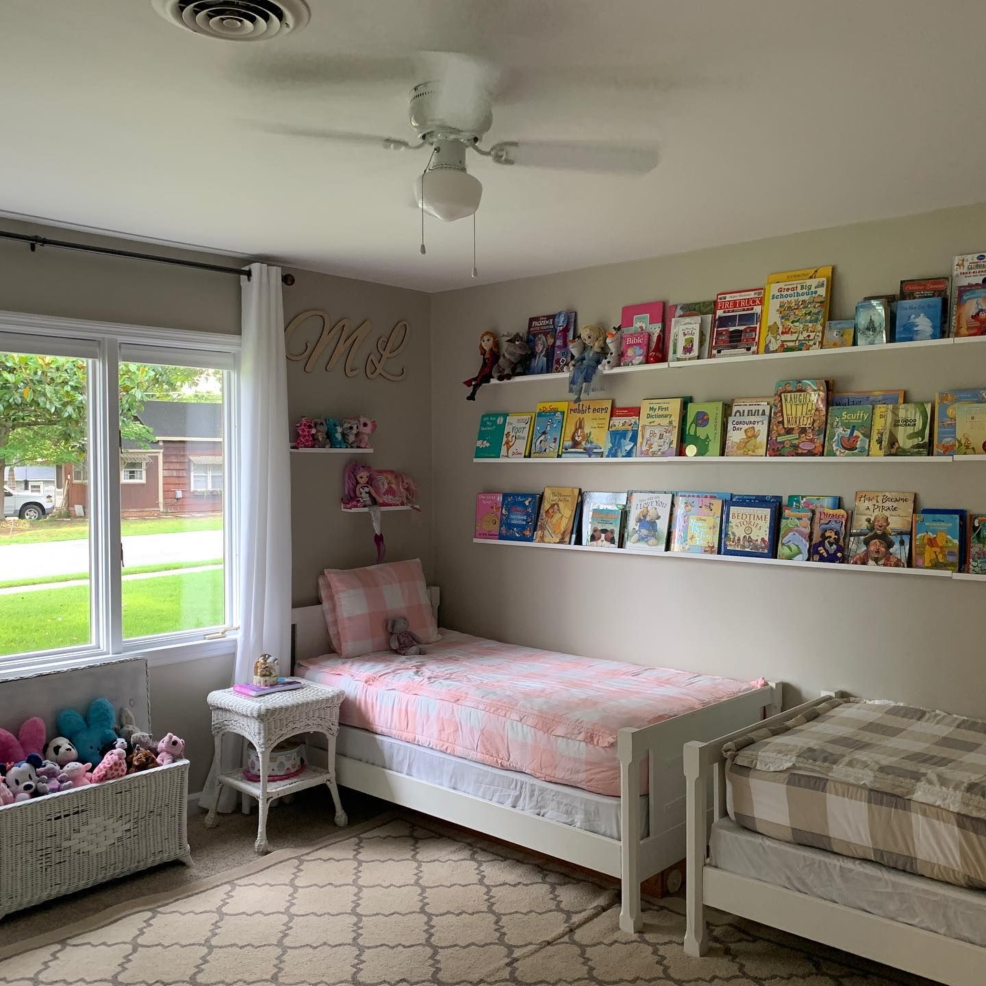
Revere Pewter in the Bedroom
Grays are a top choice for bedrooms as they’re very relaxing. Revere Pewter carries a golden glow in the image below thanks to the incoming warm light, but it also doesn’t completely stray away from its gray roots.
What Colors Go With Benjamin Moore Revere Pewter OC-117?
Some colors make using Benjamin Moore Revere Pewter in your space absolutely worth it; these hues are flattering in any form, whether as accessories or wall colors.
Being a versatile neutral, Revere Pewter has a long and unending list of allies, including warm and cool colors. Pair Revere Pewter with green, light grays, pink, lilac, bright whites, blues, and even red to match the green undertones.
Conclusion
I understand that switching up your home’s paint color can be daunting and even life-changing. This article gives you a clear view into the heights you can go with Benjamin Moore Revere Pewter, and most importantly, you get the best of both worlds (GREIGE).
Here’re a few facts to carry with you as I wrap things up.
- Revere Pewter is a gorgeous neutral that adds an earthy feel to your home.
- This color leans greige, which means you can spot some hints of beige in it.
- It’s versatile and can work in any traditional or contemporary setting.
Don’t forget to drop your comments and suggestions in the box below, as they help me give you better reviews.
 Sherwin Williams Iron Ore (Palette, Coordinating & Inspirations)
 Sherwin Williams Caviar (Palette, Coordinating & Inspirations)
 Sherwin Williams On The Rocks (Palette, Coordinating & Inspirations)
 Sherwin Williams Essential Gray SW 6002: Paint Color Review
 Sherwin Williams Cyberspace SW 7076: Review & Inspiration
 Sherwin Williams Grizzle Gray SW 7068: Paint Color Review
