
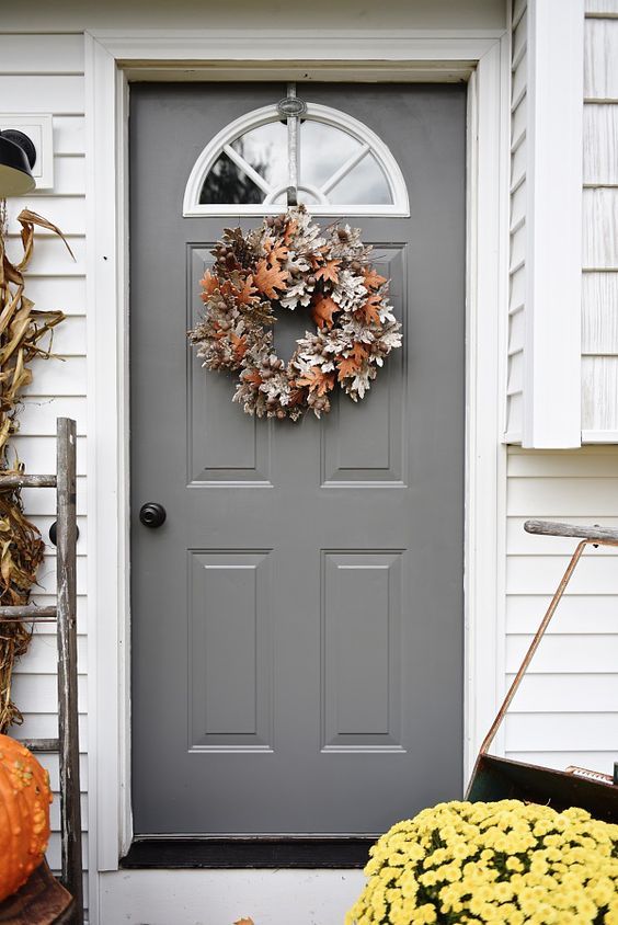
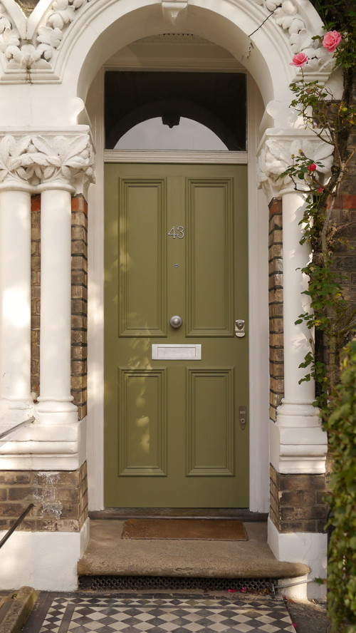
Giving your entrance a nice look is a way to define your whole house. A unique front door would seize attention and remind your guests that they are always welcome into your home.
Table of Contents
Why Is Choosing A Front Door Color A Big Deal?
The popular saying, “First impressions last longer,” should be your motto for choosing a front door color. First impressions start from the outdoors, although many people focus on their space’s interior, whether home or office.
The exterior appearance of any home or building creates an impression on strangers which could be an anxious, nervous, apprehensive, relaxed, happy, or optimistic feeling.
Front doors suffer a lot from constant and sometimes harsh exposure to different weather conditions. Over time, this causes the paint to peel and crack off. How fast the paint wears off from these doors depends on the nature of not only the material but also the quality of the paint used.
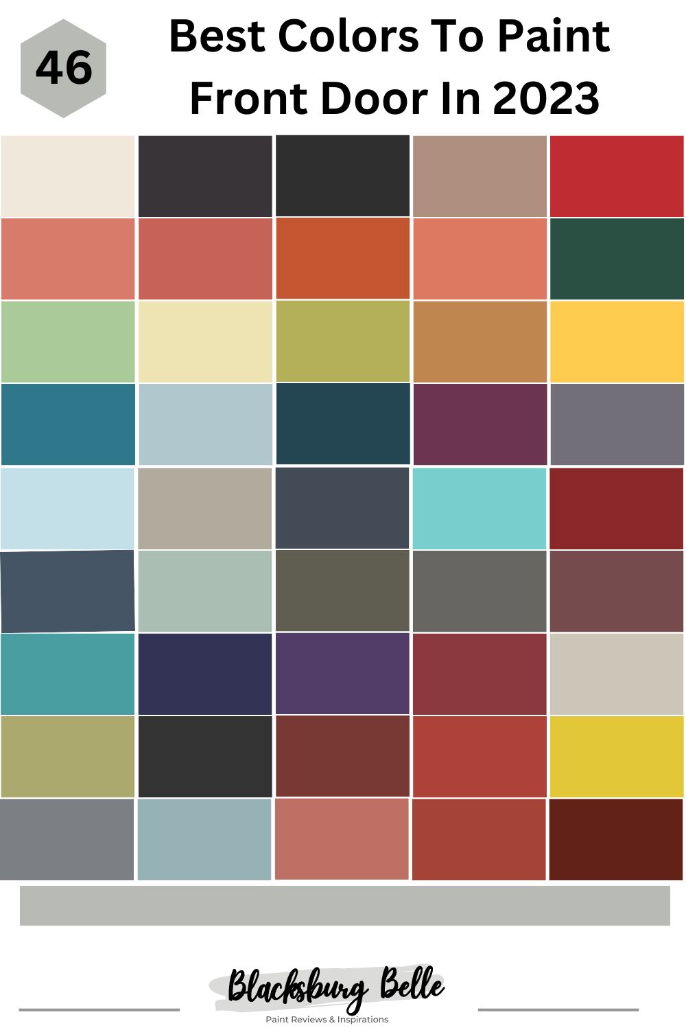
This article provides you with the finest and most durable paints that will give you the most exciting freshness no matter the weather or season. Why let your house be boring when you can give it a whole interesting vibe and get the neighbors talking by just picking the right color? Here is a list of the best paint colors for front doors.
Best Sherwin Williams Paint Colors For Front Doors
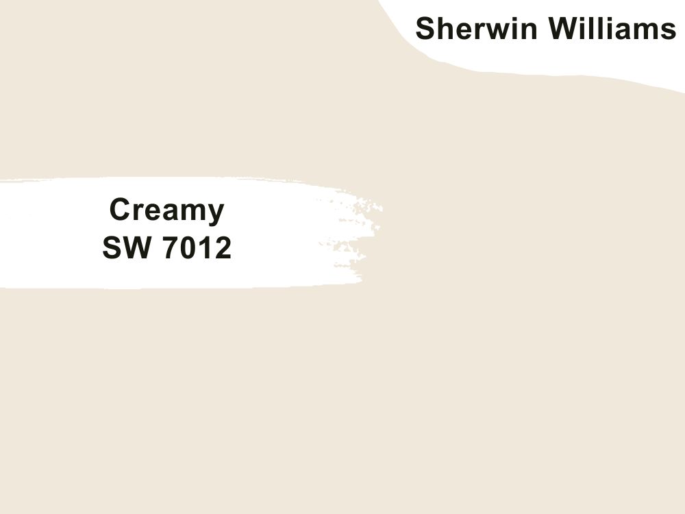
1. Sherwin Williams Creamy SW 7012
| RGB | 238 231 217 |
| LRV | 80.64 |
| Matching colors | Studio taupe, Reynard, |
| Undertones | Beige |
Creamy is what I will call a delightful, warm, and rich cream paint color that works beautifully for a variety of options including the front doors. This is a beautiful neutral paint with the softest beige undertones. It has an embedded softness gotten from the undertone that when used on your front doors gives a very inviting and accommodating warmth as it doesn’t get too yellow.
When natural sunlight light flashes on creamy, pink shiny flashes become visible allowing the entrance of your house to have a little intriguing activity. If your house is painted with a dark shade or color, creamy doors will help to maximize the environment, bringing light and color to the surrounding.

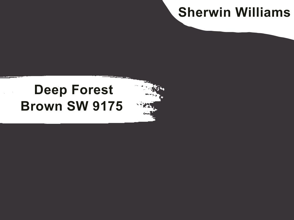
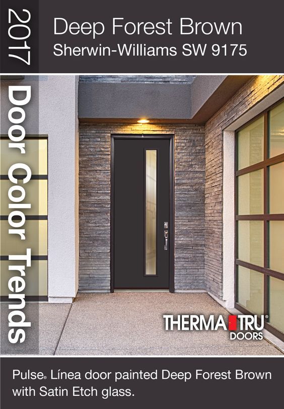
2. Sherwin Williams Deep Forest Brown SW 9175
| RGB | 58 52 54 |
| LRV | 3.60 |
| Matching colors | Creamy, cocoa whip, natural linen |
| Undertones | yellow |
This color is a dark shade of magenta-pink. This dark brown when applied anywhere, carries a very attractive prestige, stability, and strength and it commands respect. This is a powerful neutral which gives a striking luxurious appearance to your entire home by just being on your front doors. This rich deep brown is really a great way to make a bold statement.
Deep forest brown is suitable for almost every type of door, ranging from classic Double Doors to French doors. This color is perfect for people that want a dark and deep color close to black, but not black color.
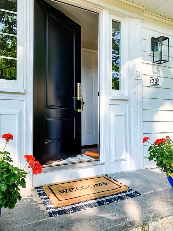
3. Sherwin Williams Tricorn Black SW 6258
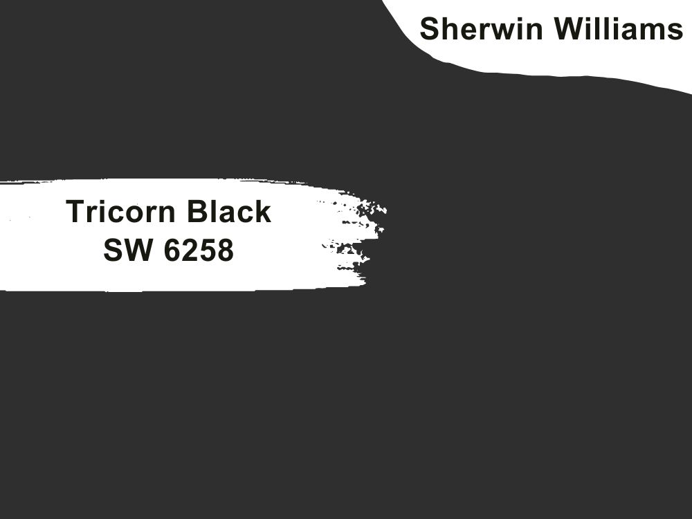
| RGB | 47 47 48 |
| LRV | 2.45 |
| Matching colors | Beige, simply white, taupe |
| Undertones | Nil |
Tricorn black is another outstanding dark paint color that helps to give your entire house a timeless look by just being the color of your front door, this color gives out a quality of comfort making your house look really like a home. It is very versatile that it can be used on any design of doors and also blends smoothly with surrounding colors.
This all-black color when used on your front doors comes with pure elegance and gives a very timeless look. It is among the top most recommended colors for front doors.
4. Sherwin Williams Redend Point SW 9081
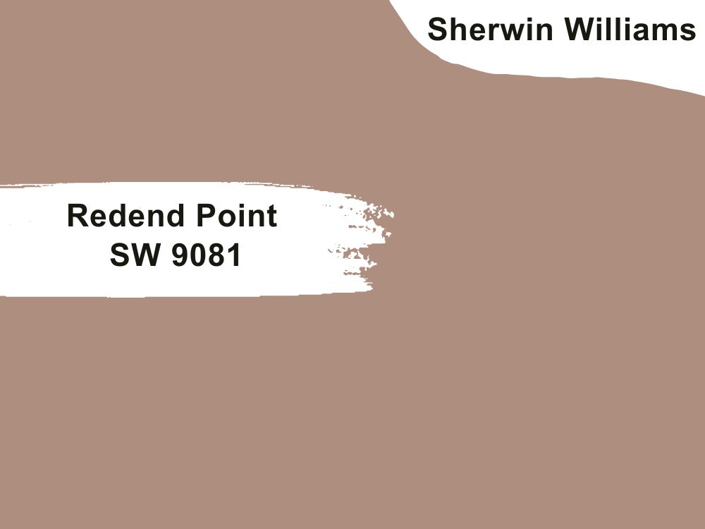
| RGB | 174 141 125 |
| LRV | 29.45 |
| Matching colors | Polite white, canyon clay, kestrel white |
| Undertones | Blush |
The red end point is a soft dark shade with yet a warm overlay. It can be simply described as a mid-toned clay color. This mid-toned clay color can sometimes be described as a rosy brown.
It possesses a warm, inviting, rich, earthy hue that is more neutral than we think. This rosy brown has undertones of blue, brown, and red. It’s very suggestive of a makeup palette with its soft, dark, and blush tones.
The interesting thing about the red endpoint is that it is very flexible, subtle, and warm. This heartening hue invites compassion and connection when applied on your front doors; it carries peace and serenity reinventing the entire front part of your house in the warmest way possible.

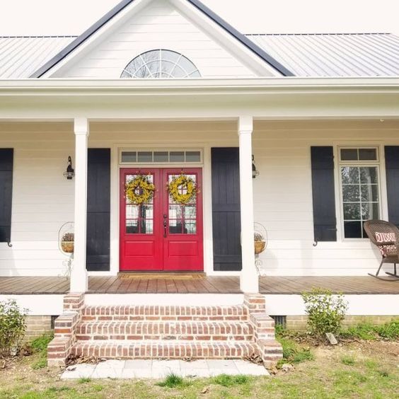
5. SherwinWilliams Real Red (SW 6868)
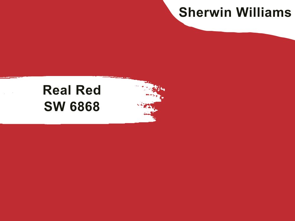
| RGB | 189 43 49 |
| LRV | 12.79 |
| Matching colors | Ibis white, site white, software |
| Undertones | Orange |
Most people might say that imbibing an angry environment is what reds do, but real red is an exception. Real reds are quite passionate and energetic with a major focus on imbibing an enthusiastic environment. This shade of red paint is stark, and rich in character which brings an energetic and warm appeal.
Real red is a color that promises cheerfulness with its exciting tone and suits any paintable door design, be it a single door, double door, or French door. So, are you looking to add some fun and eccentricity to your home? This is definitely the color that should be on your front doors. Sherwin Williams Real Red is one that will definitely give your house an energetic, lively, warm, and aggressively passionate feeling right from the first glance
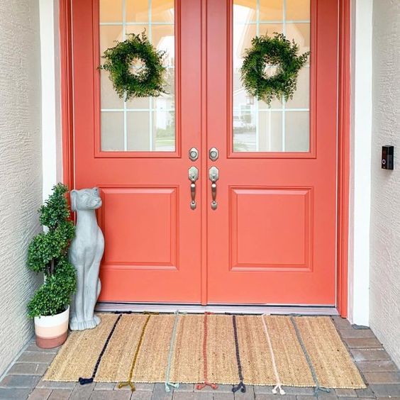
6. Sherwin Williams Lei Flower SW 6613
| RGB | 220 123 106 |
| LRV | 30.47 |
| Matching colors | Sashay sand, wrought iron crystal chandelier |
| Undertones | Red |
Lei Flower SW 6613 at first glance might not look to you like a color suitable for exterior decoration or even the front door, but trust me, when it sits on your door, there is no going back. It will leave you nothing short of addicted because of the magic it will perform on not just your front porch but the entire surrounding.
This peach-toned medium-dark color works very well for almost every type of door and also blends beautifully with colors around it. If you have your exteriors painted in very light or very dark colors, lei flower is definitely the paint for you as it will help to blend the entire look into its crisp and polished finish.
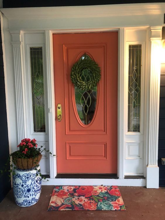
7. Sherwin Williams Quite Coral SW 6614
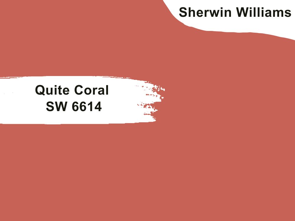
| RGB | 199 99 86 |
| LRV | 22 |
| Matching colors | Stick and stones, extra white, faint coral |
| Undertones | Red |
If you are looking for the same effect that lei flower gives, but in a darker shade, Quite Coral is the paint color for you. It is the darker alternative to Lei Flower. This orange-like color is a very bold color for front doors and one that shows its superiority over other colors when applied to a front door. It is made up of orange, red, and pink.
This very jovial color is also very flexible and the ultimate statement maker when it comes to front doors. Its flexibility makes it very easy for it to match with surrounding colors perfectly and suit any kind of door effortlessly. However, this color looks most astonishing with neutrals.
8. Sherwin Williams Raucous Orange SW 6883
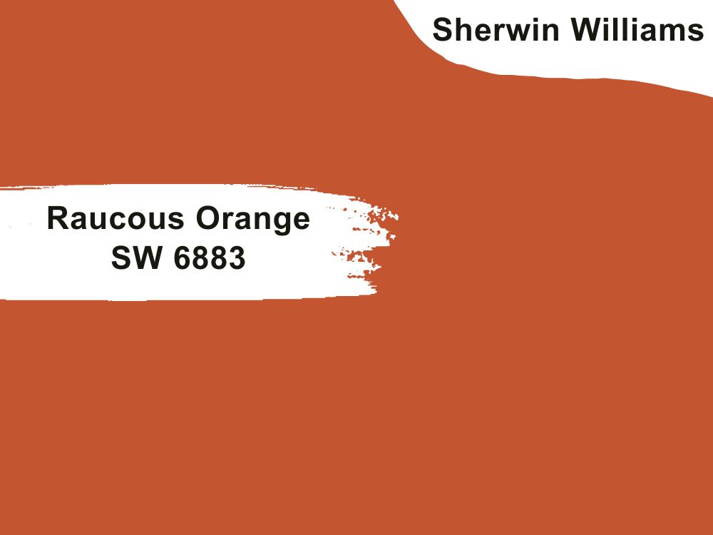
| RGB | 197 86 49 |
| LRV | 18.74 |
| Matching colors | Hale navy, nearly peach, gray matters |
| Undertones | Yellow, Brown |
Orange for a front door? I know this is the question going through your mind now.
Yes, raucous orange for a front door is one of the best colors you can grace your front doors with. This is a warm shade of orange with yellow undertones that help to beat down the orangey effect so it doesn’t give out an eye-blinding orange color, but a neutral, easy to coordinate shade of hue.
This color when applied to your front door gives a very earthy-like expression with an original touch like it is exactly where it needs to be in the middle of things and as the center of attraction. This color makes the house a very welcoming and accommodating appearance.
9. Sherwin Williams Rejuvenate SW 6620
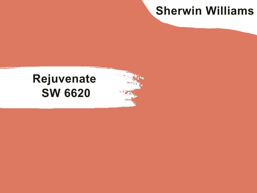
| RGB | 221 120 97 |
| LRV | 30 |
| Matching colors | Koral kicks, sea salt, pewter green |
| Undertones | Blush, Pink |
Most people see rejuvenated SW 6620 as interior paint, but this paint surprisingly works beautifully as exterior paint and especially on our front doors. This paint can be a dramatic orange or a warm orange depending on the colors surrounding it. It is a color that one would say brings or adds more life to a boring-looking front pouch.
It can easily transform a lifeless-looking area into a place bubbling with activities and strength. When used on your front doors it immediately gives out a feeling of homeliness and freedom, bringing a great deal of coordination along with it.
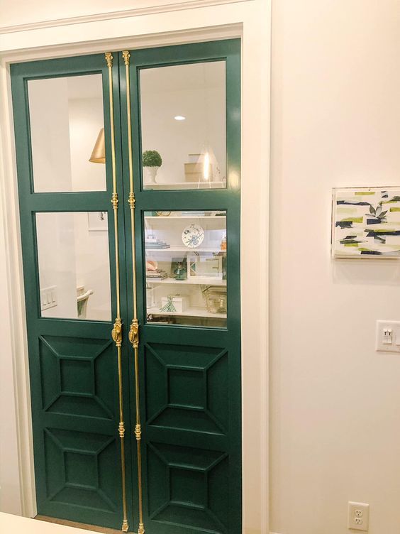
10. Sherwin Williams Hunt Club SW 6468
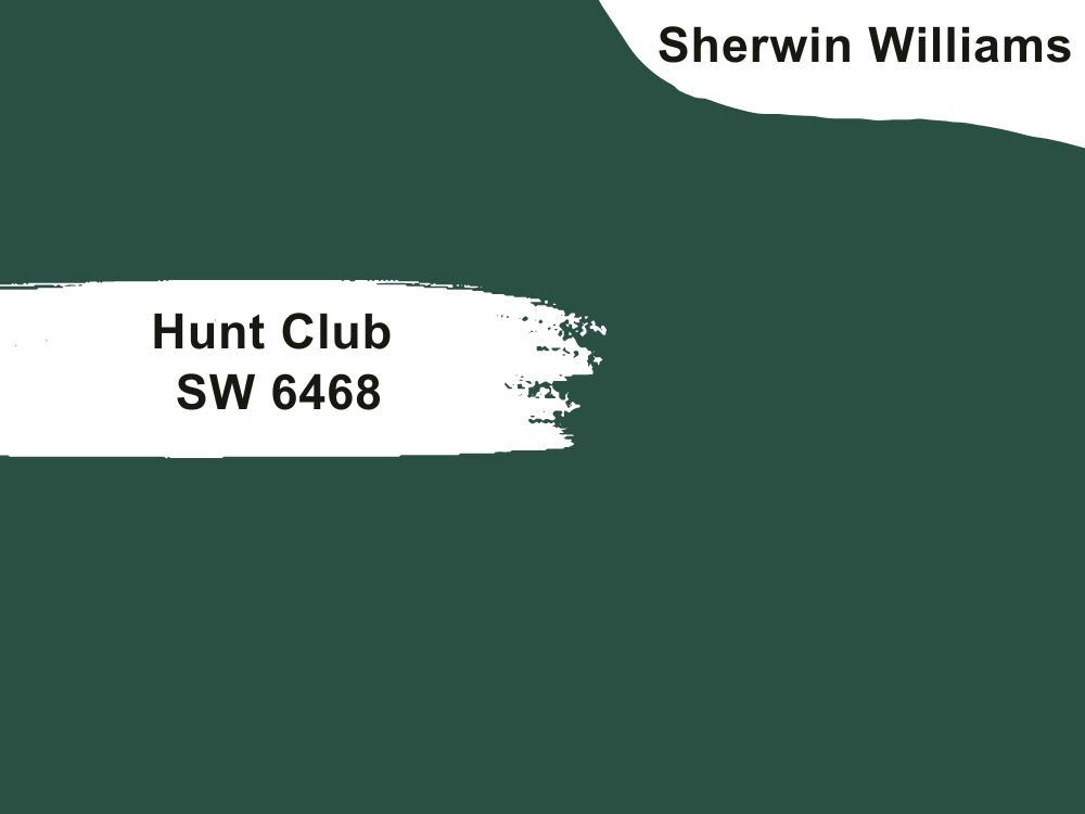
| RGB | 50 85 73 |
| LRV | 7.59 |
| Matching colors | Divine white, latte, green trance |
| Undertones | Blue |
Hunt Club SW 6468 is the ultimate deal breaker when it comes to making your front doors and by extension, the entire exterior of your house carry a not so regular kind of prestige. This rich classic dark green paint is completely nature-inspired and gives your home special freshness with a bonus pack of tranquil feeling that you get when you sit in the garden with flowers blooming on a calm evening.
A very interesting characteristic of this paint color is that it is one hundred percent versatile. It blends well with every type of color surrounding it. It doesn’t only blend well but it stands out making itself very noticeable even when placed beside dark colors of similar light reflection value. Hunt Club will look very great on front doors against a stone building.
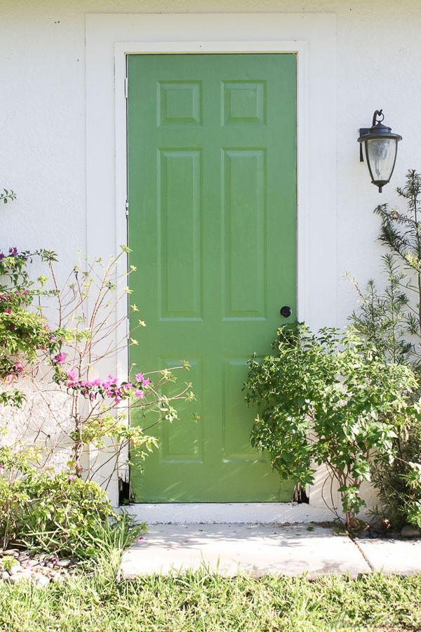
11. Sherwin Williams Oh Pistachio SW 9033
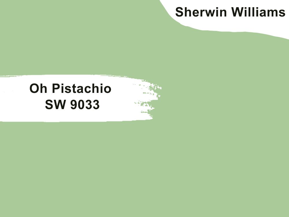
| RGB | 172 204 153 |
| LRV | 54 |
| Matching colors | Alabaster, attitude gray, sprout |
| Undertones | gray |
Did you say aesthetic and creativity? This is all oh pistachio is about. This is a color that allows you to get creative as much as you want, but still maintains stability and balance no matter what.
Most homeowners and decorators do not even bother to consider oh pistachio when it comes to front doors because they don’t expect that a medium green paint like SW 9033 can work as a front door color. However, this shade of color works perfectly for the front door, giving out an aura of softness and sophistication.
Another wonderful characteristic of this color is that weather and seasons have nothing on it. Be it fall or summer or winter, this color manages to remain stable and proud through it all.
If you’re feeling creative, pair Oh Pistachio with golden accessories and pastel yellow trims.
12. Sherwin Williams Moonraker SW 6701
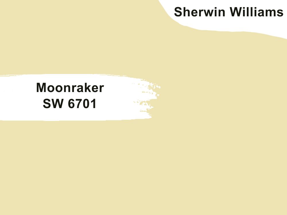
| RGB | 239 228 176 |
| LRV | 76.80 |
| Matching colors | Day break, extra white, mélange green |
| Undertones | Beige, Yellow |
Moonraker SW 6701 is a very light green paint with a light reflection value of 76.80. It often appears yellow due to its beige undertone.
This color is one of the rare light greens that work as a neutral most of the time regardless of the lighting condition. The moonraker is a very friendly and balanced color that finds a way to maintain its constant warmth no matter the amount of light it is being exposed to. NOTE: the color gets brighter in response to certain exposures, however, the warmth remains constant.
13. Sherwin Williams Parakeet SW 6711
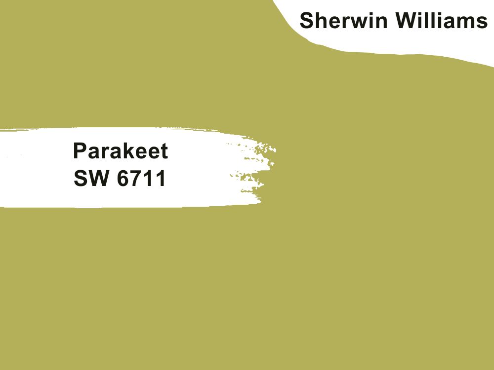
| RGB | 180 176 91 |
| LRV | 41.62 |
| Matching colors | Dried lavender, roman column, shell white |
| Undertones | gray |
This is an olive-like shade of green that when applied on your front doors, gives out the tropical outburst emotion. Greens generally possess a soft nourishing feeling and this color is no exception. It is one that brings nature to your doorstep, along with all the tranquility and happiness it can find.
Boring doors suck and this paint is definitely one that chases away such boredom far away from your entire exterior. It is important to however know that, the level of beauty this paint will exhibit depends on the coordinating colors you choose or the colors that are matched with it. So for this shade of paint, it is important to choose the color to be matched carefully.
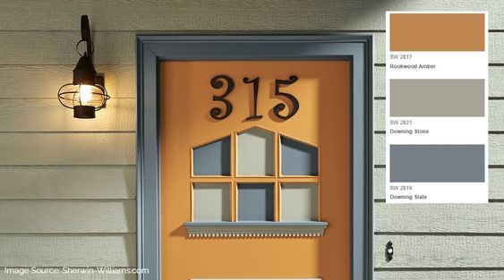
14. Sherwin Williams Rookwood Amber SW 2817
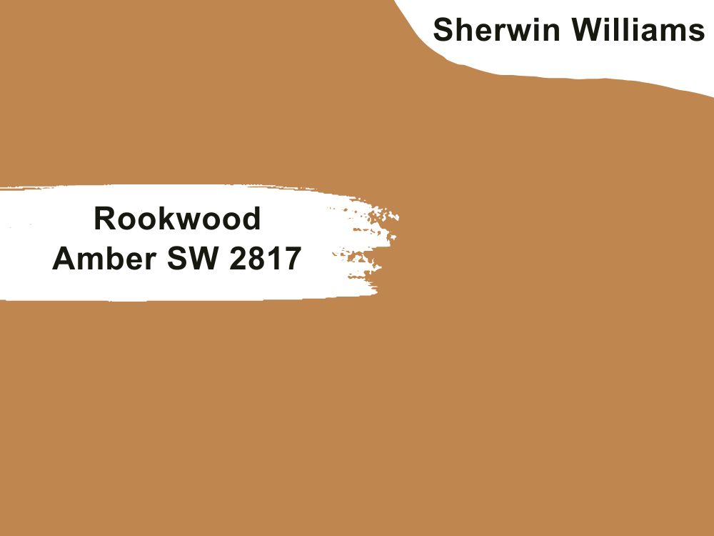
| RGB | 189 129 69 |
| LRV | 27 |
| Matching colors | Tree branch, cascades |
| Undertones | Red |
This is a dark yellow paint with a strong brown overtone that works well as a neutral front door color. This color is sometimes considered a roasted golden brown. This is because, in some lighting conditions, you will see traces of gold.
This very aesthetic paint color has a sense of authority that surrounds it, making it the main deal on your front porch. Because of its nature being neutral, it works beautifully with other colors used on trims and walls around it, helping to maximize it and bringing an aura of protection and freedom. This front door paint color also gives you the opportunity to be creative enough. Rookwood Amber pairs well with white, beige, blue, and yellow walls.
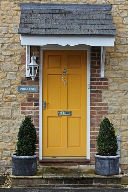
15. Sherwin Williams Decisive Yellow SW 6902
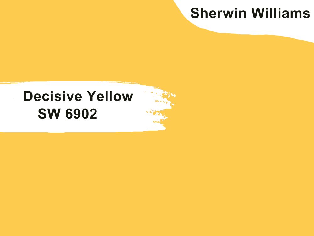
| RGB | 253 204 78 |
| LRV | 65 |
| Matching colors | Creamy, pure white, African gray |
| Undertones | Gold |
Yellow for a door is not too much! Yes, yellow paint can be used for a front door!!
Yellow front doors most definitely exist and they are breath-taking!!! If you are trying to get a touch of a very interesting color to your house and your front porch, this conventional yellow is the shade for you. This vibrant yellow paint does nothing but bring lots of positive vibes and energy to your home when it is used on your front doors.
This warm shade of deep yellow carries a daring authority that commands attention and respect. It also gives us the feeling of summer and daisies. The front surroundings of your house can never go boring or pale with this color on your front doors. It thrives best against an off-white paint like Creamy, crisp white like Pure White, or dark gray like African Gray.
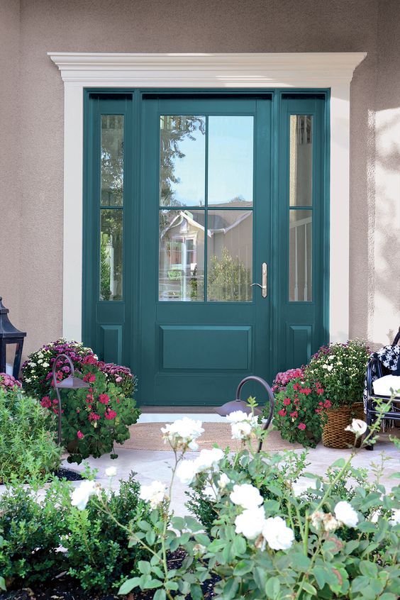
16. Sherwin Williams Loch Blue SW 6502
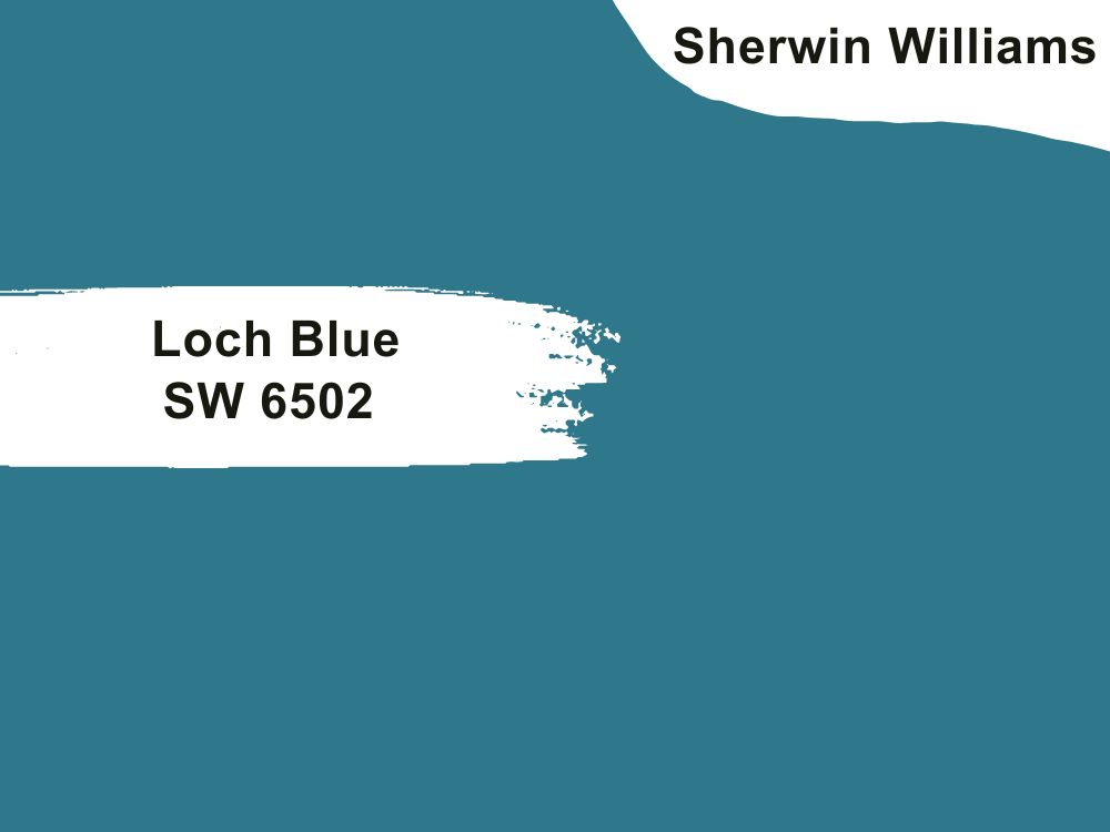
| RGB | 48 119 139 |
| LRV | 16 |
| Matching colors | Blue horizon, antiquity, oyster white |
| Undertones | Gray |
This paint color enhances and maximizes the look and beauty of a french door, giving the building a beachside aesthetic. This dark shade of blue paint is very versatile and seems attractive to children so you can use it for not only the home but the front doors of children’s clinics, schools, or games room entryways.
Loch Blue gives out a sensation of freedom and a feeling of restfulness. It paints that when used on your front doors makes your house the description of a happy home even without having to scream it out loud. This paint is also ideal for people who want a darker shade on their front doors but not too dark that it looks sad and depressing. Loch Blue is one of the best things that can happen to your home.
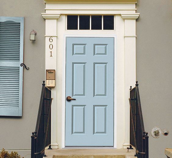
17. Sherwin William Billowy Breeze SW 9055
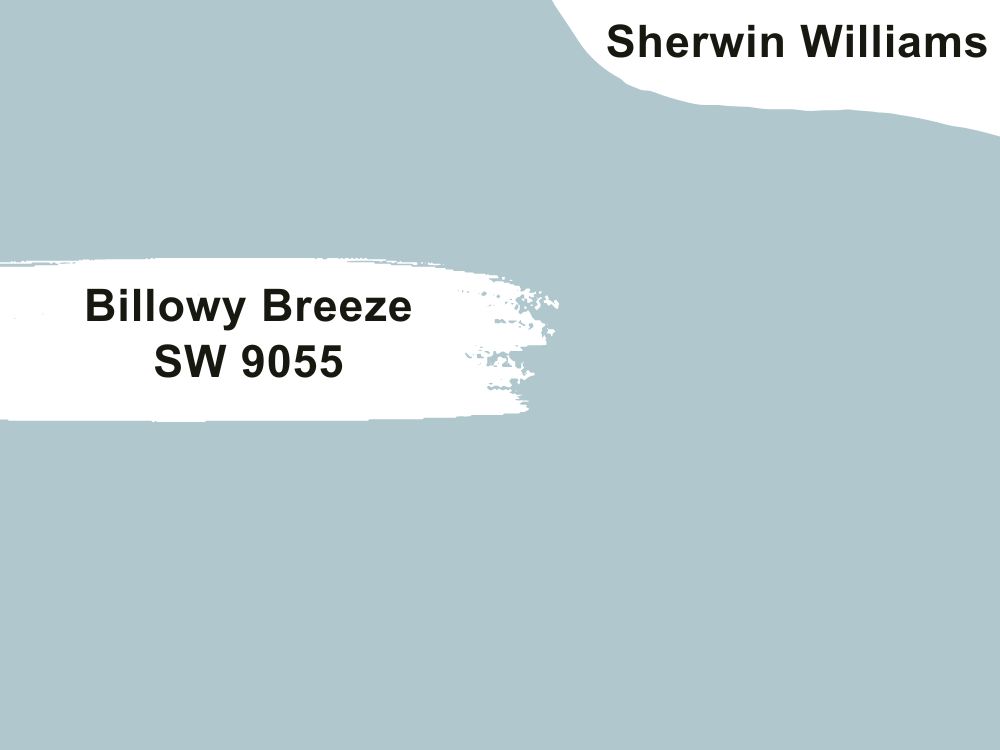
| RGB | 178 203 209 |
| LRV | 56.89 |
| Matching colors | Pearly white, relaxed khaki, mountain air |
| Undertones | Gray, Blue |
For people who don’t want stark, plain, or classic white for a front door, but still want something light with very soft and gentle activities going, a soft blue paint like Billowy Breeze SW 9055 is a safe choice. Also, it is a terrific one for creating long-lasting impressions.
This soft blue blends seamlessly into neutral walls and sidings from white to gray, tan, and even blue paints. Billowy Breeze freshens up your home giving it a very coordinated and accommodating expression and is a great way to say, “You’re welcome into a centered home.”
18. Sherwin William Rainstorm SW 6230
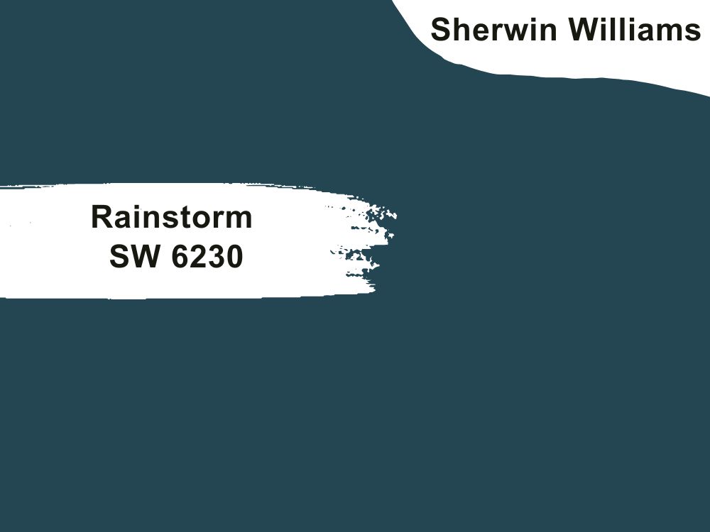
| RGB | 48 76 89 |
| LRV | 6.55 |
| Matching colors | Frosted emerald, fleur de sel, mountain air |
| Undertones | Slate gray |
This is a soft, yet dark blue color that is nothing close to navy-blue. Rainstorm is one of the colors that many people fail to recognize as a very excellent color for front doors. It is a very cool and confident shade of dark neutrals. This cool and confident aura makes the exterior part of the home appear cozy to visitors.
A house with a front door painted with rainstorm is always a place you will always want to go to, because the view is always very ravishing to look at, and the way it balances out surrounding colors and finds a way to stabilize Itself is always very contagious and satisfying.
Rainstorm’s slate gray undertone makes it a good match for gray walls and stone buildings.
19. Sherwin Williams Fabulous Grape SW 6293
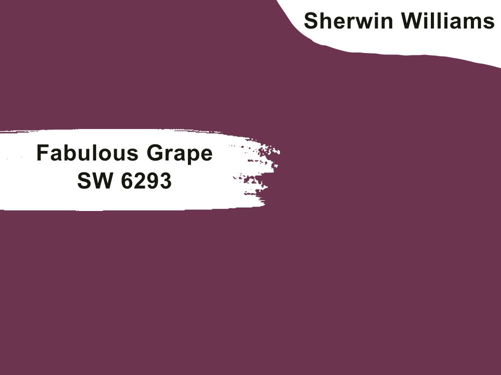
| RGB | 109 52 79 |
| LRV | 6 |
| Matching colors | Touch of sand, moth wing, |
| Undertones | Red |
Get into the ultra-modern style of exterior decoration with this shade of color called “Fabulous Grape”. This color has a strong red undertone, making it a really fantastic pair for red-based colors. It gives a very cozy feeling to the entire exterior and makes it pleasing and inviting.
This paint color among other colors has raised its head above very many other shades when it comes to making a statement among front door colors. Apart from it being a very inviting color, it is equally accommodating and very balanced, this color is like the finishing touch and
the last knob you need on your front door to give your house the term perfection.
20. Sherwin Williams Exclusive Plum SW 6263
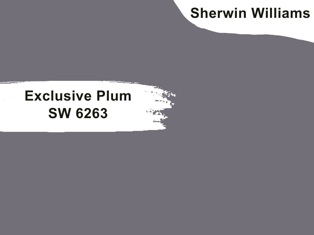
| RGB | 116 111 120 |
| LRV | 16.47 |
| Matching colors | Spatial white, dreamy white, emerging taupe |
| Undertones | Violet |
Exclusive Plum is a rich blend of Smokey blue and very pressing violet undertones. It is the less vibrant shade of Fabulous Grape, however, it still stands as a source for a grand entrance which makes this unique purple color a cool front door paint. It has a soft lavender tone with a tinge of blue-gray which makes it a suitable pair for other soft tans and white paints.
This hue has a wonderful balance between cool, blue, and feisty, and it knows just how to balance out the surroundings just fine, this is the reason why it is also suitable to be a front door paint.

21. Sherwin Williams Soar SW 6799
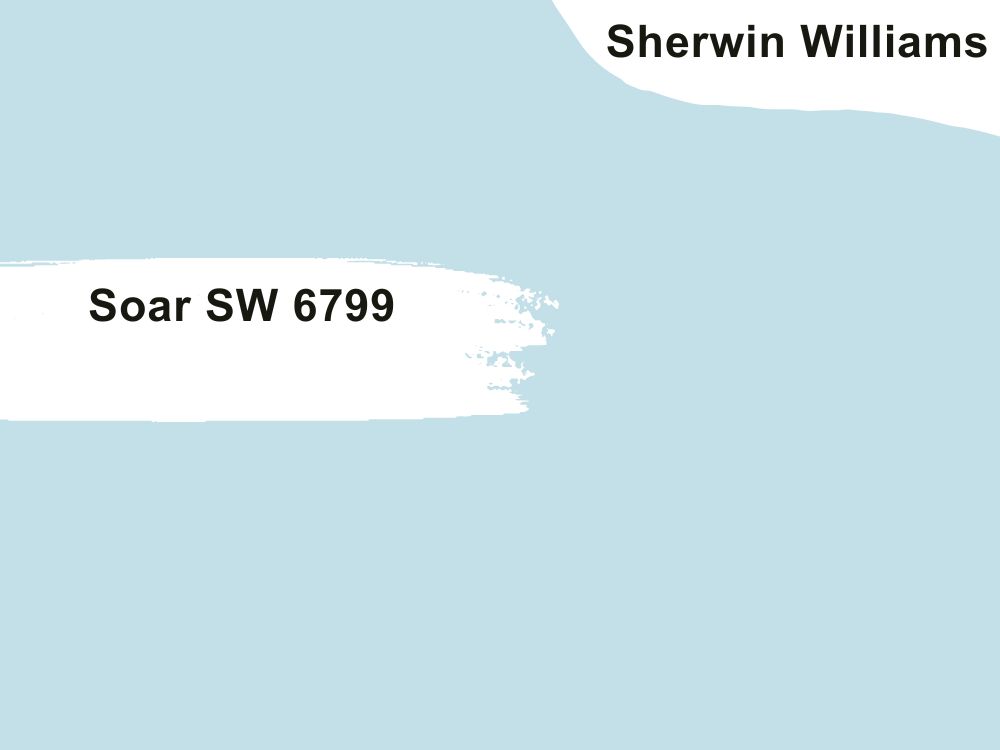
| RGB | 193 223 232 |
| LRV | 70 |
| Matching colors | Extra white, napery, iceberg |
| Undertones | blue |
Soar SW 6799 is a pastel purple paint that appears blue most of the time due to its high content in the RGB value. This color has a high LRV of 70, which can brighten up a space without natural or artificial lighting.
This paint color tends to bring brightness to the exterior of the house when it is being used on the front door. This color will work best for an exterior that needs a touch of brightness or needs revival from its pale-looking self. What it primarily does is to be an attraction catcher and then slowly make other dull-looking colors look better.
22. Sherwin Williams Chatroom SW 6171
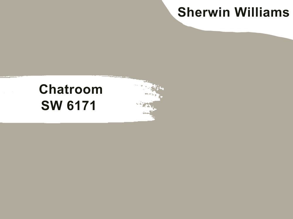
| RGB | 175 171 154 |
| LRV | 40.54 |
| Matching colors | Cajun red, ivoire, modern white |
| Undertones | gray |
This is a soft greige that releases a fine blending of green and yellow without a glitch. This very versatile neutral color is an ideal option for a front door because of its ability to blend into the surroundings and release a very chaotic calmness that provokes the release of a peaceful environment. It has a way of also coordinating okay colors around it to liberate its very beautiful balance.
Best Benjamin Moore Paint Colors For Front Doors
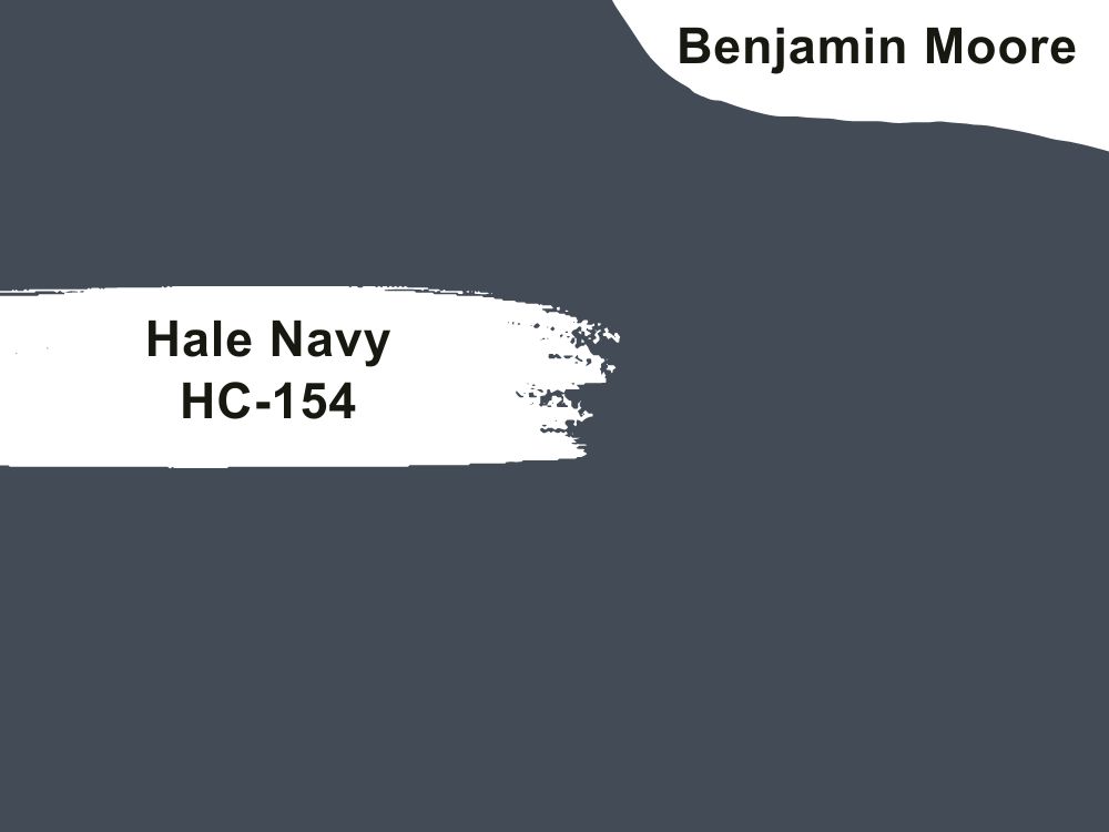
23. Benjamin Moore Hale Navy HC-154
| RGB | 67 76 86 |
| LRV | 8.36 |
| Matching colors | Coventry gray, white dove, glacier white |
| Undertones | Green |
Hale navy is a classic, deep dark navy blue, this iconic shade of warm blue is slightly grayed out and muted, and it is most times considered a neutral dark color because it matches with other colors quite well.
This paint color is an absolutely lovely option for your front doors, especially if the exterior part of your house is covered with lighter shades of paint. This helps to give the entrance of the house a very inviting feeling. The green undertones in hale navy help to spark up a little activity in the deep blue, helping to bring freshness into the mix, but not too much to overpower the iconic, original warmness.
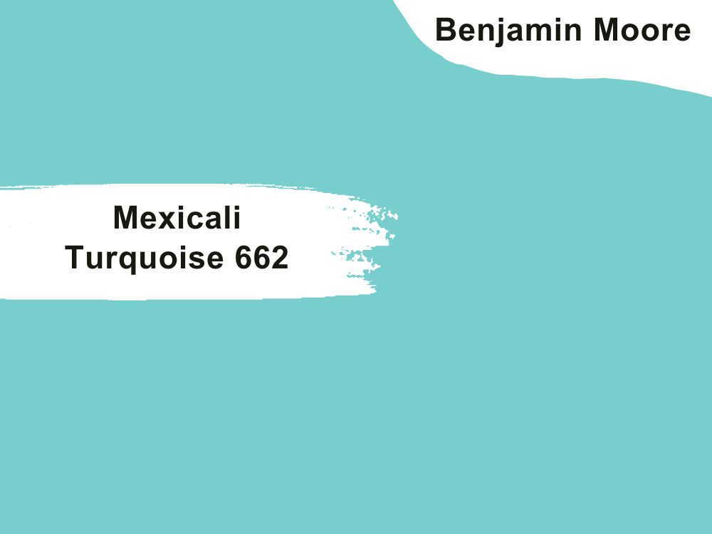
24. Benjamin Moore Mexicali Turquoise 662
| RGB | 125 207 201 |
| LRV | 53.40 |
| Matching colors | White down, north creek brown |
| Undertones | Teal |
This is a shade of blue offering the beach-like feeling, giving your house a happy celebration mood always. This color when applied to your front door helps to blend out surrounding colors, so as to create serenity and calmness like the one you would get on the beach in the evening.
This color also gives your entire house a very cozy welcome to visitors without you having to stress about it, it helps to polish the view and send out a “you can always come again and you are always welcome to our home” when your visitors leave.
25. Benjamin Moore Caliente AF-290
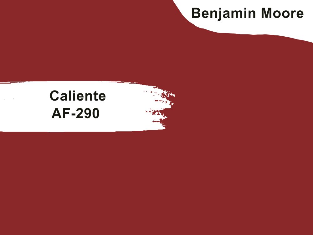
| RGB | 133 41 40 |
| LRV | 8.82 |
| Matching colors | Wish, white diamond, frostine |
| Undertones | brown |
This is a classic shade of red that gives out lots of energy. Caliente is the signature color for anybody seeking to get a modern architectural masterpiece or a powerful first impression on a front door. Caliente gives out the “you are special, hence the red carpet for you to step on”.
Just like the name, it emits the coziest and most exciting type of warmth. The eye-catchy color is one that captivates anybody, not just by its fine color, but also by how well it can match with almost any color because of its versatile nature.
26. Benjamin Moore Newburyport Blue HC-155
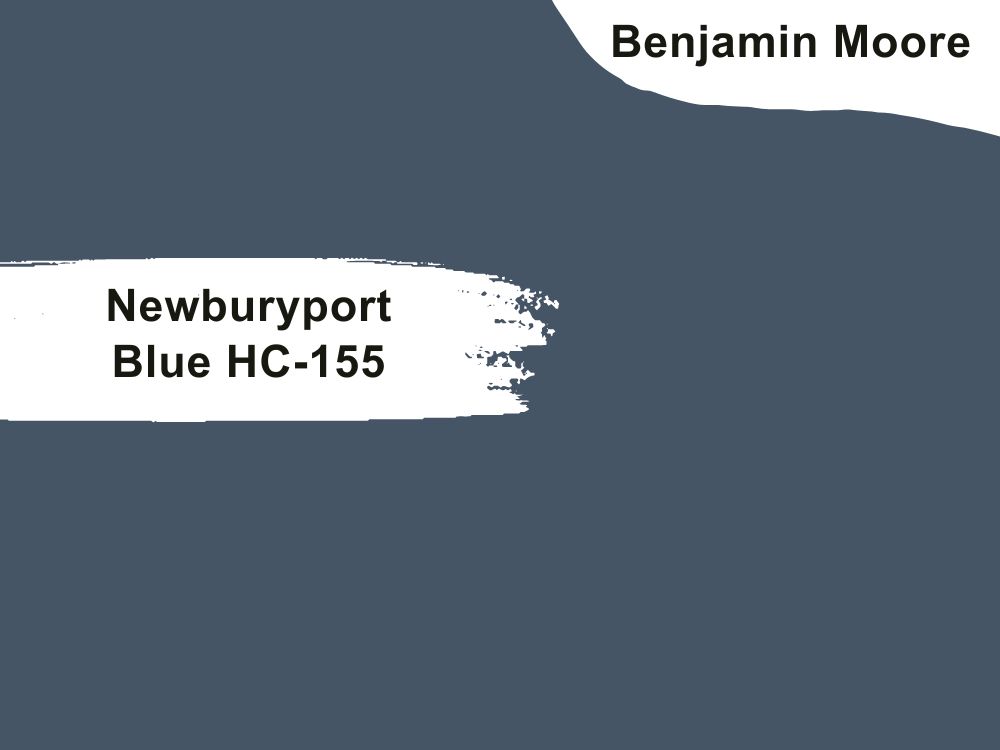
| RGB | 66 87 101 |
| LRV | 10.31 |
| Matching colors | Cotton balls, light pewter, Weston flex |
| Undertones | Slight green |
This is a shade of blue with very pronounced tones yet an overall equilibrium exists between the tones. This is a very interesting color because; though it has a very subtle first appearance, it is quite a very strong shade of blue. It balances on our doors effortlessly, creating an intense deep blue color that is very powerful yet not overpowering to the subtleness of the blue.
This is a pretty damn blue that gives you the ultimate Newburyport vibe and it represents everything nice. This shade of blue on your doors automatically turns your house to a happening place, turning it into a center of attraction in the most gentle and affectionate means possible.
27. Benjamin Moore Wythe BlueHC-143
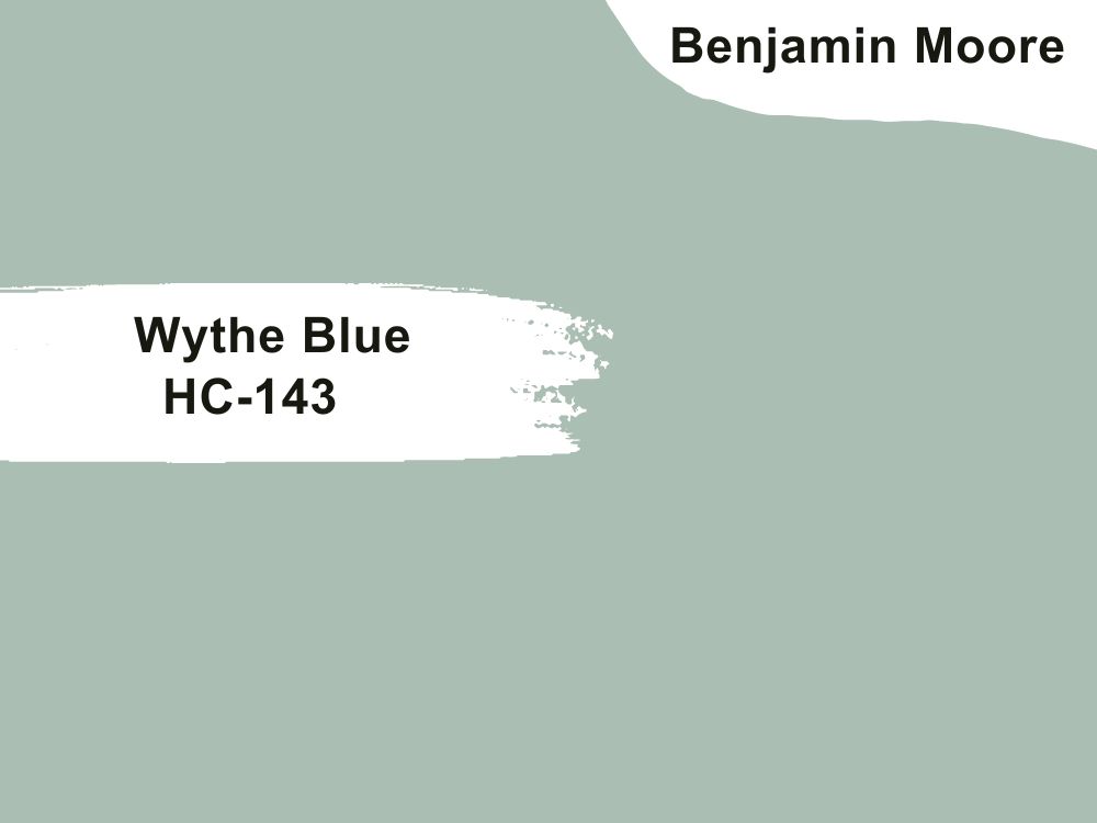
| RGB | 173 188 179 |
| LRV | 48.11 |
| Matching colors | White dove, silver gray, whitall brown |
| Undertones | Blue green |
The “dreamy blue” as it is popularly called by design professionals is a very gentle yet, conspicuously noticeable color with a very striking equilibrium between cool and warm. There is a certain charm this blue-green paint plays – on our brain as well as our doors Bringing in cheerfulness and brightness where it is needed.
This color of paint gives your front door a very homely look and an“I am the center of attraction here vibe altogether”. It is the paint that extends the warmest welcomes to friends, families, and even strangers.
28. Benjamin Moore Mohegan Sage 2138-30
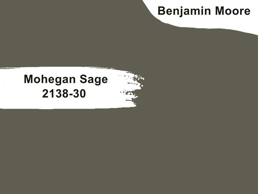
| RGB | 97 93 80 |
| LRV | 12.37 |
| Matching colors | Simply white, snow angel, tea light |
| Undertones | Gold |
This is one the most amazing colors to get for your front doors; it is dark green with gold undertones. This color of paint gives out a very stunning sophistication that cannot be found anywhere else. It gives you a premium VIP welcome from the moment your eye meets it.
This shade of hue makes it possible to give your house a very expensive look without trying too hard. It also helps to look very loveable without you having so many activities going on at the same time. To crown it all, with this color on your doors, it makes your house feel very much like a home to always be at and not just a building you live in.
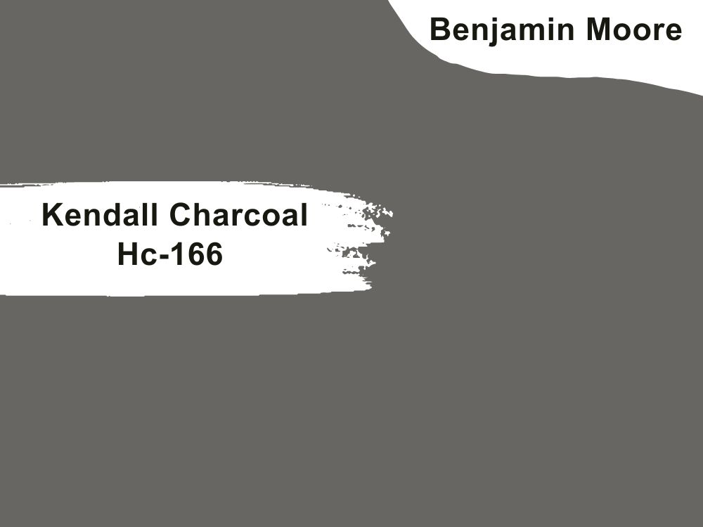
29. Benjamin Moore Kendall Charcoal Hc-166
| RGB | 104 102 98 |
| LRV | 14.61 |
| Matching colors | Simply white, harbor haze, snow white |
| Undertones | Green |
Kendall charcoal is a pretty, very dark, neutral color that is rich, deep, and luxurious.
This versatile color pops up very beautifully on front doors when applied, creating a very irresistible sensation. You don’t need to struggle with getting your exteriors looking coordinated in color or classy; all that you need is Kendall charcoal on your front door.
Its warm undertones give it the ability to coordinate other colors around it and give your house a touch of luxury and class without losing its stability. Kendall Charcoal balances effortlessly between dark gray and almost black.”
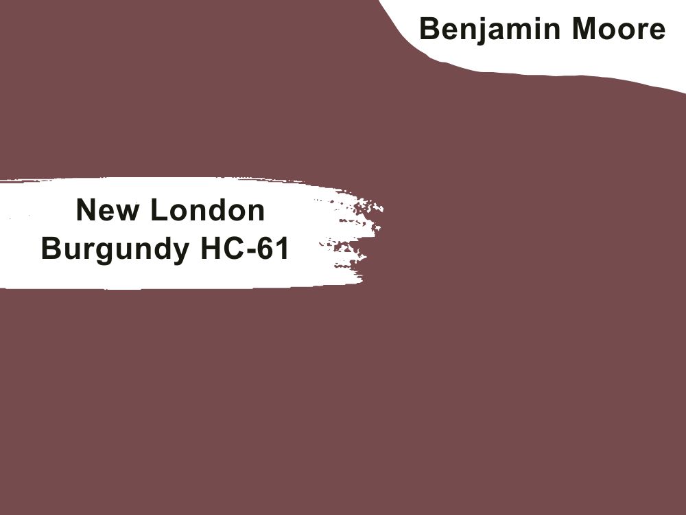
30. Benjamin Moore New London Burgundy HC-61
| RGB | 115 75 78 |
| LRV | 9.82 |
| Matching colors | Alabaster, sea pearl, Chantilly lace |
| Undertones | Violet |
Burgundy doors make quite a statement, and new London Burgundy is definitely one of those that make a very loud statement. It is made of beautiful red and very pretty purple undertones.
This classic color presents a rich and welcoming atmosphere. Making you always want to be back home when you go out. The sight of this color on your doors is a souvenir your guest and visitors won’t mind taking home with them
31. Benjamin Moore Blue Spa 2052-40
| RGB | 78 160 160 |
| LRV | 29.33 |
| Matching colors | Distant gray, pure white, white heron |
| Undertones | Green |
This is a deep shade of blue that has a tint of turquoise in it giving us the Caribbean beachy vibe. This shade of blue is very airy, carrying a sense of tranquility, and that is exactly what it does when it is applied on our front doors, it brings a sense of peace and tranquility, further making the surroundings carry a sense of calmness and hospitality. This shade is definitely one that will make you fall wholeheartedly in love with the exterior part of your home.
32. Benjamin Moore Midnight Navy 2067-10
| RGB | 2067-10 |
| LRV | 5.44 |
| Matching colors | Full moon, cloud cover |
| Undertones | Violet |
This is a dark beguiling blue fused with deep and very pronounced violet undertones. This color gives the peaceful feeling of a distant slimmer of light on a still ocean at night. This color works perfectly for coordinating and inculcating a peaceful and serene environment.
This color’s flexibility allows you to be creative with colors while maintaining balance and stability. Unmoved! This rare stability between colors is what makes your house a very important point of attraction.

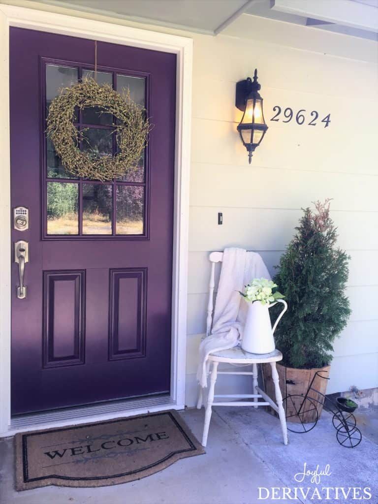
33. Benjamin Moore Gentle Violet 2071-20
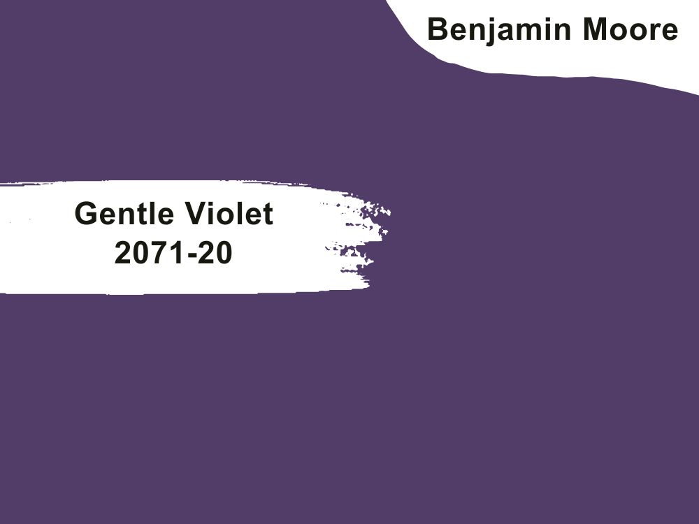
| RGB | 78 64 105 |
| LRV | 7.43 |
| Matching colors | Alpine white, violet sparkle |
| Undertones | Blue |
This is a dark, rich amethyst shade of purple that is breathtaking and absolutely gorgeous. Despite its deep color, this color is still very much soft and alluring. This paint immediately grabs you and screams welcome to my home at first glance. This shade of violet is one that steals the heart of everyone and you can simply say it is very accommodating.
A gentle violet graces your front doors in a manner that it becomes the favorite feature of everyone that comes to your home. Having gentle violet on your front door is a bold step everyone should take and definitely one you won’t regret.
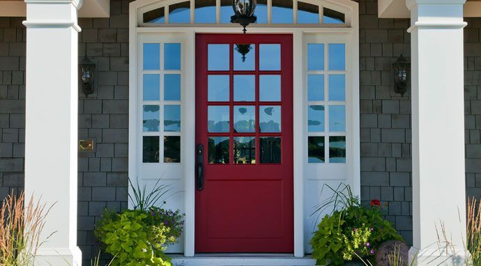
34. Benjamin Moore Pomegranate AF-295
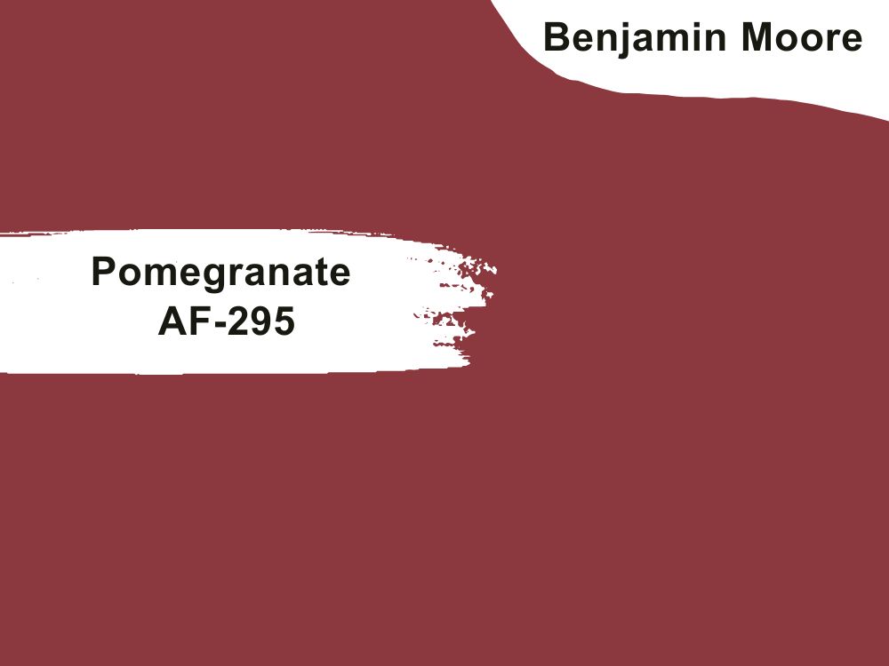
| RGB | 134 57 62 |
| LRV | 10.14 |
| Matching colors | Deep in thought, sparrow, Arizona tan |
| Undertones | Orange |
This is you can’t go wrong with me for your front door red. It’s a timeless color that never goes out of style. This color beautifully showcases itself, grabbing all the attention and compliments it can get in the world and bringing it to your doorstep, while it screams a welcoming and accommodating aura back as a response to the compliments. This red is not too red and it is also not to brick, it is just warm and inviting and perfect for your front doors
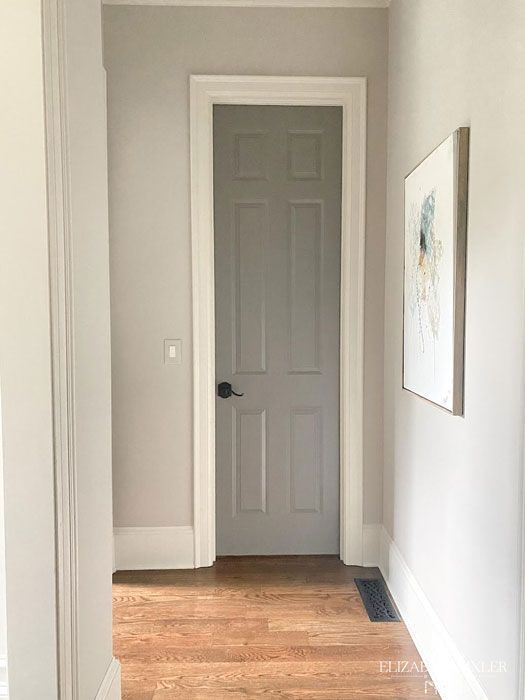
35. Benjamin Moore Revere Pewter HC172
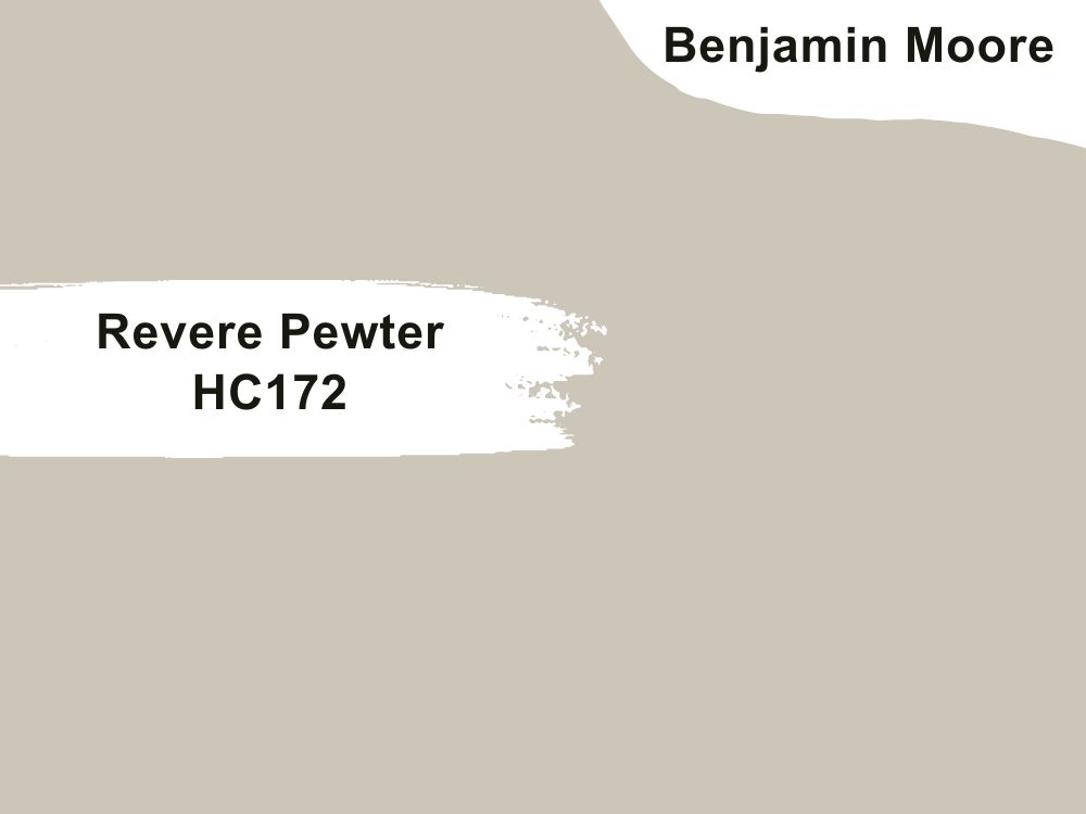
| RGB | 204 196 184 |
| LRV | 55.98 |
| Matching colors | Offwhite, whitedover |
| Undertones | Violet |
This color is not a neutral color, but it blends well with almost every color and works well for every kind of door. This shade is made up of green, gray, and violet undertones.
The gray helps the green not to be too vibrant, hence creating a greenish-gray color, while the violet undertones help the greenish-gray color not to be too dull.
When applied on your doors, This together creates a consistency of perfectly allying colors that give a warm fuzzy shade of goodness and a very inviting shade of color.
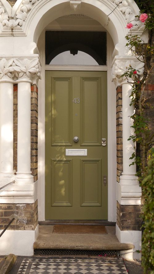
36. Benjamin Moore Agave AF-420
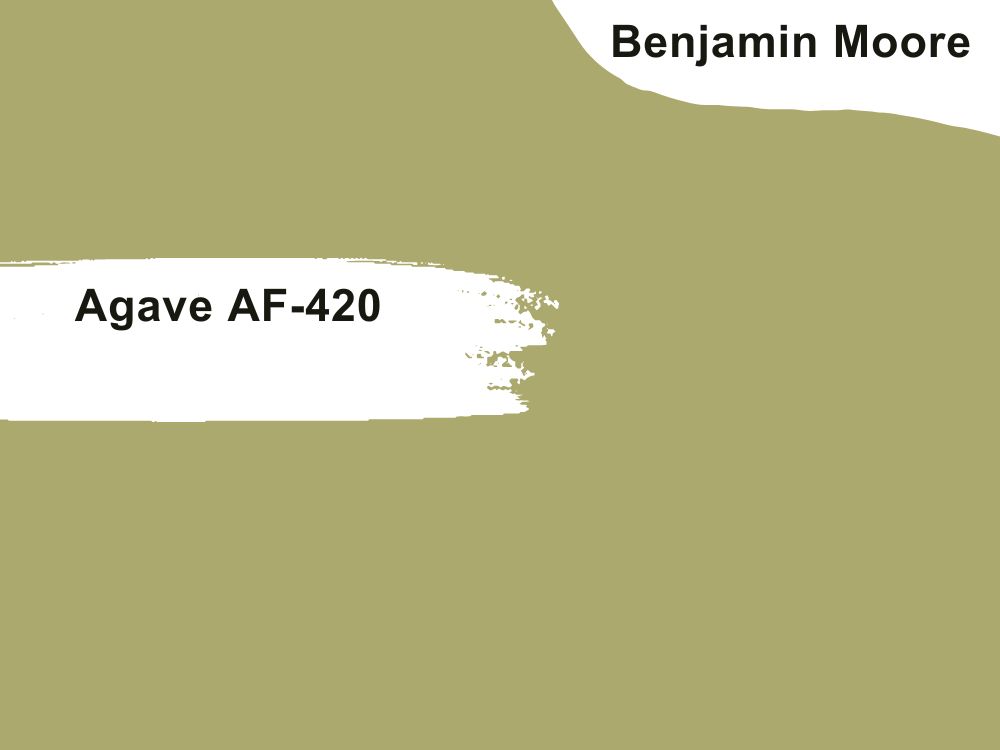
| RGB | 176 165 109 |
| LRV | 37.32 |
| Matching colors | Frostine, boreal forest, |
| Undertones | Beige |
This is a color with warm undertones that releases a calming comfort, it releases a different kind of warmth far from all the other warm yellow-green colors. It is one of the bold colors that stand out among many colors, creating serenity and a friendly atmosphere. Agave has a very contagious spirit and tends to spread that goodness everywhere it touches, bringing activity and good energy not just to the walls and trims but also to the entire exterior.
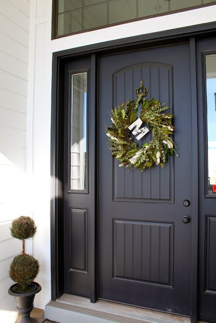
37. Benjamin Moore Jet Black 2120-10
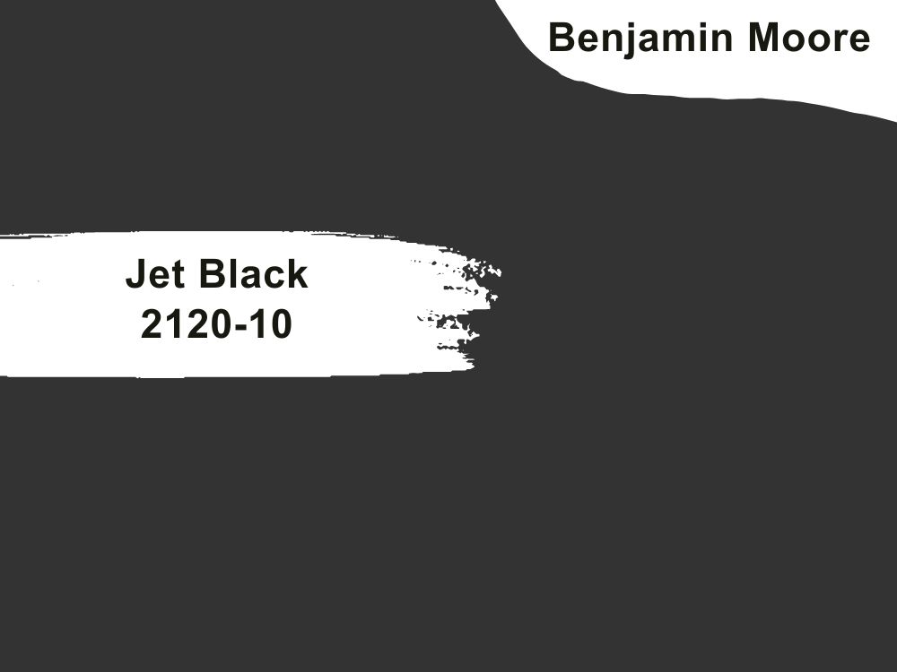
| RGB | 50 50 50 |
| LRV | 4.71 |
| Matching colors | Chantilly lace, pale avocado, cloud white |
| Undertones | Blue |
Jet black Is a color that will never go out of style. This color is one that commands respect and attention from every angle, though it may look like a common color, it has an aura around it that still makes people sit and stare at such wonder.
This color works for almost every type of door including giant double doors. And it creates an environment with a sense of security and protection. Jet black isn’t disturbed by weather or seasons, it manages to maintain stability and beauty all year round.
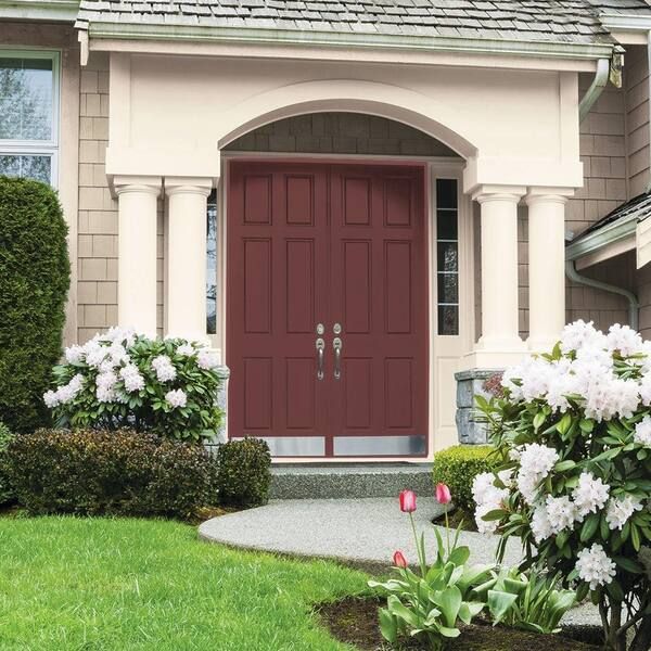
38. Benjamin Moore Sundried Tomato CC-62
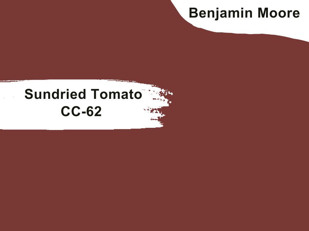
| RGB | 117 57 52 |
| LRV | 8.25 |
| Matching colors | White down, white opulence, early sunset |
| Undertones | Brown |
This is a rich, earthy shade of red that is very captivating and demands attention in the most soothing ways. It can also manifest in another way as a beautiful color that commands respect and attention.
This color is very powerful and at the same time very soft, it is not a neutral color but it coordinates and blends with almost every shade releasing a very balanced and Iconic invitation.
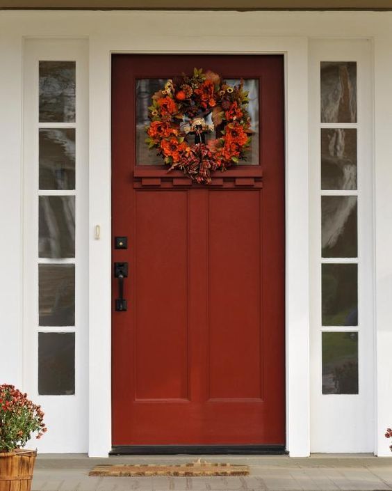
39. Benjamin Moore Shy Cherry 2007-20
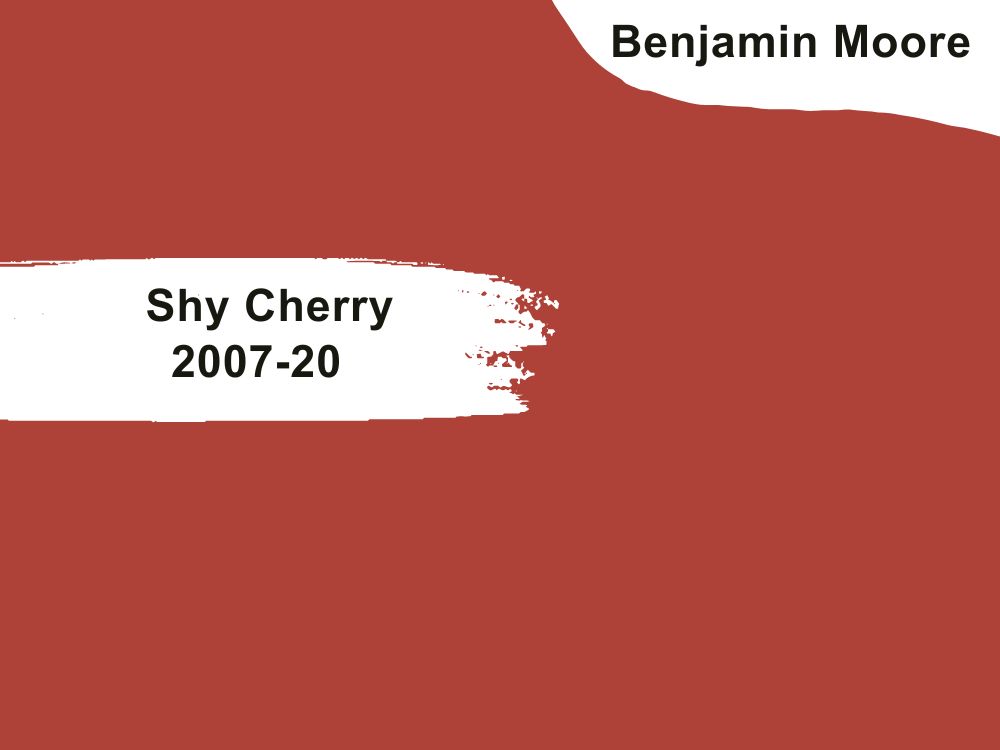
| RGB | 169 65 57 |
| LRV | 13.68 |
| Matching colors | Whitewater bay, vapor, fossil |
| Undertones | Brown |
This is a shade of color obtained from the mixture of orange and red. It is a very beautiful, bold, and bright choice for a front door but definitely one you won’t regret making. This paint color emits warmth and energy. When used on a front door, it creates coziness and a comfortable feeling.
This color also brightens up the environment or surrounding, making the entire exterior come to life in a special kind of way. This color usually helps to create a connection with the house and its surroundings.
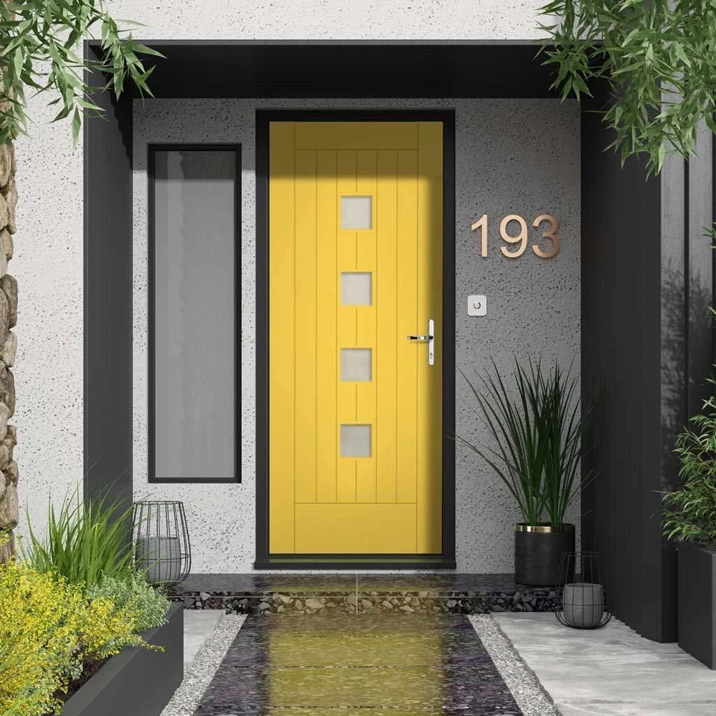
40. Benjamin Moore Yellow Hibiscus 357
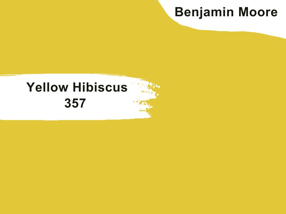
| RGB | 230 189 59 |
| LRV | 53.67 |
| Matching colors | Simply white, cotton balls |
| Undertones | Peach |
Modern, contemporary, futuristic, perfect, and home is the vibe this color emits.
How can a color be so effortlessly beautiful and not be noticed? This is one of the rare colors that do not demand attention but gains it in manifold, this fine-looking color is one that doesn’t even need a spotlight to shine because it is the spotlight itself.
Yellow Hibiscus is a color that lifts up your mood from an instant zero to a hundred, without even taking you to a therapist. When applied on your front door, it instantly sends its cheerful beam to every dark corner in the surrounding area.
41. Benjamin Moore Charcoal Linen 2133-40
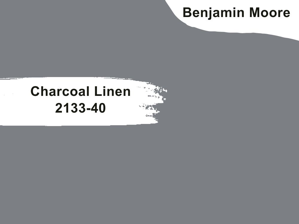
| RGB | 125 127 133 |
| LRV | 21.25 |
| Matching colors | Smoked oyster, elephant gray |
| Undertones | blue |
This is a sophisticated shade of gray with blue undertones, this shade gray unlike other grays, clouds itself with majesty in a very gentle and calm manner. This very gentle dull looking color however, when applied on front doors, makes a very very loud statement that screams luxury and every peng, it has a contagious softness that it spreads across the surroundings and somehow makes your entire exterior look very organized by just being the color of your front door.
42. Benjamin Moore Ocean City Blue 718
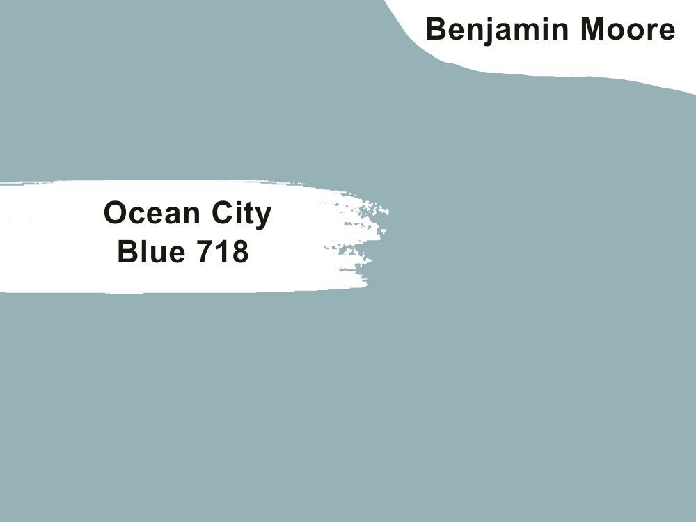
| RGB | 152 179 181 |
| LRV | 42.36 |
| Matching colors | Simply white, peach mebla |
| Undertones | Beige |
This is a very warm shade of blue with beige undertones, this color is one that emits a very subtle warmth, that makes you always want to come back for more. The beige undertones help to keep the blue from being too stale and it gives the blue a very interesting texture. When ocean city blue is applied on your front doors, it gives out the serenity that only comes when you sit at the beach. So your entire exterior has a calmness and peace that people travel for miles to get.

43. Benjamin Moore Wild Flower 2090-40
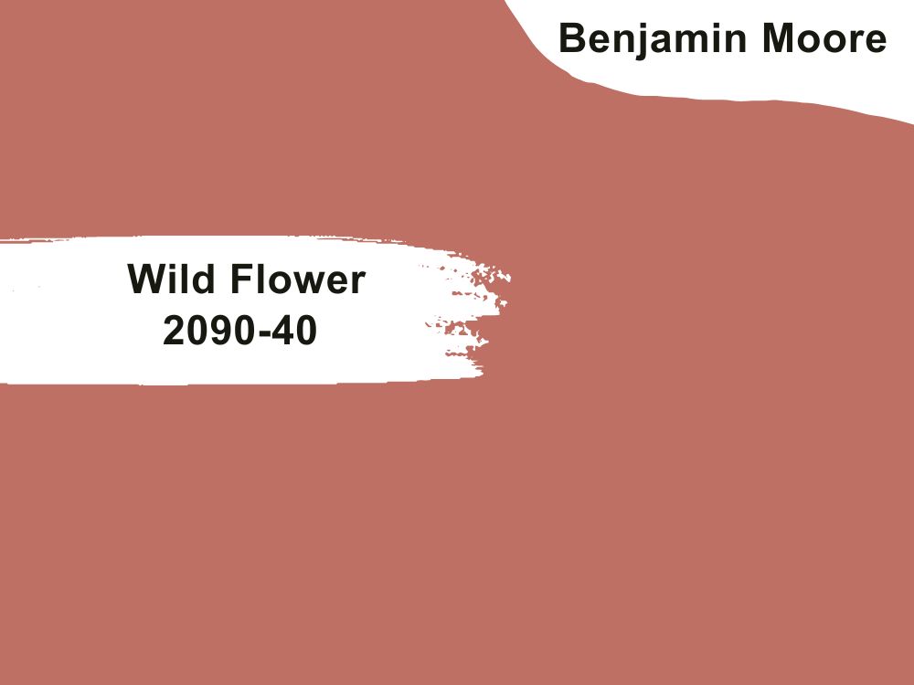
| RGB | 187 111 102 |
| LRV | 24.33 |
| Matching colors | Straw, steam |
| Undertone | Orange |
This is definitely one of the most beautiful shades of red you will find anywhere. This color is a mixture of pink, orange, and red. This read is the definition of ultimate balance and tranquility.
The three colors that make up this color find a way to blend into each other without overshadowing or taking the place of another. This paint when applied on your front door, gives your house an overall welcoming feeling and a certain wave of peacefulness.

44. Benjamin Moore Sangria 2006-20
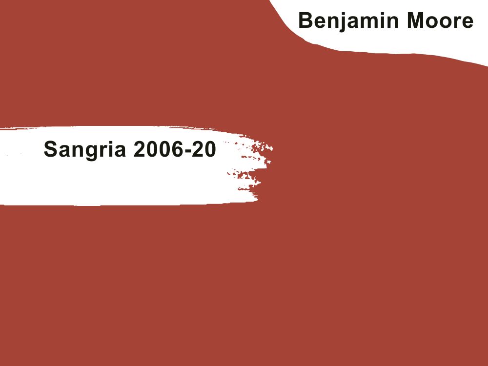
| RGB | 160 65 53 |
| LRV | 11.47 |
| Matching colors | White diamond, silver half dollar |
| Undertones | Orange |
Sangria is a calm red color with an orange undertone. What this color does is not to only remind you of fall, but to bring it right to your doorstep. For people who love the feeling of fall, this color will be the deal breaker for them.
Furthermore, this paint also carries a special kind of warmth that only it can provide, this type of warmth is the one that makes you want to come home to the welcoming arms of your front door on a cold winter evening. The flexibility this color carries, allows it to be a very good choice for front doors.
45. Benjamin Moore Heritage Red HC-181
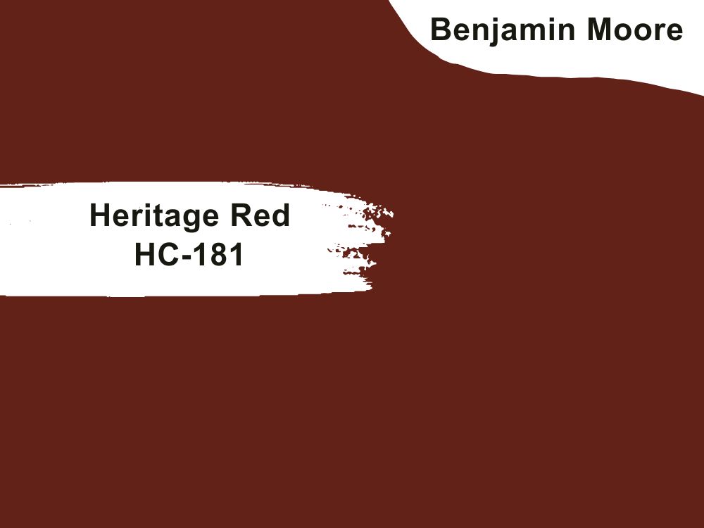
| RGB | 99 34 24 |
| LRV | 10.26 |
| Matching colors | Flient, Ashley gray |
| Undertones | Orange |
If you are looking for a can’t go wrong color, I Will recommend you go with Heritage red. This very loud statement maker is one that carries itself with so much worth, prestige, and personality. This is a color that will definitely get the neighbors talking.
It carries a beautiful aura with it that when applied on your front door, immediately affects the rest of the surroundings.
46. Benjamin Moore Coventry Gray HC-169
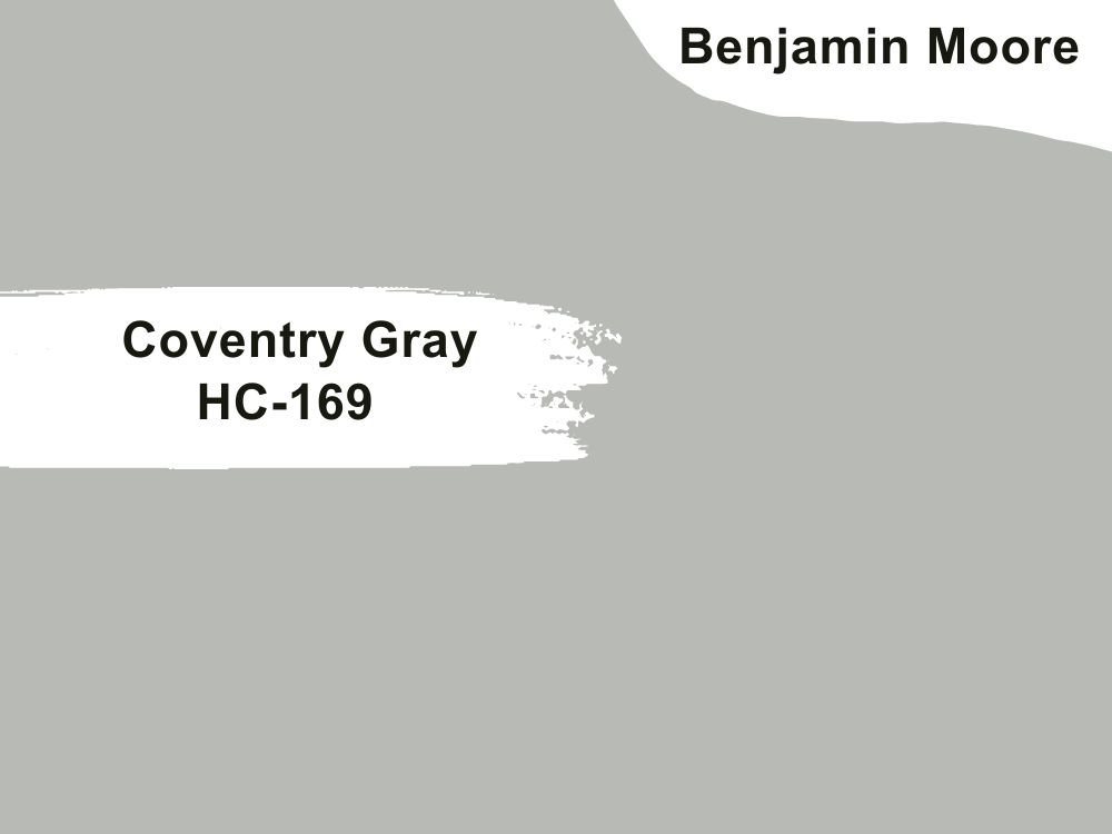
| RGB | 184 186 182 |
| LRV | 48.18 |
| Matching colors | Steam, temptation. |
| Undertones | Neutral |
Conventory gray is a warm medium shade of gray with neutral undertones. It fits perfectly for front doors because of its versatile nature. This characteristic helps it to be able to blend well in the surrounding and also with colors placed around it. Conventory gray is one of the colors that makes your front door look very stable, soft, and luxurious.
Conclusion
Your front door is the first impression anybody gets about your home and by extension about you. Do not let your front door remain with that boring color, spice it up, and do something out of your comfort zone, it might turn out to be a life changing move.
 10 Best Sherwin Williams Dark Gray Paint Colors (Trend 2023)
 17 Best Sherwin-Williams Green Gray Paints (Trend 2023)
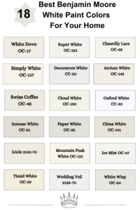 18 Best Benjamin Moore White Paint Colors For Your Home
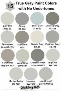 15 True Gray Paint Colors with No Undertones
 11 Best Gray Paint Colors with Purple Undertones
 13 Best Gray Paint Colors to Match Your Beige House
