
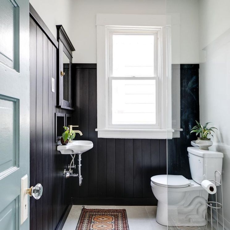
You no longer have to shy away from your dark rooms. Not every room in your house will have the same level of natural light and ventilation to be adequately lighted, but that’s a situation you can manage by applying suitable, high-quality colors to brighten your dark rooms.
Aside from making the room come alive and comfortable, the right paint colors make your home look more elegant. They can be the difference between a house with a welcoming atmosphere and one that seems haunted. That said, what should you look out for when choosing a paint color for a dark room?
Table of Contents
3 Things to Look Out for When Choosing a Paint Color for a Dark Room
Your dark rooms can serve all the purposes you want them to serve, even with the little amount of natural light they get, but you should consider some factors before settling for any color:
Function
What’s the function of the dark room you want to paint? Bedroom, Playroom, Study, or Guest Room? The function determines the color you’ll go for. For instance, if you want to use the room as a bedroom, consider cool colors that enhance relaxation, such as blue, gray, muted green, white, cream, etc. If the room will be a playroom, colors such as yellow, purple, and red are best suited. Remember, color psychologically affects the mind and body, and maximizing this connection helps you enjoy using the room.
Temperature
The temperature of the room also matters. If the dark room is naturally hot, you should go for lighter colors and vice versa. Asides weather conditions, color also contributes a lot to a room’s temperature. For example, dark colors absorb heat while light hues reflect it. That means the room will be warmer if you use a dark color and cooler if you use lighter colors. Switching this combination can make a warm room hotter and a cool room colder.
Balance
Lastly, create a balance. Using a dark color might establish a gloomy atmosphere, and too much light color can make everything seem flat. However, the best thing to do is to mix soft colors with bright hues. Asides the visual interest color balance establishes, it also highlights other statement pieces in the room, thereby making it easier to appreciate the room’s beauty better.
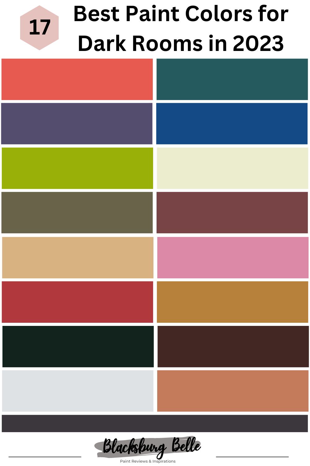
17 Best Paint Colors for Dark Rooms
1. Benjamin Moore Dark Salmon 2009-30
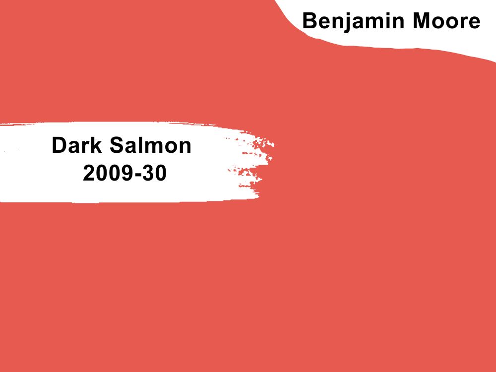
| RGB | 224 90 80 |
| LRV | 24.87% |
| Undertones | Pink, orange, red, peach |
| Matching colors | Cotton Balls OC-122, Peach Parfait 2175-70, Cloud White OC-130, White Sand OC-10 |
Research shows that dark salmon represents vigor, health, and resilience, beautiful qualities you can evoke in your home. It creates a friendly and cozy atmosphere, making it suitable for rooms such as the bedroom, study, etc.
It has a wide range of complementary colors due to its orange and pink undertones. For instance, you can pair the Dark Salmon 2009-30 with neutrals such as white and beige, shades of green, orange, or yellow, and contrasting colors such as blue.
For a more sophisticated look, you can combine this color with navy. If you want a less-obvious appearance, try blending this color with lighter shades of blue, and for a bold statement, purple and dark salmon will do. Additionally, dark salmon is a coastal-inspired color, so if you love the beach, it’s a perfect option. 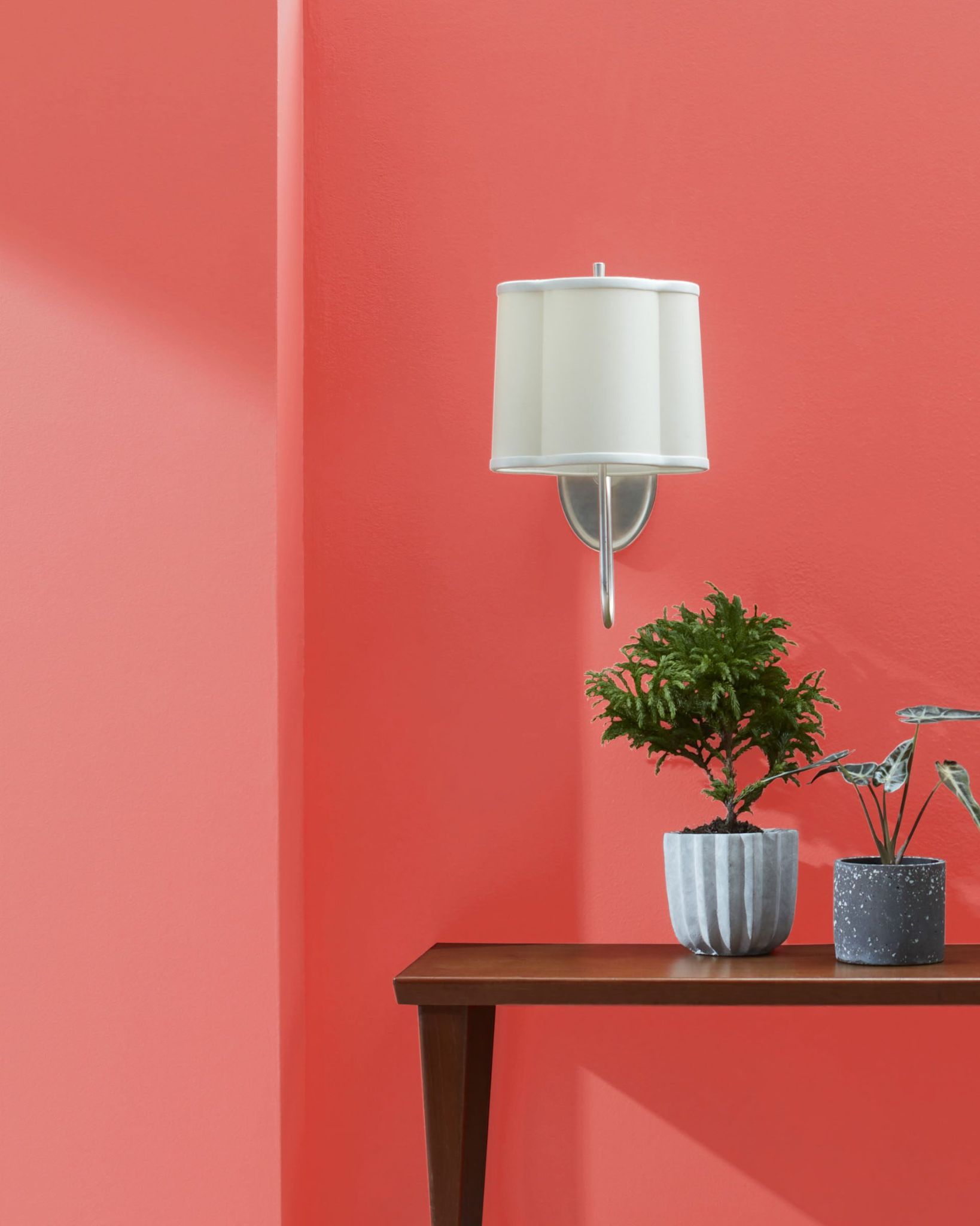
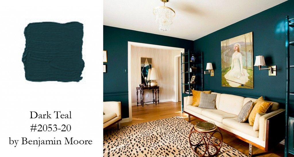
2. Benjamin Moore Dark Teal 2053-20
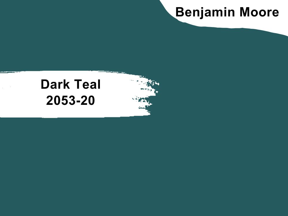
| RGB | 37 90 94 |
| LRV | 10.12 % |
| Undertones | Blue, green, gray |
| Matching colors | Winter White OC-21, Silver Cloud 2129-70, White Dove OC-17, Vapor Trails 1556 |
If you want a soothing and stimulating atmosphere in your home, the Benjamin Moore Dark teal 2053-20 is your best bet. Besides applying it on the wall as an accent color, it can also serve as a carpet for your floors. Dark teal can be combined with black to create a classy environment, or gold if you want your room to look luxurious.
On the other hand, colors like blue and bright yellow are a little too much for teal, so you want to stay away from them. If you must use yellow at all, go for a soft shade of yellow. Other complementary colors include white, cream, pink, silver, and coral. Ensure they are used in the right quantities not to reduce the teal color’s cooling effect.
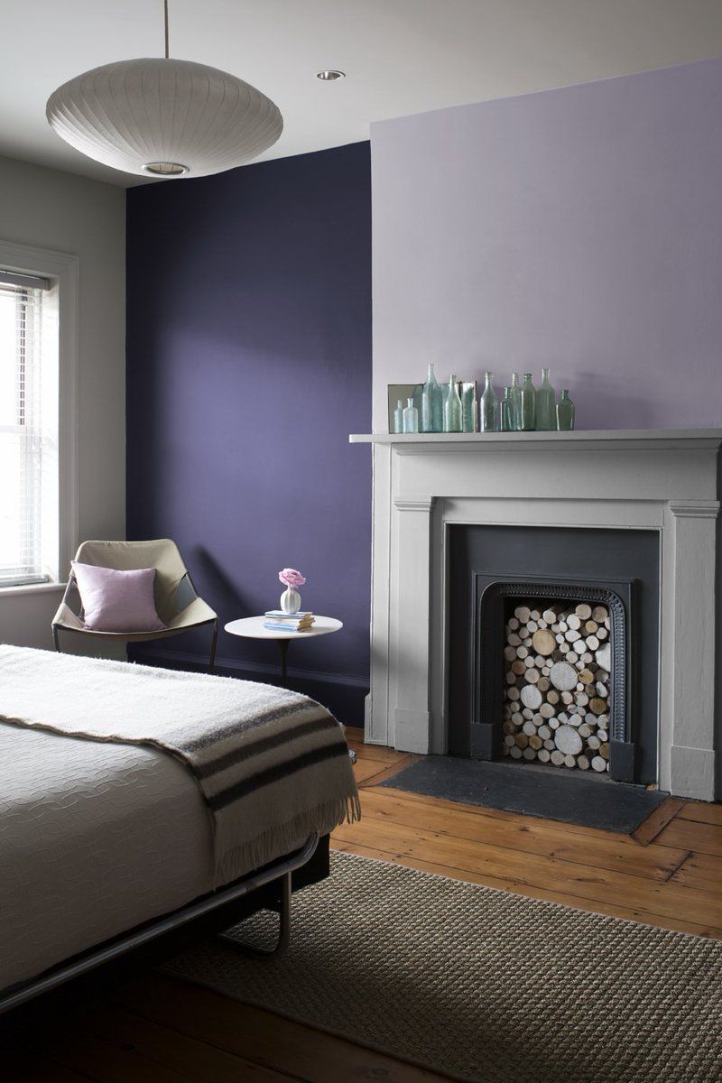
3. Benjamin Moore Dark Lilac 2070-30
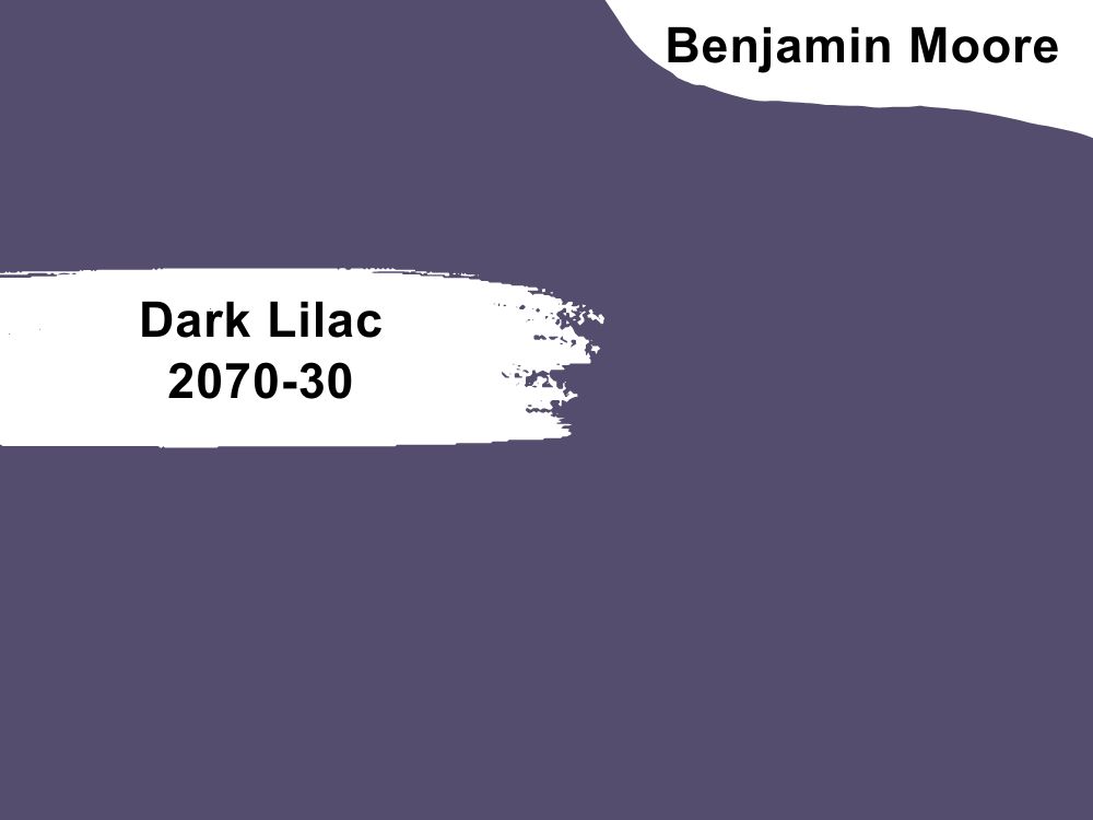
| RGB | 84 77 109 |
| LRV | 10. 44% |
| Undertones | Purple, violet |
| Matching colors | Mountain Peak White OC-121, Linen Sand 2151-60, White Christmas 872, Oyster Shell 864 |
It can be quite difficult to get the right combination pattern for lilacs as it’s not common among homeowners, especially if you don’t want to use neutrals, but the Benjamin Moore Dark Lilac 2070-30 won’t give you any trouble! It is stylish yet subtle, making blending well with many colors easier.
Its purple and violet undertones make it look ultra-modern anywhere it is used, whether in the bathroom, guest room, or entertainment area. It can also serve as the foundation color for your decor as long as you combine it with the right colors. If you want it to make a statement in your dark room, ensure you use it all over.
Pair this color with lemon yellow, dark green, or orange for a pleasant visual contrast. In short, now’s the best time to use the Dark Lilac 2070-30 as it’s poised to become a big trend in the industry soon.
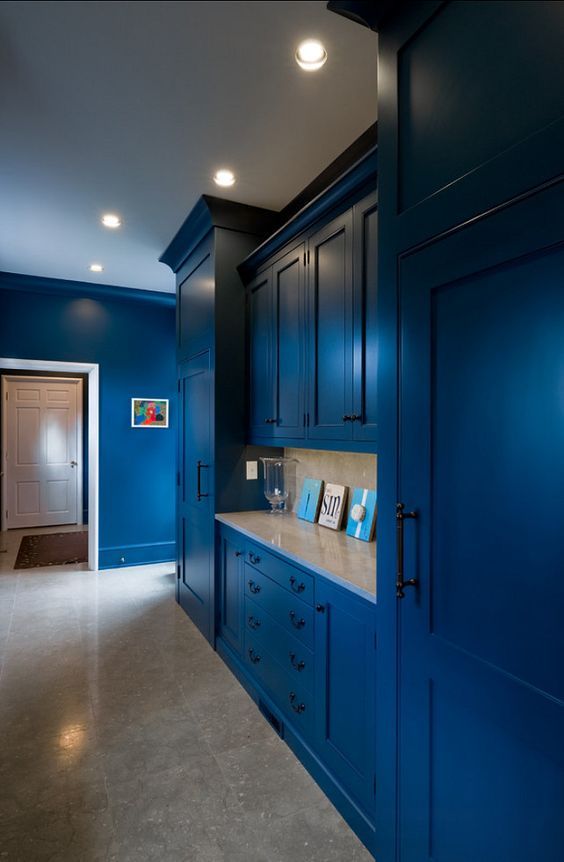
4. Benjamin Moore Dark Royal Blue 2065-20
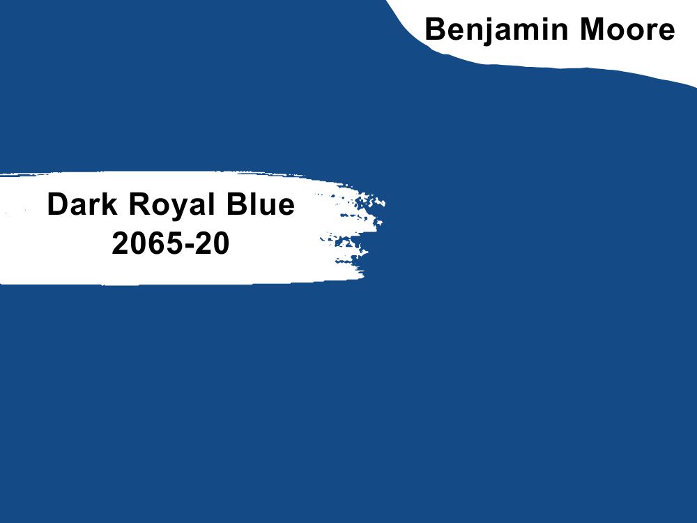
| RGB | 0 84 132 |
| LRV | 9.25 % |
| Undertones | Purple, off-white, white, cream |
| Matching colors | Winter White OC-21, Moonshine 2140-60, White Heron OC-57, Under the Big Top 1675 |
Research shows that blue is one of the most popular favorites of people across the globe, and the reason for this isn’t far-fetched. First, blue translates to tranquility and stability. It immediately creates a sense of calmness wherever it is used. Also, it is the color of the sky, making it a favorite color for those who love being outdoors.
It’s suitable for rooms meant for relaxation or productivity and creativity. If you want your room to pop, pair the Dark Royal Blue 2065-20 with red-orange. This combination is easy on the eyes but makes the room interesting. Wood hues like caramel and mahogany can be combined with dark royal blue to counterbalance. If you want a royal look, royal blue, and amethyst purple will give you exactly what you want!
5. Benjamin Moore Dark Lime 2027-10
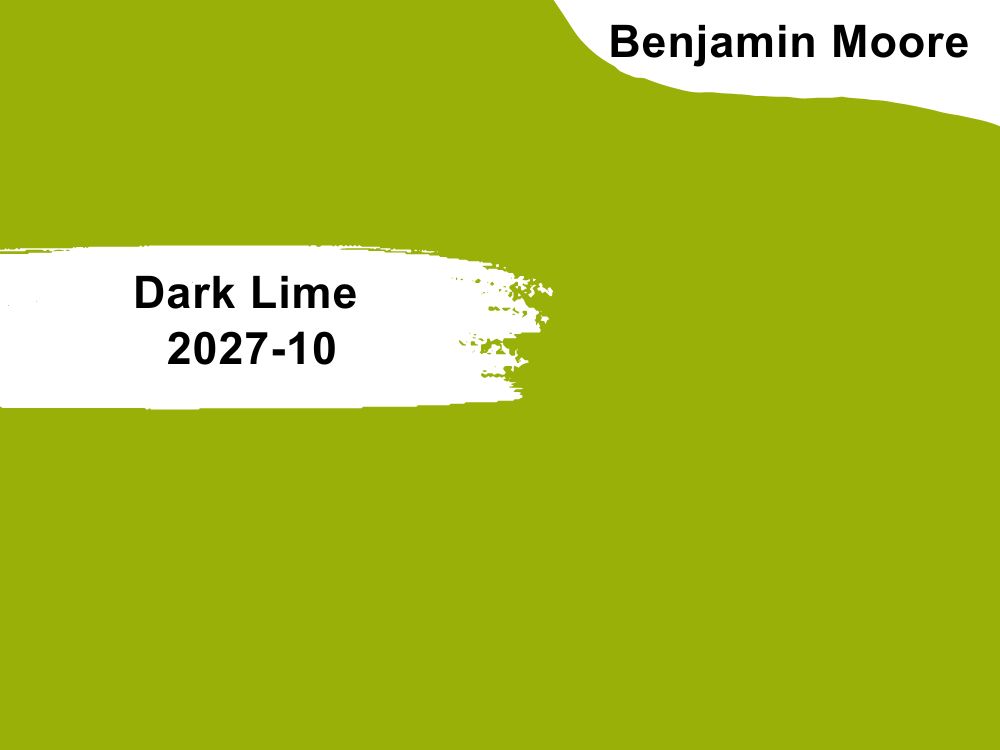
| RGB | 164 166 6 |
| LRV | 37.3 |
| Undertones | Yellow, green |
| Matching colors | Snow White OC-66, Dark Pewter 2122-10, White Chocolate OC-127, Tarrytown Green HC-134 |
If you are big on spiritual symbolism, the Benjamin Moore Dark Lime 2027-10 is a great choice. Its yellow and green undertones symbolize the heart and the mind, respectively. Also, it’s used to evoke feelings of high spiritual energy and prosperity.
The dark lime color is among the colors of nature, making it highly representative of growth and newness. It’s creative and clear and best suited for a room with a moderate amount of natural light and ventilation. Since dark lime is a delicate color, you have to be careful with the colors you pair it with.
You can use similar shades such as seafoam green, dark green, and neon green, neutrals like tan and white, or contrasting colors such as hot pink, Fuschia, silver, black, yellow, etc. However you use it, it always comes out stunning.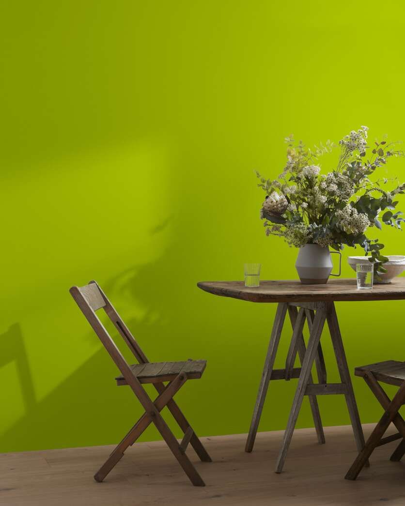
6. Benjamin Moore Dark Linen 2147-60
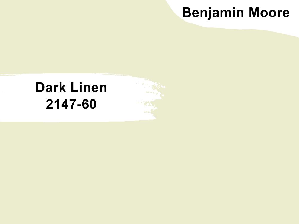
| RGB | 236 236 207 |
| LRV | 80.2% |
| Undertones | Yellow, green, white |
| Matching colors | Hibiscus 2027-50, Bison Brown 2113-30, Chantilly Lace OC-65, Yukon Sky 1439 |
The Benjamin Moore Dark Linen 2147-60 is a light color that protects against ultraviolet rays. This generational favorite has succeeded in being one of the favorites for classy homes. It has a luxurious feel, despite its soft appearance. Furthermore, it has health benefits as it absorbs moisture and resists bacteria.
It’s a great companion for anyone allergic to anything, has sensitive skin, or has a special health condition. Besides its health benefits, the Dark Linen 2147-60 repels dirt, making it more durable than most of its counterparts. You can pair this breathtaking color with shades of red, green, yellow, blue, black, etc. Beige and tan are the most befitting if you opt for neutrals. Lastly, ensure a balanced look no matter the color you pair dark linen with.
7. Benjamin Moore Turtle Green 2142-20
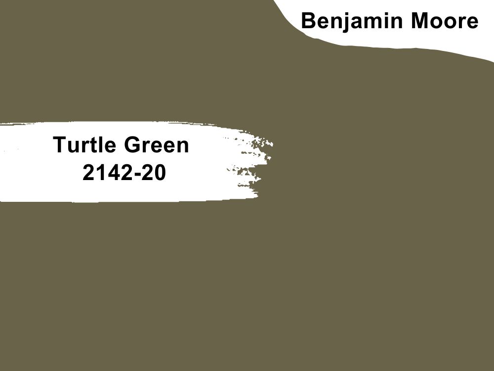
| RGB | 107 97 72 |
| LRV | 12.88 |
| Undertones | Gray, olive green |
| Matching colors | Moonlight White OC-125, Old Prairie 2143-50, Swiss Coffee OC-45, Croquet AF-455 |
One prominent quality of the Benjamin Moore Turtle Green 2142-20 is its versatility. It’s not difficult to find a preferred perfect match for the turtle green color. To recreate an outdoor look in your dark room, combine this color with neutrals like gray and vibrant colors like blue, pink, and yellow.
Also, you can use the gray and olive green undertones to build a green color scheme all through. If you want some bold accents in between, mix them with red, white, or coral shades.
For a beach-inspired look, combine it with any shade of white. Asides these modern looks, you can use turtle green to create a weathered, rustic look by pairing it with earthy tones. For instance, you can use rustic hues for the ceiling and apply turtle green on the walls.
8. Benjamin Moore Plum Raisin 2082-20
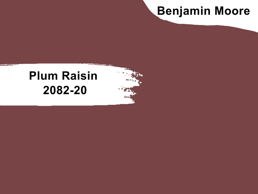
| RGB | 120 68 70 |
| LRV | 9.91 |
| Undertones | Red, violet, black |
| Matching colors | Glacier White OC-37, Sea Froth 2107-60, Cloud Cover OC-25, Sleigh Bells 1480 |
Although the plum raisin color isn’t common, it is easy to coordinate. Besides, it’s highly flexible and can transition into existing decor or serve as the backdrop to a captivating visual appeal. If you use the Benjamin Moore Plum Raisin 2082-20 for the former, black and brown are great fits. You don’t need to change your decor completely to accommodate the plum raisin color, as it easily fits into any decor.
However, you can also create a new decor out of it. For a classy look, combine gold with it. If you want a more elaborate look, silver is your best bet. It’s important to note that all colors don’t necessarily have to be applied to the wall or the ceiling. They can be in the form of other decorative pieces in the room.
9. Benjamin Moore Dark Beige 2165-40
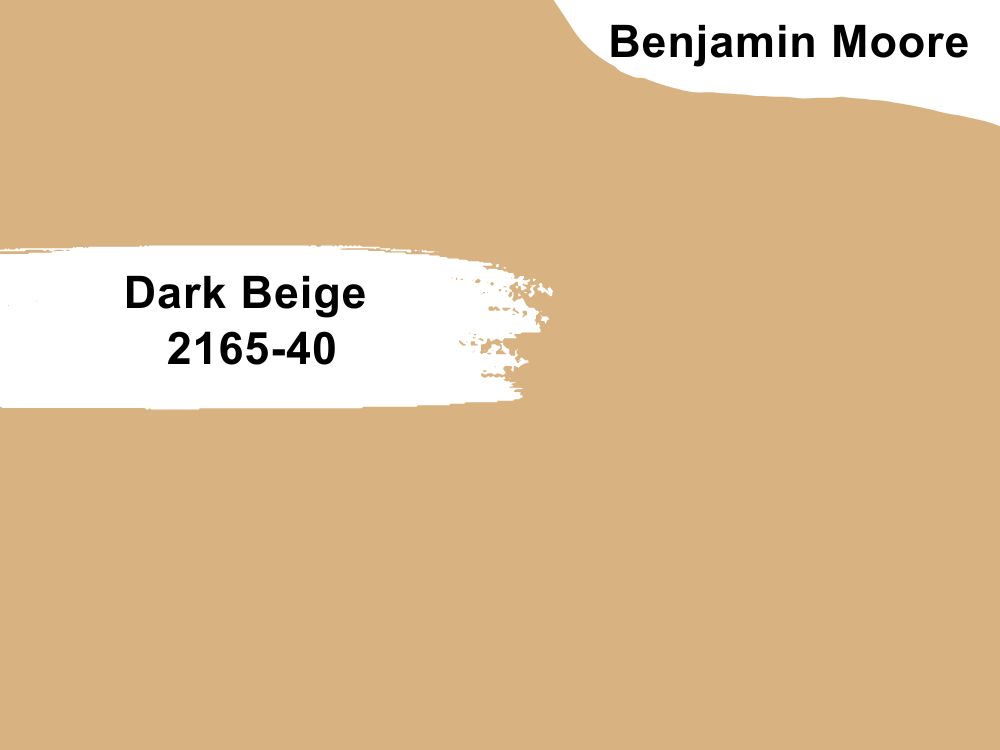
| RGB | 217 174 128 |
| LRV | 46.82 % |
| Undertones | Yellow, orange, peach |
| Matching colors | Simply White OC-117, Butter Pecan 2165-70, Mayonnaise OC-85, Greenfield Pumpkin HC-40 |
Like every neutral hue, beige is easy to color-coordinate. Naturally, on its own, beige seems boring, but you can spice it up with any color. Orange and beige will make your room vibrant. You can apply the orange paint on your wall and break it with furniture or other beige-colored statement pieces.
If you want a gentle and welcoming atmosphere, you can mix this color with a soft shade of pink. If you have statement pieces you want to have detail, combine the dark beige with teal. For an ultra-modern look, pair it with white. In addition, you can mix two or more matching colors to spice up the dark beige. Most importantly, ensure you are creative in your color coordination to achieve your desired look.

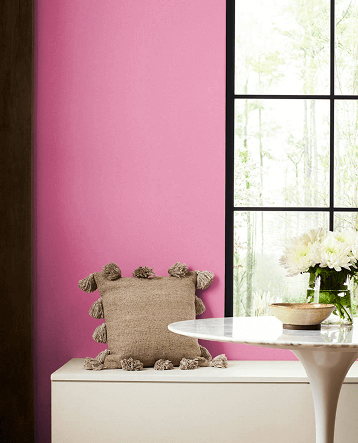
10. Sherwin Williams SW 6850 VIvacious Pink
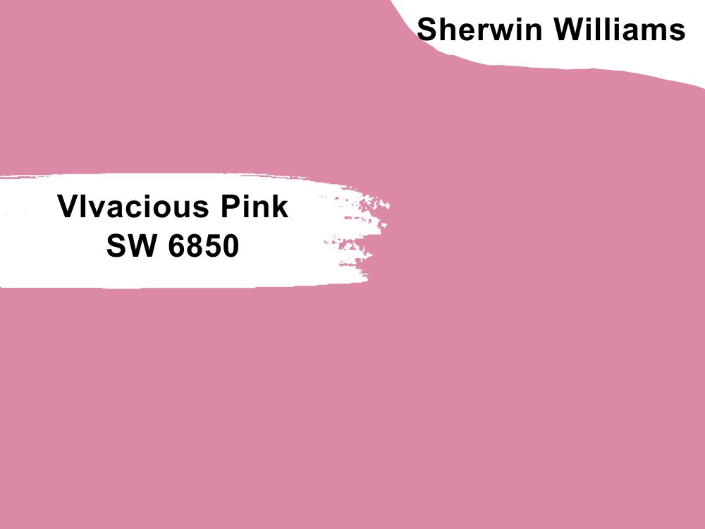
| RGB | 220 137 168 |
| LRV | 36 % |
| Undertones | Orange, red |
| Matching colors | Surprise Amber SW 6654, Honeycomb SW 6375 |
The first thought that probably comes to your mind when you think of pink is that it’s feminine and usually evokes romantic sensations. You are not wrong, but when it comes to home decor, pink is a great color despite its seeming gender representation. You can be more creative with pik -inspired decor by mixing it with more neutral colors.
Besides, due to its feminine significance, many people associate pink with calm, nurture, softness, etc. Complimentary colors of the Sherwin Williams SW 6850 Vivacious Pink include blue, black, forest green, red, yellow, white, etc. However, you need to be cautious when combining Vivacious Pink with other colors to avoid loudness by avoiding very bright colors or opting for the darker shades of those colors.

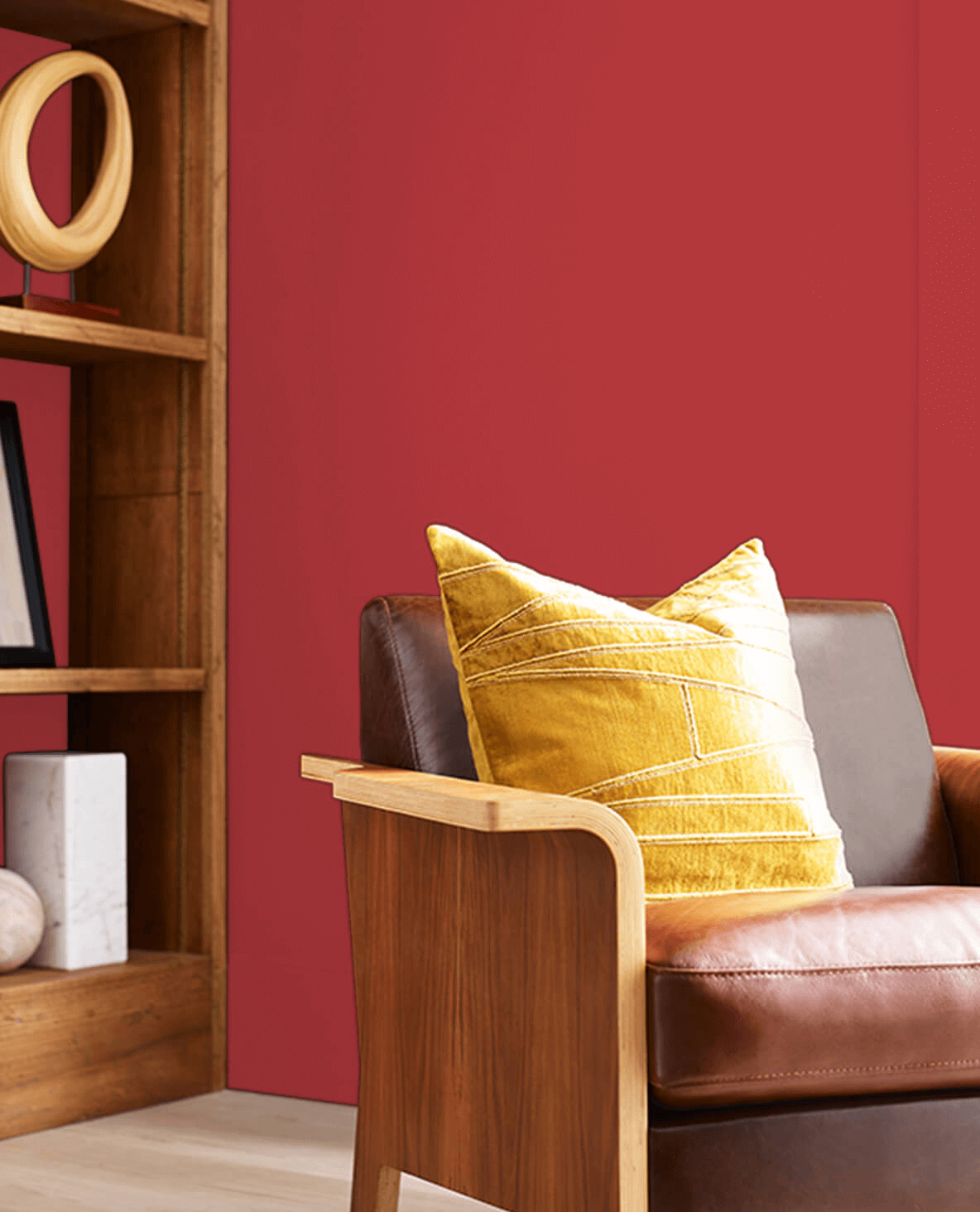
11. Sherwin Williams SW 6863 Lusty Red
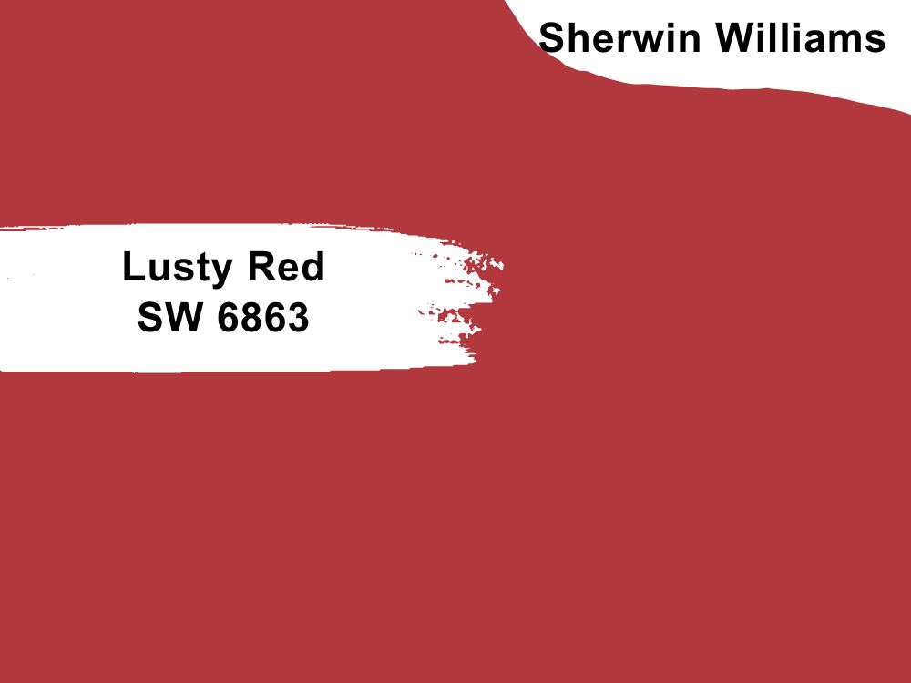
| RGB | 177 56 61 |
| LRV | 13 |
| Undertones | White, gray, yellow |
| Matching colors | Classical White SW 2829, Roycroft Bronze Green SW 2846 |
From passion to energy and authority, the Sherwin Williams SW 6863 Lusty Red symbolizes many things you’ll like to feel in your home’s atmosphere. This is why many companies, associations, and individuals use red in their branding.
Naturally, red is bold and easily makes a statement decor. As a primary color, it can be a great backdrop for other colors too. You can combine red with aqua hues to create an electrifying effect in the dark room, or red plus blue if you want a refreshing sensation.
Lusty Red also pairs well with neutrals such as dark brown, beige (light or dark), white, cream, black, etc., while earth tones such as mahogany, toasty brown, or caramel will give you a retro-inspired appearance that captures attention. In short, get ready for an energetic atmosphere using the Lusty Red.
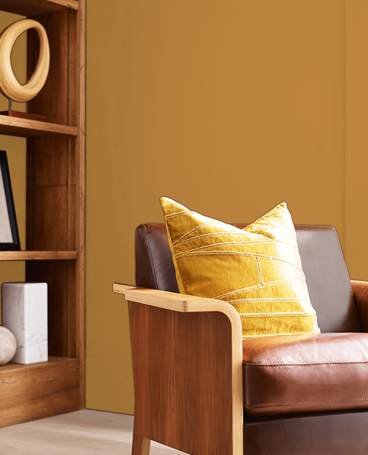
12. Sherwin Williams SW 2920 Monarch Gold
| RGB | 183 129 60 |
| LRV | 25.05 |
| Undertones | Peach, white, dark yellow |
| Matching colors | Shell White SW 8917, Mineral Gray SW 2740 |
Gold is luxurious, and it doesn’t fail to impart this quality into the atmosphere wherever it is used. The popular maxim says that not all that glitter is gold, but if you desire the glittering effect in your room, the Sherwin Williams SW 2920 Monarch Gold is a great option. It symbolizes wealth in all forms, and wealth never goes out of style.
It is timeless because gold can transition into any color scheme to create a theme – classy, modern, ultra-modern, retro, vintage, nature, etc. Besides, it always looks great in all colors. Applying it on the wall or ceiling isn’t the only way to use gold; you can extend the color to other items such as light fixtures, door handles, and other gold accessories.
13. Sherwin Williams SW 2936 Black Emerald
| RGB | 18 34 29 |
| LRV | 1.62% |
| Undertones | black, blue, yellow |
| Matching colors | Marshmallow SW 7001, Juneberry SW 6573 |
Research shows that Black Emerald has a history of being the favorite color for clothes dye and artists’ paints. Why? It is associated with gemstones, which made it the symbol of wealth and refinement in society. Also, it symbolizes regeneration, sophistication, and growth. Since Black Emerald belongs to the green family, it works well for creating a nature-inspired look. Its black undertone makes it versatile enough to blend with various colors.
Additionally Black Emerald can be substituted for black due to its dark hue. Other colors such as purple, red, white, gold, lighter shades of green, gray, pink, orange, and purple are perfect companions for the Black Emerald. For instance, mixed with white, this color creates a clean look and, combined with beige, makes for a calming atmosphere.
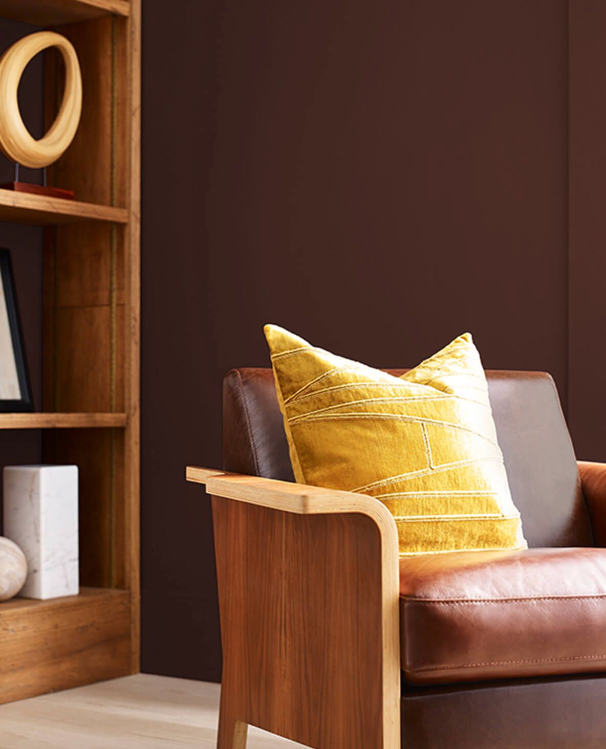
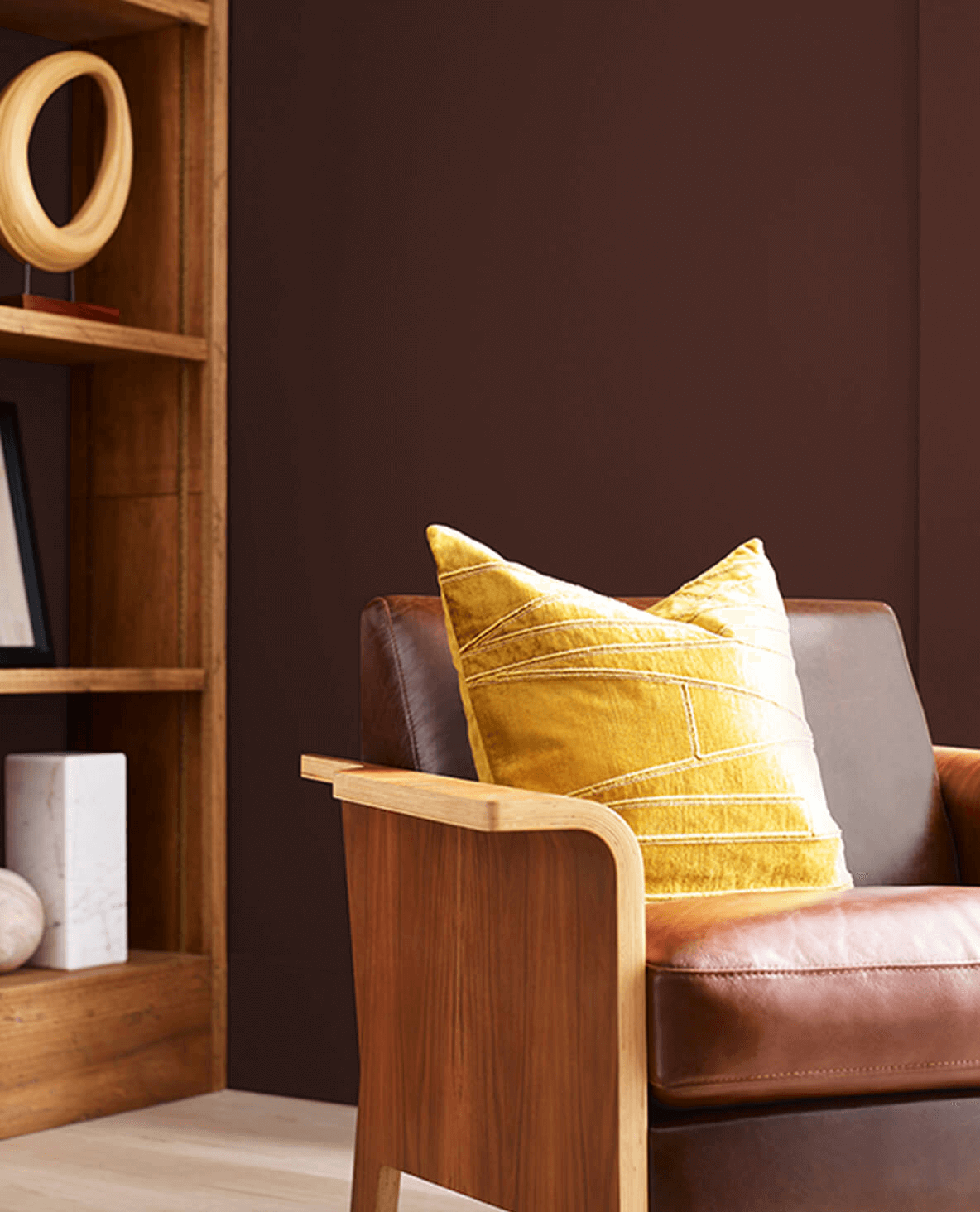
14. Sherwin Williams SW 2838 Polished Mahogany
| RGB | 67 39 34 |
| LRV | 3 % |
| Undertones | Red, brown |
| Matching colors | Barcelona Beige SW 7530, Roycroft Suede SW 2842 |
The Sherwin Williams SW 2838 Polished Mahogany is an earthy tone that is great for creating an outdoor-inspired decor. You can replicate that feeling in your home if you love the trees, earth, and nature. This color works best by contrasting it with solid colors to create an accent look or non-obvious appearance.
However, while mixing it with using bold colors, limit the quantity to avoid a chaotic situation. If you want a formal and uptight look, pair the polished mahogany with any shade of black. For a soothing atmosphere, you can opt for white and polished mahogany. If you want a seamless decor, light beige, and polished mahogany will do. Ensure you distribute the colors you use evenly across the room.
15. Sherwin Williams SW 6532 Aura White
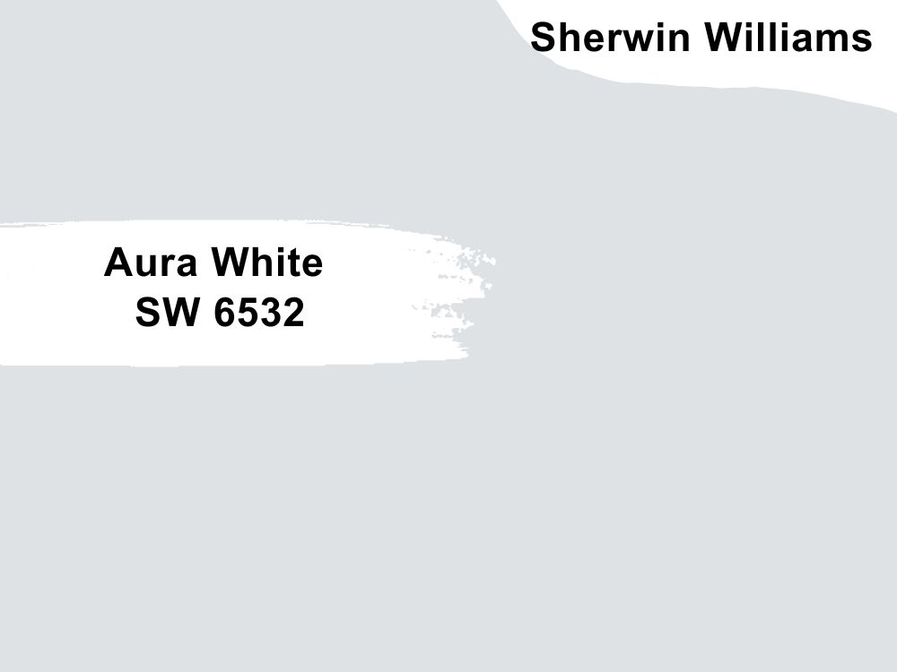
| RGB | 222 226 228 |
| LRV | 76 |
| Undertones | Yellow, red |
| Matching colors | Snowbound SW 7004, Springtime SW 6708 |
The Sherwin Williams SW 6532 Aura White immediately establishes an atmosphere of elegance. Like every other neutral, it is loved for its versatility. It always stays in style and works with every surrounding, whether the natural light is much or not. Asides its elegance, Aura White helps you to maintain your room properly because it’s easier to spot dirt on it, making you consistent at cleaning.
The room also feels lighter and more relaxing with white-inspired decor. This color is also budget-friendly; it easily blends with any existing color scheme and is easier to create from scratch. However, if your schedule doesn’t allow consistent cleaning, you might reconsider going for Aura White, as it thrives on regular maintenance.
16. Sherwin Williams SW 6347 Chrysanthemum
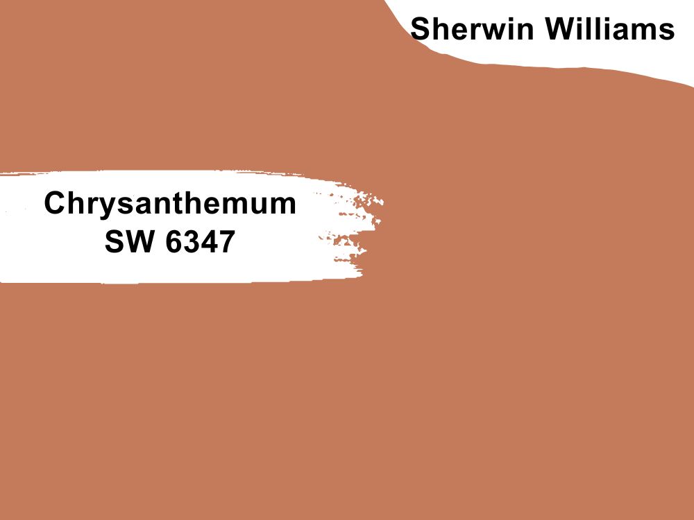
| RGB | 196 123 91 |
| LRV | 27 |
| Undertones | White, yellow, burgundy, purple |
| Matching colors | Alluring White SW 6343, Bauhaus Buff SW 7552, Cornwall Slate SW 9131 |
Usually, chrysanthemums, also known as mums, are categorized among the colors of the fall season, which indicates change, ease, and comfort. This makes the Sherwin Williams SW 6347 Chrysanthemum a perfect option to replicate such an atmosphere in your home.
You can set a color theme with this color by pairing it with neutrals like white and beige or vibrant colors like gold, black emerald, dark brown, and orange. You can use it in the bedroom, living room, kitchen, or bathroom. Even though it’s selective with the colors it blends with, it has a timeless appeal.
17. Sherwin Williams SW 6988 Bohemian Black
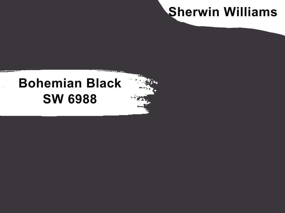
| RGB | 59 55 60 |
| LRV | 4% |
| Undertones | Ebony, blue |
| Matching colors | Snowbound SW 7004, Extra White SW 7006, Porch Ceiling SW 9063 |
If you want drama and depth in your room, don’t hesitate to choose the Sherwin Williams SW 6988 Bohemian Black. You can make it contemporary or traditional, bold or subtle. For a bold look, pair it with other shades of other colors, but vary the proportion based on your preference. For a dramatic appearance, pair this black color with metallics, such as decorative pieces painted brass or gold. You can also opt for a monochrome design by pairing it with white.
Conclusion
With any of the paint colors mentioned above, your dark rooms can be one of the most enjoyable places in your home. The Bohemian Black or the Plum Raisin will do if you want a dramatic look. Dark Teal or Turtle Green is an excellent choice for a bold statement. In short, you’ll surely find the color that catches your fancy in the list above.
 10 Perfect White Paint Colors for Trim (Trend 2023)
 15 Best Behr White Paint Colors Popular and Trending in 2023
 17 Best Sherwin Williams Yellow Paint Colors
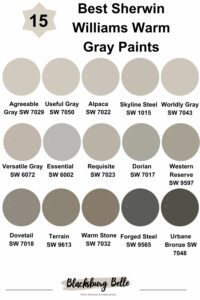 15 Best Sherwin-Williams Warm Gray Paints (Trend 2023)
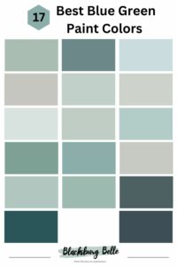 17 Best Blue Green Paint Colors In 2023
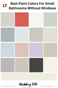 17 Best Paint Colors For Small Bathrooms Without Windows
