When thinking about your flooring choices that will most likely bring your space to life, there’s a whole lot of endless variety of colors for you to choose from. You might as well get confused in the long run; don’t worry, it’s normal!
Table of Contents
Dark Wood Floors
Dark wood floors any day anytime will remain incredibly chic and sophisticated. It never fails to bring richness and polish to any space. It offers an inviting feel and opens up a space and can make a dramatic statement in any home, increasing the value of the home and its visual appeal.
Whether you choose richer, softer, or darker colors, they both have their advantages when it comes to expanding the appearance of a room.
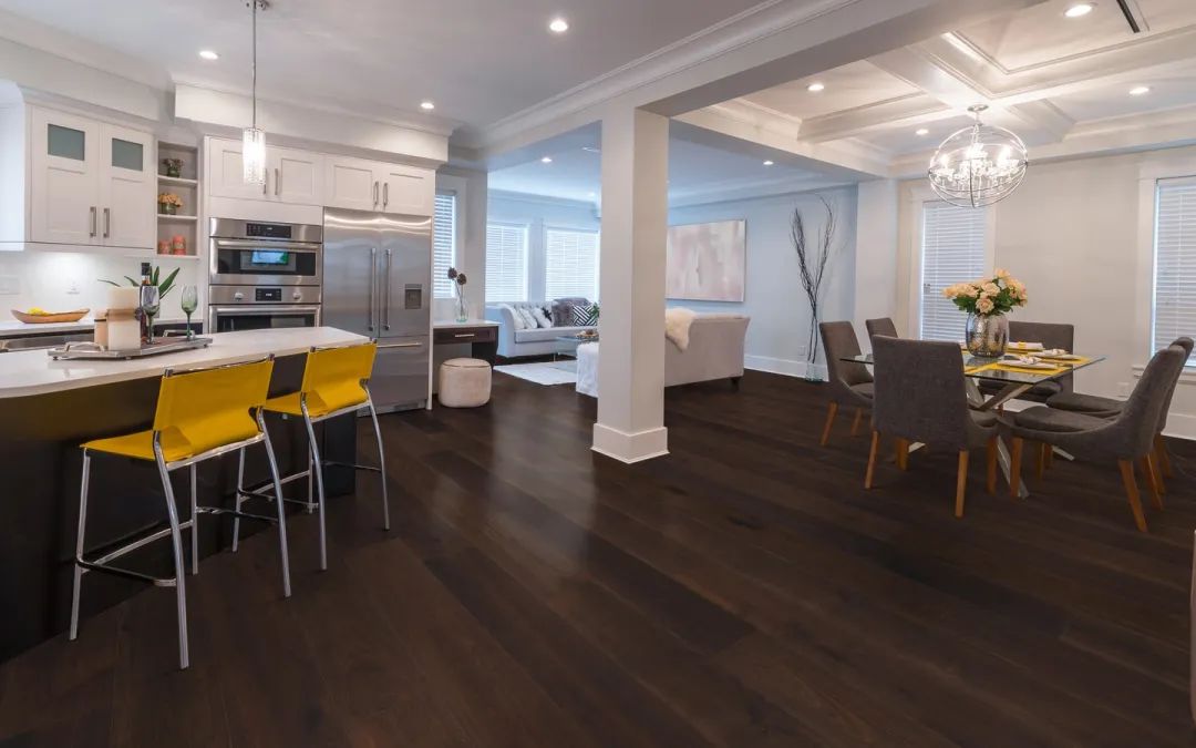
You don’t always have to repaint or refinish a dark wood floor because it absorbs a whole lot of light which helps it maintain its durability. Well, let’s just say it never fades.
Although it can be a little tricky when it comes to coordinating colors. When paired with the wrong furnishings and extremely dark and cold colors, those floors and their supporting agent run the risk of making the space feel dark and very heavy.
In this blog post, we will be reviewing some great wall paint colors that you can use with your dark wood floors.
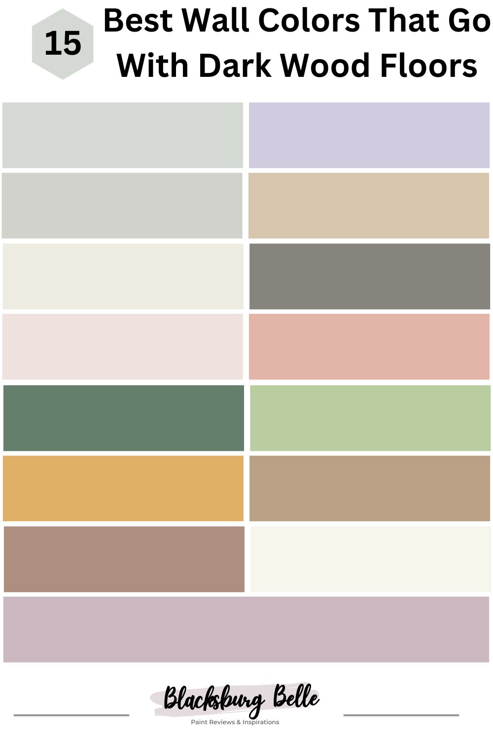
15 Best Wall Colors That Go With Dark Wood Floors
Here’s our carefully selected list of the 15 best wall colors that go with dark wood colors. This list comprises some of the best colors from Benjamin Moore and Sherwin Williams.
Take your time and pick whichever catches your fancy.
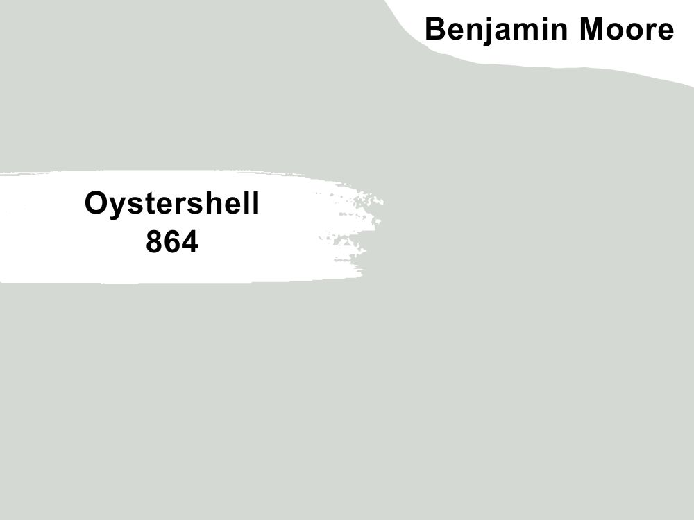
1. Oystershell 864 by Benjamin Moore
| RGB | 213, 217, 211 |
| LRV | 67.87 |
| Matching colors | White Heron, Britannia Blue, Baby’s Breath, Super White |
| Undertone | Blue |
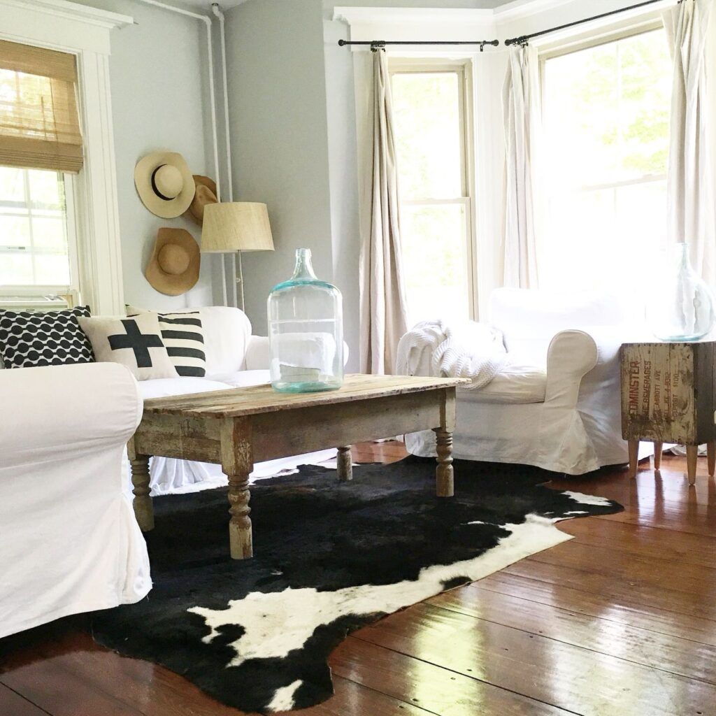
Oystershell 864 by Benjamin Moore is an eye-pleasing gray with buoyant blue undertones. It’s a popular choice of color for so many reasons which I will talk about shortly. One of the most interesting characteristics of Oyster Shell is its versatility. It’s a sophisticated gray paint color with warm undertones that can work well with various flooring options, including dark wood floors.
Using Oystershell on your walls alongside dark wood floors will definitely leave an elegant and balanced look. The only concern is the shade of the dark wood. Dark woods could have undertones such as red, brown, or even hints of gray and these different shades could sometimes affect the balance. This is why it’s always a good thing to try some sampling of colors on your walls before going all in with the painting. It’s essential to consider the specific shade and characteristics of the dark wood and how it interacts with Oystershell.
The LRV of Oystershell is way above average which means it could brighten up any space with a reasonable amount of light. Oystershell has some great matching colors like White Heron, Britannia Blue, Baby’s Breath, White Heron, Britannia Blue, and Super White. Other similar colors can be found on Benjamin Moore’s official website.
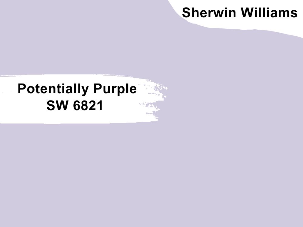
2. Potentially Purple SW-6821 by Sherwin Williams
| RGB | 209 203 223 |
| LRV | 62 |
| Matching colors | Snowbound, Original White, Berry Cream |
| Undertone | Blue, Red, Gray |
This is an insanely beautiful wall paint color that will always make you stare at your walls longer than normal. It’s an eye-catching color. But, will Potentially Purple be a potential or good fit with dark wood floors?
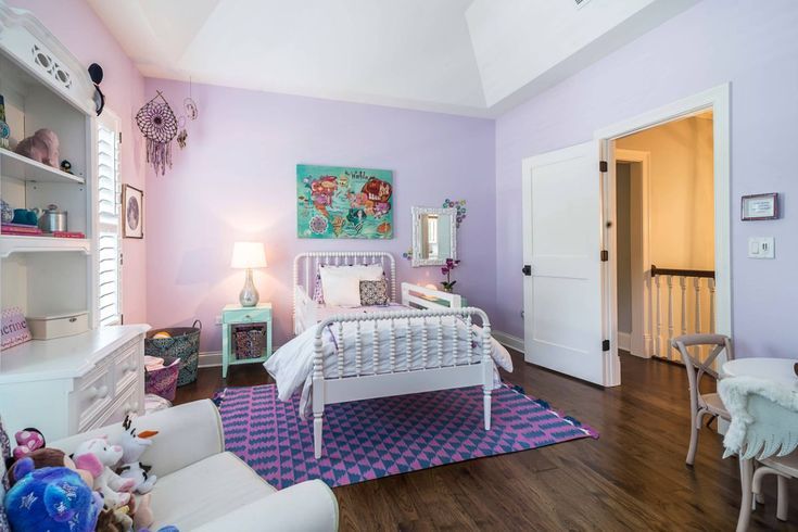
When considering Potentially Purple on your walls with dark wood floors, it can create a striking and rich contrast. The deep, warm tones of dark wood floors provide a dramatic backdrop for the cool and muted purple. This contrast can add depth and visual interest to the space.
Potentially Purple has a mix of blue and red, with a gray undertone that makes it a versatile color. In terms of Light Reflectance Value (LRV), which measures the percentage of light a paint color reflects, Potentially Purple has a moderate LRV of 62. This means it is not overly dark or light, falling somewhere in the middle range.
If you would like to try something a little bit different, you can consider looking at some of its matching colors like Snowbound and Berry Cream.
3. SIlverpointe SW7653 by Sherwin Williams
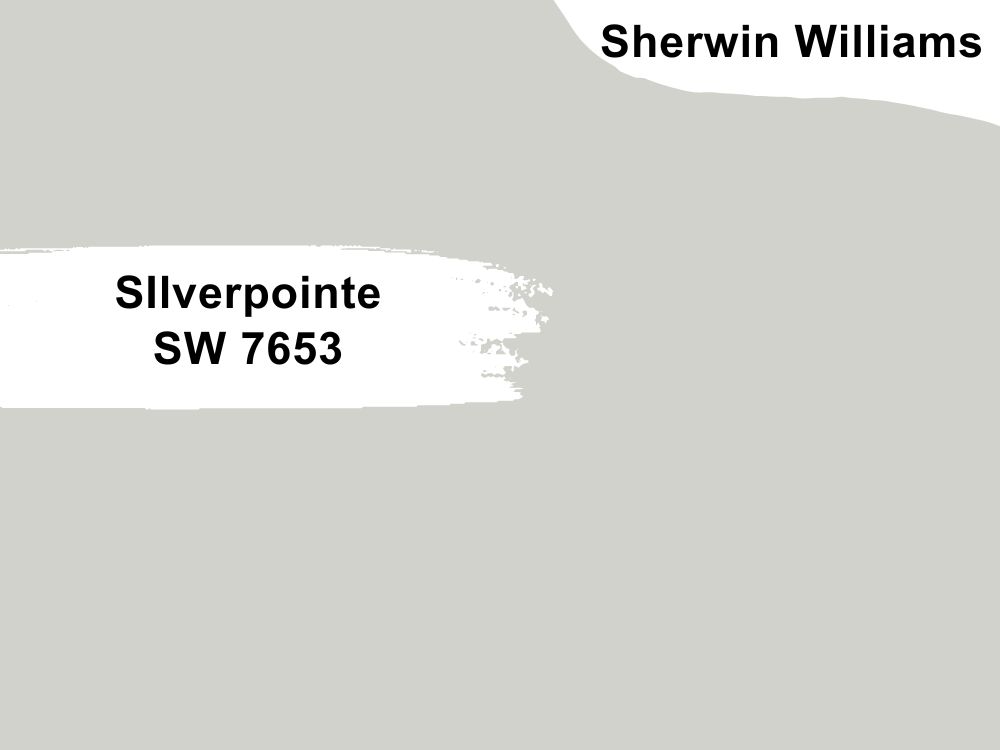
| RGB | 209 210 203 |
| LRV | 64 |
| Matching colors | Eider White, Magnetic Gray, Pure White |
| Undertone | Blue, Green |
Silverpoint by Sherwin Willaims is a light gray paint color with blue and green undertones. This cool, misty hue feels perfectly light, with a twinkle of cyan gray. It’s a perfect wall paint color if you want to make any room feel spacious and serene.
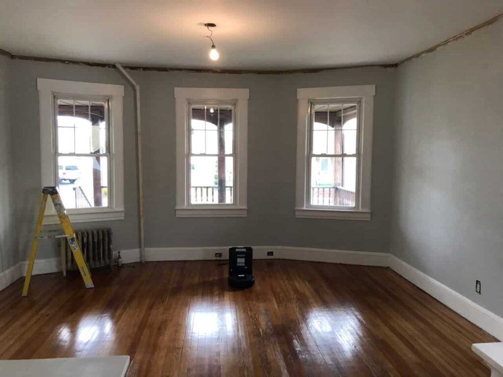
What if you have dark wood floors, will silverpointe go well with that? Yes, it will.
One of the reasons is that Silverpointe is a versatile and sophisticated gray paint color that can go well with a lot of other colors, especially dark finishes, as in our case. When used on the walls of your home or anywhere with dark wood floors, the cool gray tones can complement the warmth and richness of the dark wood, which will create a visually appealing outlook. And that’s what every homeowner or decorator wants, right?
4. Kilim Beige SW-6106 by Sherwin Williams
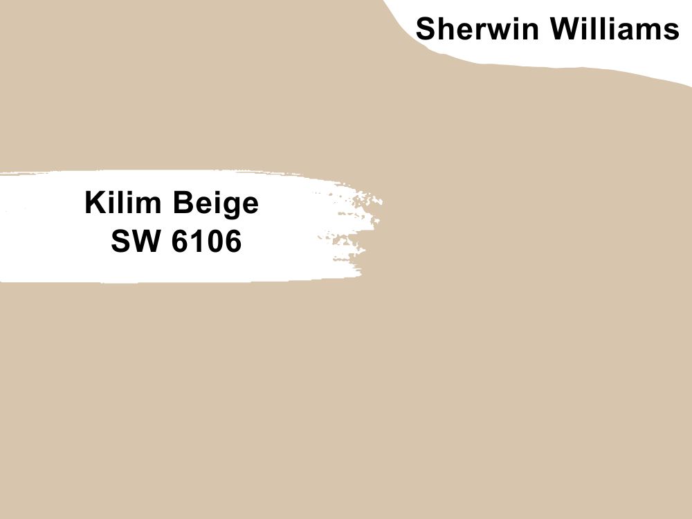
| RGB | 215 197 174 |
| LRV | 57 |
| Matching colors | Latte, Divine White, Storm Cloud |
| Undertone | Orange, Pink |
Sherwin Williams Kilim Beige is a soft neutral paint color that evokes a soft warmness that has an always-on inviting vibe. This is a great wall paint color for spaces where you and your family members gather often.
Kilim Beige is a versatile and popular choice for creating a cozy and comfortable atmosphere in a space. It allows for flexibility in styling and decor. This color works well as a main wall color, providing a warm and inviting feel.
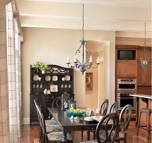
When it comes to dark wood floors, yes, you can use Kilim Beige with dark wood floors, and here’s why; Kilim Beige has warm beige tones that can enhance the richness and depth of the dark wood on your floor. This combo will give you a very balanced look, adding warmth and comfort to your entire space.
You should actually give it a try with some samples to see what it looks like before going for a full painting. Also, Kilim Beige has some pretty nice matching colors that got my attention while checking it out. Colors like Latte, Divine White, and Storm Cloud are pretty as well and can go well with other decor styles.
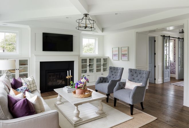
5. Swiss Coffee OC-45 by Benjamin Moore
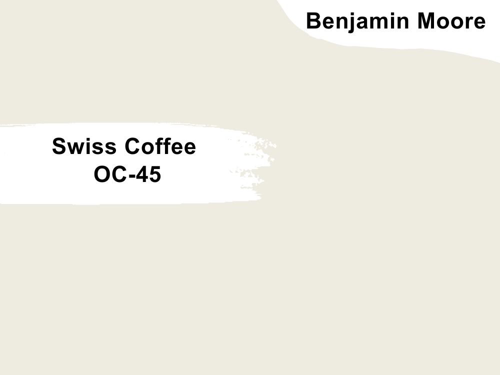
| RGB | 237, 234, 224 |
| LRV | 81.91 |
| Matching colors | Newburg Green, Fossil, Lush, White Drifts |
| Undertone | Gray, Green |
This is another insanely popular color. If you have been following us, you must have noticed how many times this color appears on our review list, either as a standalone color or a matching color to so many others. And yes, it’s one of the best-selling colors from Benjamin Moore.
If you are looking for a great white paint color that’s very versatile, warm, and has virtually no yellow undertones, Swiss Coffee is a good pick. It’s not a cool, stark white – but rather a beige, warm white that will work with everything and all styles.
Swiss Coffee’s LRV is roughly 82 which means it reflects more light in the space than it absorbs. In other words, using Swiss Coffee in a room will make it appear lighter and brighter. This tells you without any doubt that Swiss Coffee is the perfect wall color that goes well with dark wood floors.
It’s okay to step out a little. So, if you would like to try something else that works together with this color, you can check out Newburg Green, Fossil, Lush, and White Drifts, from the same brand.
6. Chelsea Gray HC-168 by Benjamin Moore
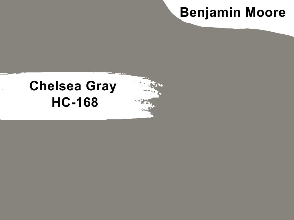
| RGB | 134, 132, 124 |
| LRV | 23.33 |
| Matching colors | Lemon Chiffon, Concord Ivory, Angelica, Sanctuary |
| Undertone | Brownish-Violet |
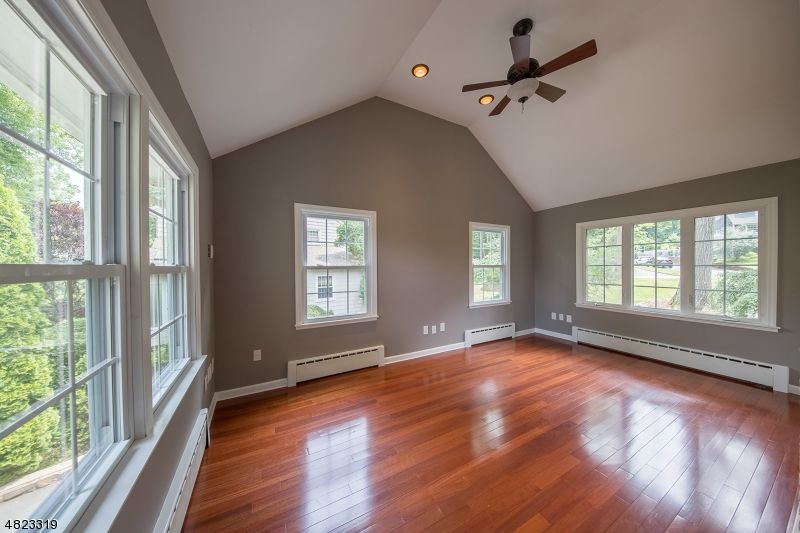
Another popular paint color from Benjamin Moore is Chelsea Gray. According to their official website, it’s described as a handsome gray with rich brownish-violet undertones. Chelsea Gray with its low LRV of 23 is a warm gray color that can hold itself quite well in dark rooms but will need some light to help it come to life.
Like I pointed out earlier, Chelsea Gray HC-168 by Benjamin Moore is a medium to dark-toned gray that naturally exudes elegance. Pairing this with dark wood floors will create a calm, sensational and dramatic look. A combination like this will easily add depth and dimension to the space while allowing the dark wood floors to stand out. It’s a great example of a good collaboration of colors.
7. First Light 2102-70 by Benjamin Moore
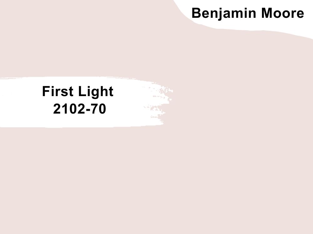
| RGB | 239, 224, 220 |
| LRV | 75.86 |
| Matching colors | White Heron, Normandy, Chantilly Lace, Amherst Gray |
| Undertone | Cool Gray |
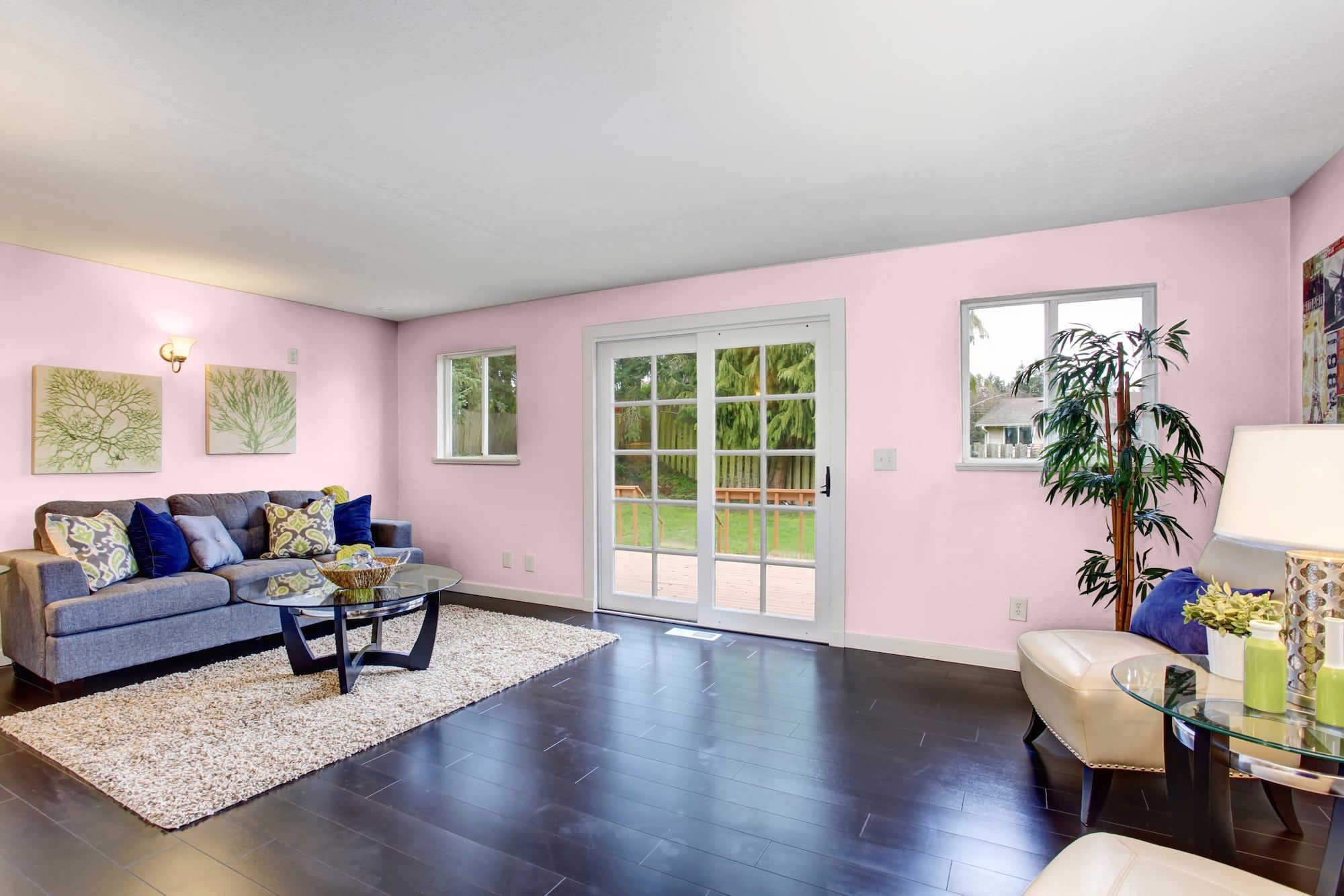
Apart from the first color on our list, I think this is another beautiful, refreshing, eye-catching alternative to white or beige. It’s a soft, airy pink color that can flatter any space and play well with other colors.
Light 2102-70 is a delicate light-toned pink color. The lightness and delicacy of the pink can visually complement the richness of the dark wood, which will give you a pleasing combination.
With its LRV of 75.86, it can add brightness and a touch of femininity to the space while allowing the dark wood floors to give out its own radiation. itworks well as both a main wall color and an accent color. Overall, it’s a great color if you want some freshness and peaceful vibe in your space.
8. Mellow Coral SW-6324 by Sherwin Williams
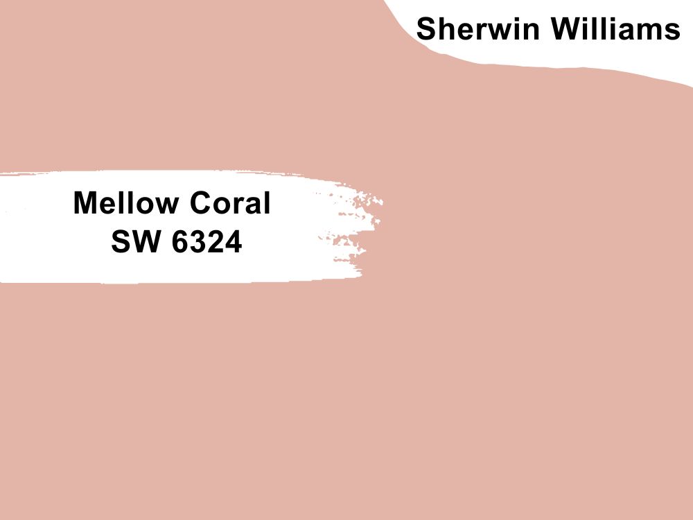
| RGB | 227 181 168 |
| LRV | 52 |
| Matching colors | Intimate White, Aged White, Cocoa Whip |
| Undertone | Peach and Blush, Pink, Orange |
Here’s another charming but calm color from the Red family. It’s a color you can easily notice, anywhere it’s used.
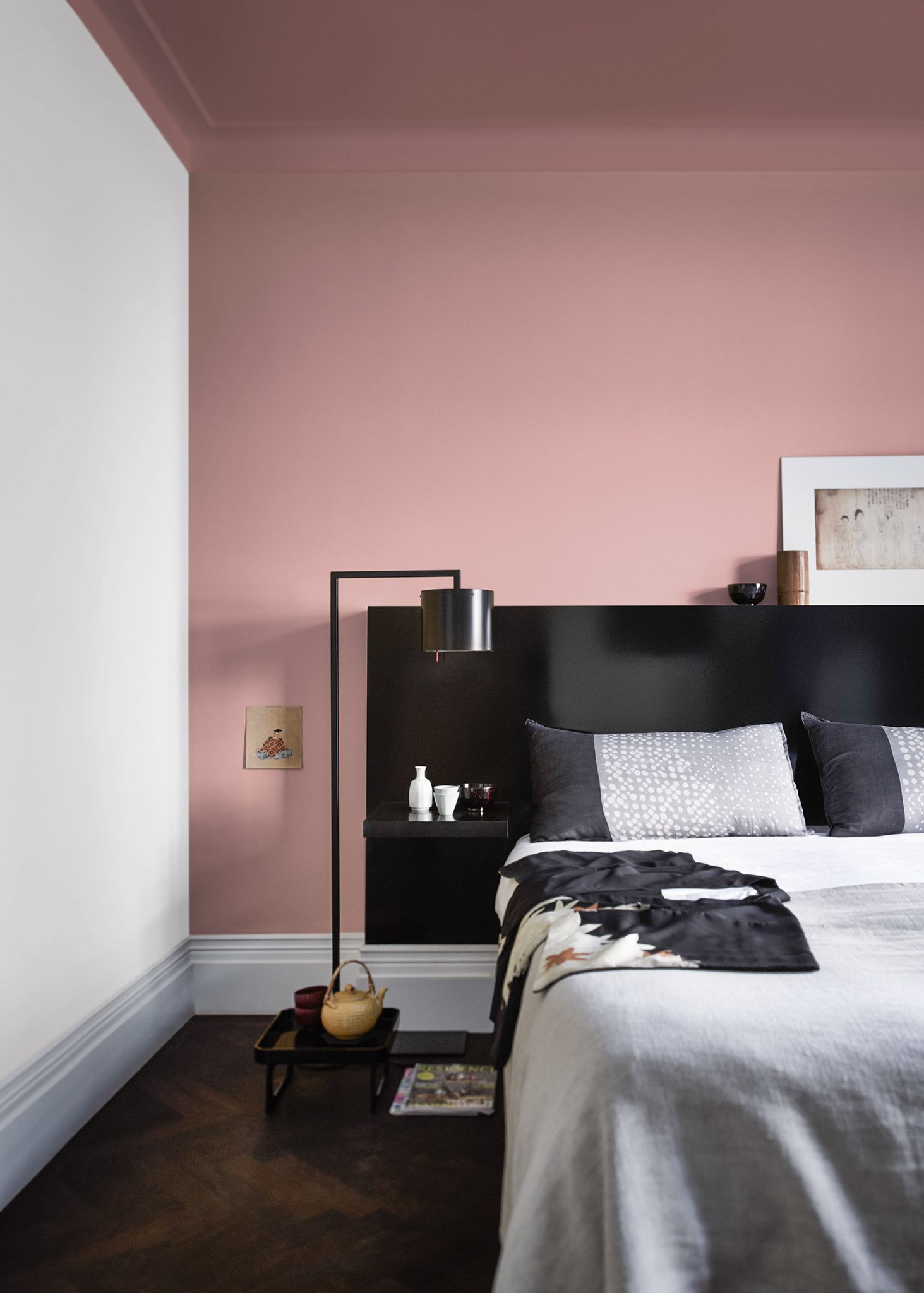
Mellow Coral is a medium-toned coral that can add a touch of vibrancy and personality to a space. It works well as a main wall color, an accent color, or even for furniture and decor. This color can create a warm and cheerful atmosphere in a room.
If you’re wondering whether this beautiful color can go well if you have dark wood floors, don’t worry, we’ve done the worrying for you.
Yes, you can pair Mellow Coral with your dark wood floors. The vibrancy of the Coral color can complement the depth of the dark wood, creating an enticing and dynamic look. With this combination, your space will have a sense of energy and playfulness while allowing the dark wood floors to serve as a grounding element.
9. Webster Green HC-130 by Benjamin Moore
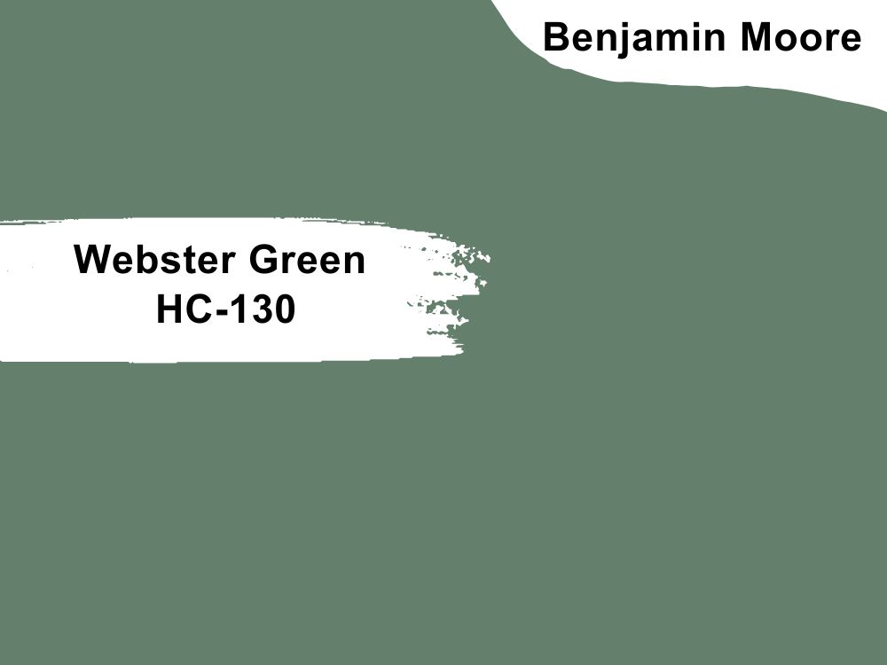
| RGB | 100 128 108 |
| LRV | 20.2 |
| Matching colors | Sage Mountain, Old Prairie, Elmira White, Glacier white |
| Undertone | Blue, Yellow |
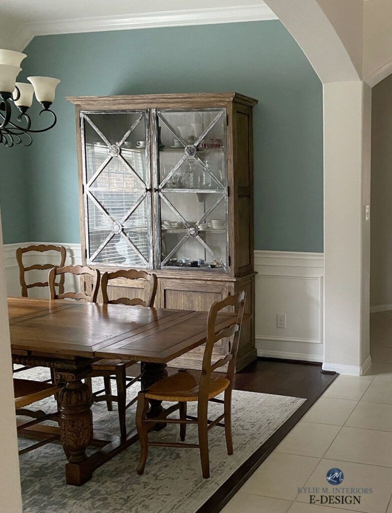
This is a rich and dark green paint color with a crisp and clean finish. It has a classic and timeless hue that is reminiscent of forest-greens. Webster Green can pair beautifully well with dark wood floors as a wall color.
The depth and warmth of Webster Green can enhance the richness and texture of the dark wood floors, creating a sense of sophistication and elegance.
The cool blue undertones in the green add depth and dimension, while the touch of yellow undertone adds warmth and also complements the natural tones of the wood. If you use Webster Green as a wall color with dark wood floors, you will get a space that’s harmonious, inviting and calming due without fear. You can’t go wrong with this pair but as usual, always try a sample before going for a complete painting.
10. Corn Stalk 542 by Benjamin Moore
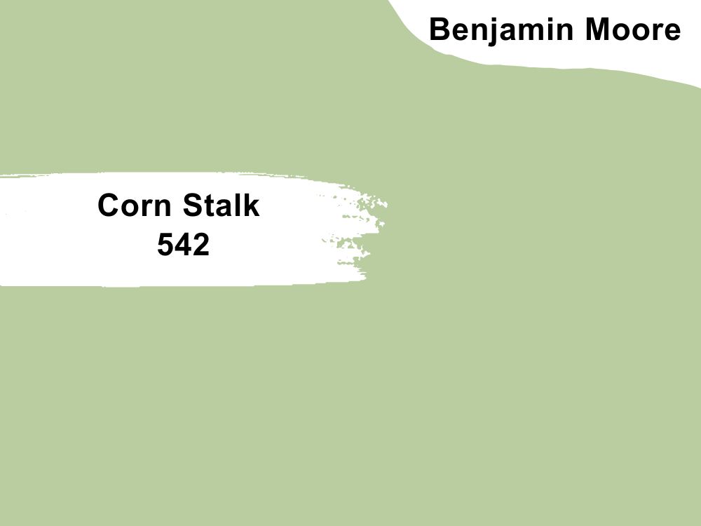
| RGB | 186 205 160 |
| LRV | 54.59 |
| Matching colors | Cloud White, Jack Pan, White Heron, Equestrian Gray |
| Undertone | Blue |
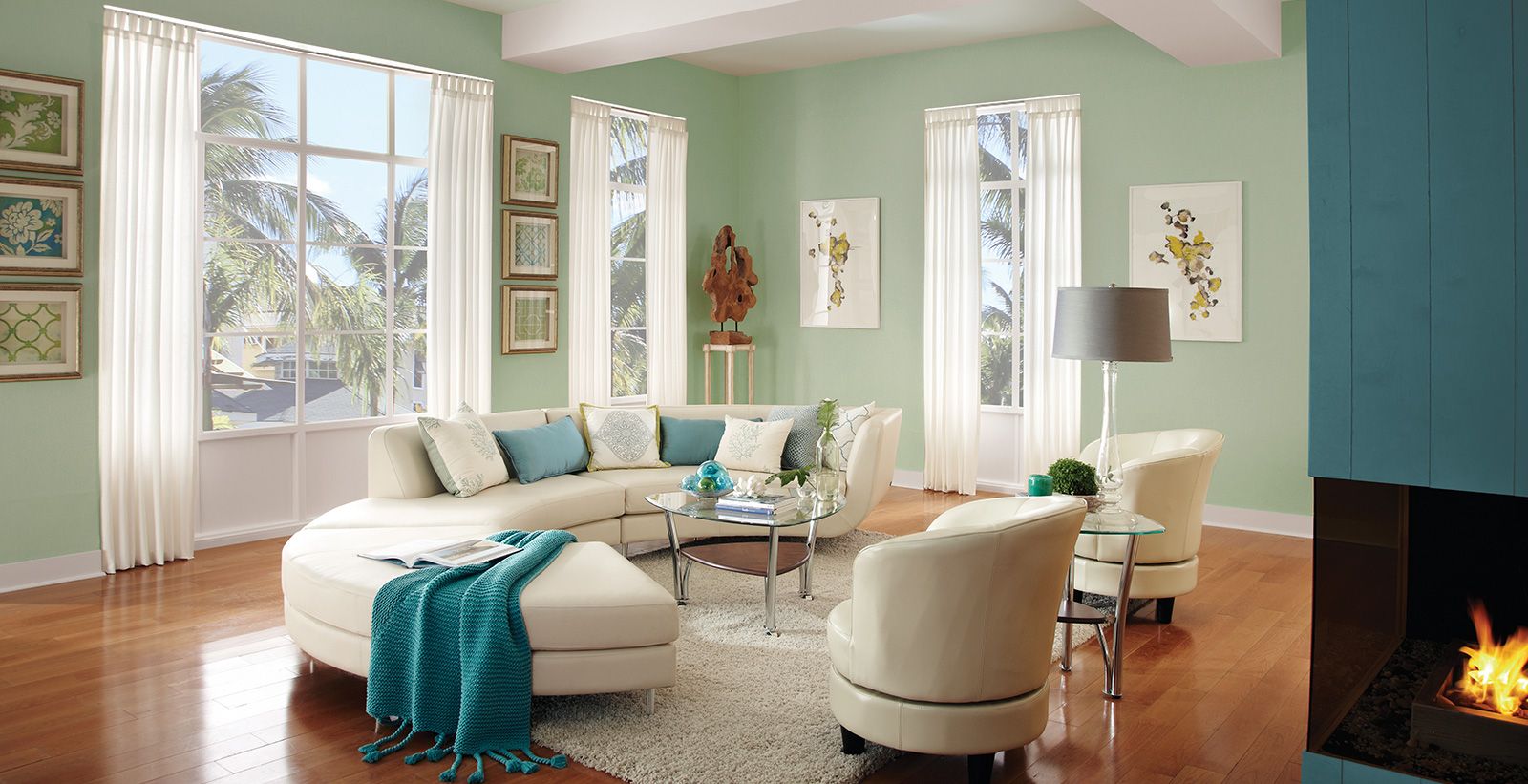
When you talk about uniqueness and balance, this medium green paint color brings an effortless sense of style to a space.
Benjamin Moore’s Corn Stalk has an LRV of 55 making it slightly light. Although it looks somewhat pale, it’s a beautiful paint color to match with dark wood walls. What this color needs is enough natural or artificial sunlight to bring its hidden aura to light.
11. YellowStone 202 by Benjamin Moore
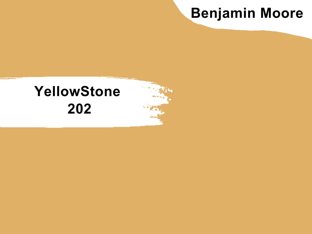
| RGB | 224 176 102 |
| LRV | 47.74 |
| Matching colors | NightShade, Cotton Balls, Rock Gray, White |
| Undertone | Gray, Green |
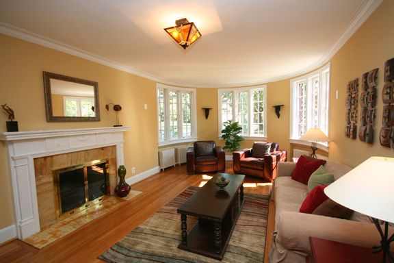
The name yellow tells you that this is a yellow paint color. Not just any kind of yellow, but a sunny amber-yellow hue that infuses a space with wit and sophistication. Most people feel the yellow color is not too appealing and will definitely not go well for an interior wall. Well, Benjamin Moore’s Yellowstone has proven to be an exception.
With an LRV of 47, this paint color is cool enough to create a calm and soothing atmosphere. It’s not all over your face by being excessively bright; neither is it too dull to make your space look pale. Pairing this Yellowstone color with just any dark wood floor will make you love it more.
Other matching colors that go well with Yellowstone include NightShade, Cotton Balls, and Rock Gray. If you need more alternatives, checking their official website would be helpful.
12. Latte SW-6108 by Sherwin Williams
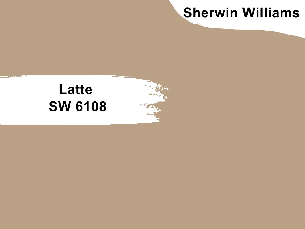
| RGB | 186 161 133 |
| LRV | 38 |
| Matching colors | Divine White, Age White, Serious Gray |
| Undertone | Brown, Orange and Beige |
I bet you know the latte coffee. Hmm how refreshing it always is taking a cup of latte coffee first thing in the morning or late at night. Now the uniqueness of latte comes to play also in paint colors.
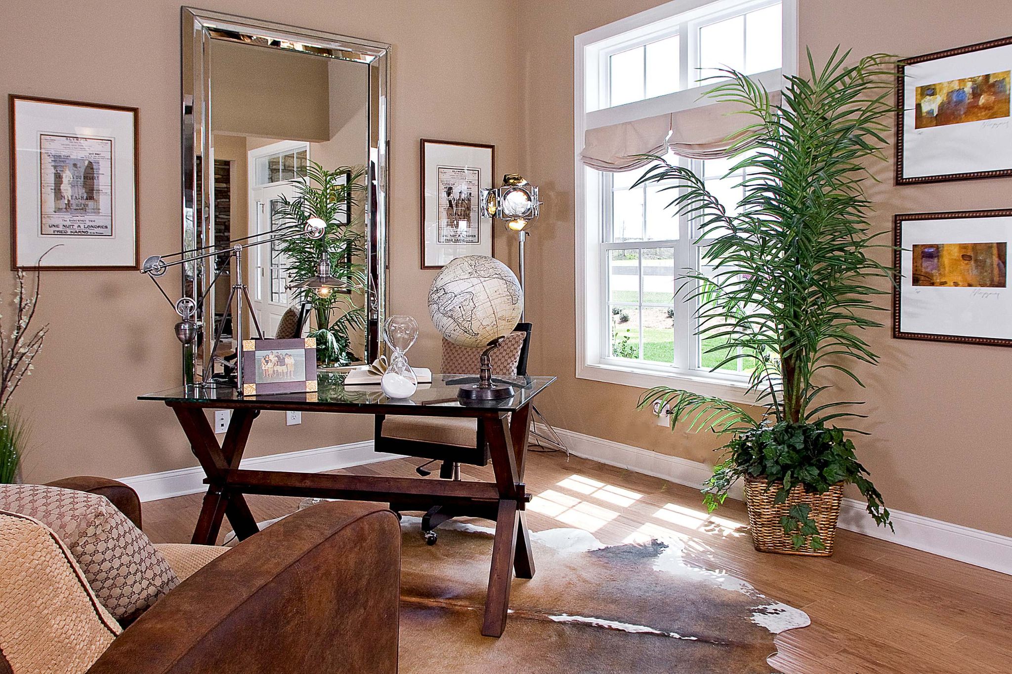
The latte is a smooth color with an LRV of 38 and an orange and brownish undertones. This color gives a highly creamy texture when painted on the walls. Enter a room painted in this warm neutral color with dashing cool dark wood floors; and drink in the stunning, inviting effect.
Is this color good for more than one surface? yeah! This softly muted brown will wake up any space. And it goes beautifully well with almost anything. It is safe to call it a versatile color. You’ll never regret pairing it up with your dark wood floors.
13. Redend Point SW-9081 by Sherwin Williams
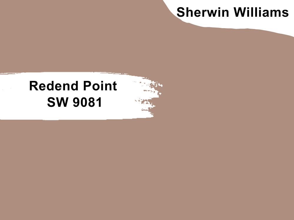
| RGB | 174 142 126 |
| LRV | 30 |
| Matching colors | Polite White, Kestrel White, Canyon Clay |
| Undertone | Gray, Beige, and Pink |
Sherwin Williams Redend Point is a warm, inviting, rich, earthy hue that’s more neutral than you might have imagined. It’s a rosy brown color that has a red and brown undertone.
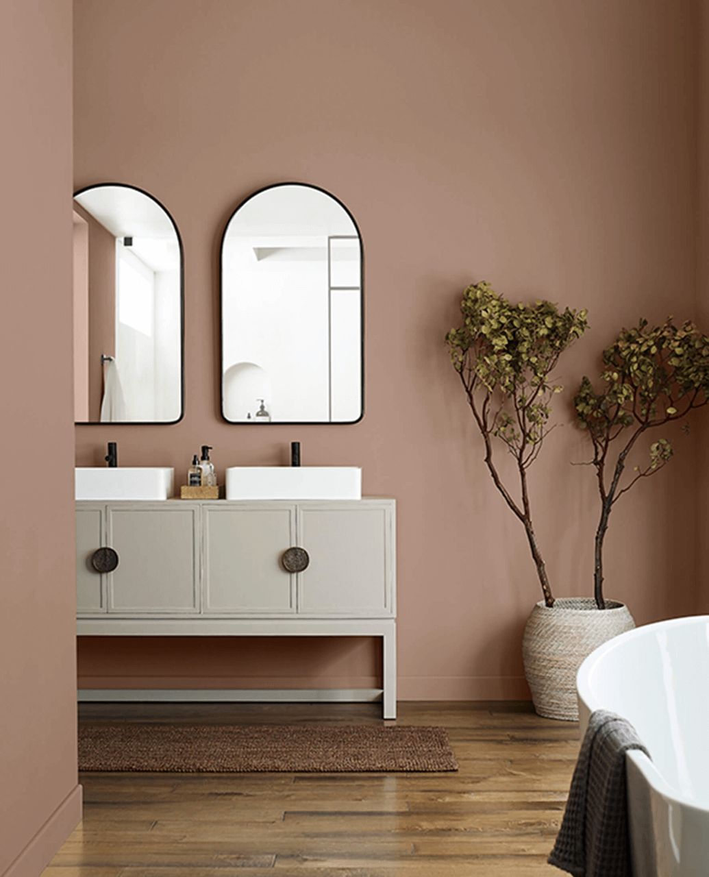
Redend Point has an LRV of 30, making it a medium toned color. With its warm and rich undertones, this color will do well with a dark wood floor or even a dark room. It has the ability to stand up to the dark corners and shadows a bit better than a more muted neutral and can also hold up well to intense light without losing itself.
Redend Point would be a nice accent wall color for a soft, earthy, somewhat relaxing look.
14. Simply White OC-117 by Benjamin Moore
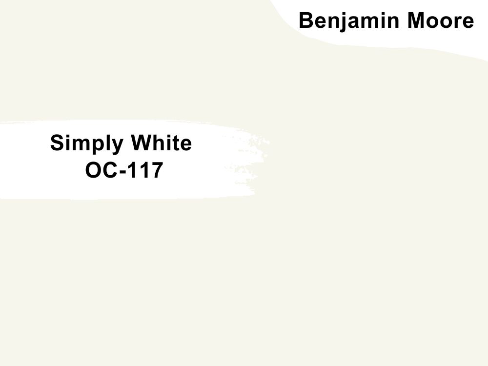
| RGB | 247 244 235 |
| LRV | 89.52 |
| Matching colors | Dove Wing, Summerville Red, Silver Satin, Casco Bay |
| Undertone | Yellow |
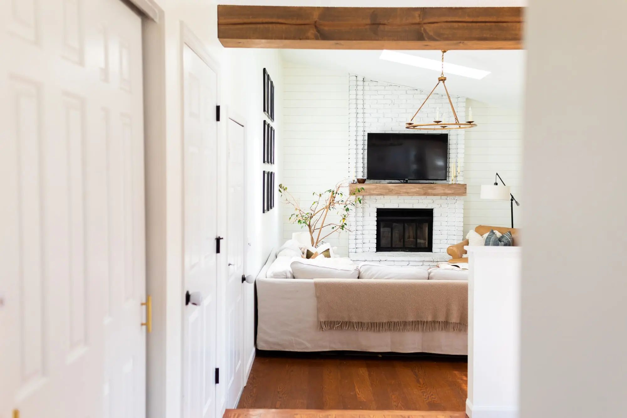
A space with dark wood floors having this slight white paint color with a yellow undertone on its walls is going to be alluring. Benjamin Moore’s Simple White in all its glory, gives sleek elements in natural light.
Simply whits have an LRV of 89 which is bright and has a yellow undertone that visually disappears when it comes in contact with bright natural sunlight, but will brightly lighten up a room with little light.
While some white paints can look too stark or cold no matter how and where you tend to use it, Simply White doesn’t. Rather it adds beautiful clean warmth to your space, especially one with dark wood floors. It’s a great option when it comes to versatility.
15. Mauve Finery 6282 by Sherwin Williams
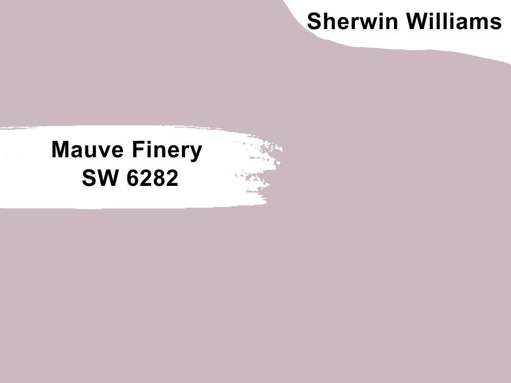
| RGB | 203, 184, 192 |
| LRV | 51 |
| Matching colors | Ibis white, Backdrop, Egret white |
| Undertone | Pink, purple |
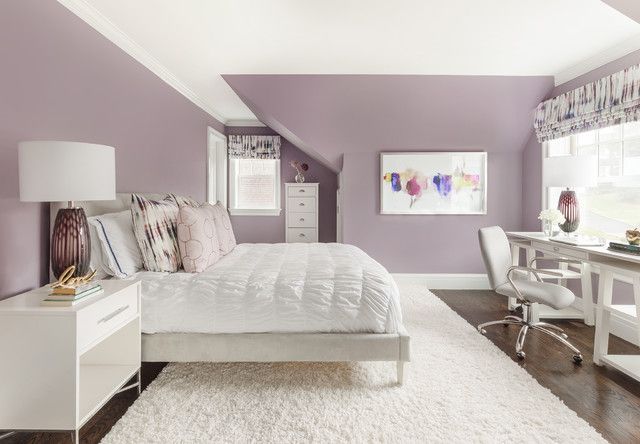
Mauve Finery is a light and dusty lavender hue from the purple family but slightly leaned towards the pink side. The mauve color is seen as a cool color, and it works well together with colors like green, blue, shades of pink, and any other dark cool colors.
With an LRV of 51 and its vibrant pink and purple undertone, this color will bring light and life to your space, perfectly complementing dark wood floors.
However, warmer colors like yellow and orange will create a beautiful contrast, helping to make each other stand out. The color mauve is an elegant and flexible color. It is very easy to work with and wouldn’t give you trouble pairing it up.
Overview
Dark wood flooring is an excellent choice for modern interiors. It can also pass for a traditional interior. You really don’t need to do too much. All you need to do is make sure to use bright and lighter coordinating colors. This will help tame the dark wood and also create an intriguing balance suitable for your space.
Remember To Consider
Do not forget, lighting is very important when dealing with relatively dark colors. In as much as you want to use bright colors, having enough natural light flowing into an airy space with your dark wood flooring calls for perfection.
Not all dark wood colors look the same, just like regular colors, there come in different shades and this affects their appearance with lighting and other colors. So while picking colors from our list, it’s important to know the shade of your dark wood floors.
Lastly, like I always advise, get an original paint of your choice from certified sellers and also try testing out your paint colors on a small surface to enable you to make a perfect choice. This is to help you avoid stories that touch the heart. It should be like an experiment, and I’m sure you’ll make the right choice.
Well well well ! Happy painting spree. See you in our next blog post!

