Let’s be honest, everyone loves a bit of dark wood in their home, and the reasons are obvious. With the right paint color and tones, dark wood can elevate your space while adding depth as well. From bedrooms, accent walls, or the kitchen, dark woods offer a unique style and aesthetic.
Also, dark woods are making a great comeback in traditional spaces such as homes and offices, so you cannot go wrong learning what paint colors work in your space.
However, for many people, styling dark wood can be intimidating and challenging in terms of color pairing. Plus, there are other factors to consider depending on your space and functionality.
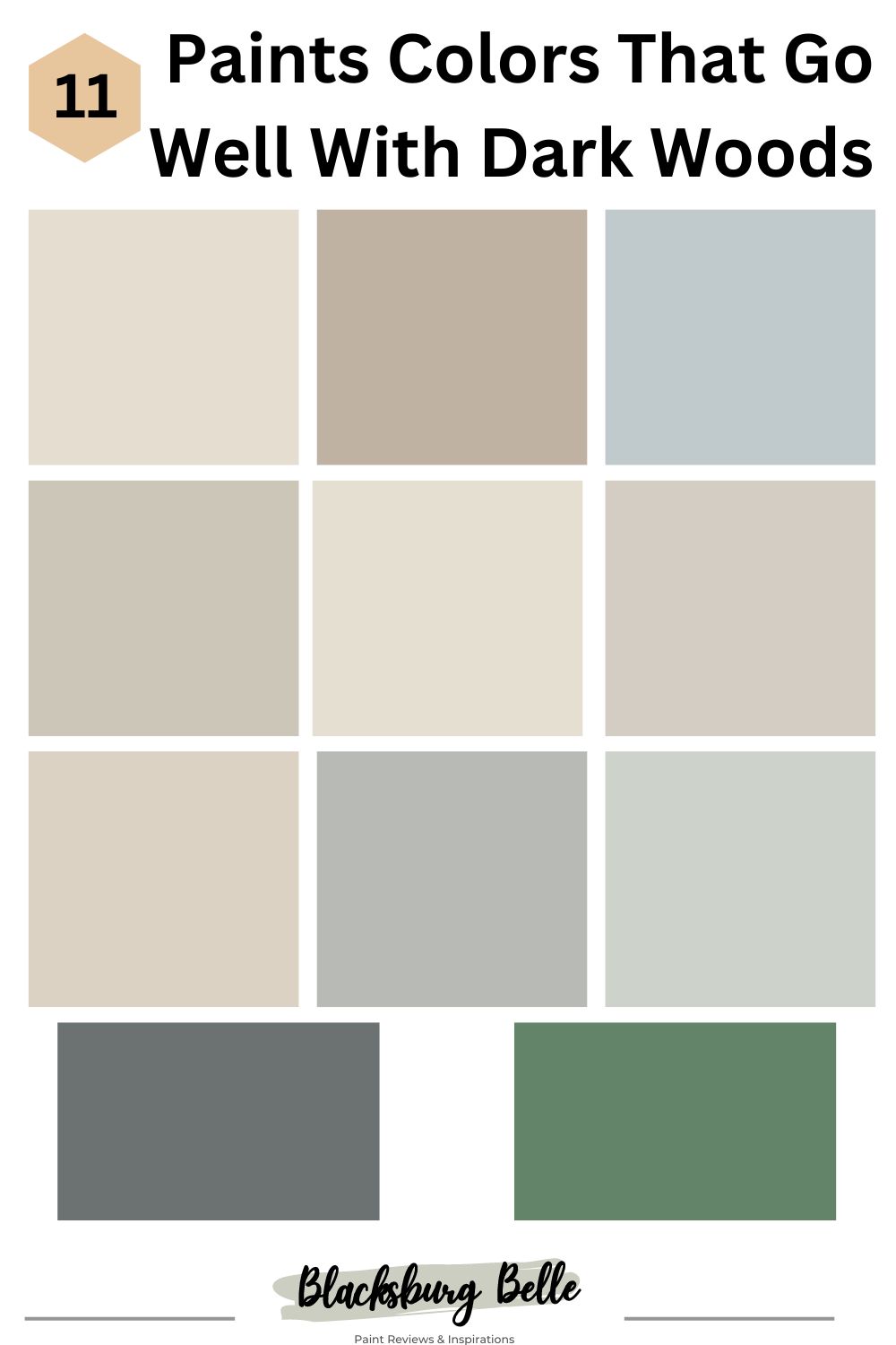
There are so many great colors that go well with dark wood, from vibrant purple to more muted tones. Whatever your preference, there is a paint color for everyone. Read on for the best 11 paint colors that go well with dark woods.
Table of Contents
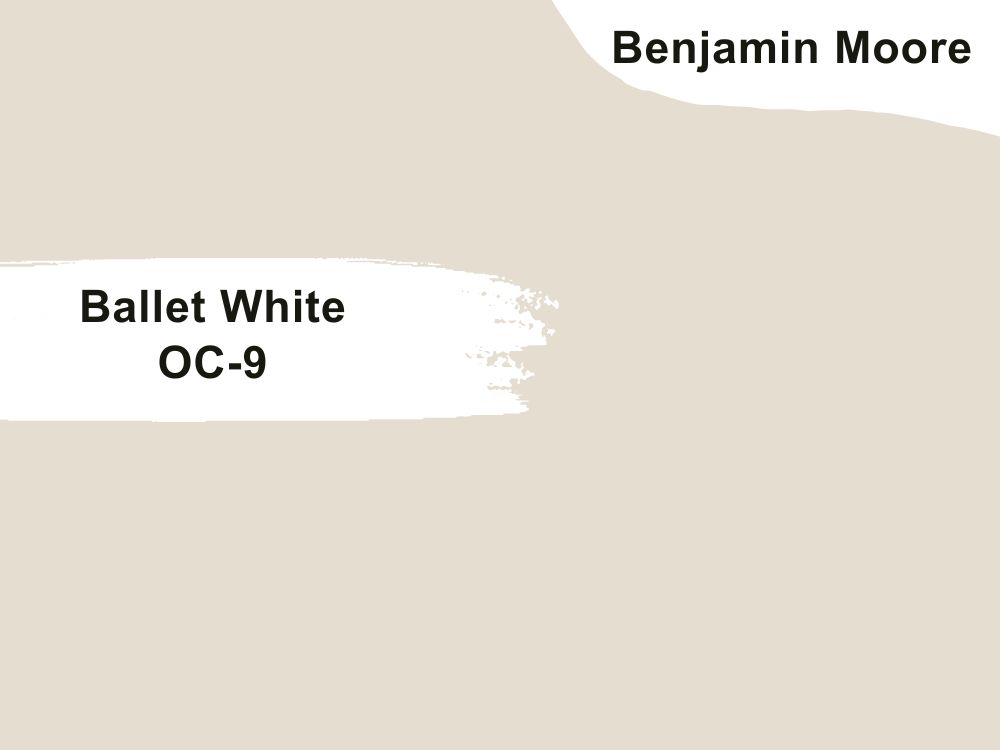
1. Benjamin Moore Ballet White (OC-9)
Over the years, there has been a trend and absolute fascination with white and its varying shades. From offices, bedrooms, and kitchens, this is a color loved by many home lovers. There is a reason white has been a staple in the world of interior décor, despite the changing trends.
Although the idea of pairing dark wood tones with white might seem like a giant chessboard to some, it is a great color to consider. Depending on the wood tones in your home, various shades of white can complement your space. Did you know there are over 100,000 shades of white and hue variations? Yeah, I am sure you did not know that.
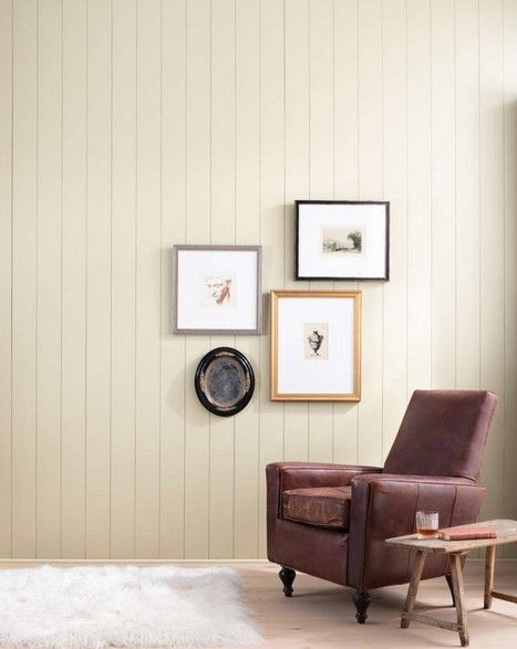
Firstly, using white with darker tones gives your home a more balanced contrast, opens up your space, and adds a touch of elegance. It can also give the illusion of a bigger and airy space, this is particularly important if you are inviting guests or having large groups over.
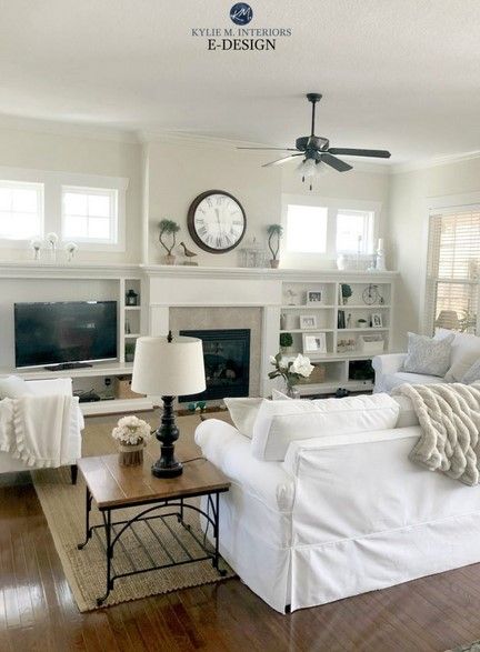
A gorgeous shade that goes well with dark wood is ballet white. Soft, warm, with a cream base, the typical yellow hue found in most creams is reduced greatly.
LRV: 71.97
RGB: 229/ 222 /208
Undertones: Yellow and Grey
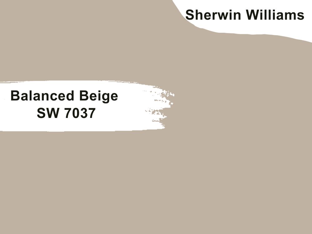
2. Sherwin Williams Balanced Beige (SW 7037)
I know you think boring old beige made it to the list. Here we go again, another tired color overused by influencers and everyone on Instagram. It seems everyone’s space is coated in beige. There are reasons this color is popular with a lot of homeowners, one of which is its versatility and flexibility.
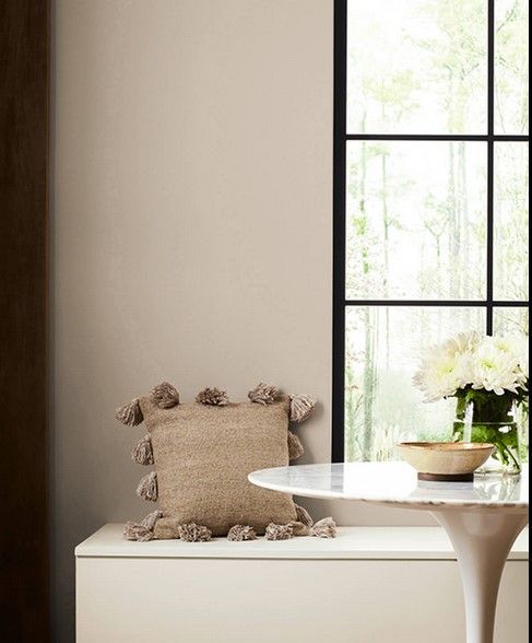
On their own dark wood furnishings can be intense, too moody, and difficult to style for many individuals. However, a combination of beige and dark woods is a match made in heaven. Also, a key thing to remember is that beige is not always brownish or warm, it can also come with yellow, pink, and green tints.
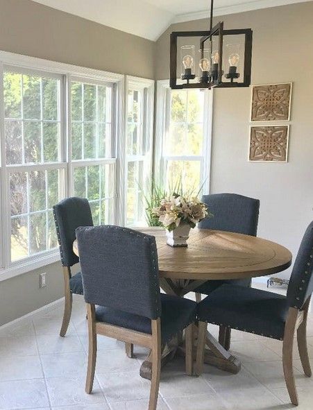
These tints can make a change in its appearance and hue depending on where the direction of light is coming from. So, it is worth considering, especially when it comes to darker wood tones. A great thing about this shade from Benjamin Moore is that it has less of a golden look and more of a grey-taupe look. This is also a beige color that would fit in with any setting.
You really cannot go wrong with this color, as it is bound to make your space more cozy and warm.
LRV: 46
RGB:192 178 /162
Undertones: Grey
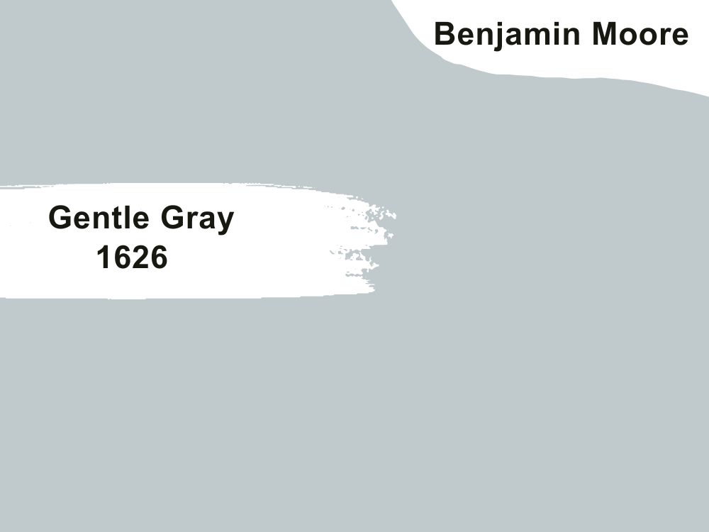
3. Benjamin Moore Gentle Gray (1626)
Pairing grey with darker wood tones might seem like a wrong choice, but it is not. Add a touch of sophistication to your home with this pairing, and you will be glad you did.
Recently, grey and its varying shades have become popular on the internet, with everyone jumping on the bandwagon. Take your space to a whole new level by teaming with dark wood tones and grey, especially with wooden accents
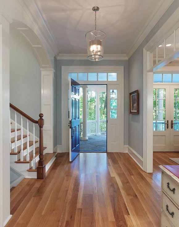
Grey does not need to look boring and rigid, as people fear, or bland and austere, this is why the contrastive pairing works really well.
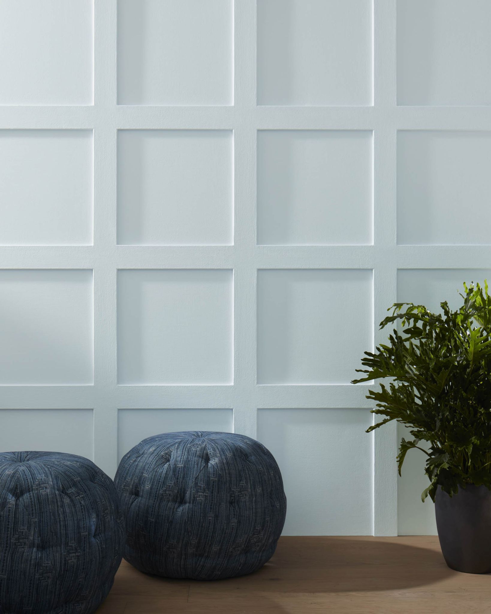
You can choose from a range of options, dramatic contrasts, light feathery greys, rustic and woody, calm and fresh. One such pairing is this delightful gentle grey from Benjamin Moore. A soft grey with blue in it, this cooler tone will give your room a lovely fresh look that goes well with dark wood.
LRV- 57.2
RGB: 192/ 202/ 205
Undertones: Soft Blue
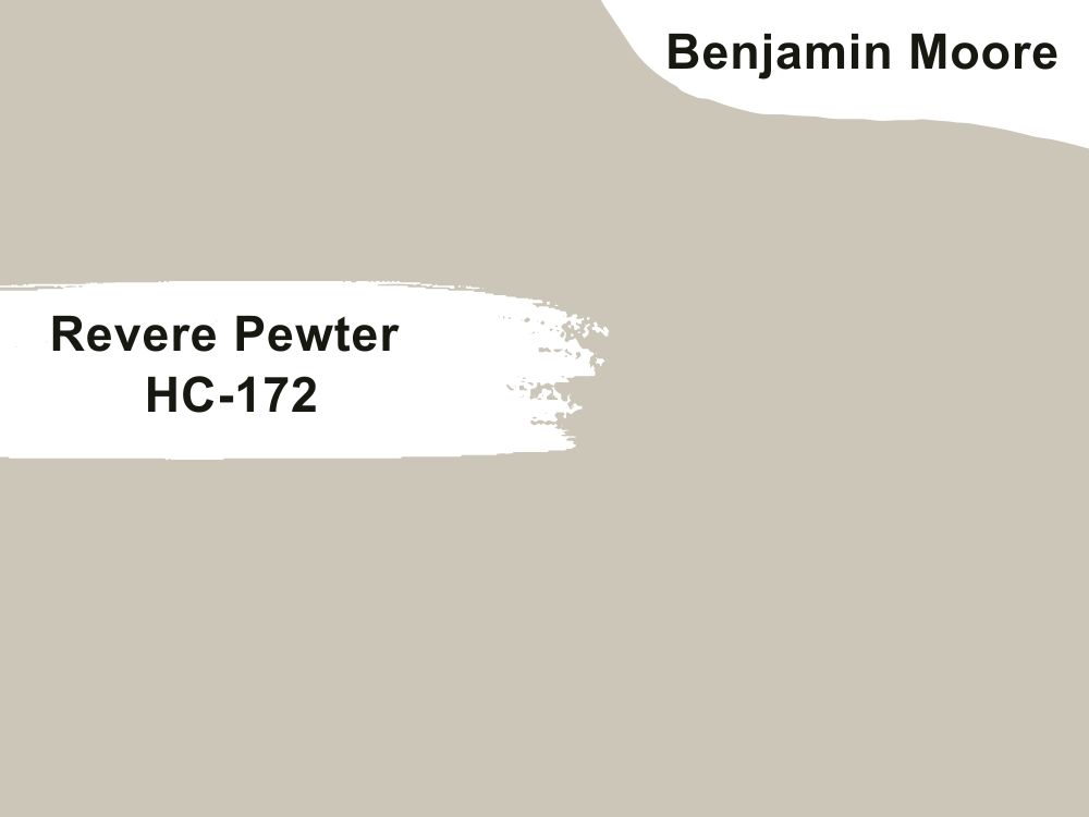
4. Benjamin Moore Revere Pewter (HC-172)
A top-selling and popular paint loved by many homeowners, this is a fantastic color that works well in different spaces. A warm, soft grey color, there is a reason this iconic color remains a top-shelf choice. Light enough to use in different rooms without looking washed out, this color works best in a light and airy room that gets lots of light.
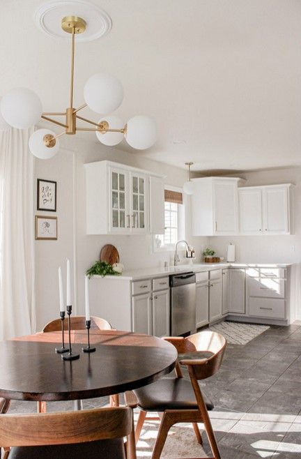
From living rooms, bedrooms, or even on kitchen cabinets, it is light enough to use in any room. Give your home a classy and elevated look with this refreshing paint. It also works well for a crisp and minimal look without looking too boring.
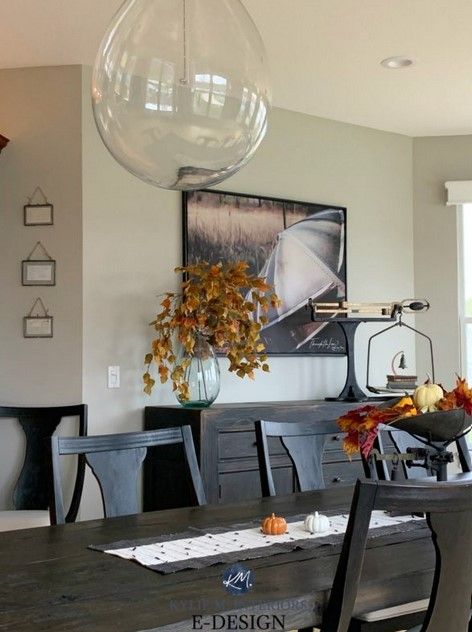
LRV: 55
Undertones: Green, Warm, Natural Beige
R:204 G:196 B:184
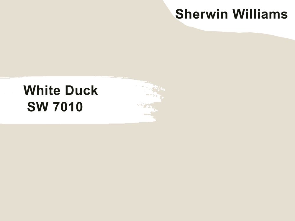
5. Sherwin Williams White Duck (SW 7010)
With this shade of white, you don’t have to worry about yellow undertones that come with cream colors. Working beautifully in any home, this shade can transform your space from drab to fabulous, and it is particularly recommended if your space is small. This color adds warmth, airiness, and brightness. Timeless and elegant, this shade of white adds coziness and warmth when incorporated into a room.
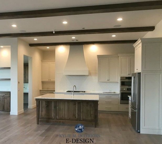
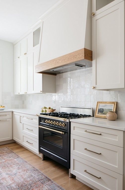
R:229 G:223 B:210
LRV- 74
Undertones: Grey and Beige
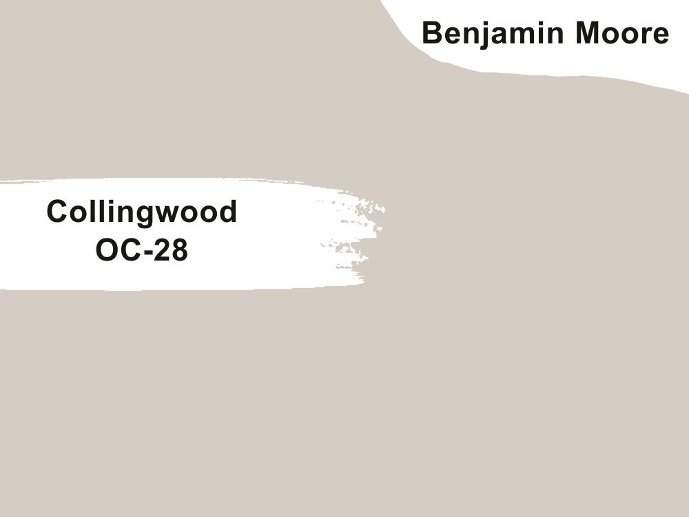
6. Benjamin Moore Collingwood (OC-28)
Another bestseller from Benjamin Moore, this paint color is an elegant color everyone falls in love with at first sight. A good in-between shade that is neither too light nor too dark, it fluctuates between grey and beige. Of course, this depends on a lot of factors, such as settings, light fixtures, and even the direction of your space.
This is a stunning shade that goes well with dark wood. For a bolder and more dramatic look, you can use a black paint color for trim or a lighter shade of this color for a simpler look.
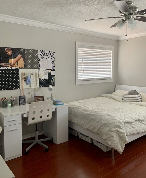
Some of the places to consider using this paint include bedrooms, bathrooms, kitchens, ceilings, and even a nursery. With this shade, the possibilities are endless.
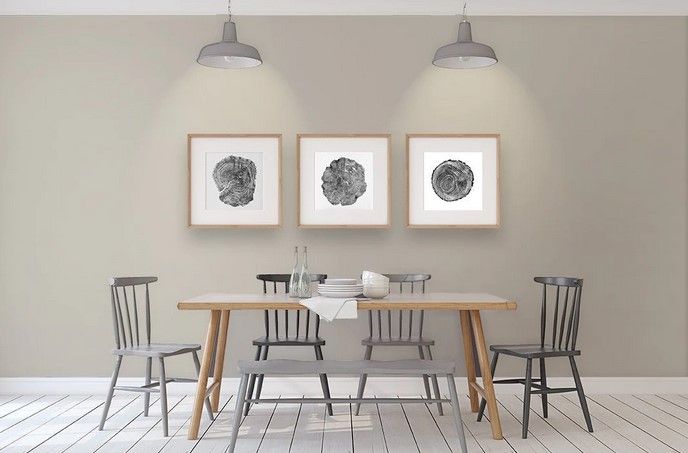
LRV-62.14
Undertones: Violet
RGB: 212/ 205/ 195
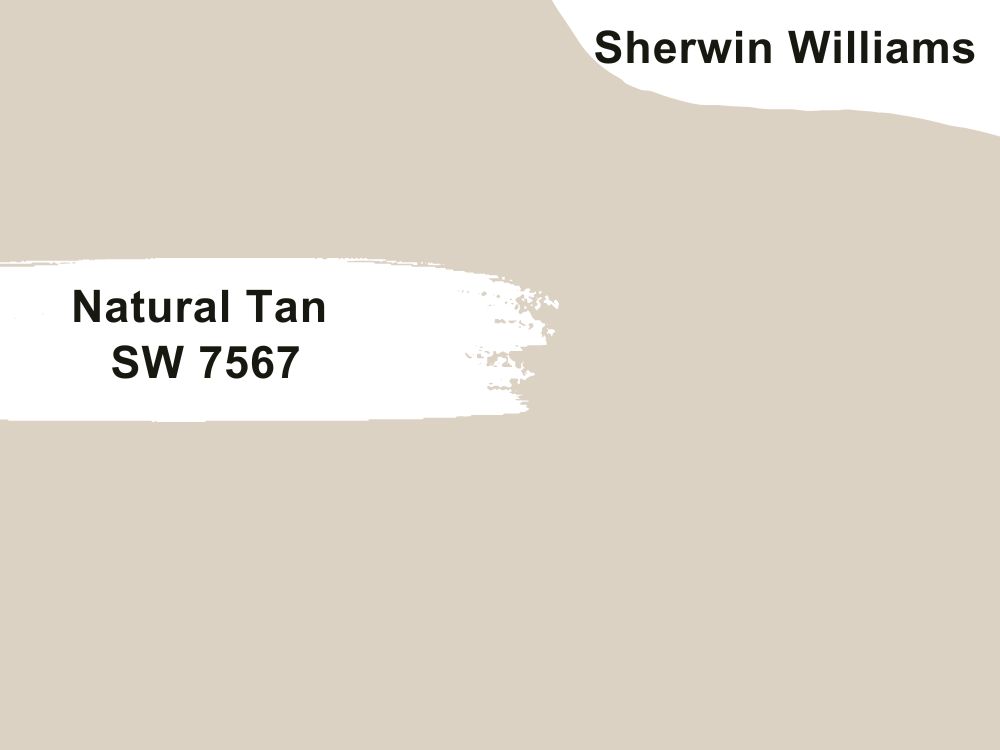
7. Sherwin Williams Natural Tan (SW 7567)
Another stunning neutral color that goes well with dark wood, this is a real find that is very versatile and flexible. Inspired by the beige color, it has a warm appearance that fits in with any space. Light and laid back, this is the warm neutral color you never knew you needed in your home.
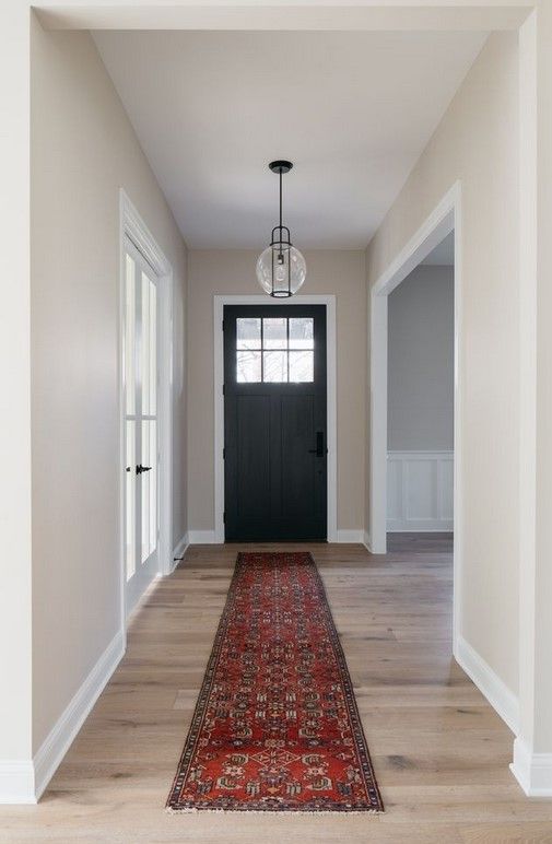
Incredibly relaxing and soothing, this shade says nothing but peaceful and ready to unwind. It is also a great color that works well with other colors in a complementing manner.
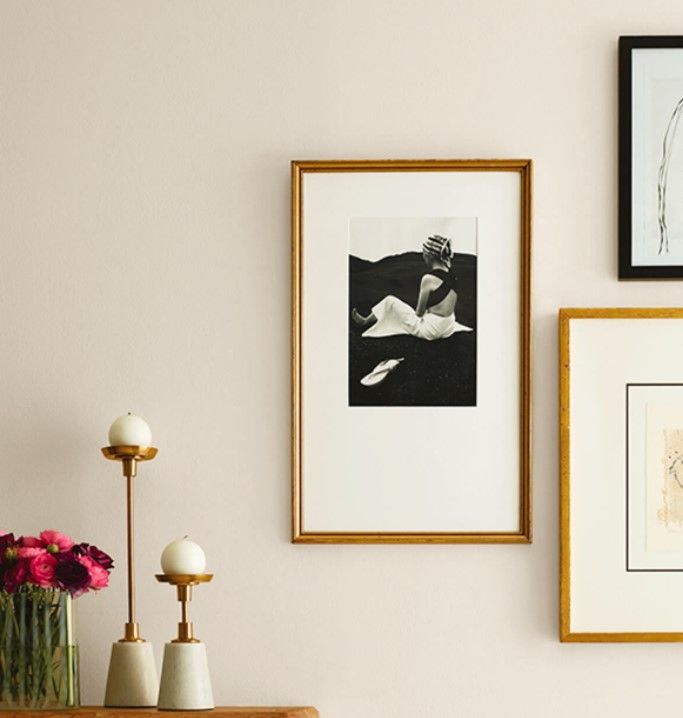
Sherwin Williams Natural Tan exudes warmth and cozy vibes that looks natural on dark wood.
LRV-65
RGB: 220 210 195
Undertones: very mild green
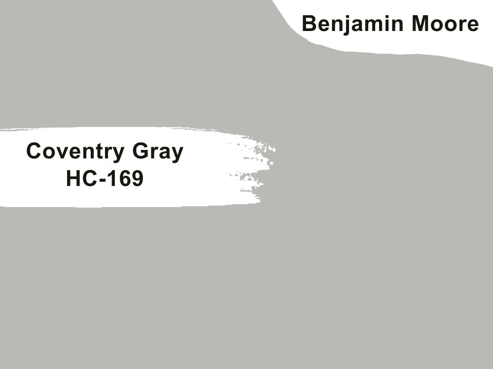
8. Benjamin Moore Coventry Gray (HC-169)
If you want to live on the more colorful side of life, this is not the shade to use in your space. However, for a more neutral and very soft look, this is a stunning shade that shifts colors as the light changes during the day.
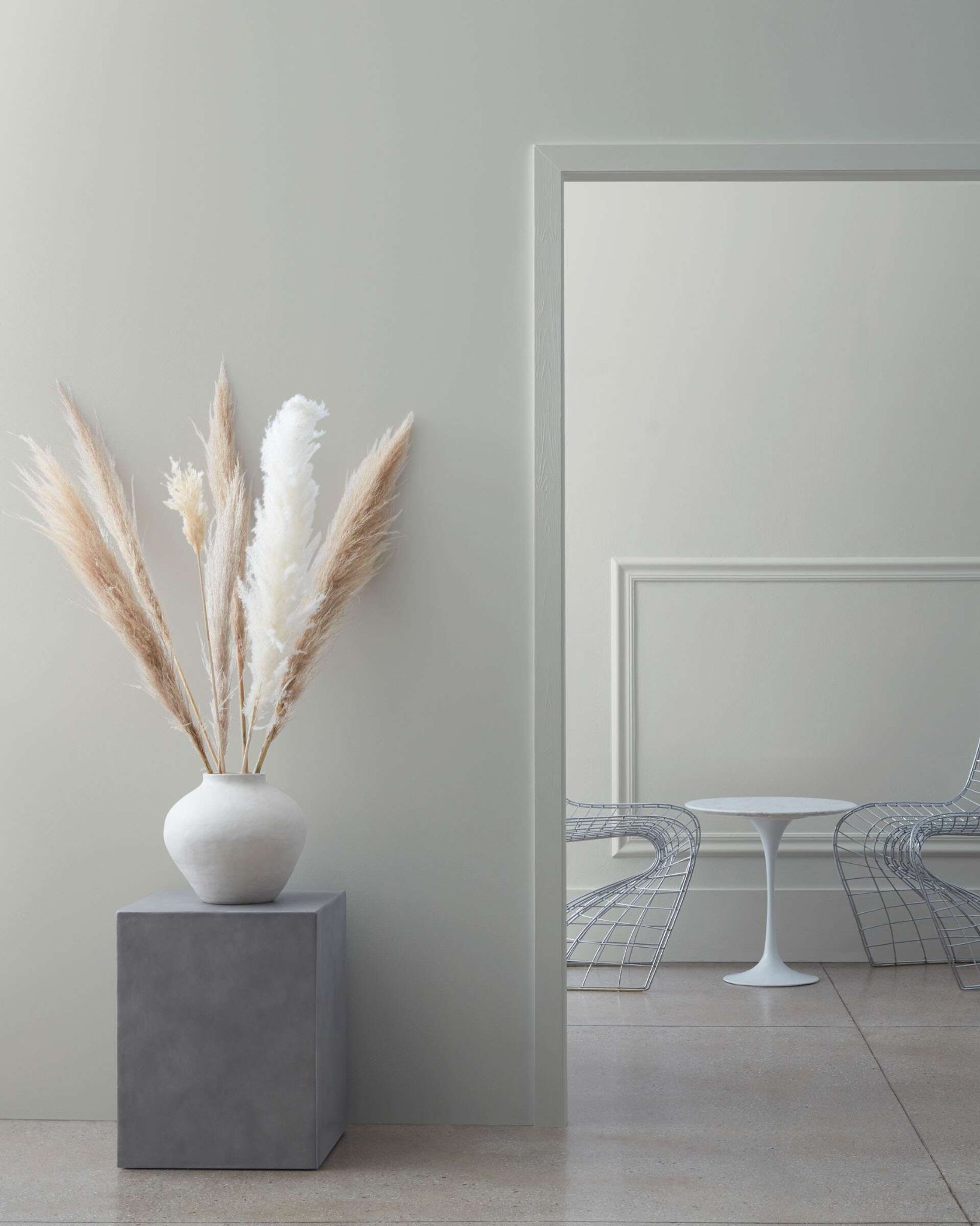
A soft cool color that can serve as an elegant and stylish backdrop, this shade goes with most spaces. From traditional décor to much more modern, this is a popular choice for many homeowners, especially in places such as bedrooms or dining rooms. It also adds a fresh appearance as it is neither too light nor dark.
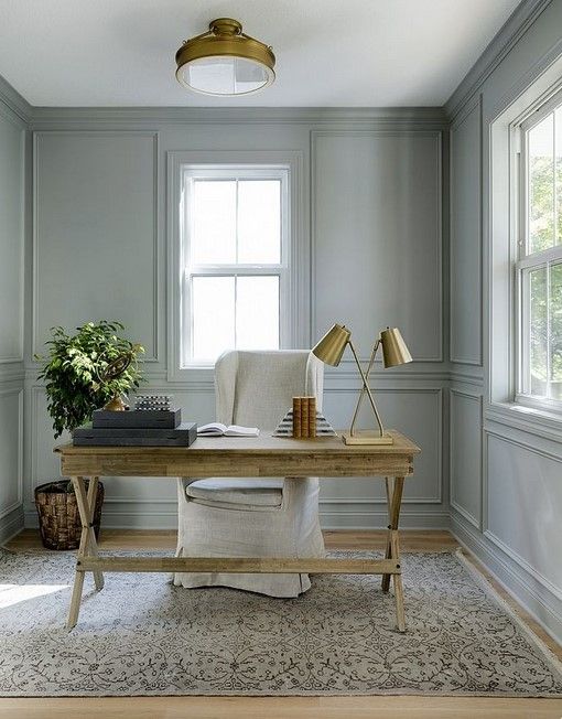
LRV-46
RGB: 184, 186, 182
Undertones: Mild Blue, Subtle Blue-Green
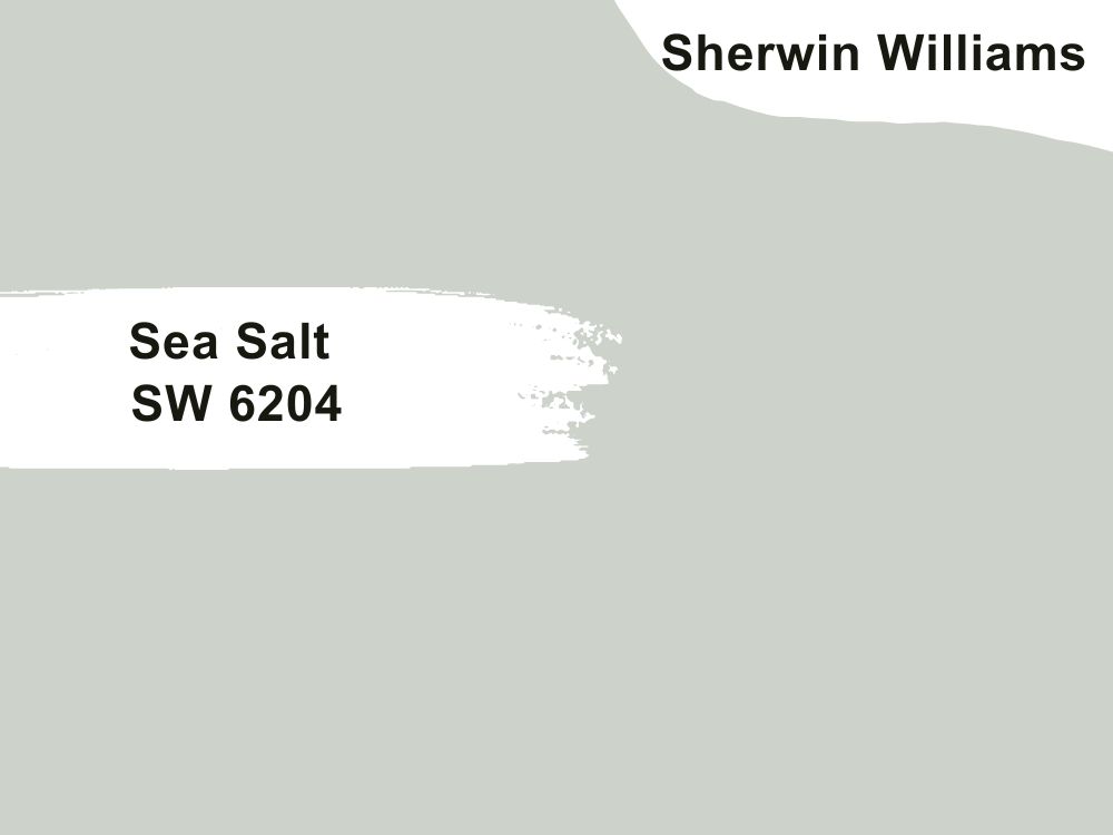
9. Sherwin Williams Sea Salt (SW 6204)
If you are looking for the best blend of green, gray, and blue, Sherwin Williams Sea Salt is the paint color you need. Did you know that Sherwin Williams Sea Salt is one of the most paint colors from the brand? It fits into so many palettes that you will always encounter it from time to time.
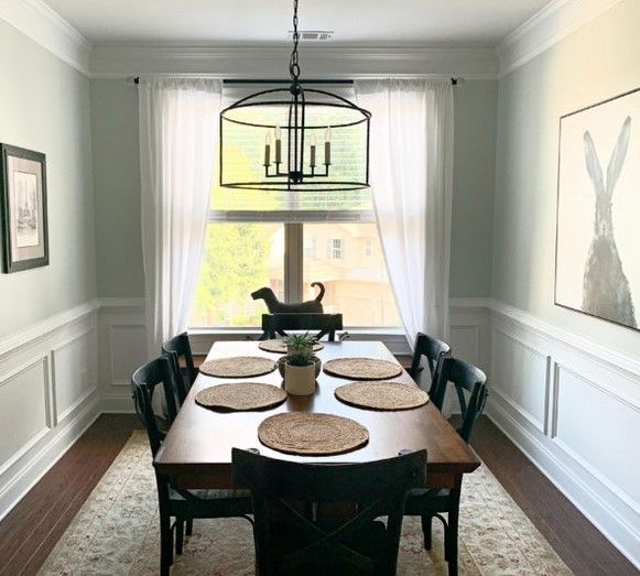
The truth is most people want a fresh, bright, and airy color that makes a room bigger and lets in a lot of light. This is particularly important if you have dark wood floors. No one wants a dreary, moody, and drab-looking space.
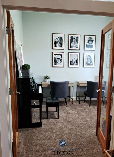
Sherwin Williams Sea Salt has many perks; it is versatile, can help a room feel brighter, and is not overly washed out in a well-lit room. What else could a homeowner ask for? It’s a match made in heaven.
LRV-64
Undertones: a mix of Green and Blue
RGB: 205, 210, 202
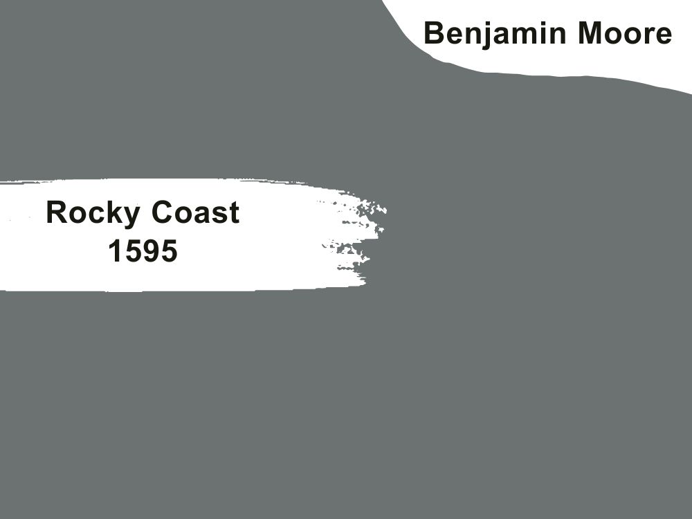
10. Benjamin Moore Rocky Coast
LRV-17.28
RGB: 108, 113, 112
A color so rich and beautiful it exudes majesty and sophistication. Let me tell you about this greyish stormy blue shade. Add some depth to your space by pairing this color with your dark wood like the other colors on the list, which are mostly warm neutrals or softer shades, this is a bold and daring shade.
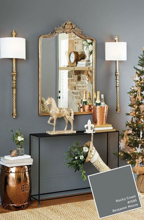
If you are looking for something soft and warm, this should not be on the list. However, it is a stunning color that works beautifully with dark wood and for those who want a darker look for their home.
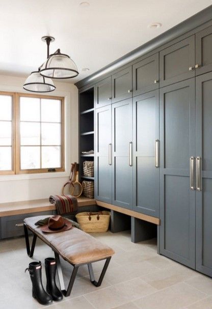
You can always pair it with coordinating colors like Benjamin Moore Collingwood, Chantilly Lace, White Down, and White Dove.
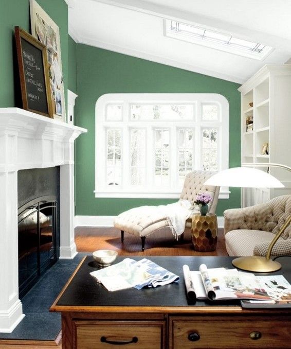
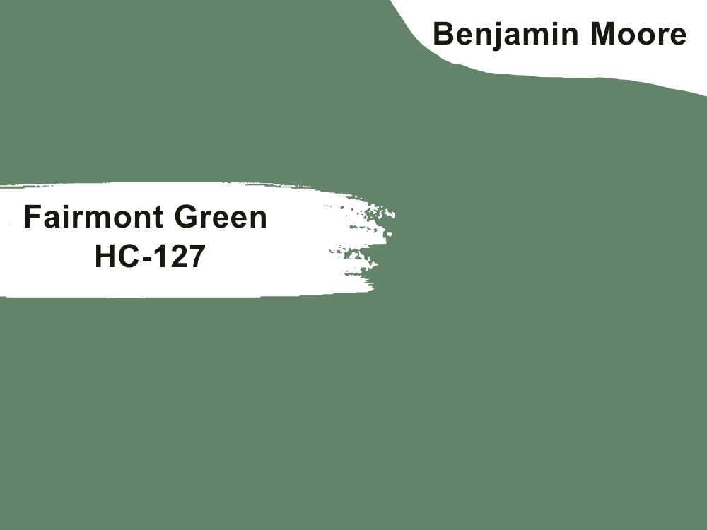
11. Benjamin Moore Fairmont Green (HC-127)
RGB:104,129, 104
LRV: 21.08
Another luxurious color rich enough to beautify any space, regardless of whether you use it on the walls or on dark wood. A lush, vibrant green shade, this is a stunning pairing with dark woods. Granted, it is not everyone’s cup of tea, but this paint is the stuff of dreams for those who want a brighter and bolder look.
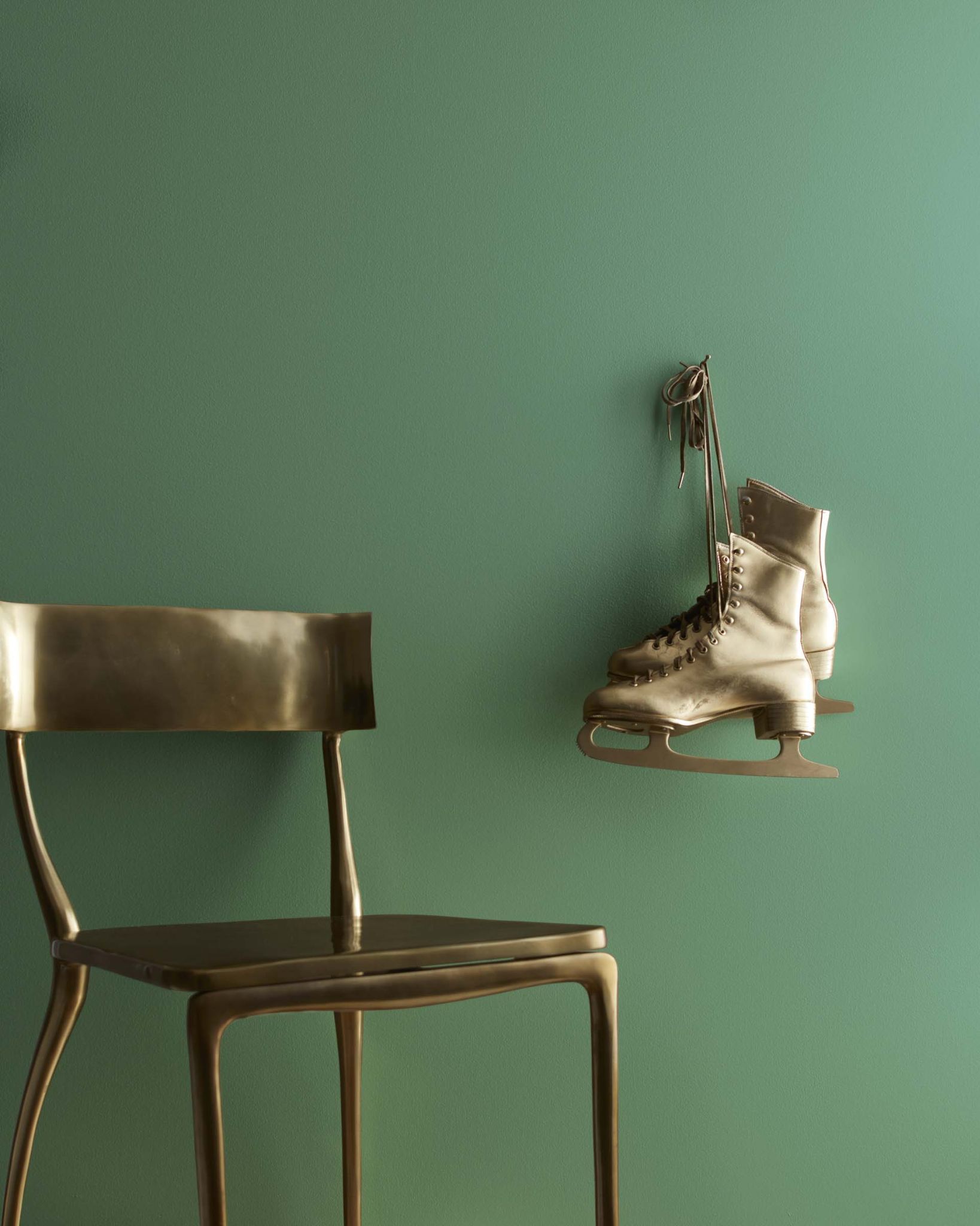
Steeped in tradition, this color adds refinement, elegance, and class to any setting where it is used. It is often regarded as timeless as it works well in any space, traditional, modern, new builds, or anyone willing to try.
When used correctly, it is a gorgeous color to behold. In order to see the fullness of this beauty, pair it with other complimenting colors.
Conclusion
Using dark woods in your home is a classic elegant move that elevates your home, adds contrast, and can help pull your space together. However, when it comes to styling and painting, this can be tricky if you are not a paint specialist or interior designer.
Fortunately, this list has been compiled just for you because you don’t have to be an interior designer to enjoy a good space. These are paint colors that go well with your dark woods. From brave pops of colors, such as Benjamin Moore Rocky Coast, to softer tones and warm neutrals and tans, there is a great selection to choose from.
So, whether you have just moved into a new place, thinking of giving your office a makeover, or simply want to try something new. There is a hue for everyone, you just have to find it.


Hiya!
I do appreciate the linkbacks and love your content, but I would love it if you would only use one of my photos per blog post 🙂 Thank you!
I just checked my other articles carefully and there is indeed a problem as you said, I will fix this problem step by step later. The reason for this problem is that your images are so beautiful and rank so well that I inadvertently select your images. I will gradually replace it. I’m very sorry.
In the paint color niche, I can see your website almost every day, I did not expect that we are this way first contact, haha, you are my example to learn.