
If you love homely beige paints with warm tints and versatile overtones and have your eyes set on either Sherwin-Williams Accessible Beige or Balanced Beige, you’ve landed in the right place.
Comparing these popular beige colors was fun and exciting, and I can’t wait to share my discoveries with you. Before we proceed any further, here’s a quick tip:
Sherwin-Williams Accessible Beige is lighter and more neutral than Balanced Beige, which contains more undertones.
There’s more to choosing between Accessible Beige and Balanced Beige than the surface differences and in this article, I analyze the RGB, LRV, tints, and color palette of both colors with pictures so that you can make the best decision.
Table of Contents
When Should you Choose Accessible Beige (SW 7036) and Balanced Beige (SW 7037)?
Choosing between two beautiful colors, Accessible Beige and Balanced Beige, can be quite daunting, but that’s why I’m here. I’ll provide you with scenarios where both of these neutrals are suitable, so you don’t have to stress over making that choice.
Choose Accessible Beige if:
- You want muted beige with a hint of gray and green
- You like versatility and are prone to changing your interior decor frequently
- You want a uniform wall paint inside and outside the house
Choose Balanced Beige if:
- You favor a cozier non-traditional beige tone
- You’re into exploring taupe designs and decor
- You love intense gray tones in dim lighting
If you’ve noticed the similarities between Accessible Beige and Balanced Beige from these brief descriptions, you are on the right path. Now, you’ll understand why making a choice goes deeper than their surface outlook.
To ensure you end up with the right paint, their undertones and palettes are also very necessary in the decision making process.
If you’re still confused, don’t worry, I won’t keep you waiting longer. Let’s discuss the differences between these Sherwin-Williams beiges.
Accessible Beige vs. Balanced Beige: Visualizing the Differences
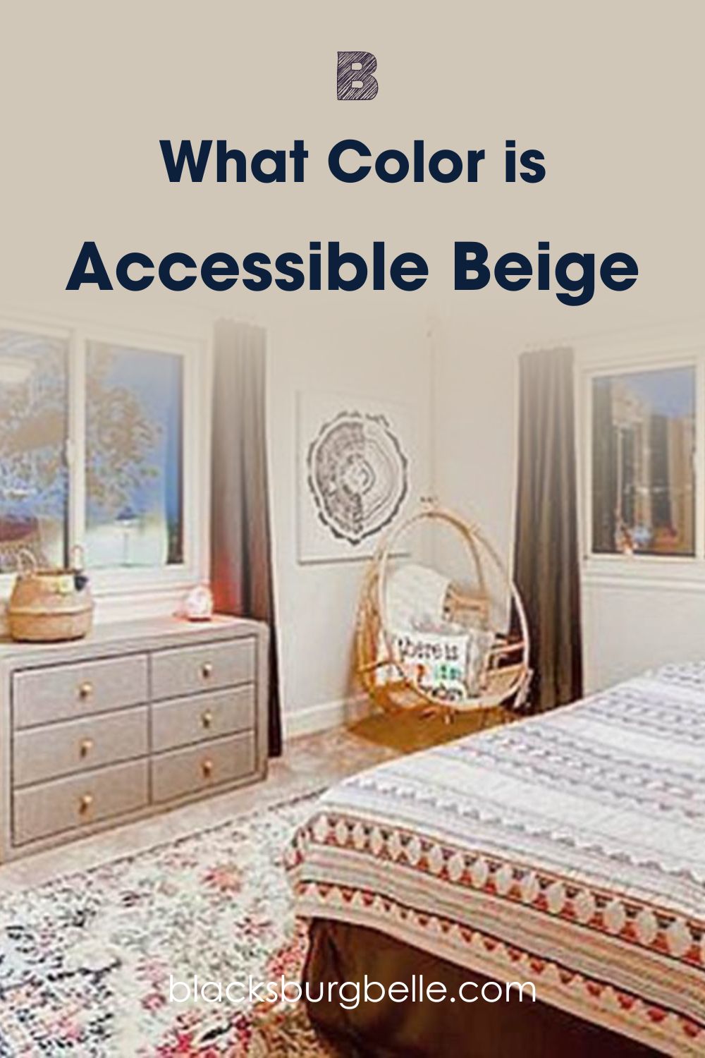
Firstly, see Accessible Beige in a bedroom with earth-toned decor
Now see Balanced Beige on a wall with Alabaster white accents and trims
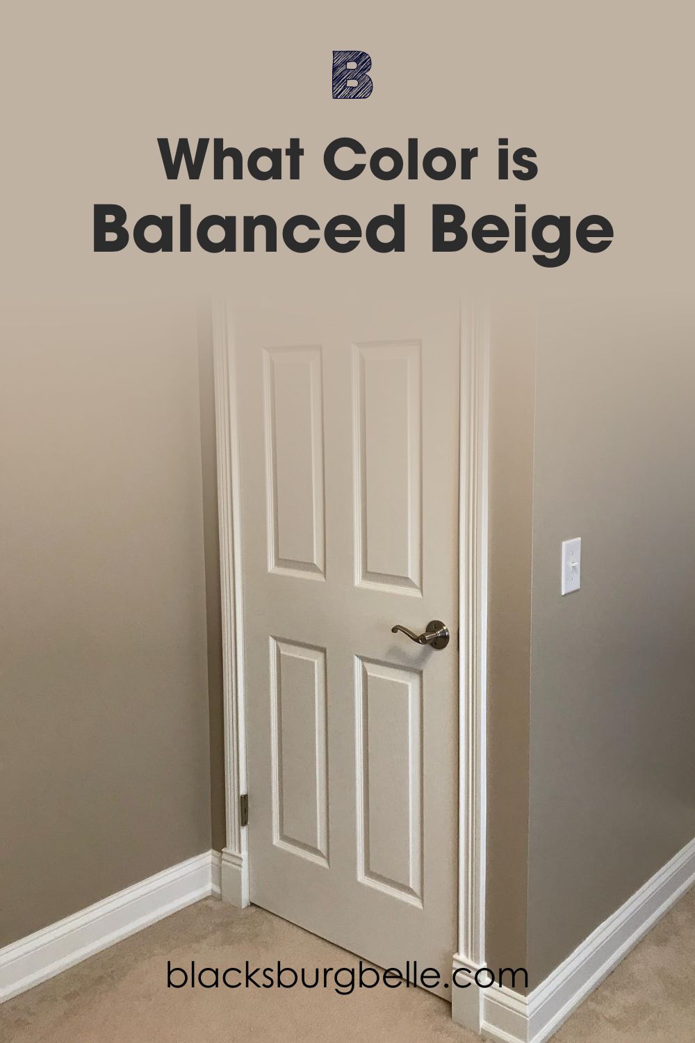
From the images, you’ll notice that Accessible Beige is a lighter tone leaning towards off-white than Balanced Beige in picture two. Balanced Beige is a deeper mid-toned neutral that appears greige instead of beige when paired with a high reflective color.
Moving on, let’s highlight the differences between Accessible Beige and Balanced Beige.
Comparing Accessible Beige and Balanced Beige: A Quick Overview
Check out the scientific differences between both colors in the table below.
| Accessible Beige | Balanced Beige | |
| LRV | 58 | 46 |
| RGB | 209 | 199 | 184 | 192 | 178 | 162 |
| Undertones | Reddish-Orange, Green, Gray | Green, Gray, Reddish Tan |
| Hex Value | #D1C7B8 | #C0B2A2 |
Emotional Effects: Accessible Beige vs. Balanced Beige
Now let’s talk about the emotional effects of the values from the table above. Accessible Beige and Balanced Beige are greige paints, but they don’t give you the same feeling.
Accessible Beige looks like a dependable neutral sweater you wear for all seasons, while Balanced Beige keeps you grounded with its earthy tone, especially when used in dim lighting.
Both colors are chameleons, but Accessible Beige is more adaptive than Balanced Beige. So, choose Accessible Beige to accommodate your changing mood from morning to night and Balanced Beige to keep the aura steady at all times.
Light Reflectance Value (LRV) of Accessible Beige and Balanced Beige — Which Color Reflects More Light?
Every paint color has a degree of reflectiveness measured on a scale of 3 for pitch black to 97 for pure white. It’s not 0 -100 because manufactured paints come with undertones no matter how faint they appear.
Sherwin-Williams Accessible Beige has an LRV of 58 while Sherwin-Williams Balanced Beige’s LRV is 46.
From these figures, it is already clear that Accessible Beige is lighter than Balanced Beige. But when you place them on the LRV scale, you’ll see that both colors are close to the median of 50.
With a 46 LRV, Balanced Beige mostly stays the same until lighting alters its overtone and highlights its other colors. Meanwhile, you can’t pick Accessible Beige for a reliable beige shade because it’s eight steps away from the unchanging mid-tone mark.
By studying the undertones, you’ll learn more about why both colors react this way to lighting.
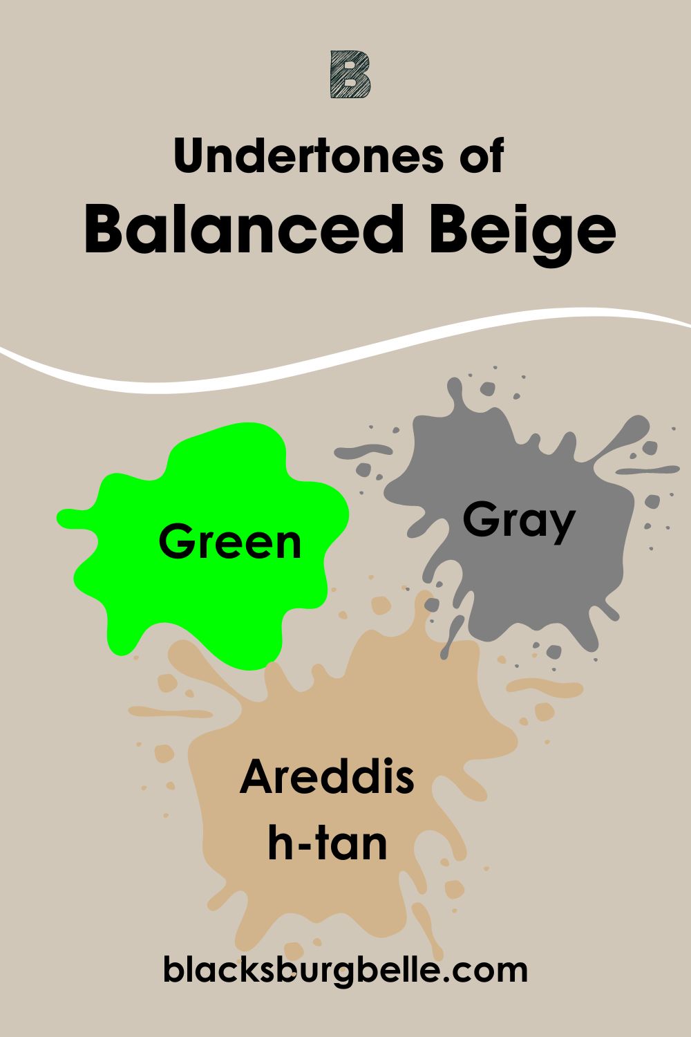
Undertones of Accessible Beige and Balanced Beige: Are They The Same?
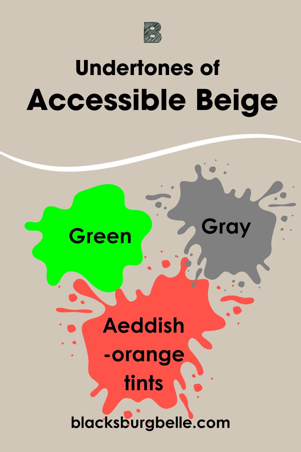
Accessible Beige and Balanced Beige share undertones, which make them similar, however their level of reflection separates them.
Both colors have green and gray undertones, but Accessible Beige includes reddish-orange tints, while Balanced Beige has reddish-tan. The additional undertones create different reflection capacities that set both colors apart.
A Closer Look at the Undertones in Accessible Beige
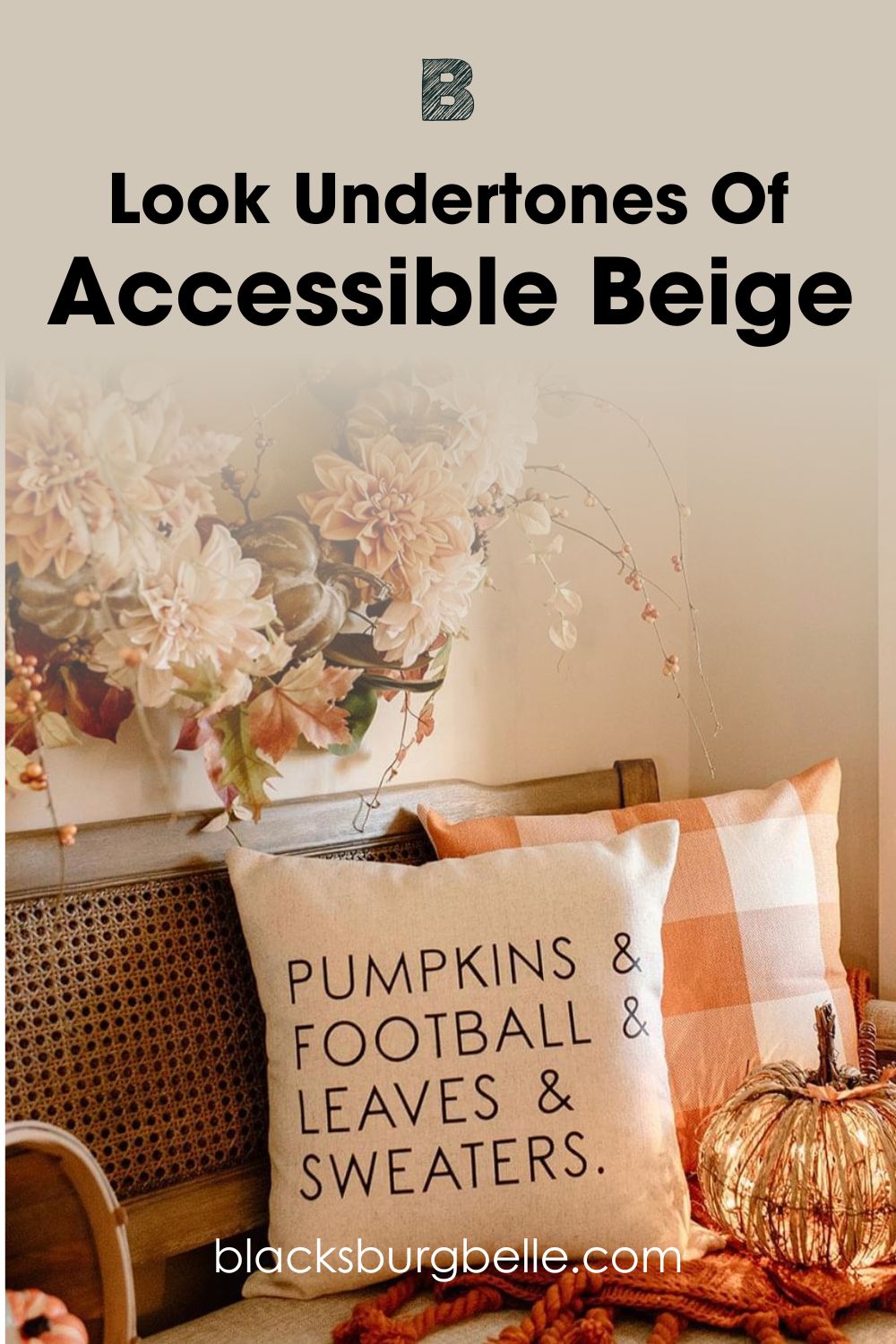
On close examination of Accessible Beige, you’ll notice that it has the potential for warmth, with its reddish-orange undertone taking over, especially when paired with similar decor.
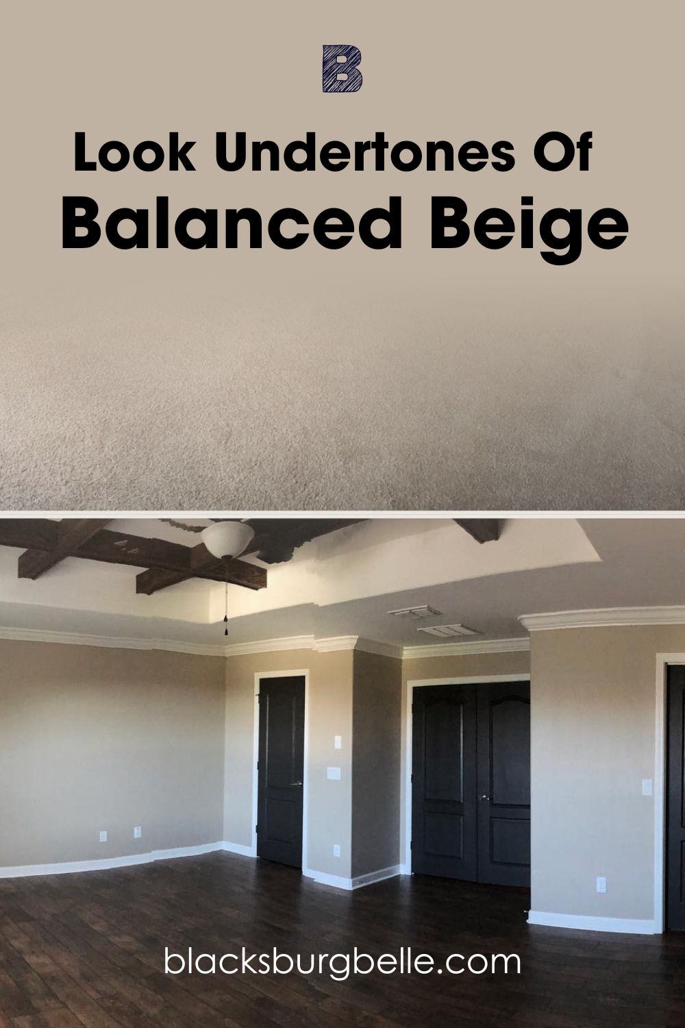
A Closer Look at the Undertones in Balanced Beige
Check out this before and after comparison of Balanced Beige in the same room. Notice how the difference in flooring color and texture changed the wall’s tone despite having the same doors, trims, and exterior natural light.
Typically undertones show up based on changes in lighting, but it takes other intense colors like tan and orange to highlight the warmth in Accessible Beige. You can see its gray tint fade under the intensity of the Fall decor in this living room nook.
Using dark brown hardwood floors highlighted the warmth in the Balanced Beige wall. Meanwhile, replacing the wood with a matching taupe carpet deepens its earthy tone. The white light and sun reflections showed the color’s many undertones, from gray to green.
Look at the top wall in the second Balanced Beige picture to notice the reddish-tan undertone. I hope you’re as fascinated with the multiple tones and tints in both neutrals as I am.
Accessible Beige and Balanced Beige — Warm or Cool?
Accessible Beige is a purely warm, greige tone, while Balanced Beige marries warmth and coolness. The gray tone in Accessible Beige has warm undertones because of its bold reddish-orange tint, while that of Balanced Beige is muted and relaxing.
You must pair Balanced Beige with cool colors like white, blue, and green to highlight its calming gray tone.
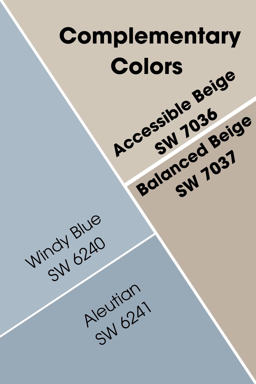
Complementary Colors for Accessible Beige and Balanced Beige
Colors opposite each other on the color wheel create complementary themes because of their contrasts. With Accessible Beige and Balanced Beige being neutral colors, there are two ways to find the exact contrast.
You can use the hex code or infer from the dominant undertones.
Sherwin-Williams Accessible Beige’s complementary color is #B8C2D1 (or Windy Blue SW 6240) and #A2B0C0 (or Aleutian SW 6241) compliments Sherwin-Williams Balanced Beige.
The medium-dark Aleutian casts a dusk and calming tone on Balanced Beige walls giving its dull beige tone a darker look. But with Accessible Beige, Windy Blue creates a breezy look for Accessible Beige’s medium-light tone.
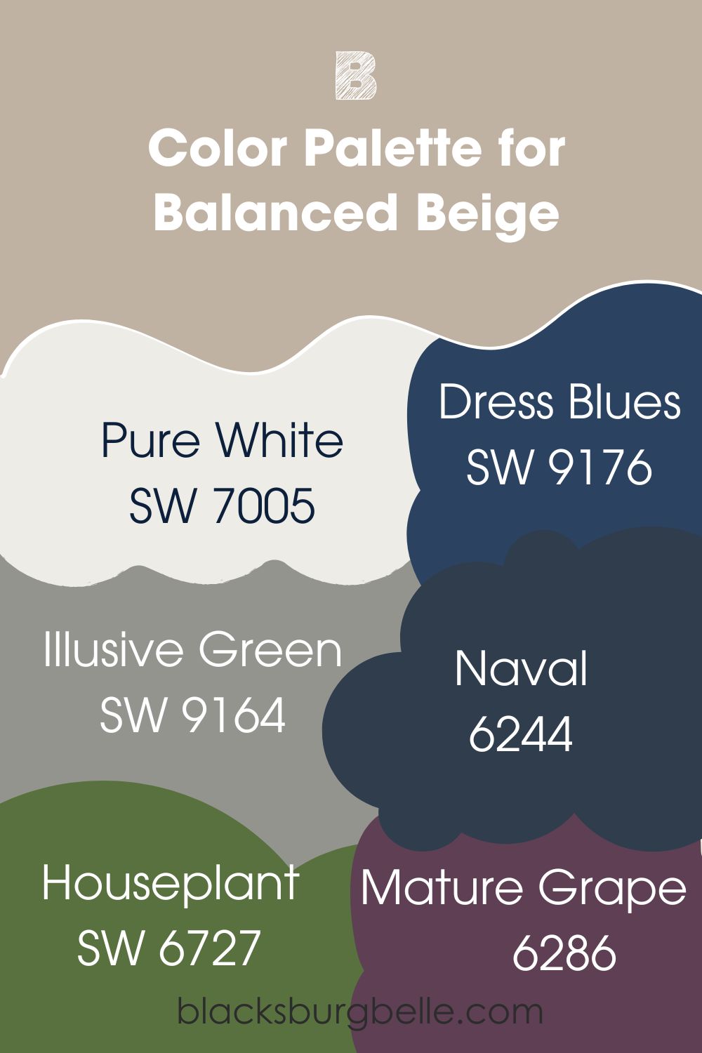
Color Palette for Accessible Beige and Balanced Beige
Designing your home is fun when you know how to use Color Theory to create ideal palettes. Combining colors goes beyond liking two or more shades. Color combinations influence the room’s overall aura and tell your guests about your personality.
I’ve analyzed some of the most popular themes designers use for your Balanced Beige and Accessible Beige palettes. Check them out below.
Accessible Beige Color Palette
Use monochrome themes to create a uniform look with different shades and tints of a single color. If daring, try bolder combos like Analogous themes with three side-by-side colors or Triadic themes with three evenly spaced colors.
- Virtual Taupe: This muted dark brown paint is warm and toasty. Its sandy tone highlights the earthy tone of Accessible Beige. Pair it with Tony Taupe and Balanced Beige for a gentle, harmonious look.
- Van Dyke Brown: Use this dark brown paint to create a sophisticated and serious aura while keeping the space warm. This goes well in the study or office space.
- Romaine: This medium-light green color is a happy tone that anchors your Analogous theme.
- Thistle:A soft purple with a 30 LRV, great for completing your analogous theme. It has a bold red undertone that matches the reddish-orange tint in Accessible Beige.
- Berry Cream:This pastel purple is darker than Thistle and pairs excellently with a Triadic theme.
- Spearmint:Complete your Accessible Beige color triad with this mid-toned pastel green. It’ll highlight the faint green undertone in this color and give the room a floral look.
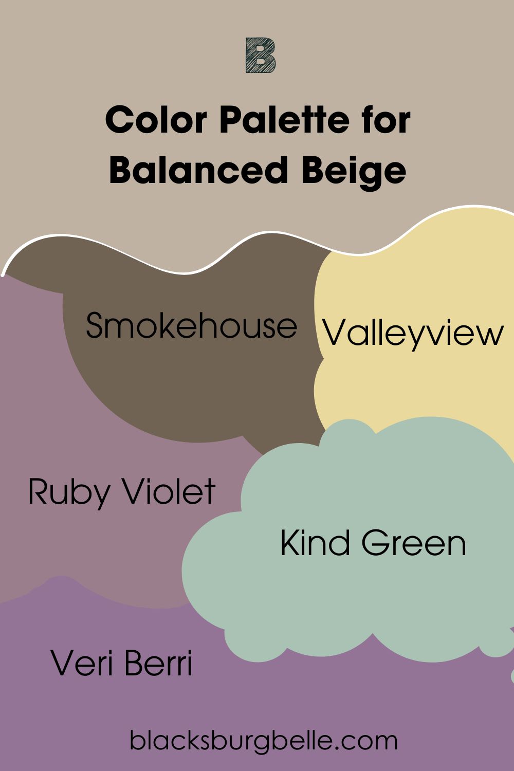
Balanced Beige Color Palette
Typically, Balanced Beige has the same combination of colors as Accessible Beige because they belong to one strip. But I’ve found alternative colors to expand your options. Check them out.
- Smokehouse:Because this warm brown paint has a hint of gray, it’s the perfect dark tone in a monochrome theme for Balanced Beige. Complete the theme with a lighter tint like Moth Wing and a medium-dark tone like Tony Taupe.
- Valleyview:This is an interior-only green paint because of its need for closed spaces. It has a faint brown undertone making it an excellent Analogous color for Balanced Beige.
- Ruby Violet:Finish your Analogous design with the soft medium-dark tone of Ruby Violet. It’s a pretty balance of red and purple. Unlike Valleyview, you can use this shade on your exterior.
- Kind Green:Choose this mid-toned shade if you want green paint outside with your Balanced Beige paint. Red and blue undertones make fascinating blends when paired with purple in triadic themes.
- Veri Berri:The deeper purple tone of this color creates an intense look for Balanced Beige. It’s a sweet lilac shade with a bold red undertone that keeps it warm.
Can you use Accessible Beige and Balanced Beige?
Absolutely. You can use Accessible Beige and Balanced Beige in a monochrome theme because they belong on the strip. That means they have similar undertones and components.
You can use the darker tone of Balanced Beige as an accent against the lighter Accessible Beige.
Then, tie both colors in with Aesthetic White trims, a warm off-white tone with violet undertones. Its medium-light white tone works well for the minimalist and neutral mood of Balanced Beige and Accessible Beige.
Accessible Beige vs. Balanced Beige on Walls
Let’s see how you can incorporate Accessible Beige and Balanced Beige on your interior walls.
Accessible Beige on Walls
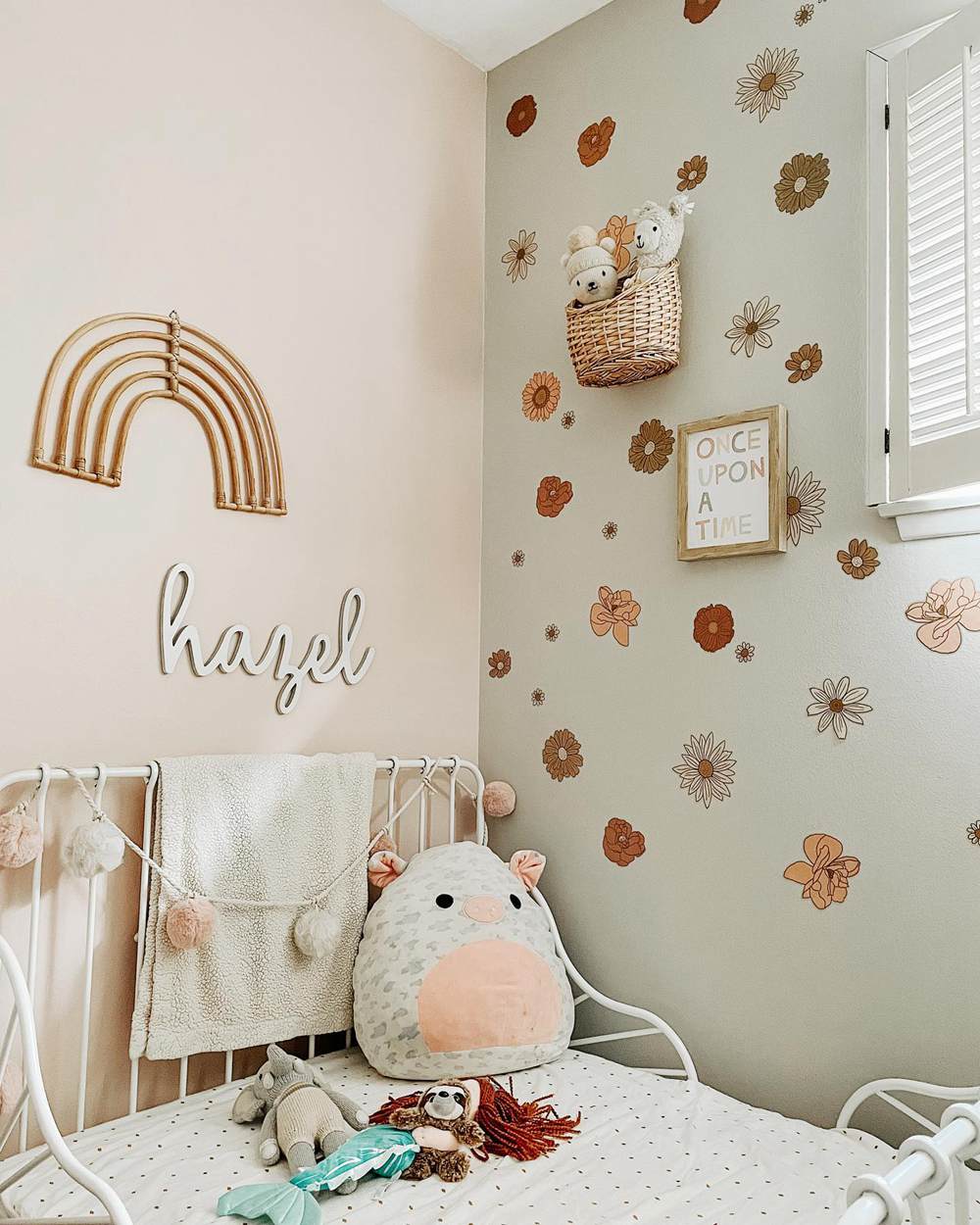
This kid’s bedroom has Accessible Beige on a side wall paired with a softer gray wall and fall-inspired tan floral motifs. The color combo gives this room a genderless character making it ideal for boys and girls.
Balanced Beige on Walls
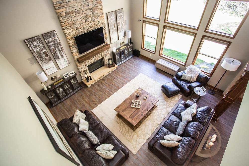
You can tell this living room belongs to a family of grown children and mature adults. The neutral Balanced Beige walls have an intense aura because of the chocolate brown leather couches and light beige accessories.
Accessible Beige vs. Balanced Beige on Cabinets
If you love cabinets that stand out whether it’s in the kitchen, bathroom, or hallway, then check out these designs with beige paints.
Accessible Beige on Cabinets
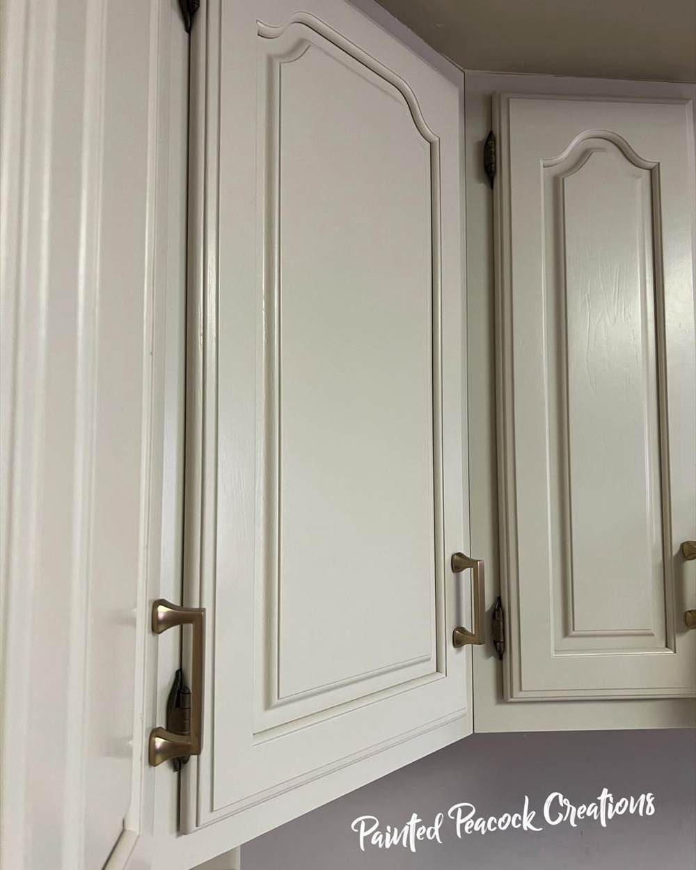
Accessible Beige looks like an off-white paint on this high-placed cabinet. It gives the furniture a sophisticated and modern look despite its traditional carving. The lower cabinets can use complementary colors like gray or a rich reddish-orange for warmth.
Balanced Beige on Cabinets
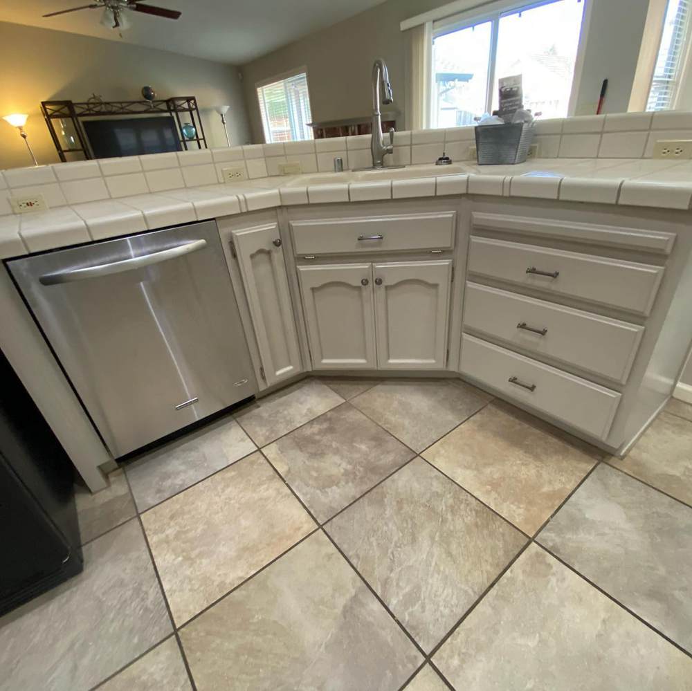
The gray undertone in this Balanced Beige cabinet is prominent because of the marbled tiles on the floor and the slab. Using silver fixtures for the taps and handles gives this kitchen workspace a minimalist charm.
Accessible Beige vs. Balanced Beige Exteriors
How do you think Accessible Beige and Balanced Beige would look outside under the glare of natural sunlight? Would you prefer a beige tone with the potential to become taupe or a softer shade that’ll turn gray?
Visualize both options below.
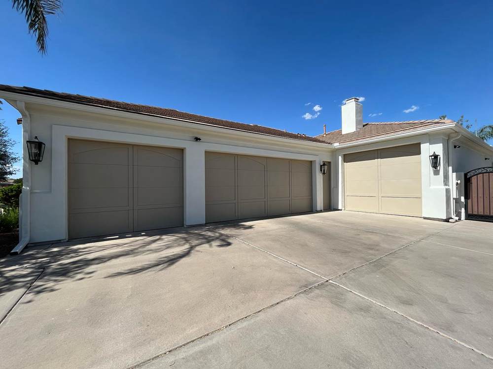
Accessible Beige Exteriors
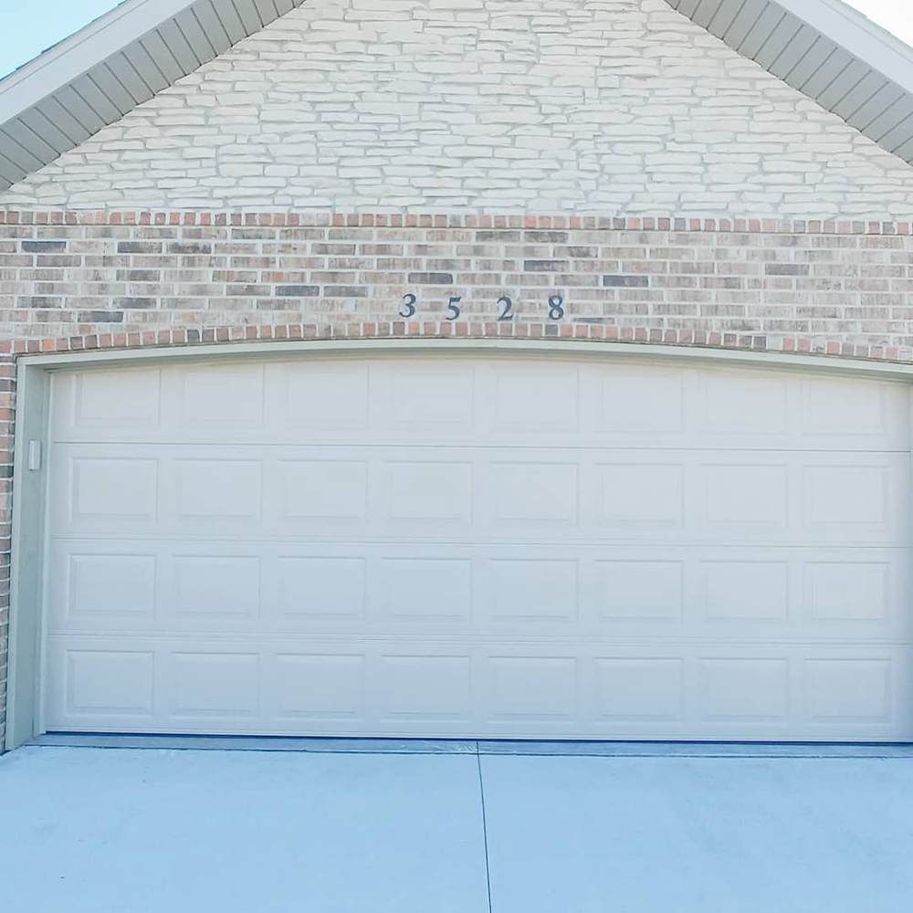
Accessible Beige is on the garage door and topmost brick wall. Pairing it with multicolored reddish-tan bricks and darker beiges gives the color a bright reflection.
Look at the cemented floor in front of the door and the lower part of the garage door, you’ll see a hint of green mixed with gray.
Balanced Beige Exteriors
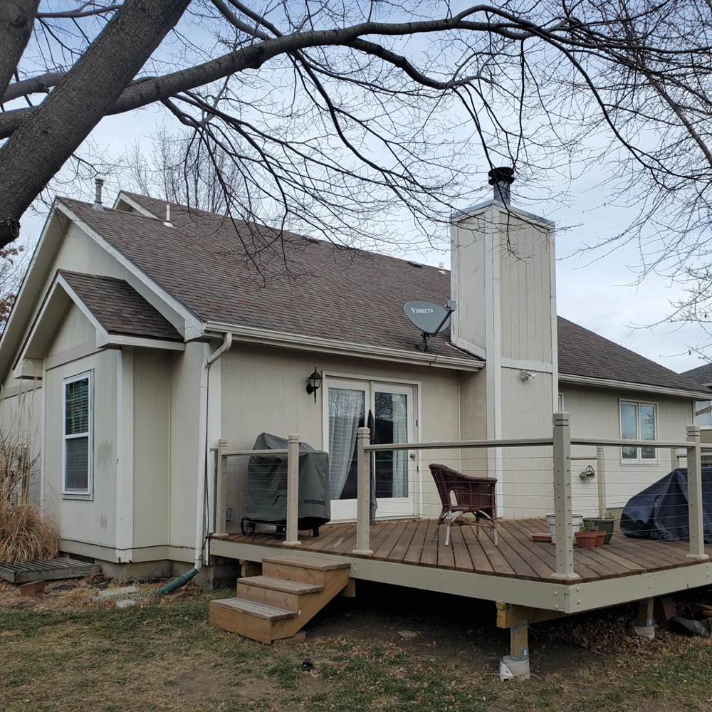
This farmhouse blends stone masonry and Balanced Beige for a nostalgic rustic home. The fence could use a makeover because it’ll look better if the homeowner paints it the same as the side wall.
Other than that, using Balanced Beige on the walls ensures the house doesn’t look odd on the untamed grass and browning leaves.
Accessible Beige vs. Balanced Beige as Accents
One would think using beige as an accent is impossible because it’s a neutral and muted color but they’re wrong. When you use Accessible Beige or Balanced Beige as an accent, you’ll need bolder colors to highlight their undertones.
Accessible Beige Accents
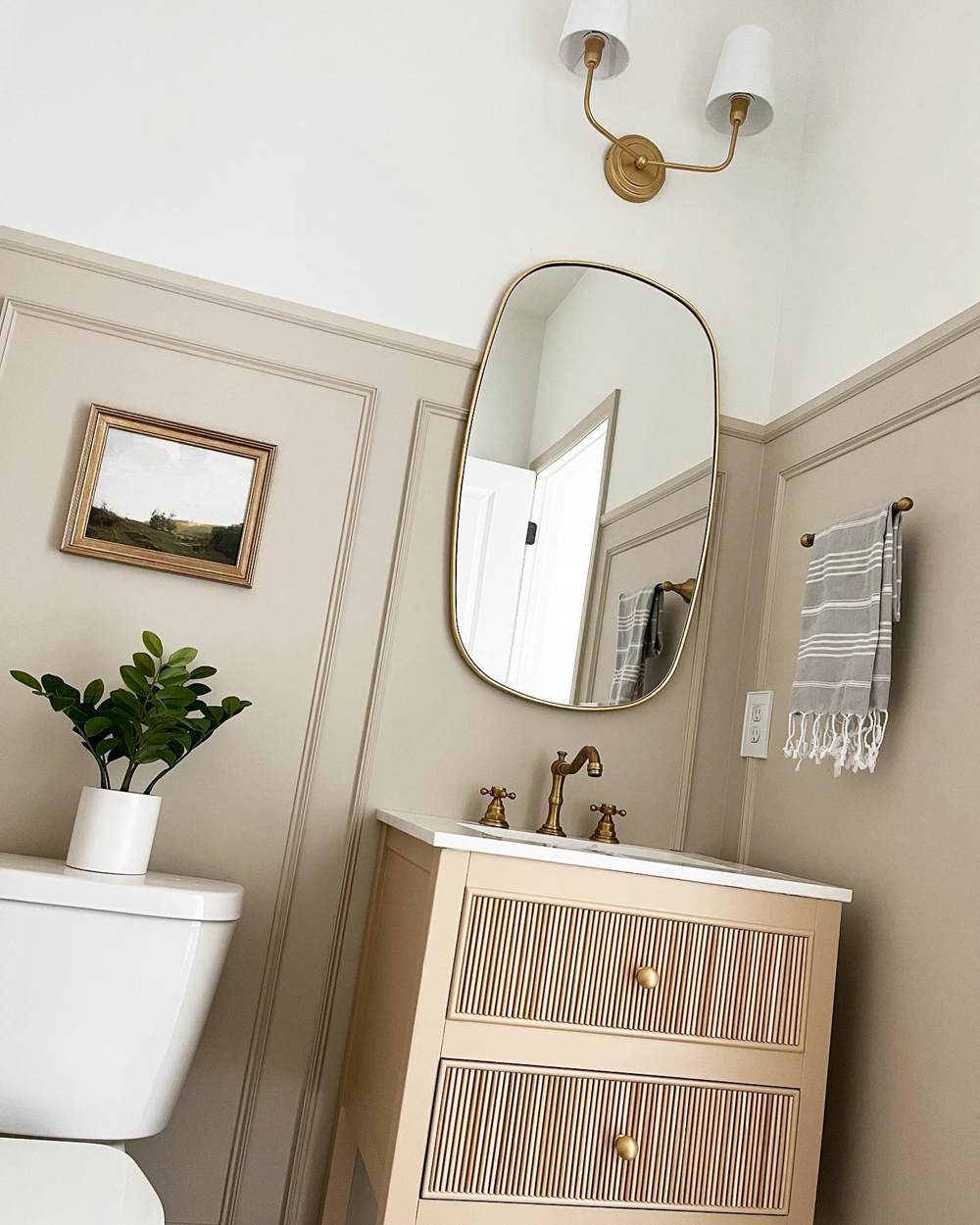
This bathroom uses Accessible Beige as its wainscoting while the top part of the wall is white. Using a brighter color like white gave the lower wall a chance to shine rather than blend in the background as is common with neutrals.
Balanced Beige Accents
I love that this house used Balanced Beige as a garage door accent. It gives the exterior a two-toned look depending on your standing position. You can see the Eastern door receiving direct sunlight and showing up as a bright beige shade.
But the shadow cast on the Northern doors gives it a grayer shade making Balanced Beige look more taupe than beige.
Accessible Beige vs. Balanced Beige for Trims
Using beige trims is a tricky choice unless you’re a professional with adequate knowledge of color theory. It’s not like white that fits whatever wall colors and accessories. You need to pick your coordinating colors carefully to avoid clashes in undertones.
See how you can make it work below.
Accessible Beige for Trims
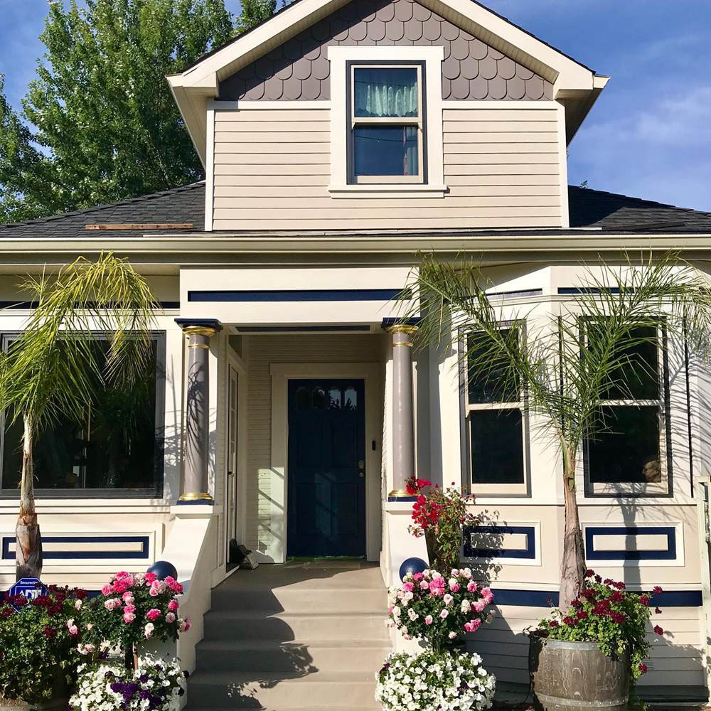
This house uses Accessible Beige trims on dusty brown and light beige walls. Adding navy blue to reinforce the Accessible Beige trim highlights the color’s beauty and neutrality.
I love that the homeowners added colorful potted plants to the front to highlight colorful exteriors. It also gives the Accessible Beige more colors to pick from when reflecting, especially the green parts.
Balanced Beige for Trims
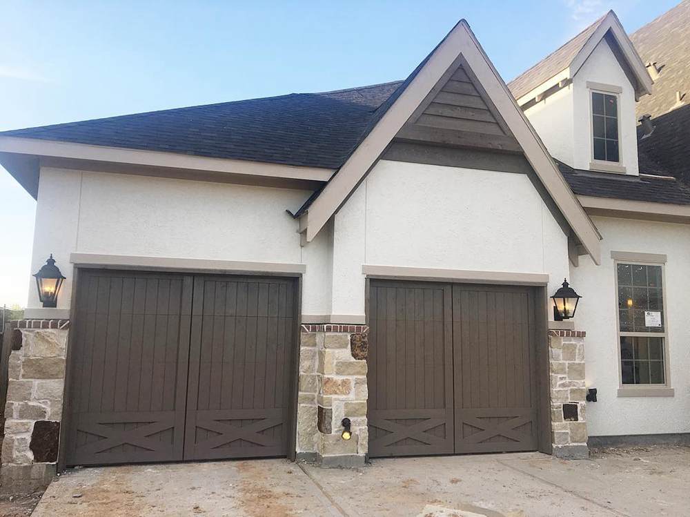
Image Credit: @casademorris
Because Balanced Beige is a darker neutral beige, it stands out against the off-white walls and dusky dark brown gates. The lower walls being multi-colored monochrome bricks gives the entire building a rustic but modern vibe.
Accessible Beige vs. Balanced Beige on Woodwork
Painting woodworks gives it a fun, interesting and sophisticated look. It’s a great way to give old furniture facelifts, or match dull ones to new home decor like carpets, curtains, and rugs. See examples below.
Accessible Beige on Woodwork
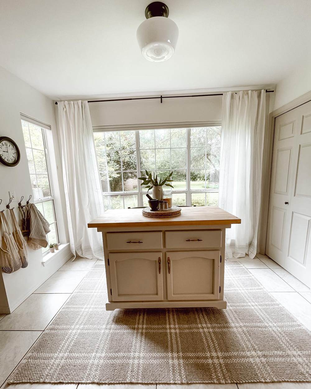
This center island painted in Accessible Beige nicely added color to these pure white walls. Notice how the designer used a beige and white checkered rug to tie in both colors so, the cabinet doesn’t look isolated.
Balanced Beige on Woodwork
This originally honey brown cabinet has a modernized look with Balanced Beige painting. Yet, it doesn’t lose the warmth that gives it a homely character. Using colors on woodwork like cabinets is typical but you can also have it on other furniture like chairs and tables.
Accessible Beige vs. Balanced Beige on Doors
Using neutrals on your doors is a no-brainer but the common choices are white, brown, and black. Meanwhile you can use Accessible Beige and Balanced Beige as interior or exterior doors and give your home an elegant look.
Accessible Beige on Doors
When you want to keep your home coloring uniform with highlighted doors, choose Accessible Beige on white. If you use a tinted white paint like Aesthetic White, it’ll take additional lighting, open windows and glass French doors to highlight the difference.
Balanced Beige on Doors
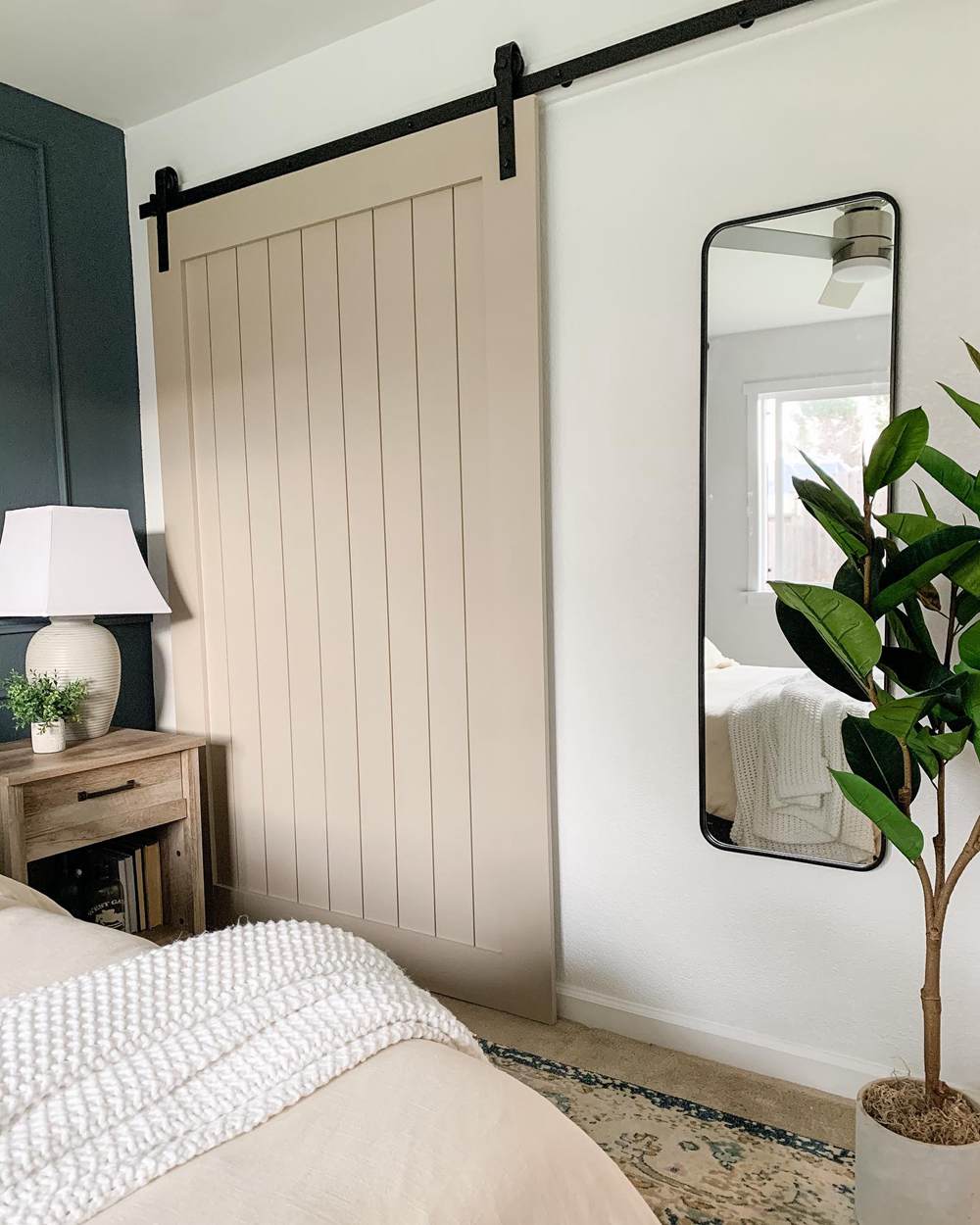
Balanced Beige on this bedroom barn door adds warmth and a cozy vibe to the contrasting neutral white and black walls. A closer look at the accent wall shows that it’s grayish black thus matching undertones with the barn door.
Lighting Conditions for Accessible Beige vs. Balanced Beige
Lighting is everything when it comes to highlighting undertones in any paint color. North-facing windows receive steady sunlight throughout the day, so it’s the ideal position for maintaining a paint’s natural color and hiding the undertones.
When you want to highlight the faintest green and reddish-orange in Accessible Beige or reddish-tan in Balanced Beige, use the color in a South-facing room or wall. The sun shines the brightest from that position, especially at 8:00 a.m. – 11:00 a.m.
By 12:00 p.m. – 3:00 p.m., the sun shines hot in the East until 4:00 p.m. – 6:30 p.m. when the sun sets in the West. Now let’s see it in pictures.
The room below perfectly shows how lighting and position change Accessible Beige. Warm ceiling lighting gives the top part of the wall a golden beige look while the lower part of the sidewall still has its faint grayish tone.
Getting the lighting position right is only the first step. You must also consider the coordinating colors as they’ll determine what shade of undertone reflects from your paint.
This picture above shows you a mix of warmth and coolness because of the brown floorboards, white trims, and warm ceiling lights.
Conclusion
I hope you enjoyed every bit of Accessible Beige vs. Balanced Beige as much as I did writing this for you. Before I leave you, let’s recap all that you’ve learned so far,
- Accessible Beige is a lighter shade than Balanced Beige
- Accessible Beige is best used in small rooms while Balanced Beige works in larger rooms
- You can use both colors as accents, trims, or together in a monochrome theme.
- Both colors have green and gray undertones
And we’ve come to the end of this color versus. Kindly share your thoughts and comments on using Sherwin-Williams Accessible Beige and Balanced Beige.
 Sherwin Williams Alabaster Vs Pure White: How to Choose!
 Revere Pewter vs Agreeable Gray: What’s The Difference?
 Light French Gray vs Repose Gray: How to Choose?
 Benjamin Moore Edgecomb Gray vs Revere Pewter: How to Choose?
 Benjamin Moore Hale Navy Vs Old Navy: How to Choose?
 Sherwin Williams Silver Strand vs Sea Salt: How to Choose?
