
Are you planning to implement forest green in your home but can’t figure out which color to use? With numerous shades of dark green on the market, choosing one that’s just perfect for your home can get quite complicated.
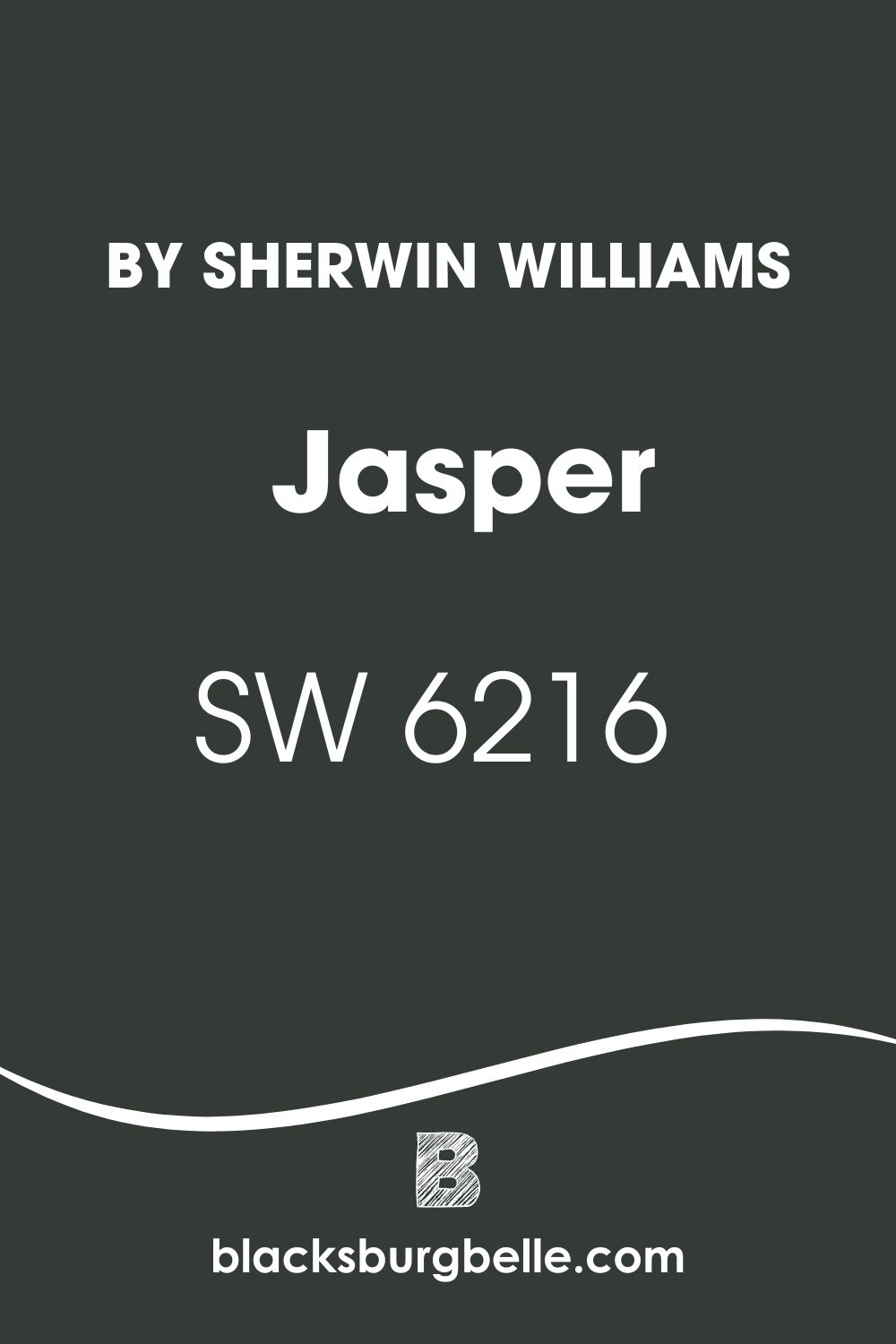
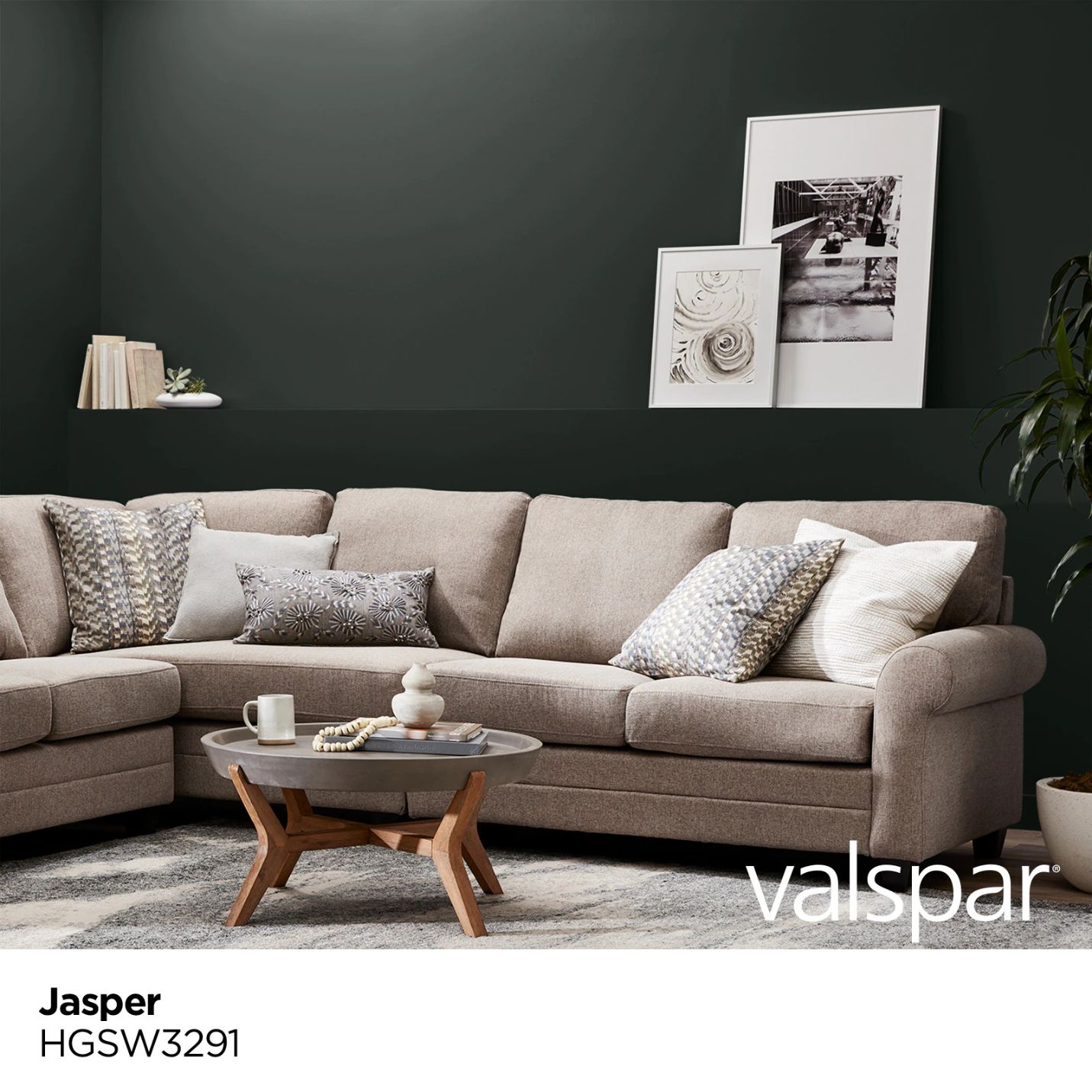
However, what if I told you all you need is Sherwin Williams Jasper? I love Sherwin Williams Jasper because it puts the most accurate forest green color in my rooms. Jasper SW 6216 carries that curious and intense dark quality, like a healthy, well-watered forest.
In this detailed guide, I will help you understand Jasper. I will mull over its color palettes, show you some close alternatives, and finally show you the color in action.
Are you ready? Let’s jump into this dark jungle green and see what it has for us!
Table of Contents
What Color is Sherwin Williams Jasper (SW 6216)?
| Manufacturer | Sherwin Williams |
| LRV | 4 |
| RGB | R: 52 G: 59 B: 54 |
| Hex Value | #343b36 |
| Color Collections | N/A |
Sherwin Williams Jasper SW 6216 is an intense/deep/bold forest green color. Because of its depth, this color may look black when you view it in a dark-lit room.
When viewed from a color swatch, it gives off a gray-green appearance. However, this is often the result of the lighting in the room—the color does not have a gray undertone.
On the CMYK color model, Jasper SW 6216 boasts 11.9 percent cyan, 0.0 percent magenta, 8.5 percent yellow, and 76.9 percent key (black). On the HSL scale, this dark green color has a hue of 137.1 degrees, a saturation of 6.3 percent, and a lightness of 21.8 percent.
RGB of Sherwin Williams Jasper
If you have been reading about paint colors for a while now, you have probably encountered the RGB abbreviation multiple times. RGB tells us the amount of red, green, and blue mixed to make a specific color, in this case, Sherwin Williams Jasper.
Jasper SW 6216 combines red: 52, green: 59, and blue: 54. The RGB scale starts at zero and tops out at 255. Interestingly for Jasper, all the colors—red, green, and blue—fall on the lower end of the RGB scale.
LRV of Sherwin Williams Jasper
LRV stands for Light Reflectance Value. It is a scale from 0 to 100 and shows the amount of light a color can reflect. For example, we find pure black at zero, reflecting 0% light. At 100, we see pure white, reflecting 100% of the light on it.
The LRV of Jasper SW 6216 is 4. At four, Jasper reflects only 4% of the light shone on it, meaning that the light is almost pure black. This explains why Jasper may resemble black when looking at it in a dimly lit room.
Is Sherwin Williams Jasper SW 6216 Warm or Cool?
I would say Jasper is more of a neutral color. However, some people will note that greens are cool, and I wouldn’t dispute that.
However, I would like to point out that the transition from blue (a cool color) to yellow (a warm color) is neutral. Interestingly, green tends to sit right at this transition.
Moving from the actual green color and looking and Jasper, the SW 6216 is right near the green range middle. For this reason, I would avoid considering this color either a cool green or a warm green—it is more of a chameleon that swings between the two sides.
While I would consider Jasper neutral by default, it could quickly change to warm or cool green, depending on the lighting conditions.
What Are the Sherwin Williams Jasper Undertones?
Jasper is one of the closest colors to true forest green. For this reason, its undertones—or lack thereof—depend on the lighting.
In some lighting, you will view a blue undertone—though quite subtle; this undertone tends to put some coolness in this forest green. You won’t see any undertone in another illumination, meaning you will look at a warmer green.
Sherwin Williams Jasper Color Strip: Sherwin Williams Jasper Color Comparisons
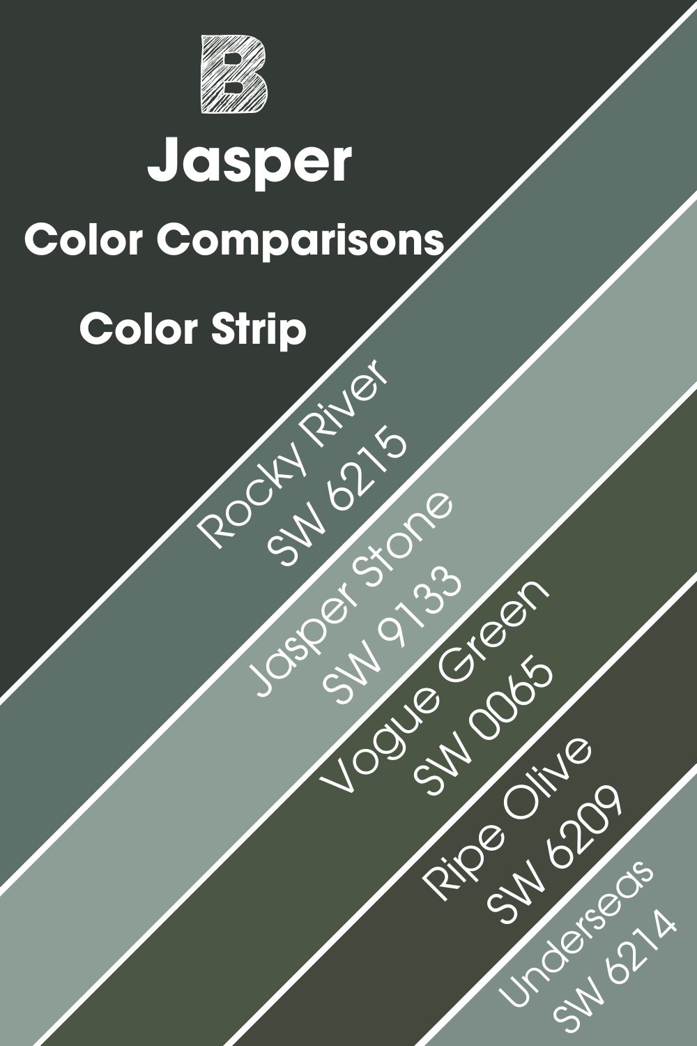
There is a series of dark greens that bear some resemblance to Jasper. In the following section, I aim to help you unearth these colors and understand how they perform compared to Jasper SW 6216.
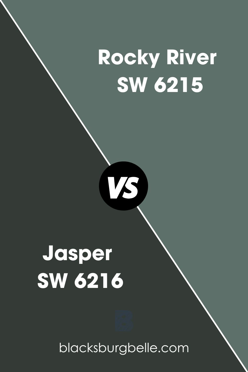
Sherwin Williams Jasper vs. Rocky River (SW 6215)
A stunning color, Sherwin Williams Rocky River is just one shade less dark than Jasper on the same color strip. However, with a Light Reflectance Value of 15—meaning it reflects almost four times more light than Jasper—you might find it too lighter than SW 6216 (Jasper).
While Jasper is a more neutral color on the warm vs. cool scale, Rocky River SW 6215 tends to swing to the cool side, displaying some blue undertone in some lighting conditions. Rocky River has a Hex value of #5e706a. On the RGB scale, Rocky River combines red: 94, green: 112, and blue: 106. Rocky River is often considered a shade of green cyan.
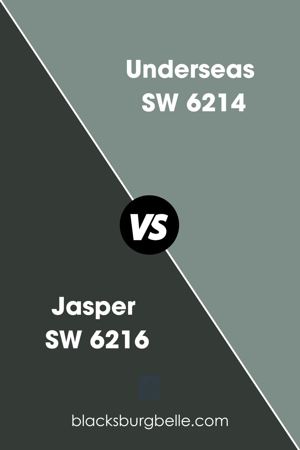
Sherwin Williams Jasper vs. Underseas (SW 6214)
Sherwin Williams Underseas is a solid but soft green shade. On the color strip, it is two shades lighter than Jasper. With a Light Reflectance Value of 25, it may appear too light if you are set on Jasper as your first choice.
Unlike Jasper which shows a blue undertone, you will notice a gray undertone on Underseas. This gray undertone softens the green color, which may tend to feel too bold. Depending on the time of the day when you are watching Underseas SW 6214, the color may display a different vibe—the paint color tends to give a bouncy vibe during the day and might look moody at night.
Underseas boasts an RGB of red: 124, green: 142, and blue: 135 and has a hex value of #7c8e87. The paint color adds an upscale feel to any space—just like Jasper—and can easily balance out the dark Jasper with its ability to reflect a little light.
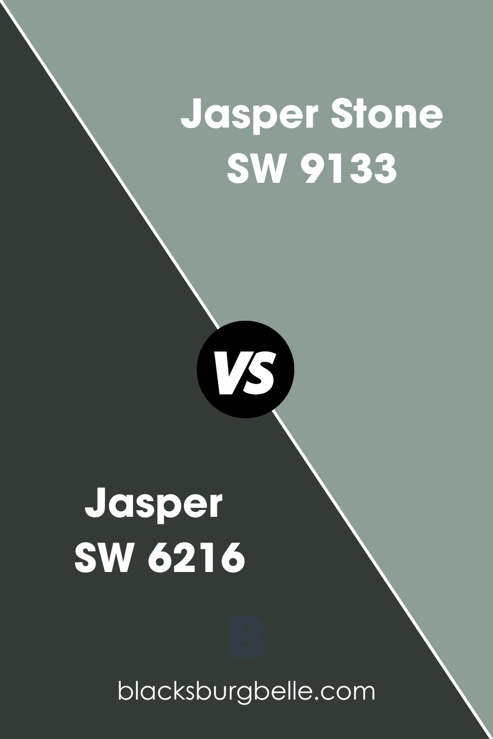
Sherwin Williams Jasper vs. Jasper Stone (SW 9133)
With a Light Reflectance Value of 32, this color is much brighter than Jasper SW 6216. However, the color is still very far from the off-white space—it may still look bland if you paint it in a room with minimal light.
Jasper Stone SW 9133 tends to be refreshing in a traditional style. Its blue undertones are much more visible than in Jasper SW 6216, making Jasper Stone cooler than Jasper.
Although Jasper Stone is more light green in ideal lighting, it tends to give off a light blue appearance when you put it in a room with additional light. Jasper SW 6216, on the other hand, maintains its dark green and rarely shows its blue undertone, even in bright light.
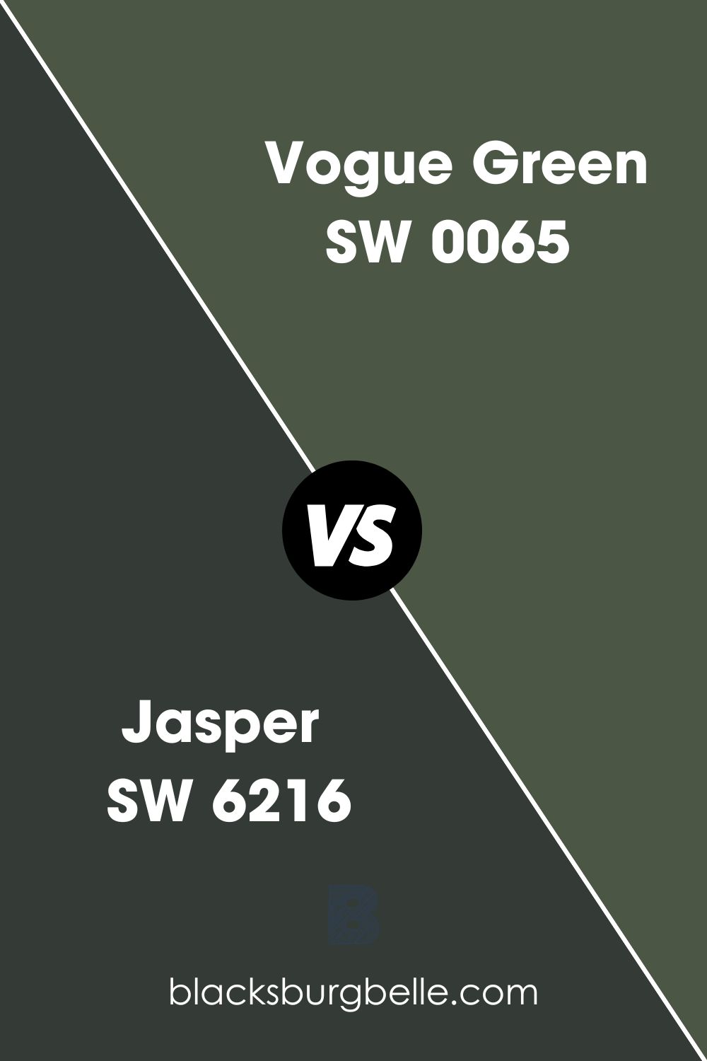
Sherwin Williams Jasper vs. Vogue Green (SW 0065)
Sherwin Williams Vogue Green SW 0065 is an exciting color that is pretty close to Jasper in terms of Light Reflectance Value—while Jasper is much lower at 4%, Vogue Green reflects a mere 9%. Vogue green combines red: 75, green: 86, and blue: 69 on the RGB scale and boasts a hex value of #4b5645.
While Jasper is a more neutral color, Vogue Green tends to swing towards the warmer side. However, the color is also not too warm.
Sherwin Williams has put the Vogue Green color in the Historic Interior Color Wall and The Streamlined Years color (1930 to 1950s)—this color, therefore, is ideal for homeowners who want to give their homes a more traditional appeal. Still, since the color is pretty dark, you may want to use it in a room with more light.
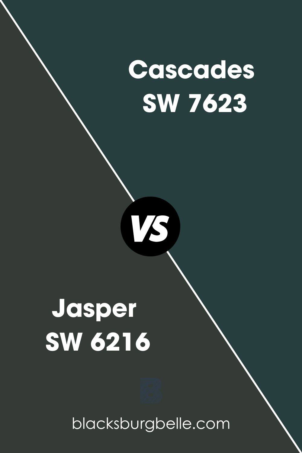
Sherwin Williams Jasper vs. Cascades (SW 7623)
Sherwin Williams Cascades is an intense green that seems to verge on turquoise or teal color. Like the Sherwin Williams Jasper, Cascades is pretty saturated—however, unlike Jasper, Cascades never looks black, even in dark-lit rooms.
For a paint color that is also as dark as Jasper, you wouldn’t expect it to have a high reflective ability. Interestingly, both Jasper and Cascades have an LRV of 4, meaning that both colors can only reflect 4% of the light that lands on them.
Just like Jasper, Cascades also boasts some cool blue undertones. However, unlike Jasper, whose blue undertone is very subtle, the blue undertone in Cascades is more visible—this makes Cascades a cool color, as opposed to Jasper, a neutral paint color.
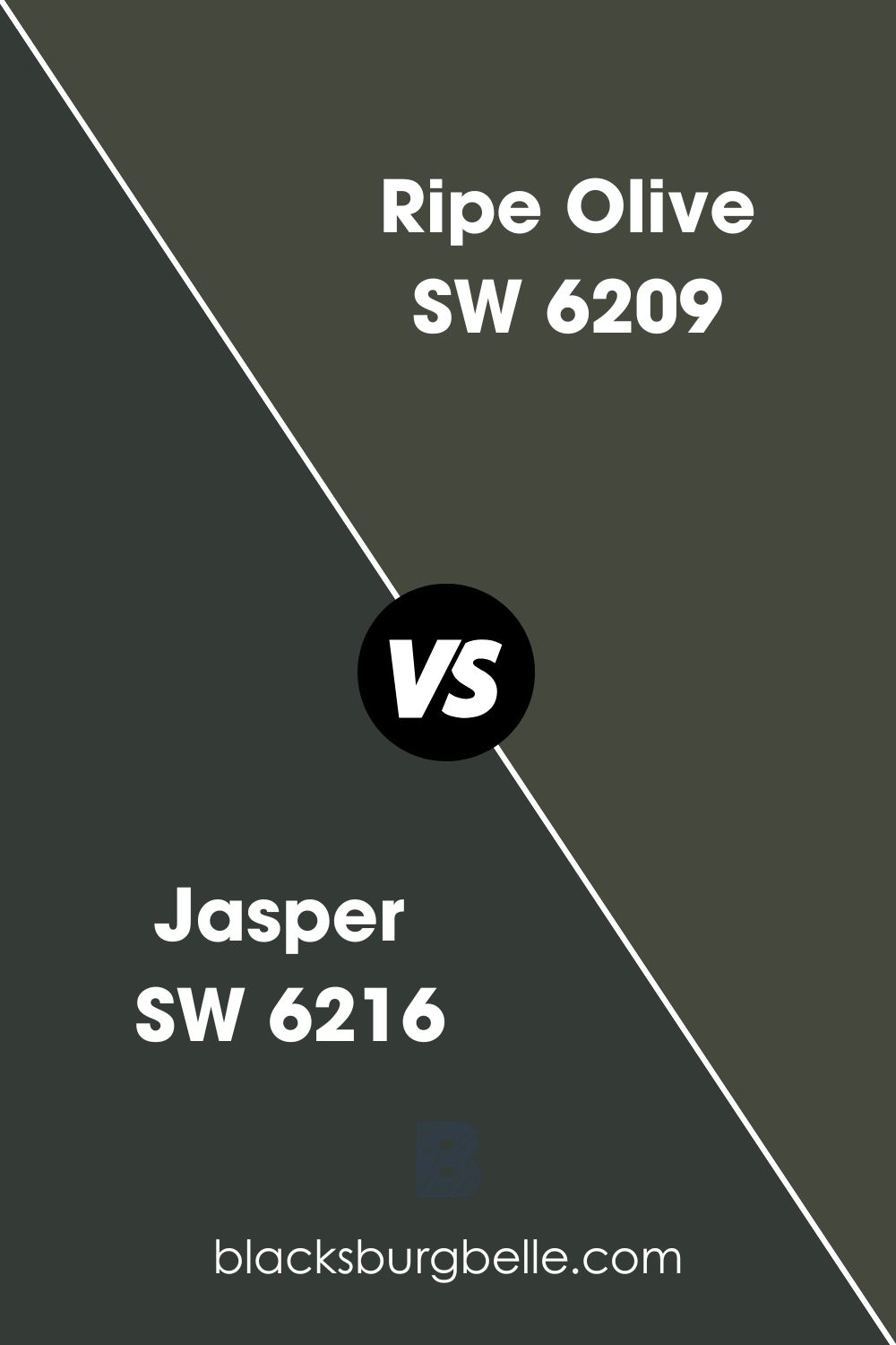
Sherwin Williams Jasper vs. Ripe Olive (SW 6209)
This is a warm version of the dark green colors—it boasts a yellow undertone that shines through in different types of illumination. While Jasper SW 6216 is more neutral because of its blue undertone, the yellow undertone in Ripe Olive creates a warm appearance.
While to an inexperienced eye, Ripe Olive may look like a pale version of bright green color, this is not the case in real life. Ripe Olive resembles a real-life ripe olive fruit.
Just like Jasper, Ripe Olive is in the middle of the dark paint colors, with an LRV of 6. While Jasper reflects 4% of light, Ripe Olive reflects only 2% more.
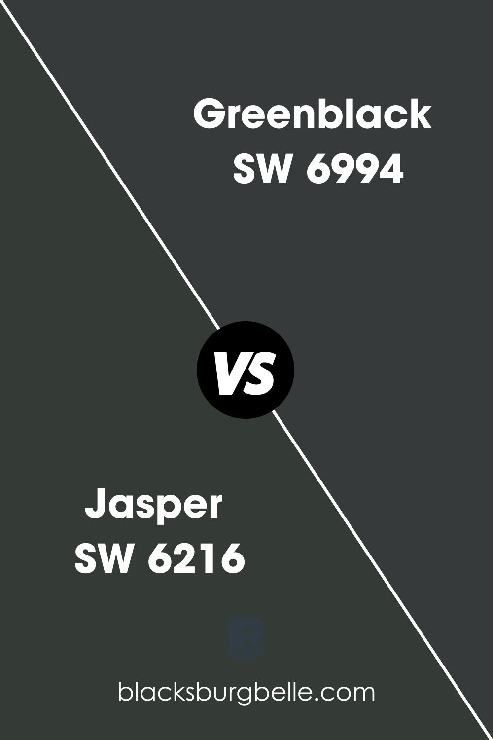
Sherwin Williams Jasper vs. Greenblack (SW 6994)
When comparing Jasper vs. Greenblack regarding their ability to reflect light, the two colors are very similar—they can only reflect 4% of the light on them. This puts the two colors in the dark paint colors region on the LRV scale.
On the RGB scale, Greenblack boasts red: 55, green: 58, and blue:58. This is pretty different from Jasper which has red: 52, green: 59, and blue: 54. The RGB color mixture for the two colors is, however, not too far off, which explains why the two colors look pretty similar when in a dark-lit room.
A truly gray-black color would feature an RGB (58, 58, 58). Interestingly, Greenblack almost matches these RGB values with only a slight difference in the red color, which explains why Greenblack can identify as a true black with a hint of blue and green.
Greenblack is a cool color that functions well as a replacement for true black—similar to Jasper. The green in both Jasper and Greenblack makes them look richer.
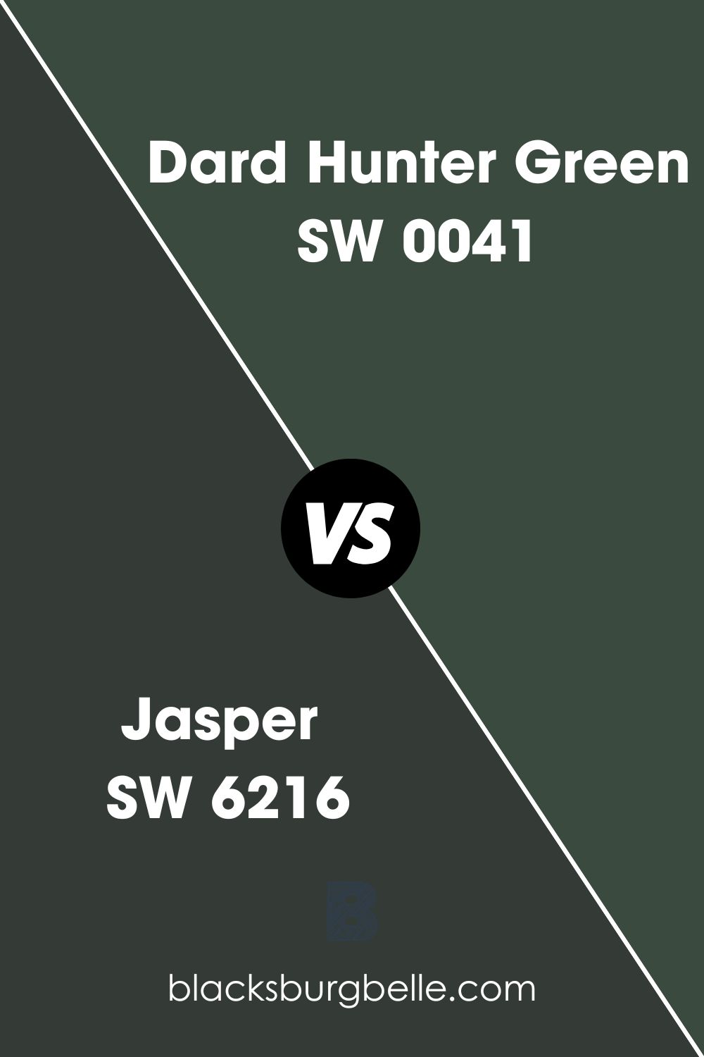
Sherwin Williams Jasper vs. Dard Hunter Green (SW 0041)
Similar to Jasper SW 6216, Dard Hunter Green is also a deep, forest green paint color. However, the two colors show a slight difference in their ability to reflect light, with Dard Hunter Green reflecting 2% more light, with an LRV of 6. The color, however, still falls in the dark paint region on the LRV scale.
Like Jasper, Dard Hunter Green creates a moodier vibe when you use it alone. Both colors, however, can help you strike an impressive balance between the paint color and your décor, making your room feel much more sustainable.
Unlike Jasper, a more neutral color, Dard Hunter Green swings on the cool side. The Dard Hunter Green cool blue undertone shows more than it does in Jasper.
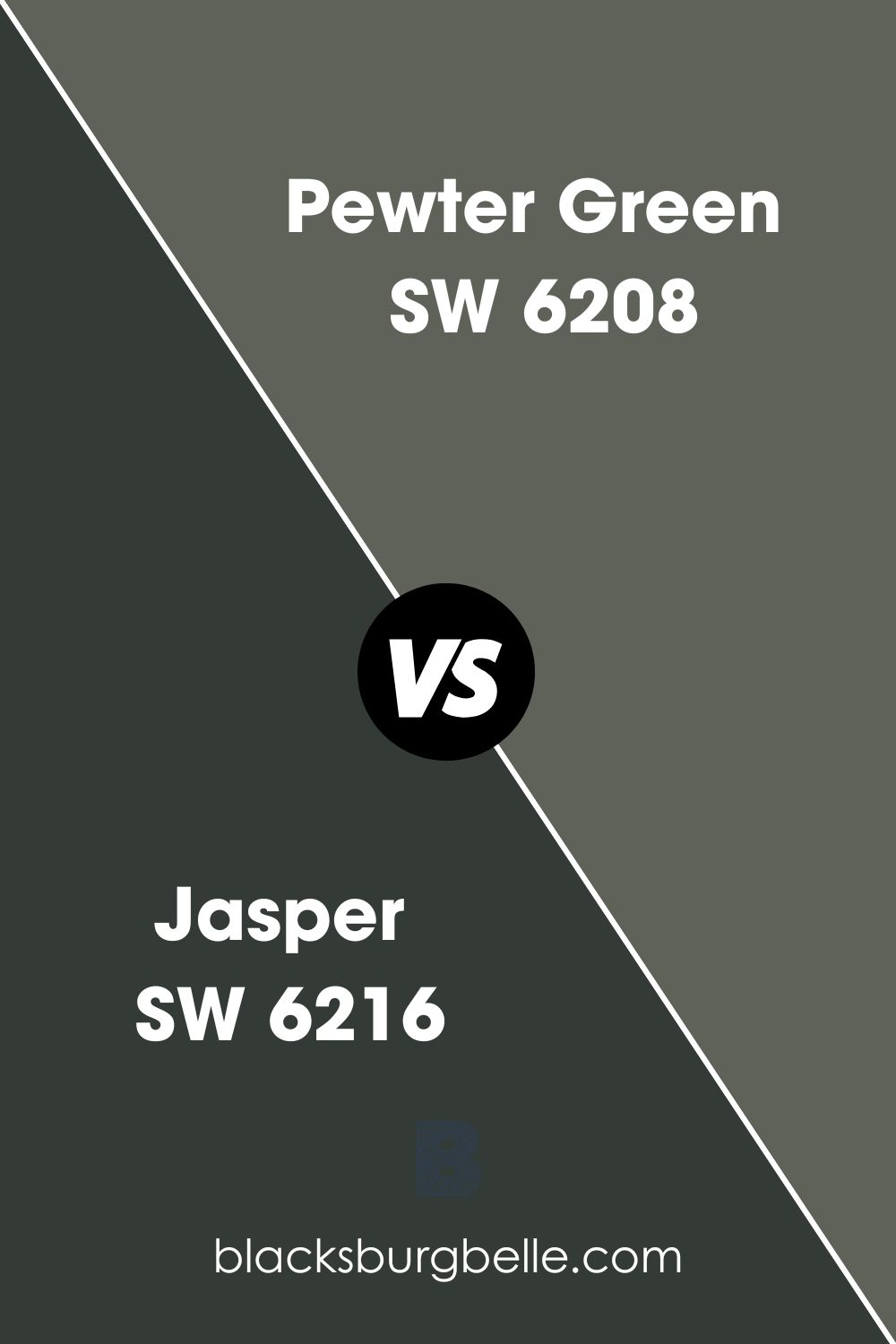
Sherwin Williams Jasper Green vs. Pewter Green (SW 6208)
Unlike Jasper which is more neutral, Sherwin Williams Pewter Green is a more cool-leaning muted green color. Pewter Green is what you would consider sage-like, although some types of light may put its hidden olive side to display.
Compared to Jasper, Pewter Green is a much more reflective color, reflecting 12% of the light that lands on it. This is about three times more light than Jasper reflects—this means that Pewter Green may perform better in darker rooms than Jasper.
While Jasper features a cool blue undertone which is more subtle, Pewter Green boasts a gray undertone. Both undertones, however, make the two colors lean on the cooler side.
Coordinating Colors for Jasper
When working on your interior design, you may want to know the colors that pair nicely with Jasper. In my experience, Jasper is a very versatile color that does not limit you in color pairing. However, my preferred coordinating colors for Jasper include the following.
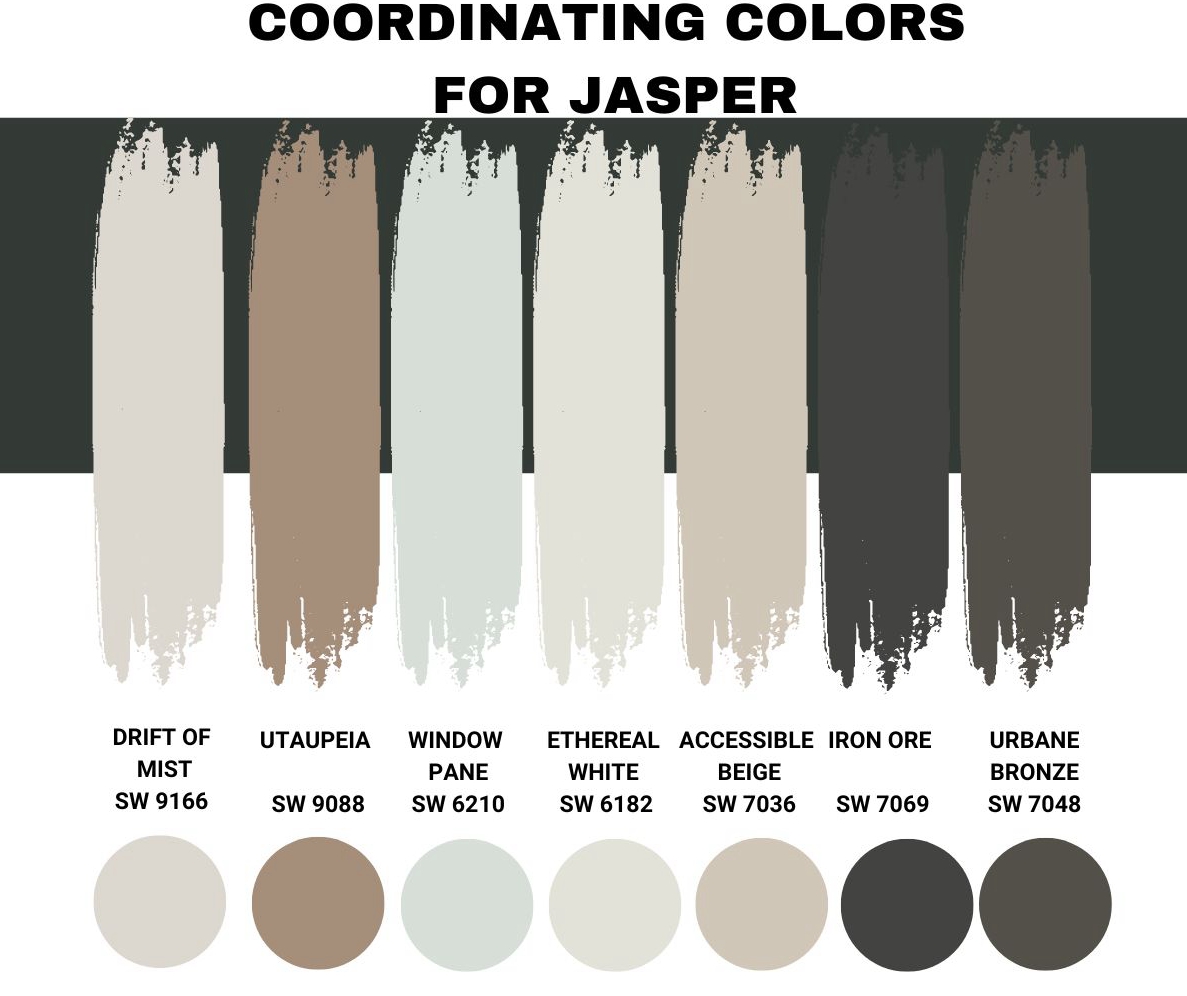
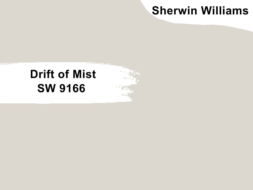
Sherwin Williams Drift of Mist (SW 9166)
The Drift of Mist will be a perfect pairing color if you want something soft that features some gentle undertone whispers. At heart, Drift of Mist tends to be a warm gray color. However, if you coordinate it with Jasper in a room with north-facing light, Drift of Mist becomes cooler, losing all the warmth tucked inside.
In a room with south-facing light, the warmth in Drift of Mist comes back, making this pairing color lean towards greige. With an LRV of 69, Drift of Mist is a perfect pairing for Jasper in a darkish room—it will reflect more light, making the room appear less bland.
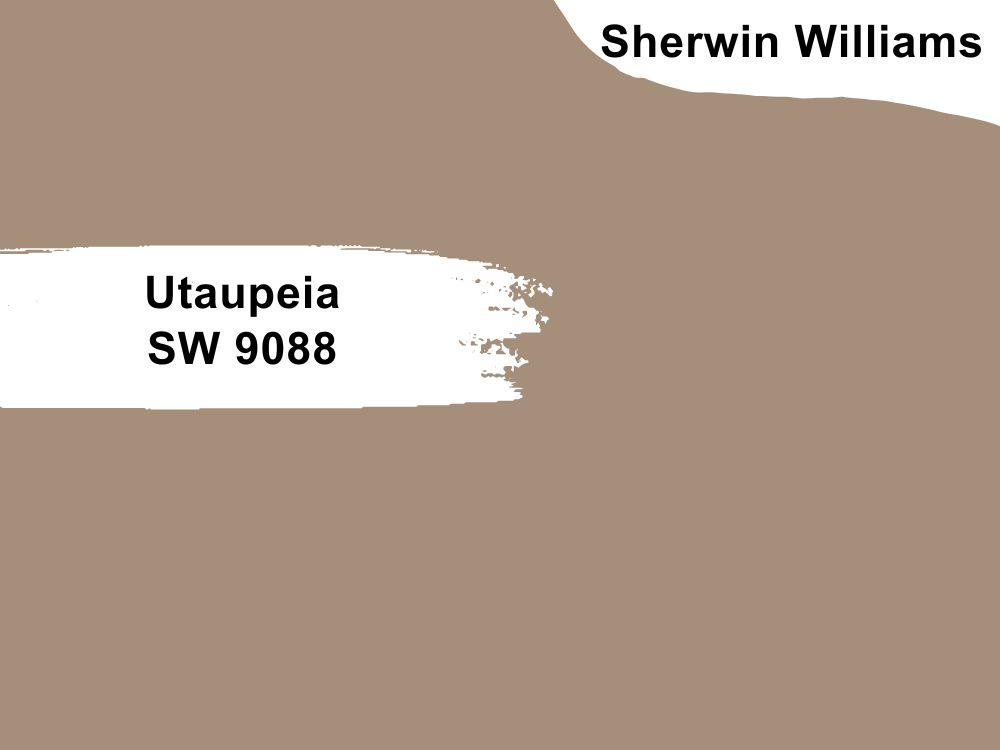
Sherwin Williams Utaupeia (SW 9088)
Sherwin Williams Utaupeia will perform well when paired with Jasper in a more lit room. While it has a much higher LRV—SW 9088 will reflect 29% of the light you shine on it—it is still leaning towards the darker paint colors. Therefore, combining Utaupeia and Jasper in a dark room could create that unlikeable dull appearance.
On the RGB scale, SW 9088 combines red: 165, green: 143, and blue: 123. Sherwin Williams Utaupeia (SW 9088) boasts a hex value of #a58f7b. The color has a more yellow undertone, making it warmer and hence can balance the cool blue undertone in Jasper.
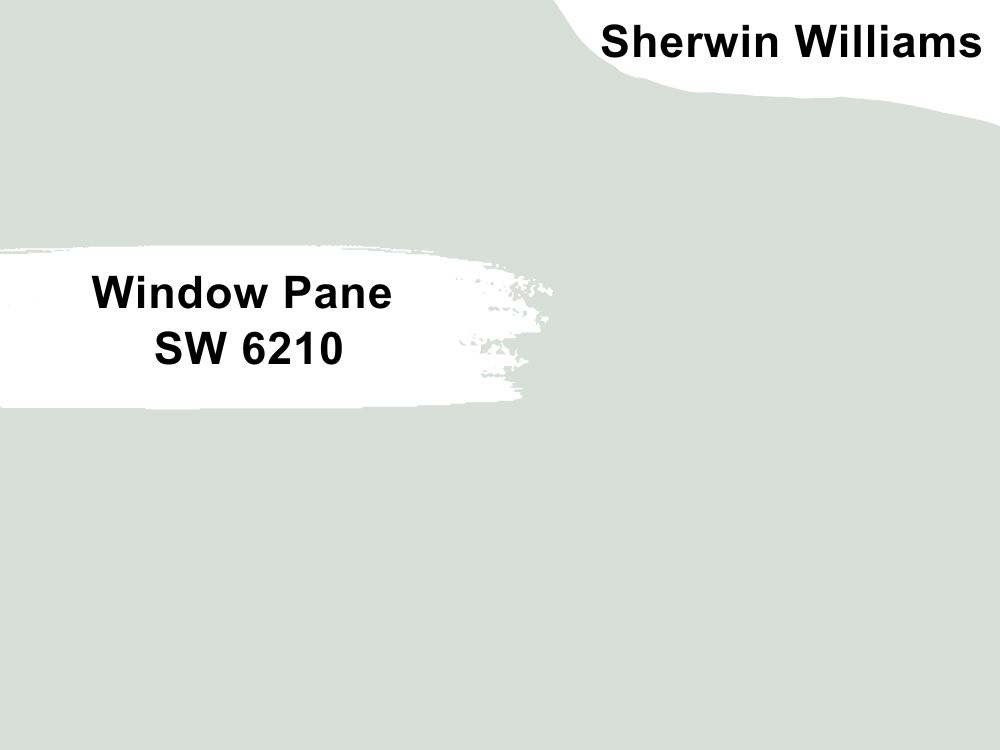
Sherwin Williams Window Pane (SW 6210)
Sherwin Williams Window Pane is a bluish-green paint color that leans on the lighter side. If you pair it in a room with Jasper, this color will light up the room considering its ability to reflect 72% of the light on it.
The color features two undertones—gray and blue. Since both undertones are cool, the color is ideal for homeowners who want to implement a cool feel in their rooms.
Window Pane SW 6210 looks more teal. However, on the RGB scale, the color is pretty saturated, with red: 215, green: 223, and blue: 216.
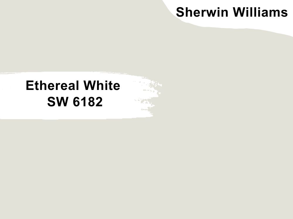
Sherwin Williams Ethereal White (SW 6182)
Ethereal white is ideal for homeowners looking for a rich white that does not feature heavy cream undertones. Depending on the finishes and light in the room, Ethereal White can look gray, cream, and sometimes, slightly green.
This color is pretty reflective, reflecting about 76% of all light. This makes it ideal for lighting a room where Jasper, which reflects only 4% of the light, has been used. Being a warm color, Ethereal White will balance the coolness in Jasper.
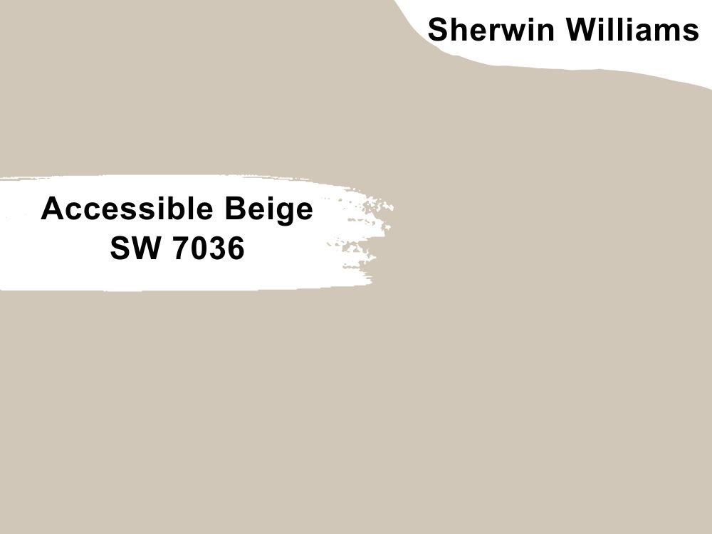
Sherwin Williams Accessible Beige (SW 7036)
Just like its name suggests, Accessible Beige is an actual beige color. Featuring a unique blend of LRV and undertones, this is one of the most versatile beiges you can pair with Jasper.
Accessible Beige has an LRV of 58, which is pretty high compared to Jasper’s ability to reflect only 4% of the light. The color has a grayish undertone that helps balance its warmth, retaining it but also making sure that the color is not too warm—you can use this paint color to create a balanced appearance with the more neutral Jasper.
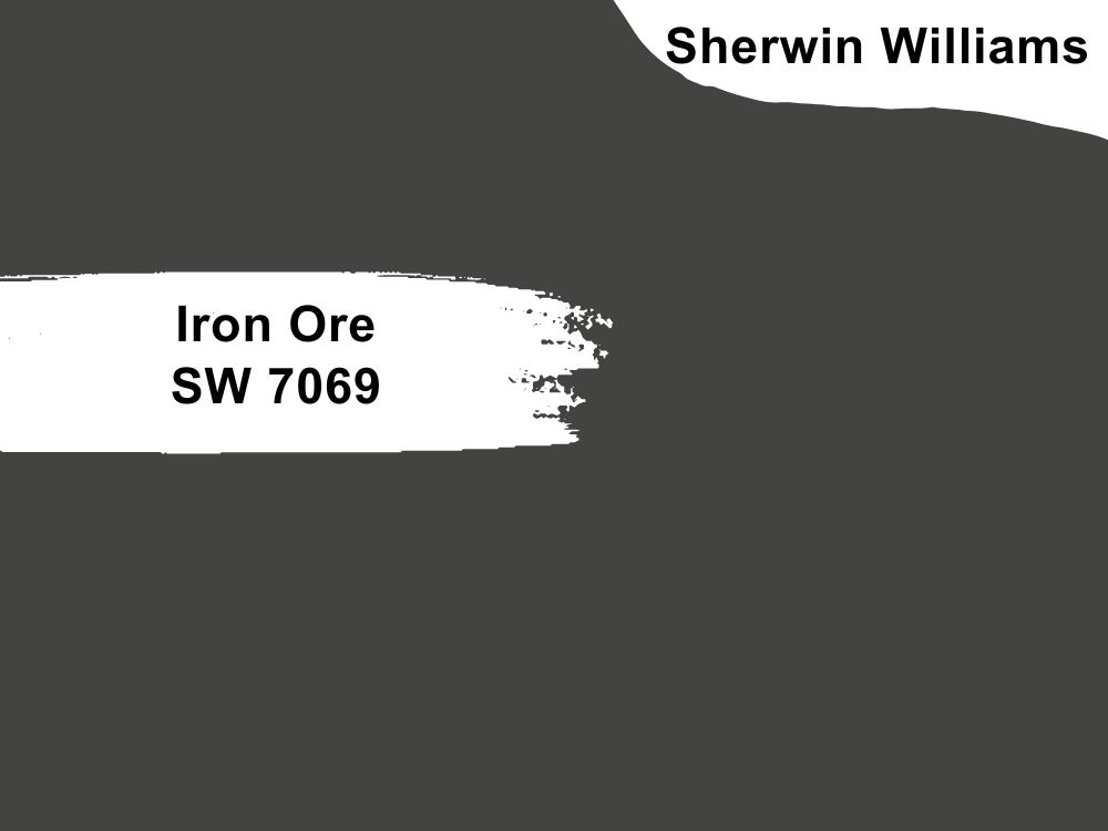
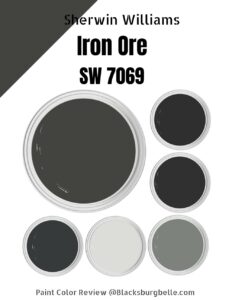
Sherwin Williams Iron Ore (SW 7069)
With an LRV of 6, Iron Ore leans on the darker paint color side. This makes it a perfect pairing color for using Jasper in a brightly lit room or outdoors.
Looking at Iron Ore outdoors gives you the impression that Iron Ore has a slight green undertone. This makes it match Jasper which is much more green, although it leans towards the blacker side.
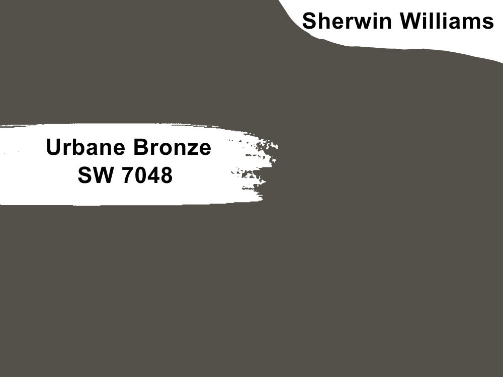
Sherwin Williams Urbane Bronze (SW 7048)
Sherwin Williams Urbane Bronze is a warm and dark greige color that boasts a fantastic and gorgeous range. With an LRV of 8, this color falls in the dark side of paint colors—it, however, reflects two times more light than Jasper. However, the fact that both colors are dark means that you may not want to put them in a dark room.
If you paint your outer walls Urbane Bronze, you will notice some cool gray undertone in the north-facing light. However, the paint color leans on the warmer side when you paint it on south-facing walls. The color can, therefore, add some character to Jasper which tends to be more neutral.
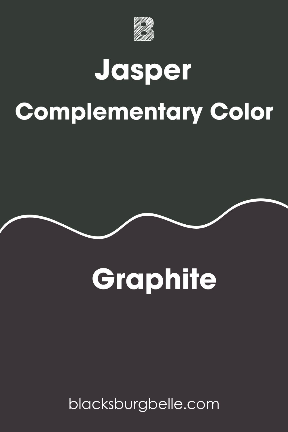
Sherwin Williams Jasper Complementary Color
When you mix Jasper with a color that complements it perfectly, the colors will cancel each other out and lose their hues. In a mixture, the two colors will either produce white or black. If you were to paint Jasper and a complementary color side by side, the two would show the most significant contrast in appearance.
Now that you know what a complementary color is, the next question is: what color shows the most significant contrast next to Jasper?
The complementary color for Jasper has a hex value of #3B3439. The closest name for this color is Graphite. This complementary color has an LRV of 4.2%, reflecting only 0.2% more light than Jasper. On the RGB scale, the color features a mixture of red: 59, green: 52, and blue: 57.
What Trim Colors Go with Sherwin Williams Jasper?
Jasper is a versatile color that can go with many trim colors. Below are some popular trim colors you may want to use:
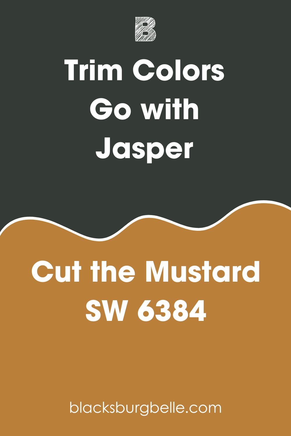
Sherwin Williams Cut the Mustard (SW 6384)
Cut the Mustard is a warm color that adds some character to any space. It is an ideal Jasper accompaniment because both shades feature earthy tones and have similar vibrancy.
Of course, you should expect the Cut the Mustard to be louder than Jasper. However, the color can quickly mitigate the silence of the Jasper paint color in a dark room where it tends to go blacker.
Sherwin Williams Cut the Mustard, on the RGB scale, boasts red: 186, green: 127, and blue: 56. Regarding reflection, the color can reflect 26% of the light.
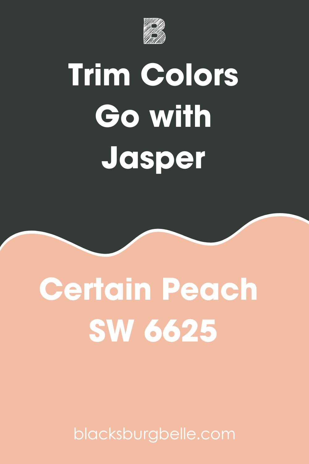
Sherwin Williams Certain Peach (SW 6625)
Gentle and subtle, SW Certain Peach can also work well with Jasper. The airy and light pink in Certain Peach pairs perfectly with the deep tones of green in Jasper. Certain Peach’s warm tones perfectly offset the cooler tones in Jasper in an attractive way.
The color boasts an LRV of 58, which means it will create interest if combined with Jasper in a not-so-well-lit room. The color boasts a combination of red: 242, green: 189, and blue: 162.
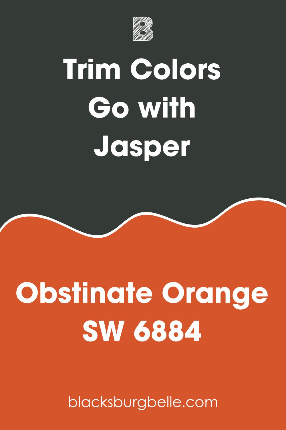
Sherwin Williams Obstinate Orange (SW 6884)
The warmth in Obstinate Orange pairs nicely with the cool tones in Jasper while maintaining the earthy appearance. Obstinate Orange, in this case, will create a vibrant appearance in the room without appearing overbearing.
With an LRV of 21, Obstinate Orange is not too reflective—therefore, if you combine it with Jasper, you may want to do that in a room with an abundance of light. On the RGB scale, Obstinate Orange boasts red: 215, green: 85, and blue: 42.
Sherwin Williams Jasper Benjamin Moore Version
If you are shopping for a Benjamin Moore color that resembles Sherwin Williams Jasper, the color you are looking for will be Benjamin Moore Black Forest Green (HC-187).
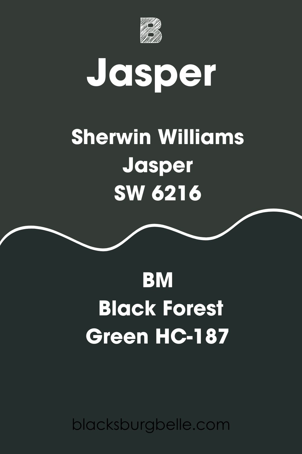
On the RGB Scale, Benjamin Moore Black Forest Green boasts red: 37, green: 47, and blue: 45. This color, however, is much darker compared to Sherwin Williams Jasper—BM Black Forest Green reflects only 2.72% of the light shone on it.
How Does Light Affect Sherwin Williams Jasper?
If the room in which you’ve painted Jasper is north-facing, it will allow soft light to get in. This will bring out the warm aspect of Jasper. It will also make Jasper look a little darker.
If your room is south-facing, more intense light will enter your room. This will bring out the cool tones in color (blue), making your Jasper appear brighter.
Standard soft white incandescent—LED lights—offer natural, warm lighting. This lighting will make your Jasper appear a little bit duller.
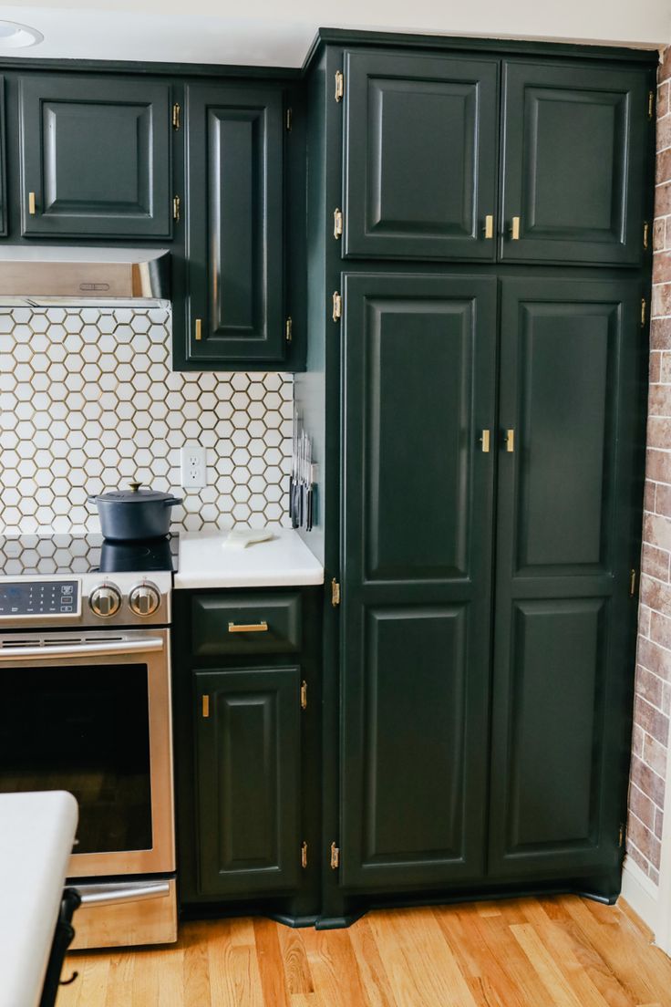
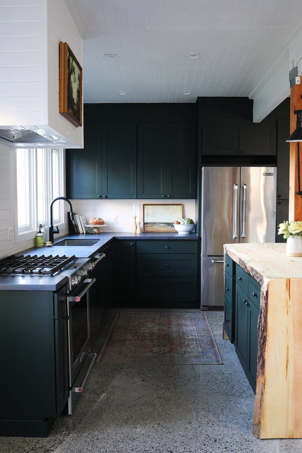
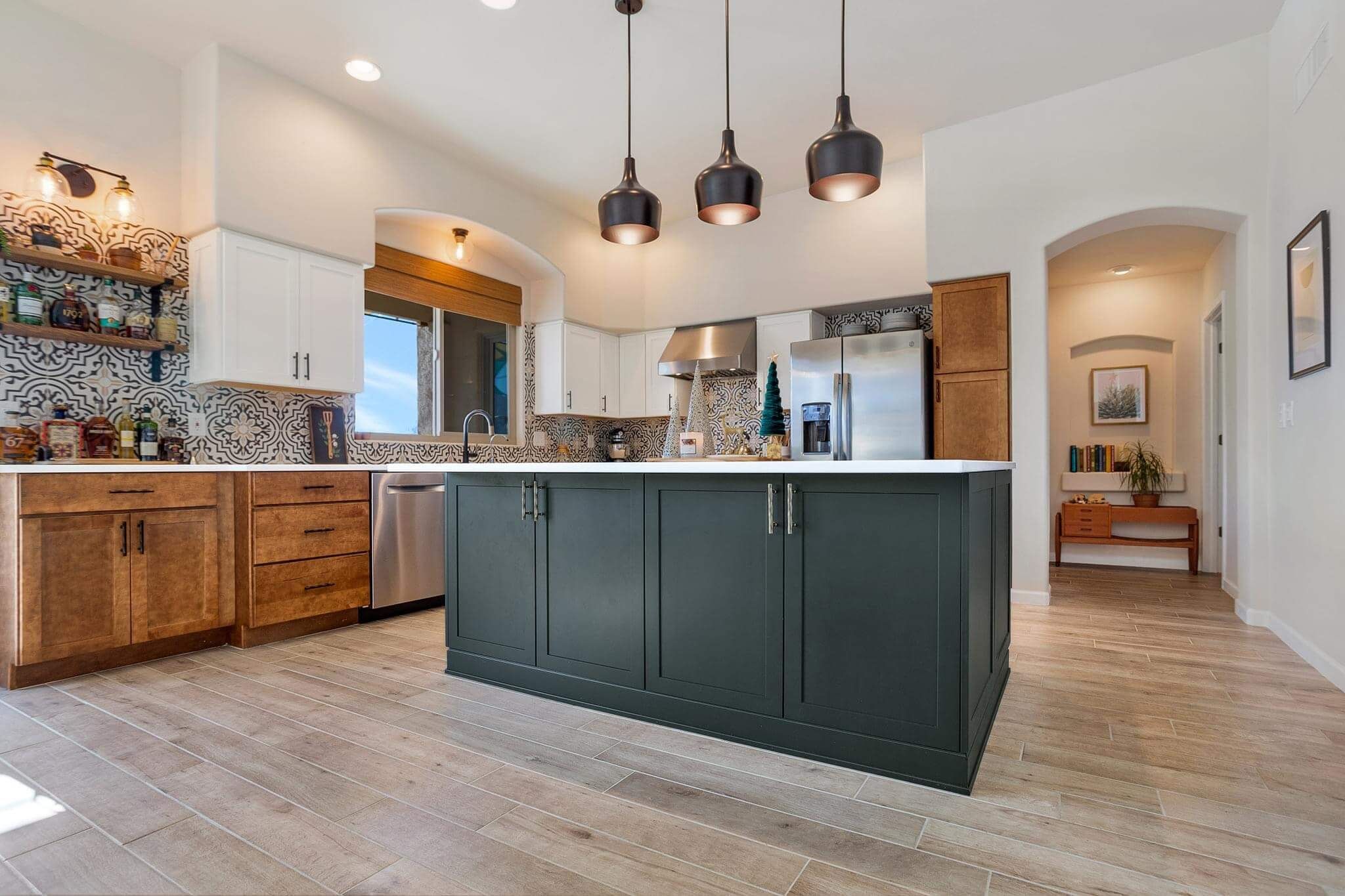
Best Rooms to Paint Sherwin Williams Jasper SW 6216
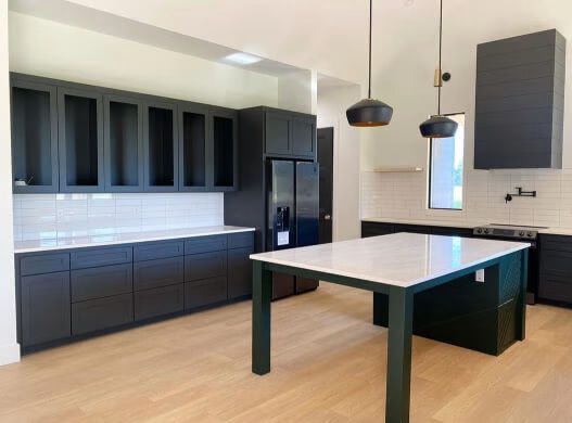
Sherwin Williams Jasper in Kitchen
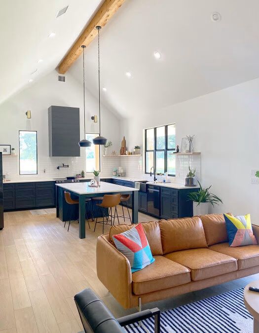
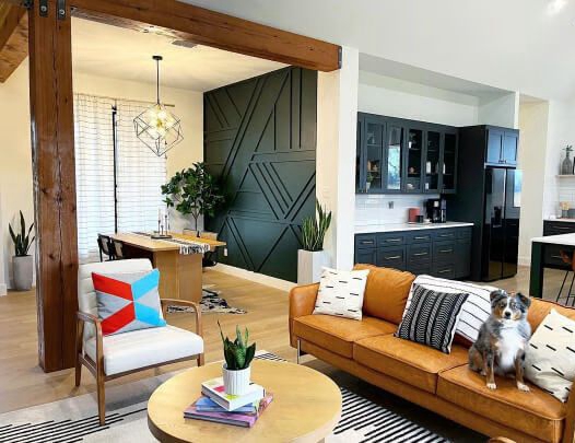
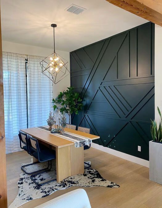
Sherwin Williams Jasper in Living Room
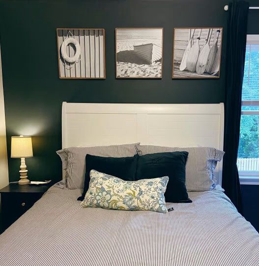
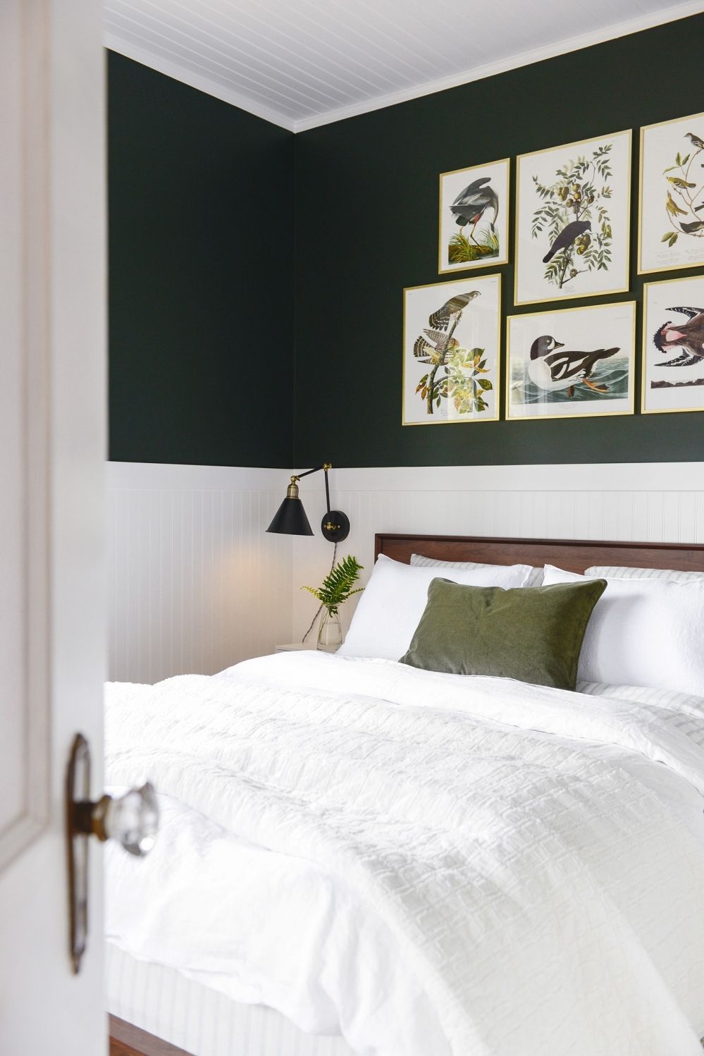
Sherwin Williams Jasper in Bedroom
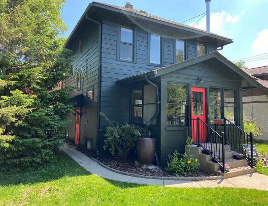
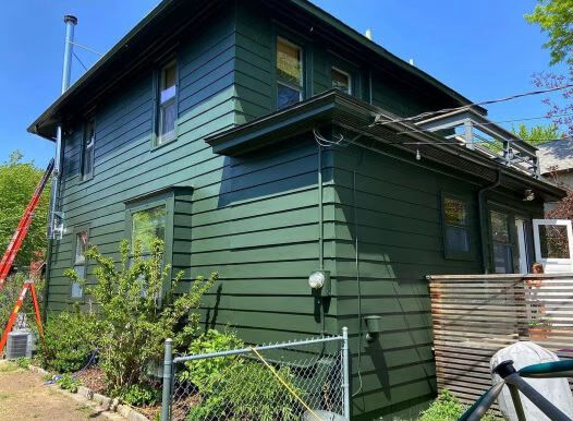
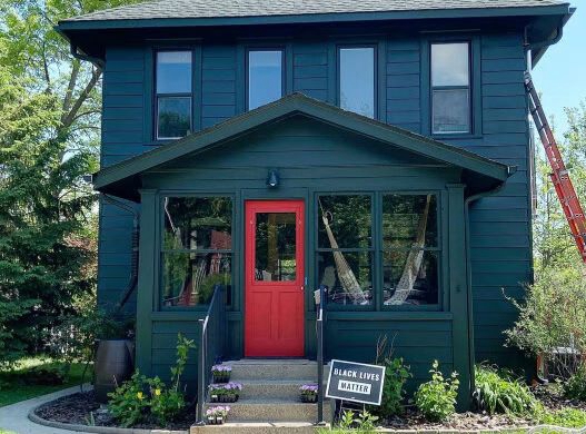
Sherwin Williams Jasper Outdoors
Overview
Sherwin Williams Jasper is a color that boasts versatility—you can use it with multiple colors and work indoors and outdoors. As a neutral color, Jasper is neither too warm nor too cold—this makes it a perfect color for homeowners who enjoy having a balance.
Depending on the light, however, Jasper may shift between blue-ish green, which appears slightly cool, and warm green. Since the color has a very low Light Reflective Value, it wouldn’t be advisable to use it in a highly dark room—in such a scenario, you may need to use artificial light to keep Jasper from looking too dark and dull. Alternatively, when you use Jasper in a dark room, it would be ideal for you to pair it with a warmer color with a slightly higher ability to reflect light.
We hope this detailed guide has answered your questions about Sherwin Williams Jasper. If there is something you feel we left out, be sure to let us know in the comments. We will make a point of responding to you with a detailed answer as soon as possible.
 Sherwin Williams Iron Ore (Palette, Coordinating & Inspirations)
 Sherwin Williams Tradewind (Palette, Coordinating & Inspirations)
 Sherwin Williams Caviar (Palette, Coordinating & Inspirations)
 Sherwin Williams Acacia Haze (Palette, Coordinating & Inspirations)
 Sherwin Williams On The Rocks (Palette, Coordinating & Inspirations)
 Sherwin Williams Essential Gray SW 6002: Paint Color Review
