
Looking for the right gray or greige paint color? If you’ve picked Sherwin Williams Perfect Greige SW 6073 as your gray paint color of choice, this guide aims to show you what the paint color is. It’s ok if you’re undecided at this point; we’ve all been there.
You’ll find that Perfect Greige is an understated color but performs better than expected in real life. Of course, what you see on your screen is slightly different from the real color, but it’s pretty close. So, stick around and learn more about paint colors, especially Perfect Greige.
Table of Contents
When to Choose Sherwin Williams Perfect Greige
If you’re unsure of where Perfect Greige fits best in a house, this section gives you a few pointers. From experience, I’ve outlined a few places and situations that make Perfect Greige truly perfect.
Looking for coziness with color?
This paint color is a warm gray that reads greige in many spaces. Its undertones can be complex, but they are always warm, especially when paired with light or dark colors.
Have an abundance of light?
Perfect Greige works best when there is an abundance of light. This is because it has a relatively low capacity to reflect light and is a saturated color. Low light may make it feel overwhelming and take on a brooding face.
Want to pair a neutral with extreme colors?
Dark wood tones mimic black or dark gray, but they can be a little challenging to get right. However, a few colors make them work well, and one of them is Perfect Greige. This color makes dark wood tones look great and also pairs well with stained wood flooring.
Have a large space to paint?
If the room you’re looking to paint is large and has high ceilings, Perfect Greige will fit in perfectly. Its saturated tone makes a room feel as if it’s closing in on you if it has low ceilings or is small.
Neutrals will also be safe colors to use in any space. And if these pointers tell you how to use Perfect Greige, you’re good to go. But this is not all there is about the paint color. Come along with me as we look at specific details of Perfect Greige.
What Color Is Perfect Greige?
Greige is a color derived from a mixture of gray and beige. It is the balance in color we all need if gray is just too bland or cold and beige is not quite the right shade. As neutrals go, greige is a perfect balance.
That is why the name of this paint color is apt. Perfect Greige SW 6073 is a greige paint color that combines gray and beige. It has warm undertones that turn a space into a cozy room with the right vibes. Some users think of it as the perfect greige paint color, no pun intended, despite its peculiar undertones.
A Snapshot of Sherwin Williams Perfect Greige Specifications
This chart shows characteristics of Perfect Greige that differentiate it from other colors. Every paint color has these characteristics, but the specifics of each are what help you know how the color performs. Let’s look at this paint color’s characteristics, especially the LRV and undertones.
| Sherwin Williams Perfect Greige | |
| RGB | 183, 171, 159 |
| LRV | 42 |
| Undertone | Creamy red |
| HEX Code | #B7AB9F |
The LRV of Sherwin Williams Perfect Greige
The LRV of color is its light reflectance value and refers to the amount of light it reflects on a scale of 0 to 100. The lower the value on the scale, the less light the color reflects, and the higher the value, the more light it reflects.
Pure black has an LRV of 0, while pure white has an LRV of 100. Every other color is between these values. Paint colors have no absolutes, so they use a scale between 2.5 and 94. So, you can better understand how much light this paint color reflects.
SW Perfect Greige has an LRV of 42, which is below the middle point. This means the paint color is muted and requires a lot of light to work. In other words, Perfect Greige doesn’t reflect a good amount of light.
The Undertones of Sherwin Williams Perfect Greige
This aspect of any paint color is, perhaps, the most crucial, depending on how you look at it. Perfect Greige is called a mid-tone gray with red undertones by the brand manufacturer.
However, it is more of a greige paint color than gray, and its undertones are creamy red that can read pink or violet.
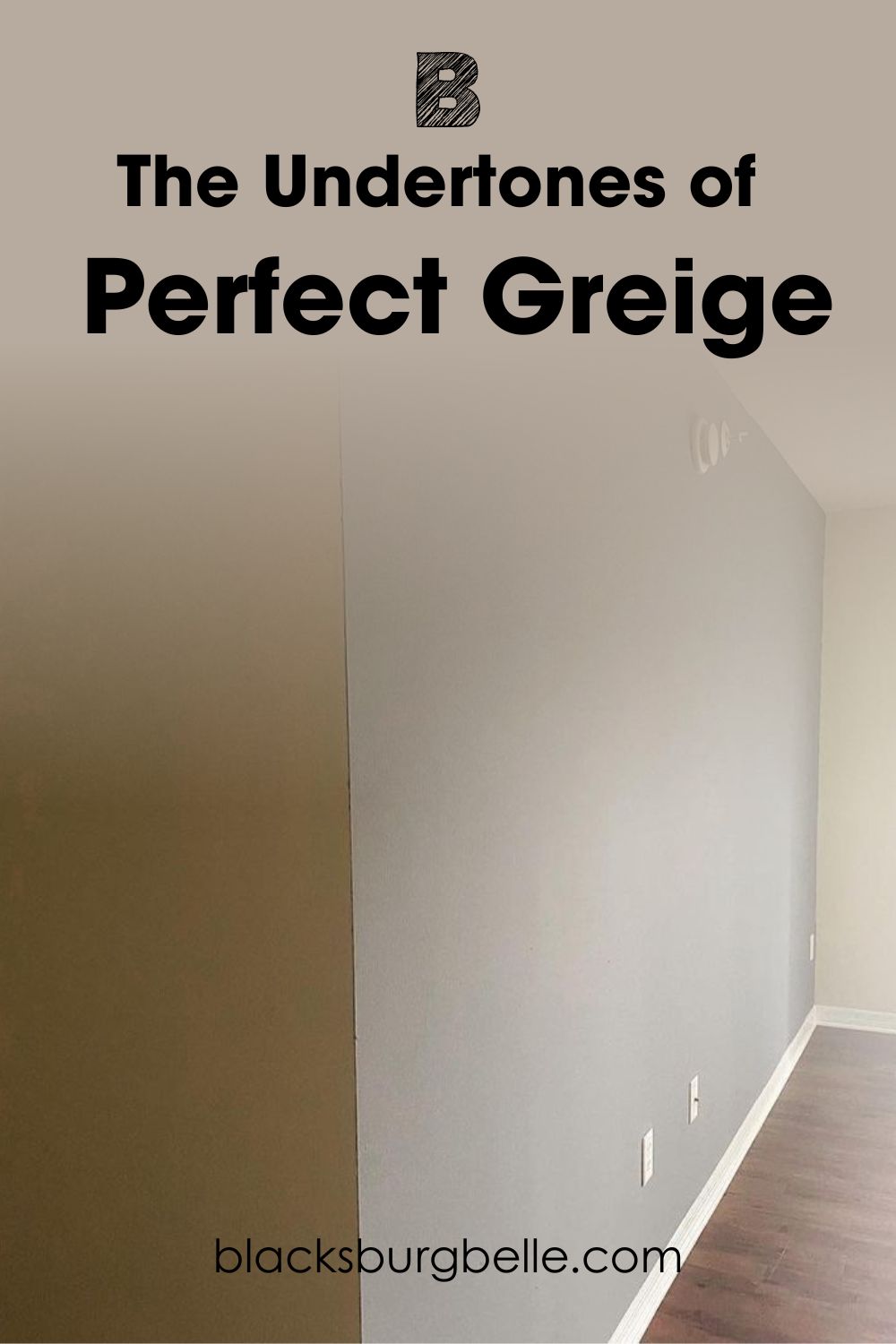
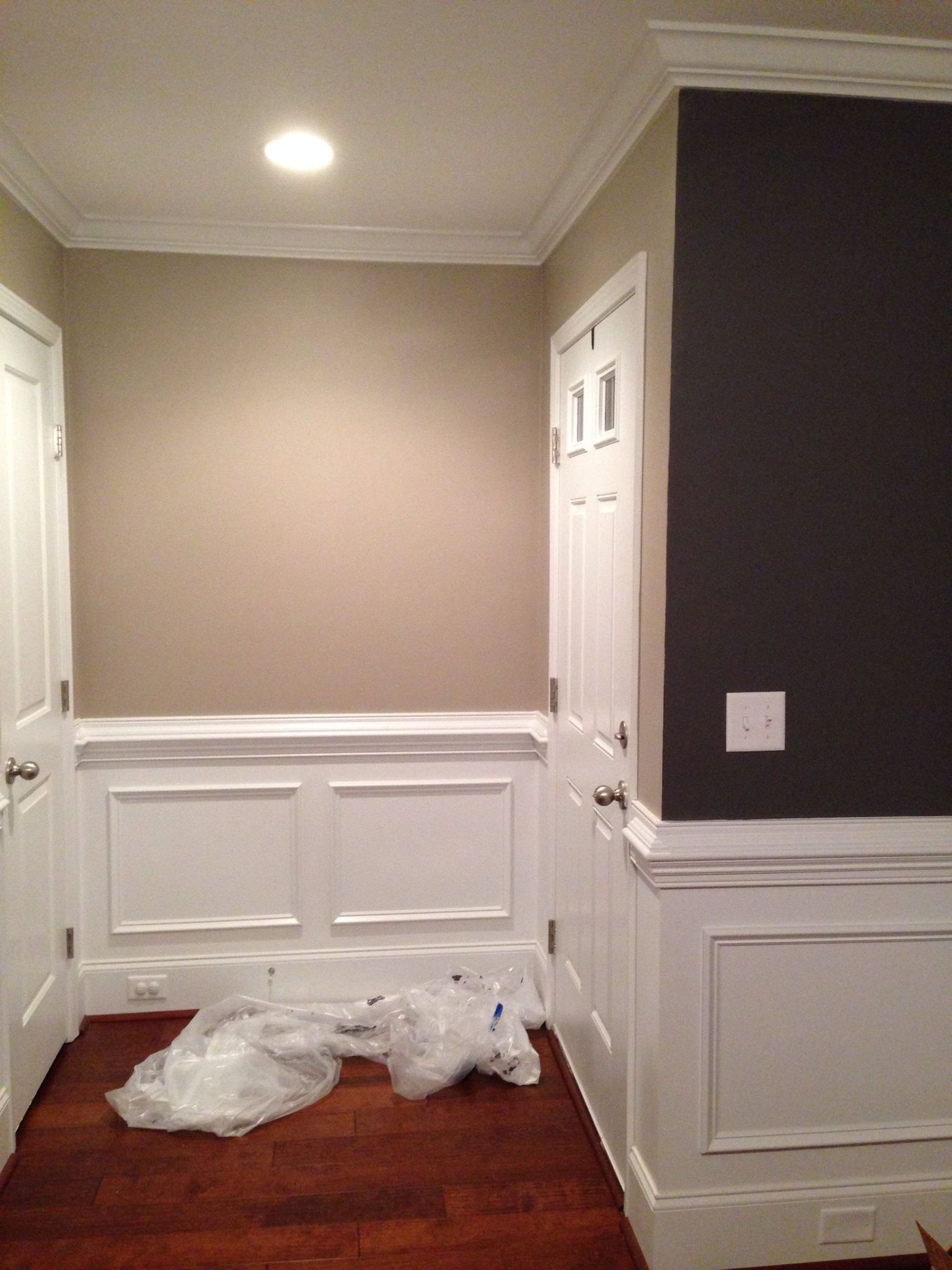
With a good amount of light, Perfect Greige looks like the right shade of gray for any room. However, it can show some of its undertones if the lighting is right. This next picture shows a bit of red in the paint color.
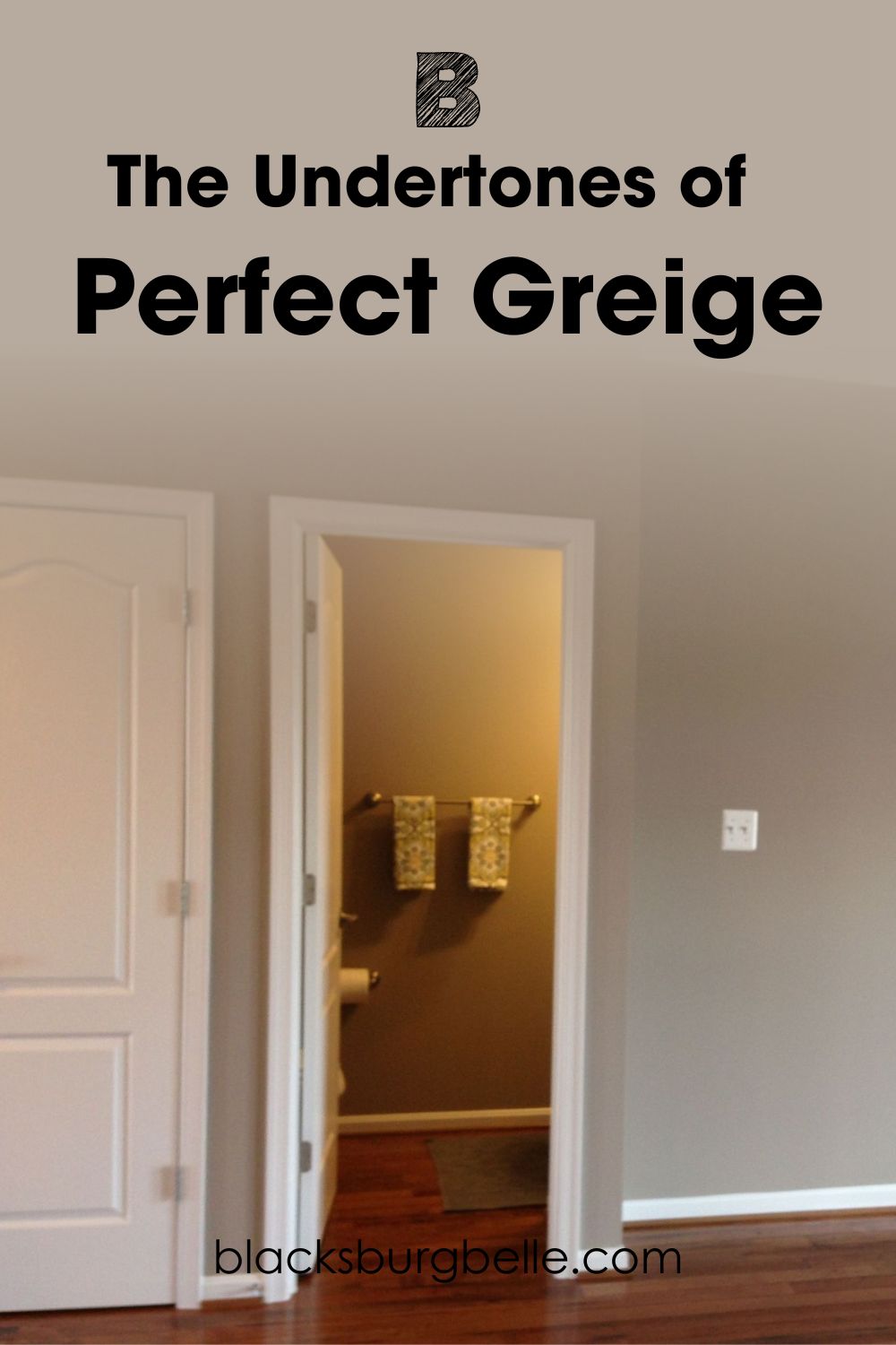
Don’t think the undertones are visible because of the lighting conditions in the upstairs hallway. Sometimes, the undertones are also visible in bright natural lighting. But here, they read a little pink/violet instead of red.
Does Perfect Greige Look Beige in a Room?
How the color appears is mostly the work of the lighting conditions in the room. North-facing rooms don’t have direct sunlight, so Perfect Greige may look too muted or dull. It may also look balanced because it doesn’t entirely lose its warmth.
In a south-facing room, the paint color will appear light, bright, and warm. This is because rooms with southern exposure have direct warm sunlight. It may also show a lot of beige so that it looks less gray and more beige.
How About Artificial Lighting?
Artificial lighting is a main concern when it comes to how any paint color comes out when dry. That is why I always advise that you use samples in the rooms where you plan to use the color. This allows you to see how it appears in different lighting conditions, including artificial ones.
Artificial lighting can transform the look and feel of color because it can be any color. White and bright artificial lighting can keep the color in its true form. And you may enjoy it better than way.
But under yellow artificial lighting, Perfect Greige tends to look different. It can appear so creamy that you want to run your hands over the walls. But the color looks pretty different from when you use it under white light.
How Does the Paint Color Feel in a Room?
Perfect Greige is a pretty color if you know how to use it. With good lighting and warm colors, it works well as a central hue or complementary color. You can also pair it with white, especially warm off-whites, to bring out the warmth in the color.
However, in a small space, it can feel overwhelming because of its color and depth. You may feel as if the room is smaller than usual. So, while Perfect Greige is a wonderful color for any space, you may want to ensure that the room has enough lighting and the right colors.
Sherwin Williams Perfect Greige: Warm or Cool?
Perfect Greige is a warm greige paint color, especially because of the red undertones. Even in low light, this paint color can retain some of its warmth.
In some lighting, however, it may look a little too warm. But it doesn’t ruin anything unless you already have a lot of warm colors in the room.
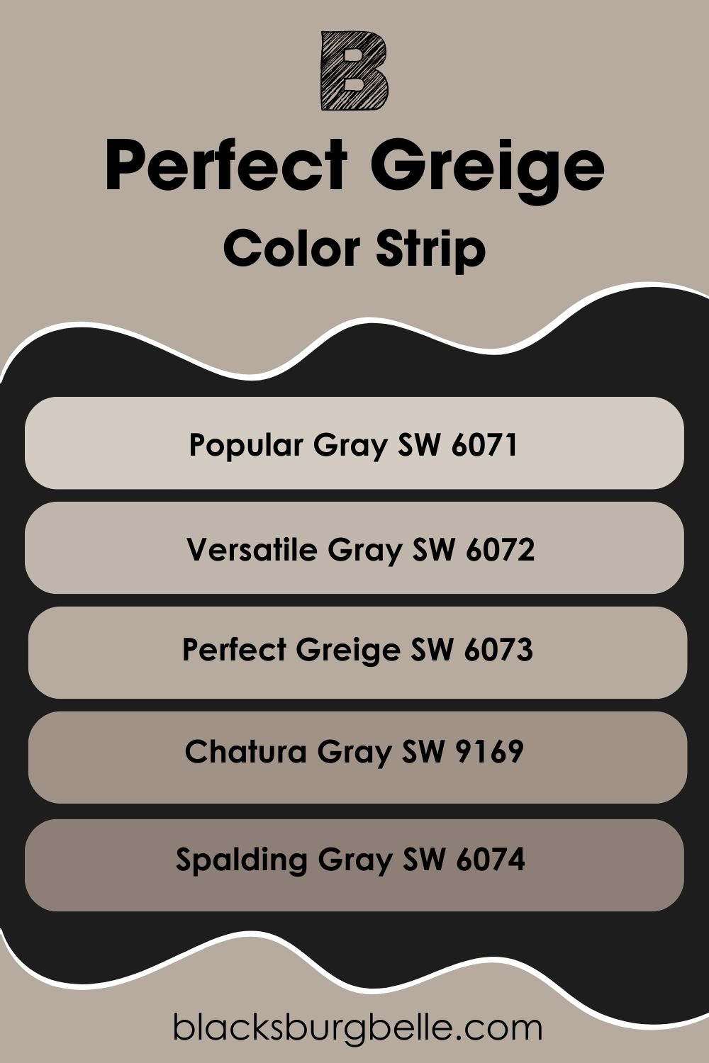
Sherwin Williams Perfect Greige Color Strip: Lighter to Darker Exploration
If Perfect Greige is not the exact shade you want, you have nothing to worry about because I have a solution. I’ve carefully picked colors, from light to dark, that can work in the place of this color. So, check them out below.
- Sherwin Williams Popular Gray SW 6071
- Sherwin Williams Versatile Gray SW 6072
- Sherwin Williams Perfect Greige SW 6073
- Sherwin Williams Chatura Gray SW 9169
- Sherwin Williams Spalding Gray SW 6074
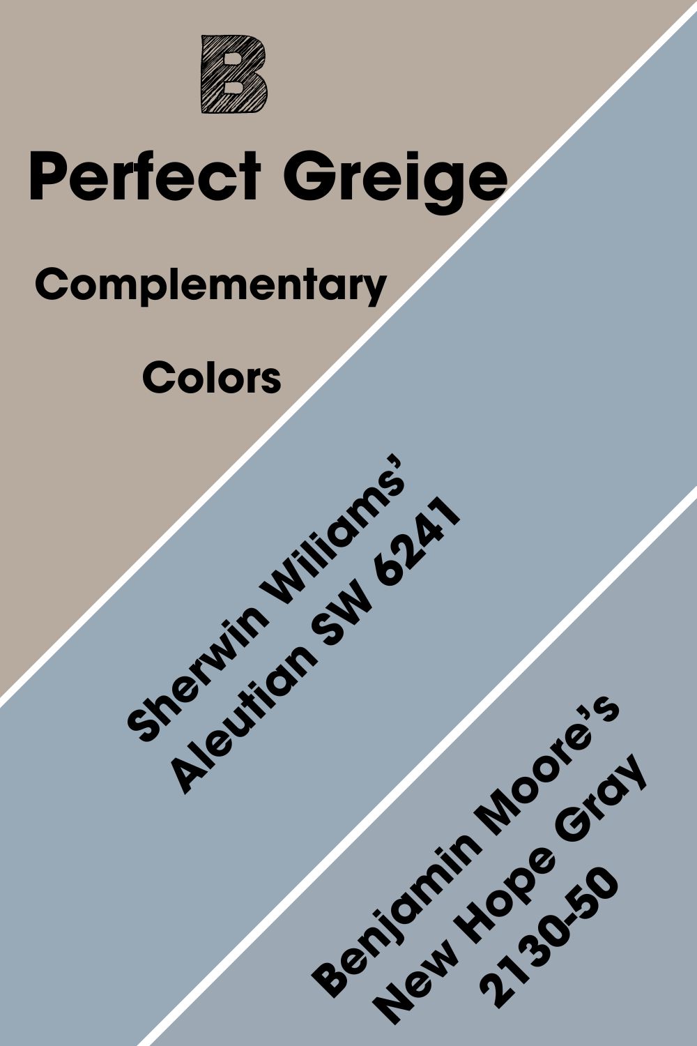
Sherwin Williams Perfect Greige Complementary Colors
Some colors look amazing alone, but they can look better if paired with the right colors. Complementary colors can turn around the vibe and effect of colors. They are opposite each other on the color wheel, and some are more obvious than others.
For example, red and green are opposite each other, so they are complementary colors. The same is true of yellow and purple, and blue and orange.
The complementary color for Perfect Greige is a medium-toned shade of blue. Sherwin Wiliams’ Aleutian SW 6241 best fits this color, and it is a beautiful shade of cool denim blue. Benjamin Moore’s New Hope Gray 2130-50 is another excellent complementary color.
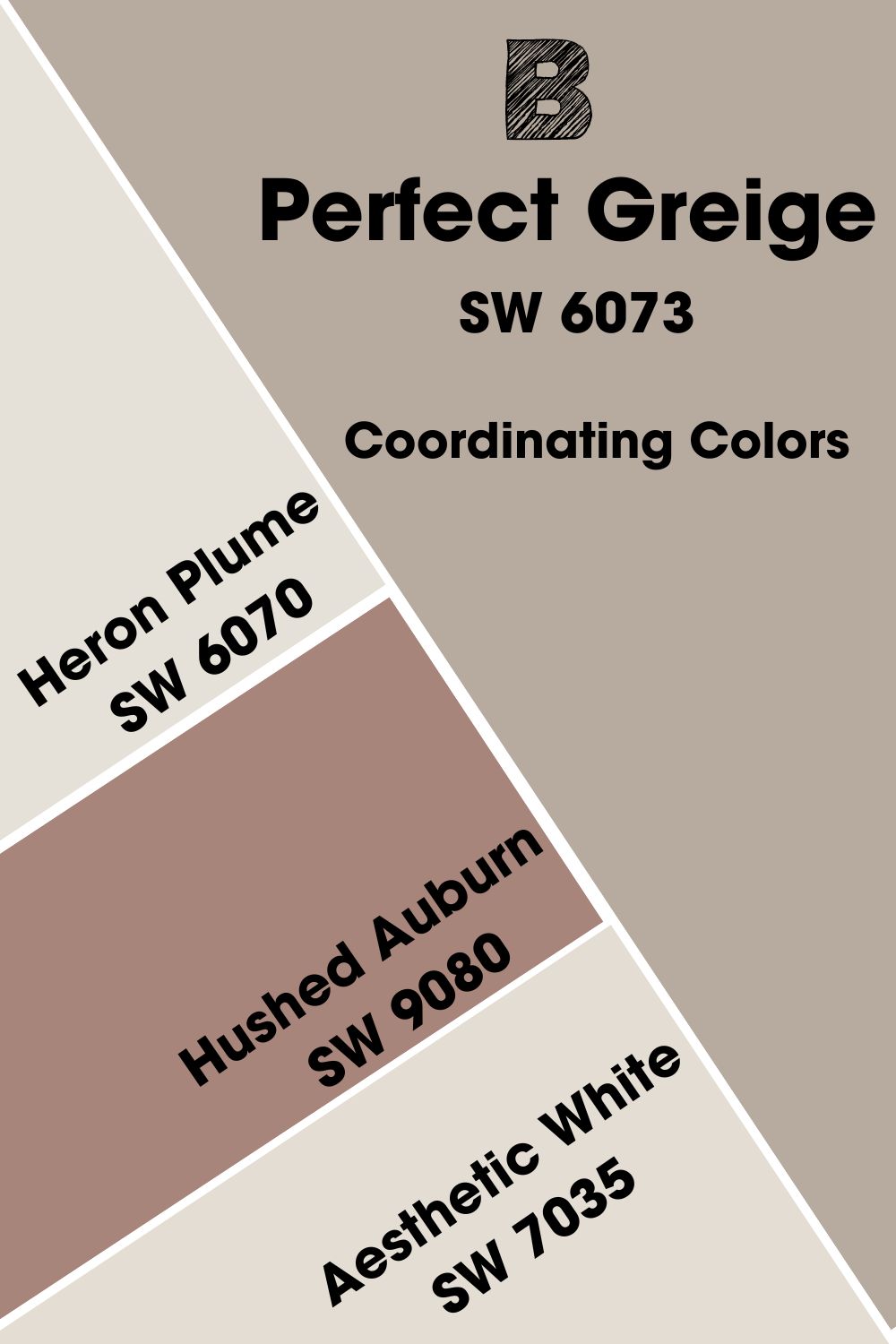
Sherwin Williams Perfect Greige Coordinating Colors
Every paint color can have many coordinating colors, although some work better than others in this aspect. Coordinating colors usually pair harmoniously with each other when used in the decor.
They flow seamlessly into each other, even if they don’t appear to look the same. There are certain similarities between their tones to create a balance. The best-coordinating colors for Perfect Greige include Hushed Auburn, Aesthetic White, and Heron Plume.
- Sherwin Williams Hushed Auburn SW 9080: A burnt shade of red that brings color and earthiness to any decor but pairs well with the undertones of Perfect Greige.
- Sherwin Williams Aesthetic White SW 7035: A cool white paint color with slightly violet undertones, and the color works well as trim or ceiling color for Perfect Greige walls.
- Sherwin Williams Heron Plume SW 6070: Another white paint color with similar undertones to Aesthetic White and works in the same manner.
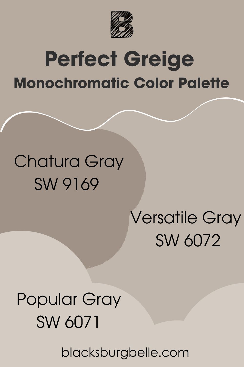
Sherwin Williams Perfect Greige Color Palettes
Every decor has colors that are infused with several colors. Sometimes, the decor may look like one color, but it is not so. Such decor usually has a few colors that perfectly complement each other and have almost the same shade. So, let’s look at some color palettes for Perfect Greige.
Monochromatic Color Palette
- Chatura Gray SW 9169: Just one shade darker than Perfect Greige, it can make the main color look lighter and pop in any decor.
- Versatile Gray SW 6072: Another color from the same collection as Perfect Greige, and just a shade lighter, it fits into monochromatic decor with it.
- Popular Gray SW 6071: You can add this color for good effect, especially if you don’t want white in the decor.
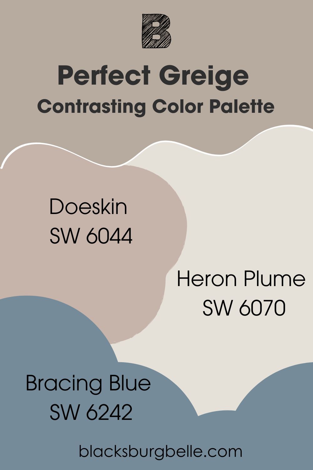
Contrasting Color Palette
- Doeskin SW 6044: A taupe paint color with a violet cast that brings something different to the decor.
- Heron Plume SW 6070: A white paint color with a cool violet undertone that looks different when paired against Perfect Greige but actually complements it.
- Bracing Blue SW 6242: A deep blue with a gray undertone that grounds it from being too vibrant but is a different feel in the decor.
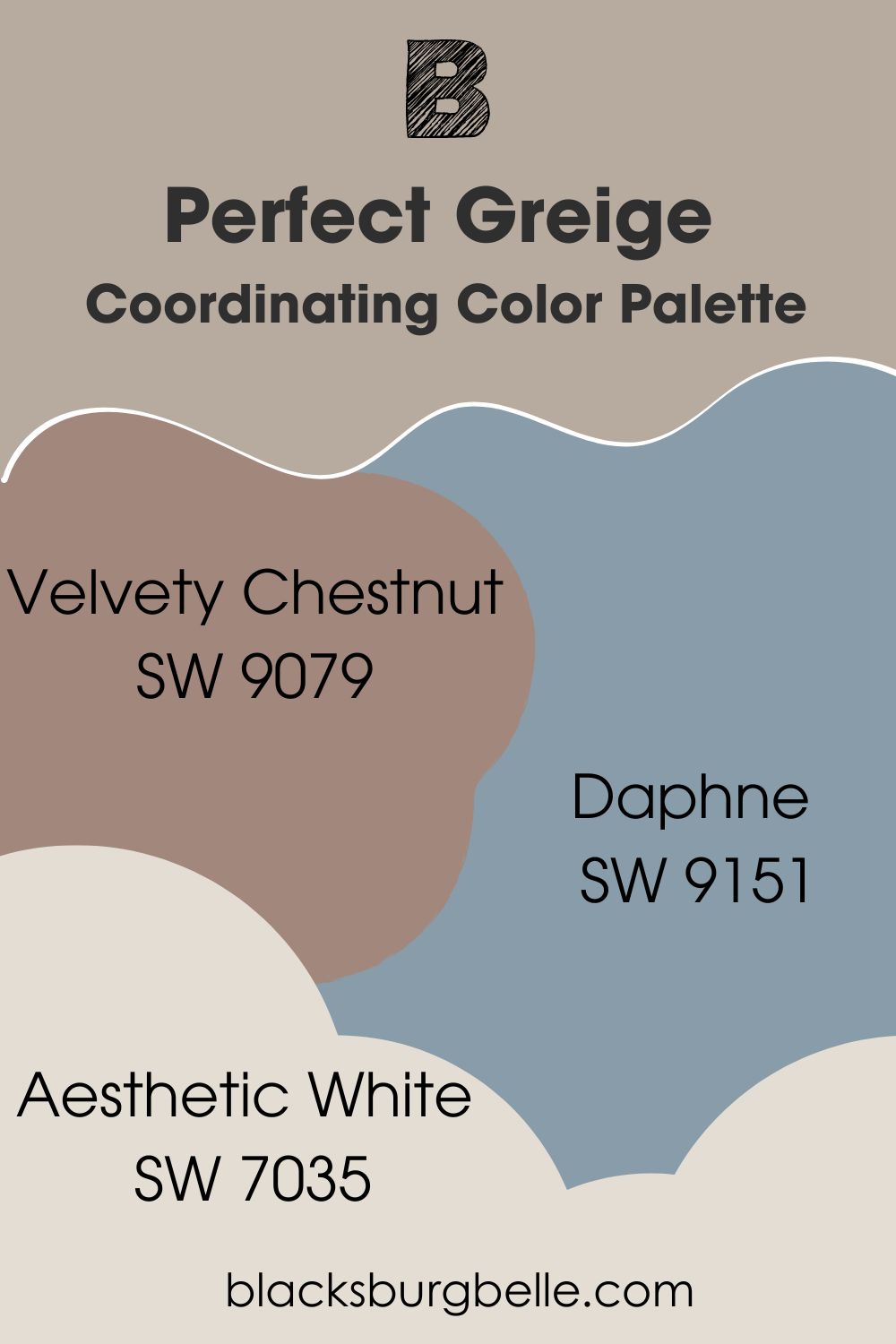
Coordinating Color Palette
- Velvety Chestnut SW 9079: A dark shade of red with earthy tones that brings nature into your home without overwhelming the decor.
- Daphne SW 9151: A medium blue paint color with a gray undertone that pulls on the strings of the gray in Perfect Greige.
- Aesthetic White SW 7035: A cool white paint color whose violet undertone pairs well with the red in Perfect Greige.
Sherwin Williams Perfect Greige vs Similar Paint Colors
So, if you want to know how this paint color performs against similar ones, you’re in for a ride. As peculiar as it may seem, Perfect Greige has some similarities with a few colors.
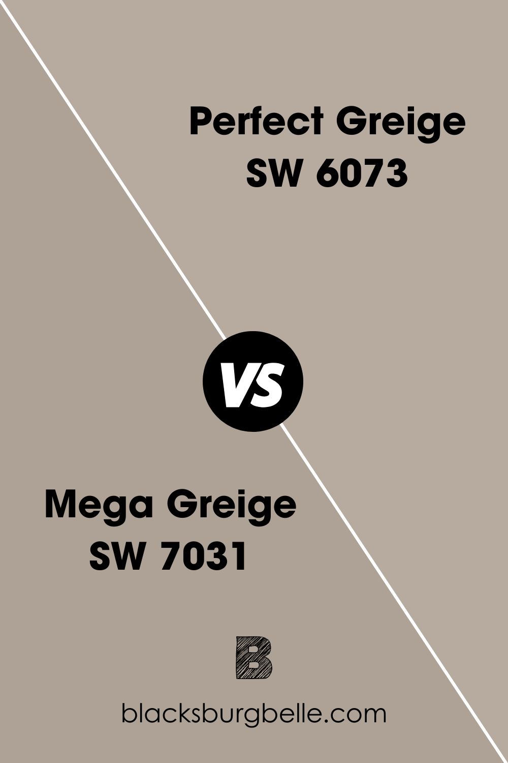
SW Perfect Greige vs SW Mega Greige
Perfect Greige is lighter than Mega Greige, with the latter being warmer when they are paired together.
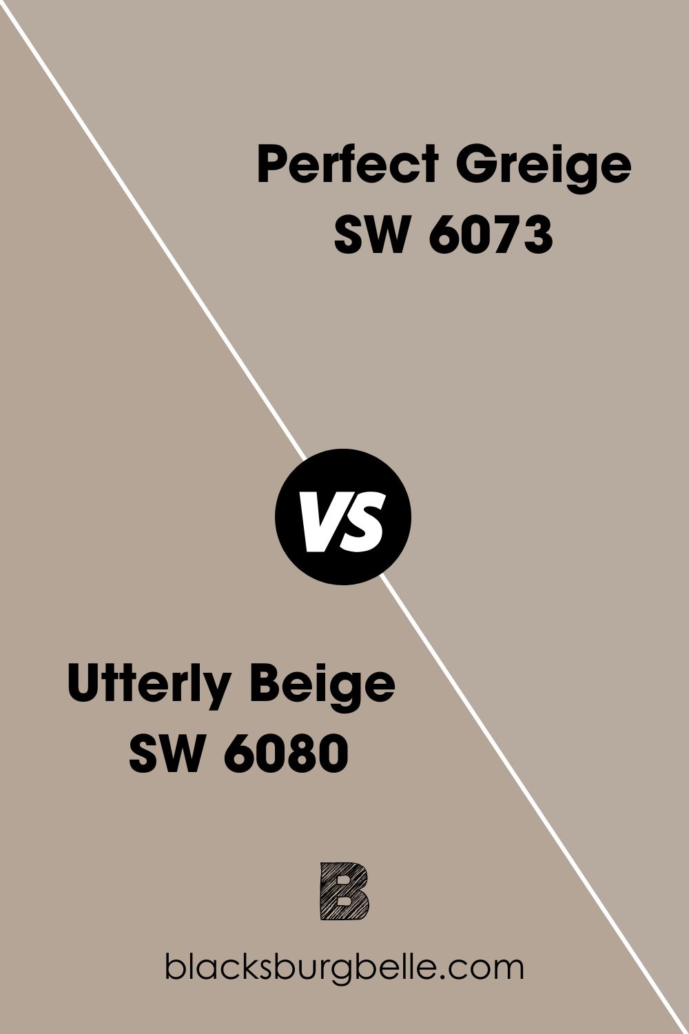
SW Perfect Greige vs SW Utterly Beige
Both colors look almost the same, but Utterly Beige is darker with an LRV of 39. It also has a bit of an orange undertone, which makes it somewhat warmer.
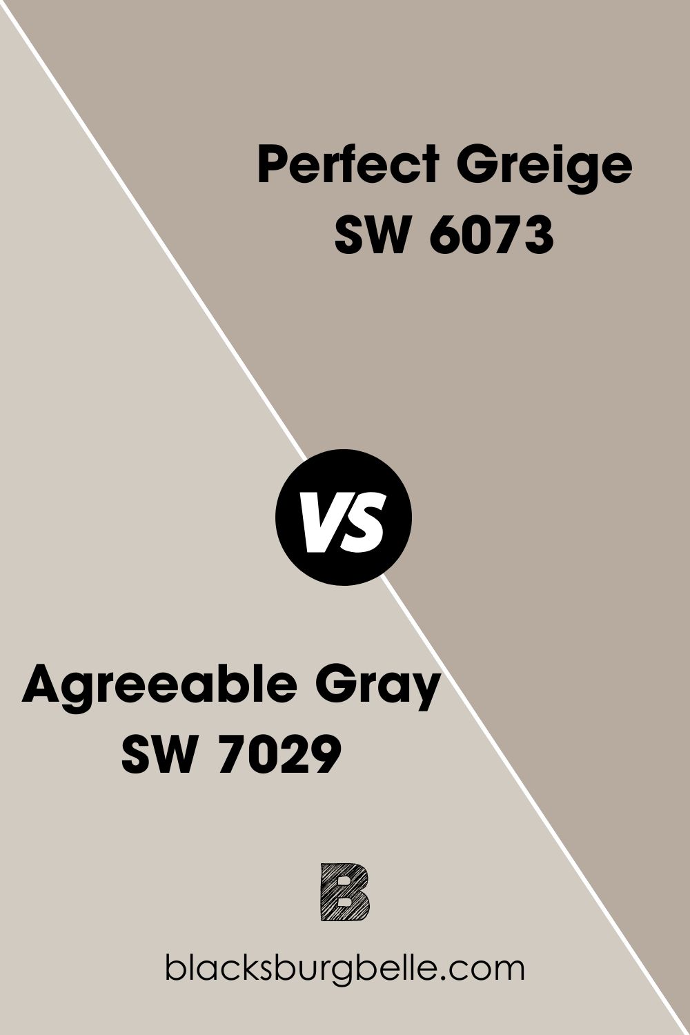
SW Perfect Greige vs SW Agreeable Gray
Perfect Greige is darker than Agreeable Gray. The latter paint color has an LRV of 60, way above that of Perfect Greige. Besides, the undertones are different, green for Agreeable Gray and red for Perfect Greige.
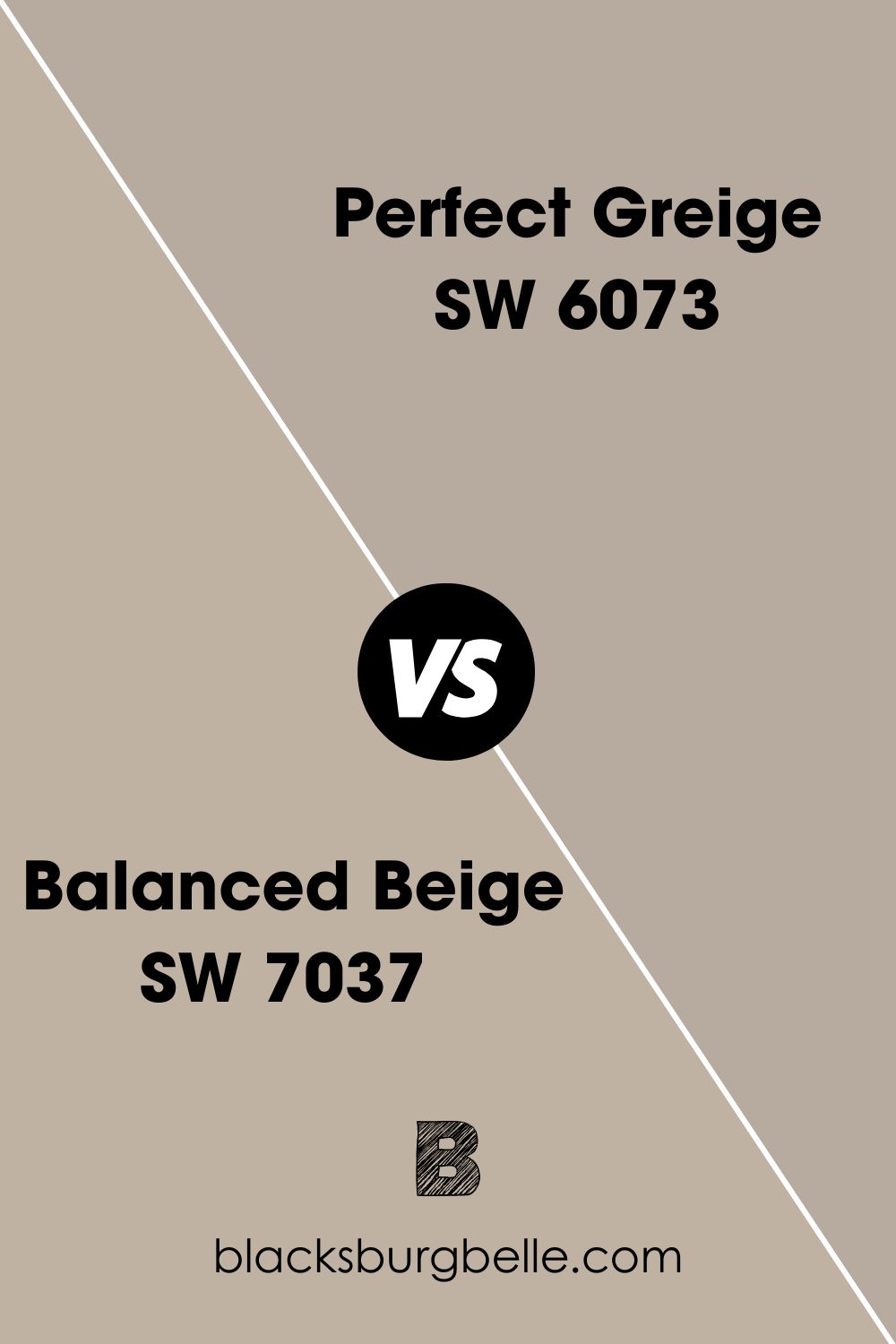
SW Balanced Beige vs SW Perfect Greige
Balanced Beige has an LRV of 46, just slightly higher than that of Perfect Greige. And with an undertone of reddish-brown, these paint colors are interchangeable.
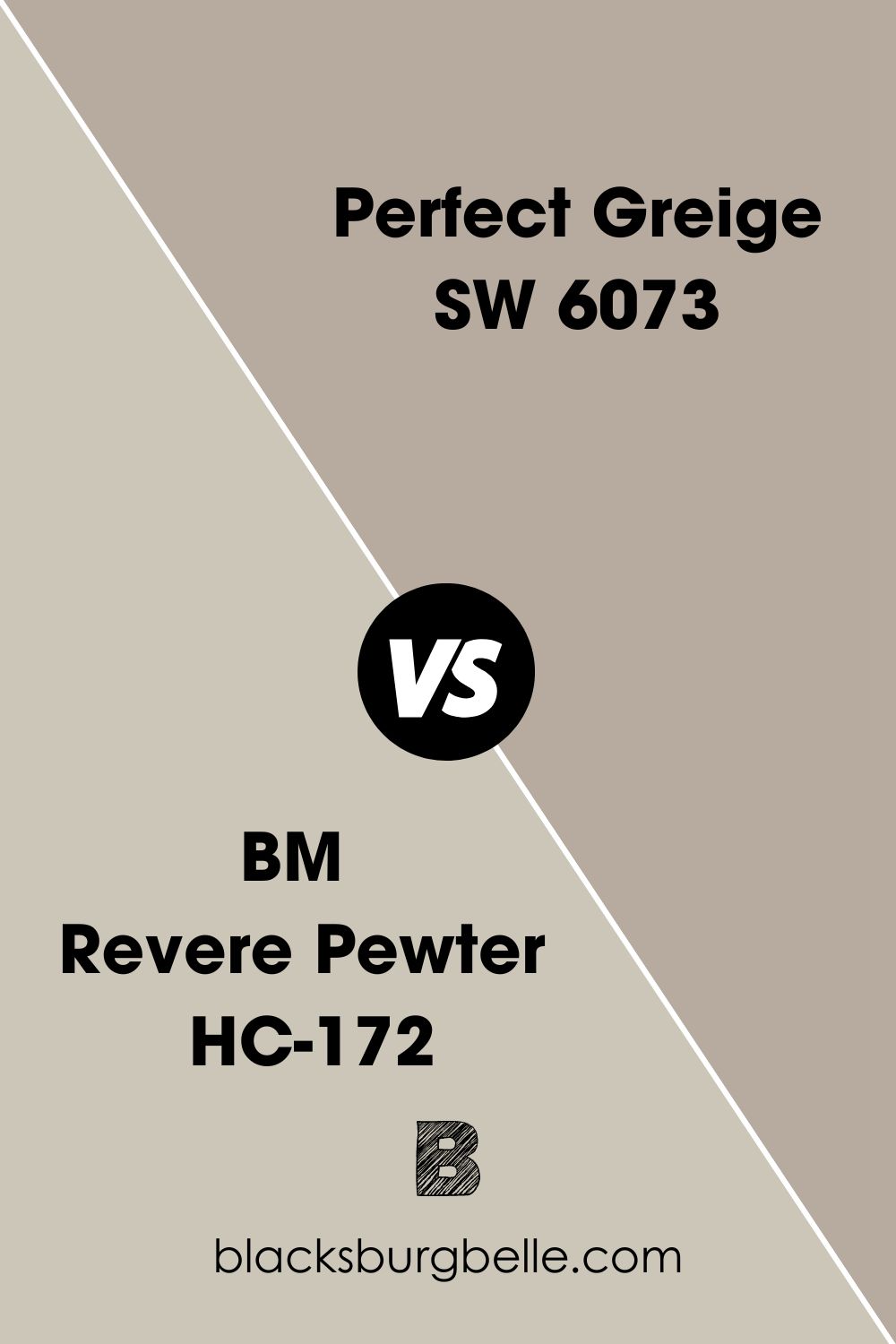
SW Perfect Greige vs BM Revere Pewter
Benjamin Moore’s Revere Pewter has green undertones and an LRV of 55.1. So, it is pretty different from Perfect Greige, although they may look alike when used apart.
Benjamin Moore Paint Color Equivalent for SW Perfect Greige
I’d like to point out that no two paint colors are the same, regardless of their similarities. That is part of their uniqueness. However, two colors from different brands may look alike so much that they are interchangeable.
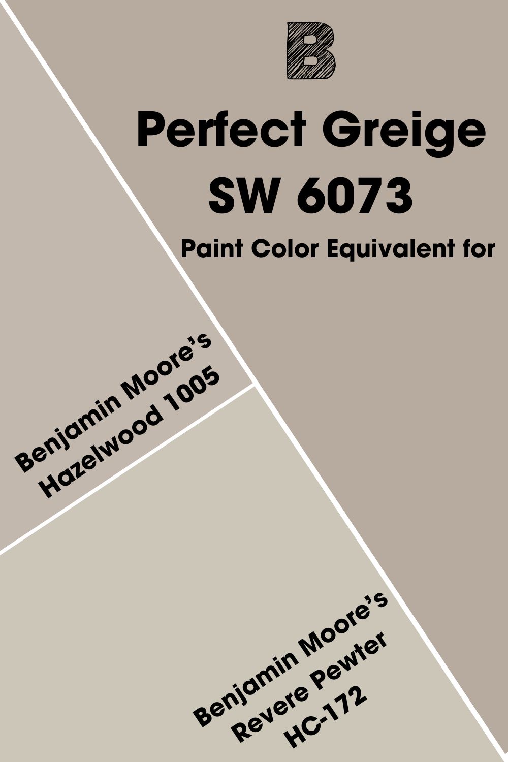
Benjamin Moore’s Hazelwood 1005 is pretty close in color and undertone to Perfect Greige. Revere Pewter HC-172 is also close in color, although the undertones are different.
Where Can You Use Sherwin Williams Perfect Greige?
This paint color is versatile enough to work in any room. The trick is to know what colors work best with it and to use it with good lighting. So, let’s see real-life pictures of Perfect Greige at work.
What Cabinet Color Goes with SW Perfect Greige Walls?
White is one color that goes well with Perfect Greige walls, whether in the kitchen, laundry room, or personal room. You can get adventurous and try a dark neutral like black or dark gray.
What Trim Color Goes with SW Perfect Greige Walls?
As with the cabinets, white is also your best shot for a trim color if you want Perfect Greige to work. Dark colors may also work, but the colors may only overwhelm the room.
Best Ceiling Color for Sherwin Williams Perfect Greige Walls
Keep the room light and airy with a white ceiling. Perfect Greige is a saturated color that can feel too much, but white keeps it in check.
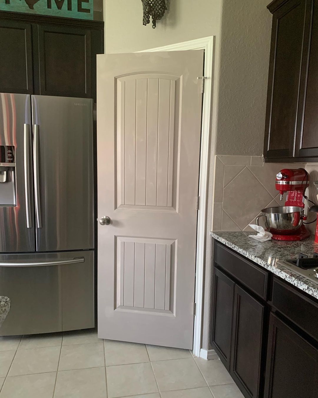
Sherwin Williams Perfect Greige on Doors
Your front door or any other door in the house can enjoy the beauty of Perfect Greige. Use a white trim color to make the greige pop.
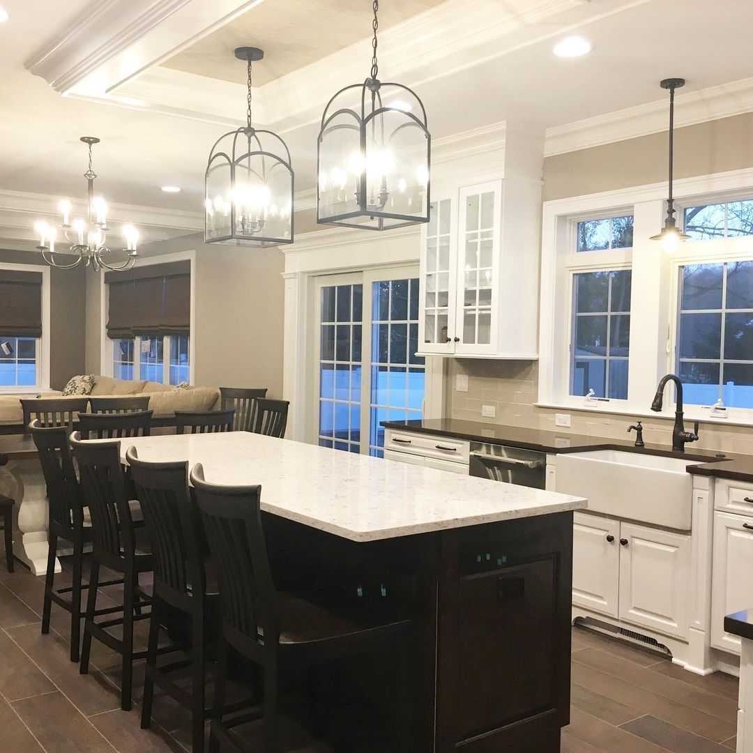
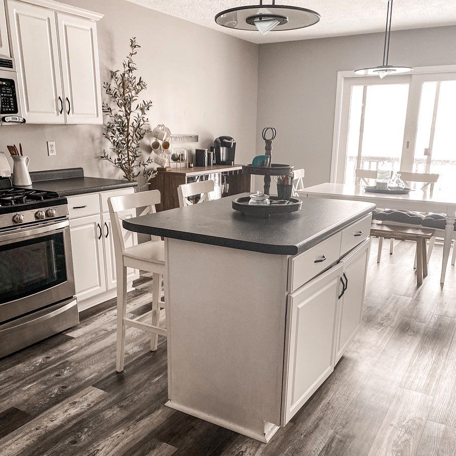
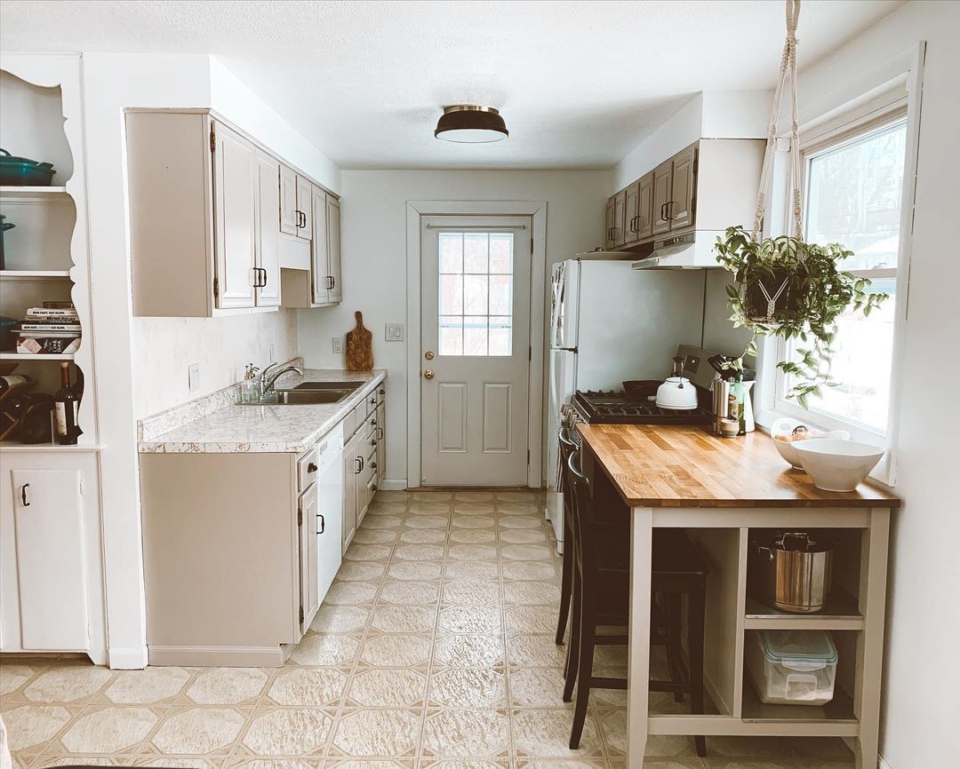
Sherwin Williams Perfect Greige on Kitchen Cabinets
Is Perfect Greige a good cabinet color? It depends on what you want in your kitchen. But I can tell you that it’s a clean color and can create a fresh look in the room.
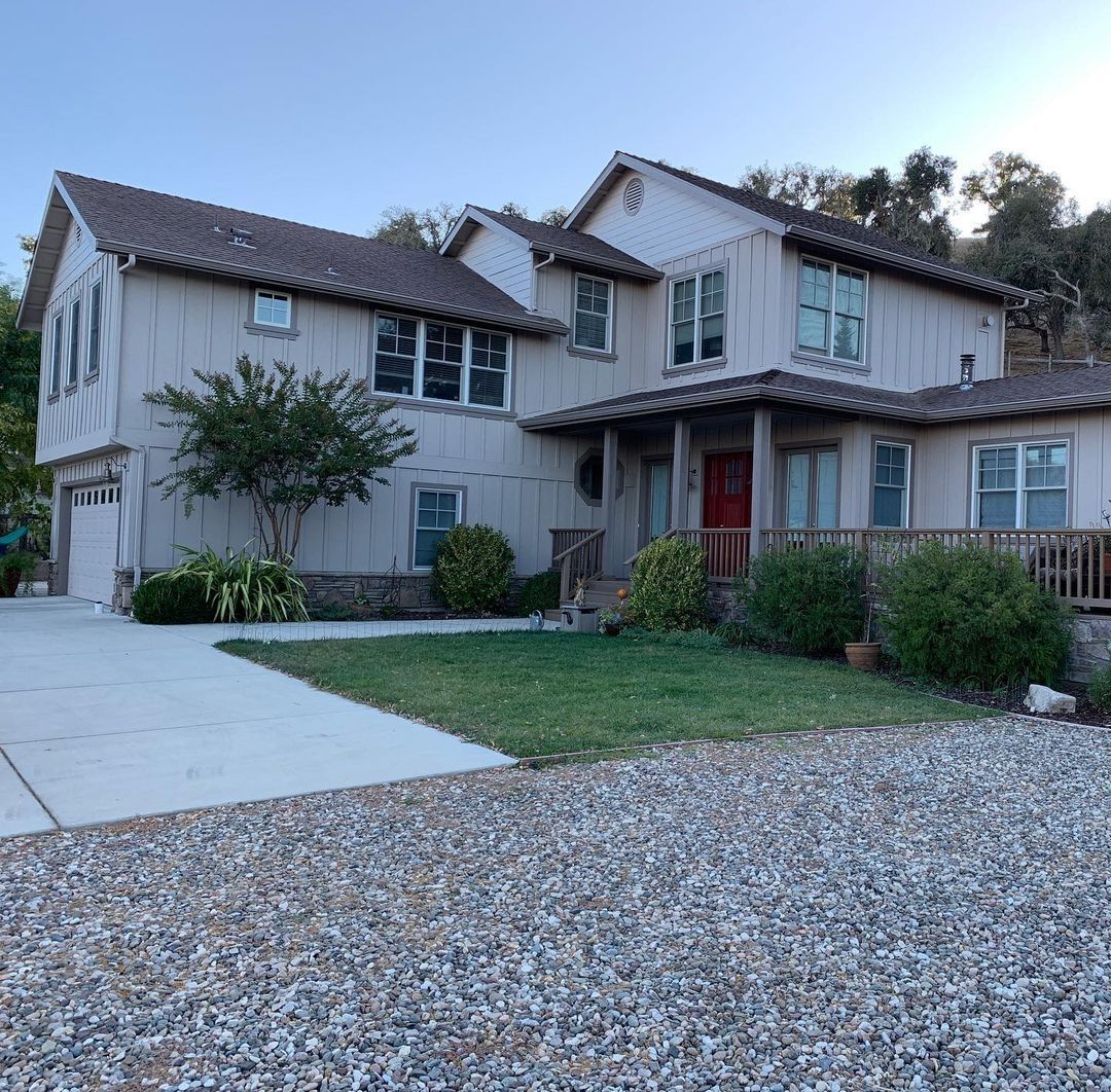
Sherwin Williams Perfect Greige on Exterior Walls
Perfect Greige is recommended for interiors and exteriors because of its color. Use a light or dark trim color since there will be an abundance of light.
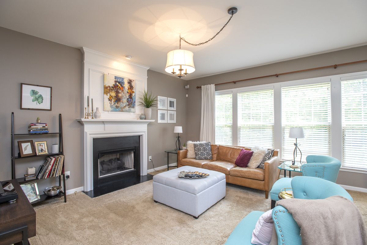
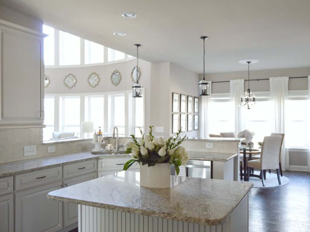
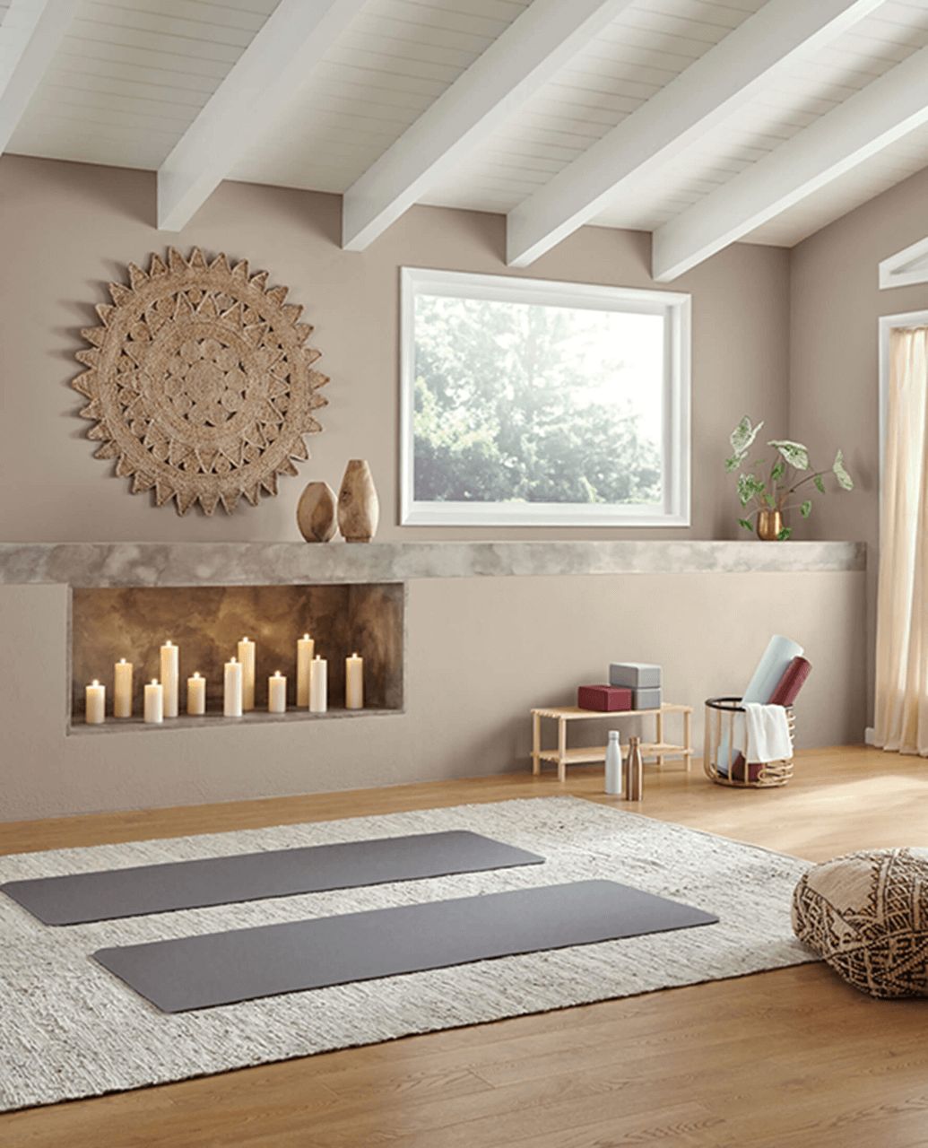
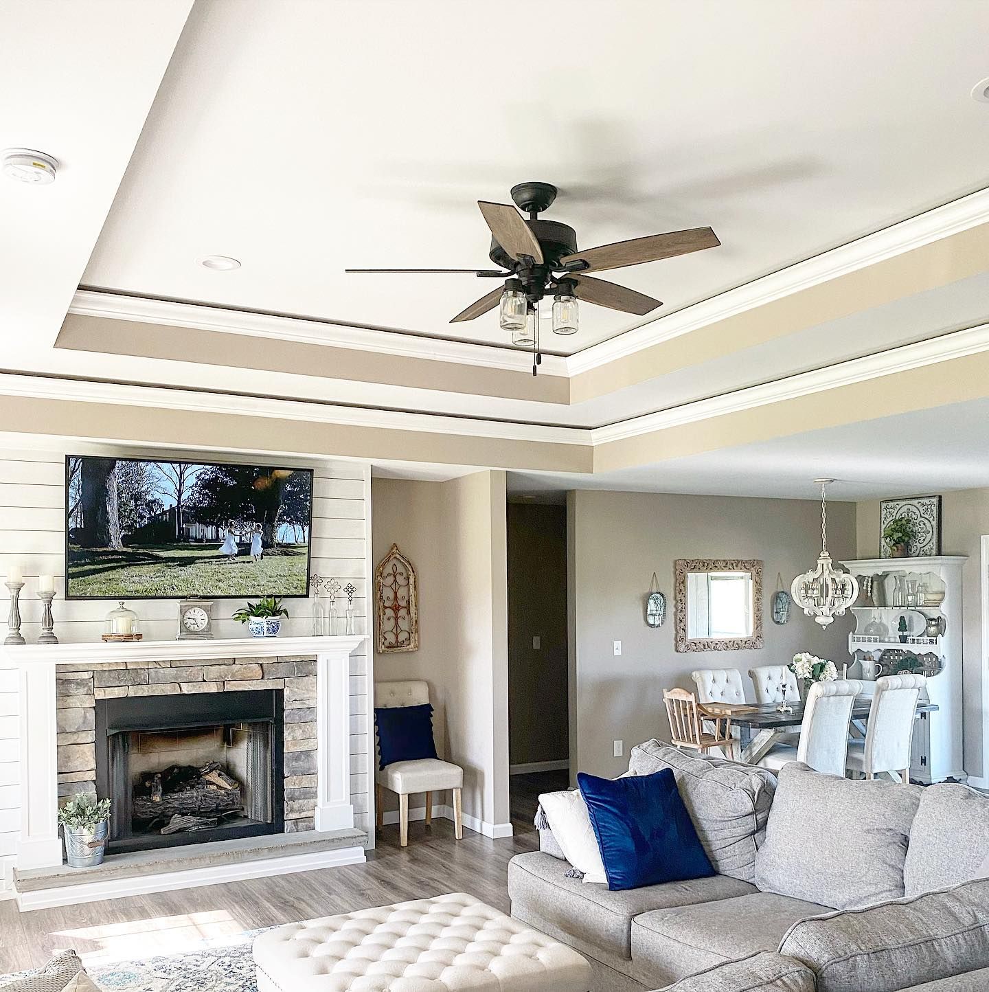
Sherwin Williams Perfect Greige in Living Rooms
If you find the right colors to pair with Perfect Greige, you can create an excellent balance. The right colors in your living room can set the tone for the rest of the house. Check out the living room in this next picture.
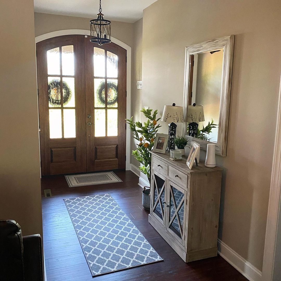
Sherwin Williams Perfect Greige in Entryways
Your foyer or entryway should be warm and welcoming. Fortunately, there are many colors that work well for this purpose, including Perfect Greige. This next picture is proof of that.
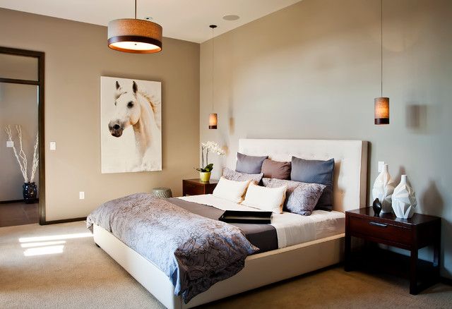
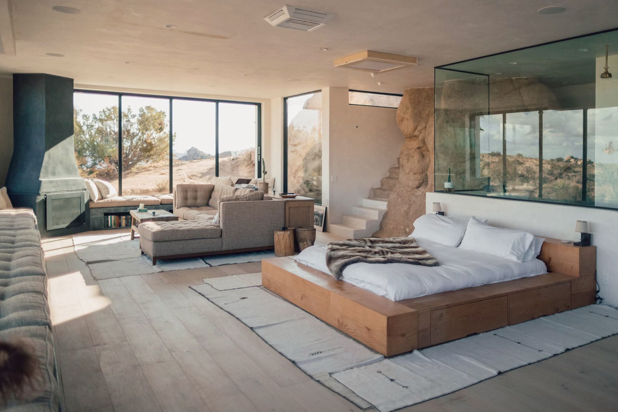
Sherwin Williams Perfect Greige in Bedrooms
Create a harmonious look and feel in your bedroom with Perfect Greige on the walls. Throw in other neutrals and vibrant colors to complete the look.
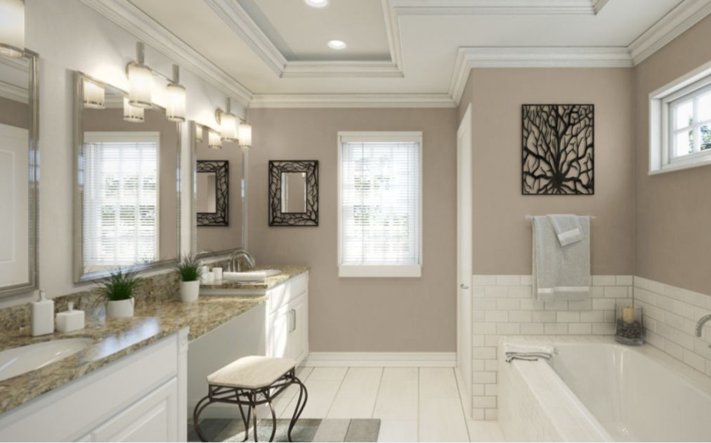
Sherwin Williams Perfect Greige in Bathrooms
A bathroom looks great in neutral colors, but neutrals with a bit of vibrant color can make it better. Try Perfect Greige with white in your bathroom to see how it feels.
Conclusion
There you have it: every detail of Sherwin Williams Perfect Greige. It is a greige paint color that read gray but has creamy red undertones. And with an LRV of 42, this paint color has more depth than many other greige paint colors.
Use extreme colors like white or black to make this color work. You can also try neutrals with similar undertones since Perfect Greige is a warm color. Try to use it in a spacious room with a lot of natural or artificial light. Otherwise, just use it with good lighting. You will better appreciate this color that way.
Let me know your thoughts and experience in the comments section. I’m rooting for you to pick the right colors for your palette.
 Sherwin Williams North Star (Palette, Coordinating & Inspirations)
 Sherwin Williams Cascades (Palette, Coordinating & Inspirations)
 Sherwin Williams Clary Sage (Palette, Coordinating & Inspirations)
 Sherwin-Williams Tidewater (Palette, Coordinating & Inspirations)
 Sherwin Williams Coastal Plain (Palette, Coordinating & Inspirations)
 Sherwin Williams Balanced Beige SW 7037: Paint Color Review
