
If you are looking to bring a breath of fresh air into a space, boy do I have the color for you!
In this review, I am going to be looking at Sherwin Williams Rainwashed SW 6211. This gorgeous cool, blue-green has just the right amount of refreshing minty vibe to truly brighten things up.
I’ve always been a big lover of all things pastel, and Sherwin Williams Rainwashed is a stunning pastel that still keeps things classy! I love the sage green notes in it too, which give it a real earthy feel while still remaining bright.
Carry on scrolling to learn everything you need to know about Sherwin Williams Rainwashed, and why you seriously need to consider it in your next design project!
Table of Contents
When to Choose Sherwin Williams Rainwashed?
As always, I’ve been taking a truly deep dive into everything Sherwin Williams Rainwashed. I’ve been scouring the internet for the very best inspiration, and also getting stuck in myself with a pot or two of this paint!
If you need a quick snapshot of why you should choose Rainwashed, I’ve collated together my top advice and tips.
A Ceiling With a Difference
Especially if you have a room that is primarily white in its wall color and furnishings, Sherwin Williams Rainwashed makes for a stunning feature ceiling color. It creates a gorgeous focal point which is like a breath of fresh air!
Give the Laundry Room Some Love
One of the most popular places to use Sherwin Williams Rainwashed is in a laundry room. This is because its fresh green-blue notes create a really clean feel to go along with your fresh laundry! It’s also a wonderful contrast against white appliances and countertops.
Calm and Tranquil Vibes
Thanks to its cool tones, Rainwashed is a beautifully tranquil color that can really add a sense of relaxation to any space. However, instead of being mellow, it’s more like a bright fresh breath of air that helps to create clarity in living spaces, bathrooms, and even home offices.
Not Just For Adults
Rainwashed works beautifully well with other pastels, making it a wonderful color to use in a nursery or a kid’s room. Create a contrast with pastel pinks or deep yellows, or create a cozy and light nautical theme with some blues.
A Breezy Coastal Feel
Sherwin Williams Rainwashed can also help you to create a coastal or beachy feel in a space without the need for deep navy blues. Instead, you get the feeling of tranquil waters in which you can really sink into!
Of course, there are a whole host of other ways in which Sherwin Williams Rainwashed SW 6211 can really shine in your home.
Keep on reading as I explore all that this color has to offer, and help you with everything that you need to know. Let’s get going!
What Color is Sherwin Williams Rainwashed?
So, what sort of color is Sherwin Williams Rainwashed?
Rainwashed is a mid-toned cool blue-green, I’ve done some thinking on why Sherwin Williams might have wanted to call this paint rainwashed, and to me, it reminds me of looking at the washed-out colors through a window on a rainy and misty day. For an idea of what I am getting at, take a look at this picture I’ve found.
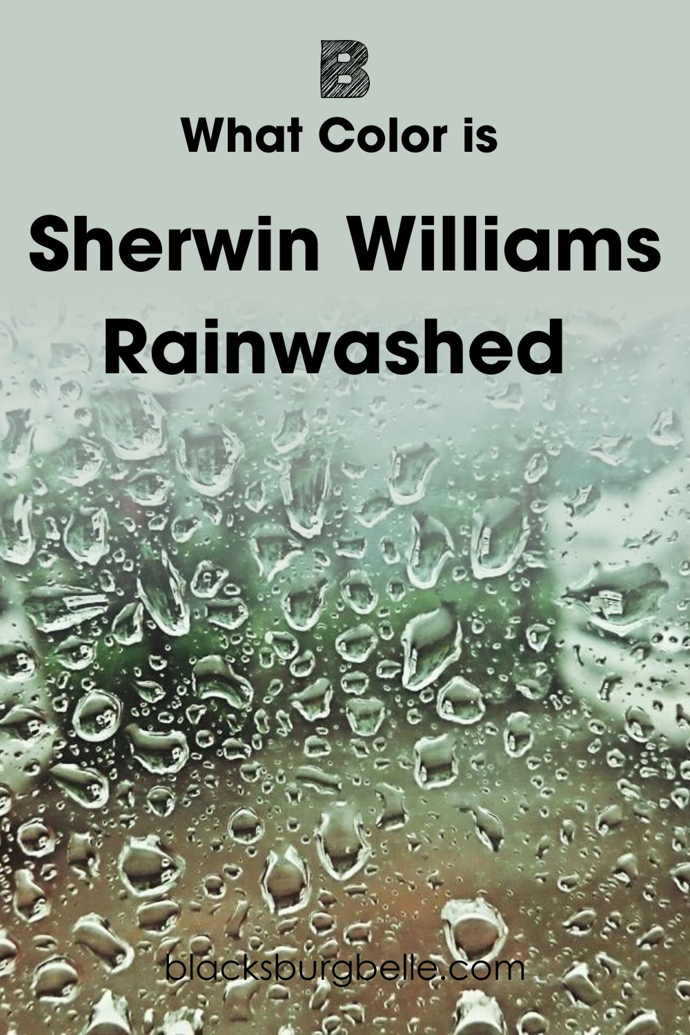
See what I mean when you look at the top half of this photo at the greenery and the sky? You can really see the blues and greens of Sherwin Williams Rainwashed shining through.
Snapshot of Sherwin Williams Rainwashed Specifications
Of course, I know that some of you need all the ins and outs of a paint color to truly understand if it is right for you. As a result, I’ve put all of the handy specifications about Sherwin Williams Rainwashed into a handy table for you!
| Sherwin Williams Rainwashed SW 6211 | |
| RBG | R: 194 G: 205 B: 197 |
| Hex Value | #C2CDC5 |
| LRV | 59 |
| Undertones | Gray |
The LRV of Sherwin Williams Rainwashed
For those unfamiliar with the term, LRV simply means Light Reflective Value. It’s used to measure how much light a color reflects. The scale goes from 0 to 100, with a true black being 0, meaning it reflects no light, and a pure white being 100 with the maximum reflectiveness.
When it comes down to it, no color is truly black, or white. There is always some sort of pigmentation due to the manufacturing process and just general everyday life! As a result of this, paint is measured using LRV values between 2.5 and 94.
The LRV of Sherwin Williams Rainwashed is 59. This puts it on the lighter end of the scale, but it’s a light mid-tone at best.
Undertones of Sherwin Williams Rainwashed
One of the ways in which Sherwin Williams Rainwashed is able to create a calming yet refreshing vibe in any room is its undertone.
The undertone of this paint color is gray, which helps to add to the cooling effect of the color and helps to stop it from becoming too intense of a pigment.
Don’t just take my word for it though, I’ve found a photo for you that shows off the gray undertone of Sherwin Williams Rainwashed SW 6211 for you.
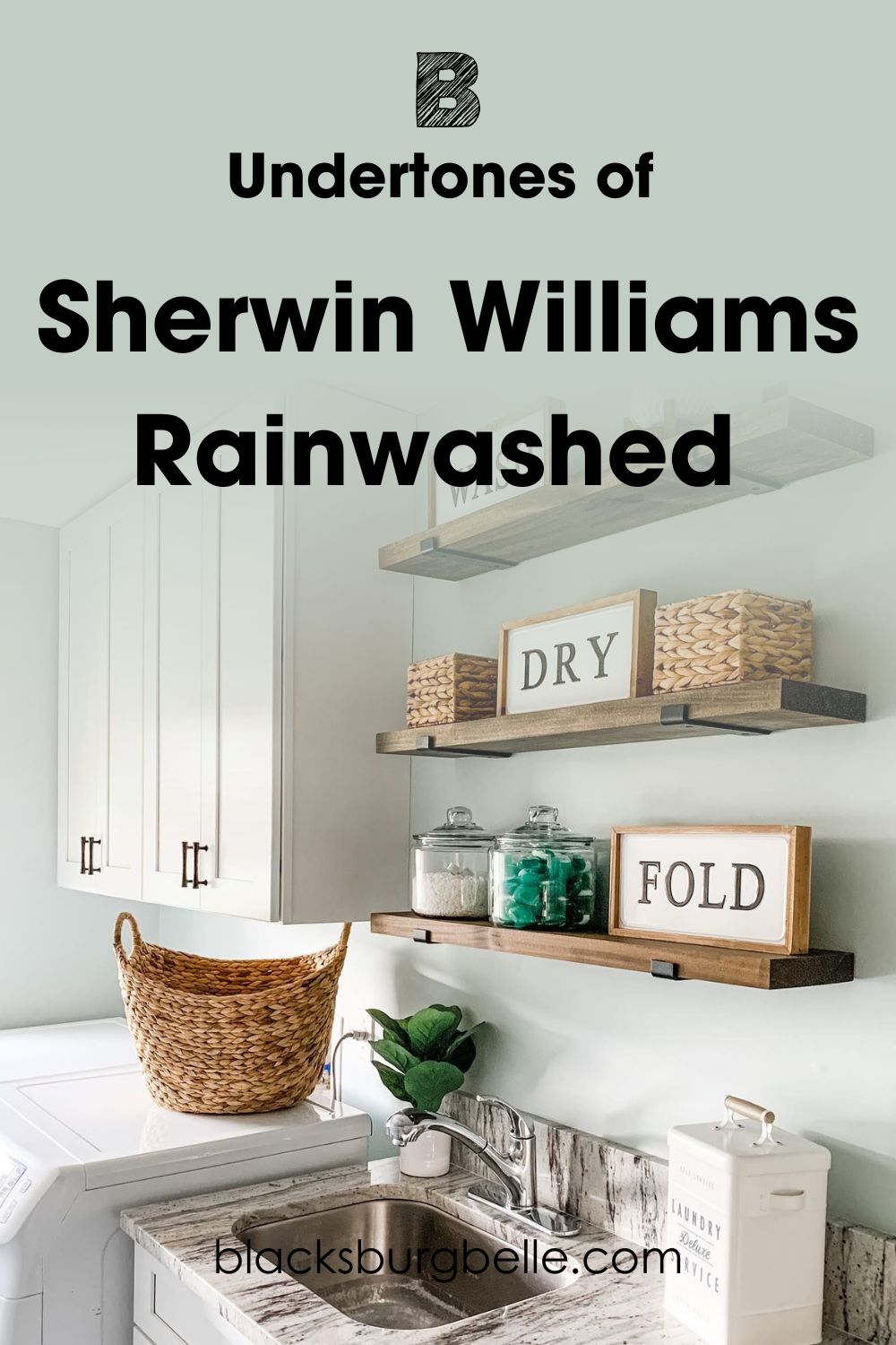
As you can see from this fresh and breezy laundry room, the gray undertones are really able to come through. In some places, it even looks more gray than a blue-green!
Is Sherwin Williams Rainwashed Too Bright to Use on an Exterior?
Although it can create a bright, breezy, and calming space on the inside of the property, some people have reservations about putting a color like Sherwin Williams Rainwashed on the outside of their homes.
This does come down to personal choice, and there are definitely some properties that may not suit this color, especially those that see a lot of natural light which can really wash it out and make this color a little insipid.
But, don’t discount it completely, because, in the right circumstances, this color can be really something!
Although it can look gorgeous when used on the siding of a wooden farmhouse-style property, one way to use Sherwin Williams Rainwashed on the exterior of your property is to go Southern-style and use it on the roof of your porch. Here’s an example for you of what I mean.
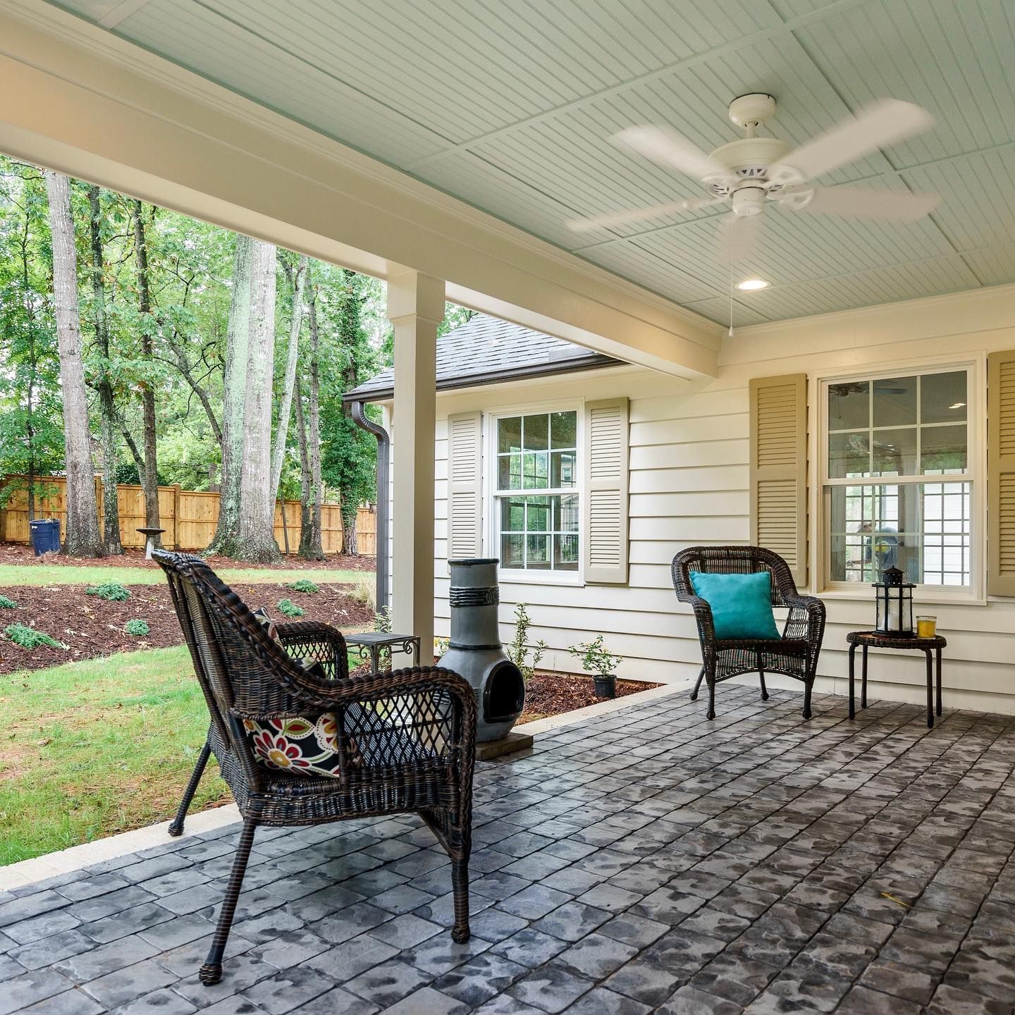
Other ways to use Rainwashed on the outside of your property without going all-in is to use it on features such as shutters or your front door. Who knows, you might then love the color so much that it starts to spread!
Sherwin Williams Rainwashed is Warm or Cool Color?
Sherwin Williams Rainwashed is a cool color. While some people can be put off by cool colors, they are actually essential when it comes to creating a vibe of calm and tranquility in your home.
So, if you need to create a room in which to feel totally peaceful, look no further than Rainwashed!
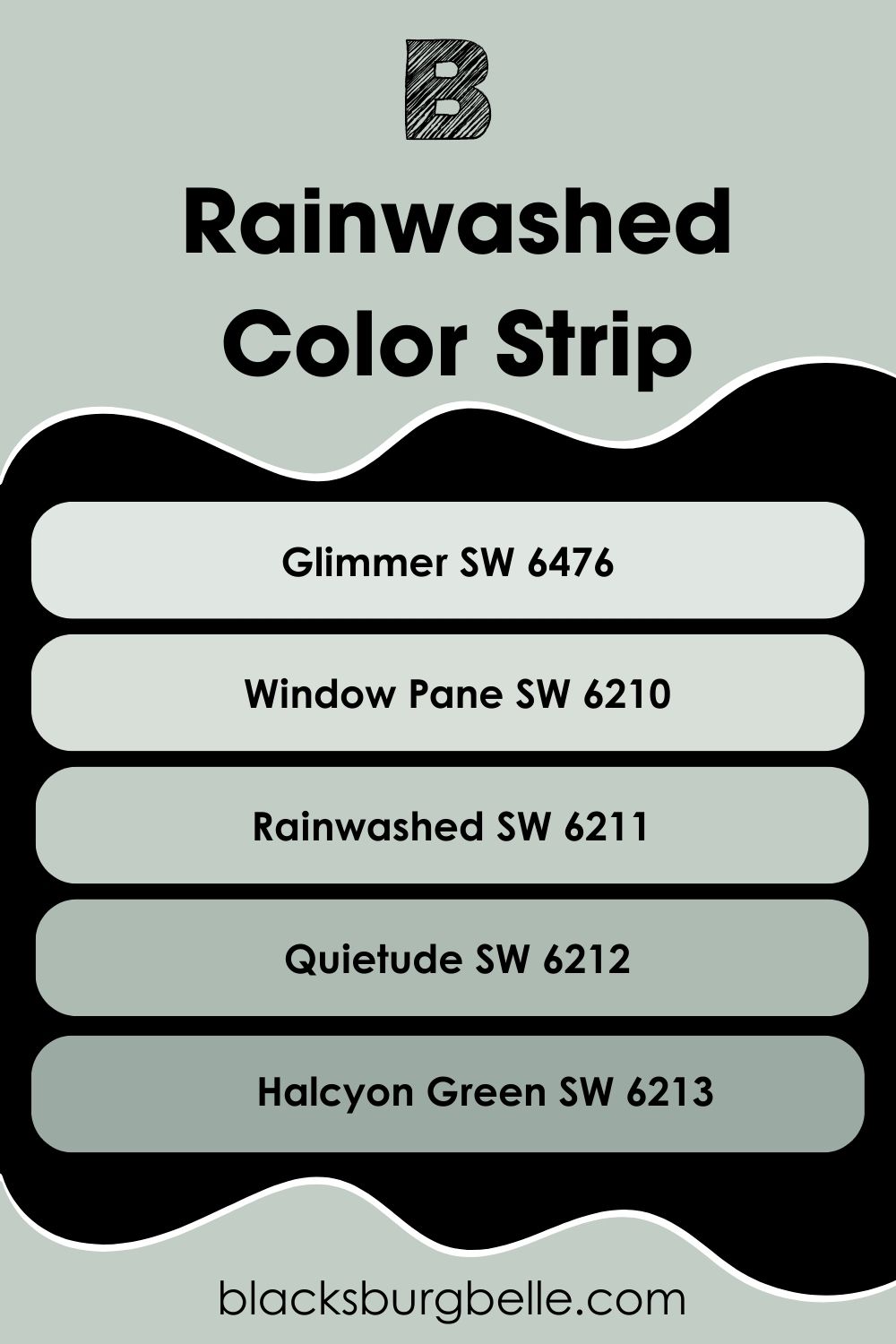
Sherwin Williams Rainwashed Color Strip: Lighter or Darker Exploration
I know that sometimes paint just isn’t quite right for a space and you wish it could be just a touch lighter or darker.
If that has been how you have been feeling while we’ve been exploring Sherwin Williams Rainwashed, don’t worry! I’ve gone through the Sherwin Williams catalog for you to find a load of similar paint colors that are lighter and darker to give you a comparison.
I’ve arranged them from light to dark, with Rainwashed in the middle as a yardstick.
- Sherwin Williams Glimmer SW 6476
- Sherwin Williams Window Pane SW6210
- Sherwin Williams Rainwashed SW 6211
- Sherwin Williams Quietude SW 6212
- Sherwin Williams Halcyon Green SW 6213
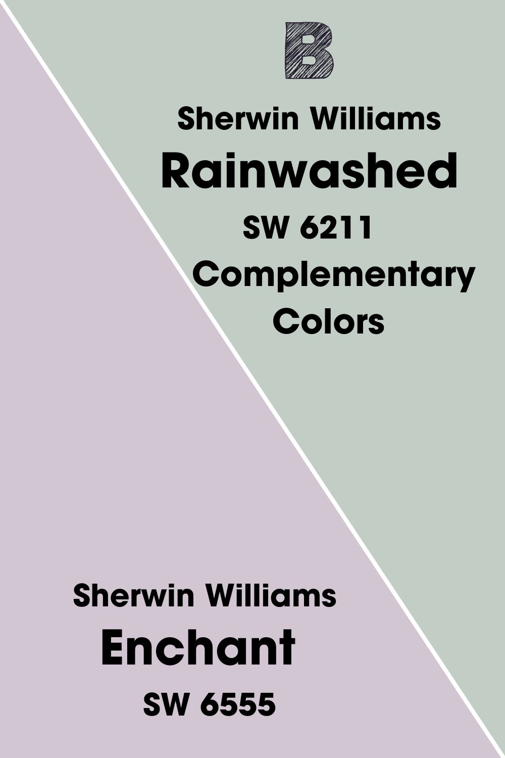
Sherwin Williams Rainwashed Complementary Colors
Now that you have realized that you love Sherwin Williams Rainwashed just as much as me, you might be wondering what colors go best when paired together in a color scheme.
One of the best places to start is to look for a complementary color. This is the color that is at an equal distance on the opposite side of the color wheel.
If this seems a bit tricky to figure out, don’t worry! I’ve gone ahead and found out what the complementary color to Sherwin Williams Rainwashed is for you, and also found a paint to match!
The complementary color to Rainwashed is a pale gray purple, and the best color to reflect this in the Sherwin Williams catalog is Enchant SW 6555.
This color would help you to create a peaceful pastel look with Rainwashed.
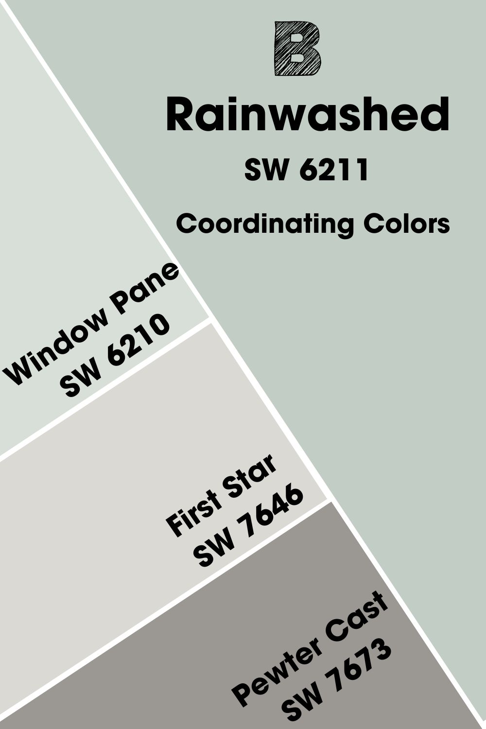
Sherwin Williams Coordinating Colors
Sometimes you don’t want to go for a color that is the exact opposite of the one you are using and want something that is a bit more harmonious and close in color to your chosen paint.
As a result, I have narrowed down the top 3 coordinating colors to use with Sherwin Williams Rainwashed SW 6211.
- Sherwin Williams Window Pane SW 6210: This color is just a slight bit lighter than Rainwashed, so it works really well as an accompanying accent to add depth and freshness to a space.
- Sherwin Williams First Star SW 7646:This cool white has just a touch of gray to help it to pick up on the undertones of Rainwashed brilliantly.
- Sherwin Williams Pewter Cast SW 7673:This deeper and darker gray than First Star has a purple undertone to it, helping to complement Rainwashed
Sherwin Williams Rainwashed Color Palette
For some further ideas on what colors to pair with this paint, take a look at these color palettes I have created for you.
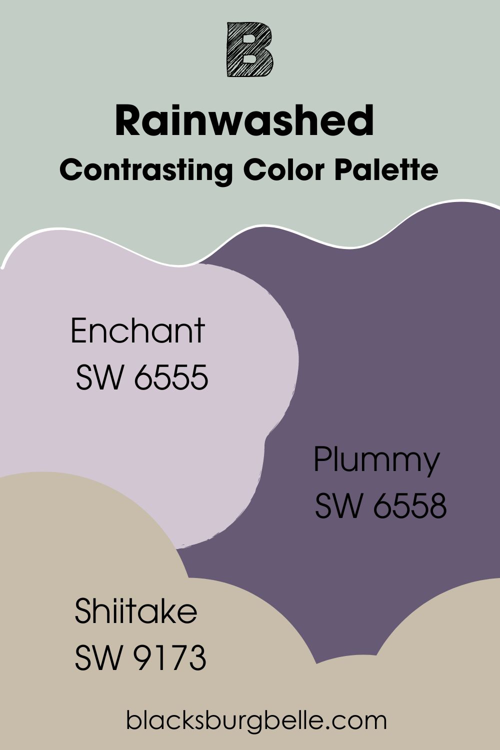
Contrasting Color Palette
- Sherwin Williams Enchant SW 6555:The complementary color to Rainwashed works really well as a contrast and can really help a floral scheme in a room.
- Sherwin Williams Plummy SW 6558: This deep purple provides depth and contrast to Rainwash, helping to draw the eye into a space.
- Sherwin Williams Shiitake SW 9173: Although it is a neutral color, Shiitake helps to combat and contrast the other colors in this scheme thanks to being a warm tone against the cool notes of the other paints.
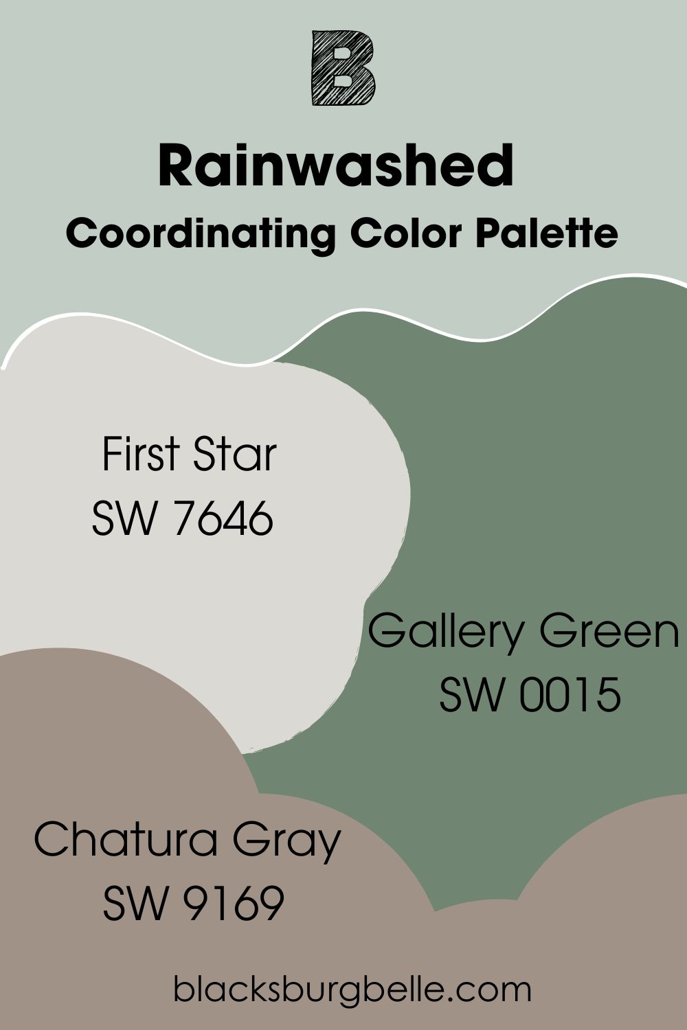
Coordinating Color Palette
- Sherwin Williams First Star SW 7646:This light white-gray makes the perfect partner for Rainwashed. Consider using it as a trim color or on furniture for a crisp look.
- Sherwin Williams Gallery Green SW 0015: This gorgeous color from the Historic Collection complements the green in Rainwashed beautifully, helping to create a natural and woodsy feel.
- Sherwin Williams Chatura Gray SW 9169: This mid-toned greige adds to the woodsy feel while picking up on the gray undertones and accents of both First Star and Rainwashed.
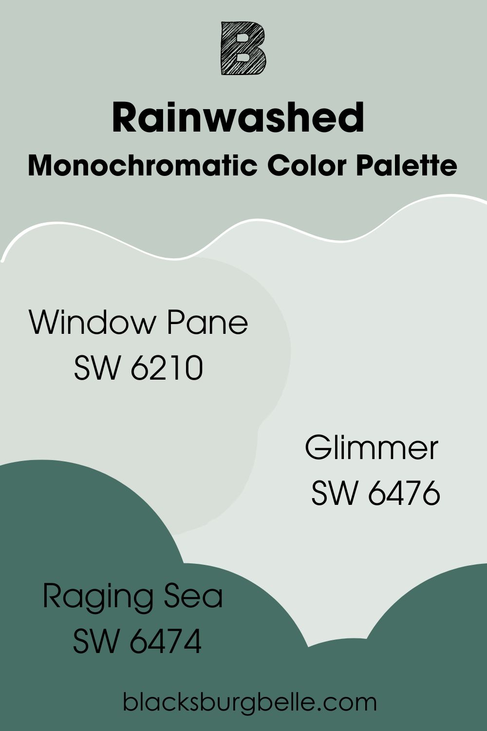
Monochromatic Color Palette
- Sherwin Williams Window Pane SW 6210: This slightly lighter shade of Rainwashed makes for a gorgeous complement that helps to brighten things even further.
- Sherwin Williams Glimmer SW 6476:This very light and bright pastel green/blue makes for a refreshing alternative to white.
- Sherwin Williams Raging Sea SW 6474:This deep sea green helps to round out and balance the lighter colors in this scheme, while still keeping things with the blue-green vibe.
Sherwin Williams Rainwashed vs Other Paint Colors
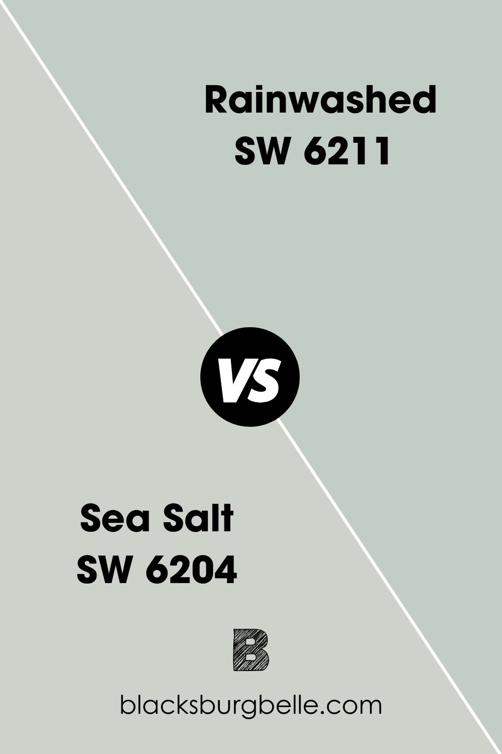
Sherwin Williams Rainwashed vs Sea Salt
When it comes to deciding between Rainwashed and Sea Salt, there are some key differences in their color to consider. Rainwashed is much more of a saturated blue-green, while Sea Salt is much more muted and leans much more on the gray side. Sea Salt also sits a touch lighter in terms of its LRV at 63.
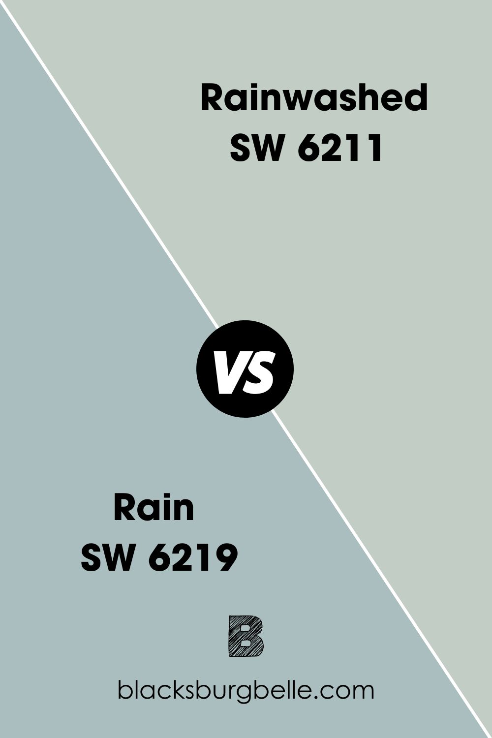
Sherwin Williams Rain vs Rainwashed
Although the names are pretty similar, there are some striking differences between these paints. While Rainwashed is much more of a green, Rain is definitely a blue color with gray undertones. It’s also on the darker end of the scale with an LRV of 49, 10 points lower than Rainwashed.
Sherwin Williams Tradewind vs Rainwashed
While both colors are bright and give off a pastel vibe, Tradewind, much like Rain that I have just spoken about, is definitely blue. Both colors do have a gray undertone, but I’d also argue that with Tradewind, the green in it is an undertone too rather than a main feature like in Rainwashed.
BM Palladian Blue vs SW Rainwashed
Aside from both being from two different paint companies, Palladian Blue is from Benjamin Moore, and Rainwashed is from Sherwin Williams, there are some other color-based differences to note here. Although slightly similar, Palladian Blue is lighter and has far more blue notes in it than Rainwashed.
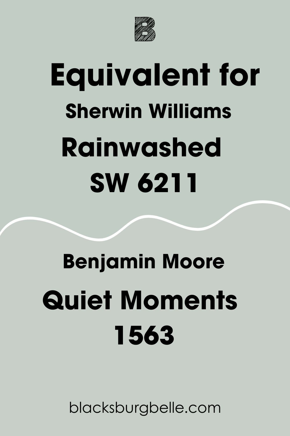
Sherwin Williams Rainwashed Benjamin Moore Equivalent
I know some of you might love the color of Rainwashed, but wish that it came in a Benjamin Moore paint instead. If this is the case, then I’ve got you!
I’ve taken a close look at the Benjamin Moore paint colors and managed to find a paint that is an incredibly close match to Sherwin Williams Rainwashed.
The best color match for Rainwashed from Benjamin Moore is Quiet Moments 1563. This color is slightly lighter, but shares many similarities with Rainwashed, including its undertone.
Where Can You Use Sherwin Williams Rainwashed SW 6211?
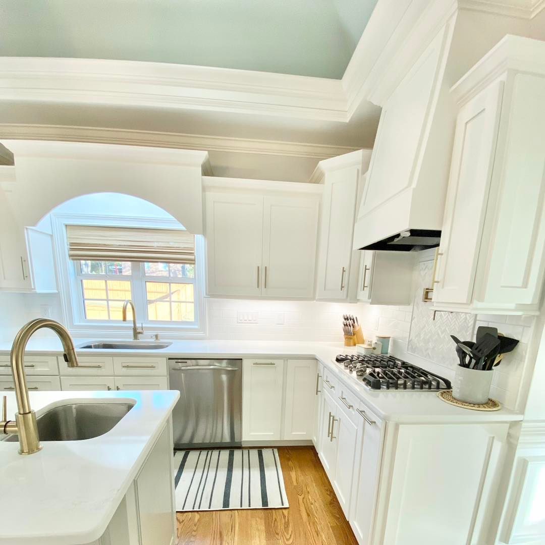
Sherwin Williams Rainwashed Ceiling
Especially if you are creating a room that features a lot of white, painting a ceiling in Rainwashed can help to brighten a space and add a taking point. In the example below, I love how the white coving suddenly gives way to the bright, fresh color of Rainwashed!
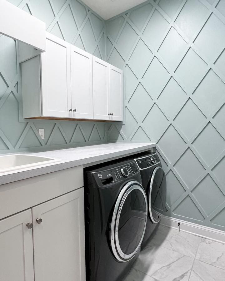
Sherwin Williams Rainwashed Laundry Room
One of the most popular ways to use Sherwin Williams Rainwashed is to create a bright and fresh laundry room, especially with the way the color works with the crisp white of cabinets and appliances.
Although just a simple wall paint can really transform things with Rainwashed, this inspiration focus has taken it one step further and created diamond-shaped paneling to really show off this color to its fullest!
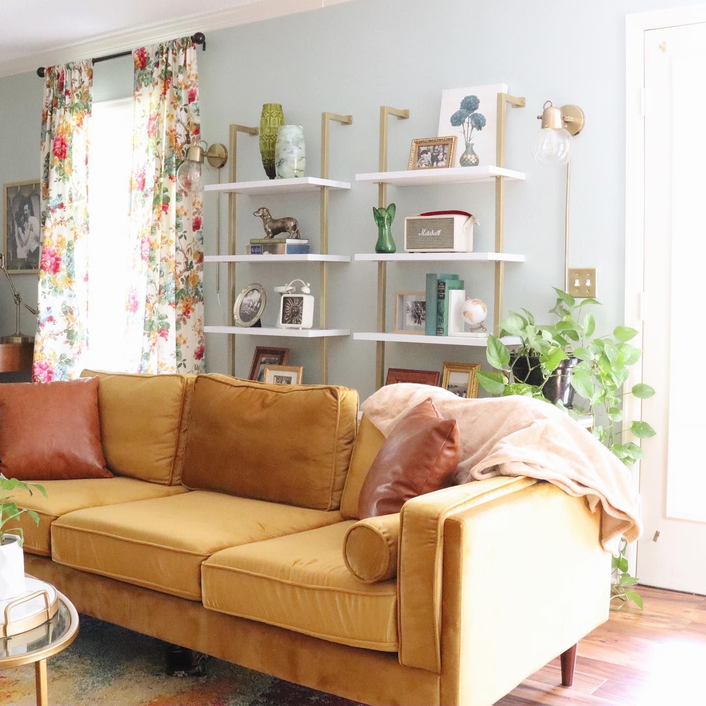
Sherwin Williams Rainwashed Living Room
If you want a cottage-core vibe, Sherwin Williams Rainwashed SW 6211 has your back. It pairs remarkably well with a floral print, and can even hold its own against warm and contrasting shades such as the mustard yellow of this couch!
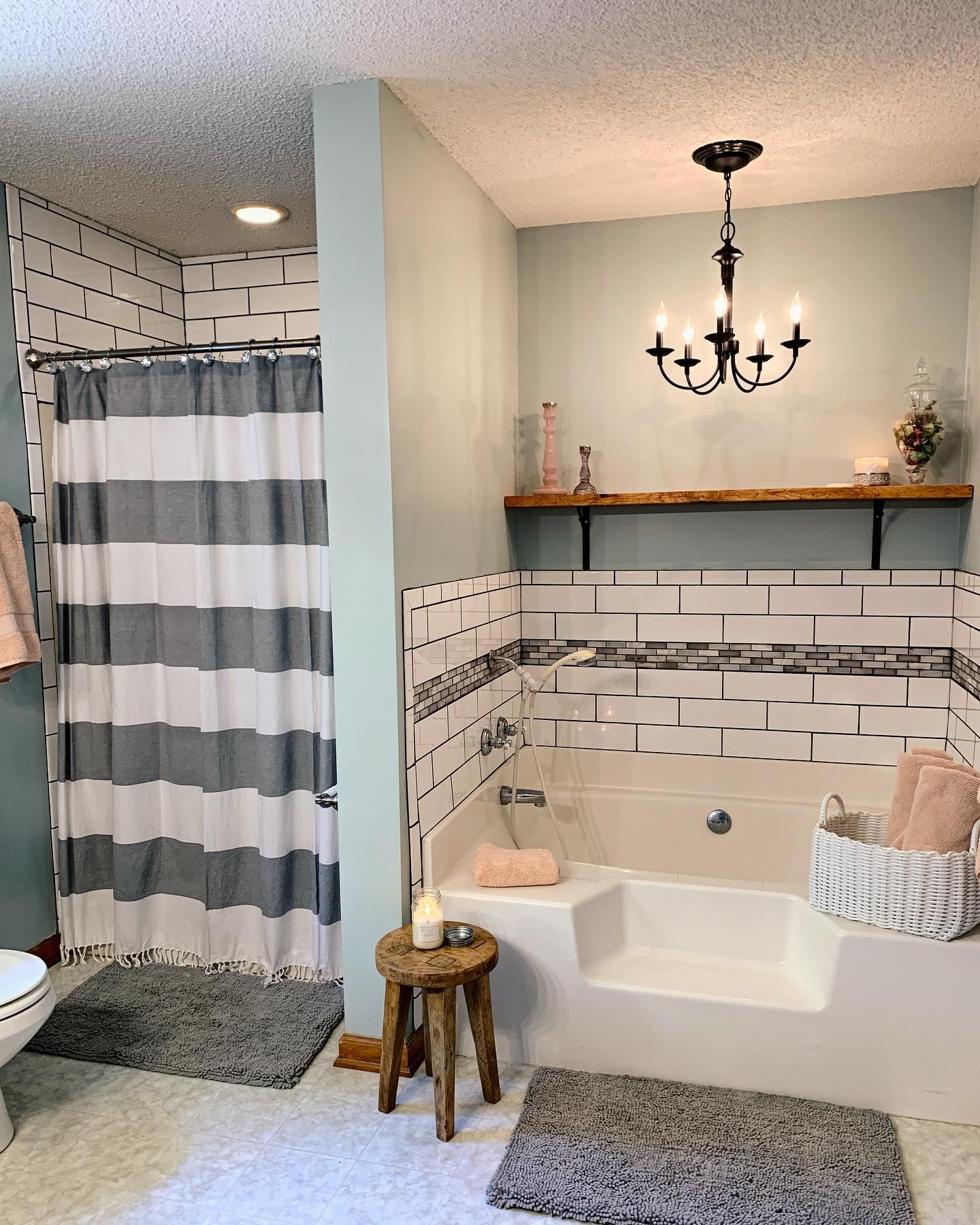
Sherwin Williams Rainwashed Bathroom
If you’re looking to give your bathroom a facelift then Sherwin Williams Rainwashed has your back. The color has just enough blue to make it feel watery, yet is still serene enough to help you to have a relaxing soak.
This bathroom below also helps to highlight the versatility of Rainwashed, as it holds its own against the pink towels, white bath, and even the black and gray accents too!
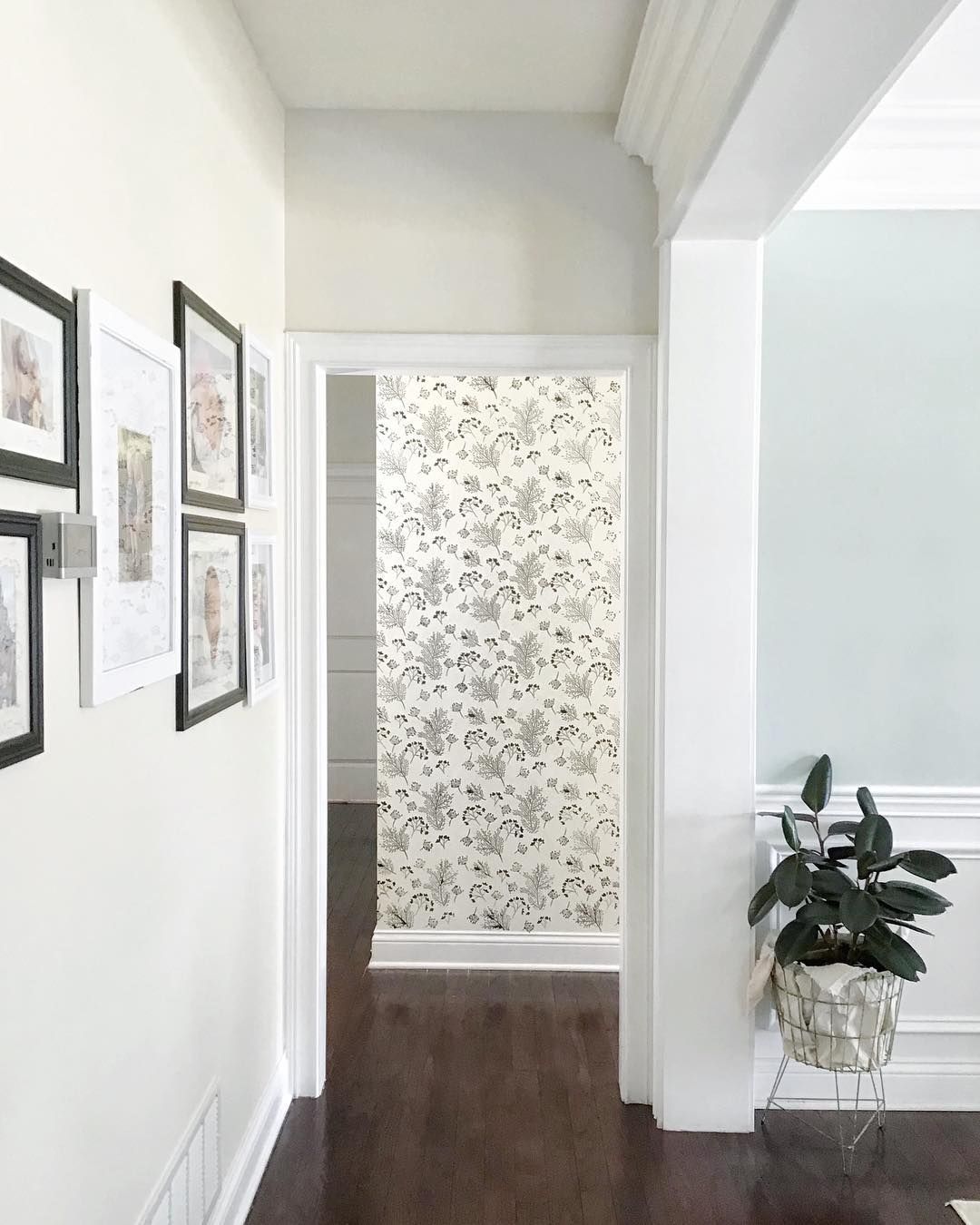
Sherwin Williams Rainwashed Hallway
If you want guests entering your home to see feel invigorated and refreshed, try using Rainwashed in your hallway! This example hallway also answers the question of what trim color with Sherwin Williams Rainwashed walls, as the crisp white of the paneling, coving, and ceiling all make this paint color pop.
Sherwin Williams Rainwashed Lighting Conditions
Sherwin Williams Rainwashed can work well in a multitude of lighting conditions, although it’s worth noting different ones will change its character. In bright light, the pastel hues really come through, while in the shadow you’ll see the grey undertones start to take the spotlight.
For an example of the multifaceted dimensions of this paint color in different lighting conditions, I believe this photo of a cozy home office corner highlights it perfectly.
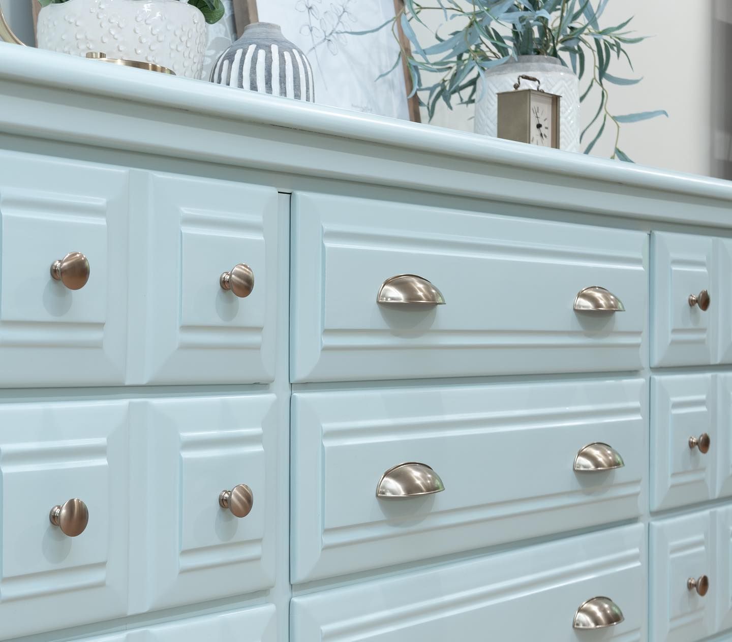
Sherwin Williams Rainwashed on Furniture
Sherwin Williams Rainwashed can really freshen up furniture, helping to add a splash of color even in a neutral room. When paired with cream colors, and slightly distressed, it can also add an air of French chinoiserie!
Otherwise, you can keep things sleek with just a fresh coat like this dresser unit below.
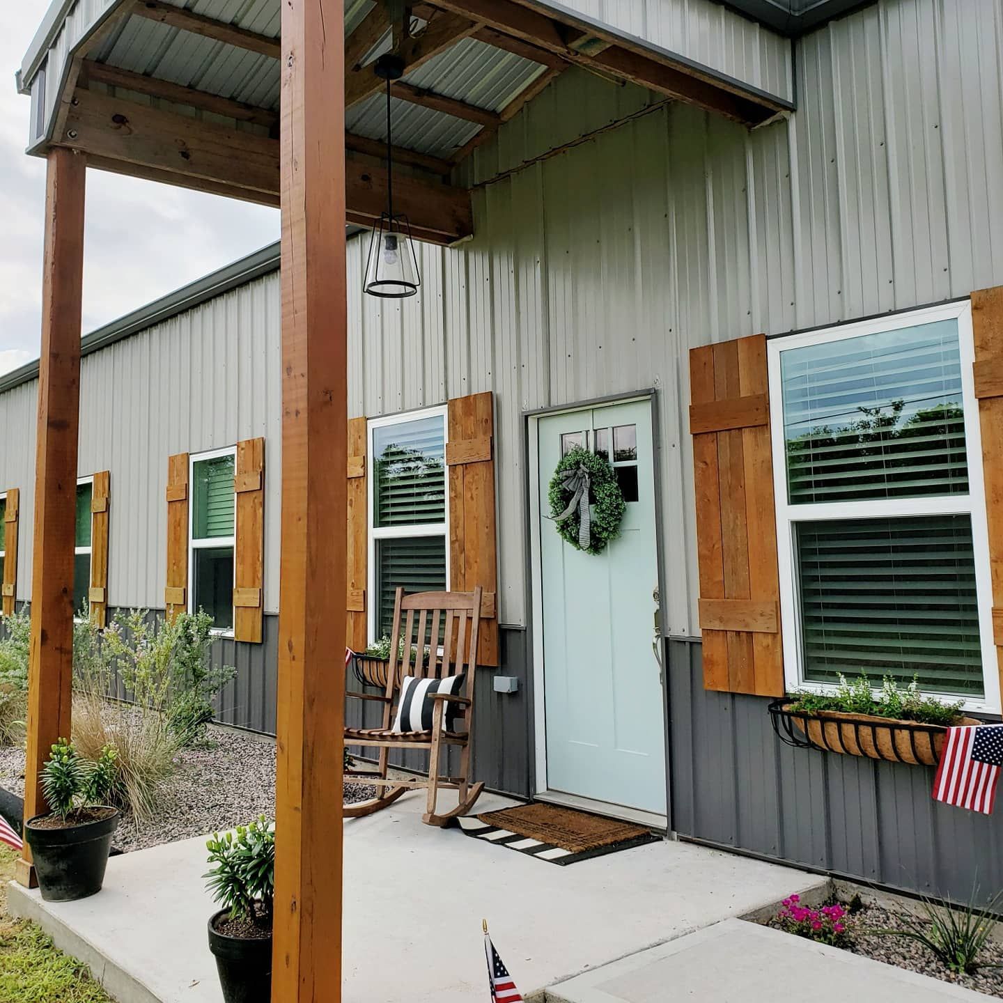
Sherwin Williams Rainwashed on Doors
Both inside and outside, Rainwashed is a bright and breezy color to use on doors. Rooms such as kitchens and bathrooms love this color on their doors, as do rooms that have it as the primary wall color to create a seamless look.
Create curb appeal and draw eyes to your front door by painting it in Sherwin Williams Rainwashed. In this inspiration photo below, even against the similar colors on the corrugated metal, the gorgeous green-blue of Rainwashed stands out.
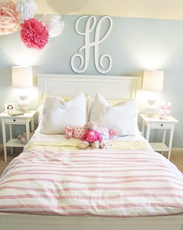
Sherwin Williams Rainwashed Kids Room
Thanks to the pastel nature of Sherwin Williams Rainwashed, it’s a perfect choice when decorating a kid’s room. Here you can see it working with white and pink accents for a girl’s room, but Rainwashed can also lend itself to deep yellows and also strong blues!
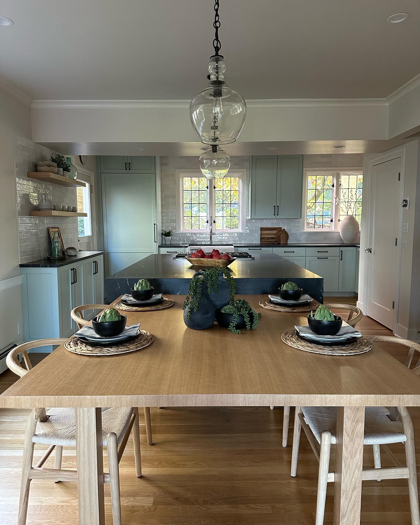
Sherwin Williams Rainwashed Kitchen Cabinets
I’ve already spoken about how in a white kitchen Rainwashed can help to bring everything together. The same can be said when things are in reverse, with white on the walls and ceiling and using Sherwin Williams Rainwashed on the kitchen cabinets. Even in this kitchen which is slightly shadowy, the paint color helps to draw the eye in and slightly brighten things up.
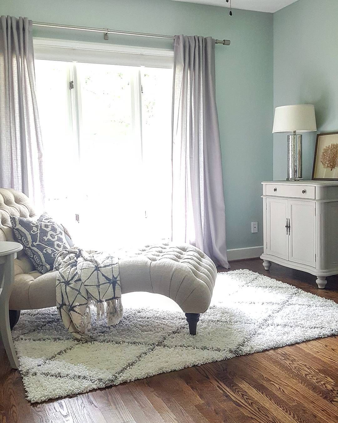
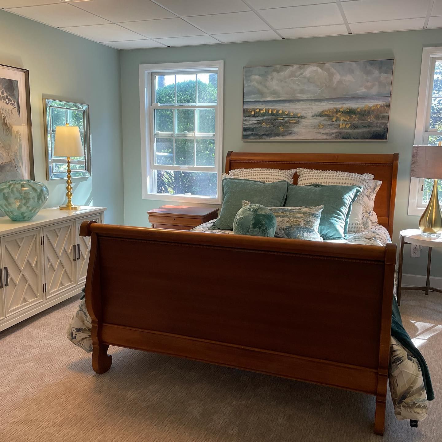
Sherwin Williams Rainwashed Bedroom
If you are looking to create a tranquil place to relax after a long, hard day then look no further than Sherwin Williams Rainwashed. It’s also a great paint to look at to create a coastal vibe, such as in this bedroom below.
Conclusion
So, if you are looking for a calming pastel, look no further than Sherwin Williams Rainwashed.
This color is surprisingly versatile, able to lend itself to a number of spaces, including bedrooms, bathrooms, living rooms, and even exterior porches!
I personally love this paint, even though I am a sucker for a pastel vibe! I find that the color is one of the best bright colors, but also one of those colors that still retains a real calmness and tranquility.
If you still aren’t sold on Sherwin Williams Rainwashed, I honestly suggest picking up a sample pot and trying it out. I swear you’ll be surprised just how much this paint can offer!
 Sherwin Williams White Duck (Palette, Coordinating & Inspirations)
 Sherwin Williams Sensible Hue (Palette, Coordinating & Inspirations)
 Sherwin-Williams Pussywillow (Palette, Coordinating & Inspirations)
 Sherwin-Williams Grayish (Palette, Coordinating & Inspirations)
 Sherwin Williams Dried Thyme (Palette, Coordinating & Inspirations)
 Benjamin Moore White Dove: The Right Choice for You?
