
Do you need a unique and warm neutral for your home? Well, let me guess, you heard of the fantastic qualities of the Sherwin Williams Wool Skein, so you’ve rushed here to see if this paint color will indeed make your space look rich and luxurious all year round.
Wool Skein has many outstanding qualities which set it apart from other beige paints in the Sherwin-Williams collection. I’ll show you all that and more in this detailed review.
I love reviewing unpopular colors like this because it helps expand homeowners’ mood boards and create more refreshing aesthetics.
Now without wasting any more of your precious time, let’s go into the review properly.
Table of Contents
When to Choose Wool Skein SW 6148
If you decide to revamp your whole space, it’s essential to understand clearly what vibe you’re going for and what your preferred color will give you. For homeowners opting for Wool Skein, the pointers below will really help articulate your thoughts.
Need a Warm Beige Paint?
Wool Skein leaves a whole lot of warmth in your spaces upon application, and if that’s what you need, perhaps to light up your warm, cold home or just bring a fresh new vibe, this color is for you.
Want to Create a Large Illusion in Your Space?
Wool Skein has a medium-to-light reflective value, which means it’ll reflect an impressive amount of light when used in your space. To create the impression that your small space is large, you should use Sherwin William Wool Skein.
Crave a very flexible Color.
Sherwin Williams Wool Skein is very easy to work with; whether you need it as a backdrop for more colors or main wall color, Wool Skein will do all that and more.
Love Muted Undertones?
Lucky for you, Wool Skein is immensely considerate, which also affects its undertones. This color has very quiet undertones that don’t do much to alter its neutral state, hence making it easy to do the pairing.
Want a Timeless Space?
Wool Skein has been around for a long time and is the perfect way to bring nostalgia back into your space. If you really want a space with a rich history that stands the test of time, you should consider Sherwin Williams Wool Skein.
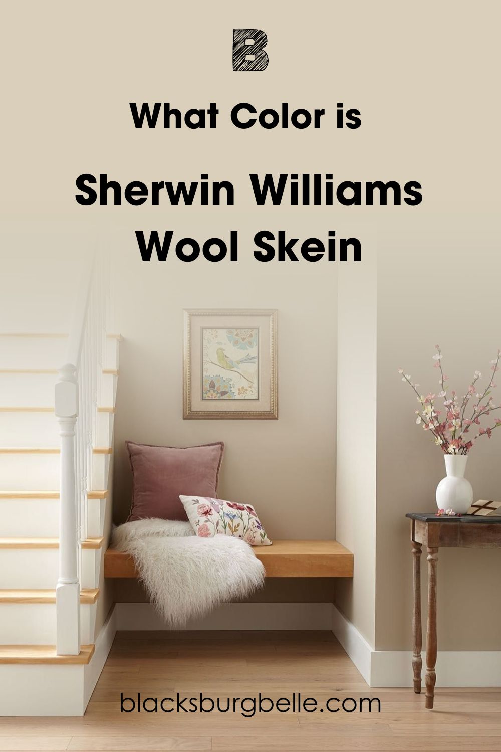
What Color is Sherwin Williams Wool Skein
Sherwin Williams absolutely snapped with this one. Wool Skein is a soft, warm beige perfect for interiors and exteriors.
This color is widely regarded as a “mushroom color” (peep the similarity between its hue and that of a mushroom) and is excellent for transition spaces- if you don’t want to go all in with beige and are tired of the gray side of things.
This color showcases a very rich creamy side when applied on walls and, most importantly, takes advantage of whatever the light situation is in that space to open up your space, making it feel lighter, larger and more spacious.
If you’ve been planning to add a fresh vibe to your home, you should totally consider the alluring and beautiful touch of Wool Skein. I desperately want this color to get a well-deserved hype because it’s a unique neutral that works hard.
Snapshot of Wool Skein Specification
| Color Name | Sherwin Williams Wool Skein |
| LRV | 63 |
| Hex Code | #D9CFBA |
| Undertones | Green, Yellow |
| RGB Value | 217/207/186 |
The LRV of Sherwin Williams Wool Skein
You must first understand the concept of Light Reflectance Value and how it affects the performance of colors in a space. LRV is represented by a scale that runs from 0-100, with 0 being the lowest and the least reflective and 100 being the highest and the most reflective.
However, the scale has been adjusted to run from 3-97, as there’s no true black or white hue. With that being said, Sherwin Williams Wool Skein has an LRV of 63, which means it tilts towards the medium-light end of the scale.
The implication is that using it in a small room reflects a decent amount of light, which may not be satisfactory enough to open your room.
However, when used in a larger room, you truly see the beauty of this color as light bounces off it beautifully, and you get to see the undertones in full glare.
It’s highly important to pay attention to the LRV of your color as it’s really a pointer to where these colors will give you optimum benefit and beauty.
Undertones of Sherwin Williams Wool Skein
Colors don’t emerge accidentally, It’s a whole process that involves mixing different shades and pigments to arrive at a particular hue, and Wool Skein isn’t any different.
There are two major characters in Wool Skein, the colors yellow and green, and if you’re wondering how they work, it’s simple. The yellow keeps it warm, and the green keeps it from getting too warm and restrictive.
Still don’t get it, don’t worry. I’ll expound further just below. Keep reading!
Does Lighting Condition Affect Wool Skein?
Like everything on earth, lighting has a major role to play in the outcome of Sherwin Williams Wool Skein, be it day or night. The undertones in Wool Skein are very prone to the lighting situation surrounding its environment.
When used in a Northern facing room, you get a cool version of Wool Skein that appeals to its cool undertones, which I’ll pick out as we proceed. The cool light from the northern light neutralizes the warm tones in Wool Skein.
If used in a Western or Eastern-facing room, you’ll get intense warmth from this color, towards the evening from the former and early mornings for the latter. As for south-facing light, you get the warm side in the afternoons.
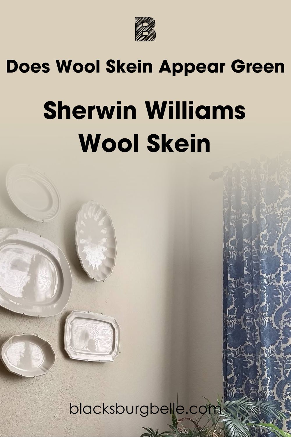
Does Wool Skein Appear Green?
By all speculations and indications, this space receives the cool rays of the northern light, drawing out the green undertones. You can also blame this on how poorly lit the space is.
The surrounding accessories are also complicit in this act, as the blue patterns on the cotton are primarily a blue color and the fresh plant too.
In the face of insufficient natural or artificial light, Wool Skein shows off more of its green side than neutral or yellow.
Does Wool Skein Appear Yellow?
You’ll find a great deal of yellow in Wool Skein, for sure. I mean, what else keeps it warm and cozy? The good thing about this yellow is that it’s not dominant or too “in your face”, which means Wool Skein doesn’t stray away from being an absolutely neutral sweetheart.
Sherwin Williams Wool Skein: Is It a Warm or Cool Color?
Sherwin Williams Wool Skein is a warm color. From its gorgeous beige tones to the perfect mix of green and yellow undertones, this color adds an intense and timeless touch to your interior.
People in colder regions should take advantage of this information and include Wool Skein on their color palettes ASAP. It also has a medium-to-light LRV, so it’s quite easy to work with.
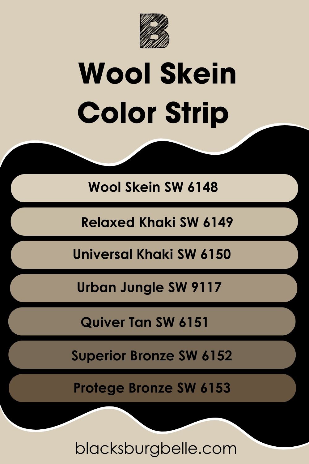
Sherwin Williams Wool Skein Color Strip: Lighter or Darker Exploration
A color strip is an arrangement of colors that serves your aesthetic needs. Usually, colors on a strip go from the lightest to the darkest or vice versa for you- the user to really spot the major difference in contrast and intensity.
A typical color strip contains 7 colors but a different gradient on the location. This is also a great way to quickly locate your color on the Sherwin Williams website, how to pair them correctly if you want a monochromatic space and how to discover your color family.
SW Wool Skein color strip sits pretty on location number 207.
- Sherwin Williams Wool Skein (SW 6148)
- Sherwin Williams Relaxed Khaki (SW 6149)
- Sherwin Williams Universal Khaki (SW 6150)
- Sherwin Williams Urban Jungle (SW 9117)
- Sherwin Williams Quiver Tan (SW 6151)
- Sherwin Williams Superior Bronze (SW 6152)
- Sherwin Williams Protege Bronze (SW 6153)
Usually, on the Sherwin Williams color strips, lighter tones are at the top of the lost, mid-tone hues are at the middle, and darker shades are at the button. Note that when you combine all colors from a single color strip, you’re creating a monochromatic color scheme.
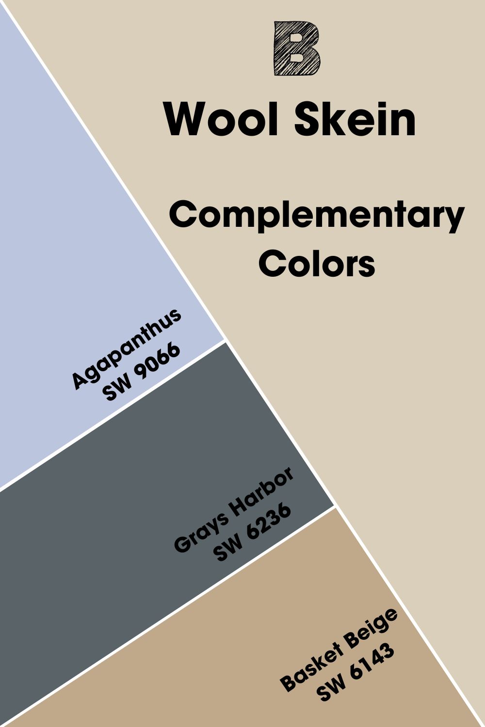
Complementary Colors for Sherwin Williams Passive
Complementary colors are necessary when working with different hues and textures. While they may seem contrasting to a layman, everything falls into balance when you pair them with your main shade.
Complementary colors are directly opposite each other on the color wheel, like red faces, green, yellow opposite blue and blue opposite orange.
This arrangement applies to both main colors and undertones. For example, if you use a neutral with red undertones and a solid green paint, you’ll barely see the differences as they work together perfectly.
1. Sherwin Williams Agapanthus: Agapanthus is a gorgeous light purple color with blue undertones and an LRV of 56 which means it can work as a chic cabinetry color in a Wool Skein kitchen or bathroom.
2. Sherwin Williams Grays Harbor: A unique blue-gray with an LRV of 12 with green undertones that can work as trims for a Wool Skein wall or a door color for sharper contrast.
3. Sherwin Williams Basket Beige: A warm tan with yellow and orange undertones works well in a monochromatic theme with Sherwin Williams Wool Skein. You can also use it as an accent wall with Wool Skein, as it’s much darker with an LRV of 42.
Sherwin Williams Wool Skein Coordinating Colors
Colors must work together to make anything make sense or even interpret your vision accurately, and that’s where the coordinating colors for Wool Skein come in. I’ll show you exactly how to achieve that with colors from Sherwin Williams.
- Monochromatic Theme: Easygoing and the most modest of all. This theme has just one base hue upon which variations of tints and shades are added for more hue and range.
- Split Complementary Theme: This arrangement is a variation of the complementary theme. It uses the two colors adjacent to its complement and have a high level of contrast that’s still a bit more controlled than the complementary palette, hence better harmony.
- Complementary Theme: Complementary colors showcase a sharp level of contrast that you won’t find anywhere. This arrangement is the most widely used, especially for ads, as it’s catchy and just makes perfect sense.
- Analogous Theme: Look outside your window, and you’ll most likely find the analogous color combination beside you. The analogous theme consists of three colors that stand side by side on the wheel. Therefore, they work in harmony and create a subtle/impressive result.
- Triadic Theme: Considered by many to be the best color scheme, this theme allows you to use one color for the background and add the extra two for content and highlight. The most important thing is that the flow between these colors is excellent.
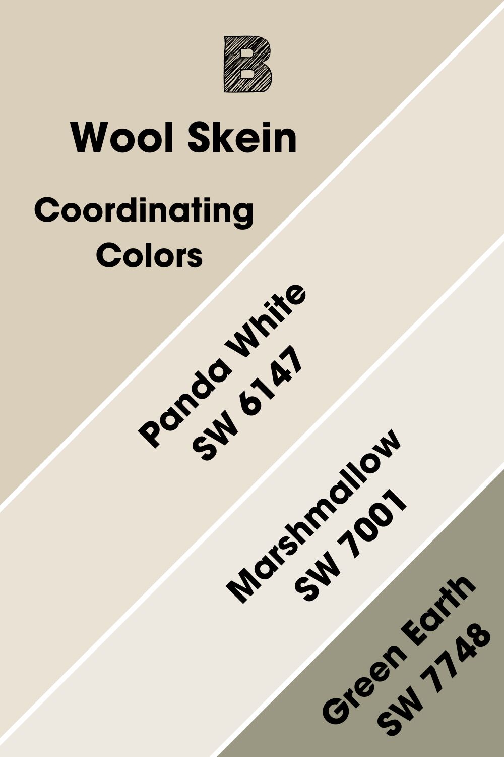
Coordinating Colors for Sherwin Williams Wool Skein
The striking thing about the colors listed below is how fast you get to figure out the likely undertones for Sherwin Williams Wool Skein if you’re observant enough. They typically revolve around three specifics- yellow, green and gray.
These shades and Wool Skein are two peas in a pod, so whether they’re brighter or darker than WS, the sky’s the limit as to where you can use them or how you can pair them.
- Sherwin Williams Panda White (SW 6147): Panda White has a soft warmth that works well with Wool Skein. It’s a bright neutral with an LRV 77 and intense yellow undertones.
- Sherwin Williams Marshmallow (SW 7001): Marshmallow with an LRV of 82 is another bright white paint with soft red and faint green undertones. It pairs well with Wool Skein, a much darker warm neutral.
- Sherwin Williams Green Earth (SW 7748): Green Earth takes after its nature-inspired name and bursts forth with a cool green hue and warm yellow-gray undertones, perfect as an accent wall with Wool Skein.
Sherwin Williams Wool Skein Color Palette
The typical and most preferred color combinations are usually either of the four palettes you’ll see in this section, knowingly or unknowingly. Most importantly, if you’re still unsure of where to start, this section is a step in the right direction.
Whether you like your decor simple or you’re larger than life with your artistic preference, Wool Skein has something for everyone.
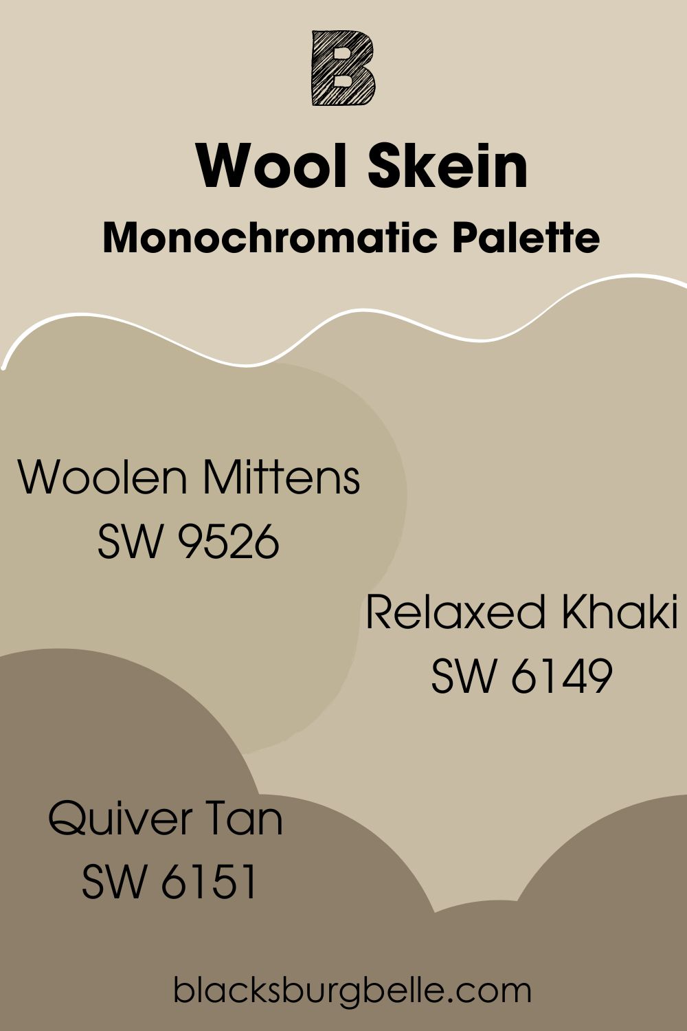
Monochromatic Palette
- Sherwin Williams Woolen Mittens: A gorgeous neutral with green and yellow undertones and an LRV of 46. Use it in a very bright space alongside Wool Skein.
- Sherwin Williams Relaxed Khaki: A warm and welcoming neutral with the perfect LRV score of 50 and green-yellow undertones to work with just about anything in a Wool Skein space.
- Sherwin Williams Quiver Tan: The darkest of the trio with an LRV of 22 and cool green undertones will work well on a Wool Skein exterior or as an accent wall in a minimalist setting.
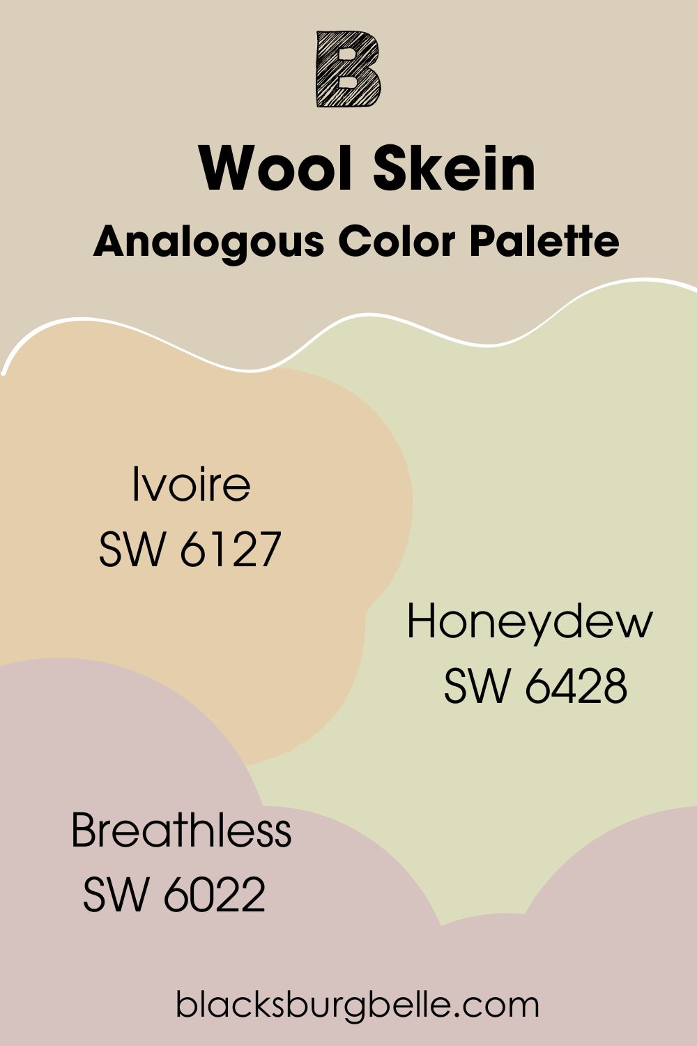
Analogous Color Palette
- Sherwin Williams Ivoire: It’s creamy, light and filled with bright yellow undertones and an LRV of 64. Ivoire pairs very well with bolder colors and even those within its LRV range.
- Sherwin Williams Honeydew:Sherwin Williams Honeydew is a bright green with an LRV of 71 and warm yellow undertones that pairs well with Wool Skein in a traditional living room or exterior.
- Sherwin Williams Breathless: Let this light neutral of soft violet undertones take your breath away. It has cool red undertones and an LRV of 57.
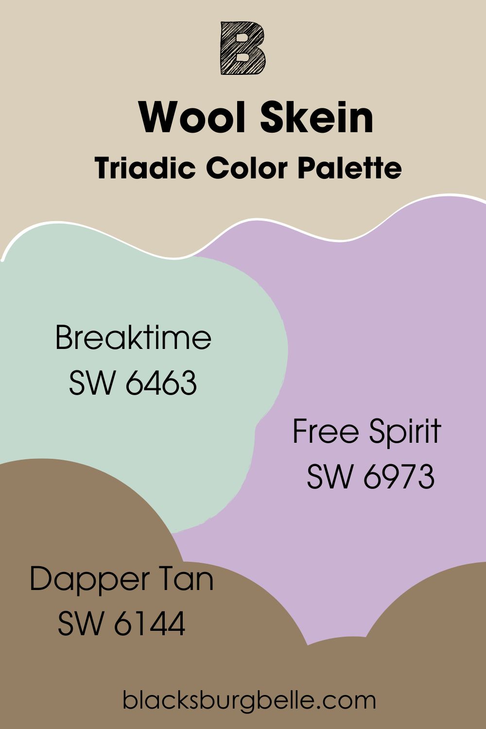
Triadic Color Palette
- Sherwin Williams Breaktime: This blue-green is a great cool color to work with alongside Wool Skein on a triadic palette. Use it to add a fun touch to that Wool Skein exterior or bathroom.
- Sherwin Williams Free Spirit: A cool true purple color with an LRV of 49. It bounces off beautifully on Wool Skein as it’s a neutral hue with yellow undertones.
- Sherwin Williams Dapper Tan: Dapper Tan has an LRV of 22 and a gorgeous yellow/green undertone. Pair it with Wool Skein and cool lighting as a nice bedroom color.
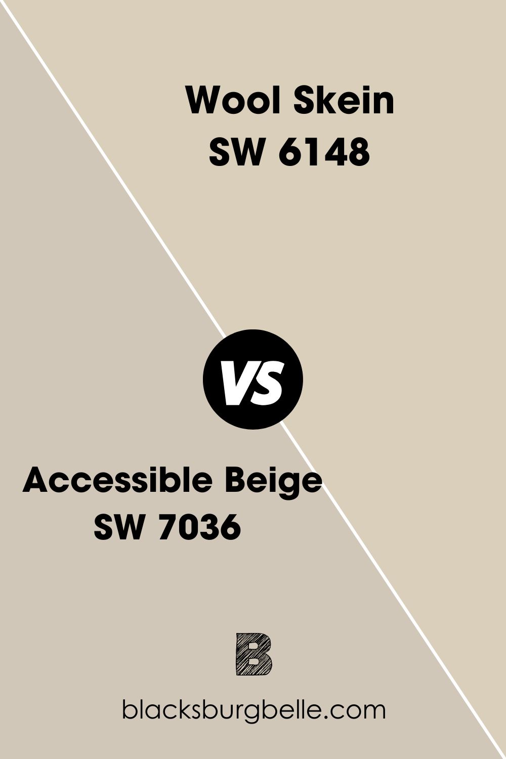
Sherwin Williams Wool Skein Vs. Sherwin Williams Accessible Beige (SW 7036)
Wool Skein is a much lighter color compared to Accessible Beige, thanks to the green in it. Accessible Beige has a whole lot of gray in it, giving your space a warm feel with its LRV of 58.
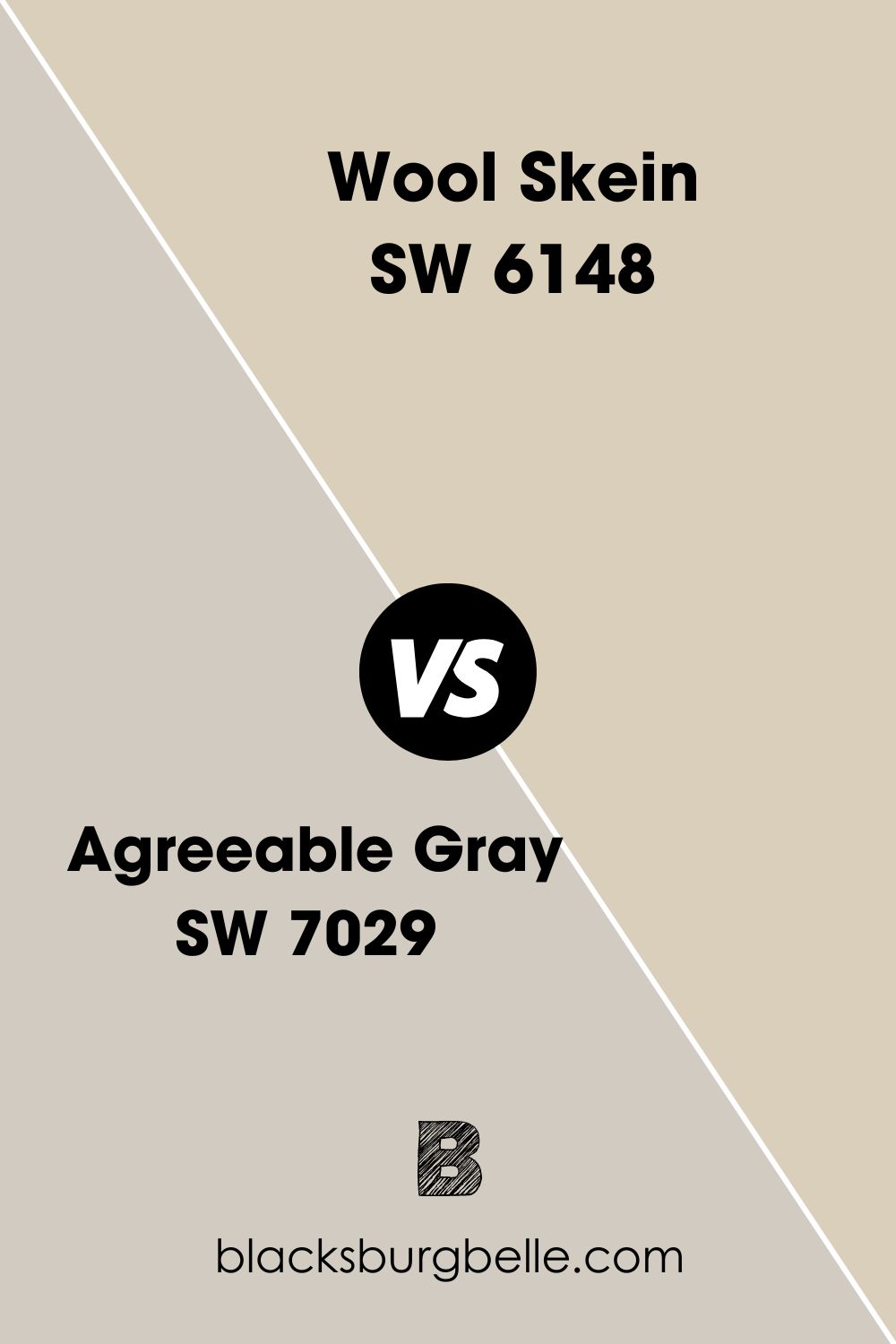
Sherwin Williams Wool Skein Vs. Sherwin Williams Agreeable Gray (SW 7029)
While Wool Skein is a green beige, Agreeable Gray is a green gray. Both colors work differently when used in space, with AG being much cooler than Wool Skein.
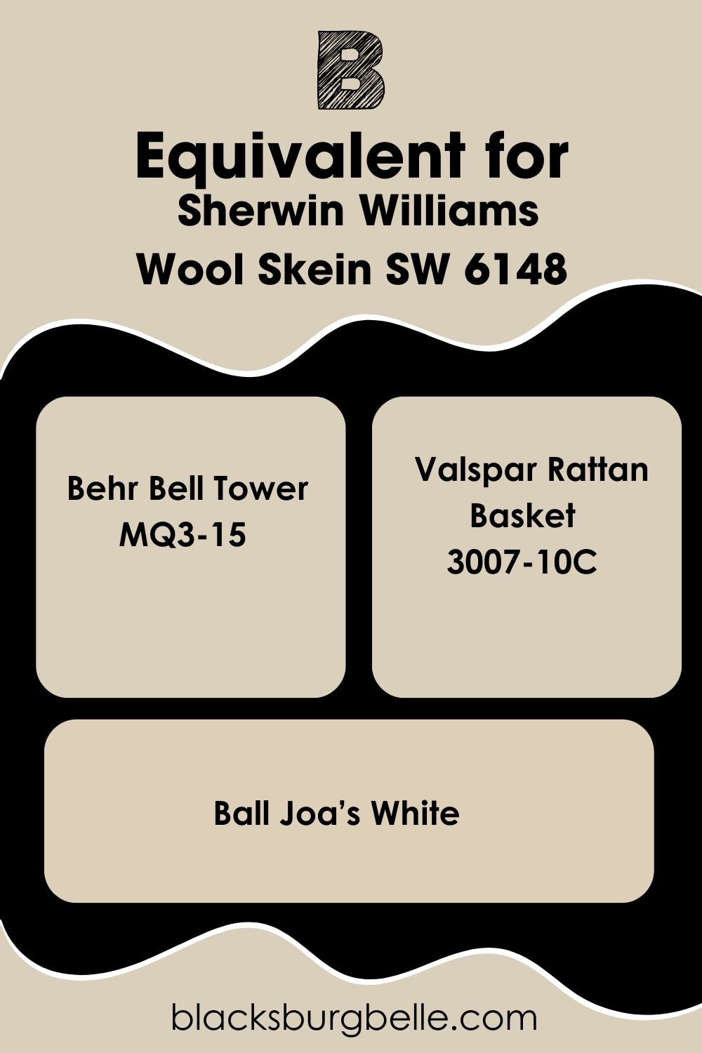
Sherwin Williams Wool Skein Equivalent in Benjamin Moore and Other Brands
Need an alternative for Wool Skein in case you don’t find the colors on shelves; well, here’re some absolutely amazing neutrals from other brands that share similar undertones and intensities.
Benjamin Moore leads the pack with Temporal Spirit, a versatile and muted neutral with yellow and green undertones that adds warmth to your space. Behr’s Bell Tower is another gorgeous beige with soft green and yellow undertones.
Check out Farrow & Ball Joa’s White, Valspar’s Rattan Basket and PPG Toasted Almond, as they’re all amazingly neutral with similar undertones and, most importantly, keep you warm all year round.
Where can you use Wool Skein SW 6148?
Every section in this article has led us up to this point. You get to see Wool Skein in real spaces and how each person has interpreted this color to suit their preferences. Please keep an open mind; you have much to learn in this section.
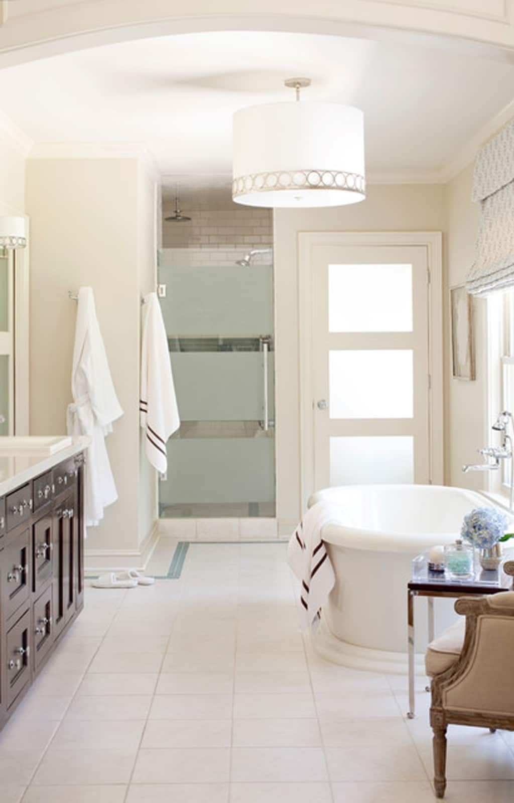
Wool Skein in Bathroom
Bathrooms can use warm colors, too, as it promotes a wholesome experience, whether you’re just starting your day or rounding things up. If your bathroom gets more light than average, you’ll surely see the yellow, creamier side of this color, like in the image.
However, it may lean into its warm and green side.
Pair your Wool Skein with creamy white accessories, dark brown drawer and cool lighting to tone things down.
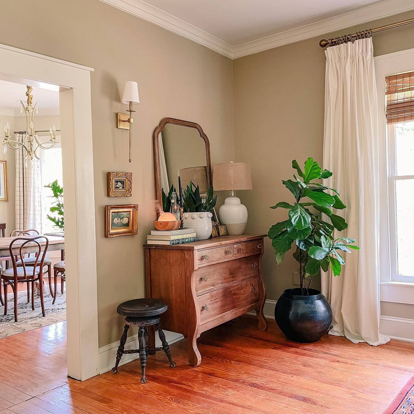
Wool Skein in Living Room
I prefer this color in colder regions as it helps keep things on the warm side and elegant too. This gorgeous beige leans green in this image, thanks to the minimal light this space is getting.
Pair your Wool Skein wall with warm whites and many wooden textures, perhaps in similar or darker tones.
This color would play out differently if this space were more opened up. You’ll get a lighter version that allows you to pair it with much bolder colors. From this simple experiment, you can deduce that the lighter color appears, the more colors you can merge.
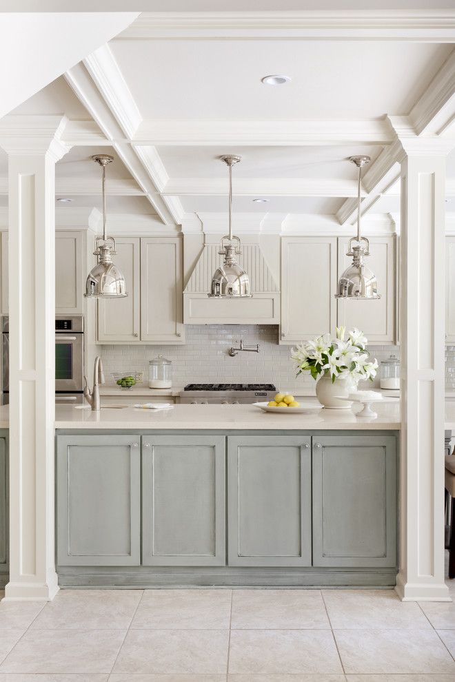
Wool Skein in Kitchen
Switch your kitchen game up by opting for Wool Skein on your walls and even cabinetry. This cozy color instantly makes your space luxurious and creamy as soon as light touches it.
I’ve noticed that Wool Skein shows a lighter/more neutral side when used on woodwork compared to a solid brick wall, which is perfect for a monochromatic palette.
Take a cue from this image and pair this color with a much more solid and darker hue for a more expression, as things can get too pale and somewhat boring.
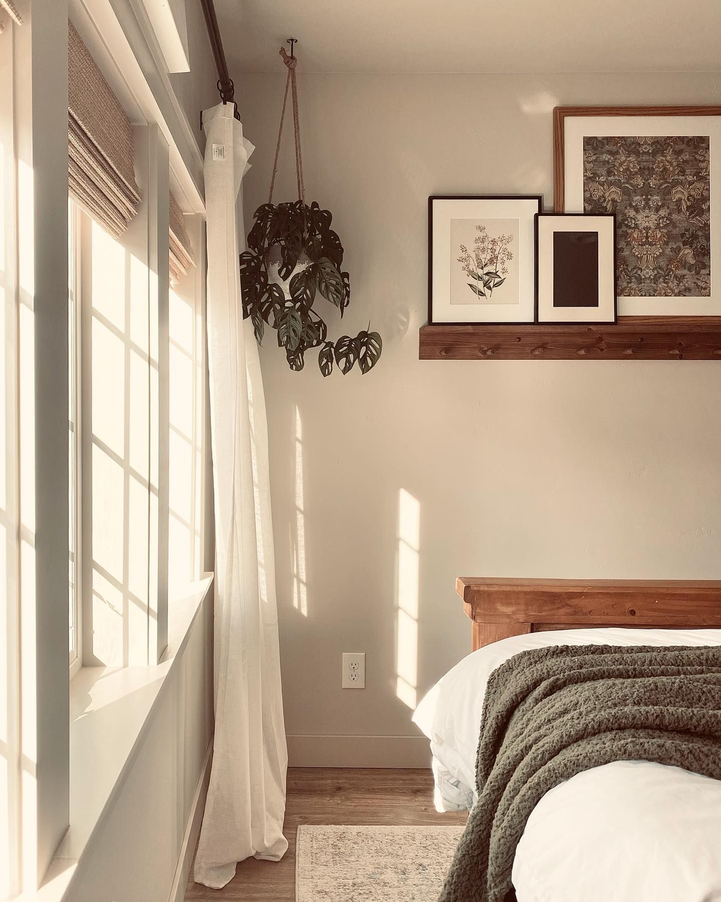
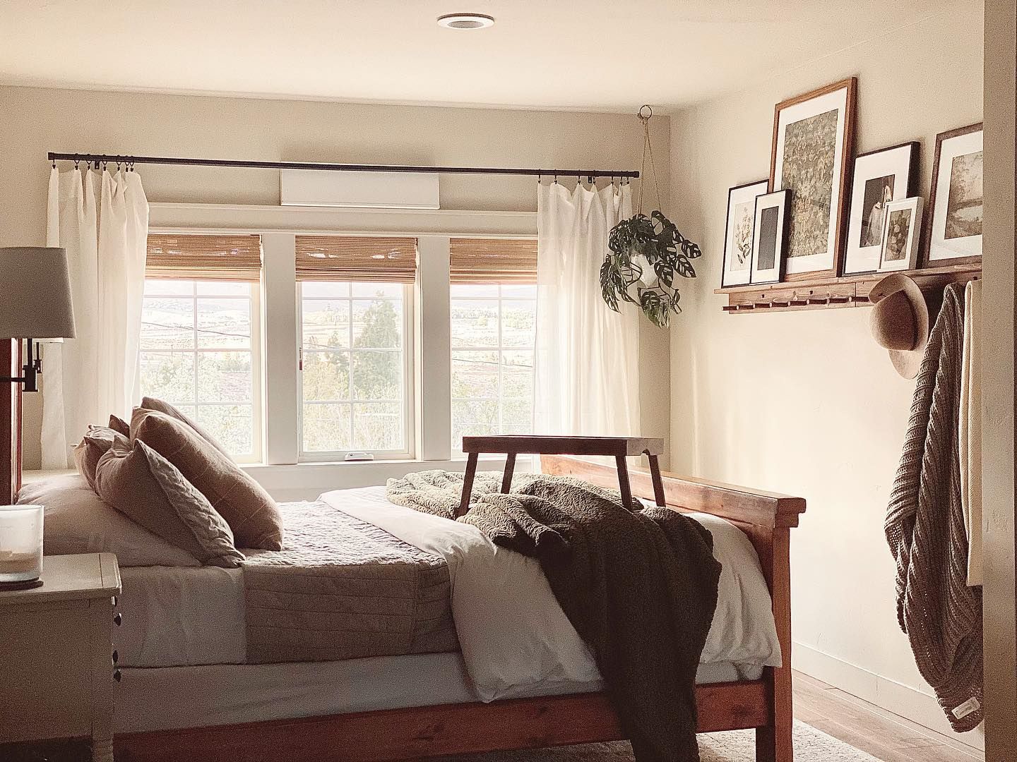
Wool Skein in Bedroom
Want a warm cozy touch in your bedroom? Well, SW Wool Skein is your best bet for that. This color’s balanced undertones throw natural light evenly in any space, which allows you to accessorize perfectly.
I love the image below as it showcases Wool Skein applied in a minimalist setting.
The dark brown sheets and creamy whites cancel out the intensity of the yellow undertones in this space- if anything, it looks very neutral. I bet it smells like a warm cup of latte coffee in that room.
Wool Skein on Exterior
It’s not news that all colors are specially washed out when applied on surfaces outside the house due to many factors, especially the intense natural lighting. It’s not controlled with windows or curtains; here, it’s a survival of the strongest undertones.
That said, SW Wool Skein is unapologetically yellow in this picture. In case you were wondering, green is a deep color that usually peeps out when used in a low-light space.
Pair your Wool Skein exterior with cooler white trims and neutrals, especially on the door and window frames.

What Colors Go With Wool Skein?
Wool Skein has enough range to work with a wide array of colors. Therefore you can pair it with gray, brown, blue and even green.
It’ll serve as a beautiful backdrop for the more pigmented colors in this arrangement and pair up nicely with the neutrals.
However, you should sample these colors side by side before making any long-term commitment, first to see if it works for your space and, most importantly, if it’s something you love.
Conclusion
Now that you have your hands full with ample information about Wool Skein, it’s time to take that next step and add it to your home wall. Let me refresh your memory about this color a little bit.
- Wool Skein is a medium-toned neutral
- It has green and yellow undertones
- Wool Skein is warm and tells on your space too.
Leave your suggestions and comments in the box below. I love your inspiring feedback and ideas on incorporating colors and spread-out palettes.
 Sherwin Williams Origami White (Palette, Coordinating & Inspirations)
 Sherwin Williams Contented (Palette, Coordinating & Inspirations)
 Sherwin Williams Urbane Bronze (Palette, Coordinating & Inspirations)
 Sherwin-Williams Anonymous (Palette, Coordinating & Inspirations)
 Sherwin Williams Extra White (Palette, Coordinating & Inspirations)
 Sherwin Williams Misty SW 6232: Paint Color Review
