
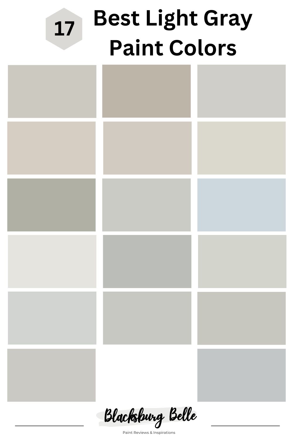
Light Gray paint colors are fast rising among homeowners, especially in 2023. This is all thanks to their versatility, outstanding ability to instantly open up space when applied on walls, and knack for happily accepting the introduction of brighter colors by working as a neutral.
Sticking to the theme of this article, we’ll be keeping you updated on the 17 best light paint colors from all the best brands out there and outlining their impressive statistics, including inspirations for you to see and ultimately create your own pretty light gray space.
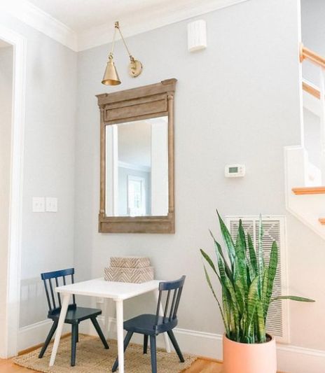
Table of Contents
Why Light Gray?
For years, white has been at the top of the list as the neutral of choice in many homes, however, recently light gray is gradually rising to the occasion as the neutral with the ability to bring your space close to peace and tranquility while also adding a bit of depth and color to the room.
If you crave that modern touch that’s also very accessible and highly relatable, you must hop on this moving train and experience bliss like never before.
Steps to Take When Choosing a Light Gray Paint Color
Painting or remodeling your home is a serious decision, and there are a few boxes you need to tick before committing to the task. A tricky color like light gray requires you to be patient and meticulous so you don’t get an underwhelming outcome.
Study The Undertones
This is the most important part of picking any light gray color. It’s not rocket science that more than one shade or concentration of any color exists, hence you must expect more than one undertone.
The reason why we recommend you pay extra attention to the makeup and undertones of your chosen color is so that you will be able to determine the accessories that would pair perfectly with the light gray paint color of your choice and ultimately curate a well-balanced space.
Consider Existing Decoration
You must consider other elements present in your home when picking a new color. They encompass drapes, floors, furniture, and many other ornaments. The general idea is to pick a color that matches their warmth or coolness for a smooth union and working relationship.
Size Of Your Room
Decorators and home designers understand the power of paint and how it can turn around the appearance, perspective, and delivery of any space. You can use paint color to make your room appear smaller or larger than it originally was.
Light Grays usually have high light reflective value, which means they’re a great choice for small and big rooms, too- you most likely won’t find any light gray with a low light reflective value; they usually range between medium and light.
Lighting
Whether from a natural or artificial source, they both directly affect the final result of your paint color. Some colors appear good on paper, but when applied on the walls, they look too washed out or too dark, as against the owner’s preference. Pay attention to the LRV of whichever light gray you’re picking, and think about the condition of your home lighting.
Pro Tip: LRV is short for Light Reflective Value, and it indicates how much light your color will reflect or absorb when used in a space. The scale runs from 0-100, with 0 being the darkest and 100 being the lightest (but since there’s no true black or white, experts begin the scale from 3 up to 97).
What Colors go With Light Gray
The flexibility of light grays is a blessing and a curse; while it opens an endless door of possible color combinations, the trickiness makes it a bit challenging to land the perfect shade and tone. But not to worry, we’ve got you covered.
Try pairing your cool light grays with other cool colors like blues, greens, and cooler whites; this way, you create a uniform palette. Switch up the warm light grays with oranges, mustard, and teal green to create a colorful, traditional space.
One professional tip straight from us is that light gray works excellently with wooden floors of any shade. The most efficient way to do this is to study your color and the undertones, then follow suit with your wooden floor of choice.
17 Best Light Gray Paint Colors
We’ve done all the work for you and curated an epic list of the 17 most unique and versatile light gray paint colors in the business. There are also real-life pictures to bolster the inspiration for your space.
Sherwin Williams Brand
Unarguably the most popular paint brand in America, Sherwin Williams offers an impressive range of durable, trendy colors that caters to a wide array of homes, palettes and tastes. Established in 1866, an average paint gallon costs between $38 to $115.
1. Repose Gray
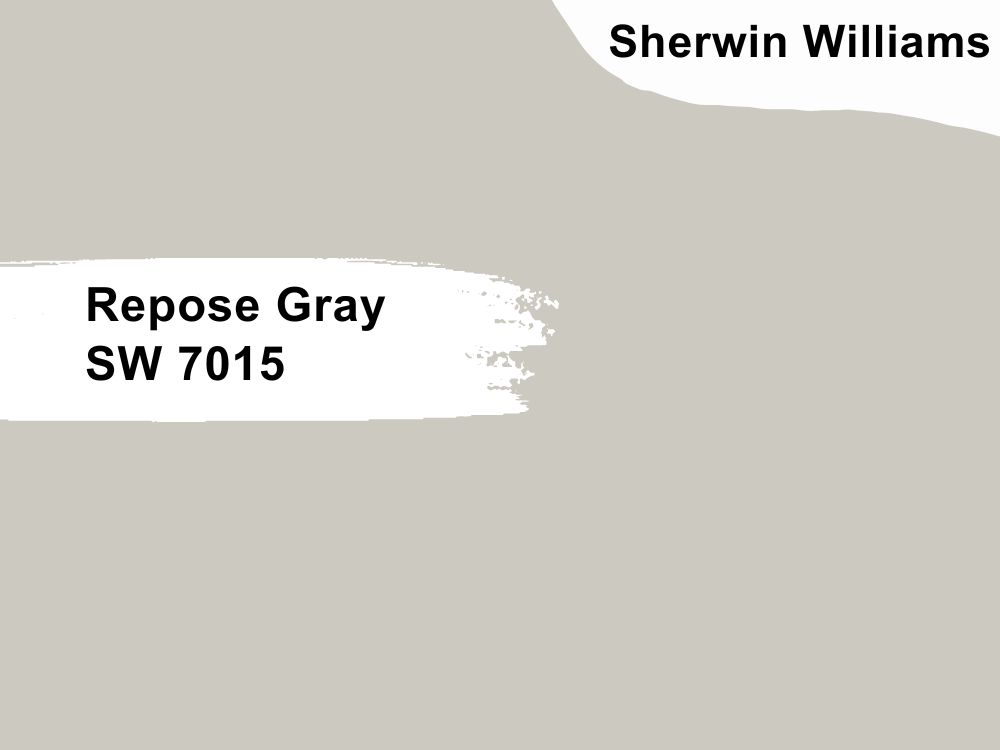
Repose Gray by Sherwin Williams is our all-time favorite. It’s that light gray that adds desired warmth to your home without feeling too blue or grayish, and it also boasts incredible range due to its unique neutral undertones.
You can use this color in your bedroom, living room, and even exterior as it’ll help open up the space, thanks to its LRV of 58- this also means it’ll work well with one of the bright whites from Sherwin Williams.
Repose Gray showcased its cool side by working in harmony with the wooden features in that kitchen. We love a versatile neutral, especially how the orange and earthy tones work perfectly well with the repose gray in the second image.
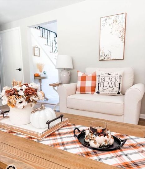
2. Amazing Gray
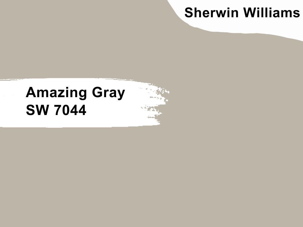
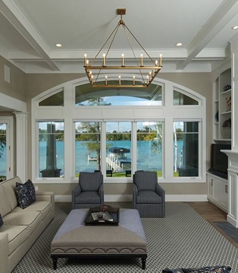
Amazing Gray is not a stranger to homeowners across the country. This light gray paint has a solid reputation of simply being amazing on home walls. It has an LRV of 47 and displays a sharp contrast when used with bright white colors.
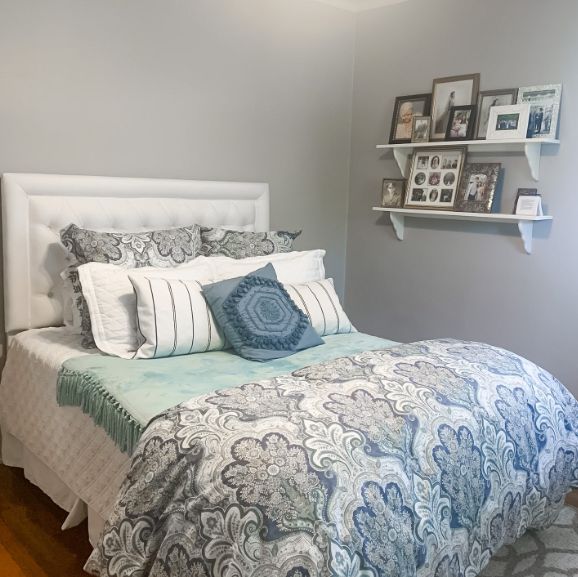
The inclusion of white trims and darker gray details helps this living room stick to the monochromatic and minimalist lifestyle- less is definitely more. Add a bit of life and personality to your Amazing Gray bedroom with touches of powder blues, teal, and grays, just like the one in the second image.
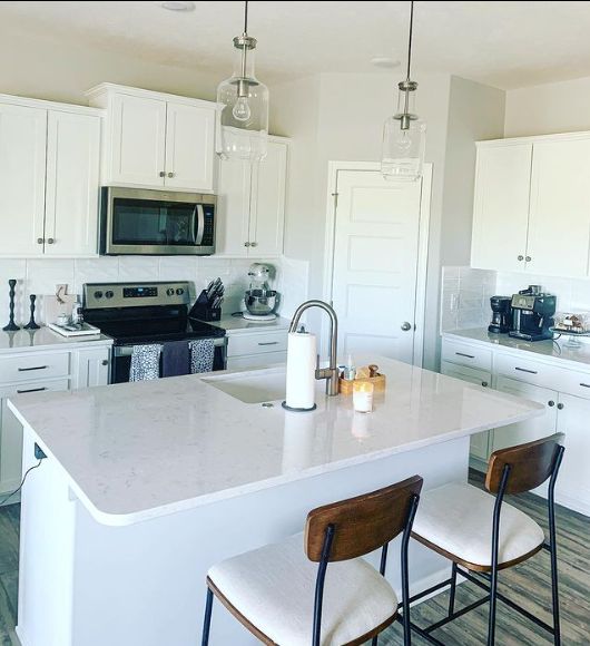
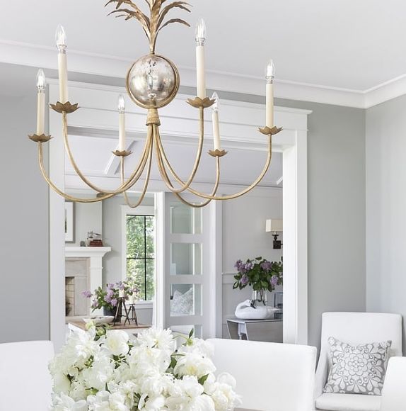
3. Big Chill
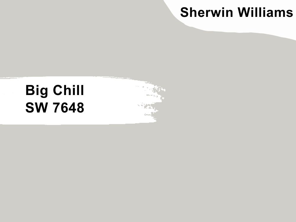
Big Chill is a cool light gray with pretty blue undertones. This light gray may sometimes confuse you into mistaking it for a true gray but don’t fall for it. It has an LRV of 62, making it an excellent choice for people working with small spaces as it makes it lighter and airer.
Sherwin Williams Big Chill proves it will function as a top-notch kitchen color in the first image with white cabinetry and black details. Get lost in the beauty of Sherwin Williams Big Chill in this living room; it’s easy to catch on to the carefully curated white and gray color scheme in this space. Keep it dramatic with bold chandeliers and some fresh flowers.
4. Modern Gray
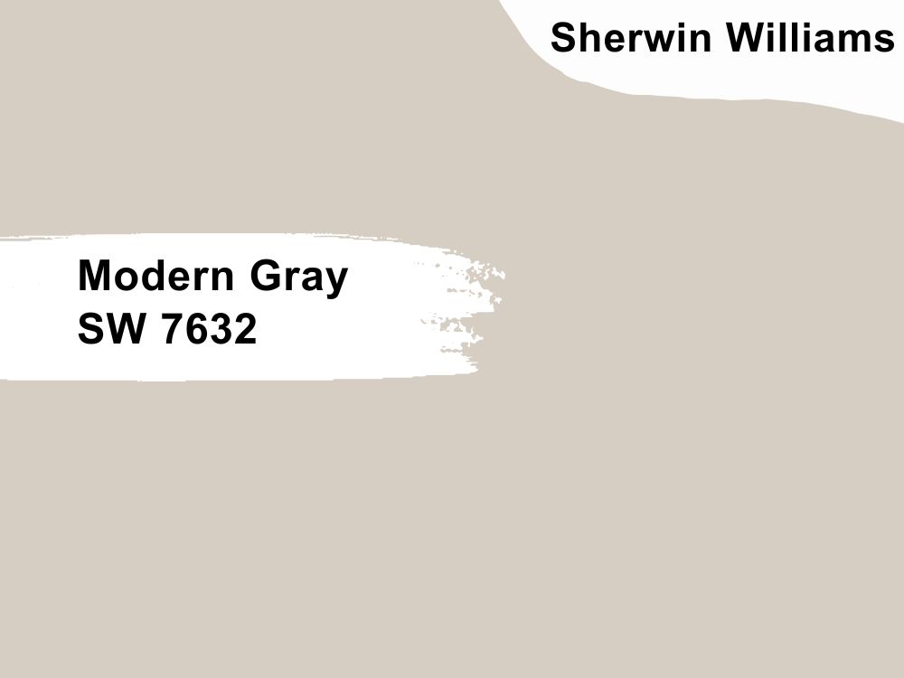
Sherwin Williams Modern Gray is a warm light gray with an LRV of 62, but the interesting thing about this color is that it still shows off enough depth even in a well-lit room, which is why it’s very important you add enough light for more balance.
You can find touches of green, pink, or even violet in this color, but it’s important to understand that it may take on any color depending on the surrounding factors. Peep the violet in Modern Gray in the first frame due to the low light the paint receives. It’s a different ball game in the second image; more lighting means more color, so you’re getting strong pink feedback from the wall in the second image.
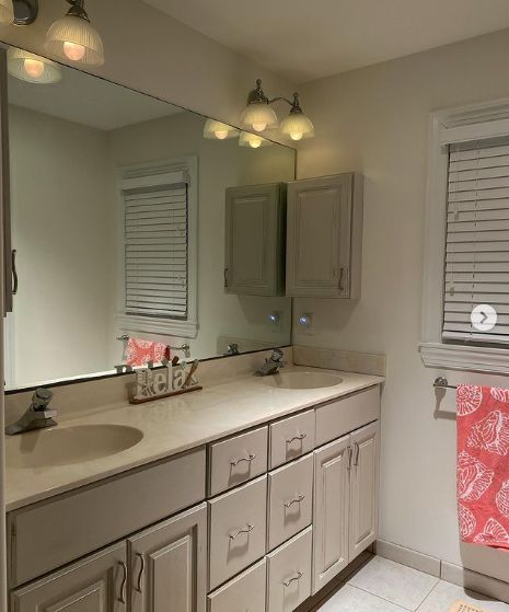
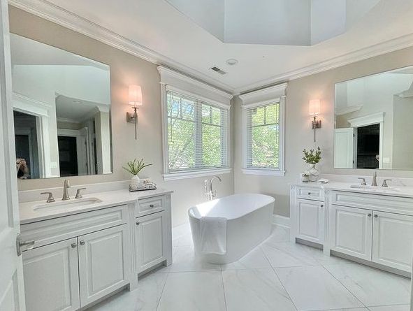
5. Agreeable Gray
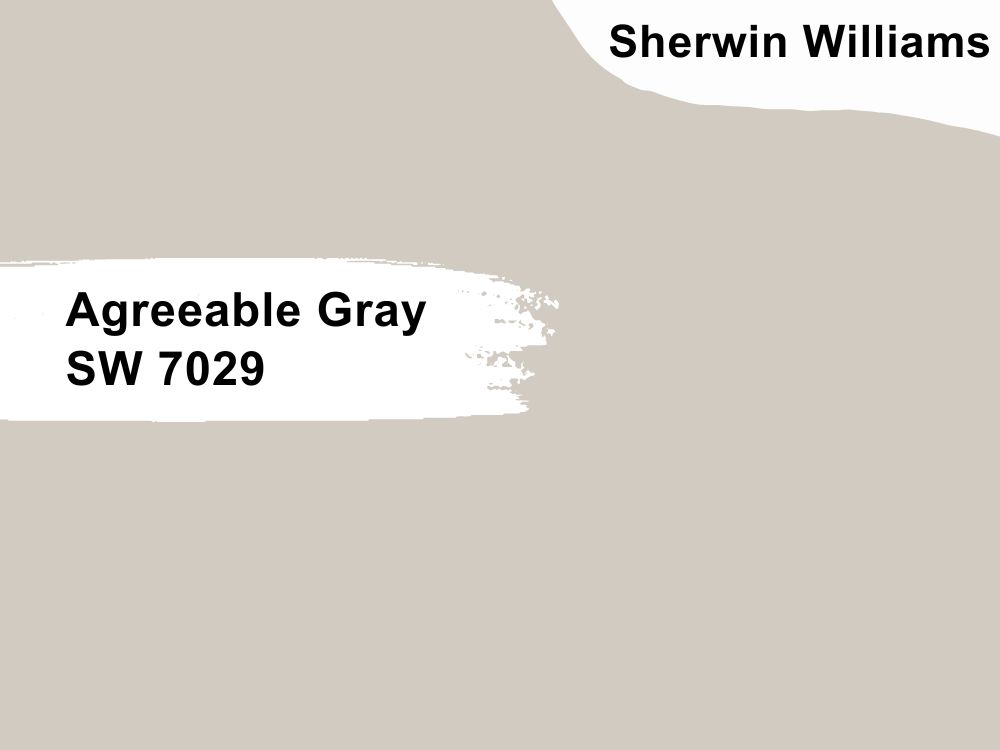
This paint color here screams flexibility and absolute finesse. Agreeable Gray is a popular choice among homeowners, thanks to its ever-changing undertones that make it fit into a wider spectrum of choices. Agreeable Gray has a moderate LRV of 60 (the sweet spot) that lets it blend finely into the medium range.
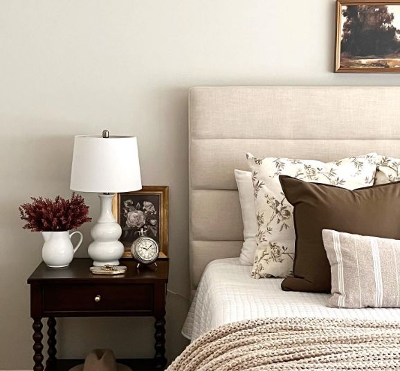
From the first and second images, Agreeable Gray showcased different undertones that were heavily influenced by surrounding lighting conditions. A great way to accessorize agreeable gray is to throw in some wooden tones and browns to appeal to its warm side, just like this bedroom. Explore the cooler side by throwing greens, blues, and cool whites in the mix, just like in the second image.
Benjamin Moore Brand
It’d be a wonder if Benjamin Moore’s paint colors don’t make the cut. This brand has been around for over a century, delivering the best and most affordable paints while constantly staying on the trend to bring American homeowners’ dream houses to life.
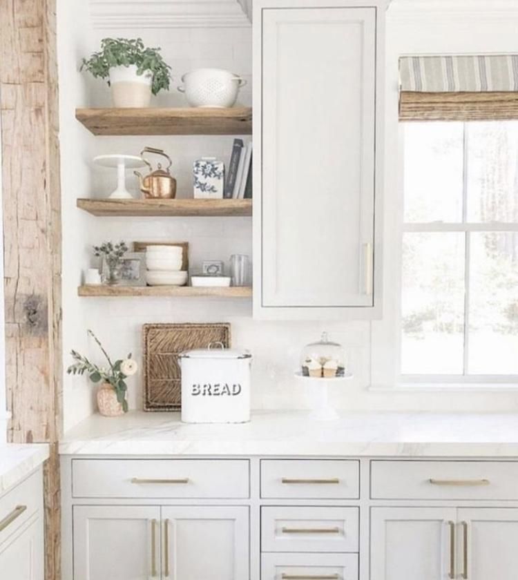
6. Light Pewter
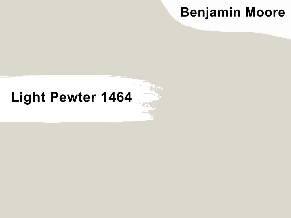
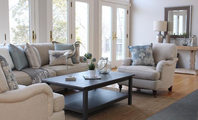
When you see Benjamin Moore’s Light Pewter in a space, the only thing that sticks is how subtle it is, which may be responsible for its relatively underrated status. This brilliant light gray is warm with beige undertones but still manages to give off a cozy vibe on your wall.
Benjamin Moore Light Pewter has an undertone of 67.52, which reflects a lot of light like this living room in the first image, and the blue details on the throw pillow add a bit of coolness to the warmth.
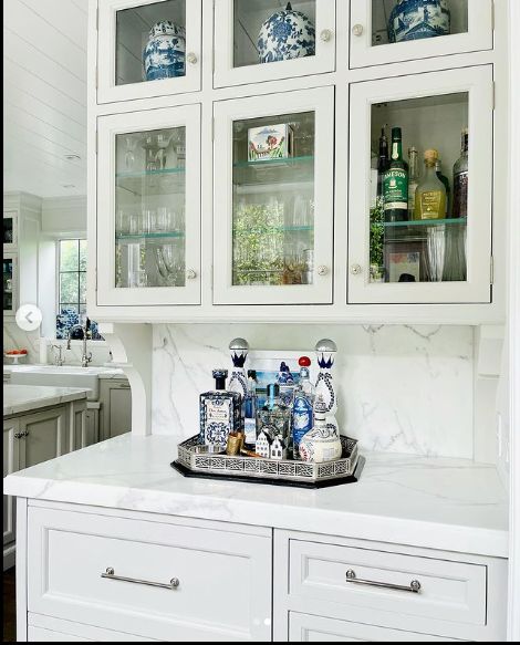
Yes, like the second image, you can use Revere Pewter on your cabinetry to achieve that minimalist and easy flow in your kitchen. Your bedroom, bathroom, and dining space are included.
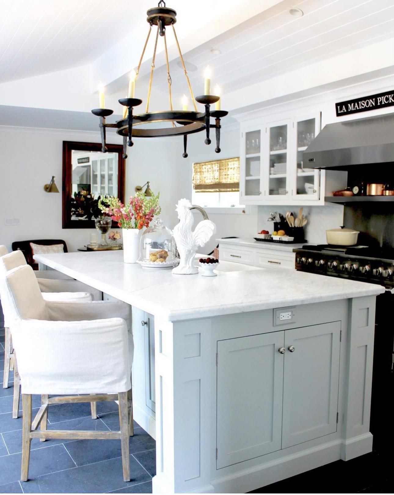
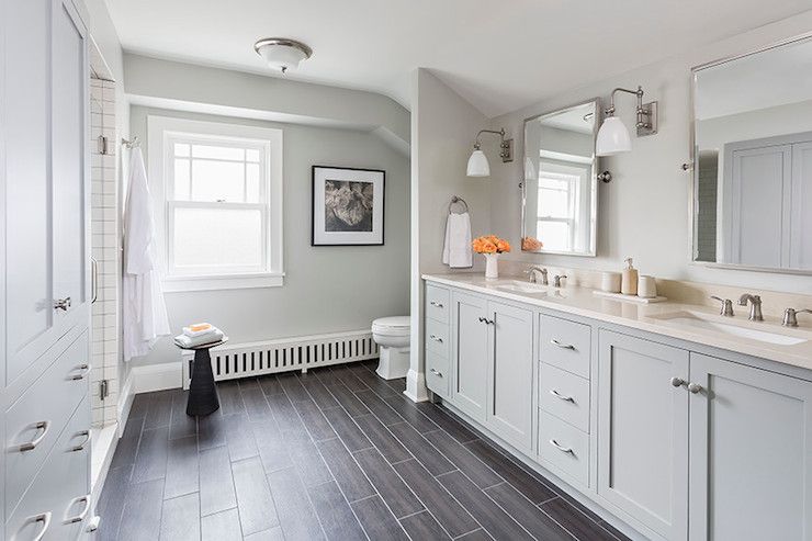
7. Fieldstone
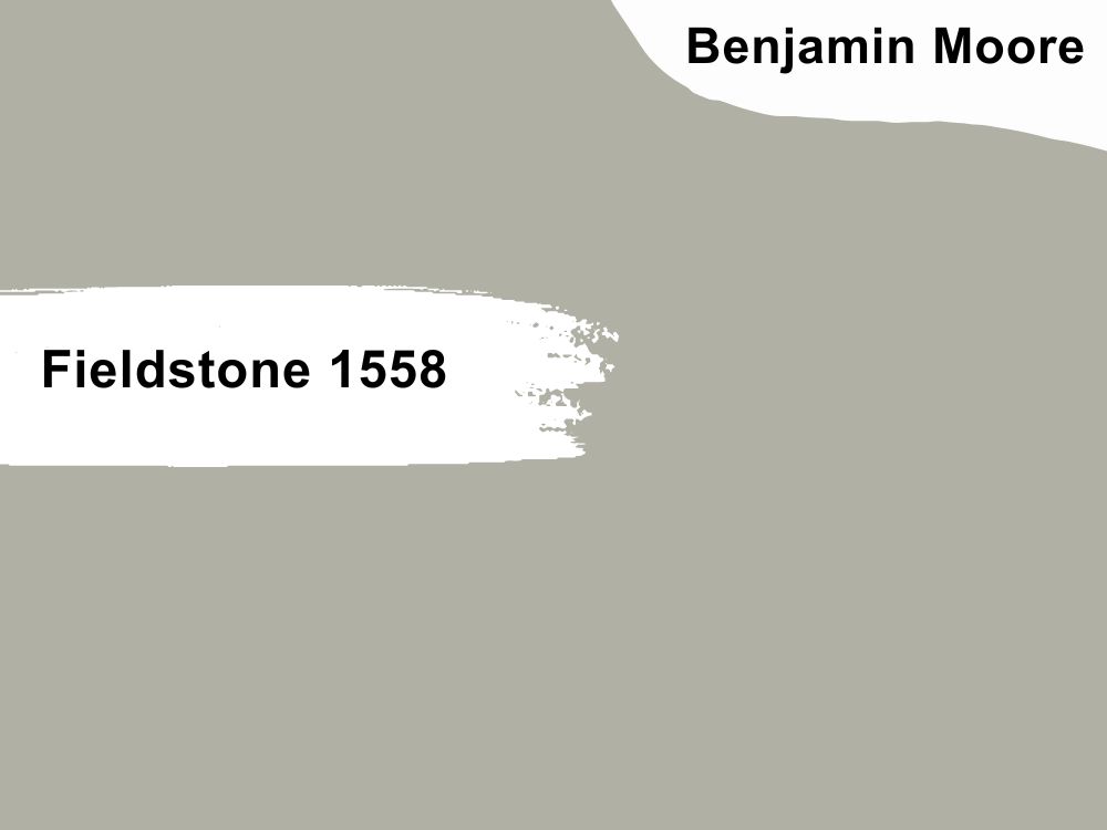
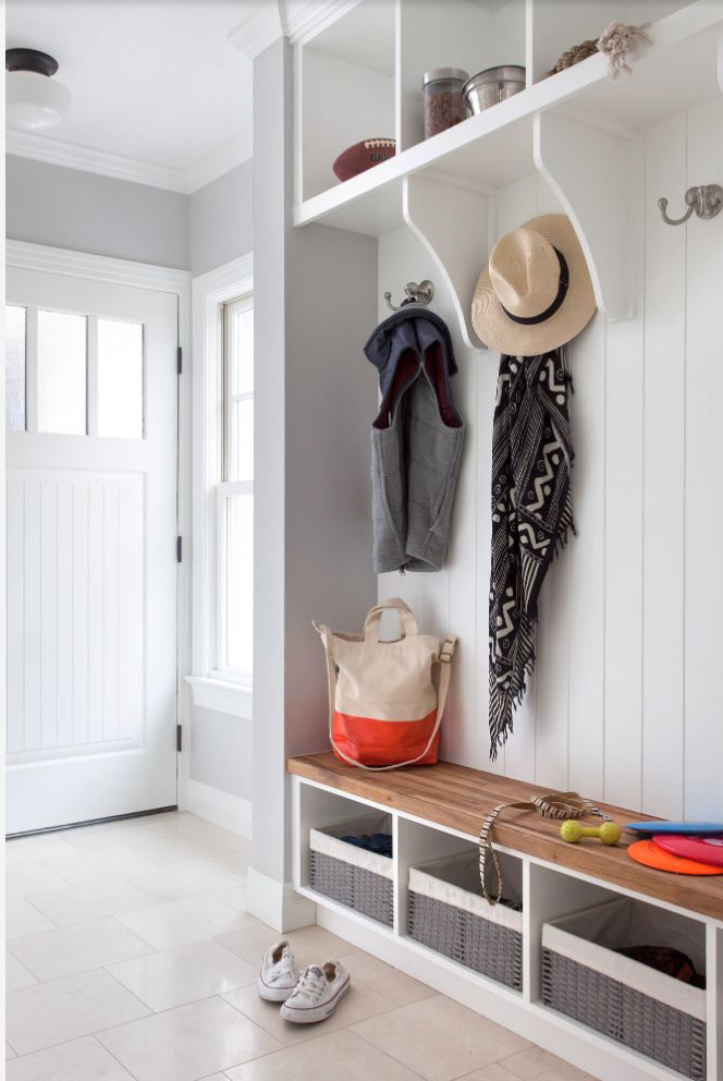
Benjamin Moore Fieldstone sticks to its nature-inspired moniker with the lush green undertones you’ll find in this light gray. It has an LRV of 42.73, which brings it safely out of the dark category.
This one is a cool color, so expect softness in your home when it appears on the walls. The bathroom in the second image shows off Fieldstone in all of its beauty, especially how it works well with the white trims on the window and ceiling.
Fieldstone also works in the kitchen, like in the second image, adding hints of white and black to cover a wider range and appeal to a different color scheme.
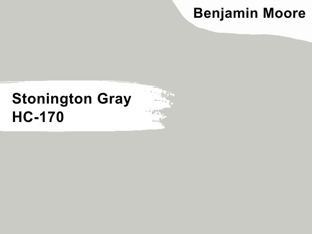
8. Stonington Gray
Before we proceed, grays often almost appear with very cool undertones. Since it’s a relatively cool color itself, it shouldn’t come as a surprise that the immediate reaction of this color in a space is to absorb any strong incoming light.
Stonington Gray comes fully packed with an LRV of 59 and a truck full of cool undertones. The blue in this one can sometimes wink as purple or green, depending on how you decide to accessorize.
We love the gray details in this Stonington Gray living room as it creates a sharp contrast with the walls. Curate a minimalist dressing room with Stonington Gray, like the second image, and throw in some bright oranges and wooden textures to switch things up.
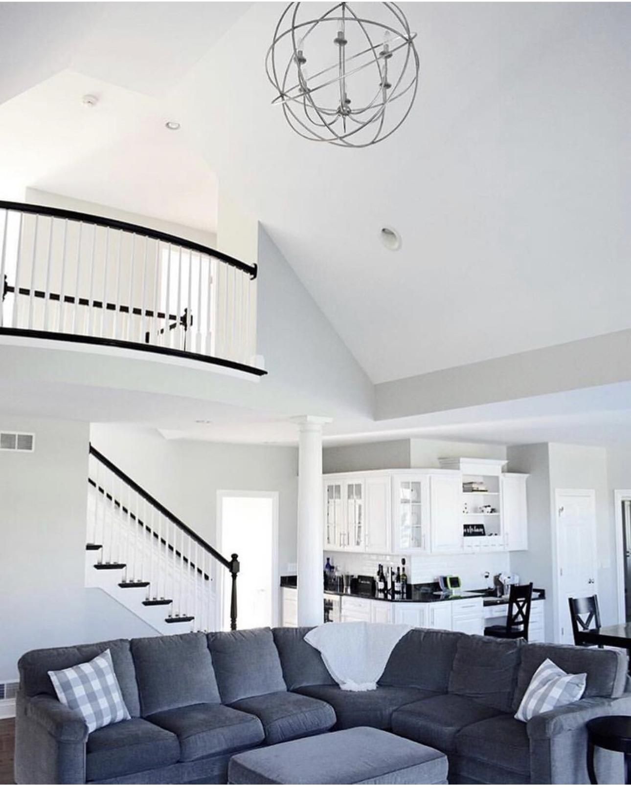
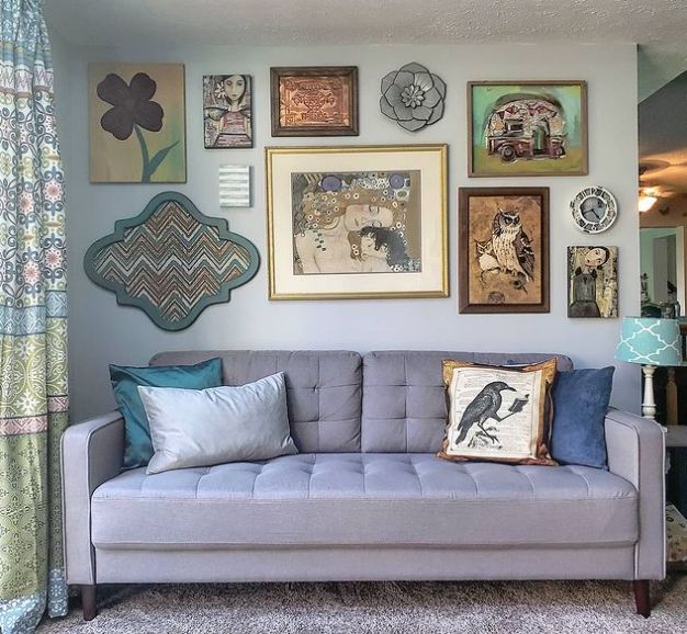
9. Beacon Gray
![]()
Beacon Gray contains two main colors, blue and warm gray; The result is a unique neutral that welcomes every shade while passing a strong statement. The dominant feedback you’ll get from this one is calm, tranquilizing effects that reflect a lot of light, thanks to its LRV of 65.92.
This kitchen beautifully showcases both sides of Beacon Gray, greatly influenced by lighting elements. The yellow and black details on the lamp add a warm feel to this cool space. Create the bedroom of your dreams by adding bright blues to your Benjamin Moore Beacon Gray bedroom, and watch it become your favorite corner in the house.
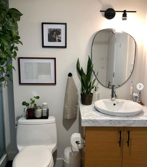
10. Calm
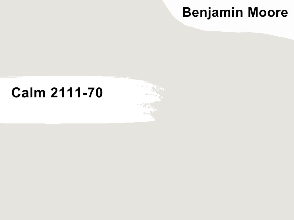
Calm is a chameleonic shade with a high LRV of 78, making it appear light or pale gray, but that’s what we love. Calm has hints of brown and purple, but these duos work together to make it appear rather soft than the usual warmth expected from any color with brown features.
Benjamin Moore Calm stays vibrant on this bathroom wall, displaying its brown undertones simultaneously. Pair yours with white and black details for a better appearance and to make it more modern.
This set of cabinets looks gracious while being covered in Benjamin Moore Calm; we also get subtle feedback of purple undertones, thanks to the northern light that leaves a blue cast on the paint color.
11. Metropolitan
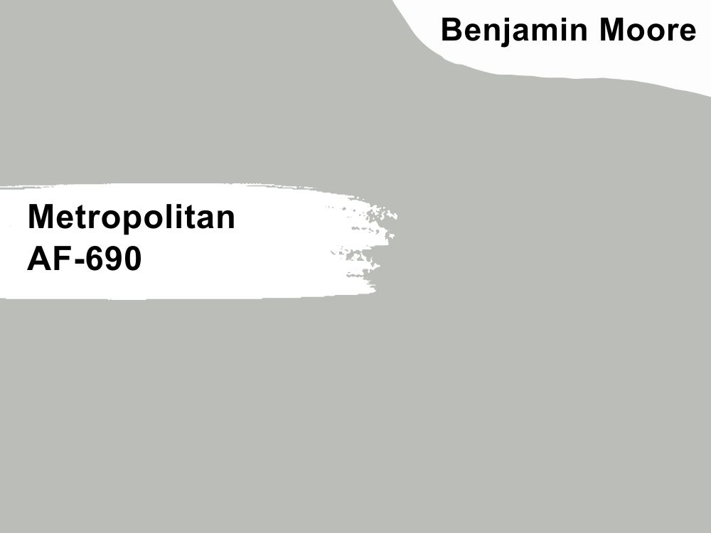
No other paint color deserves to round up our awesome list like Benjamin Moore Metropolitan. This neutral light gray is cool, calm, and collected, and we mean this because it stays the same under varying light conditions.
It has an LRV of 50.5 with cool greenish-blue undertones, which works magic in your space by making it appear not too light or dark.
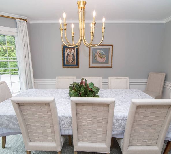
The color reflects a lot of light in the dining space, thanks to the white chairs and wooden details on the wall. Adding a bit of white to your color will always be a good idea, as it helps create a beautiful contrast that’s subtle but still pronounced.
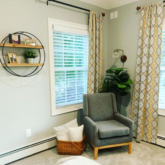
Take a needed time off in this living room as Benjamin Moore Metropolitan oozes nothing but tranquility. We love how the homeowner kept it bold with the big gray chair, patterned curtains, and the extra details of the basket and faux leaves.
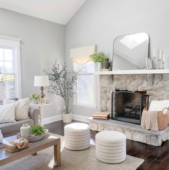
12. Gray Owl
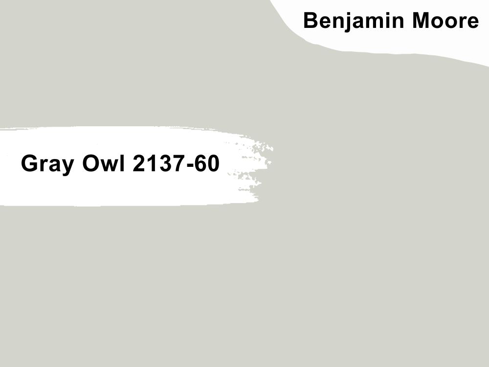
Gray Owl boasts an LRV of 65.7, which means you’ll get an impressive dose of light reflectivity when you apply this in your space. Benjamin Moore Gray Owl is a light gray that leaves a fresh cool cast on your home walls.
Adding white to your light gray color is a beautiful way to add dimension and further explore the beauty of Gray Owl, just like the first image; we love the white couch and ceiling, including the unique fireplace, which spiced things up.
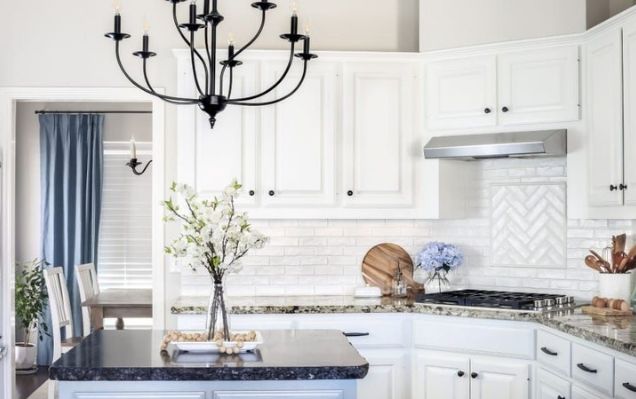
Gray owl works wonders in the kitchen area, stick to white for your cabinetry, and throw in a little black and other cool colors to create a chic aesthetic like the second image.
Behr Brand
Perfect for those working with a budget, but we can’t guarantee long-term use/durability, especially when compared to Sherwin Williams and Benjamin Moore paints. Behr’s paint gallon costs just a little below $45.
13. Sterling
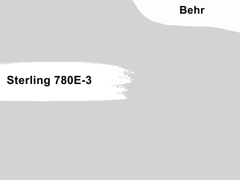
Sterling from Behr has an LRV of 65, which means it conveniently passes as a light gray but is also not too overwhelming in a space. Sterling is a cool gray that has winks of blue and purple undertone, which is excellent for southern-facing rooms.
Enjoy the cool touch of Behr Sterling in your kitchen by throwing in cool bright white and black cabinetry. Switch up your decor using Behr Sterling as an accent wall, then pair it with soft beige and black details for more dimension.
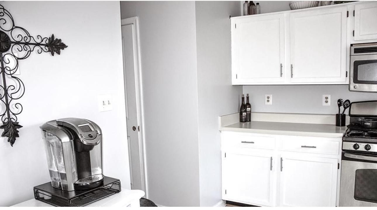
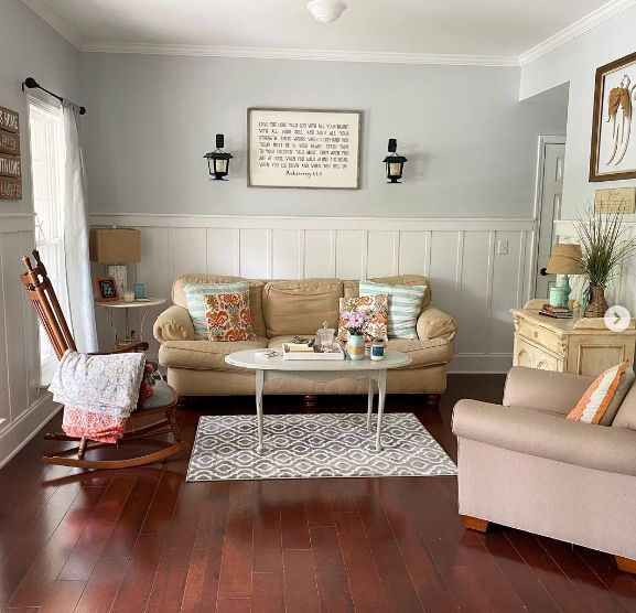
14. Silver City
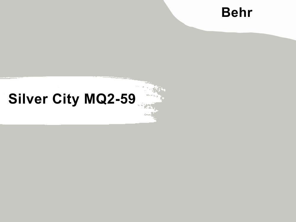
Behr Silver City is a strong candidate in this category with an LRV of 57, which brings it closer to the light range. This neutral has undertones of blue to green, bringing it to a cool category, and it also means you’ll experience a chilly feel when you apply it in your space.
Colors with high LRV peak when used in a space that receives impressive light. The first image is proof, and most especially, we see the soft green undertones, which perfectly compliments the impressive faux tree in that living room.
Behr Silver City absolutely understands the assignment in this dining space. Throw in some whites, beiges, and metallic details as you curate your own space.
Valspar Brand
Valspar paints are relatively popular on the scene, but they’re excellent colors for interior walls and ceiling, boasting of a good finish. They’re also easy to apply and have excellent projection.
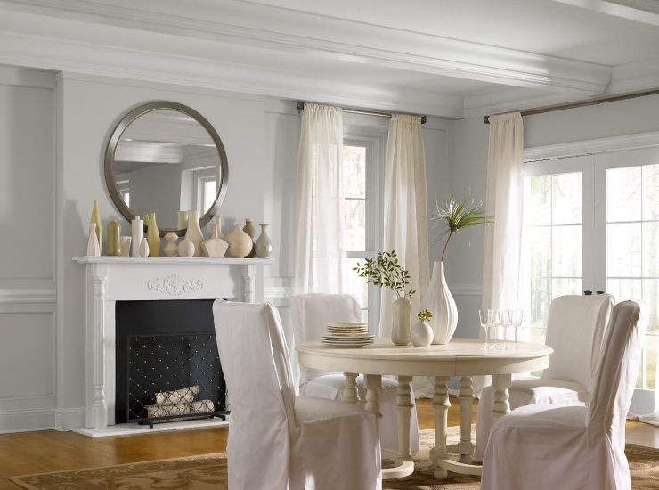
15. Notre Dame

Think of that light gray with just enough depth and lightness to cater to your interior desires. This neutral color has the gentlest green undertones that add extra coolness to this cool color. It also has a medium to high LRV of 56 which means you’ll enjoy a great feedback from this color when you use it in a space that receives a lot of light.
Low light reception means more depth for your color, and that’s evident in the first image. We absolutely adore the black details added to this space. Notre Dame is such a welcoming color, so it works amazingly as an accent wall in this cute, bright bedroom in the second image. The bright blue drawer and monochrome accessories are the perfect allies for executing this beautiful interior work.
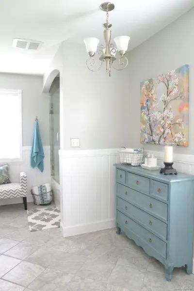
16. Filtered Shade
Filtered Shade is a breathtaking warm light gray from Valspar. It comes with a subtle feminine energy, and you may find shades of purple and brown undertones when used in space.
Notice how the brown undertones come out to play in this chic nursery. The white cot just brings everything together. Valspar Filtered Shade looks great in this bedroom and embraces its coolness with a wink of purple undertone. We love the black and white details with the bedding.
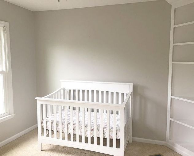
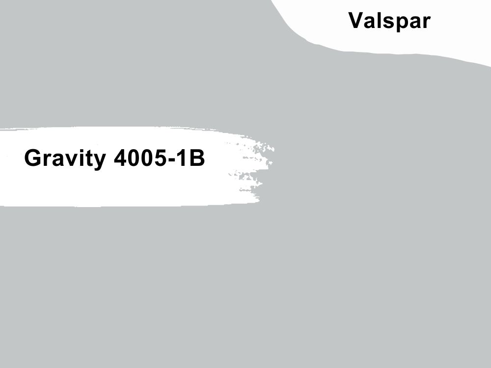
17. Gravity
A newcomer on the list but very experienced. Valspar Gravity is a chic cool gray color with unique purple undertones that gives it a fresh burst. Chances are high that you may get feedback of blue from the purple undertones since it’s on the cool side.
The light reflective value of Valspar Gravity is 56.2, which means it’s sitting pretty in the medium category. You can’t deny the strong influence of the purple undertones in the first image and how the wooden textures in the space contribute to it.
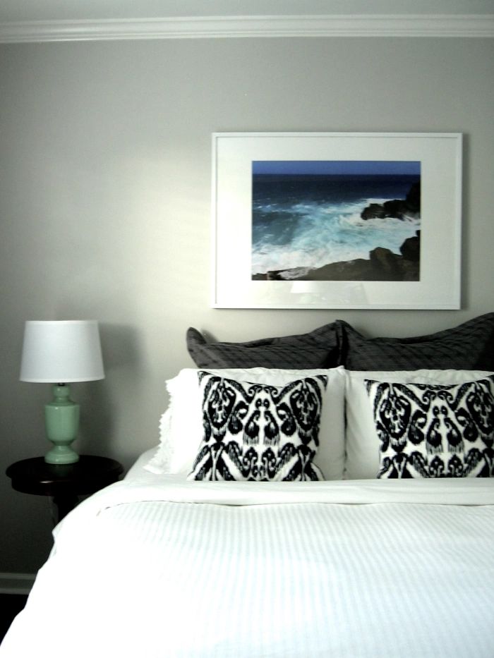
Switch up things in your Valspar Gravity space by throwing in interesting art pieces and throw pillows like the second image.
Conclusion
It’s not enough that you like light gray paints; you must be very armed with enough information about the brand and the color you’re committing to. Sample your paints with our highly recommended SAMPLIZE strips that are super affordable, accessible, and very easy to work with.
All you need to do is purchase the SAMPLIZE strips in your desired shade, leave them on your walls for a few days, and continually review them under different light conditions to understand what you’re about to do fully.
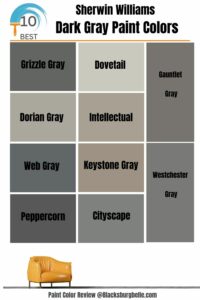 10 Best Sherwin Williams Dark Gray Paint Colors (Trend 2023)
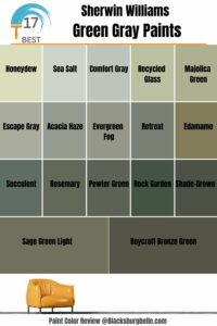 17 Best Sherwin-Williams Green Gray Paints (Trend 2023)
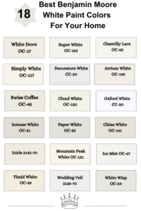 18 Best Benjamin Moore White Paint Colors For Your Home
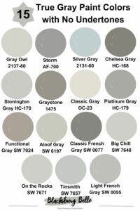 15 True Gray Paint Colors with No Undertones
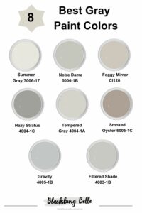 8 Best Gray Paint Colors From Valspar in 2023
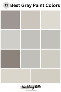 11 Best Gray Paint Colors with Purple Undertones
