
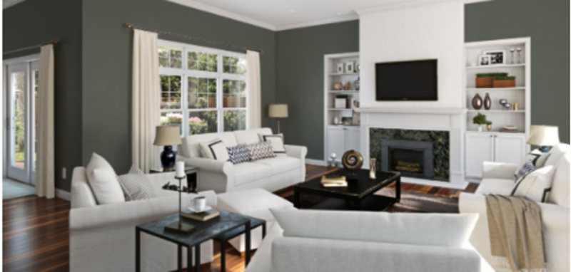
Settling on what to paint your home is one of the toughest decisions ever for any homeowner or interior decorator. Sherwin Williams has solidified their place as one of the best paint providers in the industry, hence the reason why we’ll be checking out the 10 best green paints from its shelf.
Sherwin Williams Green paint colors come in different shades to serve your décor needs. They also vary in undertones, allowing you to pick whatever suits your personality and the existing lighting situation in your home.
This explosive review and insightful picture/inspiration will get you well on track toward achieving the home of your dreams.
N.B. If you’re a greenhorn to paint terminologies, you’ll find terms like LRV and RGB in this article; while they may sound foreign, they’re terminologies common to painters and interior designers. RGB represents the amount of red, green, and blue present in each paint color.
LRV is shorthand for Light Reflective Value where 0 is the darkest range, and 100 is the lightest- as there’s no true dark or light color, we keep it within 3-97.
Table of Contents
Benefits Of Using Green In Home Décor
So, you may wonder what’s so special about the color green that Sherwin Williams produces different shades of it. Besides the fact that green is gradually becoming one of the industry’s most popular and widely admired color options, they’re also closely related to nature. They can give off a vibe of relaxation, tranquility, and harmony in a space.
Another reason why you should choose green when making home decor decisions is that it’s kind enough to work with other colors and textures you may want to introduce. You’ll soon realize that green can also function perfectly as a neutral, allowing you to layer beautiful bright colors in a way that makes total sense.
Choosing The Right Green Color For Your Space
Before taking the big jump, there are several factors you must consider. Once you’ve ticked these boxes, then you’re ready to go. Making a careful hypothesis helps you achieve aesthetic balance between artistic and realistic. People should be able to walk into your home and instantly connect to the color and decor while resonating with your personality.
Step 1: Consider the Room’s Lighting
You must first check the lighting situation in your room of choice. Green is traditionally a cool color; what this means is that it absorbs light and is quite easy on the eyes. Lighting comes in two categories, too- natural and artificial light sources.
The effects of the Northern, Southern, Western, and Eastern light on your green paint color will tell on its appearance in your home. The Northern light is the coolest of all and if your room is in this direction, your green color will show off its cool side (expect the blue undertones in your green to give a wink).
South facing rooms get a golden glow from the sun and this appeals to the warm side of your green color (watch out for the yellow undertones with this one).
Open your arms wide to the beauty of the bright morning sunshine if your room faces the east. The yellow-orange cast the sun leaves on your color in the early hours of the day adds a bit of warmth to your green color.
You’ll see the effect of the western sun in the early evenings as your green wall gets intense warmth from the red-orange light of the sun. The final appearance of your color influenced by lighting can make or mar your space.
Step 2: Take Note of the Undertones in the Paint
Another important prerequisite for settling with any paint color is the undertones. Due to the makeup of color (RGB), you will get more than one play the moment you apply it. Some greens have a dash of purple, gray, and violet to them, and it’s important to really note this down because they determine the pattern your remaining interior décor pieces will follow.
Step 3: Consider the Room’s Size
Based on their Light Reflecting Value, some colors can make your space appear larger or smaller. It’s also important you bear this in mind before picking a paint color. You don’t want the walls caving in on you when entering your room.
Step 4: Choose Your Shade Of Green
The options are endless when it comes to the Sherwin Williams Green palette. All greens are different; understanding this statement will help you make a clear decision on the exact tone you want.
With that being said, you need to sample. Don’t what that means? Sampling your paint involves only one thing- SAMPLIZE paint strips, and they come in different colors.
With sampling you get a firsthand view of how a paint color will react to the surrounding light conditions and what undertones will be visible . It’s best to try them out in different areas of the home and leave it on the wall for a few days.
We recommend you get strips to ensure you don’t end up with a green shade you don’t want. These strips are mobile, efficient, affordable, and can last for days, depending on your experiment’s length. Ensure you’re trying them out on plain white walls to get accurate results- failure to do that means the existing wall color will mess with the eventual outcome.
It’s very important to go through all the processes involved so you can really make a choice and pick a color you can grow with and never get tired of looking at. It can be mentally, physically, and financially exhausting to embark on redecoration now and then.
Pro Tip: Softer green tones help you achieve a calming atmosphere in your home and are also excellent for brightening your room. (If you don’t want your walls to be plain white but still need the flair, try soft greens.)
Medium greens bring a tropical vibe into your space. If you’re looking for greens that are not so dark or bright, this is the one for you.
Dark greens generally contain a higher intensity, and when you use them for main walls, you may get gloomy feedback; this is where accent walls come in. These colors perform wonders besides other shades of green that are much lighter.
Finishing Touches
You can elevate your space further by adding trims or contrasting colors. Wondering what trims means? In the paint world, trims help to enhance your anchor color by bringing visual interest to your room. You’ll usually find trims on pillars, railings, window frames, and other minority spots in your home.
It’s an unspoken rule that trims should come in neutrals, i.e., white. Thanks to the versatility of the color and its ability to pop without taking anything away from the main color, it enhances it.
That said, you can add contrast to your green paint with white trims or accent colors (whether a deeper shade of the green you’re using, a lighter one, or one out of the undertones, contrasting or complimentary colors).
The last thing you must do for this section is to balance your paintwork with matching textures and furnishing. If you decide to go monochrome, that’s an excellent idea, and if the popular traditional pallet mixes and matches related colors to create one big creative space is your vibe, then feel free to express yourself.
Types Of Green Paints Colors to Choose From
There are generally two types of green paint colors available for everyone.
- Warm Green
- Cool Green
Warm Greens
Before choosing one of these two colors, you must consider the location of your room with the amount of natural light it gets, and your home’s interior finishes. To get this, you can use the SAMPLIZE color strips to quickly compare and settle for which connects best.
If your room has flexible finishes, you’re lucky because it doesn’t box you into picking a particular kind of green. You can do warm or cool and still kill it.
Warm Green colors generally have yellow undertones; some may be in very small amounts or overwhelming large quantities, so much so that you see the yellow regardless of the time of day.
The warm greens with a strong neutral base are classified as GREIGE or TAN. The beauty of warm green paint colors is that it helps balance out the coolness of the incoming northern light and the flatness of the eastern light.
For better understanding, GREIGE colors are warm neutrals with green-yellow undertones. Check the picture below.
Warm Greens, like their names, will help homeowners feel a deep sense of comfort in their homes, and they make spaces appear larger, thanks to their ability to make the most out of sunlight and convert the intensity into warmth.
Another thing warm green does is give more life to the natural light in a room; you’re not walking into a dull-looking space with this one.
Cool Greens
As for the cool greens, these come with a truckload of blue, and we can as well qualify them as green blue or blue-green. A perfect example is Sherwin Williams Sea Salt which is popular for being gray with intimidating blue undertones.
Cool greens are quite the view in rooms facing the south and west. They help give a balance to the intense warm light these spaces receive.
Check this picture out to discover the magic they offer.
With cool green, you get a modern room- most homeowners tilt towards the minimalist lifestyle for décor, and since cool tones are not so “in your face” like their warm counterparts, achieving that is easy.
Cool greens take their purpose quite literally as they stay in the background to help much brighter colors in the room take center stage. The right word for this is that cool greens are “muted,” very welcoming, and let dominant colors bounce off them.
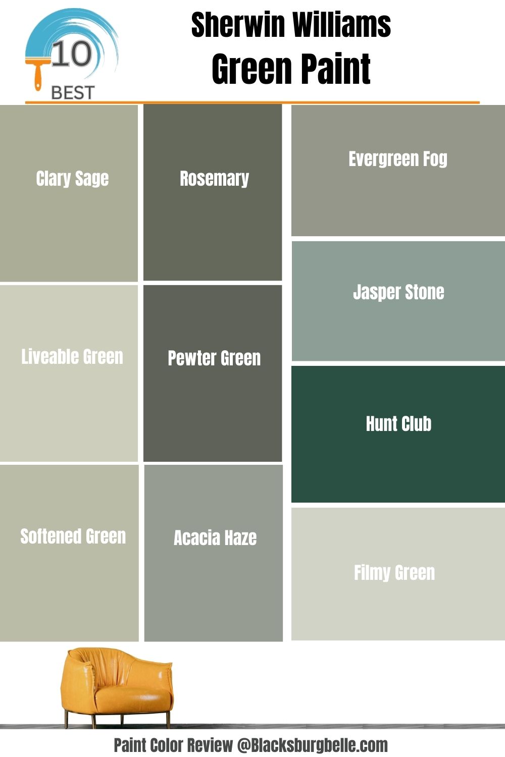
10 Best Sherwin Williams Green Paint Colors
These are the 10 finest selections we’ve made from Sherwin Willaims, and we’ll be introducing you to their properties and how to pair them with other colors to create magic!
Sherwin Williams Clary Sage

Clary Williams Clary Sage is a true sage green that mirrors every color around it. It can come off as a mid-toned yellow gray-green, which you should expect to see in the undertones.
The LRV of Sherwin Williams Clary Sage is 41- as it absorbs more light than it reflects and can work in any space. Another good quality this color has is that it works on both the cool and warm sides of the spectrum; as long as you pair it with the right number of grays and greens to draw those characters out.
For the images, Sherwin Williams Clary Sage was paired with cool-toned whites to even out the warm yellow undertones peeking through. At night, the yellow is dominant, as per the kitchen (notice how the warm surrounding lights put it into perspective, and you’ll get more of the soft herbal green during the day.
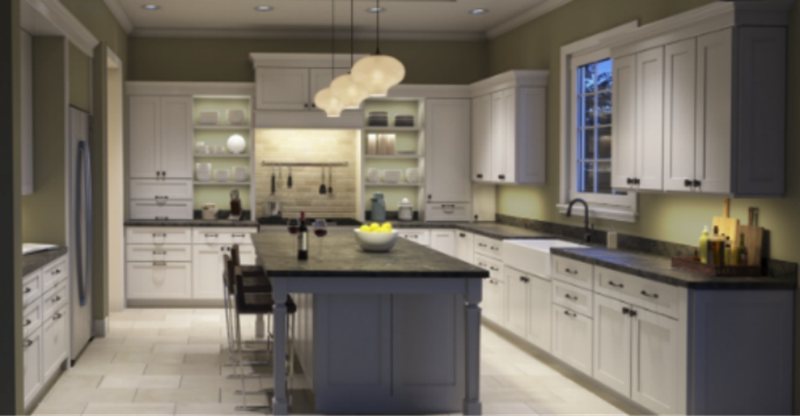
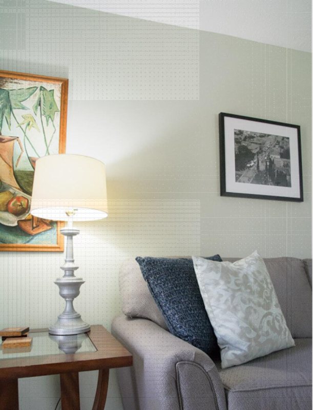
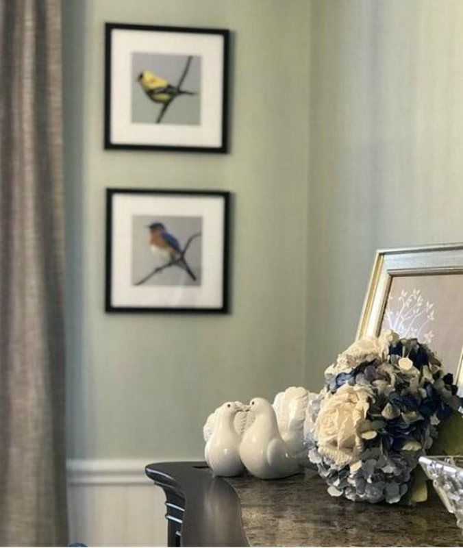
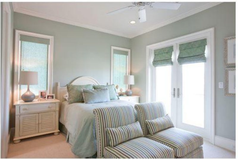
Sherwin Williams Liveable Green
Liveable Green makes your space come alive with its light tone and slight sage undertones. This is a great option for small spaces and exteriors as its LRV is 61, which makes it an excellent base and neutral for coastal and Caribbean-inspired homes that want to stray away from the typical blues.
Create a soothing, organic, and fresh vibe with this cool green; it’s a full color because it also has that yellow and gray undertone that gives it a neutral balance and versatility. Combine this color with warm whites, sage greens, and darker greens to create a monochromatic palette.
Notice how the gray couch in this living room instantly calms the paint and works with the warm light from the table lamp that shows off the yellow undertone.
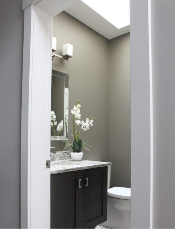
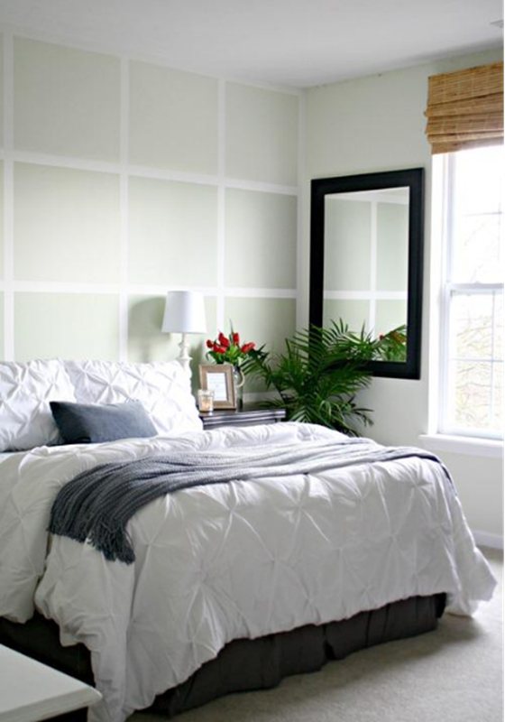
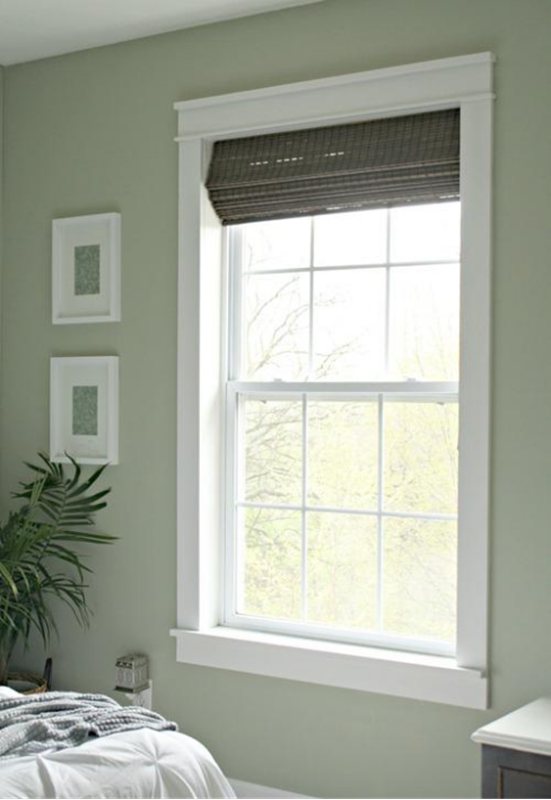
Sherwin Willaims Softened Green
Your search for that perfect bedroom color is over with this one color. The Sherwin Williams Softened Green is a great neutral green paint color that works in a home with white and black accents. WIth an LRV of 49, this warm green paint color has touches of gray and yellow undertones, which adds to the famed versatility.
Its LRV indicates that this color performs well in a small space, and the more natural light you give it, the lighter and brighter it’ll make your space. We love this color on cabinets, bedroom walls, and window frames- which also works great as colors.
Like the photo inspirations, Sherwin Williams Softened Green works well with neutral whites, light gray, taupes, and dark blue. You can also throw in some wooden textures for more range.
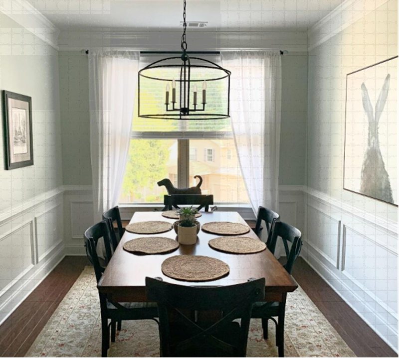
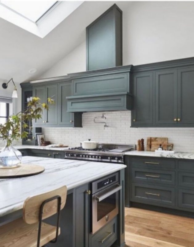
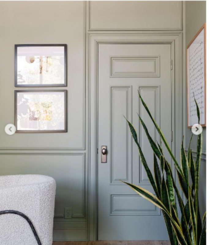
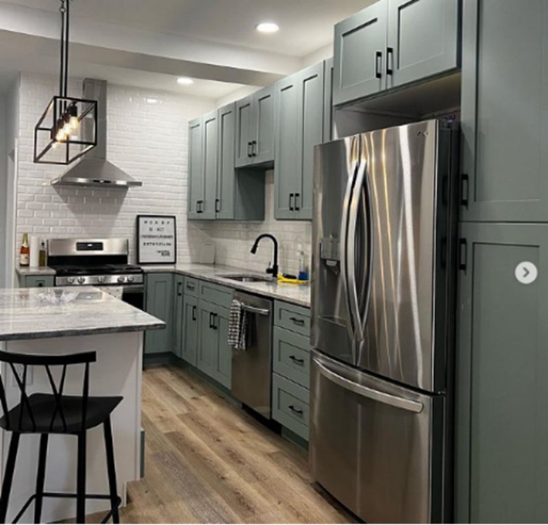
Sherwin Williams Rosemary

Sherwin Williams Rosemary is a dark tone that pulls you in with its mesmerizing touch on surfaces in the home, your walls, and even kitchen cabinets. This color is perfect for a crisp and fresh outlook, not minding the depth it gives.
This green is amazing for any space that’s too large. When applied, it will make your walls appear crispy and fresh and create the illusion of a smaller and well-managed space. If space management is on your list, go ahead and pick this green, you won’t regret it.
The artful blend of Rosemary, the potted plant, the white chair, and that dark brown table top with the wooden floor help bring the modern and organic vibe to life- it’s funny how these vastly different tones come together to create the perfect atmosphere for reflection.
A dream kitchen doesn’t get any better than this. The harmony between the textured rug, warm wood tones, and Rosemary on the walls and cabinets with the white table top shows how a monochromatic color palette isn’t bad.
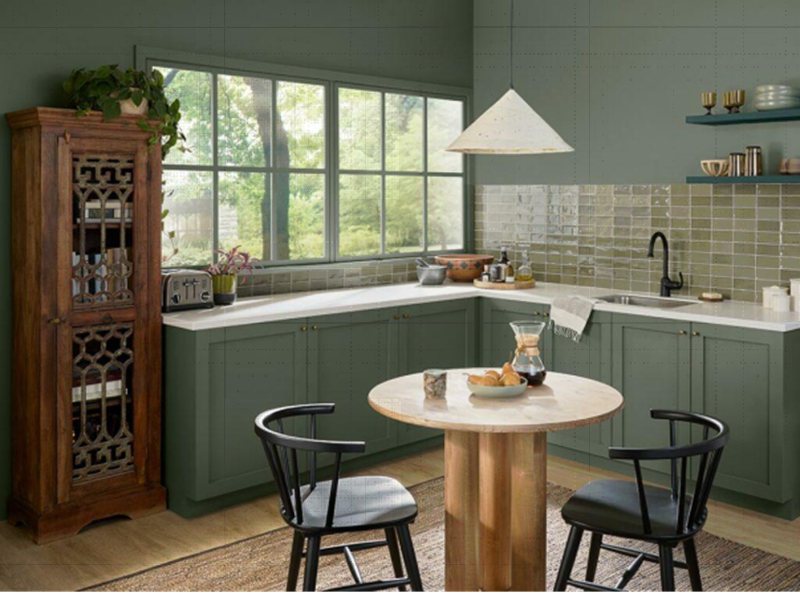
Sherwin Williams Pewter Green
Notice how this bold color sits beautifully on the kitchen cabinets and gives off a cool vibe, especially with the gold and wooden details. The beauty of this color is that you can apply it as the main color or the accent; either way, it’s versatile and works well around other tones/textures.
You can’t deny the richness of this color and how much it fits into a traditional home setting (you’d feel like you’re the main character in a movie set in the Victorian era with his one).
Pewter Green belongs to the warm category, and it comes with an LRV of 12 and RGB of 94/98/89, making it the best choice for a large space because it draws in the walls and gives the illusion of a small living area. This color also works great on exteriors as the sun washes it out, making it less overwhelming yet passing on a strong statement.
This living room oozes vintage meets modern energy; thanks to the mix and match between pewter green and white tones, notice how the fireplace is drawing attention with the dark brown and dark gray color.
Sherwin Williams Acacia Haze

Sherwin Williams Acacia Haze is a gorgeous sage green color that rarely goes out of style. If you’re planning a project for this year, include this color in your palette. Acacia Gaze has beautiful green-gray undertones that make it a warm neutral tone.
It has an LRV of 32, and RGB details include 150, 156, and 146. If you do not know how to discover the base color for your paint, this is where RGB comes in. The hack is to study the color with the highest ratio and make your deductions from there.
From the images included, you can see in real-time how these homeowners worked with Acacia Haze in their spaces and the creative marrying of corresponding warm stones like the soft white, black handles for the cabinets (the pop is everything), the brown marble detailing on the cabinets and the grays in the bedroom.
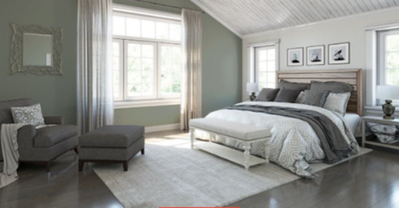
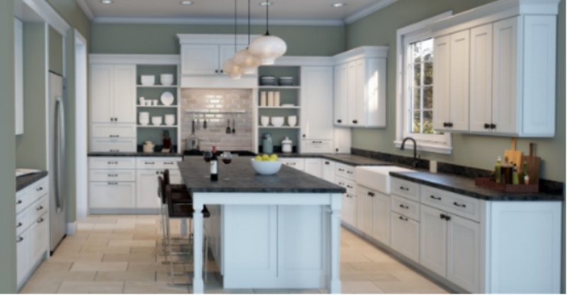
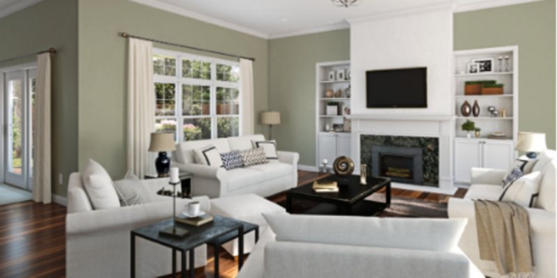
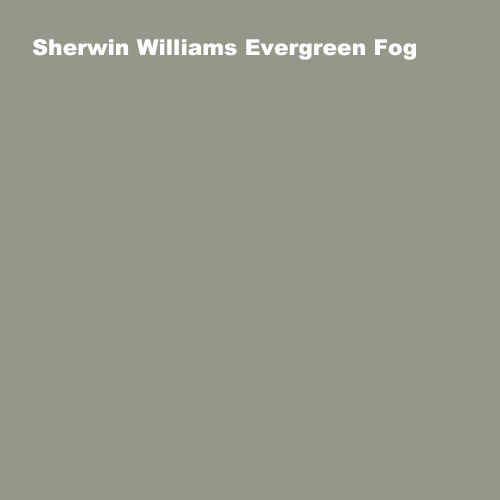
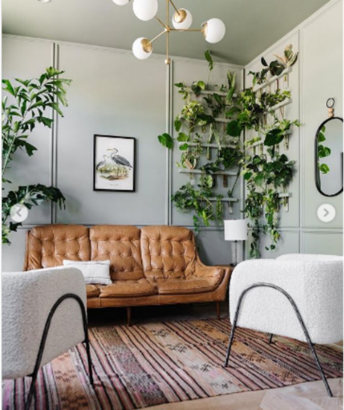
Sherwin Williams Evergreen Fog
Evergreen Fog brings nature into your home with its soft moss tone. The sage green is medium-to-dark, with an LRV of 30 and an RGB of 149/151/138. It falls in the greige color family and belongs to the warm category.
This color has a versatile hue that’s easy on the eyes, and you’ll see peaks of green, gray, and a hint of blue. If you need your space to make a statement, you should consider this color. Pair it with orange, brown, beiges, and off-white to really draw a contrast.
The chameleonic nature of this color makes it the right choice for any space that needs a subtle color but also needs to make a resounding statement and leave a lasting impression in the hearts of many people.
We’ll let you in on a secret, and it’s the fact that this color is suited for a modern, monochromatic setting like that living room in the picture. The beige couch and white couch with the green plants on the wall all create an impressive palette.
Sherwin Williams Jasper Stone

This is yet another mazing color from Sherwin Williams. It’s a medium-dark green that leans towards blue. It has rich gray undertones that give it a retro demeanor when you use it in a space and pair it with a metal cabinet and vintage style décor.
The Jasper Stone paint color has an LRV of 32 and is a great choice for calm and minimalist spaces. Its RGB is 141/158/151- the implication is that Jasper Stone is a legitimately cool color, and you can’t take away its green roots from the formation, considering it’s with the highest ratio in the RGB formation.
The two images depict the versatility of Jasperstone. It was used on the kitchen cabinets and paired with black handles and cool wall tiles, creating a beautiful contrast.
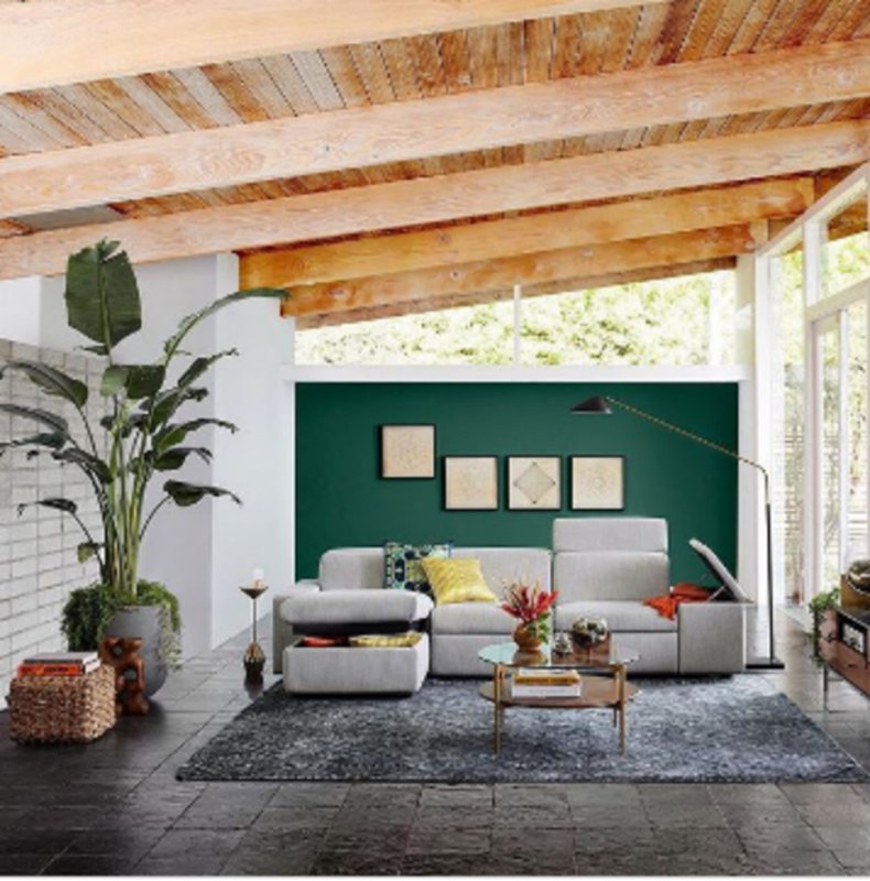
Sherwin Williams Hunt Club

The Hunt Club bears a striking resemblance to Isles of Pines. It’s the perfect accomplice should you ever decide to go bold. Pair it with brass tone or natural wood details for that va va vroom. Sherwin Williams Hunt Club has an LRV of 6, putting it in the dark category, and an RGB of 42/79/67.
The two inspirational images perfectly buttress our earlier point regarding pairing Hunt Club. The wooden ceiling, green plants, and neutral-toned chairs in frame two create a versatile, artsy space that’s surely far from boring- Hunt Club is the right companion for a traditional setting.
Sherwin Williams Filmy Green

Filmy Green has an LRV of 64, which is high enough to work as a neutral backdrop in your space. This light foamy green really doesn’t have any undertones except the subtle shades of gray that give your space a mild touch.
This is your best for any lighting situation. Filmy Green is versatile and unique and has a soft appeal that’ll make you look forward to coming home every time.
We advise people with limited space to use this color on their walls to expand, brighten and open up their spaces to lighter and permanently eliminate that clustered effect. Now you know your paint can help you manage space.
The first image shows how filmy green works with the dark brown accessories in the reading room (the dark computer screen has no idea how much of an accessory it is). The working experience in this space would be top-notch.
The monochromatic setting in the bedroom is a testament to how much filmy green works with other tones of green, as we indicated in this section. The multicolored stripes and white trims add some character to this space.
Tips For Combining Colors With Green
This section is important to help you find the right ways to make green paint work in your space. Dead the narrative that this color restricts you to a particular tone or style of execution.
A simple glimpse outside your window and notice how nature has perfectly created a unique scenery with every shade of green you can think of- this should tell you one thing- the endless possibilities. You just need a pointer.
The Undertones are Crucial to the Projects Success
We’ve written about undertones earlier, but this one is in a different context. It’s important to get familiar and create a mental relationship with your anchor color undertones; this keeps you in check as per combining colors with your green.
To make it easier, green with yellow and gray undertones will walk well with a gray and yellow accent wall depending on the time of the day and artificial lighting conditions in that room.
The green+gray+blue undertones in Sherwin Williams Evergreen Fog show that you’ll get a well-balanced, monochromatic space if you ever pair it with any of the three. You can also be bold and try out other colors with it, like Sherwin Williams Clary Sage, Sea Salt and
Play Around The Color Scheme
One of the best ways to make the most out of green colors is to use the ones on the same palette at varying intensities. For context, you can use all the colors on the Sherwin Williams Clary Sage color strip with location number 213.
The end result of this is a simple, monochromatic space, calming, and still gives you sophistication. The play between the undertones is something you’d absolutely love. Colors on a strip usually have the same undertones, so you’re on the right path.
Conclusion
Now that you have all the information on the best green paint from Sherwin Williams, the next step is to take all you’ve learned from the beginning of this read up to the end, including all information about the color, and create the most unique, inviting and exciting space ever.
Always remember to sample any paint color before fully committing to it. While our guide is quantitative enough, nothing beats being able to experience the range and features of these green paints yourself by using SAMPLIZE strips.
Greens are versatile and very expressive colors; once you find the tone that fully expresses your personality, you can pair it with textures and hues that’ll enhance and add more meaning to your space.
 10 Best Sherwin Williams Tan Paint Colors (Trend 2023)
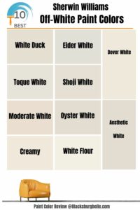 10 Best Sherwin Williams Off-White Paint Colors (Trend 2023)
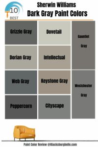 10 Best Sherwin Williams Dark Gray Paint Colors (Trend 2023)
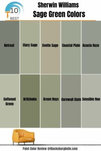 10 Best Sherwin Williams Sage Green Colors
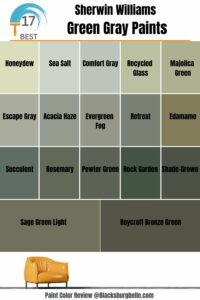 17 Best Sherwin-Williams Green Gray Paints (Trend 2023)
 17 Best Sherwin-Williams Taupe Paints (Trend 2023)
