
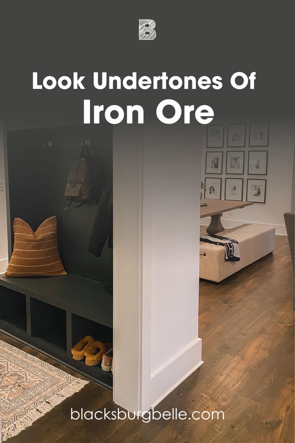
Once you dive into the world of dark neutrals, you quickly realize that black has several variations and shades. Regardless, you will sometimes have to pick between options, like Urbane Bronze vs Iron Ore.
Have you experienced Iron Ore’s deep, mysterious vibe and desired it for your space? But then you can’t resist Urbane Bronze’s earthy feel and also want it? I’ve prepared just the thing for you. This comprehensively compares the brand’s two most popular charcoal paint colors.
These paint colors’ major differences are their depth, shade, and temperature. Sherwin Williams Urbane Bronze has more brown and gray in it. On the other hand, Iron Ore has more depth and looks a little cooler.
Want a deeper dive into the Urbane Bronze vs. Iron Ore territory? Join me as I explore their differences, undertones, palettes, color pairings, and much more.
Table of Contents
When to Choose Urbane Bronze or Iron Ore?
It is never enough to only know the differences between Urbane Bronze and Iron Ore. You also need to understand when and where to use either one of them. This is especially true if you strictly want one or the other.
Here is a quick rundown of when to choose Urbane Bronze or Iron Ore.
Choose Urbane Bronze if:
- You want a dark neutral with strong brown and gray tones.
- You want the warmer option of the two.
- Your space needs earthy tones. This is also valid if the space has several pieces of furniture or wood.
- You don’t mind a hint of green in certain lighting.
Choose Iron Ore if:
- You prefer a dark neutral that is close to black but also distinct.
- Your space has good lighting to fully explore the color’s depth and mystery.
- You are picking a dark neutral for an accent wall.
- You want a dark neutral with solid depths but a soft feel.
So, how did I come to the above conclusion? Don’t worry, you will also make the same deductions after going through the rest of the article. I have prepared several analyses to help you understand the differences between both colors in detail.
A Visual Comparison of Urbane Bronze and Iron Ore
First, let’s look at both colors in real homes. After all, what better way to start a color comparison than examining their appearances?
While you can immediately notice their depths, Iron Ore displays a deeper tone. Also, Urbane Bronze shows a tiny hint of green, and Iron Ore looks more mysterious.
Quick Comparison: Urbanze Bronze vs. Iron Ore
Next, we’ll look at the vital attributes of both paint colors.
| Attributes | Urbane Bronze | Iron Ore |
| RGB | 84 / 80 / 74 | 67 / 67 / 65 |
| LRV | 8 | 6 |
| Undertones | Brown and Gray (tiny green might show) | Gray, hidden mild blue, and a tiny bit of green |
| HEX Value | #54504A | #434341 |
Emotional Effects: Urbane Bronze vs. Iron Ore
Dark neutrals generally have a pull of some sort. They spark certain levels of attraction and also whisper confidence. Ever heard the line “Black is bold”? Yeah, paint colors of this sort do that and more.
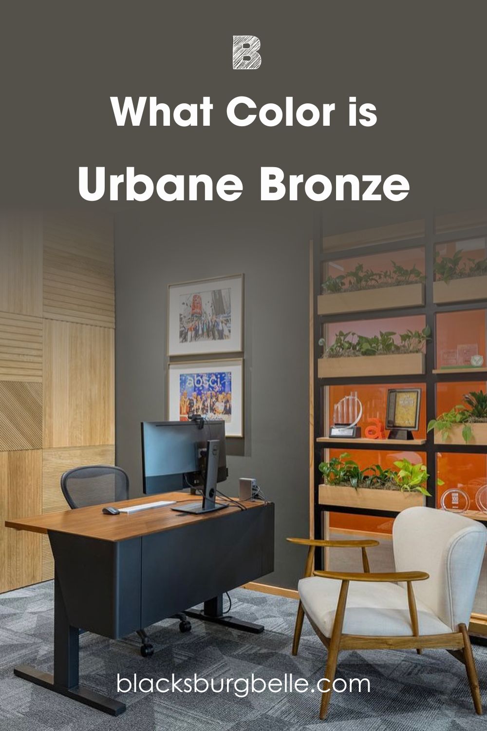
Sherwin Williams Urbane Bronze makes a space feel sophisticated. However, the dark neutral’s lesser depth gives a sense of tranquillity. Having this in a space meant for relaxation can easily make one feel like opening up or unwinding. Also, the paint color can improve focus in work-related spaces.
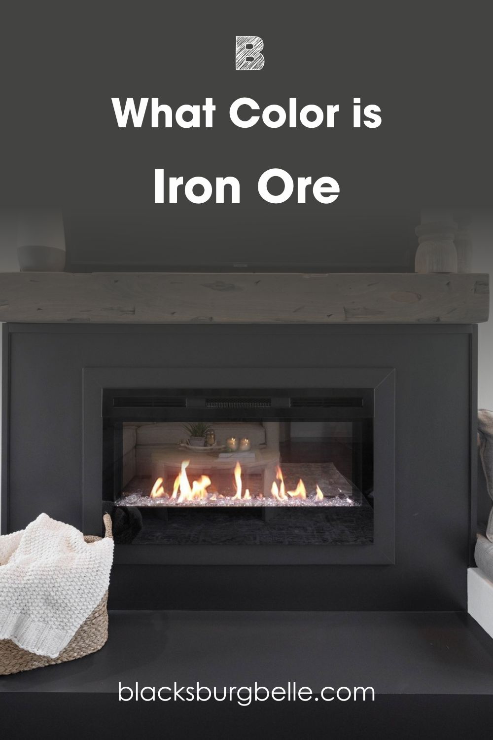
Sherwin Williams Iron Ore has a deeper tone. This gives it a bolder appearance and a stronger pull for attention. Using it in living spaces will give a sense of confidence with a touch of taste. Thanks to its undertones and ‘dark chocolate’ look, Iron Ore will also make your space feel sophisticated.
So, if you want a sense of calm and focus, go for Urbane Bronze. However, Iron Ore works best if you want more sophistication and boldness in your space.
LRV of Urbane Bronze and Iron Ore: Which Reflects More Light?
LRV refers to Light Reflectance Value. It indicates on a scale of 0 – 100 how much light a color reflects (or doesn’t reflect). True black has an LRV of 0, indicating no reflection of light, while pure white has an LRV of 100, signifying full reflection of light.
Urbane Bronze has an LRV of 8.
Iron Ore has an LRV of 6.
What does this mean? It means that Iron Ore has a darker shade and reflects less light as a result. This is why I don’t recommend it for spaces with little access to light. The same goes for Urbane Bronze.
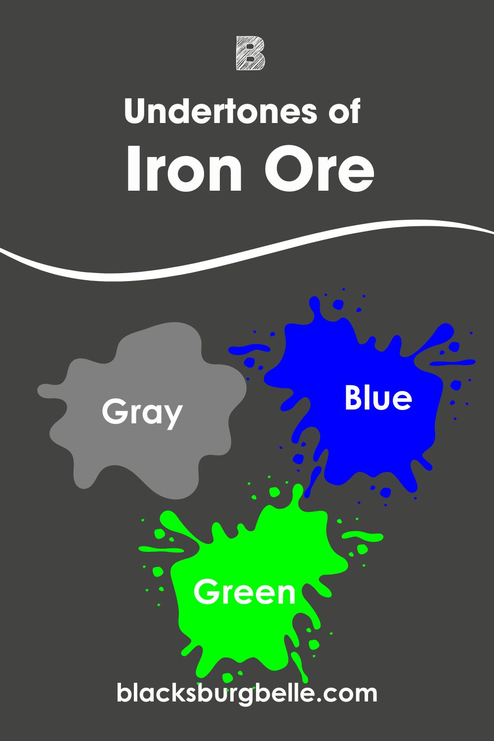
Undertones of Urbane Bronze vs Iron Ore: Are They Similar?
Undertones can easily make the difference between similar colors. While they might not always show up, you will always take note of them.
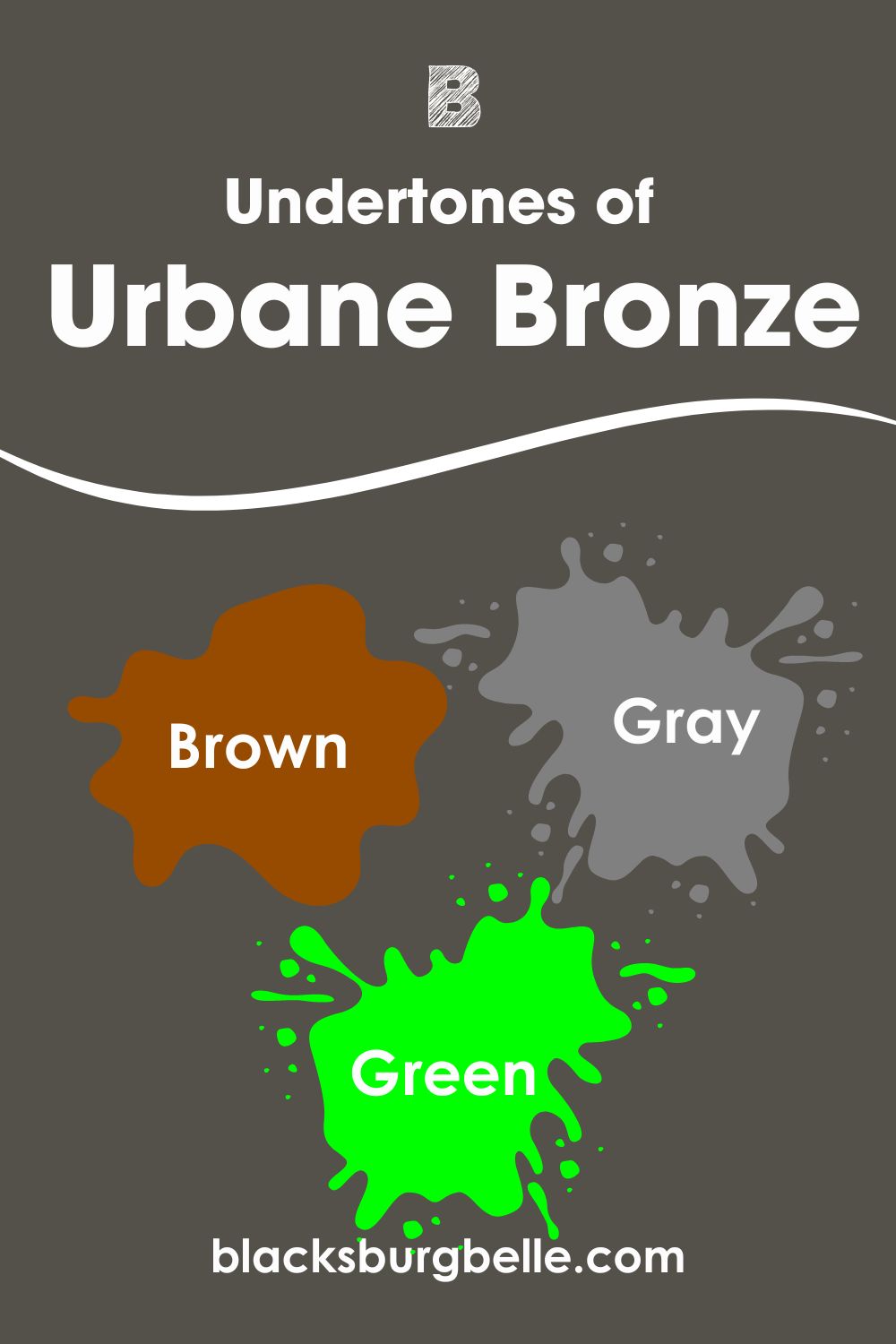
Urbane Bronze has strong brown and gray undertones. However, the paint color also shows hints of green in some settings. Spaces with bright light or cool color pairings increase the tendency of seeing its green.
On the other hand, Iron Ore has mainly gray undertones. Interestingly, the soft neutral also shows a mild blue sometimes. In exterior spaces or bright light, you can also catch a slight hint of green.
When placed side-by-side, Iron Ore looks ‘black’ compared to Urbane Bronze because of its deeper tones. Also, the latter appears to have a stronger ‘chocolate’ shade. That is because of Urbane Bronze’s strong brown tones.
Fun Fact: The green undertone make both paint colors suitable for earth-themed or nature-inspired decor.
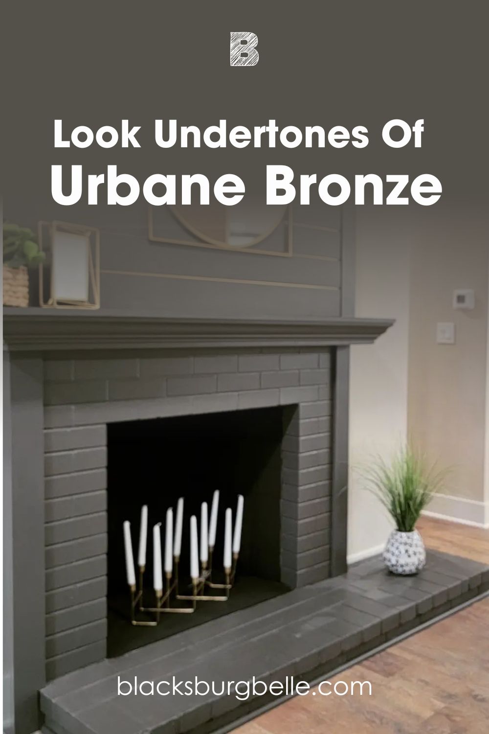
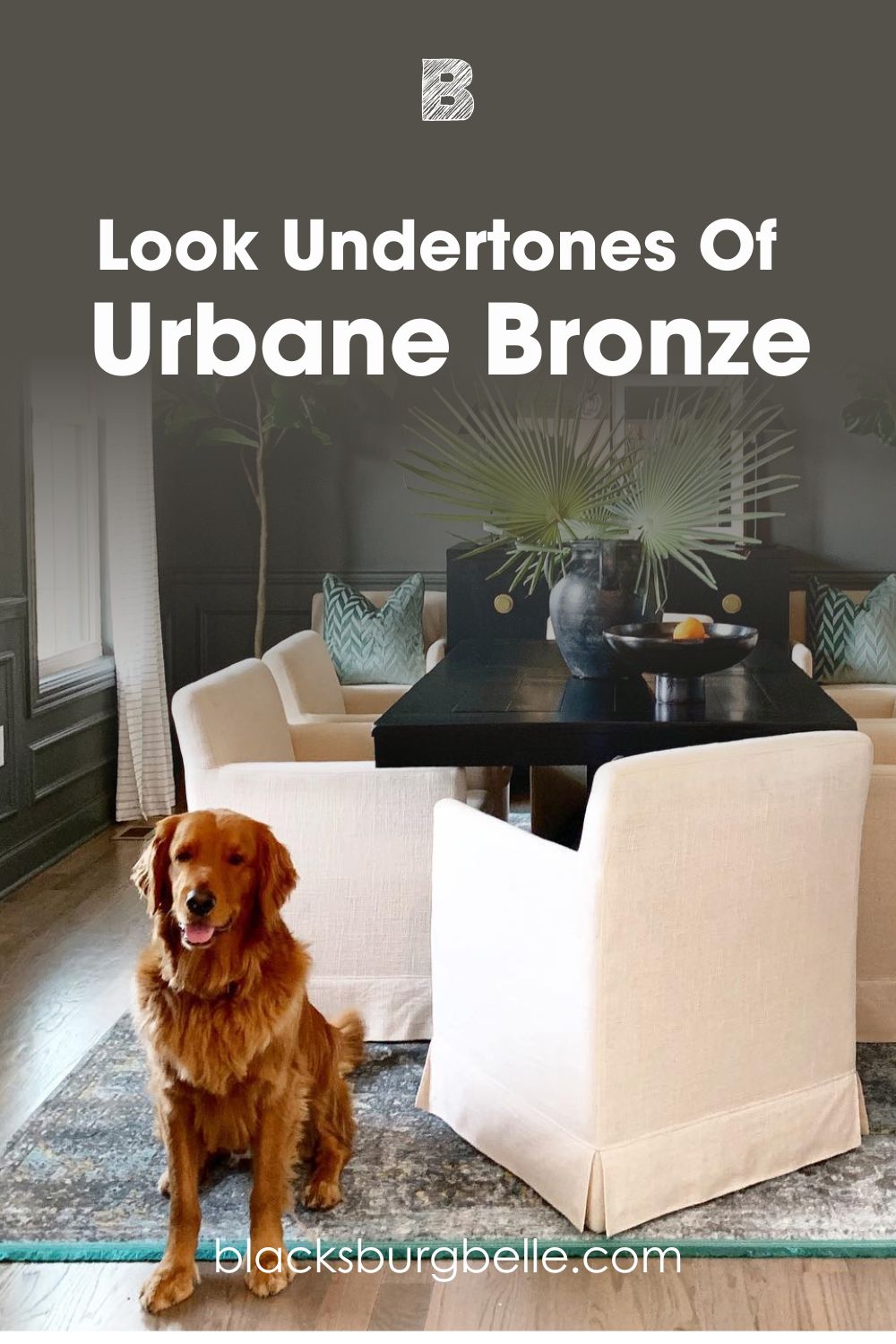
A Closer Look at Urbane Bronze’s Undertones
Urbane Bronze sometimes reveals gray and brown undertones, like in the picture below. Although they generally look mild, these undertones give it a much softer look compared to deeper neutrals.
Incase you haven’t seen Urbane Bronze display its green undertone, check the picture below. Here, the paint color reveals a deep green, thanks to the other colors in the space. However, it looks more like its natural self on the right wall.
This further reinforces the fact that lighting and color pairings influence which undertone the paint color displays.
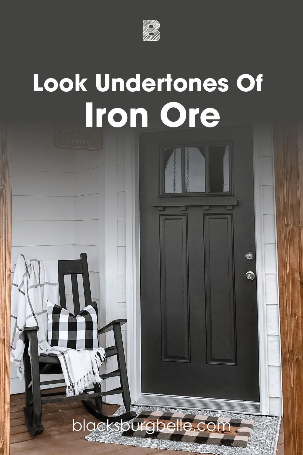
A Closer Look at Iron Ore’s Undertones
Iron Ore can easily look black and hide its undertones when there are proper black colors beside it. As you can see in the picture below, the paint color looks wonderful on the front door.
However, you can still notice its softness compared to black colors like Sherwin Williams Black Magic or Tricorn Black.
Remember when I mentioned that Iron Ore can also display a hint of green sometimes. Well, I’ve got a picture to back this claim. Here, you will notice the dark neutral take on a green shade amidst the warmth in the space.
Urbane Bronze vs Iron Ore – Are They Warm or Cool?
Sherwin Williams Urbane Bronze and Iron Ore both fall on the warm side. Their undertones further reinforce this fact.
However, Urbane Bronze is the warmer one. Even when pairing with wood, it goes best with warm wood, thanks to its green undertone. Iron Ore appears slightly cooler but has more depth because of its lower LRV and lesser gray.
You should note that this doesn’t mean Iron Ore will not look warm in living or work spaces.
Urbane Bronze vs. Iron Ore Complementary Colors
Just like you need several ingredients to make an amazing delicacy, you need more than one color for splendid results. These colors are called complementary colors, and you should know about them.
How do you get the color that perfectly complements your main one? Simply locate your main color on the color wheel and pick the color on the opposite side. Hues on opposite sides of each other on the color wheel end up as complementary colors.
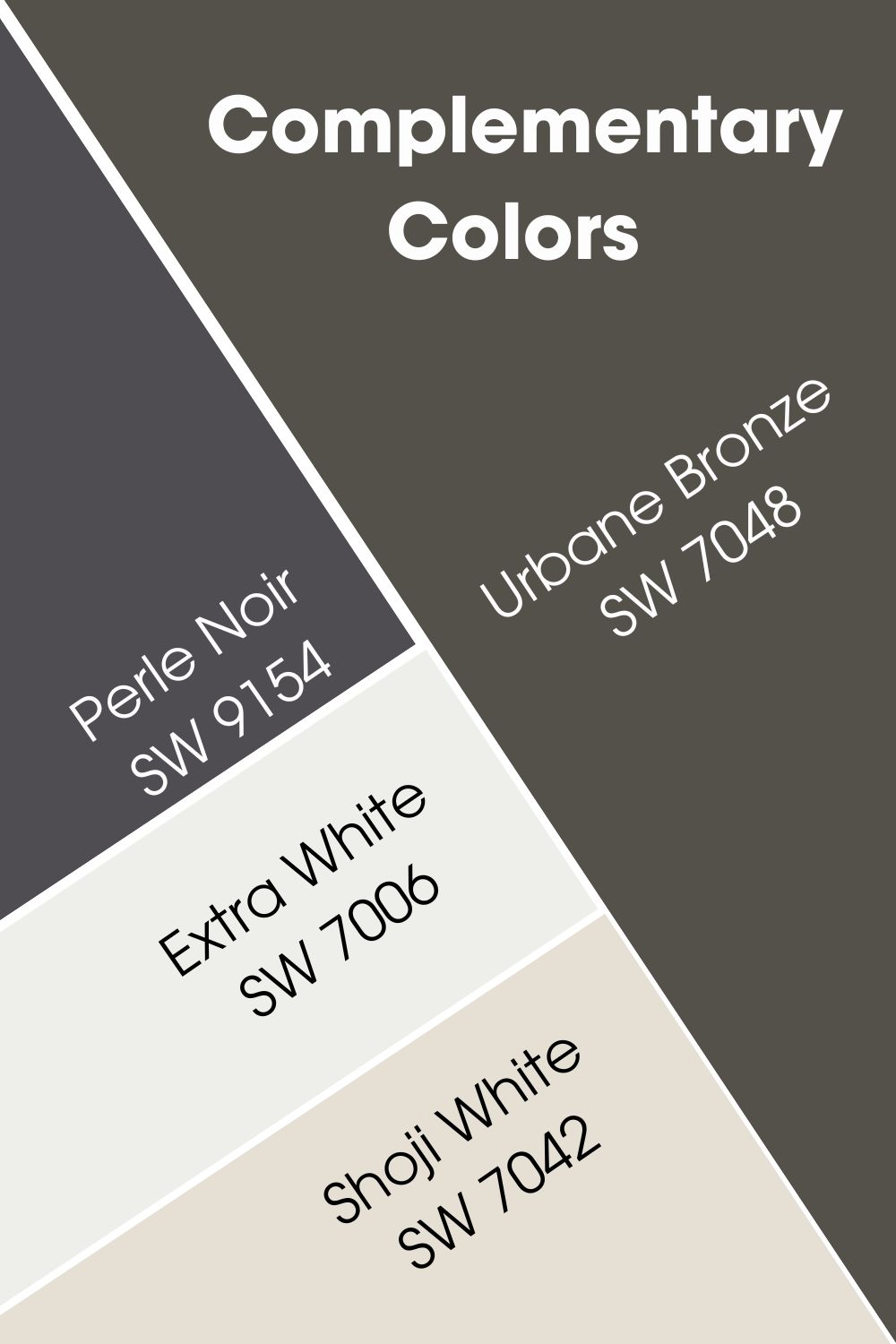
Urbane Bronze (SW 7048) Complementary Color
I have included Urbane Bronze’s main complementary color below, including a couple of honorable mentions.
Sherwin Williams Perle Noir (SW 9154)
This deep purple looks almost black and has an aura of sophistication. Although it has the same LRV as Urbane Bronze, it has more depth. As one would expect, Perle Noir has significantly less gray.
It works best on accent walls but feel free to go creative with its use.
Sherwin Williams Extra White (SW 7006)
This paint color gets the job done if you want to pair Urbane Bronze with a cool white paint color. Extra White has a crisp look and can also work well as a trim or ceiling color. It has an LRV of 86.
Sherwin Williams Shoji White (SW 7042)
If Extra White works well as a cool, crisp white, Shoji White is the warm, cozy alternative. The white paint color has a creamy look that gets close to greige. It has an LRV of 74 and goes great in any interior and exterior space.
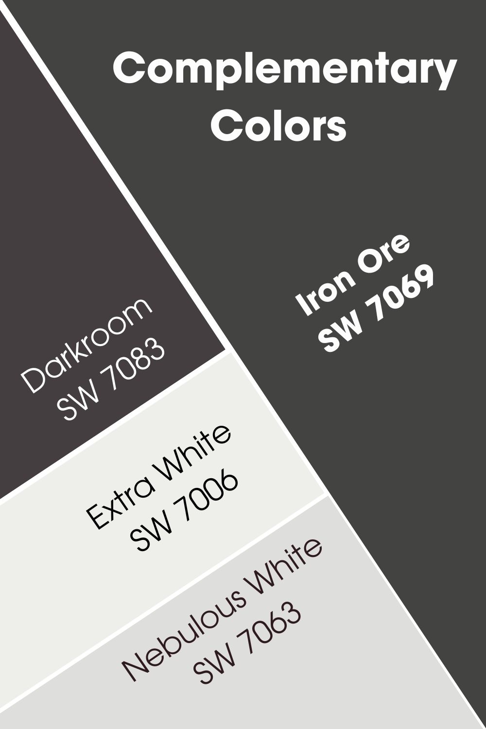
Iron Ore Complementary Color (SW 7069)
Iron Ore also picked its complementary color from the purple hue.
Sherwin Williams Darkroom (SW 7083)
Darkroom is a deep shade of purple with strong brown undertones. In fact, you can easily mistake it for a dark brown paint color. It has as much depth as Iron Ore with an LRV of 5. This is why I always recommend combining both paint colors only in well-lit spaces.
Sherwin Williams Extra White (SW 7006)
Extra White works just as well with Iron Ore. The bright, cool white contrasts nicely with Iron Ore’s dark look.
Feel free to pair both colors on walls or use the darker one on furniture or doors instead.
Sherwin Williams Nebulous White (SW 7063)
Nebulous White is another cool white color that goes well with Iron Ore. It isn’t as bright as Extra White and has blue undertones. This makes it a better choice if you want a bit more color or simply want its cloud-like vibes.
Urbane Bronze and Iron Ore Color Palette
What’s better than knowing the colors that complement these dark neutrals? Checking out different ways they pair up for amazing effects. Regardless of their differences, these paint colors have wonderful color palettes.
I’m sure you’re as excited to see these palettes as I am to show you!
Sherwin Williams Urbane Bronze Color Palette
This palette features colors that contrast nicely with Urbane Bronze. It also has a cozy addition for spaces that require extra color and warmth. Finally, I included a dark color for some extra sophistication and depth.
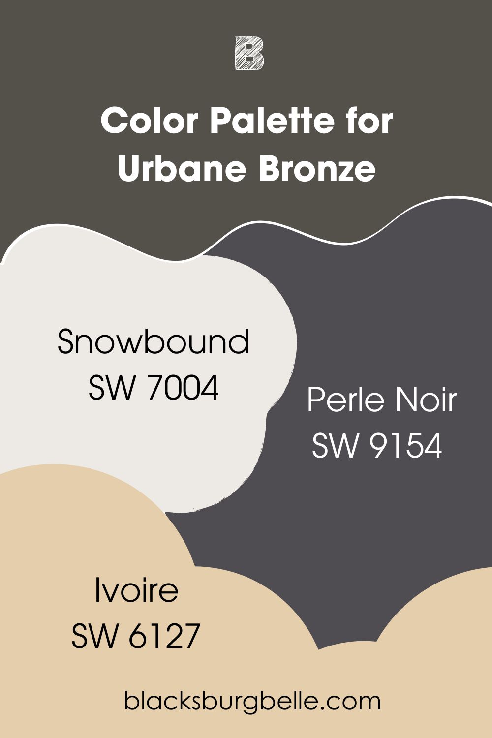
Sherwin Williams Urbane Bronze (SW 7048)
This is our main paint color for the palette. A deep brown with strong gray undertones. Works wonders on walls and cabinets alike.
Sherwin Williams Snowbound (SW 7004)
Snowbound is a white paint color, popular for its majestic vibe. It pairs nicely with warm and cool colors alike.
For this palette, Snowbound contrasts well with Urbane Bronze to give a calm, welcoming feel.
Sherwin Williams Perle Noir (SW 9154)
Remember this color? Yes, the perfect complement to Urbane Bronze. Perle Noir is a deep purple that can look almost black. It adds a bit of luxury to this palette.
Sherwin Williams Ivoire (SW 6127)
Ivoire adds some extra warmth and color to this palette. With this paint color, you’ve got lots of cozy vibes to work with.
Sherwin Williams Iron Ore Color Palette
I chose to explore Iron Ore’s rich tones and fully utilize its coziness with this palette. As usual, I’ve added some extra color for a balanced and cheerful feel.
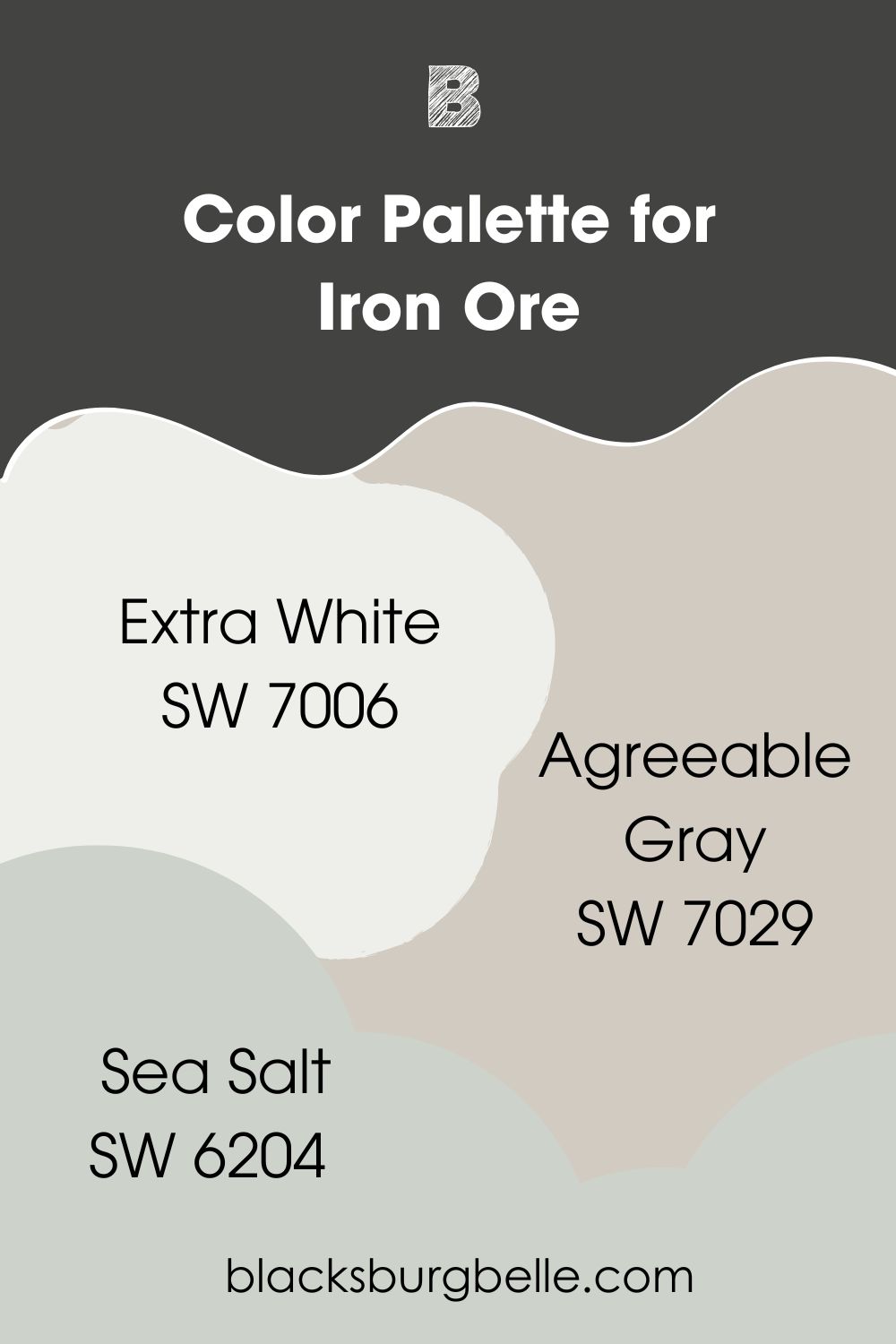
Sherwin Williams Iron Ore (SW 7069)
The main color for this palette. Iron Ore goes well on walls and furniture, regardless of space. However, you should only use it in well-lit areas.
Sherwin Williams Extra White (SW 7006)
Apart from using it as a trim color for Iron Ore, Extra White also pairs nicely with it on walls. You can use both colors in spaces with less lighting. However, you will have to use Iron Ore sparingly.
Sherwin Williams Agreeable Gray (SW 7029)
Agreeable Gray establishes the coziness in this palette. The popular gray pairs with just about any color and works wonders in any space.
Sherwin Williams Sea Salt (SW 6204)
Sea Salt is another popular paint color from the brand. The cool, muted green has strong blue undertones. It easily gives beachy vibes in any space.
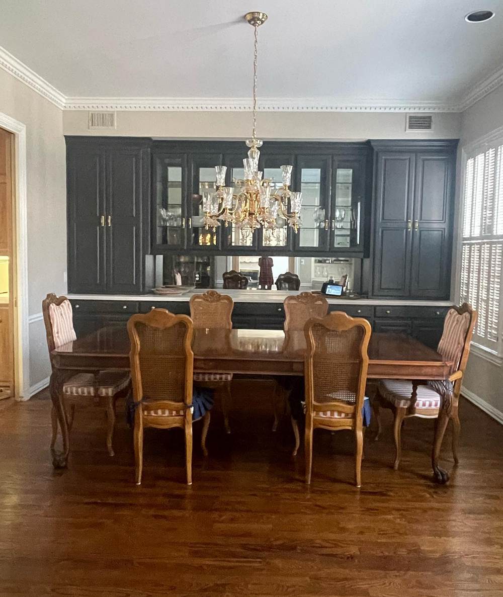
Urbane Bronze vs. Iron Ore on Cabinets
Dark paint colors naturally look good on cabinets. The same applies to Urbane Bronze and Iron Ore, as the pictures show.
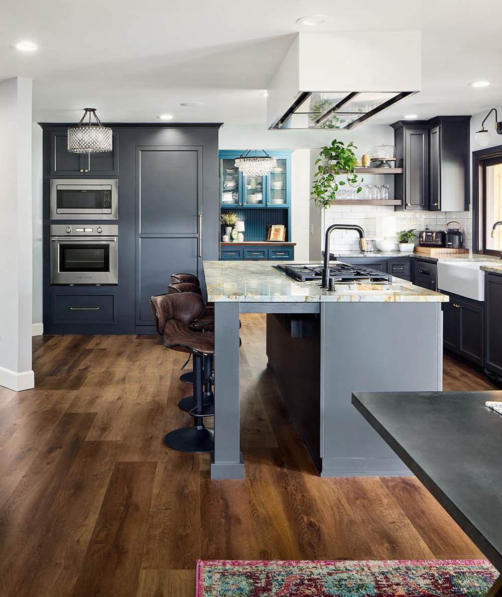
Urbane Bronze on Cabinets
I expect nothing less than an amazing result when using Urbane Bronze on cabinets. The reason is that the paint color goes well on wood.
As you can see in the picture below, Urbane Bronze adds to the overall coziness in the kitchen.
Notice how the lighting plays with its green hint? The upper cabinets show more green than the lower ones.
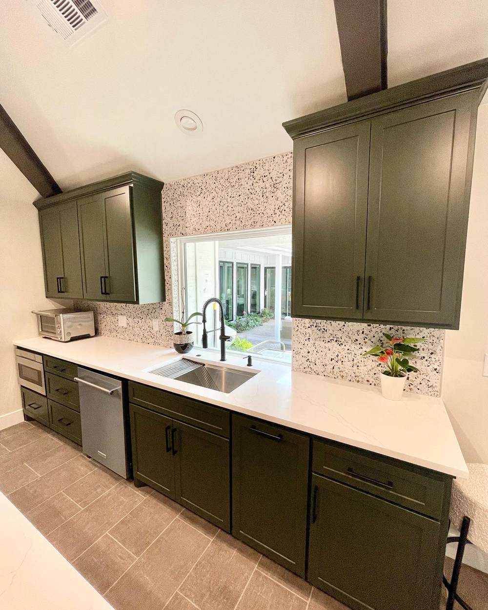
Iron Ore on Cabinets
Sherwin Williams Iron Ore looks black and natural on cabinets as the picture below shows. However, it adds that soft touch and bit of color that many homeowners have come to love.
Pairing Iron Ore with the a cool crisp white like in the picture gives an overall cool and pristine vibe. This type of feeling is befitting a kitchen space where hygiene matters.
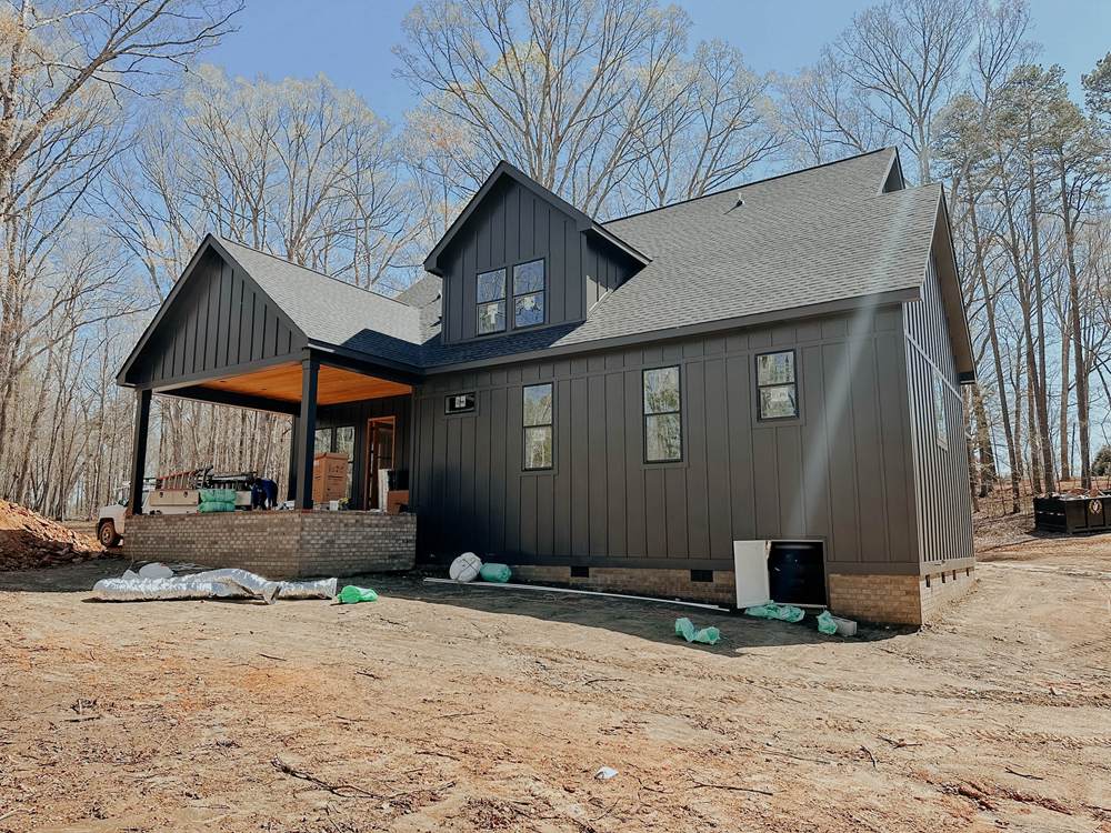
Urbane Bronze vs. Iron Ore on Exterior Walls
Using these paint colors on exterior walls always give a confident vibe. Who doesn’t want a sense of sophistication for their home’s exterior?
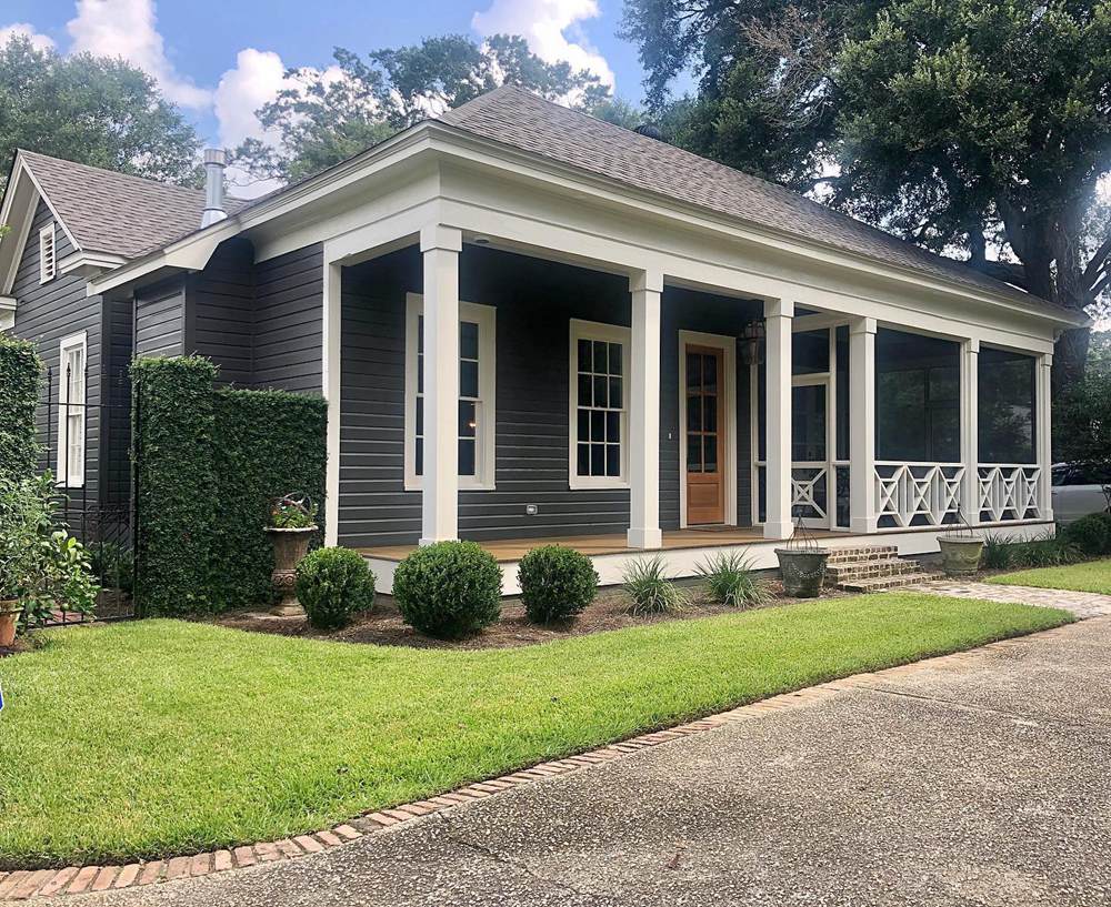
Urbane Bronze on Exterior Walls
Sherwin Williams Urbane Bronze pairs nicely with the creamy white on the pillars. Together, they give the exterior a bold, sophisticated feel.
Not only that, the dark neutral fits perfectly into the vegetation around. In fact, it adds an exquisite look to the building exterior.
Iron Ore on Exterior Walls
With more depth, comes more boldness. Yes, Iron Ore adds a sense of confidence and style to any exterior wall.
In the picture below, the bright sunlight allows the paint color to flex its full potential. You can easily feel its soft touch and aura of gentle mystery.
Urbane Bronze vs. Iron Ore on Furniture
Your furniture is every bit a part of your decor as the walls. As such, you want to choose the correct paint color for any piece you have. Urbane Bronze and Iron Ore both look wonderful on furniture.
Let’s check the pictures!
Urbane Bronze on Furniture
The paint color looks clean and natural on this shelf. Urbane Bronze gives a vivid sense of taste and style, which suits the contents of the furniture.
Also, it pairs nicely with the surrounding brighter colors in the interior space.
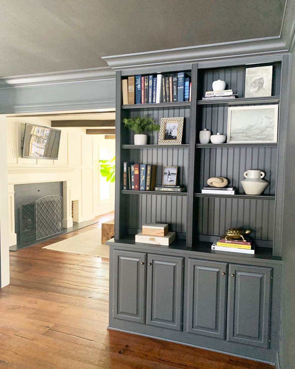
Iron Ore on Furniture
Here, you can see Iron Ore on the cabinets, adding a luxurious look to the space. The surrounding coziness allows it to show a little green this time.
Also, the dark neutral looks natural on the woodwork, giving a bit more color.
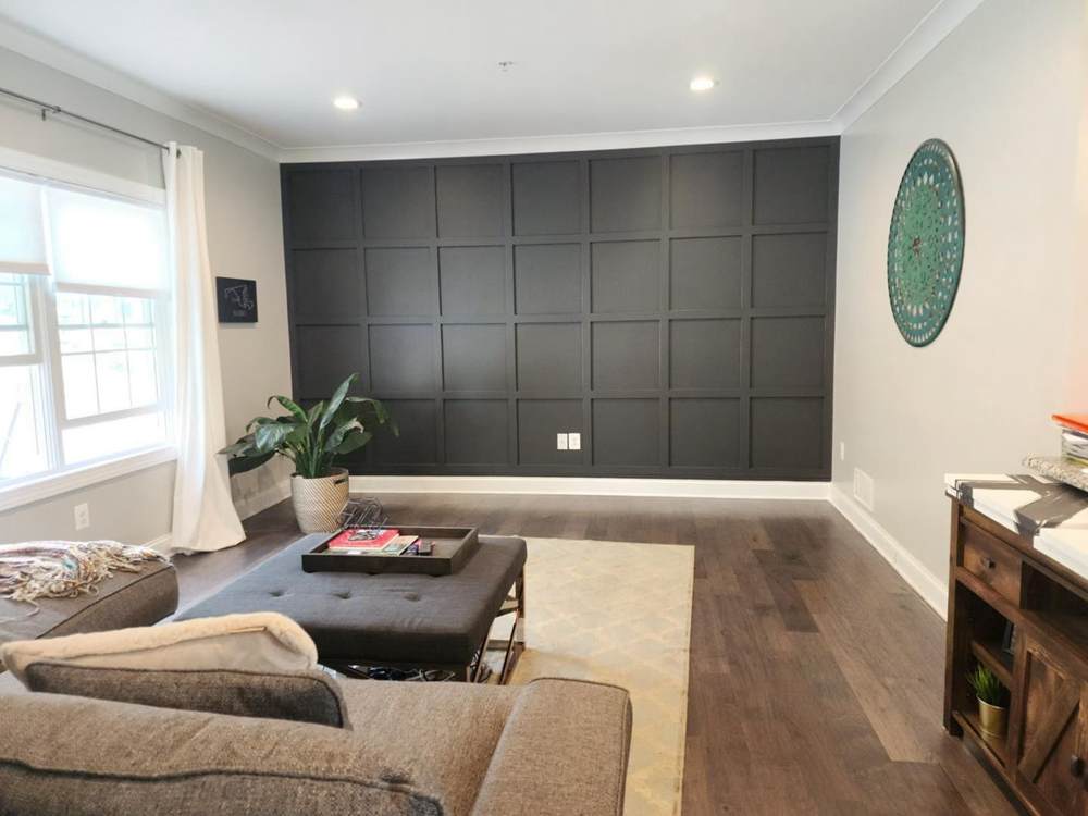
Urbane Bronze vs. Iron Ore in Living Rooms
These colors also look great on interior walls. In living rooms, they help to make shrink the space. This comes in handy in large areas that need to appear smaller.
Urbane Bronze in Living Room
The picture below shows Urbane Bronze contrasting nicely with white on the interior walls. The lighting reveals a hint of green on the center wall. The wall on the left shows more of the paint color’s brown tones.
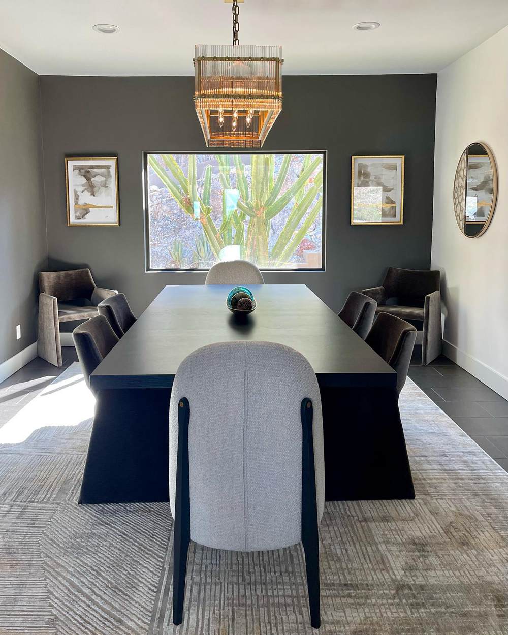
Iron Ore in Living Room
Sherwin Williams Iron Ore on the accent wall contrasts nicely with the white. You can say it acts as an anchor for this space.
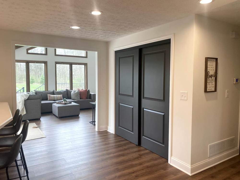
Urbane Bronze vs. Iron Ore on Doors
How do these paint colors look on doors? Well, let’s check out the pictures!
Urbane Bronze on Doors
Sherwin Williams Urbane Bronze on a front door gives your home a cozy and welcoming vibe. Its high versatility ensures that you don’t have to worry about your choice of wall colors.
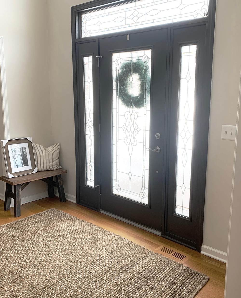
Iron Ore on Doors
The lovely dark neutral adds some depth to this space. It also plays well into the overall coziness.
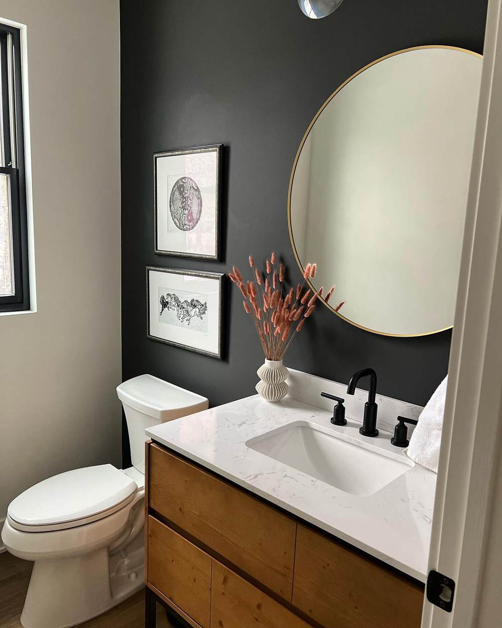
Urbane Bronze vs. Iron Ore in Bathrooms
Sherwin Williams Urbane Bronze and Iron Ore looks good in bathrooms. However, you have to pair them with brighter colors and have good illumination in the space.
Urbane Bronze in Bathrooms
Here, Urbane Bronze shows its strong brown tones on the bathroom cabinets. It also pairs excellently with the warm white color on the walls.
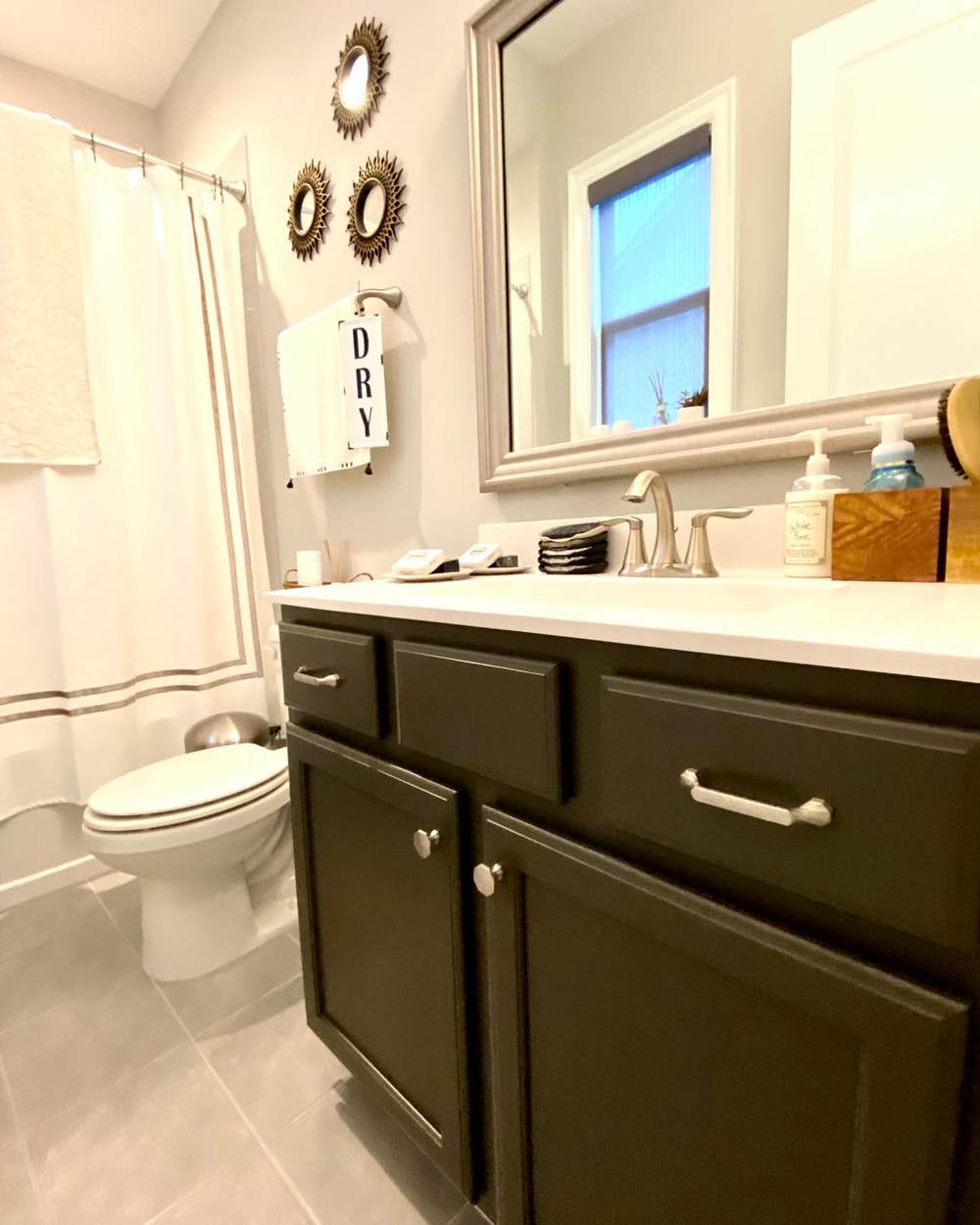
Iron Ore in Bathrooms
Sherwin Williams Iron Ore contrasts nicely with the white on the bathroom walls. It also adds a sophisticated vibe to the space.
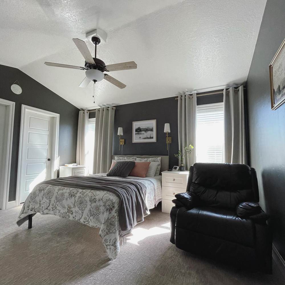
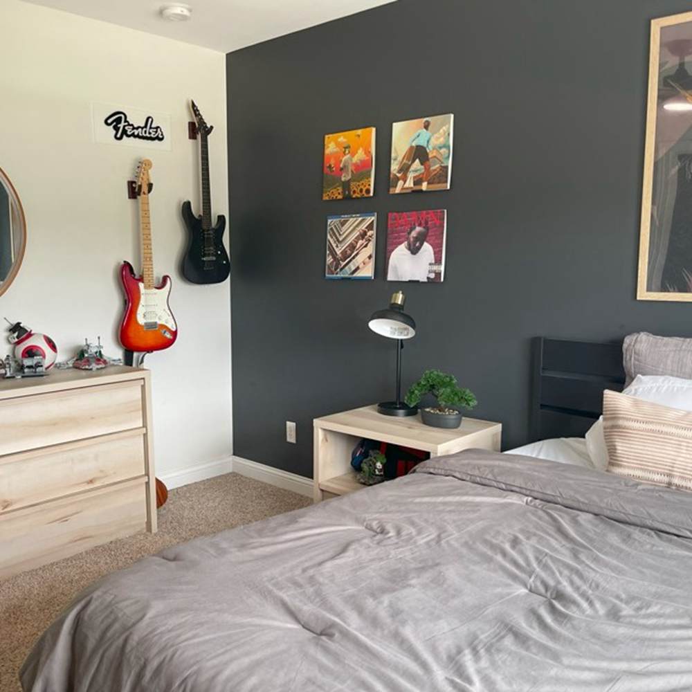
Urbane Bronze vs. Iron Ore in Bedrooms
How would these colors look on bedroom walls? Well, I have gotten pictures to show that they look amazing.
Urbane Bronze in the Bedroom
Sherwin Williams Urbane Bronze looks amazing and sophisticated on the bedroom walls. The abundant natural light also helps the color to reach its full potential.
Iron Ore in the Bedroom
Sherwin Williams Iron Ore adds to the overall sense of comfort and balance in this bedroom. It also contrasts nicely with the cool white.
Conclusion
Urbane Bronze and Iron Ore are popular dark neutrals in interior and exterior spaces. Sometimes, you don’t want a completely black paint color. You want something dark enough with some brown or extra warmth.
A super comfortable way to make the right choice between the two is to answer the following questions:
- Do I want more depth or not? If yes, go for Iron Ore.
- Do I want more gray and lightness? If yes, go for Urbane Bronze.
- Am I comfortable with a bit of green? If you don’t mind green tones in your space, pick Urbane Bronze.
- Do I want earthy tones in my space? Urbane Bronze fits well into such styles.
- Do I want something soft and less warm? If yes, go for Iron Ore.
If you still have more questions about these two colors, drop them in the comments section. I’ll happily answer them!
 SW Alabaster Vs BM White Dove: How to Choose!
 Sherwin Williams Rainwashed vs Sea Salt: How to Choose?
 SW Dover White vs BM White Dove: Let’s Compare
 Benjamin Moore Pale Oak vs Classic Gray: How to Choose?
 SW Alabaster vs BM Swiss Coffee: Let’s Compare
 Sherwin Williams Creamy vs Alabaster: How to Choose?
